I use my phone for everything.
Groceries? App.
Calendar? App.
Deep-dive into whether niacinamide and vitamin C can coexist in the same serum? You bet. Phone browser, 2 a.m., three tabs open.
But do you know what makes me bounce off a website faster than you can say "Massachusetts? Side-scrolling tables. I don’t care how useful the info is. If I have to drag my thumb across the screen just to read one row, I’m gone.
And I’m not the only one.
If your tables look like this on mobile:
Users have to scroll sideways just to read a single line
Important columns get cut off or stacked in the wrong order
There’s no clear CTA or visual hierarchy
It feels more like a spreadsheet than a sales page
Then yeah — you're bleeding conversions. Quietly. Continuously. Painfully.
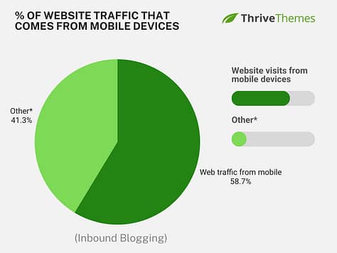
In a world where over half of all web traffic comes from mobile, your table layout matters. A lot.
61% of consumers are more likely to purchase from mobile-friendly websites – which means we need to fix your tables now.
Not just to “make it fit” on mobile, but to make it work.Like, really work.
In this guide, I’ll show you how to build mobile responsive tables in WordPress that look clean, feel intuitive, and actually guide visitors toward action.
No code. No plugins. No more rage-swiping left and right.
Ready? Let’s build tables that keep your visitors on your site.
What Makes a Table “Mobile Responsive” vs. Mobile Smart
Let’s start with a number that makes me want to flip a table (see what I did there?):
Mobile users are 5x more likely to abandon a task if a site isn’t mobile-friendly. Source: Baymard Institute
That means if your table isn’t pulling its weight on a small screen, you’re actively sending people packing.
And something to dwell on: a lot of so-called “mobile responsive tables” still miss the point.
Just because a table technically shrinks down to fit your phone screen doesn’t mean it’s actually usable. And just because it’s usable doesn’t mean it helps your visitors do something—like compare, decide, or click that lovely “buy now” button you worked so hard on.
Here’s a quick breakdown of the usual suspects:
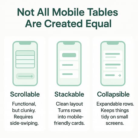
- Scrollable tables: AKA the “eh, close enough” solution. It slaps a horizontal scroll bar on your desktop-style table and expects mobile users to go on a thumb workout journey just to read one row. It works, but only if you’re very, very forgiving.
- Stackable tables: These are much better. On mobile, each row becomes its own tidy little card, and your headers show up as side labels. It’s like giving your data a nice mobile outfit — clear, comfy, and user-friendly.
- Collapsible tables: These let users expand rows or sections to reveal more info. Great if you’ve got loads of content but don’t want to overwhelm people at first glance.
But honestly, the method matters less than the mindset.
A smart mobile responsive table isn’t just about structure — it’s about supporting decision-making. It should:
Show the most important info first
Make comparisons dead simple
Use bold labels, color, or spacing to guide the eye
Include a clear, easy-to-tap CTA (seriously, don’t make them hunt for it)
Avoid turning into a tiny-fonted mess of stats and footnotes
Your table should be helpful and direct. If it’s just sitting there being decorative or confusing, it’s not doing its job.
Now that we know what we’re aiming for, let’s talk tools — specifically, the three main ways to build mobile responsive tables in WordPress, and why only one of them truly respects your time and your conversions.
3 Ways to Add Mobile Responsive Tables in WordPress
Alright, now that we know what a good mobile responsive table should do, let’s talk about how to actually make one inside WordPress.
There are three main ways you can go:
One is fine if you just need to toss a table onto the page.
One is feature-heavy but a little high-maintenance.
And one is… well, the Thrive way. Easy, flexible, and actually built for conversions.
Let’s break them down.
Option 1: WordPress Block Editor Table Block (Good, But Basic)
If you’re already using the native WordPress Block Editor (a.k.a. Gutenberg), you’ve probably seen the Table block.
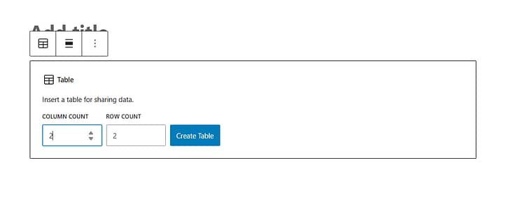
It’s great for:
Simple layouts
Displaying small bits of text
Quick copy-paste tables (like contact details or shipping zones)
But it’s also… basic.
The responsive table block in WordPress works… until you want to collapse columns or add CTAs without code.
There’s no built-in mobile responsiveness — no stacking, collapsing, or mobile-optimized formatting. If you want that, you’ll need to bust out custom CSS or hunt for a third-party block plugin.
Use this option if: your table is low-stakes and not tied to any sort of purchase, opt-in, or key decision.
Otherwise? Keep scrolling.
Option 2: WordPress Table Plugins (Better, But Often Bloated)
Plugins like TablePress, Ninja Tables, and wpDataTables are built specifically for complex table needs.
What they’re good at:
Large datasets
Sortable or filterable tables
Importing/exporting from spreadsheets
Integrating with WooCommerce or form data
What they’re not so good at:
Styling flexibility (you often have to fight the plugin to get it to match your site)
Adding CTAs inside rows
Playing nicely with conversion-focused layouts
Keeping things lightweight (some of these are performance hogs)
If you’ve ever tried building a WordPress responsive table with a plugin, you’ve probably run into styling issues or awkward mobile layouts.
Also, most of these use shortcodes to embed your tables, which means editing them feels like switching back and forth between two separate worlds: the plugin builder and your actual page.
Use this option if: you’re managing data-heavy content that’s meant to be browsed, not converted on.
Option 3: Thrive Architect’s Table Element (The Smart Marketer’s Choice)
Okay, I know what you might be thinking:
“Why would I use a landing page builder just to add a table?”
Fair question. Here’s the thing:
If your table is just there to display a few numbers or a snack schedule, you probably don’t need Thrive Architect. There are plenty of responsive tables WordPress users can try.
Seriously, you could go ahead and let the Block Editor or a plugin do its thing…
But — if your table is part of a sales page, a pricing section, a feature comparison, or literally any part of your funnel that’s meant to help someone say yes… then yeah. You want Thrive.
Because Thrive Architect acts like a WordPress table builder — except it actually understands what your landing page is trying to achieve.
Here, you’re building a visual decision-making tool that fits seamlessly into your message, your brand, and your conversion strategy.
Need a comparison table WordPress won’t butcher on mobile? Thrive Architect’s templates are your friend. I could go on.
Here's why this is my absolute favorite way to create mobile responsive tables in WordPress:
✅ Pre-designed templates for pricing tables, comparison layouts, and schedules — already mobile-optimized
✅ Full drag-and-drop control: add columns, icons, badges, and even real CTAs right inside the table
✅ Everything lives inside your actual page — no shortcodes, no switching tools, no styling conflicts
Plus, you’re not locked into static layouts. You can:
Personalize the layout for different visitors using Smart Landing Pages
Track which CTA or offer gets more clicks and feed that data into your funnel
In short: you’re not just “adding a table.” You’re designing a guided experience that looks clean on every screen, feels great to use, and gently nudges your visitors toward action.
So yeah, it’s more than just a table tool. But that’s exactly the point.
You’re building a mobile-first, conversion-friendly sales experience — and your table should be pulling its weight in that.
Feature | WordPress Block Editor | Table Plugins | Thrive Architect |
|---|---|---|---|
Responsive Layout | ❌ Manual CSS required | 🟡 Varies by plugin | ✅ Full visual control |
Visual Editing | 🟡 Inline only | 🟡 Plugin interface | ✅ True drag-and-drop |
Mobile Optimization | ❌ None built-in | 🟡 Add-ons or workarounds | ✅ Collapse, stack, hide columns |
CTA Integration | ❌ Basic links | ❌ Usually not supported | ✅ Real buttons, timers, tooltips |
Pre-Designed Templates | ❌ Nope | 🟡 A few premium | ✅ Yes — conversion-focused |
Ease of Use | ✅ Simple | 🟡 Can get complex | ✅ Page-level control, no shortcode chaos |
Performance | ✅ Lightweight | 🟡 Can be bloated | ✅ Built-in, optimized |
Best For | Quick drafts, admin tables | Large data display | Sales pages, pricing sections, funnels |
TL;DR: If you’re publishing a table just to show info, any of these tools will work. But if your table needs to help someone choose, click, or convert — Thrive Architect is the only one that actually plays offense.
How to Build a Mobile Responsive Table in Thrive Architect
Alright, time to get hands-on.
If you’ve made it this far, I’m guessing you’re ready to actually build a table that doesn’t make your visitors rage-tap the back button. So let me walk you through the process.
Step 1: Open a Page in Thrive Architect
You can use an existing page if you really want to, but I’m going to gently recommend you start fresh.
Because if you’re here trying to fix your tables… there’s a solid chance your page layout could use a little love too. So let’s go clean slate.

Step 2: Choose Your Page Type
Once Thrive Architect loads, you’ll get a few layout options:
Normal Page
Blank with Header & Footer
Completely Blank Page
Pre-Built Landing Page Template
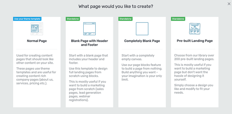
For this walkthrough, I’m using the Completely Blank option. Why? No distractions. No weird leftover styles. Just you, your table, and your high-converting future.
📚 Want a deeper dive into building landing pages the Thrive way? Check out this step-by-step landing page tutorial →
Step 3: Drag and Drop the Table Element
Now for the fun part.
- Head over to the right-hand sidebar
- Search for “Table”
- Drag the Table Element onto your page
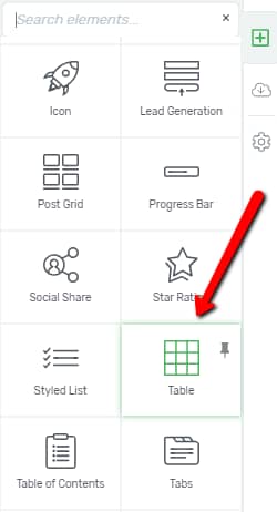
- Boom — Thrive gives you a list of gorgeous, pre-designed templates to start from (no blank grids of sadness here)
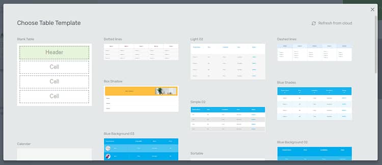
Choose one that fits your use case and let’s get creative.
Step 4: Customize Your Table (Without Breaking Anything)
Now you can really start making it yours.
A few quick best practices as you edit:
And remember: in Thrive, every text box, button, icon, and border can be styled visually — no CSS required. So go wild (responsibly).
Step 5: Make It Mobile Responsive (This Is the Whole Point)
This is where most table tools tap out. Not Thrive.
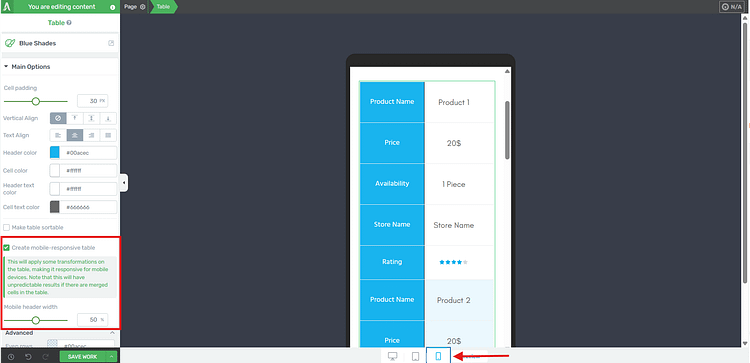
Switch to mobile view inside the Thrive editor and you’ll see your table automatically stacks vertically — which means:
No awkward sideways scrolling
Columns become clear mobile cards
Your content flows naturally top to bottom (like every mobile user expects)
Up next: want to really elevate your table design? I’ve got a few clever tricks that make your data pop and your conversions jump.Let’s get into Smart Table Design Tactics for Better UX and More Conversions.
Smart Table Design Tactics for Better UX and More Conversions
Now that you’ve got your mobile responsive table in place — clean, readable, doesn’t make your audience want to throw their phone — let’s make it work harder.
Here are a few Thrive-powered design tactics to take your table from functional to fabulous:
🧲 Add a Sticky CTA Bar Beneath Long Tables
Got a comparison table that requires some scrolling? Keep your call-to-action in sight with a sticky section that appears just below the table.
That way, when they’ve finished comparing and their brain goes, “Okay, I’m ready,” your button is right there — not three swipes back up the page.
✅ Thrive Architect makes this easy with scroll behavior and sticky positioning built right in.
🌟 Highlight Your Top Offer Column
If your table includes multiple pricing tiers or plans, make the best one pop.
Add a “Most Popular” or “Best Value” badge
Use a contrasting background color or border
Slightly enlarge the featured column to create a visual cue
People tend to choose the path of least resistance. Make your recommendation obvious, and they’ll often follow your lead.
Alternatively, you can use our pricing table element – which you can learn more about right here.
📱 Break Long Tables into Steps or Toggles
If your table is looooong — like, “makes you scroll for days” long — it’s time to simplify.
Here are a few easy ways to make it feel lighter and less overwhelming, especially on mobile:
Step-by-step layout: Instead of showing everything at once, break the table into small chunks. For example, show Step 1 (basic features), then Step 2 (pricing), and so on. In Thrive Architect, you can easily create multiple mini tables on one page.
Toggles or accordions: Use collapsible sections so visitors can tap to reveal more info only when they need it. This works beautifully for FAQs, feature breakdowns, or layered pricing options.
Group your rows visually: You can make sections easier to scan by adding background colors or content boxes around related rows — like grouping all “Pro Plan” features together.
The goal? Make your table feel like a helpful walkthrough, not a dense spreadsheet. Especially on a small screen.
🎯 Use Visual Hierarchy to Direct Attention
This one’s subtle, but powerful:
Use bold labels and short phrases
Add checkmark icons for feature lists (they scan faster than text)
Use spacing and alignment intentionally — not all data needs equal weight
Place CTA buttons where the eye naturally lands (usually bottom-center or bottom-right of a column)
Good tables don’t ask for attention — they naturally guide it.
FAQs About Mobile Responsive Tables in WordPress
If you’re plugin-curious, here are a few that get mentioned a lot:
TablePress – Solid option, especially with the Responsive Tables add-on.
Ninja Tables – Slick UI, mobile-friendly settings, and solid customization.
wpDataTables – Great for heavy data and spreadsheets that need filtering, sorting, or charts.
That said… if you're building anything conversion-focused (like a pricing table or product comparison), I'd still recommend Thrive Architect over a plugin. Why? Because it actually lets you design your table, not just plug data into it and pray it looks decent on mobile.
Yes, and no — depends how you built them.
If you used the Block Editor or a plugin like TablePress, you might be able to tweak some settings or add a bit of CSS to make them scrollable on mobile. But if you’re going for something polished — like stackable or collapsible layouts — you’ll probably get better results by rebuilding them using a proper tool (like Thrive Architect).
Basically: If the table is critical to your page, it’s worth giving it a fresh start with mobile in mind.
Stackable tables are like a glow-up for mobile users.
Instead of forcing someone to scroll sideways or squint at crammed columns, stackable tables turn each row into a clean, card-style block. Headers become labels, spacing improves, and your content becomes actually usable on smaller screens.
If you’re serious about mobile UX (and you should be), stackable layouts are a no-brainer.
Conclusion: Don’t Just Build Tables — Build Mobile Responsive Tables That Convert
At this point, you’re not just someone who knows what a mobile responsive table is. You know how to build one that looks good, reads clearly, and actually helps your visitor take action.
Whether you’re showcasing pricing, comparing features, or organizing info your audience needs to make a decision — the way you present that content matters. Especially on mobile.
And while the WordPress Block Editor and table plugins might get you part of the way there, Thrive Architect gives you the tools to go all the way:
Responsive design without code
Visual control over layout and CTA placement
Built-in templates that don’t just fit the screen — they drive results
A builder that treats every element (including your tables) like a conversion opportunity
Bottom line? You’re not just designing to display. You’re designing to win the click.
👉 Final CTA:
Want to build mobile responsive tables in WordPress that don’t just “work,” but work for you? [Try Thrive Architect now and get access to responsive templates, drag-and-drop control, and conversion tools built right into your design.]



It was a much needed feature. Thanks Thrive team for making it happen. Love you 🙂
Glad is was something you were after Istiak!
Thanks stephany , very usefull. Good job you and all of your team
I’ll send your thanks to the team Juan 🙂
Great that this is mobile now
Agreed Johannes, I feel like this is going to make a lot of people very happy.
oh yes Stephanie, that’s fantastic! When will it be available?
Hi Jan. It’s available now within Thrive Architect (using the table element). Just make sure you’ve updated to the latest version of the plugin.
Using the most updated version that released today, I do not see the new table feature.
Hi Doug,
Try following these steps:
(first off, if you’re using any caching, make sure to clear it)
1. Open a page or post with the ‘Edit in Thrive Architect’ button
2. Search for the ‘Table Element’
3. Drag that onto your page or post to add table to your page
4. Change to ‘Mobile’ in the ‘Responsive View’ menu (shown here) and select the table element on the page. You should see the ‘make table mobile-responsive’ checkbox within that menu (there’s a screenshot of this in the article above)
If the option still isn’t showing for you I would suggest contacting our support forum.
This is great and is a awesome and highly needed update. Thank you, Thrive Themes!
Thanks John, and agreed on the highly needed 🙂
Hi Stephanie, I thought so. I have also TA in the newest version 2.0.15 but this menu is unfortunately not available by me 🙁
Hi Jan,
Make sure you’re in ‘mobile’ under the responsive view settings, then select the table element. From the table element sidebar menu you should have the option to make the table mobile responsive. If it’s still not coming up for you, contact our Support Forum and they should be able to help.
Thank you, Stephanie! I never came to this idea that tables could be a ranking factor, but this totally makes sense!
Yep, Google loves organized information. Glad you got something out of the post Christoph 🙂
It looks much better on mobile devices.
Sure does Matthias. A lot more user friendly.
It would be great to be able to insert some spacing between sections (between the old rows, now columns). Not sure if I’m explaining it properly, but between the old row 1 and row 2 in the mobile view, it would be nice to be able to break it up a bit.
Good point I think.
Hi Randy,
I understand what you mean. A suggestion for helping with this is making the first column a different color so that when it changes in mobile there’s a color change to let visitors know it’s a new entry. But I’ll pass this on to the developers nonetheless and see if there’s anything we can do about it.
I am really happy to grab this feature, Thank you!!
Glad you’re happy with it Alica!
Pure genius – and what a great heads up on snippets too from Matt. I don’t know any other CMS as good as ThriveThemes now Architect is firmly established.
That’s Quentin, this is nice to hear 🙂
Thanks Stephanie! i was about to request this feature in thrive forums. thanks!
It’s that ol’ Thrive Themes ESP at work again 😉
Still, I didn’t find this feature “creat mobile, responsible table “?
Hi Galib,
First off make sure you’ve updated to the latest version of Thrive Architect, and if you’re using any caching, make sure to clear it.
Then try following these steps:
1. Open a page or post with the ‘Edit in Thrive Architect’ button
2. Search for the ‘Table Element’
3. Drag that onto your page or post to add table to your page
4. Change to ‘Mobile’ in the ‘Responsive View’ menu (shown here) and select the table element on the page. You should see the ‘make table mobile-responsive’ checkbox within that menu (there’s a screenshot of this in the article above)
If the option still isn’t showing for you I would suggest contacting our support forum.
ALL IN ! So timely ..Building two sites and needed a mobile way to display offerings that didn’t suck…
Now can put my good hands around the neck of more competitors..and show them a thing or two..
I appreciate the violent enthusiasm John :p
Awesome tables and feature!
Side question: how can we make those neat price tag buttons?
Make both top left and bottom left corners radiused. Then use a radio button (selected) icon for the “hole” and adjust your text accordingly.
10 points Robert – I spot a tinkerer 😉
What Robert said 🙂 Just clever use of an icon within the button.
Wow, this is pretty awesome stuff guys. Great work! That was a huge drawback of tables that they just don’t show up nicely on mobile view.
This is a great addition to be able to show tables nicely on both desktop and mobile view. Happy Christmas :)!
Merry Christmas Mike!
This is great, Stephanie. Thanks for the update.
So you know, I think you have the wrong url on the link to the page of table samples. When I click that link, instead of going to a page with table samples, I end up on a page with landing page samples (https://thrivethemes.com/landing-pages-gallery/).
Cheers,
Grant
Hi Grant,
The templates are on the ‘Table Templates’ page within the gallery, which you’re right, is pretty hard to find among them all. The exact preview page is here.
This is great! Is there a way to use this feature outside of TA in a regular wordpress post while using a thrive theme?
Hi Mario,
Unfortunately not, it’s a Thrive Architect element so it can only be created within the Thrive Architect editing window. But you can create and edit posts with Thrive Architect, so you can create whole post with Thrive Architect including the tables.
Will these tables break gracefully on AMP versions of my articles?
Very cool Stephanie! So now that Woocommerce is working on other themes this should be great for your store – something I still have to figure out – when can we expect a post on setting up a photo store with a variety of categories of photo sections with a variety of sizes and types – in other words the photos are imported as a variable product csv table – will be trying to get this done over the next few weeks – will post if I get it working. Looking forward to the new theme – drool, drool!
Hi Craig,
I’m going to be honest, that’s not something we’re planning to create a post about at this stage. It’s a little bit too niche. Although I do understand WooCommerce is being used by a lot of our customers – so I’m keeping a keen eye on how we can integrate that into more of our content. I hope you manage to figure it out! (and I’m also drooling over the new theme 🙂
A recent article buy SEMRush showed the data they gathered highlighted the importance of using tables to be featured in rich snippets, and by coincidence I saw this once myself for a competitor’s site.
However, I wasn’t aware of the item placement (in rows, rather than columns) as being important. This is very helpful.
I’m going to change my tables (current done in the Amazon AAWP plugin) or possibly try with Architect if they can be done with shortcodes perhaps.
Thanks
Great to hear Marty, I hope this gets you that feature snippet 😉
Hi, How can make mobile responsive tables from old version? I am using 1.5 version. Thank you
Hi Abu,
In order to get the updates you need to update the Thrive Architect plugin to the latest version.
This is really neat! I think it would look better if there were some separation between each of the rows when they stack up on mobile so it’s not as difficult to see where one stops and the next one starts. Possibly just a thicker divider line or something.
Hi Christina,
Thanks for the suggestion. I’ll send it through to the developers. An immediately implementable solution for this is to have a different color for the first or last entry in the table so the visitor knows when that color repeats it’s a new entry.
Brilliant! You guys are sooo good. Thanks Stephanie.
Glad to help Bob 🙂
This is fantastic! Thank you! I was just able to update a pricing table on my website. It looked good on desktop, decent on tablets, but crashed on mobile. Now it looks great on all 3 devices 🙂
Good job!
Yeah it was pretty frustrating not being able to optimize for mobile. Glad it’s helped on you site John!
The best xmas gift ever!
Merry Christmas Bo 🙂
Going to find a reason to use this, just because it looks awesome ????????
Mary!! I had exactly the same idea. That’s why everyone ended up with a template too, I wanted to play with the tables 🙂
COOL nice feature thanks Thrive
We’re getting a little bit fancy over here at Thrive Themes 😉
Nice one. Esecially to combine with the template save. Cya, Steffen
Yeah once you start building multiple post the templates help a lot! Thanks Steffen
I had a client complaining about the non-responsive table I built with the old content builder, so this is fantastic news!! Love it. Big thanks to the team.
I’ll send on the thanks Andre!
Great addition. You guys (& gals) just keep on producing and over-delivering.
Thanks Keith!
What about making columns mobile friendly as well?
Hi Jaco,
The columns are already mobile responsive. You can chose to either stack the columns on mobile and tablet, or reduce the size of the content so the content will still fit next to each other on mobile. More details on the responsiveness of columns can be found at around 12.50 of this video.
Thank you for that Stephanie! The problem is I had to begin with a blank page in order to get my header exactly as I want it to be. A logo on each side and the menu in the middle. The problem is it looks fine in Desktop view but are totally chaos in mobile and tablet view. As soon as I hide certain elements for certain views, I can’t add new elements in the mobile and tablet view. I know it works from Desktop view downwards but truly a headache! Thank you for your assistance and comments on all of our opinions. Appreciate it! 😉
Hi Jaco,
You need to add all elements in desktop view, and you can chose to hide or show them on desktop and/or tablet and/or mobile from there. I’d suggest watching a few of our latest landing page from scratch videos to learn the best practice for responsive editing.
I’d recommend starting with the Thrive Architect Quick Start Tutorial and this post on mobile editing.
Hope that helps!
Thank you for the Christmas present and the know how on additional comments about the SEO benefits of this. Loved the gallery.
Take care Stephanie.
Thanks Luis, Merry Christmas 🙂
Great! also love the table templates, so easy to use and they look great as well.
Glad they were helpful Tim!
Is there a way to import the elements into my thrive architect instead of making it on my own? I am looking for the “Basic Comparison Table” and “Product Quick Stats” that would been a great help!
Thanks!
Hi Yarik,
You sure can, that’s what the tables template page is for. Create a new page in Thrive Architect, load a new landing page template, go to the ‘Element Templates’ set, click on that and choose the ‘Mobile Responsive Tables’ template. Once the page has loaded follow the instructions to save the tables as content templates- to use anywhere in your posts and pages.
Thank you so much, appreciate that :)!
Hi Stephanie,
just followed the instructions of the Tutorial, but there is only a “Styles” Dropdown. Is it possible that the templates are just available for Thrive members (I bought Thrive Themes before you launched the Membership).
Thanks
Will this be updated to pull images and prices from amazon? There is a new one out there that has these features. It will be so much easier to create amazon tables
This is not on the development timeline Manuel, but I do know there and plugins that can generate this content for you quite easily.
Thank You to the good people at Thrive Themes! I call this a beautiful thing for sure…Well played once again from the solid value that is Thrive Themes.
Thanks Mr. Ritter!
Nice feature, thanks. One irrelevant question, though. What app do you guys use for the talking head feature on your tutorials?
Hi Michael,
We got asked so much that we made a tutorial on how to do it. 🙂
Hello! Thanks for your work! You are best.
Thanks stephany! Before i didn’t know about this things but, now i can understand that. Thanks once again.
Hi
I am not getting tables, landing pages option… I have found one landing pages templates but there is no option like a table and other elements.
Thanks
Hi Prince, it’s one landing page template that is full of table designs. The table template page is under the ‘Element Templates’ set in the Landing Page cloud.
How can I add a Column to the Feature Comparison Table? I have one more product that needs to be added.
Hi Norman,
This tutorial on the table element should have the information you need.
Hi Stephanie K, I haven’t find the button of create mobile-responsive table in my side. Could you help me to solve this problem? Many thanks.
Hi Helicia,
You have to switch the view to mobile in order for the button to show up (also make sure to have the latest version of the plugin installed).
I found this article very informative.
Thanks so much for sharing and making it possible.
Thrive Architect is an awesome product with lots of future.
Keep it always up! You guys rock..
Hello how about for tablets? Do you have a link how to fix tables when using a tablet? By the way this is what I really need for the mobile view thanks. I fixed my tables already but now I am having issues when viewed on a tablet.
Stephanie,
Question I have a legacy website that was developed utilizing tables. Is there a way to convert to responsive using thrive?
Hi,
No you would have to rebuild the tables with Thrive Architect.
How do you get more than 6 rows in these tables? Nothing I try seems to work and I can’t find any tutorials about it either. Currently I use TablePress but that isn’t responsive.
When you’ve created a table, select it and go into edit mode for it. There, you have the options to add and remove more rows and columns.
This is awesome! But you guys really need to make it easier to find and import those pre-formatted tables. It took me over 20 minutes to figure it out!
Sorry Bill,
That element does not have templates attached to it, which makes it harder to deliver the templates to you. But happy you like them!
Table looks very cool – a reason to buy Thrive Architect it seems.
I would imagine many Amazon Associates would be looking for this except I can find no way to insert the product image without physically downloading the image onto my server and then linking to it. Which all works fine except it is totally against Amazon’s terms of service.
Is there a way I am missing?
This is the normal way to show images in WP, yes. You could use the “WP content” element instead of the image element and use the link to the amazon image. I don’t know if this is accepted in the Amazon terms of services, but in this way you’re not hosting the image on your site.
I’m sorry, I don’t understand these instructions, and therefore I can’t make my tables mobile-responsive. How/where do I get the Create Mobile Responsive Table checkbox? Is it in the Responsive menu or the Table menu? I have tried both areas and still can’t get Mobile Responsive checkbox to appear.
Hi Melanie,
First you have to put the canvas on mobile view (in the middle on the bottom of the editor). Then in the main options you’ll see the “create-mobile responsive” option.
https://cl.ly/2ae691d55e0a
Hey!! everything is ok but I’m facing some issues on how to fix tables on tablets? Do you have anything about how to fix tables when using a tablet? If you have any information about that kindly share. This really helped me a lot.