How to Create the Perfect Header for Your Website

Author 
Shane Melaugh   63

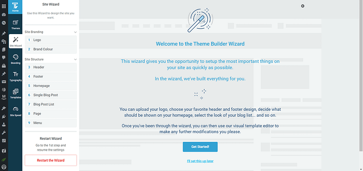
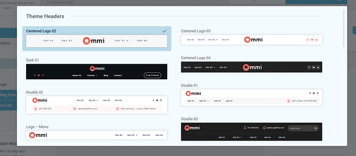
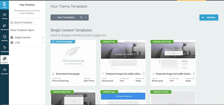
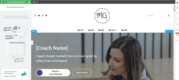
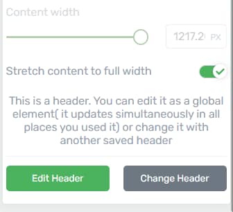
Update for March, 2020: With the release of Thrive Theme Builder, you now have the ability to easily create and set custom headers for your entire site, or for specific pages and posts.

Your website's header is one of the few things that may show up on every single page on your website. Add to that its prominent position on the page and it becomes clear: the header is a critical element.

But what does a good header - one for a conversion focused website - actually look like? What should you add in your header? What are the dos and don'ts?

In this post, you'll discover the answer to all of these questions.​

More...

Like It's 1999...

We've gotten many questions about headers since we started Thrive Themes and all our themes come with extensive options you can use to customize this part of the site.​

Many of the questions have been about header images and banner-style headers. This kind of thing (please excuse the cheeky example):

While it is possible to create a header like this using a Thrive Theme, we don't have a banner-style header as a default in any of our themes. And there are good reasons for that.

This banner type header was quite popular years ago and the idea it's based on is not too bad: at the top of every page, you'd have a large, attention grabbing advertisement of your site or brand. Makes sense, right?

There are two reason this header type has gone completely out of fashion: banner blindness and mobile devices.

Banner Blindness

If something looks like a banner ad it will be ignored by a large percentage of visitors. This effect is called banner blindness and it looks like this:

Eye-tracking showing visitors ignoring the banner.

Source

Quite simply, if your header follows the design language and dimensions that are typical for a banner ad, it will likely be ignored by the majority of your visitors.

Mobile Devices

At the time of this writing, the lines between mobile devices and desktop devices is already blurred beyond recognition. Visitors are accessing websites from everywhere and at every screen size imaginable. And a banner style header simply does not scale well:

The alternative to the above example is to create a responsive banner type header and try to display all its elements at full scale, even on a mobile device. In this case, it would take up the majority of the screen.

Header Examples

Now that we've got the retro-headers out of the way, the question is: what does a good header look like? Let's first have a look at some examples, taken from different types of sites.

SaaS Websites

Stripe:


Zendesk:


Airbnb:


Square:


In these examples, we're seeing slim headers and relatively few elements in the header. If there are many links, they're in drop-downs.

Blogs

Quicksprout:


Location 180:


Chris Guillebau:


Again, we see slim headers for the most part (Location180 being the exception with a large logo). Like in the examples before, the menu items in the header are in line with a slim logo, in most cases.

Ecommerce Websites

Amazon:


MyProtein:


Walmart:


In the ecommerce examples, we see a prominent search feature as an important part of each site's header. There are many pages to navigate and search is the primary way visitors are encouraged to find their way around. Other links are usually sorted into drop-down menus.

Magazine/Media Websites​

Mashable:


MindBodyGreen:


Engadget:


In these examples we're seeing extremely economical headers, leaving as much space as possible for the content of the sites.

What can we learn from these examples and other successful and thoroughly tested sites?​

Here are the top 5 factors that make a great website header:

1) Keep it Slim

The header is on every page of your site, but it's never the most important thing on the page. It's there for convenience and branding, but it's not as important as your main headline, featured image, page copy, video, etc.

Keep the header slim, so that no matter what screen size your site is viewed at, it doesn't take too much space away from the site's content.​

2) Don't Sweat the Logo​

A lot of fuss is made about logos as a branding element, but if we look at some of the most successful websites on the net, we see that logos are usually small and simple.

Your logo has to be little more than your brand name written in a simple font. And more importantly, no matter how fancy (or expensive) your logo is, don't try to show it off and make it too big. See point number one: the space on your site is too valuable and the logo is never the most important thing on it.​

3) Keep Your Navigation Tidy

When it comes to the main navigation links you add to the header, "less is more" sometimes applies - and sometimes it doesn't.

If you can't keep the number of navigation links at a minimum, the best alternative is to keep everything tidy and nicely grouped together. Instead of hitting visitors over the head with too many links, present them neatly grouped into drop-downs.

​4) If Search Is Important, Add it to the Header

A search function isn't equally important on all websites. If your website has a lot of content and visitors typically look for something very specific or browse through different categories, search is important. And in this case, it's a good idea to have a search bar in the header, where it's accessible from any page.​

5) Test it On Small Screens​

Take a close look at what your site looks like on a tablet and a mobile phone. Is the header taking up too much vertical space? Are links too close together? Are elements too small to see?

It's very important that your site looks good and functions correctly on more than one screen size.​

Over to You

In our themes, we've made sure that headers follow the best practices above. Our goal is that you can easily create a header that's highly effective, while keeping it slim and simple.

Do you have examples of excellent website headers to share? Thoughts or questions about this post? Let us know by leaving a comment below!​

Shane

by Shane Melaugh  January 28, 2015

63

Enjoyed this article ?

You might also like:

Leave a Comment

  • In the example provided, there is a spelling error. You can remove this comment once it is corrected. Ecxellent vs Excellent

    • Thank you for pointing this out! This is why Shane shouldn’t be allowed Photoshop after midnight. 😀

  • We recently switched to a responsive theme and after reading your tips here, I have some things to improve. I changed the width of my browser to be fairly narrow just to get a sense of how our logo and navigation appear. It seems we’re too proud of our logo because it’s way too tall. We also have a tagline that wraps under our logo…which is creating too much space. Thanks for the great ideas. I have some things to change. 🙂

  • Hi Shane
    As ever great info that makes a lot of sense.
    Guessing that a thin type header maximises the space left for the real stuff.
    Perhaps there could be a case for a homepage header which is different to the rest of the site.

    Thanks
    Rich

    • That’s an interesting idea, Rich. I never thought of that before. It brings up the issue of consistency, though: if the header (and presumably navigation) are different on the homepage, that might cause some confusion.

  • Extremely good post…

    I’ve been dealing with this issue and this was right on time. I’ve noticed the change in headers as you’ve stated and really glad that Thrive Themes makes it easy for me to build my websites!

  • I’m definitely seeing the trend to smaller headers. It’s time for me to do the same. Thanks for the tips and samples.

  • I have a directory theme from AppThemes – http://www.aklrel.socdir.co – and have added two items that are not standard in the theme; a sticky header menu and a “scroll to top”. I think that for mobile access, these are important elements, as mobile often requires a lot of up and down scrolling. I am using a child theme that is “flat”, rather than the older 3D elements. I’d appreciate your take on the scrolling elements and the flat layout. And … do you have a directory theme in the pipeline?

    • We don’t have plans for a directory theme in the near future. Although I do like the idea of creating one, it’s just too far down our list of features and planned releases at the moment.

      We’ve got floating header options in our themes. A “back to top” element is easy enough to add, but I’ve yet to see one implemented well on mobile. It usually gets in the way of important content. So, I’m still looking for a better way to do that.

  • I would appreciate a discussion on best practice for the inclusion of “compliance” pages – disclaimers, policies, terms, cookies, copyright, security certificates, anti-spam, https address bars, warranties, safeguards for underage viewers etc. Are they just a necessary evil, or can we use them to actually create credibility and authority?

    • The way I see it, these are on the “necessary evil” side most of the time, which is why they’re usually placed as small links down in the footer of a site. Unless security or privacy are central to what you sell, they should be secondary on your website.

  • Hello Shane. Thank you for this great post and tips in headers. I am just using the thrive content builder and i am really thrilled with how good it works. I will also now use your tip and update my site.

  • The minimal menu is something that also help me focus on just one thing on my site. Email opt-ins. (I can sell stuff later)

    • Yes, good point. You can take this one step at a time and that’s often better than diluting your visitor’s focus too much.

  • Great reminder that less is more with the header. However, what are your thoughts for small business websites? I believe they could be an exception to the “thin” header rule since it could be beneficial for them to more prominently display the logo/contact information in the header. Particularly for doctors or other professions where the conversion goal is receiving a new client/patient.

    • Hello Jake,

      thanks for your comment! I agree that adding contact information such as a phone number to the header can be a good idea. I would still try to keep it relatively minimal, though. IMO, it should never be the header’s job to explain your company, explain the benefits and get the conversion. If you’re trying to do all that in a header, you almost inevitably end up with an oversized, banner-style header and we’re back in 1999 again. 🙂

      Instead, the individual pages on your site should have specific purposes. E.g. one to explain what the business is about and what the benefits are, one with detailed contact information, one with more information about specific services etc. On these pages, it might also make sense to prominently add contact links or contact information at some point. Just like on a sales page, you add your purchase button and call to action at some point. But should you have a purchase button in the header at all times, just because it’s important? Probably not a great idea.

      • Hi Shane,

        Thanks for your reply and further explanation! I will see what I can do about making a slimmer header for http://dolordeespaldasa.com to maybe just include the name and phone number since the rest of the information is already available on the contact page. Currently, it’s not quite “1999 style” but it could definitely be improved.

        I continue to be impressed by the customer support and interaction from you and the rest of the Thrive team. Oh, and the products are nothing short of stellar either 🙂

      • Hi Jake –

        Just took a look at your URL – In the Thrive Themes Short Codes you will find a “Click To Call – Phone numbers” code. You could use that to add to the bottom of your page to make it easy for your Prospect to call you.

        Also, if I might make a suggestion? I would have your Prospect give you a Code or Name of a person to speak to (make up the name), and if they do that, offer them a first free session if they sign up for one of your Programs ( ie say Six sessions)… So they pay for the first session if they don’t sign-up, but they get it free if the do…. or some such.

        Just a thought….. Michael

  • Hi Shane,
    First of all, let me say that I am a huge fan of Thrive Themes and of your work. I rave about your fabulous products at every opportunity.

    After much work, we finally rebuilt our (formerly non-WP) academy website of 70-some pages onto Thrive Themes using your content builder. It made a long, tedious process much faster and easier. Even a staff member who swore he would never understand WordPress, learned it in an hour and transferred most of the content.

    Even though we already launched it on January 10th, we are still tweaking to improve it.

    Your post about the appearance of headers could not have arrived at a better time. We have a round logo (http://pccca.org) so it has been a challenge to know what to do with it. The name of our academy is very long so I don’t know if using the name is a good idea or not. I welcome your suggestion or any from your readers.

    Warm Florida Regards,
    Leelo Bush

    • Thank you for your comment, Leelo!

      The name of your business is indeed very long. This is a problem I’ve seen on a few sites and there’s no easy fix for it. If you want to display the full name of your company and still have it at a readable size, it will inevitably take up a lot of space. Now, there’s a good reason why long business names are avoided in general: the longer the name, the harder it is to remember. I’ve noticed that even with short(ish) names such as “Thrive Themes” and “Hybrid Connect”, many people will not remember the name correctly and will not use the full name (e.g. “Hyper Connect” or “Thrive” instead of “Thrive Themes”).

      What I’m getting at is that I bet no one’s going around saying “Professional Christian Coaching & Counseling Academy” in casual conversation. What do the majority of your customers use to refer to your business? What do you use internally, with your team? There’s a good chance that your customers have already given you a different name, in which case the best thing to do is to change the official name to the one your customers already use anyway.

      • Shane, this is excellent advice. As an example, Leelo, you need look no further than FedEx, which rebranded because that’s what customers called it anyway, even when they were Federal Express. And the URL becomes more memorable, too!

  • One thing I was wondering about these thin headers including menus on the same “line”.
    Some use icons (walmart in top menu), some dont.
    My thoughts was “the lighter, the better”, but is it more user friendly to use icons in your opinion ?

    • That’s a good question. I think the use of icons can help and it shouldn’t have much of a performance impact. I’d like to add this as a feature to our themes, as well.

  • Nice post Shane. Whoa…The last time I saw that 1999 type of website header was, well…in 1999! That was when i had to take HTML lessons as part of a school elective. *cringe*

  • Hey there Shane, been following along with your fantastic posts, tutorials and the like. About a month ago I redid my site more along these lines using Ignition. Don’t know if I’m “there” yet and let me know if you have suggestions! As soon as I get my Agency membership I have two sites I want to transfer over to Thrive Themes. I’m already pulling my hair out figuring out what’s what on the existing sites. I’m NOT a developer and don’t want to be AND for heaven’s sake why can’t all the themes be like yours. Oh wait, no, that leaves more for you and your great team.

  • Hi Shane,
    I am very grateful for your suggestions about our header at pccca.org. We got creative and within a 24 hour period, had re-branded the site and love the results. Your suggestions were genius!
    Thanks again…
    Leelo

  • Just found out that Hybrid Connect is discontinued, with Thrive Leads as replacement. Do we get a coupon code or a replacement license if we have a HC license from before? 🙂

  • So I went and looked at my Home page on my iPad. The logo starts out larger and then shrinks and sticks as you move down the page. https://littleriverinnsc.com
    When I got to the bottom of the page and clicked the thrive light box optin button, the screen darkened as expected but the lightbox stayed mostly off screen.
    Thanks for helping me catch that!

  • Hi Shane,
    I can’t wait for my webmaster to get underway with this theme as he builds a new site for me….I ordered this and 2 other products from you via PayPal on 2/25 and I’m still waiting to receive the logins…Please advise ASAP! Thank you.

  • I’m trying to create a full header for my site, just like Genesis. I’m using the FocusBlog theme. Do you guys have any tutorial for that?

  • i have an issue Shane, when creating a landing page, i always get this small white section in the header, i want to put an image, but even taking out the margins in looks terrible, can you fiz this?

  • How do I convince my old school dad to let me update and change how old big header on his childrens sermon website?! I am going to show him this page and see if it helps.

  • Love the post, Shane, and it couldn’t come at a better time for me as I am building my first site with your Squared theme. My question is, given the trend toward slimmer headers, why is “Header Height” only an option in the Customize menu if the “Background Image” option is selected? In other words, why can’t I adjust the header height if I am using the “Custom Color” option?

  • Shane – what happens when your header is NOT scaling to mobile – I have thrive themes but the header does not scale and i’m not sure why. any thoughts or help on the matter?

  • Hello Shane and Thrive Gang !

    *I have a question for you* :

    In some header bars… i see special objects (such as: buttons and icons)
    These often appear alongside the standard text inclusions (such as : blog, start here, send-me-all-your-money etc)

    Example: on this very page the header / navigation bar features a neat little green grid and also a small bell.. these make interesting stuff happen when i click them..

    I am currently building my little empire using Thrive Squared Theme – can I have special things in my nav bar too ?

    Best Regards
    Asha Eidolon

  • Hey Shane,

    Is this good practice to write more words or sentence on header? If we use only our core keyword on header, that represent our site content. Isn’t it?

    Thanks

    • I don’t recommend adding copy to your header. Copy is what goes on your page, as part of your content. Your header should be mostly about usability.

  • it would be useful if you included the steps to creating the header within one of the thrive themes. The vid tutorials are not quite up to date regarding this. Thanks!

    • Hello Daniel,

      We’ll revisit this topic soon, when we have the new header features in Thrive Architect and the new theme.

  • {"email":"Email address invalid","url":"Website address invalid","required":"Required field missing"}
    >