Quick Answers: What Every Smart Business Owner Wants to Know
Before we dive into frameworks and tactics, here are the high-stakes questions this post is here to solve:
- What’s the difference between a sales page and a landing page?
A landing page collects leads. A sales page closes the deal. Understanding the goal of each changes how you write, design, and measure success. - What does a high-converting sales page actually include?
Think beyond flashy design. You need a persuasive headline, a clear offer, social proof, objections handled, and a CTA that works. - Should I go long-form, short-form, or use video?
It depends on your offer. We’ll show you how to pick the right format based on buyer awareness, trust level, and offer complexity. - How do I know if my sales page is working or not?
You’ll get a simple process to measure, test, and improve conversions. No more guessing what’s broken (or what’s working behind the scenes).
Sales pages get sidelined all the time. Treated like a checkbox. Designed like a pretty flyer. Then left to carry the weight of an entire funnel.
But this page does is not meant to be a hub of information. This is your page for landing the sale.
To be clear:
- A homepage sets the vibe.
- A landing page collects interest.
- A product page lists features.
Only a sales page is built to take someone from “maybe” to “I’m in.”
And yet… most of them underperform. From my research, the average funnel converts at just 2.35%, while top performers triple that. That difference rarely comes down to price or design — it’s almost always about structure and clarity.
In my 7 years of marketing, I’ve seen great offers buried under cluttered layouts, or persuasive copy weakened by poor sequencing. One misplaced section — one muddy headline — and the whole thing loses steam. Not because the product isn’t good, but because the reader never gets the right message at the right time.
A strong sales page builds belief step by step. It anticipates questions, earns trust, and creates momentum from top to bottom.
This isn’t just a guide. It’s a playbook — built to help you craft a page that does the real work of converting interest into action.
This is where everything comes together. So let’s build it like it matters.
Why Most Sales Pages Fail (And Why It’s Not Your Fault)
Now, the truth is: most sales pages don’t fail because of laziness, bad design, or lack of effort. They fail because no one ever taught you how to structure a persuasive argument — not just write copy, but guide belief.
Instead, people copy what they’ve seen.
And the result is a page that inspires little to no action.
Because without structure, strategy, and story — even the best offer gets lost in the scroll.
Here’s what I’ve seen across dozens of struggling funnels:
- Pages that lead with features, not belief.
- CTAs dropped in too early — or buried too late.
- No narrative thread. No reason to keep reading.
Think of it as building a stage, then forgetting to write the script.
Or worse — sending a great email campaign… only to land someone on a page that doesn’t deliver what the email promised.
You need to go beyond “designing well” and learn how to be persuasive.
A sales page is like a closing argument in court — but too many are showing up without evidence, without structure, and without a story that makes the verdict clear.
You don’t need more copy. You need a case.
And that’s what we’re about to build.
The Sales Page Strategy Framework
This is where everything starts to change.
You’ve seen what happens when sales pages are built on guesswork. Now we’re flipping the script.
This isn’t just about plugging in the “right” elements. It’s about learning to think like a strategist — mapping out your page with purpose, sequencing your message to build belief, and removing every ounce of friction between interest and action.
You don’t need to be a copywriter to do this well.
You just need a clear framework.
Let’s break it down step by step — so you can build a sales page that actually does its job.
Step 1 – Start With Audience Insight, Not Copy
Before you write a single word, map out what your reader already believes when they land on the page.
- What are they frustrated with?
- What have they tried that didn’t work?
- What do they think they need — and what might they be missing?
This isn’t just empathy. It’s strategic positioning.
Your sales page needs to join the conversation already happening in their head — not try to bulldoze it with features and benefits. The more accurately you can reflect their current reality, the easier it is to guide them toward a new one.
Start here:
- What fears, doubts, or objections are they quietly carrying?
- What goals are they chasing — and why hasn’t anything worked yet?
- What alternatives are they comparing you to (whether direct or not)?
If you skip this step, your copy will sound generic — no matter how polished it is.
Strong sales pages don’t start with the offer. They start with understanding.
🟢 Want more on mapping customer journeys? Check out our guide to sales funnels.
Step 2 – Build the Sales Argument, Not Just the Layout
Most sales pages are designed for aesthetics. But if you want a high-converting sales page, looks aren’t enough — it needs to persuade.
The best pages follow a clear structure rooted in persuasive copywriting techniques. Every objection your reader has? That’s a section. Every moment of hesitation? That’s a message waiting to be written.
Instead of asking “What goes here?”, ask:
“What does my audience need to believe next?”
That’s how you move from a static sales page to actual strategy.
A well-structured long-form sales page maps the buyer’s journey:
Doubt → Curiosity → Trust → Relief → Action
And this isn’t about stuffing in extra content — it’s about removing friction. Every scroll should lower resistance and build momentum.
This shift — from filling space to guiding belief — is the difference between a dead page and one that performs.
It’s how you turn sales page design best practices into real conversion rate improvement.
Step 3 – Choose the Right Format: Long, Short, or Hybrid
Before you write anything, choose the right container for your message. Format isn’t just about length — it’s about what the reader needs to feel ready.
Here’s how to think about it:
- Long-form works when you’re building trust from scratch.
Perfect for complex offers, high-ticket products, or audiences that need to be educated before they commit. - Short-form works when trust and clarity already exist.
Great for warm traffic, repeat customers, or simple, low-friction offers. - Hybrid gives you the best of both.
A high-impact CTA above the fold for fast decision-makers — with deeper content below for those who need more context.
This choice should be led by buyer psychology, not personal preference.
When the page format matches the reader’s readiness, conversion gets easier — and cheaper.
🟢 Not sure whether your offer needs a short, punchy page or a deep, persuasive scroll?
Read our guide: Long vs Short Sales Pages
You’ll learn when to go all-in with storytelling and objection handling — and when a focused, minimalist approach drives better results.We break down real examples, key decision factors, and how to align your page length with audience awareness and offer type.
Before you build, get clear on what converts.
Step 4 – Stack Proof in the Right Places
Anyone can claim their offer is amazing. But your reader’s job is to not believe you — until you give them a reason to.
That’s where proof comes in. But not just anywhere. And not just anything.
Strategic proof placement is what separates basic pages from high-converting ones.
Here’s how to think about it:
- Drop testimonials right after key claims — especially the bold ones
- Use visual proof (before/after, screenshots, results) to make impact feel real
- Quantify outcomes where possible: “Increased conversions by 43%” lands harder than “worked great”
And skip the brag bars. No one trusts a row of logos anymore unless they’re tied to specific results.
Instead, focus on moments of hesitation. Ask:
Where might my reader be silently thinking, “Sure… but will it work for me?”
That’s where proof belongs.
When used with purpose, trust-building elements become the quiet force that moves someone from doubt to belief.
🟢 Want help turning testimonials into conversion assets?
- Read our full guide: Testimonial Marketing: How to Use Customer Proof to Convert
- Then see how to implement it: How to Collect and Display Testimonials in WordPress
Or use Thrive Ovation to automate the collection and display — and never chase down testimonials again.
Step 5 – Guide, Don’t Push: CTA Strategy That Works
A call to action should feel like a natural next step — not a hard sell. When someone is ready to move forward, the path should already be clear.
That starts with visibility. Your first CTA belongs above the fold, where motivated visitors can act without hunting for the button. From there, space additional CTAs throughout the page — after key sections like benefits, objections, or testimonials — when belief is high and hesitation is low.
Effective CTAs don’t just look good. They use outcome-driven language that reinforces value:
✅ “Start My Free Trial”
✅ “Unlock the Full Course”
✅ “Get Instant Access”
If you’re using urgency, make it meaningful. Scarcity only builds trust when it’s genuine — like a limited bonus, time-sensitive offer, or restricted enrollment window. Tools like Thrive Ultimatum can help you build these in, honestly and effectively.
Also, think about friction. A great CTA is easy to see, easy to click, and easy to follow through on — especially on mobile. Each layer of effort you remove builds momentum toward the sale.
Want to sharpen your CTA strategy even further?
Whether you’re just getting started or fine-tuning your funnel, these resources will help you turn passive buttons into active conversion points:
🎯 How to Create the Right Type of CTA in WordPress
Learn how to create intentional CTAs that grab attention at the right time and drive the click.
🚀 CTA Hacks to Boost Clicks and Conversions
Explore subtle design, copy, and placement tweaks that increase engagement without overwhelming your visitor. Great for A/B testing and continuous improvement.
🧩 Thrive Ultimatum
If your offer is time-sensitive or bonus-driven, this tool helps you implement authentic urgency — from fixed countdowns to evergreen scarcity — without sacrificing trust.
Because a CTA isn’t just a button. It’s the moment your message turns into action. Make sure it’s doing the job it was meant to do.
What is the Structure of a High-Converting Sales Page?
Now that you’ve got the strategy — let’s zoom in and build it piece by piece.
A well-built sales page isn’t just persuasive. It’s predictable.
It walks the reader through a sequence of trust, clarity, and action — with each section doing a specific job.
Here’s the anatomy of what works:
Headline + Subhead
Lead with clarity, not cleverness.
If your reader doesn’t understand what you’re offering within 3 seconds, you’ve lost them.
Use your hero section to communicate the transformation — not just the topic.
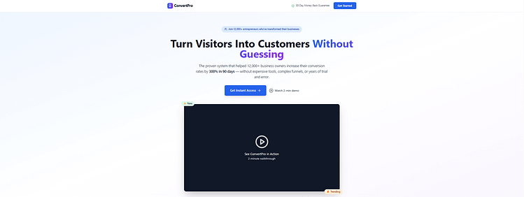
Example: “Grow Your Email List Faster — Without Paid Ads or Funnels”
🟢 If your headlines aren’t earning the scroll, they’re losing the sale. Here’s how to make your sales page headlines stand out.
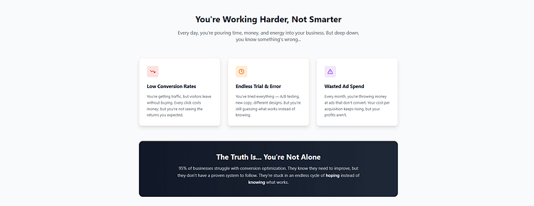
The Hook / Problem
Make them feel seen.
Your opening paragraph or section should reflect the exact challenge they’re facing. Use emotional language, real-world language, and the stakes.
Don’t just describe the problem — mirror their lived experience.
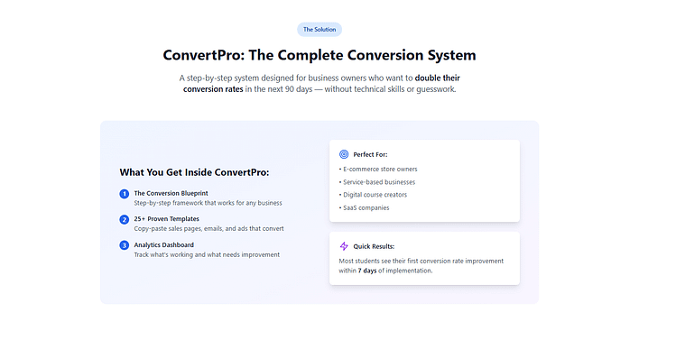
The Offer Snapshot
Say what it is + who it’s for.
What’s the product or service? Who’s it designed to help? Why now?
Keep this crisp — one or two sentences max.
Bonus: Include a quick visual or bulleted summary to anchor the offer early.
🟢 A clear, benefit-driven pricing table can do more than display your offer — it can tip the decision. See learn how to create conversion-focused pricing tables.
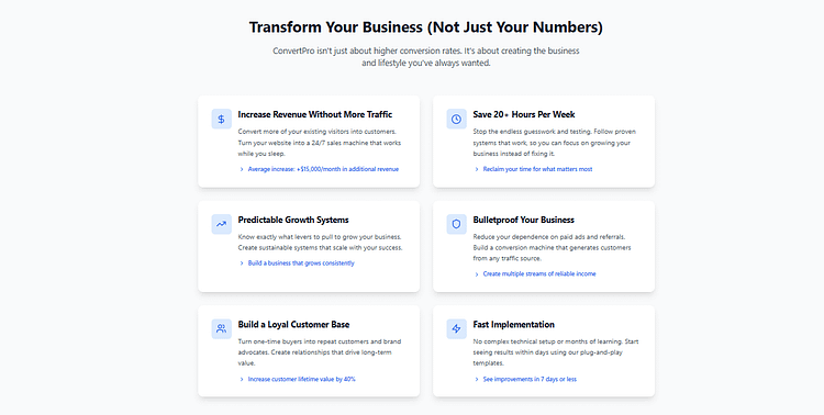
Benefits Over Features
Translate tech into transformation.
Features tell. Benefits sell.
Don’t just list what’s included — connect each element to how it makes their life better, faster, easier, or more enjoyable.
If it’s a tool, what pain does it remove?
If it’s a program, what’s life like after it?
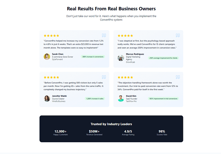
Testimonials & Trust Signals
Overcome doubt mid-scroll.
Place proof where people pause — not just at the bottom.
Use real language, quantified results, before/after scenarios, and identity-based trust (e.g., “This worked for someone like me.”)
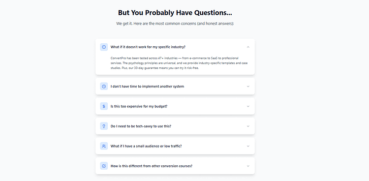
Objection Handling
Answer what they’re scared to ask.
“What if it doesn’t work for me?”
“Do I need to be tech-savvy?”
“Is this too expensive?”
Treat objections like FAQs — and answer them before they derail the sale.
Guarantees + Risk Reversal
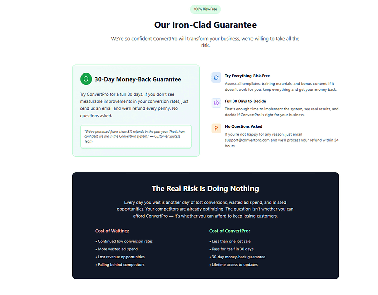
Let them say yes safely.
If the offer is solid, don’t be afraid to stand behind it.
Use money-back guarantees, flexible trial periods, or satisfaction commitments to reduce fear.
Make the risk feel lower than doing nothing.
🟢 Pricing isn’t just a number — it’s part of your persuasion strategy. Learn how to build the perfect pricing page here.
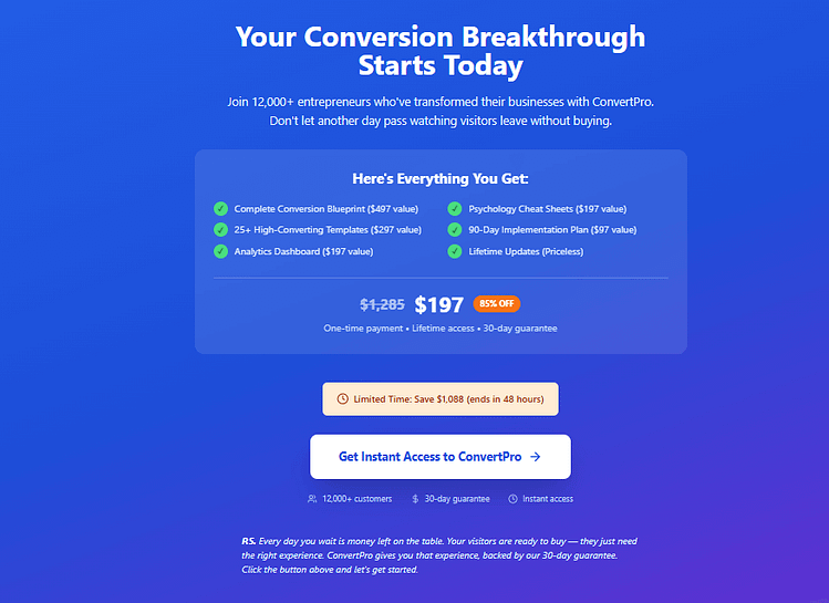
CTA (x3)
Guide the action with intention.
Should You Use Video? What to Know About VSLs
Now that your layout’s taking shape, let’s talk media. Because sometimes, what seals the deal isn’t your copy — it’s your presence.
Video Sales Letters (VSLs) can boost conversions dramatically — but only when they serve a strategic purpose. The question isn’t “Should I add video?” It’s “Would a video make this easier to believe, understand, or feel?”
Here’s when a VSL can be a game-changer:
And the data backs it up:
- Sales pages with embedded video convert up to 86% better than text-only pages
- 89% of consumers say watching a video convinced them to make a purchase
- Over 90% of marketers use video to improve traffic and brand visibility
But video only works when it’s used with intention.
Here’s how to do it right:
And here’s the part most people overthink:
You don’t need perfect lighting. You need presence.
I’ve seen shaky phone videos convert better than polished studio shoots — because what matters is whether your audience feels you’re being real. That connection is what earns the click.
Conversion Psychology — What Makes People Click “Buy”
Once the page is structured, persuasive, and clear… what actually gets someone to commit?
This is where strategy meets psychology — because conversions don’t happen in a vacuum. They happen when your page aligns with how people actually make decisions.
Here are the four psychological levers that drive action:
Trust
People don’t buy if they don’t believe.
Stack credible signals like:
- Social proof: Testimonials, reviews, case studies
- Endorsements: Influencers, industry experts
- Media logos: “As seen in…” badges that signal legitimacy
Trust doesn’t just reduce fear — it gives them permission to believe your offer is real.
Belonging
Your reader needs to feel like this was made for them.
Speak their language. Use phrases they’d use. Reference real frustrations and desired outcomes.
This isn’t about mirroring demographics. It’s about mirroring *identity*.
“People like me buy things like this.”
Urgency
No pressure, no action. But it has to be real.
You can create urgency through:
- Scarcity: Limited spots, enrollment caps
- Time: Deadlines, early-bird windows
- Exclusivity or Bonuses: Limited-time extras, fast-action rewards
The goal isn’t to rush them. It’s to help them make a decision now instead of “someday.”
Safety
Even when they love the offer, people need a safety net.
That’s why clear refund policies, free trials, or no-risk guarantees matter.
Spell it out. Make it feel easy to say yes — and safe to walk away if needed.
You don’t need to manipulate anyone.
You just need to understand what makes people hesitate — and remove that friction with strategy, clarity, and respect.
The Thrive Sales Page Toolkit (How to Build What You Just Planned)
You’ve mapped out the strategy. Now it’s time to make it real — without wrestling code or waiting on developers.
Here’s how to bring your sales page to life using tools built for conversion:
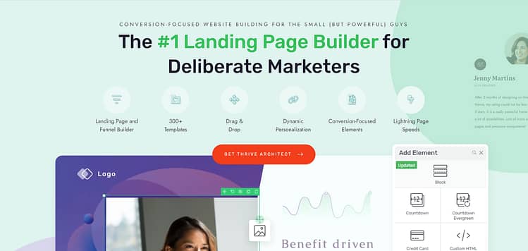
Build your page with drag-and-drop layouts designed for persuasion — not just design.
Use proven templates built around real sales psychology, then customize every section to match your message.
Whether you need a long-form VSL page or a minimalist short-form offer, you’re covered.
Turn testimonials into strategic proof — not scattered quotes.
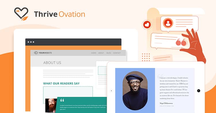
With Thrive Ovation, you can collect, manage, and showcase social proof in just a few clicks.
Tag testimonials by offer, audience type, or format so the right story appears exactly when and where you need it.
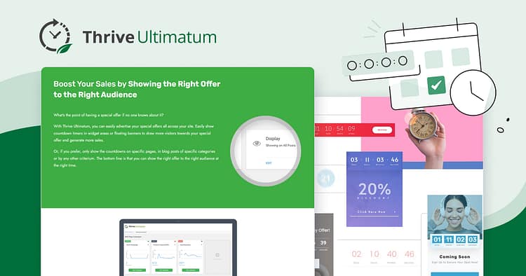
Create real urgency with countdown timers, limited-time offers, and evergreen scarcity campaigns.
This tool helps you encourage fast action — without fake deadlines or pushy gimmicks.
You’ve seen what works. These tools make it buildable.
💡 Ready to bring all the pieces together?
I recommend Thrive Suite because it gives you everything you need to design, optimize, and test your sales funnel — in one connected toolkit. No switching tabs, no plugin patchwork.
You’ll move faster, convert better, and build a system that actually grows with your business.
👉 Explore Thrive Suite — and start building your best sales page yet.
Optimization: What to Track, Test, and Improve
A high-converting sales page isn’t a one-and-done project — it’s a living asset.
The smartest marketers don’t just launch. They listen, learn, and adjust.
Here’s what that looks like in practice:
Track What Matters
Don’t drown in data. Focus on behavior that signals intent and friction.
These give you clear signals about what’s working, what’s missing, and what’s just in the way.
Test What Moves the Needle
Start small, stay focused. Great tests isolate just one variable at a time.
You don’t need to test everything — just the things that change minds.
Upgrade Based on Real Behavior
Use tools like heatmaps, session replays, or user feedback to catch what you’d miss by guessing.
Update layouts to reflect how people actually move through your page — not how you hoped they would.
Good sales pages are persuasive.
Great ones are iterative.
🟢 Deepen your strategy: See how this fits into your sales funnel →
👀 Want an easier way to track the right metrics?
If you want to see what’s happening on your page without becoming a data analyst, I highly recommend MonsterInsights.
It gives you real, human-friendly insights — not just charts.
You can track scroll depth, form conversions, link clicks, and even eCommerce behavior directly inside your WordPress dashboard.
I’ve seen too many people rely on guesswork when what they really needed was visibility.
With MonsterInsights, you get the clarity to stop guessing and start improving.
👉 Try MonsterInsights — it’s the difference between hoping your sales page works… and knowing it does.
How to Use AI to Support Your Sales Page Strategy
AI won’t write your sales page for you — but when used right, it can make the process faster, smarter, and a whole lot less overwhelming.
Think of it as a creative partner that helps you get unstuck, spot blind spots, and move from strategy to structure when your brain’s running on fumes.
Here’s how to use AI intentionally:
1. Break the Blank Page
Prompt:
“Write a benefit-driven opening section for [product] using the AIDA framework.”
Use it to spark momentum — then rewrite with your voice and audience in mind.
2. Spot Real Objections
Drop reviews, support chats, or surveys into ChatGPT and ask:
“Summarize the top buying hesitations in these comments.”
This gives you instant insight for FAQs, trust-building sections, and CTA timing.
3. Test Headlines Faster
Use AI to generate 5–10 variations for a core benefit.
Pick your top two and run an A/B test. Let performance guide your next move.
When used with intention, AI supports your persuasive copywriting process — helping you brainstorm, refine, and adapt without burning out.
Use it to speed up the thinking, not replace the strategy.
🧠 Want to go deeper?
Check out our guide on how to use AI as your creative partner. You’ll learn how to integrate AI into your workflow without losing your voice — from brainstorming benefit-driven hooks to refining sections that just won’t land. It’s not about shortcuts. It’s about support.
FAQ: Sales Page Strategy
A sales page is designed to drive conversions — it walks a visitor through a persuasive journey that leads to a purchase. It typically uses storytelling, trust signals, and structured copy to remove buying friction.
A landing page, by contrast, is usually part of a lead generation funnel (think opt-in forms or webinar signups). Both serve a purpose in your marketing funnel, but only the sales page is built to close the deal.
It depends on your offer, traffic source, and buyer awareness. For cold audiences or complex, high-ticket products, long-form sales pages often convert better because they build trust, handle objections, and communicate value in-depth.
If you're targeting warm leads with a clear offer, a short-form page might outperform. The goal is conversion rate optimization — not word count.
Yes — especially if your product requires emotional connection, nuanced explanation, or you're a personal brand. A compelling video sales letter (VSL) can boost engagement and drive conversions.
Just follow best practices:
- Keep the CTA button visible during playback
- Use a proven framework like AIDA or Problem–Agitate–Solution
- Include a transcript for accessibility and skimmers
Strategically place 3–4 CTAs at moments of highest buying intent:
- Above the fold (for fast-action buyers)
- After benefits and social proof
- After handling objections
- At the very end of the page
Each CTA should align with your core offer and reduce decision friction.
They’re designed like digital brochures — pretty, but passive. Instead of following a persuasive sales funnel structure, they rely on information overload.
A high-converting sales page creates belief — not just awareness. It anticipates objections, builds momentum, and guides the reader toward action.
- Thrive Architect: Drag-and-drop editor with conversion-focused templates
- Thrive Ovation: Testimonial collection and display tool for social proof
- Thrive Ultimatum: Smart scarcity and urgency timers for time-sensitive offers
These tools integrate seamlessly into your conversion funnel to drive results.
Track key metrics using tools like Google Analytics, Thrive Suite, or Hotjar:
- Sales page conversion rate (visits vs. purchases)
- Scroll depth and time on page
- CTA click-through rate
Then use A/B testing to refine your headlines, layouts, and CTAs. Your sales page isn’t a one-and-done — it’s a living asset that gets stronger with every iteration.
Wrap-Up: Build a Sales Page That Deserves Your Offer
Think of your sales page as the final conversation before someone says yes.
It carries all the weight of your effort — the trust you’ve built, the problem you’re solving, the promise you’re making.
What works isn’t a mystery. Strategy gives you the roadmap.
The right tools help you bring it to life without the usual roadblocks.
You’ve already done the hard part: figuring out what you want to say.
Now it’s about building a page that delivers that message with clarity and confidence.
🟢 If you want a toolkit that’s made for this kind of work, I always recommend Thrive Suite:
- Use Thrive Architect for layouts built around persuasion, not guesswork
- Add Thrive Ovation to organize and display your strongest testimonials
- Set up real urgency with Thrive Ultimatum, no gimmicks needed
You’ve got the vision. Thrive gives you the tools to match it.


