Today we’re sharing our best tips and tricks to be more productive when building your designs in the Thrive Visual Editor.
If you’re a new Thrive Suite user, these tips will help you become a faster, more confident web designer with our software.
If you’re a veteran Thrive customer or power user, I’m sure you’ll discover a new trick or two to add to your workflow.
You’ll find the intuitive drag-and-drop Visual Editor in the following tools:
- Thrive Architect
- Thrive Theme Builder
- Thrive Leads
- Thrive Ovation
- Thrive Quiz Builder
It’s time to up your Thrive design game...
More...
Hidden Keyboard Shortcuts
Here’s a few helpful keyboard shortcuts to speed up repetitive tasks when designing in the Thrive Visual Editor.
If you’re using a Mac instead of the obviously superior PC, you’ll find some of the hotkeys will be a little different.
For the most part, you can just swap out the Ctrl key for ⌘ in these shortcuts, but we’ll mention when it’s different, but there are a few differences.
Mac or PC? Let me know in the comments below!

Quick save
PC: Ctrl + S
Mac: ⌘ + S
The Thrive Visual Editor will helpfully remind you to save your unsaved work after 10 minutes.
You can save your work either by clicking the green save button, or by embracing your inner keyboard warrior and pressing Ctrl + S.
Hit Ctrl + S after every major change and you’ll never lose your work again.

Split the text element into two
PC: Ctrl + Enter
Mac: ⌘ + Enter
Place your cursor at the exact point you want to split your text element, hit Ctrl + Enter, and boom – you’ll split it into two separate text elements.
But ask yourself: should anyone truly have this kind of power?

Add a link
PC: Ctrl + K
Mac: ⌘ + K
Tired of highlighting words and finding the link button on the inline formatting bar?
Then this shortcut is for you!
Click at the start or end of the word, hit Ctrl + Shift + left (or right) to highlight it, and then Ctrl + K to open the link dialog.

Customize Your Canvas
The Thrive Visual Editor can be modified to match your approach to design. Most of these customizations will remember your choices whenever you start a new landing page or other project, so it’s worth experimenting to find the best settings for you.
Here’s how you can customize the Thrive Visual Editor experience to be more productive...
Move the inline formatting bar
The inline formatting bar appears whenever you select text, allowing you to set formatting, alignment, headings, links, and dynamic text sources.
But sometimes it gets in the way of what you’re editing.
Simply use the ‘handle’ on the left to drag the inline formatting bar anywhere on the canvas.

Search for elements
The Thrive Visual Editor is full of great elements to use on your page, and we’re adding more all the time. However, the more we add, the more you have to scroll to find the one you need.
What if I told you that you don’t need to scroll?
Simply use the search box to filter the elements in real-time as you type.
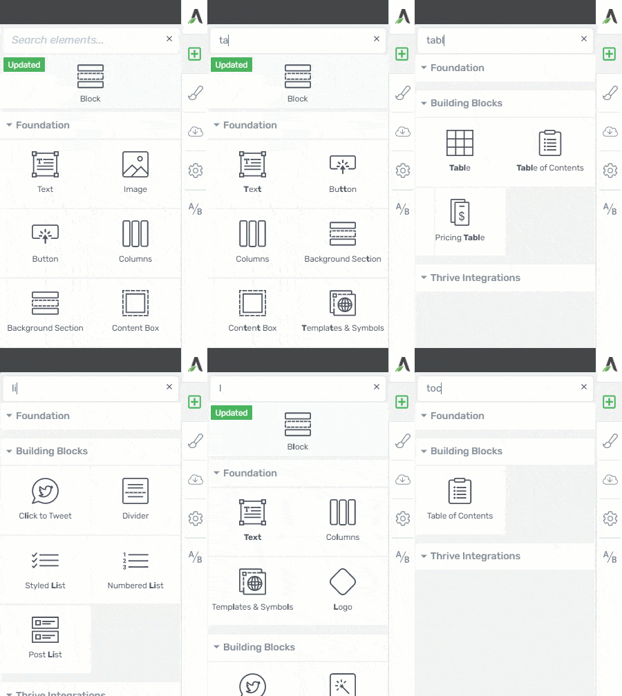
Not sure what an element is called?
You can find many of the elements using alternative names, such as “line” instead of “divider”, or “toc” for “table of contents”.
In fact, if you have a suggestion for an alternative element name we can add to the search feature, let us know in the comments below!
Pin your favorite elements
Do you use a few elements time and time again?
Tired of scrolling or searching for them each time?
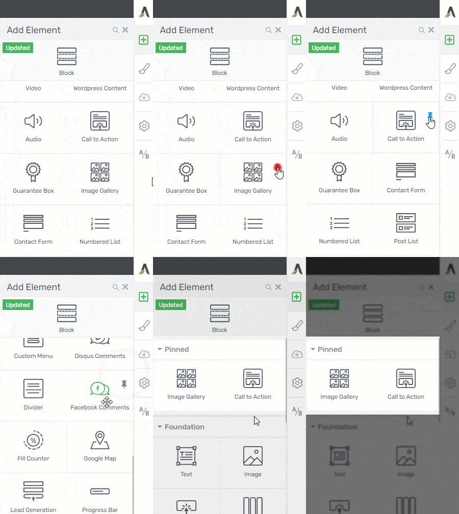
Hover your mouse over the element tile and you’ll see a little pin icon appear. Clicking this will pin the element to the top of your elements picker, so it will always be ready to use in your page designs.
Distraction free mode
For some people, a productive environment is a clean environment.
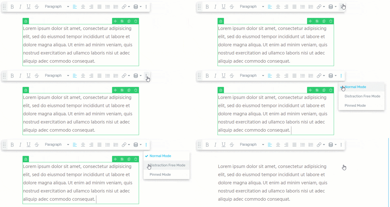
The Distraction Free Mode hides the borders while you’re editing, making it feel like you’re writing directly onto your landing page. It’s a more familiar writing experience for those used to a traditional word processor.
You’ll find the Distraction Free Mode hidden in a secret drop-down menu at the end of the inline formatting bar.
Watch the animation below... both modes allow editing, but the Distraction Free Mode hides the element borders for a more natural feel.
Hide the sidebar
The Thrive Visual Editor aims to provide an editing experience that is as close as possible to the final, published version.
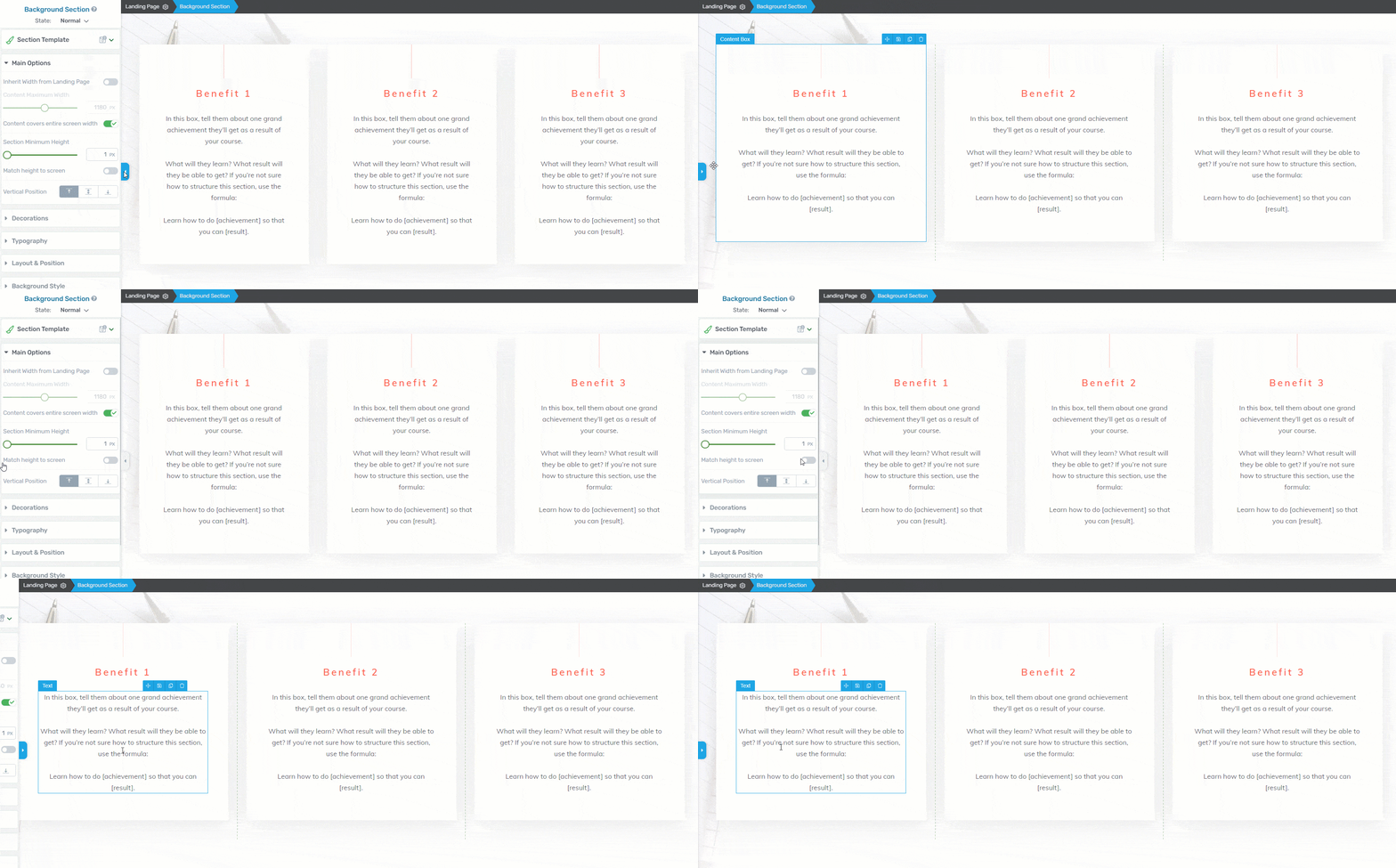
However, for very wide pages and elements, the options sidebar can sometimes force a responsive change in the browser.
Sure, you can preview the final page in a new tab to see your design without the Thrive Visual Editor UI, but another option is to quickly hide the options sidebar using the toggle button.
You won’t need this very often, but it can help you to visualize your final design for very wide pages.
Work Smarter in the Thrive Visual Editor
These are the real productivity hacks!
With the right knowledge, you can replace those repetitive mouse clicks with a flick of the wrist.
After learning these tricks, you’ll find designing your projects to be faster, more intuitive, and even fun.
Move multiple elements
The Multiple Selection Mode allows you to move multiple elements together as a group. It’s a very useful time saver when rearranging elements on the canvas.
Simply select multiple elements while holding Ctrl (⌘ on Mac), and drag one to the desired location.

If you select non-neighboring elements, they’ll appear next to each other after moving them.

Resize columns in 5% increments
Trying to drag a column to exactly 30% width?
31%... 29%... 30.5%... arrgh!
Relax, breathe, and hold Ctrl (Control on Mac) while you resize the column. It will jump to 5% increments!

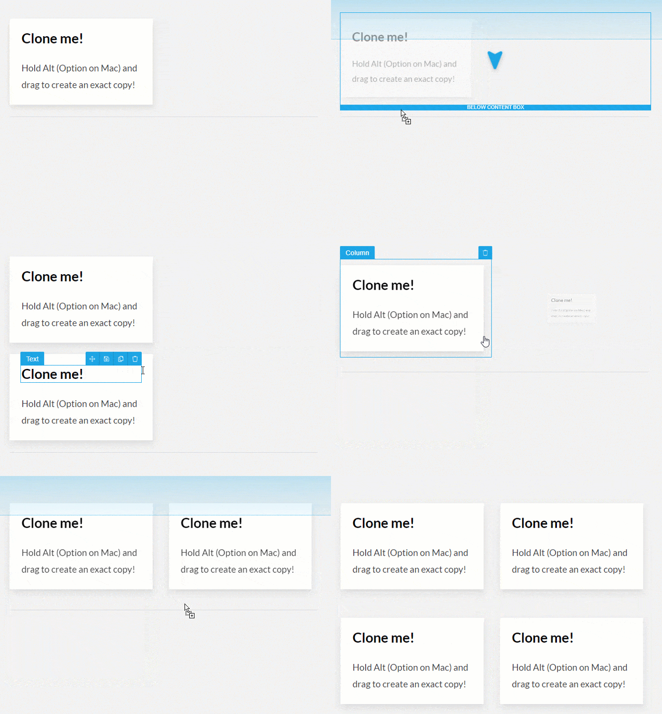
Duplicate the current element
This. Changes. Everything!
Most people already know that you can easily duplicate an element by clicking its clone icon.

But most people don’t know that you can just hold the Alt button (Option on Mac) to quickly drag a duplicate element to a new location.
Breadcrumbs
Do you find yourself searching for that single pixel that separates an element within another element?
Are you trying to find whether the padding is on the text element, the column, the columns, or the surrounding content box?
Do you like bread?
Then you need breadcrumbs.
If you want to select an elusive parent element, simply click on an inner element first and then use the breadcrumbs at the top of the editor window...
This way, it’s super easy to select the element you’re trying to edit.
Quickly create columns
Columns are a fundamental tool for making a landing page or lead generation element look professional. But how do you add them in the Thrive Visual Editor?
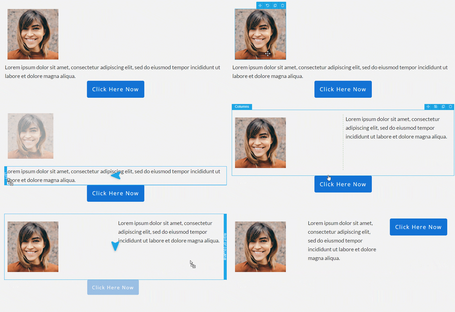
You could search for Columns in the element tray, drag it to your desired location, and choose a predefined layout.
Or you could impress anyone watching by dragging an element next to another, and instantly creating a new column!
This works with almost every element in the Thrive Visual Editor: images, buttons, content boxes, lead generation forms. It makes designing your page quick and fun.
Try this productivity shortcut and you’ll be building columns faster than the Ancient Greeks.
Share Your Own Productivity Tips
I hope this post helps you to feel more confident designing in the Thrive Visual Editor. I’m sure there’s one or two tips in this post you can add to your workflow to save time on those repetitive design tasks.
Do you know any other helpful tips and tricks when working with the Thrive Visual Editor?
Share them below for everyone to read!


Thrive is better than any competitor.
And so is Mac. 😉
+1 for Mac 🙂 Thanks, Stef.
double that!
*takes up some pitchforks*
—–E
*yells in windows*
There’s nothing wrong with a PC, it’s just the garbage OS they run. After 25+ years you’d think Microsoft could get it right. BTW, and me to the Mac column.
Haha, I’m starting to get outnumbered on my own post!
Thank you for the useful tips David!
PS: +1 for PC 🙂
Evening the balance, Demetris. Thank you 🙂
Merci pour ces généreuses astuces
De rien, Denis. I’m glad it was valuable.
Re mac vs PC, I use both and there is technically little difference but vast difference in price. But of course, it is cool to support mac even with no justification.
You’re right Edward, the tools don’t matter as much as people think.
Fabbydoo. I use a few of these already and that column sizing tip is now on my radar- thanks 🙂
I’m happy it added a new trick to your workflow, Brian.
Actually knew most of them already, although the ctrl-s is something I had not considered, thanks mentioning that!
I do wonder: would it be possible to implement some kind of auto save function? I’ve had times something went wrong and I had to start all over…
By the way: +1 for PC 😉
Autosave can be a double edged sword sometimes, but I’ll definitely pass your suggestion onto the team. Thanks Patrick!
I don’t need auto save. Sometimes, I have some design ideas I’d like to add to current Architect pages so I try creating the design but sometimes end up disliking it or can’t get it to my specifications (I’m not a Thrive Architect design pro yet) so I scrap the design. I do this simply by closing the Chrome tab. Autosave would make my workflow a pain in the butt.
I hear you, Caleb. I often refresh the page to scrap my latest experiements in the visual editor. Perhaps an optional autosave would be a good idea.
I vote for PC :-).
My suggestion is to make the undo function work smoothly. When I hit undo several times and redo again, I usually don’t end up where I started. For me, undo and redo is not predictable. So, I usually don’t use those.
That said, it’s the only thing that really annoys me. All the rest is super cool 🙂
Oh, I’m glad I’m not the only one with this problem! Yes, it would be great that the undo and redo buttons were a bit more predictable!
And definitively, +1 to optional autosaving, and +1 to PC lol
Mac always, forever and all the way!!! 😀
Thanks for the tipps! I did not know that you can move several elements at once. And the 5% column jumps are cool, too.
I’m starting to get outnumbered! Glad you learned some new tips, Anna.
All good, David… except your attempt (cough, cough) at suggesting that PCs are superior. But hey, have fun on that cloud, haha!
All in good fun, Matthew 🙂 I grew up with PCs, but I know many successful entrepreneurs who built their business and website on a Mac. Whatever works is good.
Wow. This article is very helpful.
I will start using those tips today.
Thank you very much.
That’s great to hear, Claudemir! Let us know how you get on.
Actually, It would be useful, if it were possible to merge several text blocks. I tend to split text boxes by dragging images and other elements in. But when I change the layout, I end up with choppy text boxes all over. It would be great if there were some easy way to reunite them rather than copy/paste.
Great suggestion. I’ll pass it along, Anna.
Oh yeah, I will +1 to that. Because when I write my blog posts I write them with Thrive Architect and I tend to add and remove various content boxes as I go.
In the end It can get messy because every text block has it’s own margin + inside text padding.
There could be also a simple css fix for whole thrive pack:
div.example + div.example { margin-bottom: 0; }
(if two of the same blocks follow one another one of the margin is just 0… It doesnt solve inner text padding, but, at least… :D)
Thank you. ????????
Ooooooh, I didn’t knew ctrl works when sizing collumns! Also I didn’t knew about alt duplication!
For some reason, for me, Thrive works better on Firefox than Chrome. I have no idea why, but it feels way more responsive on Firefox. Maybe it’s unintended and isn’t a real tip, but, eh, I have to mention it 😀
Thanks for the Firefox tip. I’ll definitely try that.
Mac all the way. And the “Move Multiple Elements” is a game changer.
I’m so glad to hear it, Melanie. I hope it speeds up your workflow with the Visual Editor.
I’m a CPA whose apps requires Windows. However, I’ve had it with Microsoft. Too many gotchas, far too much time to keep things running smoothly. Right now I have an unboxed iMac sitting in my living room. As soon as tax season is over, the iMac will be my go to machine. For apps that cannot run on IOS, there’s always Parallels.
I’ve tried to make the jump a few times, but I always seem to come back to Windows. I’m too scared of having to learn everything again 🙂
I think the two environments are become more similar as they mature. Aside from a few different keys on the keyboard, things work about the same. One thing I try to embrace when trying out a new app is understanding the mindset of the developer. If I can get inside their head to understand what they are trying to accomplish, much of the battle is done. In the last 24 months I finished my MSCIS – and I’m 72 ;-). New challenges keep the brain alive!
+1 for PC. 🙂 But as another person commented, for the most part, you can accomplish the same thing with either. I do see a touch screen as a non-negotiable, and for whatever reason, that’s still not an option on Macs.
You’re absolutely right, your choice of Mac vs. PC won’t be the deciding factor in moving your business forward.
Interesting you mention touch screens, I haven’t tried that yet on a full sized display. Is it a useful feature?
Okay productivity game changer request in
3…
2…
1…
Please integrate the “/“-command workflow that makes notion.so so extremely fast into Thrive Suite.
Now how fast could we build a landing page then?
PS: PC wins as a standalone, Mac as a whole ecosystem 😉
Oooh, I’m curious now Philip. Can you give us an example of how the “/” command would work?
If you type “/” in notion a dropdown-menu opens, where you can choose any available element.
Absolutely!
Here are some top of mind examples:
You type…
/b and it creates a new “block” element underneath the element you’re currently editing and opens the dialog to select a block
/t = text element and inside of that text element you can use /h1 to create an h1 etc.
/l = lead form element
/t = template & symbols
…you get the idea.
I would start with the most frequently used elements (maybe your data can show this) and then add new ones.
Another option to implement this would be to let the “/“ open a floating search bar instantaneously that the lets you enter the name of the element you’re looking for.
What do you think?
This sounds like real-time Markdown for web design! I love the idea of using “/” as a trigger to option a floating search bar, allowing you to type the element you want to insert.
This is such an innovative idea, Philip. Thank you for expanding on this, it’s really helpful.
Thanks! 🙂 feel free to add me to your list of people for customer interviews etc., I love to co-create the products I’m using!
I new most of them, but I didn’t know about the split text element which will be really helpful.
I prefer Mac.
I would suggest that you create a “copy the style” tool. I work a lot with colors and different text format, and I find it annoying to always go to the side bar to repeat all the formating of the following element I want to copy.
Thanks for this post !
Great suggestion, Annie. So like a way to copy and paste styling between elements – I think this would be very well received.
Hugely helpful, David. Thanks for the tips. I don’t spend enough time building websites to stay fluid, so resources like this save tons of time. I’d love to hear your thoughts on sustainable digital marketing… and yeah, Macs Rule!
Thanks Scott. +1 to Mac 🙂
The “sustainable marketing” in my author bio means I believe strongly in building a marketing strategy with a long-term view. That means find ways to interact with your customers regularly, without resorting to all that marketing hyperbole that might work once, but certainly won’t work a second time. I believe that sustainable marketing means continuing a genuine conversation with your audience by respecting their time and needs above your desire to make a quick sale.
David – I agree 100%. Relevant Engagement is the key to online marketing results. Fail to be relevant to your audience and they dismiss you. Fail to engage, and you’ve lost your purpose.
I’ve always noticed that the performance of the editor is bad on Mac OS regardless of which browser I use.
That’s a surprise, Ben. Drop us a new support ticket and we’ll look into it.
So as far as Thrive Theme is concerned, it doesn’t matter if it’s PC or Mac. At best, the choice of browsers is still important.
The Mac Finder is useless compared to Explorer. The PC is much faster and for much less money.
I went back to the PC after a year. I couldn’t stand the constant compromises anymore.
+1 für PC
Great point that your choice of browser can make a difference!
Pc, Pc, Pc!!!!!!!!!
😀
Didn’t know the Ctrl-Enter for splitting text or Ctrl-drag for column width. Very useful.
+1 for Mac.
Thanks Jason.
Wow, it’s a so useful article ! Thanks for sharing this, David !
Let me suggest one function which I really wanna use this on Thrive. It is Block Copy and Paste function, not just duplicate underneath the original one.
Sometimes, I want to move a block so far, like a top to bottom, then, I have to wait and keep drag them on the very long sales page. It’s just wasting time and boring…
I used to use the Elementor, currently not using, it has the function Block Copy and Paste, it’s really fast to reuse the element again. It also has ‘Paste Style’ menu, it was useful one too.
Hope these are implemented in Thrive near future…
BTW, I’m using Macs for 21yrs although I supported PCs in the office when I was an IT worker lol
Great suggestion, Moto. An element copy and paste would really help avoid duplicating and dragging on longer pages. Thank you.
+1 for this feature!
I use both but gotta vote for my Mac 🙂
Awesome post! Thank you! You just made one typo… surely you meant Mac is better than PC and not the other way around?
Ouch 🙂 Thanks Bec, I’m happy the post was helpful.
This is game-changing. I didn’t know so many of these, but am stoked to go try them out now!
Now just to get Advanced Custom Fields working on category/archive templates… 🙂
Hi Joshua. What are you hoping to achieve with ACF and archive templates?
Hey, support is looking into it and Hanne and I are back and fourth on Facebook.
ACF wasn’t working with category/archive templates. Now it magically is (well images still don’t work, but text custom fields do).
I’m convinced your dev team are ninjas, Hanne says otherwise. It’s been a hoot and a holler. ????
Yeah, our support team and devs are amazing 🙂 Thanks Joshua.
Do they still make PCs? M1 baby! Apple Silicon for the “W”
I love this! +1 to Macs
Mac is best. Yes, you pay more for a Mac than a PC. If by some chance you have a problem with Mac, the customer service is awesome. Yesterday I had a problem with a 10-year-old iPad and got help in two minutes, and it’s fixed now.
ich gebe meine stimme für den MAC, ich arbeite allerdings auf Grund der viele Applikationen die ich bediene mit beiden Systeme. Damit ich alles bedienen kann. 🙂
Excellent piece of work, and excellent animations.
+1 for the freedom of choice, but I am a Mac guy (since 1990)
Please note that a personal computer (and a mac) is a piece of hardware (like a car); they both need occational cleaning, adjustment and service to work smooth
My daughter is laughing at the geeking out I’m doing.
Turns out Ctrl is a superpower!
I knew all but one of these tips, and that was resizing columns in 5% incriments…game-changing for me! Oh and I’m a PC guy me, not one of the great easily lead Mac clan.
Also, I have a feature request for your comments section. Can you add a thumbs-down voting option so I can show my disapproval when someone votes for Mac. lol
PC but with linux. The right combination !
No windows update every 2 days and obscure proprietary mac.
Linux is free, optimized by thousands of people and crystal clear. You know what you install.
I like that. ????
Great to see some of these shortcuts, several are new to me.
I’m a Mac guy now but it’s really just personal preference (my wife hates them).
Someone else mentioned browser bring more important and I agree: I use Chrome for everything, regardless of whether I’m on Mac or PC.
Going back to the shortcuts: are they displayed in the interface e.g. as tooltips as that would be awesome?
I love all the shortcuts that been added. Just a suggestion on some more that could be very handy. An update to the Margins and Padding(I love that graphic and glad the click and drag feature its not on the canvas elements. Thank you).
How about adding
1.) Shift and Click & Drag – top and bottom increase and decrease together and left and right together.
2.) Ctrl + Shift with Click and Drag – All four are connected.
PCs rule
Hi Bonnie,
Thanks for the suggestion.
Did you know that when you click on the “lock” icon in the center of the panel https://share.getcloudapp.com/yAuDEEgk, all 4 are connected?
Great tips , thank you. What helps me to do my projects more efficiently is planning the process of performing tasks. In order to do that, I use kanbantool.com – it’s a wonderful task management app. Thanks to it, my work goes a lot smoother.