The 6 Psychological Triggers Behind High Converting Webinar Registration Pages (+3 Examples)

Author 
Stephanie K   18

Updated on December 22, 2019

Be honest with me…

The chances you’re going to read this whole article from start to finish are pretty much zero, right?

It’s ok, no offense taken.

Even though it’s Thrive and you LOVE our content, it’s just hard to get through a 3000 word article on anything these days.

Attention and time are precious commodities that we don’t (and can’t) give away lightly.

So how are you meant to convince visitors to give away 1+ hours of their time to watch your webinar...?

By creating a ridiculously convincing webinar registration page, that’s how!

So here’s three of the best webinar landing page examples we could find — deconstructed. You’ll see what works, what doesn’t, and how you can create a high converting webinar landing page of your own.

More...

Building Blocks of a High-Converting Webinar Registration Page

There are a few crucial factors that make up a high converting webinar registration page.

The ‘factors’ I’m talking about here are psychological triggers. Ones that elicit a certain reaction in your visitor, causing them to be more likely to sign up.

A great webinar registration page will hit some, if not all, of these conversion-boosting psychological triggers:

  •  Authority & Credibility
  •  Social Proof
  •  Scarcity & Urgency
  •  Curiosity
  •  Objection Handling & Relieving Fear
  •  Perceived Value 

We’re going to deconstruct 3 webinar registration landing page examples to show you how to weave these triggers into your page elements and copy.

By the end, you’ll see exactly how you can include all of these triggers on your own webinar registration pages to boost your signups.

Prepping for Landing Page Surgery

Let’s take a quick look at each of the webinar registration page examples as a whole, before we break them down into specific psychological triggers.

Mindvalley - Energy Medicine Webinar

We couldn’t have a webinar article without including Mindvalley. They sell a majority of their courses through webinars, and now have it down to a science.

While they’re not technically ‘webinars’ (they’re branded as pre-recorded ‘Masterclasses’), the videos generally follow the same structure as a webinar - just with more polish.

These Masterclasses usually lead into a one time only discount on a course of the same subject.

Mindvalley has been using this webinar-to-limited-time-offer formula for years, which tells us its working.

Take a look at the landing page for Mindvalley’s Energy Medicine Masterclass:

Click to enlarge.

Foundr - Start an Online Store

Using visual hierarchy — meaning structuring your page so the most important elements draw the eye — is a great tool for conversions. And Foundr uses visual design strategy very well in their webinar registration landing page:

Click to enlarge.

Such as a MASSIVE Call To Action button.

The visitor’s eye is automatically drawn to the title, video and registration button. This ensures their attention is not wasted on anything that doesn’t directly lead the visitor to registering for the webinar.

With a high converting webinar landing page in place, Foundr sends traffic to this registration page through Facebook and Instagram ads.

Paid Traffic Training - Facebook Ads in 2019

Maxwell Finn from Unicorn Innovations / Paid Traffic Training does a few things incredibly well in his Facebook Ads Training webinar registration page.

Instead of being ‘just another guy teaching you to make millions with Facebook Ads’, he’s added some very clever additions to the page that ensure you trust and respect him as an authority in the space.

Click to enlarge.

For context, this used to be a live webinar, but is now set up as a pre-recorded replay webinar.

Now you've seen the 3 webinar registration pages, let's get to the triggers.

Trigger #1: Authority & Credibility - “You Can Trust Me, I Promise!”

The Authority & Credibility trigger involves establishing that you are a niche expert in your visitor’s mind.

It’s important your visitor is left with the impression that your webinar will have important, unique or more accurate information on the topic you’re teaching than is available anywhere else.

Overall, you need to establish that the visitor can trust the information you are providing and that the content will be worth their time.

Let’s look at the different page elements and copy you can use to establish this type of trust.

‘About the Speaker’ Section

Adding an ‘About the Speaker’ section to your page gives you the perfect place to detail your experience and relevant qualifications… but you need to do it with tact to establish trust.

Here’s how our examples turn the ‘About the Speaker’ section into authority grenades.

Using Story to Hit ‘em Where it Hurts

Using storytelling in your ‘About the Speaker' section is a great way to trigger an emotional response and establish credibility.

Mindvalley does this brilliantly in the ‘About the Speaker’ section of their landing page. The visitor is taken through the story of how Donna (the speaker) was diagnosed with Multiple Sclerosis at the age of 27, and after 5 different doctors telling her to get her affairs in order, she took matters into her own hands to heal herself.

Donna Eden's 'About the Speaker' section.

Now yes, your story probably isn’t going to be quite so impressive, but I’m sure there’s some sort of compelling reason you ended up running a webinar on your topic.

Were you really struggling with something that you were finally able to overcome? Did you somehow manage to get amazing results?

If relevant, talk about how you’ve been where your target audience currently is. This helps them relate to you and see themselves at your own starting point. Then, talk about your ‘after’... how you managed to overcome [x] to get [x] result.

This will give your visitor the impression that it’s possible for them to get those results too - and you’re the perfect person to show them how to do it.

TAKEAWAY

Use a story in your ‘About the Speaker’ section to connect emotionally with the visitor. Include anything that builds your authority, such as studies or achievement, and talk about the results you’ve managed to achieve.

Show Me the Money

Numbers, numbers, numbers - look at all those numbers!

Gretta Van Riel's 'About the Speaker' section.

Gretta’s ‘About the Speaker’ section is full of figures. “$5x startup founder, $1Mil in Sales, 11 million cups, 1.5M kgs of weight lost, $100k of revenue in a day…” I could go on.

Specific figures like this help establish credibility because they seem more real. ‘$11 million dollars’ for instance has much more impact than ‘millions of dollars’.

And the mini summary just underneath the section title (5X STARTUP FOUNDER | $1M ECOMMERCE SALES etc.) is great for establishing quick authority with the skimmers.

NOTE: You’ll also notice the use of the ‘I was where you are, now I’m here’ script in Gretta’s bio.

TAKEAWAY

Be as specific as possible when talking about your figures or other numbers. It helps them seem real to the visitor.

Consider adding a mini-bio line below the title of your ‘About the Speaker’ section to give a quick hit of authority.

1000 Words

You can hit the authority trigger in your ‘About the Speaker’ section by using something other than copy...

Maxwell Finn's 'About the Speaker' section.

Maxwell has added pictures of himself presenting in front of large crowds. These kinds of photos are perfect for hitting the authority trigger on a visual front. As a visitor skims through the page they can immediately see that Maxwell is an experienced presenter.

Taking it up a notch, you can see the exact conferences those pictures were taken at. This adds authority and is also a form of social proof. If the visitor knows or has been to any of these conferences, they’ll immediately associate Maxwell in a similar regard.

TAKEAWAY

Add any photos of you speaking or presenting for an extra visual hit of authority. It doesn’t have to be in front of huge crowd - even just a close up of just you looking as if you’re presenting to a crowd (while a bit cheeky) can have a similar effect.

If you have spoken at a well known event, add the conferences logo on the picture for an extra hit of social proof.

What Not To Do Note: “Let me introduce myself…” (but then I’m not going to introduce myself). Maxwell hasn't added his name in this section, or anywhere else on the page for that matter.

Don’t forget to add your name in the About the Speaker section.

It’s an easy mistake to make. After all, you know who you are so it seems weird to mention it. But this is a very common misstep we see people make.

Personal Recommendations from Experts

While quite similar to testimonials, and often presented in the same style, personal recommendations from industry experts or well known names can give your credibility a booster shot.

No One Wants Your Opinion ‘Sue from Connecticut’

On Mindvalley’s energy medicine webinar registration page, they’ve done away with testimonials and only use high authority recommendations. An impressive array of experts sing Donna's praises for her teachings.

The 'testimonial' section from the Energy Medicine webinar registration page.

Mindvalley uses authority focused ‘testimonials’ rather than ‘average joe’ type testimonials (eg. Sue from Connecticut ★★★★★ “I finally understand how I can implement energy medicine in my own life. My back pain is gone!”).

This tells us Mindvalley is strongly focused on building authority for Donna. The reasoning behind this is because the subject matter feels quite woo-woo, so the more credibility Mindvalley can establish for Donna, the better.

TAKEAWAY

If your subject matter is commonly disputed or prone to being scammy, make sure to hit the authority and credibility triggers harder than normal. One way of doing this is to get recommendations from respected experts (or anyone with a Ph.D at the end of their name apparently).

Bentley Cred

Um... excuse me?

Personal video recommendations on the Paid Traffic Training webinar registration page.

On Paid Traffic Training's Facebook Ads Training webinar registration page, Tim Bird - THE Facebook Ads expert - is giving a personalized recommendation straight from his Bentley...?

How’s that for authority!

It’s one thing to have other experts in your industry leave you a testimonial, but this sort of personalized video recommendation can’t be beaten.

The visitor can see and hear the recommendation, both making it more appealing to consume (text testimonials = boring! Visitors are likely skip over them) and more trustworthy.

You can’t fake a video of famous guy in his Bentley giving you props.

TAKEAWAY

If you can, get influencers in your industry to give your recommendations. Bonus points for getting these recommendations on video, especially if the influencer is a big name.

Give Yourself an Award

If you, your content or your webinar have won any awards, your webinar registration page is a great place to display these accolades visually. These give great mini-hits of authority without taking up much space.

Best of the Best

The first thing you see when you look at the Mindvalley webinar registration page is a left-right jab of authority.

On the top right there’s an official-looking ribbon showing off the title ‘Awarded the Best Masterclass of 2018’. This is followed by the text “A Masterclass With The World’s Leading Master Practitioner of Energy Medicine”.

Energy Medicine webinar registration page.

Best Masterclass of 2018 and run by the world’s leading practitioner of energy medicine? Well dang, it must be good.

It may sound like I’m poking fun, but believe me, this stuff actually works. Even I want to sign up, and I don't even know what energy medicine is!

These hits of authority tell a new visitor that this is THE place to get your information from if you’re interested in learning more about energy medicine.

The authority jabs continue consistently throughout the page. For example, one image caption reads “Donna Eden (the speaker) and her husband David Feinstein run the world’s largest energy medicine school”.

This kind of ‘best of the best’ authority is especially effective for cold traffic because the visitor feels they can trust you and your content almost immediately.

TAKEAWAY

Is there a way you can position yourself as an authority in your topic? Have you won any awards, or do you have any unique insights into the topic that no one else has? Stick these babies right up at the top of your webinar landing page!

Trigger #2: Social Proof - "You Can Trust Them, We Promise!"

You can’t just tell people to trust you. Other people need to tell your visitors they can trust you too.

This sort of third party validation is called social proof. Hitting the social proof trigger tells the visitor that others are finding your content useful and are getting results.

Testimonials

Testimonials are the most obvious form of social proof. It involves showing what others have said about you and your webinar.

Just like the ‘About the Author’ section, you can do this well, or you can do this REALLY well. 

Getting to A+

Just as Maxwell’s registration page goes to the next level with authority triggers (hello Tim Bird in a Bentley), his social proof is also dialed up to 11.

If you want to do testimonials right — this is how!

(Click to enlarge) Social Proof on Paid Traffic Training's webinar registration page.

These testimonial screenshots are amazing for two main reasons.

First, they are real screenshots from his clients’ social media accounts. These sorts of screenshot testimonials hold much more weight than normal testimonials.

This is because they are ‘from the wild’ so to speak... not constructed or curated by the presenter. Visitors are much more likely to trust these types of testimonials because they are from an objective third party source.

Second, these social shout-outs present real results in a very visual fashion. This means it’s easy for the visitor to immediately gauge the impact of Maxwell’s work. Plain text testimonials run the risk of not being read.

The copy at the top of the testimonial/recommendation section is worth a mention too. “Are you going to be my next success story” encourages the visitor to see themselves as a future success story. 

TAKEAWAY

Use social shout outs or screenshots of success emails as your testimonials. This makes the testimonials seem more real.

Encourage your audience to use graphic elements in their social shout outs, such as a graph of their results. While it’s a little awkward to encourage, if you can make it happen, those testimonials are going to be an incredible resource for you.

The Logo Strip

I Mean Really, It's Just a Line of Logos

It’s a classic…

Logo strip below Donna's 'About the Speaker' section.

The Logo Strip.

You might think this one belongs under the authority subheading, but it’s actually a form of social proof.

By showing these big name companies on your webinar registration page, you’re using their reputation to validate your own. It’s as if saying, ‘well these guys think we’re legit enough to do business with us, so you should too’.

It is a great way to show your authority visually without taking up too much of your visitor’s attention. It will just tick the little box in their head their not even consciously aware of.

TAKEAWAY

Display logos of companies you’ve worked with or are affiliated with to give yourself extra authority. This section can also double as a divider in your page.

Borrowed Authority

Rather than being a specific element, borrowed authority should be sprinkled throughout your webinar registration page.

It’s the strategy of using someone else’s authority to boost your own. This hits both the social proof triggers and the authority & credibility triggers.

Let’s take a look at how one of our examples uses borrowed authority.

Well If These Guys Like Her, She Must Be Good

I’m going to go ahead and invent a new internet marketing term here - ‘self-perpetuating social proof’. Think it will catch on?

Mindvalley’s webinar landing page has a brilliantly woven thread of reciprocal shout outs, spreading social proof here, there and everywhere.

Nothing captures how they use this strategy as well as the photo and caption below.

On the webinar landing page, there is an ‘About the Host’ section that introduces Vishen Lakhiani as the founder of Mindvalley and bestselling author (whose book was #1 on all Amazon charts - also a form of social proof).

From that, we get the impression Vishen is kind of a big deal.

And here we see the guest speaker Donna Eden using energy medicine on Vishen.

Energy Medicine webinar registration page.

That means Vishen, founder of Mindvalley, gets energy healing from Donna Eden. Whoa. That must mean Donna Eden is a big deal too!

Even the fact that Mindvalley has chosen to do a Masterclass with Donna gives her a huge hit of social proof. In fact, anyone Mindvalley deems worthy enough to run a masterclass with is instantly boosted up the ‘big deal’ ladder a few rungs.

See, self perpetuating social proof. It’s a thing.

TAKEAWAY

Is there anyone you can borrow authority from for your webinar? Did someone well known use the method you're teaching in the webinar? 


You can even borrow authority from your own company. An example of this would be us running a webinar hosted by Shane Melaugh (THE CEO of Thrive Themes!).

Trigger #3: Scarcity & Urgency - Get It Before It's Gone

Creating a sense of urgency in your visitor encourages them to act immediately rather than later (A.K.A. never).

You can do this by showing that your offer will be limited in some way, either in quantity (spots available) or time availability.

Countdown Timer

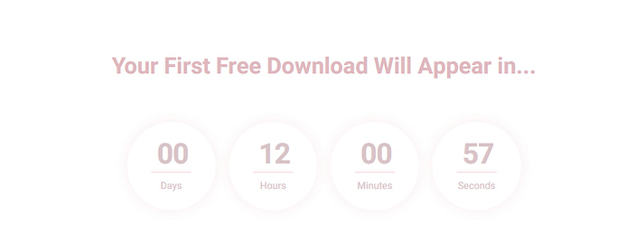
It’s a little bit ironic, because none of our examples actually use a countdown timer, but we couldn’t mention the scarcity trigger without discussing the classic countdown timer.

Countdown timers are a fantastic way to create a sense of urgency in your visitor.

Let’s look at one example where a countdown timer would have been useful.

Real Scarcity

One way to create scarcity is to actually do your webinar live.

That’s what Maxwell of Paid Traffic Training used to do with his webinar registration page (that’s before he made them pre-recorded replays).

Paid Traffic Training's CTA button.

In his video on the webinar registration page, Maxwell explains that the paid ads climate is changing so fast, the only way to ensure he could deliver viewers accurate information was to do a live webinar.

Here, he could have also added a countdown timer to emphasize the time-limited nature of his webinar to encourage signups.

NOTE: Now if you sign up to Maxwell’s webinar, it just takes you straight to a replay, invalidating much of the original scarcity.

TAKEAWAY

For real scarcity - do a live webinar. You can always record the live version for use as a replay webinar later. Highlight the time limited nature of your webinar by using a countdown timer on your registration page.


If not live, add some sort of time constraint to your webinar registration page - such as a free bonus when you sign up within the next 24 hours - and use a countdown timer to highlight the time urgency of that offer.


Note: Remember never to use false scarcity. This just teaches your audience not to trust your deadlines.

Countdown Timer Alternative for Evergreen or Repeating Webinars

Since Mindvalley’s Masterclasses are clearly pre-recorded, there’s no easy urgency trigger they can use with it — such as a live start time. But, with Mindvalley being the A-grade marketing students that they are, they still manage to make it work.

Energy Medicine webinar registration box.

You would be surprised at how just using the words ‘For a Limited Time Only’ can help push a visitor to sign up. There’s no real time limit or webinar signup cut off here, but those simple words still hit that scarcity trigger and tell our brains we better hurry.

TAKEAWAY

Even if you use a pre-recorded webinar, it can be helpful to add a line like “Hurry, only available for a limited time”.

Despite the lack of a concrete deadline, this copy will still create a sense of urgency in the visitor.

Trigger #4: Curiosity - Guess What the Fourth Tool Is...

Successful curiosity triggers create the impression that there’s something juicy the visitor doesn’t know yet, which will be revealed in the webinar. This ensures the visitor gets invested in attending to see the big reveal.

Here are some strategies you can use to create curiosity on your own webinar landing pages...

Unanswered Questions

Curiosity can be hit using copy and other elements throughout the page. It should be sprinkled throughout the entire registration page, from headline to button text (e.g. click here to find out…).

Visual Curiosity

Foundr's webinar registration page.

“Oh a video... with a very clickable thumbnail. What is she doing? I’m just going to go ahead and click this play button to find out…”

On Foundr’s registration page, the first thing you see is what looks like an action filled clickable video.

On closer inspection however — or once you try to hit the play button — you realise it’s just an image with a link trigger that launches a webinar registration form.

This clever strategy is a great way to establish curiosity with your visitor because we’re so wired to click when we see a video — especially one with action in the thumbnail. We want to know what’s going on... what’s inside.

This strategy also helps to relieve the fear of the unknown. You know what the webinar is going to look like because you can already see it.

TAKEAWAY

Consider including a thumbnail of your webinar on the registration page to spark curiosity and show visitors ‘what’s inside’.

Using Curiosity in Your Copy...

Let’s take a look at how Mindvalley uses curiosity in their copy.

Bullet points from Mindvalley's Energy Medicine registration page.

How’s this for a hot tip. Apparently you can heal yourself with a simple kitchen utensil.

But which utensil…? And how…?

The only way to find out is to watch the webinar...

We’re wired to seek answers, especially to questions as enticing as “what’s sitting in my kitchen cupboard right now that has the power to heal me?!

TAKEAWAY

​Give your audience just enough information to be interested, but not enough to make signing up for the webinar redundant.

Use curiosity inducing copy throughout your page, especially in the headline and bullet points.

Trigger #5: Objection Handling & Relieving Fear - Yes, This Is for You

This trigger involves addressing a visitor’s objections before it stops them from signing up. If you can get to the visitor’s objections before they do, there’s less friction between them and the ‘yes’.

Similar to this is taking away the fear of the unknown. This resolves the objection that ‘it might not be right for me’.

Here are a few ways to handle objections and relieve fears on your own webinar registration page.

Using Your Copy to Relieve Objections

A great place to do this is in your copy, especially in the headline and just above or below the buy button.

Q. Is This Going to Suck?

As you can imagine, fear of the unknown hits pretty hard when you’re signing up for a Masterclass on energy medicine.

Is this for me? Will this be worth my time? Am I ‘woo-woo’ enough? Will I be able to understand or implement any of the information?

Fair questions. Mindvalley has done a great job at addressing these objections in their registration page copy:

The paragraph below the headline on Mindvalley's webinar registration page.

They use lines like “But how do you apply this to your life?” (followed by the answer), “This Masterclass is FREE and plays in your local time.” and “Anyone can do this. You don’t have to be a healer.” to address and resolve objections before they even have a chance to arise.

TAKEAWAY

​What questions are your visitors likely to ask themselves before signing up to your webinar? Answer these in your copy. You can even directly call out the objection in your copy by asking the question before your visitor does (and then answer it).

What’s It Going to Look Like… on the Inside?

Mindvalley also includes a step-by-step guide of how to prepare for the webinar. This is another form of tackling the fear of the unknown. Those who have never participated in a webinar before may be a little intimidated by the medium:

Mindvalley's webinar registration page.

The simple step-by-step guide allows the visitor to see how easy it is to prepare and participate in the webinar.

There is also a trailer on the page that allows the visitor to ‘look inside’ the Masterclass. This helps the visitor conceptualize what they’ll be getting, while building authority and curiosity.

Without these peeks inside the webinar, it’s too easy for a visitor to leave the page because they don’t have enough insight to feel comfortable signing up.

TAKEAWAY

Make your webinar look as unintimidating as possible. Talk your visitor through what is going to happen after they sign up, and on the webinar. Try to make the visitor feel as safe as possible participating in what you're offering.

Trigger #6: Perceived Value - How Much Free Stuff Am I Going to Get?

Because who doesn’t love free stuff?

Technically it’s not free. A visitor is choosing to give you one of their most precious resources in exchange — their time.

So it’s your job to make it sound and feel worth it.

You can hit this trigger by clearly outlining the value they’ll get, but also by offering tangible bonuses like a PDF download. Anything that gives the visitor the impression they will be receiving some form of value in exchange for their time. 

Class Favorite - The Bullet Point List

There’s one element every single page we reviewed has, and that’s the bullet point list.

This gives you an idea of just how valuable listing benefits can be on your webinar registration page.

Bullet point lists are great for laying out — in skimmable terms — exactly what the visitor is going to get if they attend your webinar.

Spell it Out

Foundr doesn’t shy away from telling visitors “This is what you’ll get and this is why it’s valuable” on their webinar landing pages.

Sounds silly, and obvious - but so many people forget to do this on their webinar registration pages.

Foundr uses a bullet point ‘What You'll Learn’ section to clearly convey the value a viewer will get from their webinar:

The 'What You'll Learn' section on Foundr's webinar registration page.

You can clearly see that if you attend this webinar, you will learn how to find a niche, how to build a brand and the 3 elements every ecommerce business needs.

The list is tangible, measurable and specific.

TAKEAWAY

​A visitor is not going to sacrifice their time for nothing. You need to clearly convey the value you’re offering. Do this by stating exactly what the visitor gets in a specific, measurable way (eg. x methods for achieving z). Use a clear list of tools, tips or strategies.

Create a ‘method’ or ‘steps’ to get the desired result, but don’t reveal these in full on the landing page. Instead, give a brief outline of how many steps there are or what the method you’ll teach in your webinar achieves.

You can even give each item a name or number (eg. Strategy #2: The Maverick method to getting [x] result).

Add a ‘You Will Learn’ section to your page and use bullet points to detail each tangible learning point.

Add a Bonus

You can add an extra incentive to sign up by offering a bonus gift with registration. If your webinar is recurring, offering a bonus on a limited time basis can be a good way of adding scarcity to your page.

A Cake’s No Good Without Icing

Mindvalley offers a 14-page workbook with their Masterclass.

Mindvalley's bonus offer.

This adds to the perceived value the visitor will receive if they sign up for the webinar.

These sorts of little extras are great incentives to register, and add to the overall value of the offering.

Foundr offers a PDF bonus as well.

Foundr's bonus offer.

The perceived value of this guide is improved by showing a graphic representation of the PDF.

This helps establish it as a tangible object in the visitor’s mind, and makes them feel as though they are getting a tangible gift.

TAKEAWAY

​Sweeten the deal by offering a bonus in the form of a downloadable workbook or PDF. Include some kind of visual mockup of your free bonus to give your webinar more value in your visitor’s mind.

Build Away

What, you read it all?

I’m impressed!

Now that you have a list of psychological triggers to hit — as well as some clearly defined ways to deploy them — it’s just a matter of tying them all together to create your own high converting webinar registration page.

Even incorporating just a few of these triggers into your webinar registration page will help boost its effectiveness.

Happy constructing!

Which example did you find most useful? (Mindvalley? It was Mindvalley wasn’t it?)

Do you have any other webinar landing page elements you love?

Let me know in the comments below!

by Stephanie K  June 21, 2019

18

Disclosure: Our content is reader-supported. This means if you click on some of our links, then we may earn a commission. We only recommend products that we believe will add value to our readers.

Leave a Comment

  • What an amazing article, Stephanie. It’s a perfect combination of info and actionable content and goes hand in hand with Shane’s YT series about webinar providers.

    I was always scared a little bit of doing webinars but how Thrive puts it, it makes me feel more comfortable following this very promising marketing approach (btw, is that a little bit of storytelling in itself? ????)

    Great post, thank you for sharing it with is.

    • Sure is Phil, we need to put that on one of our landing pages 😉

      I wish you the best with your first webinar!

  • Hi Stephanie! Thanks for the great post (an example of perfect SEO blogging and editing in itself;) ). Just wondered what to consider if you look at webinars for B2B courses? As for B2C emotions and personality are a key driver, I wonder about the difference when creating courses to sell to target audience, corporate clients, e.g. in the field of time management?

    Walter

    • Great question. I actually had a B2B example in here but the article was already so long I had to cut it.

      In my research I found much more of a focus on authority. Industry or other company recommendations. Another difference was a lot of the logo strips were used to show off partnerships, such as a company being a Google partner. These partnerships sound very impressive but are often easy to get, so it’s worth looking into. You get to borrow the partner company’s authority.

      Case studies are also a good thing to feature on the page, but as visually as you can (Maxwell’s testimonial example is a good place to start).

      Hope that helps Walter.

  • Thanks for sharing such a useful article related webinar. Now I’m more confident about starting my first webinar. Great Work.
    Keep it up!

  • I saved this for some late night self education points and it’s been well worth my time. Thank you for all the great examples and takeaways – I’m full of action ideas now ❤

  • Yes, read it all the way to the end which just goes to prove that it was great information, well-written and very informative. Who knew that the simple, humble landing page for a webinar registration, could or should incorporate so many enticing features. Thank You Stephanie.

    • I’m impressed Nobby, it was a monster of an article! I hope it helps with any of the landing pages you create in the future.

      • Absolutely it will Stephanie.
        Already planning out a new page.
        Thanks again!

  • {"email":"Email address invalid","url":"Website address invalid","required":"Required field missing"}
    >