Hey!👋🏾 How are your form conversions looking?
Be honest... (it's a safe space, really). Are they bringing in steady signups, or are you starting to wonder if anyone even sees your forms?
In my 7 years of digital marketing, I’ve built more email opt-in forms than I can count. Some I was genuinely proud of… and they completely flopped. Others? Thrown together in 15 minutes — and they converted like crazy.
And that’s the tricky thing about opt-in form conversion rates: they’re influenced by small, often overlooked details. One headline tweak, one extra form field, or one poorly timed popup can make or break your results.
In this guide, I’ll walk you through 12 smart (but simple) strategies to improve your opt-in form conversion rates — so your forms finally pull their weight and help grow your list.
But First...What’s a Good Opt-In Form Conversion Rate?
Before you start tweaking button colors or swapping out form templates, it helps to know what “good” actually looks like.
Are your email opt-in rates just average, or are you sitting on untapped potential?
Let’s break down the industry benchmarks so you know what to aim for.
By Form Type: How Your Format Stacks Up
Form Type | Average Conversion Rate | Top Performers |
|---|---|---|
Landing Pages | 30%+ | |
Popups | Mobile popups: +38% more conversions | |
Scroll Boxes | Up to 4.9% | |
Smart Bars | Top 10% reach 1.4% |
Thrive Tip: The right format + the right timing = a powerful combo. That’s where tools like Thrive Leads shine — giving you control over triggers, targeting, and design without needing a developer.
By Industry: Averages You Can Benchmark Against
Industry | Average Rate | Optimized Forms |
|---|---|---|
Professional Services | Up to 3.45% | |
B2B Tech | Up to 2.65% | |
Healthcare | Up to 4.9% | |
Real Estate | Top 10% reach 1.4% |
Most industries see opt-in rates between 1–3%, but with optimization, you can comfortably double that.
🎯 Overall Benchmarks (and Where You Fit In)
If your forms are sitting around 2–3%, you’re doing alright — but if you want to scale, there’s plenty of room to grow. Below 1%? It’s time to rethink your form strategy.
What Causes Low Opt-In Form Conversion Rates?
What I’ve learned after building dozens of forms that underperformed, overperformed, or made no sense at all — is that low conversion rates are rarely about the offer itself.
More often, it’s the small things getting in the way. Quiet friction points. Easily overlooked details that interrupt what should be a simple “yes.”
Here are some of the biggest culprits:
Too many fields
Asking for more than a name and email up front can create hesitation. The more work your form feels like, the more likely people are to bounce.Vague or forgettable headlines
If it’s not instantly clear what someone gets (and why it matters), they’ll keep scrolling. A headline that speaks to a real need will always outperform one that just sounds “nice.”Generic CTAs
“Submit” or “Sign Up” doesn’t tell anyone what’s on the other side. A good CTA is specific, benefit-driven, and feels like a natural next step.
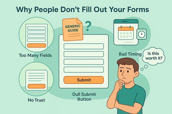
- Poor timing or placement
Even the best-designed form won’t convert if it shows up too early, too late, or in the wrong spot. Timing and visibility are half the battle. - Low perceived value
A generic freebie won’t cut it. Your lead magnet needs to feel useful, targeted, and worth trading an email address for — especially in today’s crowded inboxes. - Missing trust signals
People hesitate when they don’t feel safe. If your form doesn’t show signs of credibility — like testimonials, subscriber counts, or a visible privacy promise — that hesitation can quietly cost you conversions.
Once you know what’s holding your forms back, fixing them becomes a lot easier. And you don’t even need to start from scratch. Most of the time, a few smart changes are all it takes to turn things around.
In the next section, we’ll walk through 12 practical ways to improve your opt-in form conversion rates — based on real data, experience, and tools that make testing (and winning) a whole lot simpler.
12 High-Converting Tips to Improve Your Opt-In Form Conversion Rates
This section covers 12 actionable ways to improve your opt-in form conversion rates.
From refining your value proposition to optimizing the timing of your form's appearance, you'll learn how to make adjustments to generate more leads.
Let’s dive in:
1. Experiment with Different Form Types
Sometimes, a standard on-page opt-in form might not be the best (or only) way to get your visitors to convert.
Header forms, sliders, and even pop-ups can be effective when done right – but you won’t know if you don’t try them out.
If you’re using a WordPress lead-generation plugin like Thrive Leads, you have access to 450+ different opt-in form templates to try out. These include:
Popup Lightbox
“Sticky” Ribbon
Slide-In Box
Screen Filler Overlay
Scroll Mat
... and so much more.

This means you never have to design your lead generation forms from scratch.
You can create your own custom signup forms in seconds with Thrive Leads’ one-click edit feature, and add a variety of design elements to make filling a form easier – checkboxes, dropdowns, radio buttons, and more.
So, if you haven’t given this tool a try yet – today is a good time to do so.
2. Simplify Your Form Design
When it comes to opt-in forms, less really is more.
Every extra field you add introduces another reason for someone to hesitate — especially if they’re on mobile or just not ready to hand over a bunch of personal info.
In fact, a recent study found that forms with just three fields convert at an average of 25%, while forms with more than six fields drop to 15% or lower.
That’s a 10% difference — just for asking fewer questions.
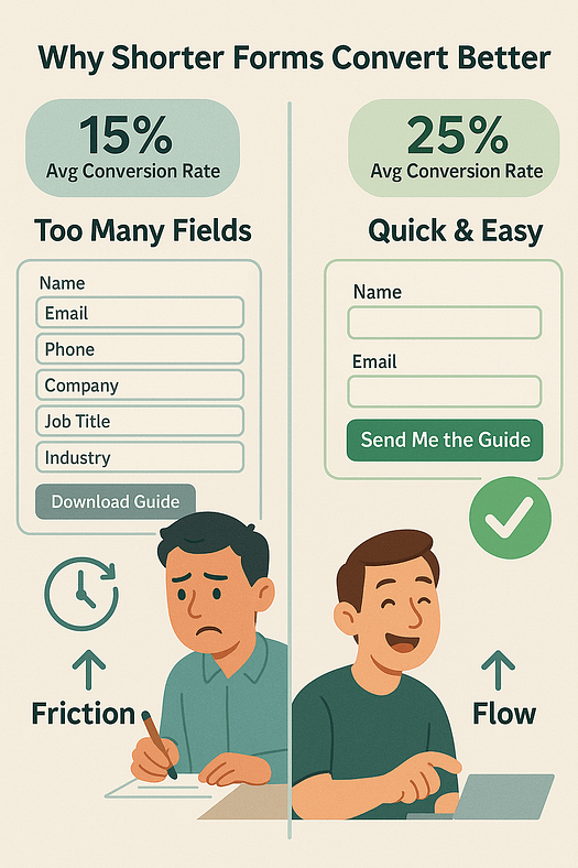
Start with only what’s essential: usually a name and an email address. If you absolutely need more info, save it for later in the funnel. The easier your form feels to complete, the more likely someone is to say yes.
And if you really do need to collect more information — like interests, preferences, or qualifying details — consider using a quiz instead of a traditional form. Quizzes feel interactive, offer value upfront, and give you the same data without overwhelming your visitors (and you can learn how to build one right here).
Win-win.
3. Craft a Compelling Headline and Copy
A captivating headline coupled with persuasive copy can dramatically boost your form’s conversion rates.
Keep your headlines concise and focus on highlighting the key benefits of your offer. Use words like “Join Now” and “Limited-Time Offer” to drive urgency and get your visitors to opt in faster.
The copy that follows should reinforce the headline by providing a clear explanation of what your offer entails, how it benefits the user, and what they can expect after signing up.
It should be as brief as possible while still being informative and persuasive.
4. Optimize Your Call-to-Action (CTA) Buttons
Your call-to-action button is responsible for making your audience take action. It’s important that they are clear to see on your opt-in forms.

One of the simplest ways to optimize your calls-to-action is to ensure they’re visually distinct from the rest of your form.
Use contrasting colors to draw attention and size your CTA button so it’s easy to spot immediately.
Your submit button text shouldn’t be generic so avoid using simple terms like “Submit” or “Enter”
Instead, use action-oriented, benefit-focused phrases like “Give Me My Free Report” or “Become a VIP Today” to indicate what comes after opting in.
In terms of CTA button placement, it should be in a logical spot where the user's eye naturally goes after reading the form content, typically at the bottom after all the necessary information has been provided.
5. Study Your Website’s Metrics
As you work on optimizing your opt-in forms and landing pages, be sure to take to understand how people are responding to the offers and content already on your website.
We recommend using a Google Analytics plugin like MonsterInsights to track your site’s traffic and conversions.
This tool can help you understand where your audience is coming from (social media, search engines, or digital marketing ads) and how they’re spending their time on your website.
This provides clearer picture of what your potential customers are searching for so you can make sure your messaging and lead magnets are aligned with their needs.
6. Reevaluate Your Lead Magnet
If your opt-in form isn’t converting as expected, the value of your offer – your lead magnet – might be why.
It's vital that what you're offering resonates with what your audience needs. If they don't see clear benefits, they won't be compelled to sign up.
Take a moment to reassess your lead magnet. Is it something that promises a tangible benefit to your subscribers?
For example, if your audience is keen on healthier living, a downloadable 21-day meal plan could be the perfect lure. It’s specific, actionable, and directly aligned with their interests.
Make sure to communicate the value proposition of your offer vividly.
Don’t just say it’s “free” or “useful”—illustrate how it will improve their lives.
Will it save them time? Help them feel better? Give them a skill?
Your form should promise these outcomes clearly and compellingly. When you paint a picture of a better life that’s just a form away, you’re more likely to see an uptick in your conversions.
7. Include Social Proof to Build Trust
No one wants to be the first person to hand over their email — and that’s exactly why social proof works so well.
Whether it’s a short testimonial, a subscriber count, or a quick note about who your content has helped, giving people a sense that others trust you makes it easier for them to do the same.
And it’s not just a nice touch — it’s a proven conversion booster. According to WPForms, adding social proof to your forms can increase conversion rates by up to 26%.
That could mean more subscribers, more leads, and more momentum — without changing a single word of your offer.
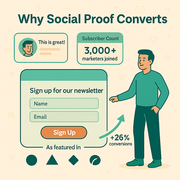
Here are a few ideas that work well:
- A short quote from someone who used your lead magnet
- A live subscriber count ("Join 3,000+ marketers already subscribed")
- Brand logos or mentions from companies you've worked with
- A quick success story, especially if it's relatable
And if you need help with learning how to collect testimonials without feeling awkward, this step-by-step guide is the one for you.
8. Use Advanced Display and Targeting to Get Your Form in Front of the Right People
If you’re using Thrive Leads for your lead-generation forms, you can take advantage of this plugin’s comprehensive targeting features to boost your conversion rates.
Suppose you're looking to tailor your opt-in forms to cater to a particular segment of your audience. With Thrive Leads, this customization is made effortless through the use of 'Lead Groups.'
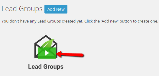
'Lead Groups' allow you to design and deploy forms specifically for defined audience segments. You can control where these forms appear on your site, choosing to display them on certain posts, pages, or excluding them from others as needed.
For example, if your lead magnet is a 'Start Your Business the Right Way' webinar you can set the form to show only on content geared towards entry-level entrepreneurs.
Conversely, you can prevent it from showing on other non-related content (or on core pages like your homepage), ensuring it reaches the right eyes.
The granular targeting capabilities of Thrive Leads mean you can strategically align your opt-in offers with the most relevant content, optimizing your chances for list growth and engagement.
9. Optimize Your Forms for All Devices
If your form looks great on desktop but falls apart on mobile, you're leaving leads on the table.
More than 50% of all web traffic now comes from mobile devices, yet mobile forms still tend to underperform. In fact, Unbounce found that mobile landing pages convert at an average of 2.9%, compared to 4.0% on desktop.
That gap doesn’t just happen — it’s often caused by poor design, slow load times, or clunky form fields that don’t play well on small screens.

Here’s how to fix it:
Use a single-column layout so users don’t have to pinch and zoom
Make buttons big and tappable — no one likes tapping a 10-pixel link with their thumb
Keep it short — fewer fields means less drop-off on mobile
Compress images and scripts to keep your forms lightning fast
10. Use Exit-Intent Popups
Exit-intent pop-up forms can be your secret weapon in getting more conversions from your opt-in forms.
They act as a last-second pitch to your visitors, appearing when they're about to leave your site.
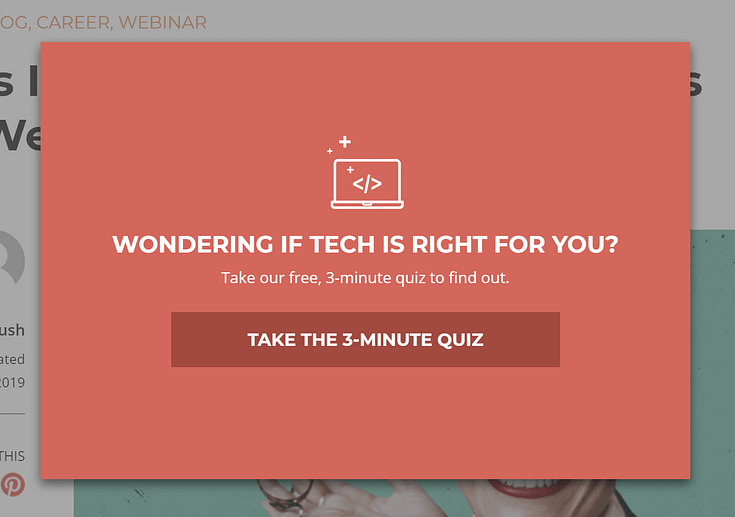
Here's how to make them work for you:
Get the timing right: Set up your exit-intent popups to trigger just as a user is about to navigate away.
Re-emphasize the value of your offer: Remind your visitors of what they stand to lose if they leave your page without opting in. Add a tone of urgency to your copy to encourage them to take immediate action.
Include a clear exit option: Your visitors should feel in control, and able to dismiss the popup with ease. This respect for the user experience not only avoids frustration but also maintains—and can even enhance—the trust and integrity of your brand.
11. Use Multi-Step Forms (If Applicable)
Multi-step forms are a great way to keep your potential leads engaged while collecting relevant information from them for better segmentation.
Be sure to include progress indicators to show your almost-subscribers how much of the form is left.
Keep your questions as simple as possible, and group them according to relevance.
Thrive Tip
Want an even more engaging way to glean info from visitors and ramp up those opt-in rates? Try a quiz as your lead magnet.
Quizzes are a great way to encourage interaction, and gating their results with an opt-in form serves as an effective way to get them to sign up.
12. Test and Optimize Your Forms
The best way to know what’s helping (or hurting) your opt-in form conversion rates is through A/B testing.
If you’re using Thrive Leads, you can set this up in minutes.
This plugin has its own built-in A/B testing engine, which means you don’t need to download a separate plugin to test your forms.

With this function, you can run a range of opt-in form
A/B tests:
Opt-in form design tests (change a single variable on the same design – like different headlines)
Form placement on your landing pages (e.g. above the fold vs towards the end of your webpage)
Opt-in form type tests (test different opt-in form types against each other – like a lightbox vs. a sticky ribbon)
Opt-in offer value proposition tests (test different opt-in offers against each other – like a free checklist vs. a free video course)
Trigger setting tests (test different trigger settings against each other for the same opt-in form design – like a page load trigger vs. an exit intent trigger)
You can also use the “set it and forget it” automatic winner settings in Thrive Leads to make sure your losing opt-in form variations are paused and only the highest converting form continues to be shown to visitors once enough data has been gathered!
Next Steps: Set Your First Advanced Trigger in Thrive Leads
Now that you understand the importance of targeting and timing in your opt-in strategy, it's time to put that knowledge into action.
Depending on the opt-in form type you’re creating, Thrive Leads gives you several advanced trigger options to make your offer present itself in the most effective way to your audience.

Simply put, a “trigger” is an action that prompts your opt-in form to appear on a visitor’s screen. For example, trigger settings in Thrive Leads include:
- On desktop only, mobile-only, or both
- On page load
- After a certain number of seconds has passed
- After a certain % of the screen has been scrolled
- ...and many, many more.
Is Your Website Helping or Hurting Your Lead-Generation Efforts?
Now you have everything you need to generate higher conversion rates for your opt-in forms.
But, if your website is hard to navigate and hard to read…your readers will drop off.
Your website's design should contribute to winning your audience's attention, instead of driving them away.
Here are four free resources to help you improve your current website or webpages:
- How to Create a Clean, Conversion-Focused WordPress Website
- How to Create SEO-Friendly Blog Posts Users and Bots Will Love (14 Tips)
- How to Build a One-Page Website on WordPress (the Easy Way)
- How to Build a Consulting Website on WordPress
And if you feel certain that you need to upgrade your form-building tools to generate more leads, then this is the time to switch plugins and try Thrive Leads.


