TL;DR: Black Friday Landing Page Tips
Looking for Black Friday landing page tips that actually move the needle? You’re in the right place. Black Friday isn’t about throwing discounts on a page and hoping for the best — it’s about urgency, clarity, and turning chaos into conversions.
Here’s the quick rundown:
- Use progress bars to nudge shoppers toward bigger carts.
- Add countdown timers that reset for flash sales and keep people glued to the page.
- Drop pop-ups with secret offers to surprise browsers before they bounce.
- Build in scarcity — hourly deals, low-stock alerts, or VIP early access.
- Showcase real customer proof to cut through the frenzy and reassure buyers.
- Keep support close with chat features and smart quizzes to guide decisions.
- Use the right tools — Thrive Architect, Thrive Ultimatum, and Thrive Leads — to make all of this happen fast.
That’s the skim-friendly version. But if you want to see how these strategies fit together — and why they’re so powerful when the clock is ticking — keep reading.
What makes someone stop scrolling, open their wallet, and buy on the busiest shopping day of the year?
I asked myself that exact question after my first chaotic Black Friday experience. The deals were there, but the landing pages felt like a maze — cluttered layouts, hidden offers, and checkout flows that seemed designed to test my patience. By the end, I wasn’t excited. I was exhausted.
Black Friday has changed so much since that first chaotic experience of mine. It isn’t a race for the loudest discount anymore. It feels more like a stress test for your entire digital presence — especially now that most shoppers are browsing on their phones and search engines are pulling quick answers straight into AI summaries.
Your page has to load fast, make sense instantly, and hold its own in a space where people are deciding in seconds. If it hesitates, if it feels cluttered, if it doesn’t match the promise that brought someone there, it simply fades into the noise. And that’s the part most people don’t see: the page is doing just as much work as the offer.
That frustration is what pushed me to dig deeper. Over the years, I’ve studied, tested, and refined what actually works when the pressure is on. And trust me: a strong Black Friday landing page isn’t about being flashy — it’s about urgency, clarity, and timing.
This guide is a collection of the strategies I lean on when I need results fast. They’re practical, simple to implement, and built for the one day of the year when every second counts.
Let’s get into it.
“If you’re brand new to the world of landing pages, I’d suggest starting with my complete guide to landing pages. Once you’ve got the basics, this Black Friday playbook will make a lot more sense.”
Quick Answer: What actually makes a Black Friday landing page work in 2026?
A Black Friday landing page is a dedicated, time-sensitive page built to guide someone toward one clear decision without distractions. It’s different from a regular sales page because the pressure is higher, the competition is louder, and shoppers are moving fast — especially on mobile.
If you strip away the noise, the pages that convert this year have a few things in common:
- A single, focused offer (or a tight cluster of related ones).
- A fast mobile load time — ideally under three seconds.
- Real urgency (a genuine deadline, limited stock, or VIP-only perks).
- Clean structure that makes the next step obvious without forcing it.
- Trust anchors — UGC, reviews, guarantees, and easy-to-find support.
Think of this section as your compass before we dive deeper. Everything that follows builds on these core principles.
Your Landing Page: Where Black Friday Marketing Pays Off
I’ve learned that Black Friday doesn’t forgive weak links. You can pour your heart into ads, spin up the sharpest email subject lines, get people buzzing on social… but the second someone hits your landing page, all that work is on trial.
For me, this page isn’t just another step in the funnel — it’s the moment everything either clicks into place or slips away. Shoppers are moving fast, juggling a dozen tabs, hunting for wins. If my landing page isn’t clear, bold, and built to move them straight into action, I might as well wave goodbye to the sale.
Why This Matters
💰 U.S. consumers spent $10.8 billion online on Black Friday 2024 — a 10.2% jump from 2023. Your page is the gatekeeper to a slice of that revenue. (Digital Commerce 360)
📱 Over 50% of Black Friday purchases now happen on mobile, which means your landing page has to be fast, clear, and thumb-friendly. (Digital Commerce 360)
🛒 The average cart abandonment rate is around 70%, and a messy landing page is often the reason shoppers don’t cross the finish line. (Hotjar)
⏱️ 59% of customers abandon carts because they were “just browsing” — urgency elements like countdowns or VIP early access can flip that hesitation into action. (Tidio)
What makes a great Black Friday landing page? It’s not a product grid with prices slapped on. It’s an extension of your story. It’s how you prove the promise you made in your ads was real. It’s where you keep the energy alive, guide people forward, and show them you’re not just running a sale — you’re running their best option.
The strategies I’m about to share are the exact ones I lean on when the pressure is highest. They’re quick to set up, powerful in practice, and they’ve saved me more sales than I can count. Because on Black Friday, every second and every pixel matters.
Landing pages are the heart of every funnel, and if you want to understand why they’re so powerful, my guide to landing pages breaks it down in detail.
Tips to Help You Create Black Friday Landing Pages That Bring Sales
I’ve spent more Black Fridays behind the scenes than I can count, and I’ve learned one thing: shoppers don’t just want discounts, they want an experience. A landing page that feels alive — ticking clocks, surprise offers, that rush of “I need to grab this before it’s gone.”
The following tips aren’t theory. They’re the exact moves I use to turn a simple page into a high-energy sales machine. Each one is about urgency, scarcity, and guiding people from “just browsing” to “shut up and take my money” in the shortest time possible.
1. Use a Progress Bar to Encourage More Purchases
I’ve always loved a progress bar — not because it’s cute, but because it taps straight into a real psychological pattern. Humans don’t like unfinished business. That quiet pull you feel when something is almost done? That’s the Zeigarnik effect at work (Psychology Today).
On Black Friday, that tiny strip of color becomes a motivator. It shows shoppers exactly how close they are to unlocking free shipping, a bonus gift, or an exclusive discount. And when cart abandonment hovers around 70% (Baymard Institute), even a small sense of progress can stop someone from backing out at the last moment.

Here's how it works: As customers add items to their cart, they see a visual representation of their progress towards finalizing their purchase. These could be anything from extra discounts to free shipping or even a complimentary gift.
This approach taps into our natural desire for achievement. Seeing that bar fill up creates a sense of satisfaction, and the promise of unlocking bonuses can be just the nudge a customer needs to add one more item to their cart.
The key is to make the thresholds achievable but still valuable for your business. You want customers to feel like they're getting a great deal, while also increasing your average order value.
2. Use a Pop-Up to Reveal a Secret Discount or Freebie
Black Friday shoppers love a surprise — especially the kind that feels earned. A well-timed pop-up can offer that little spark: a secret discount, an unexpected freebie, or a VIP-style perk that makes someone stay longer than they planned.
But we’re in a new era. In 2025, intrusive pop-ups aren’t just annoying — they can get your page quietly penalized. Google specifically warns about intrusive interstitials that disrupt mobile browsing (Google Search Central), and layout shifts from poorly loaded pop-ups can hurt your Cumulative Layout Shift (CLS) score, one of the Core Web Vitals (Web.dev CLS).
Here's how to implement this tactic effectively:
⚠️ SEO & UX Note
Avoid pop-ups that appear immediately when the page loads, especially on mobile. They can cause layout jumps and trigger Google’s intrusive-interstitial signals. Instead, use exit intent, scroll-depth triggers, or a thoughtful delay, and always test them on an actual phone.
Tools like Thrive Leads make this painless with device-specific rules, scroll triggers, and exit-intent detection, so you can stay persuasive and avoid performance penalties.
If you’re using a solid WordPress pop-up plugin like Thrive Leads, you can easily set these pop-ups up on your landing page.
In its expansive library of templates, you can use a set of specially-made Black Friday pop-ups to grab your customers’ attention and drive them to make more sales.
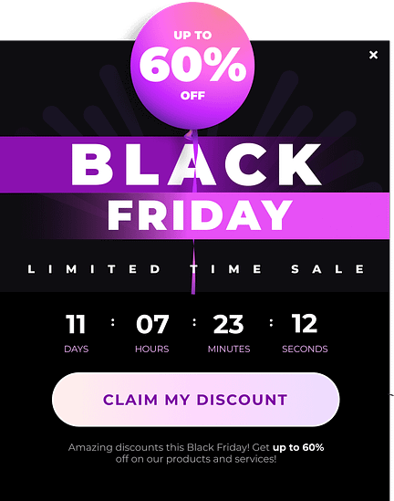
They look great, can easily be programmed to show up at the right time, and are designed to land you more conversions.
Thrive Tip: Need more guidance on how to use pop-ups the right way? Take a look at our detailed guide.
3. Introduce "Buy Now, Pay Later" Options for Flexibility
Black Friday is when people build their biggest carts — and also when they hesitate the most. BNPL bridges that gap. It softens the moment of decision, making the overall purchase feel more manageable.
This isn’t just a hunch. Flexible payment options have been linked to higher conversions and larger average order values — especially during high-spend events (Klarna Report). BNPL works because it reduces the psychological pressure of paying everything upfront.
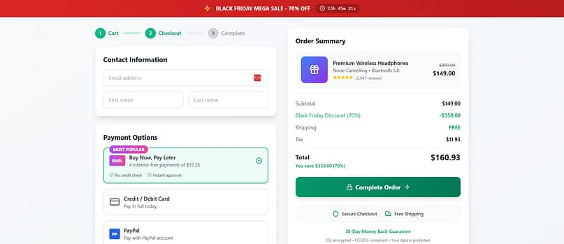
Set it up with a reliable payment gateway plugin and highlight it on your landing page. Shoppers need to know they can stretch the payments without hidden strings. It’s about flexibility — and when people feel secure, they’re far more likely to click buy.
To implement this feature on your website, you’ll need to do it through a reliable WordPress payment gateway plugin. Take a look at this list of options to find the best one that supports BNPL and other payment methods.
Thrive Tip: Remember to promote responsible spending. Be upfront about terms and conditions. Make sure customers understand what they're agreeing to when they choose BNPL.
4. Showcase Real Customer Experiences with User-Generated Content
Black Friday is noisy. Every brand claims they have the “best deal,” the “biggest savings,” the “don’t-miss-this” moment. But shoppers believe other shoppers more than they believe brands — especially on days when everything feels too good to be true.
That’s why I love weaving real customer content into Black Friday pages. Photos, quick videos, Instagram posts, short reviews — all of it builds trust faster than polished copy ever could. There’s plenty of research to back this up too: UGC can lift conversions by up to 29% (Adweek). It’s social proof with a pulse.
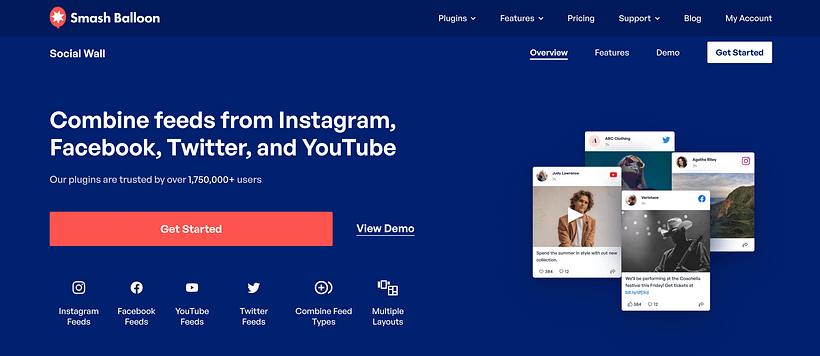
Photos. Testimonials. Social posts. All those real voices screaming “this product works” matter more than polished copy ever could. I like embedding social feeds directly (Smash Balloon is my go-to) so visitors see the buzz unfold in real time.
💡 Not sure how to add a social media feed to your website? This guide can help.
5. Use a Countdown Timer That Refreshes for Flash Sales
A well-placed countdown timer can change the energy of an entire page. When the clock is ticking, decisions feel sharper, and people act faster. There’s psychology behind it — urgency pushes us toward quicker choices — but the key is to use it honestly, not dramatically.
And timing matters.
Research shows that 53% of mobile users abandon a site that takes longer than 3 seconds to load (Google/SOASTA). That means your timer can’t be a heavy script that slows the page down or causes layout shifts.

This is why I treat countdown timers as “moment setters,” not decorations.
One clear, central timer is usually enough — ideally powered by something lightweight that doesn’t drag the whole page with it.
And if you’re wondering how to pull it off without breaking your site? Thrive Ultimatum has your back. You can set it to run fixed-date campaigns or even evergreen ones — perfect for those doorbusters you want flying off the shelf.
Thrive Tip: Need a tutorial on how to add a countdown timer to your website? Take a look at this step-by-step tutorial.
6. Cut Through the Noise with a Smart Product Quiz
Black Friday overwhelm is real. Too many tabs open. Too many choices. Too much noise.
A product quiz feels like a breath of fresh air in the middle of that chaos — almost like having a personal shopper step in and say, “Okay, let’s simplify this.”
Recommendation engines and guided selling tools consistently outperform guesswork. In fact, product quizzes can lift conversions by up to 20% in ecommerce environments (RevenueHunt). It’s the power of clarity in a moment of overload.

I use quizzes to cut decision fatigue and point people toward what makes sense for them.
The trick is to place the quiz where it supports the buying experience instead of competing with it. Somewhere mid-page works beautifully — after someone has shown interest but before they wander off.
And if you don’t want to build from scratch, Thrive Quiz Builder gives you templates, branching logic, and nice little design touches that keep the flow smooth.
Thrive Tip: New to creating product recommendation quizzes? I've got you! Check out this tutorial to learn how to get started.
7. Add a Live Chat or Chatbot for Quick Support
This is the safety net I never skip.
On Black Friday, people don’t want to wait for email replies or dig through dense FAQ pages. They want answers right now — especially when they’re deciding between two items or checking something simple like shipping times.
Live chat gives people reassurance. Chatbots handle the basics when your team is swamped. Together, they keep shoppers moving instead of stalling. And there’s data behind this: 79% of consumers prefer live chat because it’s fast (Salesforce).
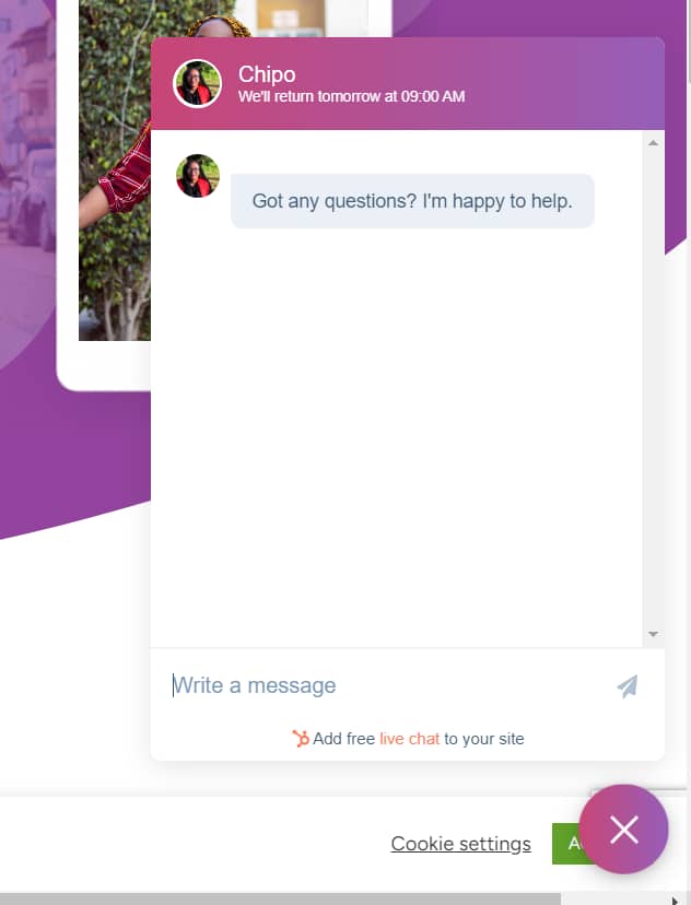
Example of a chatbot on a Thrive Architect-built site.
Just one piece of advice: pick one chat tool and stick to it. Don’t load three different widgets and pray your page survives.
And please test it on mobile. Some chat tools sneak in heavy scripts that can affect your Interaction to Next Paint (INP) — something Google is paying much closer attention to now.
Whether it’s a simple support box or a well-trained AI assistant, the goal is the same: help people move confidently toward the checkout.
💡And chatbot tools aren’t that hard to add to your website either. Use this free guide to get started.
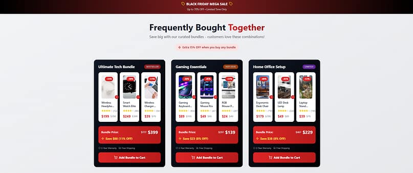
8. Create a “Frequently Bought Together” Section
Cross-selling works because nobody shops in isolation. Every product has a natural companion, and when you pair them thoughtfully, you’re not being pushy — you’re being helpful.
Amazon built an empire on this logic. And it works beautifully on Black Friday too, because people are already in a buying mindset. A strategic “Frequently Bought Together” section can quietly increase average order value without feeling salesy. Smart cross-selling strategies have been shown to boost revenue by 10–30% (McKinsey).
My rule of thumb?
Keep it simple.
Two or three recommendations max, placed close to the main product or offer. Anything more becomes clutter, and clutter kills momentum.
And if you’re already in Thrive Architect, conditional display makes it easy to show different bundles to different users. Clean, personalized, and high-impact.
Thrive Tip: This strategy is actually known as cross-selling, which is part of a three-pronged approach to increasing the value of each sale: upselling, cross-selling, and downselling.
9. Feature a “Deal of the Hour” Section
This is where Black Friday starts to feel fun.
A “Deal of the Hour” setup turns your landing page into an event — something people revisit throughout the day instead of browsing once and disappearing.
It taps into that “I don’t want to miss the next one” energy. And repeated visits can dramatically increase total purchases. Ecommerce brands that roll out hourly deals see higher engagement and more multi-purchase customers (Shopify shared similar findings in their peak-season wrap-ups — here’s one example: Shopify Holiday Behaviour Report).
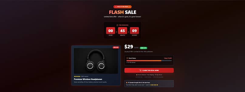
But the real magic happens when shoppers keep coming back. Maybe they missed out on the 10 AM deal, but they're determined to snag the 11 AM offer. This repeated engagement increases the chances of multiple purchases throughout the day.
To make this work, choose products that will genuinely excite your customers. Mix it up - include some popular items, some unexpected gems, and maybe even a few big-ticket items with eye-popping discounts.
In terms of setting up this “Deal of the Hour” section, you can easily configure this in Thrive Architect, one of the best landing page plugins out there.
With this tool, you can use a smart feature – conditional display – to program different “deals” to show up at different times on your website.
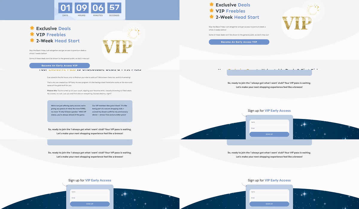
10. Offer Early Access for VIPs or Subscribers
This is where Black Friday strategy meets long-term growth.
Early access turns your loyal customers into insiders — and they love that feeling. It also helps you start generating sales before the main wave hits, which takes pressure off your systems and your team.
Brands that run early-access windows often see higher conversion rates from email subscribers and more repeat buyers long after the sale ends (Campaign Monitor).
And there’s one more layer most people overlook:
SEO.
Instead of creating a new landing page every year, build one URL — something like /black-friday — and keep it live all year. This is called an evergreen URL strategy, and it preserves the backlinks and authority you build over time. In the off-season, turn the page into an early-access signup hub. When the next Black Friday comes around, simply switch it back.
It’s simple. It’s clean. And it sets you up for stronger rankings every year.
Technical Black Friday Landing Page Checklist
Before you hit publish, run your page through a quick technical check. Black Friday traffic is fast, impatient, and mostly mobile — which means even the prettiest landing page won’t survive if the basics aren’t solid. Here’s what I always double-check:
Keep mobile load time under three seconds.
Heavy scripts, uncompressed images, and auto-playing elements slow everything down. Lazy-load anything below the fold and keep your JavaScript footprint light. Slow pages lose people quickly — Google’s research shows that more than 53% of shoppers bounce when a site drags past that three-second mark.Avoid instant popups, especially on mobile.
Use exit-intent, scroll triggers, or short delays. Anything that jumps onto the screen before the main content loads can cause layout shifts and trigger Google’s intrusive-interstitial signals.Stick to one primary action.
Let your main CTA be the loudest voice on the page. Everything else — quizzes, chat, bundles — should support that path, not compete with it.Reuse the same Black Friday URL every year.
Keep/black-fridaylive all year, then update the content when the season rolls around. This preserves your backlinks and page authority instead of resetting your SEO every November.Add basic SaleEvent schema.
You don’t need to get technical unless you want to, but adding SaleEvent markup helps search engines understand your dates, discounts, and offer windows. If you don’t handle schema manually, pass it to your dev or use a generator — anything is better than skipping it entirely.Test your page on a real phone.
Not the office Wi-Fi. Not the desktop preview. Load it on a mobile network and scroll through the full experience. Buttons, timers, popups, chat widgets — everything needs to behave cleanly on smaller screens.
This little checklist saves you from the typical Black Friday heartbreak: a great offer held back by small technical issues that didn’t need to exist.
Frequently Asked Questions About Black Friday Landing Pages
I get asked about Black Friday landing pages every single year — and honestly, the questions don’t change much. Everyone wants to know how to stand out in the chaos, how to use urgency without being pushy, and which tools actually make a difference. So let’s clear up the most common ones right here.
A Black Friday landing page has one job: capture urgency. I think of it as the adrenaline shot in your funnel. Regular landing pages can afford to be calm and persuasive; a Black Friday page has to be loud, direct, and unapologetically built for action. That means bold branding, time-sensitive offers, limited stock callouts, and a clear path to checkout. If someone has to scroll or think twice, you’ve already lost them to another tab.
Scarcity should feel exciting, not manipulative. I use progress bars tied to real rewards, “deal of the hour” drops, and honest low-stock messages. Transparency is everything — if I say there are ten left, there are ten left. When scarcity is framed as a chance to win rather than a trick to trap, customers enjoy the chase and trust your brand more.
A countdown timer creates the rhythm of a Black Friday sale. It reminds shoppers that every second counts, and it transforms browsing into a game they don’t want to lose. I’ve seen timers boost conversions just by making deadlines visible. Pair one with flash sales or bundle deals and suddenly your landing page feels like a live event people want to stick around for.
I keep momentum alive with rotating offers. Hourly deals, pop-up bundles, or surprise discounts keep shoppers refreshing the page. I layer in live chat for questions, product quizzes for quick recommendations, and VIP perks for my email list. That mix turns a landing page into more than a catalog — it becomes an experience people check back on again and again.
Black Friday is chaos, and chaos makes people second-guess themselves. Social proof — photos, reviews, unboxing videos — cuts through the noise and reassures buyers they’re making a smart move. I slot real customer content right between deals so it’s impossible to miss. It’s not fluff; it’s the trust signal that makes someone click “buy now” instead of abandoning their cart.
I stick with tools that handle both design and conversion. Thrive Architect lets me build the page fast and on-brand. Thrive Ultimatum powers countdowns and scarcity campaigns so I can run flash sales without babysitting the site. And Thrive Leads handles my pop-ups, list growth, and exit-intent offers. Together, they give me speed, flexibility, and the firepower I need to sell under pressure.
I always start weeks ahead. Teasers, VIP early access invites, and “save the date” campaigns build anticipation long before the doors open. By the time Black Friday arrives, my audience already knows where they’re shopping — they’re just waiting for the deals to drop. That early buzz is what turns a single day into a weekend of record sales.
Next Step: Set Up Your Black Friday Pop-Ups
Your landing page is set, but don't stop there. Strategic pop-ups can take your Black Friday sales to the next level.
With this strategy, you can easily can highlight deals, capture emails, reduce cart abandonment, and guide visitors to your best offers. The key is to enhance, not disrupt, the user experience.
And if you need a solid plugin to help you get started, you already know my recommendation: Thrive Leads.
Ready to create pop-ups that convert? Check out Thrive Leads. This tool helps you design, target, and optimize pop-ups that match your brand and Black Friday goals.
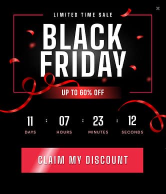
More Black Friday templates in Thrive Leads.
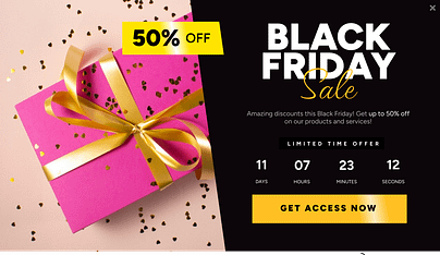
With Thrive Leads, you can create eye-catching pop-ups, set precise triggers, A/B test different versions, and track performance.
Don't let Black Friday visitors slip away. Start planning your pop-up strategy with Thrive Leads today and turn more clicks into customers.
Ready to Improve Your Black Friday Landing Pages?
We've covered a lot of ground in this guide to creating a standout Black Friday landing page. From progress bars to spotlighting special deals, each strategy is designed to help you cut through the noise and connect with your customers.
As you implement these tips, keep your unique brand and customers in mind. Test different approaches, gather data, and be ready to adapt. The beauty of digital marketing is its flexibility—use it to your advantage.
Here's to your most successful Black Friday yet. You've got the knowledge—now go make it happen!


