TL;DR: Quick Wins From This Landing Page Checklist
Lead with clarity. If your visitor can’t tell what you offer in five seconds, they’ll leave. A clear headline + subheadline combo is your best chance to hook them.
Make one decision easy. Every element should push toward a single, obvious call-to-action — that’s the core of any effective landing page checklist.
Show proof fast. Testimonials, recognizable logos, or quick stats help overcome hesitation before they scroll.
Think mobile first. Most visitors are on their phone — if your page isn’t fast and tap-friendly, expect drop-offs.
💡 Master these four tips first, then use the full landing page checklist to fine-tune every other detail before you launch.
“By failing to prepare, you are preparing to fail.” — Benjamin Franklin
…and that’s exactly what happens when you try to build a funnel without a landing page checklist.
I’ve been in this marketing game for over seven years — and at this point, I don’t wing anything. Not my page layouts, not my CTAs, not even the post-click experience. I work in steps, checklists, and templates, because process is non-negotiable.
And I’ve done some research to show you why this matters:
The average landing page converts at around 2.35%*. Which means there’s a lot of room for improvement.

So no, it’s not enough for your page to just look good.
It has to work across devices, for real users, and under pressure.
This checklist gives you the exact framework I use to build high-converting landing pages.
We’ll cover the basics like value props and trust signals, but also the less glamorous (but critical) things like mobile responsiveness, conversion tracking, and how to follow up after the form gets filled out.
And while these tips apply no matter what tools you’re using, you’ll learn more about the tech stack I use for my pages.
So if you’ve ever watched your traffic come in… and then quietly disappear, this checklist is here to fix that.
The 15 Must-Haves of a High-Converting Landing Page
Right, let’s kick this off because this is what you’re here for.
The landing page checklist I actually sign off on.
If you’re looking for next-level, outer space tactics… that’s not this list. Not yet.
This is about getting the basics right — because you can’t experiment when your foundation’s shaky. And I’m about 87.5% certain you’re here because that foundation?
Yeah, it’s not doing what it should.
So no fluff, no “optimize for synergies” nonsense.
Just the 15 core elements every high-converting landing page needs — the same ones I check every time I launch.
Here’s the list: clean, scannable, and built to get results.
What Should a Landing Page Have?

Why Most Landing Pages Don’t Work (Even If They Look Nice)
I know you’re doing the work – trying to highlight your offer, write the emails, and get people to your pages..
I imagine when the traffic shows up, you’re thinking, “This is it. Here come the leads.”
And then…
They click.
They blink.
They vanish.
No opt-in. No scroll. Just vibes.
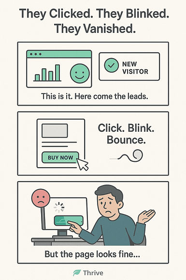
If you’ve ever found yourself refreshing your analytics and muttering “But the page looks fine?” – don’t give up yet.
Your landing page might look good. It might even match your brand guide to the letter.
But if it’s not clear, focused, and conversion-ready? You’re dressing up a mannequin and wondering why it’s not closing sales.
Here’s why this actually matters:
Landing pages typically bounce between 70% and 90% of the time. That’s most of your visitors leaving without doing a thing.
That’s a pretty steep number. But don’t focus on that.
You need to focus on making sure your page holds attention.
Missed Conversions Are Quietly Killing Your Results
It’s easy to blame yourself:
Maybe the offer isn’t good enough. Maybe people just don’t want this.
But chances are, it’s not your offer.
It’s your landing page quietly underperforming — and sabotaging your results in silence.
Here’s what that actually costs:
So yes — every missed conversion is more than just a bounce.
It’s a compounding leak in your funnel. A slow bleed you don’t see until the quarter ends and the numbers don’t add up.
“Every visit without a conversion is a tiny leak in your funnel. Let enough of them slip through, and you’re pouring water into a bucket with no bottom.”
This is why checklists matter.
Because when your page works, your entire business starts to move differently.
FAQs from People In Your Situation: Landing Page Checklist
(Real FAQs About Landing Page Checklists)
You’re not the only one searching for guidance before hitting “publish.” These are some of the most searched questions about building high-converting landing pages — and why a checklist is your best friend:
It’s your go-to tool for landing page optimization. A checklist acts like conversion-focused quality control — making sure your page is primed for action before you launch.
If you're wondering how to build a landing page that performs, start lean. A checklist with 10 to 15 key points covers the essentials. Then build it out as you scale and A/B test.
Every high-converting landing page needs:
- A clear, benefit-first headline and subheadline
- Strong call-to-action best practices
- Trust signals (like testimonials)
- Mobile responsive design
- Fast load speeds
- Conversion tracking tools
Use the checklist as a launchpad — then customize based on your funnel stage, audience, and whether it’s a lead generation page or sales funnel landing page. One size doesn’t always fit all, but skipping structure? That’s where most marketers trip.
🔧 Before You Dive In… Is Your Landing Page Tool Helping or Hurting?
You can absolutely follow this landing page checklist with whatever tool you’re using — and it’ll still help.
But I’d be lying if I said your tech stack doesn’t matter.
Because if building your page feels clunky or frustrating —
If you’re spending hours fixing padding, lining things up, or trying to make a mobile version not fall apart —
That’s not a you problem. That’s your builder holding you back.
What made the difference for me?
After trying too many “almost there” tools, I landed on Thrive Architect, which is part of Thrive Suite. And this is why I’ve been using it for the last few years:
And I’m not the only one who thinks these tools are great. Here are what a couple of Thrive customers have said over the years:
#Tk testimonial section
If you’ve got a tool that gives you that feeling? Amazing. Stick with it.
But if you’ve been wondering why building a high-converting landing page feels like pulling teeth… maybe it’s time to ask if your builder is part of the problem.
Deep Dive: Each Landing Page Checklist Item Explained
You’ve seen the full list — now let’s unpack it.
Because knowing what to include is a good start, but knowing why it matters (and how to do it well) is where the real conversions live. This is your conversion playbook — broken down step by step, with practical tips and examples for each.
In this section:
1. Clear Value Proposition
Your landing page has one job the second it loads: tell people what you offer and why it matters — instantly.
This is your value proposition, and it’s not just a catchy line. It’s the anchor of your entire page – and it starts from your hero section.
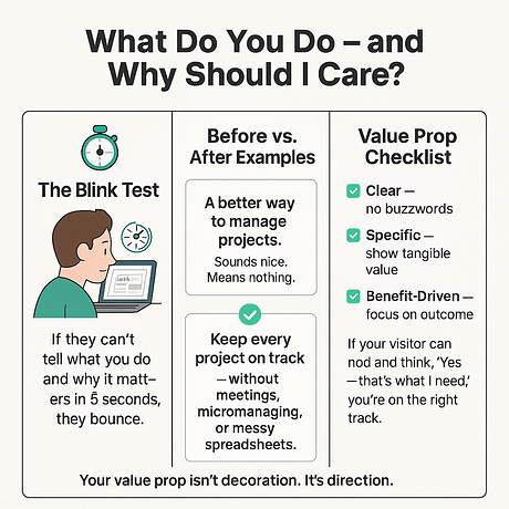
If it’s vague, clever-but-confusing, or buried under irrelevant copy? You're losing people before they even know what you do.
What makes a strong value prop:
So, ask yourself:
Quick example:
❌ “A better way to manage projects.” → Sounds nice. Means nothing.
✅ “Keep every project on track — without meetings, micromanaging, or messy spreadsheets.”
Your value proposition isn’t just the headline — but the headline and subheadline together usually do the heavy lifting.
💡 Thrive Tip: Try using Thrive Architect’s Hero Section templates to frame your value prop visually, with space for a bold headline, subhead, and button right up top.
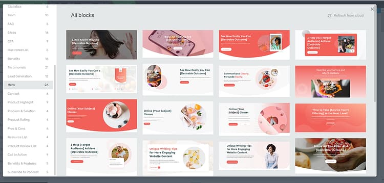
A sample of some of the hero section templates you find in Thrive Architect
And if you’re not sure your message is landing, revisit the fundamentals in our Landing Page Strategy guide — it’s packed with examples of how to make your promise clear and benefit-led.
2. One Page, One Goal, One CTA
This might be the golden rule of high-converting landing pages: keep it focused.
The moment you ask your visitor to choose between actions — “Sign up for this” or “Read this blog” or “Follow us here” — you’ve already lost momentum.
Landing pages are not homepages. They exist to drive one clear outcome, whether that’s getting a lead, booking a call, or selling a product.
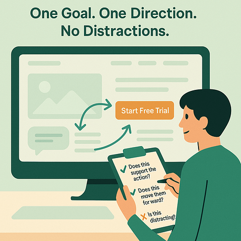
Here’s what that means in practice:
If your CTA is “Download the guide”, every piece of your page should support that action — not distract from it.
Quick examples of strong CTAs:
❌ “Submit” or “Click Here” — generic buttons kill momentum.
Need help refining your call to action?
If you’re not sure what your CTA should say — or where to place it for the most impact — check out our full guide:
📌 How to Create the Perfect CTA Section
It breaks down what makes a CTA convert, how to align it with your funnel goals, and how to test variations that actually move the needle.
If you want to refine how you word and position that action, our CTA click-through optimization guide and real-world CTA examples show what works best.
3–6. Messaging That Sells
It’s not just what you say — it’s how (and where) you say it. These four elements work together to shape your visitor’s first impression and build momentum toward action.

3. Headline = the hook
Your headline is your opening move. It should grab attention and deliver a clear benefit in 1–2 lines.
Example:
✅ “Lose the overwhelm. Plan your content in 15 minutes a week.”
Not just what — but why it matters.
If writing headlines feels like guesswork, use the principles in Copywriting Tips for Beginners to make your opening lines work harder.
4. Subheadline = the explainer
This is your supporting line. Use it to clarify your offer, introduce urgency, or highlight the key transformation.
Example:
🕒 “Join 10,000+ marketers using this system to stay weeks ahead — without burning out.”
5. Copy = specific, skim-friendly, benefit-led
Most visitors will not read every word — they skim. Your job is to lead their eye with short paragraphs, bullet points, bold phrases, and plenty of white space.
Tip: Lead with outcomes, not features.
❌ “Includes drag-and-drop blocks”
✅ “Build your launch page in under an hour — no tech headaches”
6. Hero Image or Video = trust + context
Visuals matter. Use an image or short video that shows success, builds connection, or explains what you do — fast.
Best Practices:
💡 Landing pages with videos can boost conversion rates by up to 86%. (source)
Thrive Tip: Thrive Architect’s image + testimonial blocks let you combine messaging + visuals seamlessly — no designer needed.
7. Create Urgency That Feels Real
People are wired to act when there’s a reason to do it now — not later. But here’s the catch: fake urgency backfires. Your job is to make it timely, not pushy.
✅ Use urgency tools that respect the user:
❌ Avoid:
🧠 Stat to know:
Urgency-based tactics can increase conversions by up to 332% — when used authentically.
Example:
“Bonus expires in 2 hours” hits harder when it’s tied to something real — like an onboarding call or free resource.
8. Use Social Proof to Build Trust Fast
People trust people — not brands. And when someone sees others validating your offer, it reduces hesitation and builds confidence.
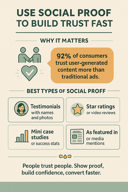
✅ Best forms of social proof:
Example:
Instead of “Our clients love us,” try:
“After switching to our tool, I doubled my signups in 3 weeks — and finally felt in control of my launch.” – Jasmine, Course Creator
Thrive Tip:
Use Thrive Ovation to collect, manage, and display testimonials dynamically — no copy-pasting required.
9. Mobile First, Always
Over half your traffic is coming from a phone — but too many landing pages are still desktop-first afterthoughts.
If your page doesn’t load fast, fit the screen, and make CTA buttons thumb-friendly, you’re bleeding conversions.

✅ What to check:
10. Short, Simple Forms (Win Most of the Time)
Forms are where conversions actually happen — so if yours is long, confusing, or looks like a tax return, people will bail.
Short forms lower friction and increase submissions. The fewer fields, the fewer excuses to bounce.
✅ Best practices:
Even small tweaks to your form can unlock serious gains — so keep it light, fast, and user-friendly.
👉 Not sure what to trim, test, or fix?
Check out our in-depth guide to form optimization tips — packed with examples, data-backed strategies, and a few quick wins that’ll help you turn more visitors into actual leads
11. Optimized Thank-You Page (Don’t Waste the Win)
The conversion doesn’t end with the form submission — it begins a new stage.
A good thank-you page:
Pro Tip: Need more guidance on how to create a thank-you page that seals the deal? Check out this guide.
12. Strip Out the Distractions
Menus. Social icons. Footer links. Exit routes.
For a typical website they’re essential, but these are the enemies of focused conversion.
A great landing page keeps the visitor’s attention locked on the action — no tabs to wander off to, no shiny objects to click.
✅ What to remove:
13. Directional Cues (Guide the Eye to the Goal)
Your layout should gently nudge people toward action. Think of it as silent choreography.
Strategic design choices — like arrows, imagery, contrast, or whitespace — help guide your visitor’s attention to what matters: your call-to-action.
🧠 Ideas to implement:
14. Track It or Trash It
If you’re not tracking, you’re guessing. And in conversion, guesses cost money.
Analytics tools help you understand what’s working — and what’s silently killing your performance.
🔍 Must-haves:
Thrive Tip:
Use Thrive Architect + MonsterInsights for no-code GA setup — track conversions right from your dashboard without developer stress.
Because if you don’t measure it, you can’t improve it.
15. The Blink Test (Can a Stranger “Get It” in 5 Seconds?)
If a visitor doesn’t understand what your page offers — and what they should do next — within 5 seconds, you’ve already lost them.
That first glance needs to communicate:
It’s not about squeezing in more info — it’s about clarity, hierarchy, and confidence.
📊 Stat: You have less than 8 seconds to capture a user’s attention before they leave. That’s shorter than the average goldfish.
Try this:
Ask a friend (or stranger) to look at your page for 5 seconds. Then close it and ask:
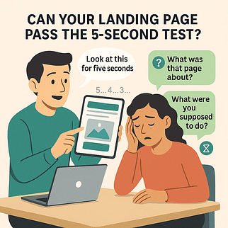
If they hesitate, your page needs work.
Want to Go Pro? Think Like a Conversion Scientist
Once your fundamentals are locked in, the next level is all about thinking strategically. High-converting landing pages aren’t just built, they’re engineered.
Here’s how to go beyond the basics:
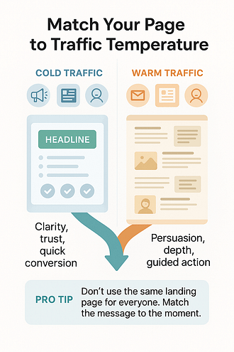
Match Your Page to Traffic Temperature
Cold traffic from paid ads or social media needs fast clarity and trust.
Warm traffic from your email list or content? You’ve earned some wiggle room — go deeper with detail and persuasive CTAs.
👉 Pro tip: Don’t use the same landing page for everyone. Your conversion strategy should match where people are in the funnel.
Use Micro-Conversions to Guide Design
Clicks on buttons, scroll depth, form interactions — these are signals.
Track them. Learn from them. Then shift your layout to nudge users forward.
Personalize Key Blocks
Smart marketers swap headlines, testimonials, and offers using tools like Thrive Architect’s dynamic content options.
Example: Show different testimonials based on the traffic source or campaign they came from.
Integrate Post-Conversion Nurturing
Don’t stop at the “thank you” page.
Sync your CRM or email tool to trigger:
This is where real ROI lives — nurturing that first yes into repeat trust and long-term value.
Print the Checklist. Apply the Checklist. Build the Page That Converts.
The good thing here is — you’re not starting from zero.
You’ve already got the offer. The traffic. The drive to make it work.
What you need now is a landing page that pulls its weight — one that loads fast, speaks clearly, earns trust, and guides action without friction or fluff.
You have everything you need.
And this checklist? It’ll help you get across the finish line — with fewer guesses, cleaner builds, and more consistent wins.
So print it. Bookmark it. Build with it.
Because solid conversion results don’t come from magic — they come from having a method that works.
Ready to Build Your Landing Page — the Right Way?
If building your landing page feels harder than it should… it probably is.
Your tools shouldn’t fight you every step of the way — they should speed you up.
That’s why I use Thrive Architect. It’s a landing page builder made for marketers who want to move fast, stay flexible, and launch with confidence. Paired with the rest of Thrive Suite, it gives you everything in one place:
Start fast. Edit live. Launch pages that convert — without the tech drama.
👉 See Thrive Architect in action — and get your next page live in less time, with more results.


