Trying to figure out how to create a multiple offer homepage that does convert?
You've come to the right guide 🙂
If you're like most businesses, you've probably heard you should focus on one offer per page. But what happens when you've got a suite of services, different customer types, or multiple product lines that all need a spot on your homepage?
Maybe you're a consultant offering both coaching and courses, or a software company with solutions for different industries.
The good news? You can use your homepage to promote several offers without compromising on design or conversion focus.
In this tutorial, I'll show you exactly how to build a homepage that guides different audience segments to the right solutions – all while maintaining the focus and conversion power of your digital marketing efforts.
Multiple Offers…One Homepage. What Do You Do?
It’s a tricky one to figure out.
You have several great offers you want to show the new visitors you’ve reached through social media, Facebook Ads, Google Ads, etc. … and only one homepage. Do you follow other landing page examples and only display one offer?
What happens to the rest?
Or, do you try to show all of them? Knowing full well that you might overwhelm your visitors and miss out on a few sales?
Truthfully speaking: there isn’t a “right” and “wrong” answer here. If you have multiple best-selling offers and want to present them to your audience on one page, this could work out in your favor and get more people buying.
But, you need to do it correctly. That’s where this collection of tips comes in.
Tips for Displaying Several Offers On Your Main Landing Page
These tips apply to all offers — lead-generation (to get your visitors’ contact information), eCommerce, SaaS, etc.
So read through and find the best tips to use for your own landing pages.
1. Narrow Down Your Offers
Having too many offers on your homepage can be overwhelming for visitors, which can cause them to bounce without taking any action.
Ideally, you should focus on one primary offer – your star product or service. But if you have multiple best-sellers – which is a good problem to have – limit them to 3-5 on your homepage.
When displaying multiple offers, establish a clear visual hierarchy.
Start with your star value proposition above the fold, then spread the rest throughout the page strategically.
This draws the eye to your main offer first while still allowing visitors to discover your other products or services.

2. Offer Sneak Previews of Each Offer
Don't go into excruciating detail about each offer on your homepage.
Instead, use it to provide a compelling summary that piques interest. Include key benefits and persuasive social proof, like testimonials or impressive statistics, to highlight the value. Pair this with a clear call-to-action button that leads to a dedicated landing page.
This strategy builds interest without overwhelming your audience. Visitors receive just enough information to decide if the offer is relevant to them. If interested, they can click through to learn more on a distraction-free landing page designed to seal the deal.
3. Use Clear, Benefit-Driven Labels
With limited real estate, every heading and label on your homepage needs to be clear, concise, and benefit-driven.
Try not to use jargon or complicated language that requires visitors to decipher what you're offering.
And, make sure each offer label instantly communicates the end benefit it provides and who it's for.
This allows the right visitors to self-identify with ease. An example of a clearly, benefit-driven headline for an offer would be: "The Solopreneur's Guide to Hacking Email Marketing Campaigns & Landing More Sales."
4. Set Up a Smart Navigation System
Scrolling endlessly through offer after offer can quickly lead to visitor fatigue and a loss of interest. It’s a common pitfall that can dilute the impact of your homepage.

Instead, create a smart navigation system that directs visitors straight to the categories they’re interested in.
You can use elements like jumplinks at the top of the page, a mega-menu, or a neatly categorized list of your products and services to get the job done.
With these tools in place, visitors can effortlessly find the offers that resonate with their specific needs, bypassing the ones that don’t matter to them.
This strategic setup helps your visitors spend their time wisely on your site, engaging only with content that interests them and moves them along in the buyer’s journey – getting you much closer to a higher conversion rate.
5. Use a Quiz to Point The Right Offer to a Potential Customer
Even with the clearest labels and intuitive navigation, some visitors may still find it hard to identify which offer best fits what they’re looking for.
This is where a marketing quiz can make a big difference.
A well-designed quiz asks key questions upfront to segment visitors, then automatically routes them to the offer most relevant to their responses.
It's a simple, clever way to personalize the user experience and make sure everyone sees exactly what they need.
These relevant recommendations cut out the noise and increase the chances of landing more conversions.
Thrive Quiz Builder is an excellent choice for creating online quizzes that not only engage your audience but also help with lead generation.
With this plugin, you can easily create engaging online quizzes using a user-friendly, drag-and-drop interface, no coding or design skills required.
It's ideal for lead generation and segmentation, allowing you to integrate quizzes with email services like ConvertKit and segment your leads based on their responses.
6. Design a Clear, Attention-Grabbing Page Design with the Right Tool
Your page’s success heavily depends on its layout and aesthetic appearance.
If your homepage is clunky, hard to decipher, and features low-res images… you can kiss a lot of conversions goodbye.
You need to create pages that are organized and visually appealing, so your audience remains engaged. To do this, you’ve got to use the right tools to build these pages.
A standard WordPress theme, with limited customization options, is not going to help you here. For premium results that lead to high conversion rates – you’ll need a landing page builder.
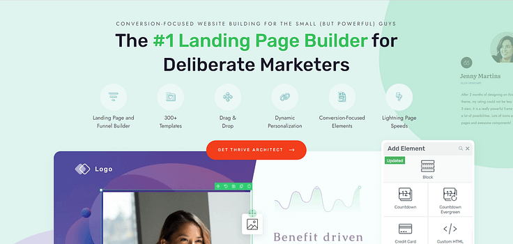
And our top recommendation is Thrive Architect – the page-building plugin for marketers & entrepreneurs who want to build stunning, SEO-friendly webpages quickly – and land steady conversions.
With Thrive Architect's intuitive drag-and-drop editor and library of pre-built templates and elements optimized for conversions, you can create a great landing page that grabs attention and guides visitors effortlessly to your top offers.
7. Limit Homepage Offers to Your Biggest Draws
Even if you have an extensive range of products, don't try to promote everything on your homepage.
This quickly leads to clutter and confusion. Instead, limit your homepage real estate to your biggest draws – your highest-value offers, best-sellers, or lead generators.
Highlight these top performers front and center, as they'll appeal to the largest segment of your target audience.
Then, incorporate down-sell offers into your sales funnels to catch any potential customers who may not be ready for your premium products yet.
8. Provide Clear Next Steps
Each content section promoting an offer should have a clear, prominent call-to-action telling the visitor what to do next if they're interested.

This could be CTA buttons like "Learn More" or "Get Started" that lead to dedicated landing pages.
But don't stop there.
Also include some brief text reinforcing the CTA and setting expectations, like "Click here to see course curriculum and enroll" or "Click to book your free consultation call."
9. Consider Using an Offers Carousel
If you want to highlight more than 3-5 main offers on your homepage, why not try an offers carousel?
It’s a creative and efficient way to spotlight several products or services — and their use cases — without taking up too much room. Visitors can simply scroll horizontally to see each one, making it super user-friendly and a tidy solution for compact spaces.
And if your visitors want to dive deeper, follow up with a link to a dedicated offers page? This way, they can check out your full array of offerings at their leisure.
10. Tell a Cohesive Brand Story
As you arrange your offers into separate sections, make sure your overall homepage design tells a cohesive brand story that ties everything together.
Thrive Architect can help you do this easily.

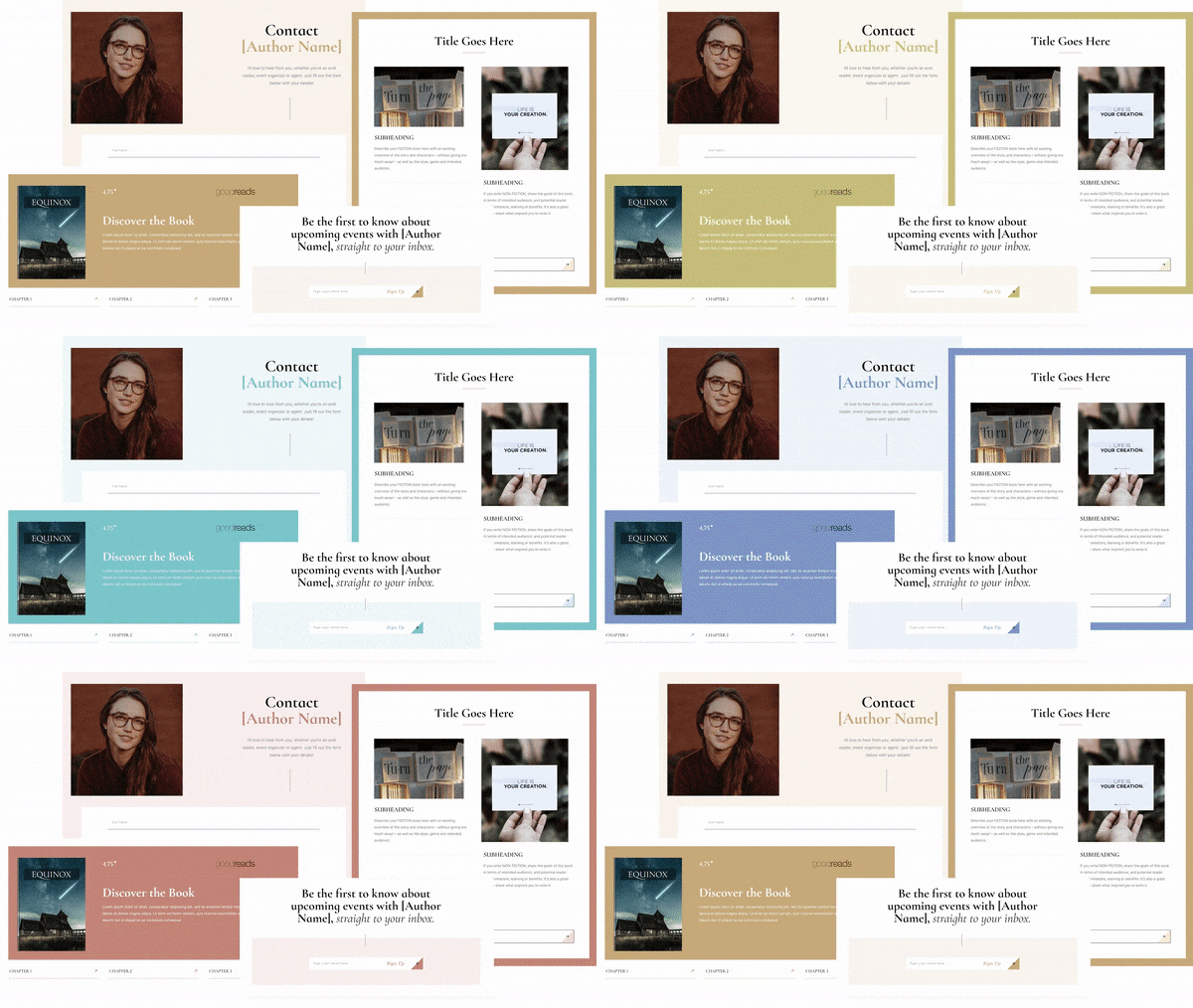
With Smart Color Technology, you can change the color of your theme with one click.
Use the same fonts, color schemes, graphic styles, and other branding elements throughout your page. Thrive Architect offers easy-to-use design tools that let you apply these elements consistently across your homepage with just a few clicks. For example, you can set global styles for fonts and colors so every section matches up automatically, keeping your brand's look and feel aligned.
This consistent styling strengthens your brand identity and reminds visitors of who you are as they check out your different offers. It also creates a professional and polished look that builds trust and credibility.
11. Test and Optimize Constantly
No matter how you choose to display your offers, it's important to see this as an ongoing project, not a set-it-and-forget-it task. Start by using tools that can help you understand how visitors interact with your page.
First, you’ll need an analytics plugin to track your site’s performance and understand how your audience is interacting with your web content.
This real-time feedback is helps pinpoint exactly what's working and what needs improvement.
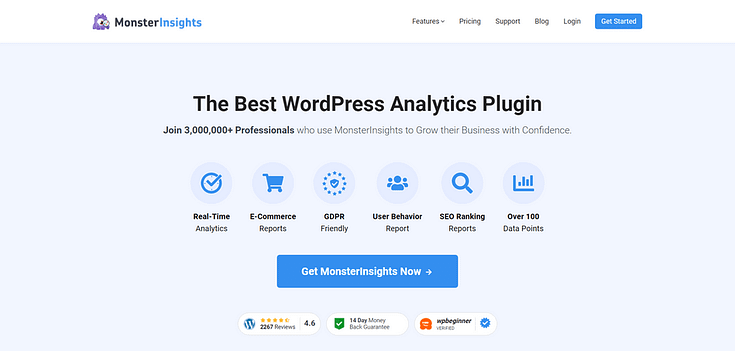
Our top recommendation for WordPress site owners is MonsterInsights. This plugin turns tricky Google Analytics reports into easy-to-understand data you can take and use in your business.
In terms of page optimization, you should A/B test your pages, too.
Simply put, A/B testing is experimenting with small changes on a landing page (and 2 or more variants of the same page) and comparing results.
You could adjust the order of offers, tweak headlines, switch out images, change the copywriting, add an FAQ section, throw in a pricing table, or try different calls-to-action.
Keep an eye on the results of these tests to find the variation that resonates more with your audience and leads to more conversions.
Next Steps: Design a Landing Page for Each of Your Star Offers
After you’ve figured out how to position your offers on your homepage, the next step is to create dedicated, high-converting landing pages for each one.
These pages allow you to go in-depth on all the benefits, features, testimonials and other persuasive elements needed to close the sale.
We’ve got four tutorials for you, right here, you can use to create pages that lead to conversions:
Ready to Create Your Own Landing Page for Multiple Offers?
With these tips, you can easily map out a straightforward strategy for marketing your multiple offers.
Though we do recommend sticking to one offer where possible, if you absolutely can't and need to display several of your best-selling products or services go right ahead.
And if you're looking for the best page builder to get the job done...


