TL;DR: A/B Testing Opt-In Forms in a Nutshell
If you only take one thing from this guide, let it be this: guessing gets you nowhere, but testing gets you conversions. Here’s the fast version — skim it now, then keep scrolling for the full playbook.
- Conversions don’t improve by chance. They improve by testing. Even one change (a headline, a CTA, a trigger) can make or break your results.
- Run smart tests, not random ones. Stick to one variable at a time, give the test enough traffic to reach significance, and check guardrails like bounce rate and page speed.
- The biggest levers: headline, offer, form type, CTA, form fields, design, and trigger timing. These are where real gains happen.
- Thrive Leads makes it easy. Duplicate forms, split traffic, view clean reports, and even let the tool auto-pick a winner. No spreadsheets, no extra plugins.
- Every result counts. Winners show you what works. Losers and inconclusive tests still save you from rolling out bad ideas.
👉 This is the quick hit. But the why, the how, and the creative test ideas your competitors aren’t running? That’s all below. Keep scrolling — your next conversion lift is in here.
When was the last time you asked yourself if your opt-in form is actually pulling its weight?
I’m not talking about whether it looks nice or matches your brand colors. I mean — is it converting? Is it turning the attention you fought for into subscribers who move deeper into your funnel?
I had to learn this the hard way. My first “big” form pulled in ten signups from two thousand visits. Ten. That wasn’t a victory — it was a red flag. Because the truth is, an opt-in form isn’t a box you tick once. It’s a living experiment.
And that’s where A/B testing comes in. Not random tweaks, not myths about magic button colors, but real experiments that show you what your audience responds to — so you can stop guessing and start compounding wins.
In this guide, I’ll walk you through how to run A/B tests that actually matter: what to test, how to test it, how to know when you’ve found a winner — and how to do it all inside Thrive Leads, without juggling extra tools. By the end, you won’t just have “a form.” You’ll have a system for growing your list on purpose.
If you haven’t built your first form yet, start with our guide on how to create an opt-in form. Once your form is live, come back here to learn how to test it for maximum conversions.
Solution: The 10 Questions Every Marketer Asks About A/B Testing Opt-In Forms
Before we get tactical, let’s start with the questions every marketer secretly Googles when they’re trying to figure out A/B testing. These are the “I don’t want to waste six weeks on the wrong test” questions. The ones you wish someone would just answer straight, without burying you in jargon or hypotheticals.
So let’s cut through the noise. Here are the ten most common (and most important) questions about A/B testing opt-in forms — answered clearly, from a conversion-first perspective.
I never trust a test that runs for just a couple of days. At minimum, you need at least one full business cycle (a week), ideally two, so you catch weekday and weekend behavior.
The smarter move is to pre-calculate your sample size and stick to it — Thrive Leads makes this easy by showing you when significance is reached. Stopping early is the fastest way to celebrate a “winner” that isn’t real.
If you test three things at once, you’ll never know which one drove the result. That’s not testing — that’s chaos.
Start with one variable per test: headline vs. headline, CTA vs. CTA. If you want to compare multiple elements together, that’s multivariate testing, and it demands way more traffic than most blogs get. Stick to single-variable A/B tests until your traffic volume justifies otherwise.
There’s no magic number — it depends on your baseline conversion rate and the size of change you want to detect. On a low-traffic blog, you’ll need bigger, bolder tests to see results within weeks, not months.
Think removing half your form fields, rewriting your headline completely, or testing a totally new lead magnet. If you try to measure small tweaks with 200 visitors, you’re setting yourself up for inconclusive data.
Your north star metric is form submission rate — it’s the cleanest measure of conversions. That said, don’t ignore downstream quality. If your “winning” variation fills your list with freebie-chasers who never open another email, you didn’t actually win. Keep form submissions as your primary metric, but check lead quality over the next few weeks to confirm the impact.
Start with the copy and CTA. That’s where the biggest conversion jumps usually come from, because words directly communicate value. Once you have a strong, compelling offer, then experiment with form length to balance conversion volume against lead quality. The mistake is testing form length on a weak offer — the result tells you nothing useful.
It’s always about contrast, not the specific color. A blue button can outperform red if the rest of your design is red, because it stands out. On mobile, contrast is even more important since you have seconds before someone swipes you away. Don’t obsess over color theory — just make your CTA impossible to miss.
Define your guardrail metrics before you test. For a homepage lightbox, I always watch bounce rate and page load time alongside signups. If conversions go up but bounce rate doubles, that’s not a win. Thrive Leads makes it easy to test responsibly because you can track impact beyond just form submissions.
Treat each offer as its own variation and split traffic evenly. Just don’t change the surrounding page or promotion at the same time, or you won’t know if the shift came from the form or the context. Keep everything else stable so the result reflects the offer itself. That’s how you avoid skewed analytics and learn what your audience truly values.
Run one trigger type against another, but don’t overlap them on the same article — that muddies the data. I usually test a 30-second delay against a 50% scroll trigger to see which respects attention while still converting. The “right” answer depends on how people engage with your content, which is exactly why testing beats guessing.
I’m biased, but honest: Thrive Leads is the best WordPress-native option. You can launch A/B tests directly from the dashboard, split traffic automatically, and see statistical significance without spreadsheets or calculators. No third-party integrations, no duct tape setups — just clean tests that help you optimize faster.
This Is Why Most Opt-In Form Testing Fails
Most marketers don’t fail because they’re lazy. They fail because they’re guessing.
I see it all the time:
The result is predictable — hours spent setting up “tests” that never deliver useful insights, or worse, lead you in the wrong direction. You think you’re optimizing, but really you’re spinning your wheels.
Without a strategy, A/B testing becomes expensive guesswork. Time gets wasted, ad budgets get burned, and those “conversion lifts” vanish the second you try to replicate them.
And that’s the real danger: not just running bad tests, but believing in them.
This is the cost of not A/B testing
Testing without strategy is more than just a waste of time — it’s a trap.
Think about it:
- Ad dollars vanish sending traffic to forms that quietly bleed opportunity.
- You celebrate a “win” in your dashboard, only to watch it collapse when you re-test under real conditions.
- Week after week, your numbers stay flat, no matter how many tweaks you make.
It’s exhausting. It feels like shouting into a megaphone in an empty room — all that effort, zero response. And the worst part? Believing those false positives and building your funnel on data that never deserved your trust in the first place.
That’s why this isn’t optional. If you want forms that consistently pull people in, the only way forward is to be conversion-obsessed and test with purpose. Not hunches, not myths — real experiments that give you proof, not guesses.
The A/B Testing Framework: How to Test Like a Pro
A/B testing works best when you treat it like a process, not a guessing game. Once you follow the discipline, the results stop being random and start being reliable.
Here’s the structure I use:
Step 1 — Start with Research
Begin with data, not hunches. Look at the opt-in forms or pages with strong traffic but weak conversion rates. That’s where the highest-impact opportunities live.
Still at the stage of designing your control? Make sure your baseline follows best practices — we cover them in detail in how to create an opt-in form
Step 2 — Build a Real Hypothesis
A clear hypothesis connects observation, cause, and prediction. For example: “Our webinar form converts at 2%. Session recordings show users hesitating at the phone number field. If we remove that field, submissions should rise by at least 20%.”
Step 3 — Create a Variation
Change one thing at a time. Headline vs. headline. CTA vs. CTA. A focused test gives you a clean answer.
Step 4 — Set Up the Test
Inside Thrive Leads, duplicate the form, make your edit, and let the tool split traffic evenly. Randomization and traffic distribution are handled for you.
Step 5 — Let It Run
Commit to patience. Define your sample size up front and run the test for at least a full business cycle. Data gathered too quickly tells half the story.
Step 6 — Analyze with Confidence
Check significance levels. A 95% confidence threshold ensures you’re looking at real impact rather than noise. If the result is inconclusive, that’s a learning — not a loss.
Step 7 — Implement or Iterate
Deploy the winning version, or log the outcome and move to the next idea. Every test adds a layer of insight that sharpens the next one.
Pro Tip: Document your hypotheses, results, and learnings. Over time,
What to Test: 7 High-Impact Variables for Opt-In Forms
When you’re testing, not every element is worth your time. These seven variables consistently move the needle. Think of them as your high-leverage levers — the places where a small change can create a noticeable lift in conversions.
1. Headlines
Your headline carries the heaviest weight. It’s the first thing visitors read and often the only thing they remember.
- Example 1: “Download Your Free Checklist” (clear benefit) vs. “Are You Making These 7 Mistakes?” (curiosity-driven).
- Example 2: A short, punchy hook (“Grow Faster”) vs. a detailed promise (“Get Weekly Marketing Tips Used by 50,000+ Pros”).
- Example 3: Statement vs. question framing.
Pro Tip: Lead with clarity. Clever headlines may impress you, but clarity convinces your reader.
2. Offers
The offer behind your form determines perceived value. If the offer falls flat, no headline will save it.
- Example 1: Ebook vs. checklist on the same topic.
- Example 2: Short video training vs. PDF guide.
- Example 3: Discount code vs. free resource.
Watch-Out: Don’t just test the format — test the angle. A checklist that solves a micro-problem can often outperform a big ebook that feels overwhelming.
3. Form Types
How the form appears shapes how people engage with it. Context matters as much as design.
- Example 1: Lightbox popup vs. slide-in banner.
- Example 2: Sticky ribbon at the top vs. inline form in the middle of content.
- Example 3: Multi-step popup vs. single-step form.
Pro Tip: Aggressive doesn’t always mean effective. A form that interrupts at the wrong time can spike bounce rates even if conversions rise short-term.
4. Call-to-Action (CTA)
The CTA is the tipping point — the moment someone decides yes or no.
- Example 1: “Submit” vs. “Get My Free Guide.”
- Example 2: “Sign Me Up” vs. “Show Me How to Double My Leads.”
- Example 3: Large button vs. smaller, subtle style.
Pro Tip: Write your CTA so it completes the sentence, “I want to…”. That simple shift flips the copy into your visitor’s voice.
5. Form Fields
Every field adds friction. The question is: does the extra information pay off?
- Example 1: Email-only vs. name + email.
- Example 2: Full company details vs. one simple field.
- Example 3: Multi-step form (breaking fields into pages) vs. one long form.
Watch-Out: More fields can filter for quality, but they will lower total signups. Align the choice with your business goal: volume vs. qualification.
6. Images & Design
Visuals guide attention. The wrong choice can distract, the right choice can reassure.
- Example 1: Ebook mockup vs. simple icon.
- Example 2: Person’s face vs. product screenshot.
- Example 3: Image vs. no image (clean, minimalist design).
Pro Tip: Focus on hierarchy. Make sure the eye naturally lands on headline → benefit → CTA. If your image steals the spotlight, it’s costing you conversions.
7. Triggers
Timing can make or break your form’s performance. Trigger tests often deliver surprisingly large swings.
- Example 1: Exit-intent popup vs. time-delay (e.g., 30 seconds).
- Example 2: Scroll-based trigger at 50% vs. 80% of article read.
- Example 3: Immediate load vs. two-click activation.
Watch-Out: Always balance visibility with respect for user experience. A form that shows too soon can repel visitors before they’ve engaged with your content.
If you’re not sure your starting form is strong enough to test, revisit the fundamentals with our step-by-step tutorial on how to create an opt-in form. A strong baseline makes every test more meaningful.
How to Set Up an A/B Test in Thrive Leads (Step-by-Step)
Spinning up a test doesn’t have to be complicated. Thrive Leads bakes A/B testing right into the workflow, so you can go from “idea” to “running experiment” in minutes — no third-party tools, no messy spreadsheets.
Here’s exactly how to do it:
Step 1 — Open Your Thrive Leads Dashboard
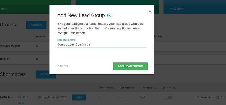
Head to Thrive Dashboard → Thrive Leads. Decide which Lead Group you want to optimize (popups, ribbons, slide-ins, inline forms all live here).

💡 Pro tip: Start with a form that already gets steady traffic but underperforms on conversions — that’s where you’ll see the biggest lift.
Step 2 — Create a Variation
Choose your current form (your control) and duplicate it to create a variation. Rename clearly: “Control – Current Headline” vs. “Variation – New Benefit Headline.”

Inside the editor, make one focused change: headline, CTA, image, trigger, or fields. This keeps your data clean and your results trustworthy.
Step 3 — Set Up the A/B Test
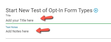
Back in your Lead Group, select both versions and click Start A/B Test. Give it a name (“CTA Test – October”), jot a quick hypothesis, and let Thrive Leads split traffic evenly (50/50).

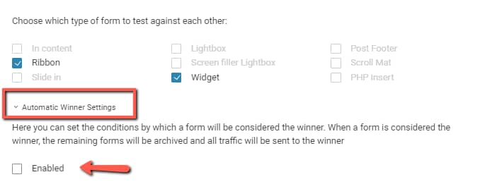
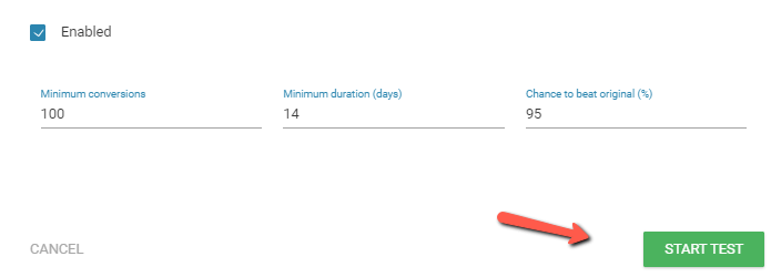
Want Thrive to pick the winner automatically? Turn on Automatic Winner Settings and define:

Step 4 — Launch and Let It Run
Hit Start Test. You’ll see the test appear under your Lead Group marked In Progress.

Now comes the hard part: waiting. Resist the urge to peek early — give your test at least one full business cycle (7–14 days depending on traffic).
Step 5 — Track Results in Reports
Click View Test to see live stats:
The visual chart makes it easy to spot trends at a glance.
💡 Guardrail check: While watching conversion rates, also keep an eye on bounce rate and page performance in your analytics. A spike in signups that drags down engagement isn’t a true win.
Step 6 — Stop the Test and Choose a Winner
When the data is clear:
That’s it — your winning form now becomes the default, and you can line up your next test.
Why Thrive Leads Makes Testing Simple
Most marketers never test because setup feels like a hassle. Thrive Leads kills that excuse: everything you need — cloning, traffic split, auto-winner rules, reporting — lives inside one dashboard. No integrations, no coding, no extra cost.
👉 Try it now: duplicate your highest-traffic form, change just one element, and launch your first A/B test today. You’ll learn more in one week of testing than in a year of guessing.
Analyzing Results: How to Pick an A/B Testing Winner
When your test finishes running, the question is simple: which version deserves to stay live? Thrive Leads gives you the numbers, but here’s how to read them without second-guessing yourself.
1. Trust the math. A 95% confidence level is the gold standard. All it means is that the result is highly unlikely to be random. Think of it as: if you ran this test 20 times, you’d expect the same winner at least 19 times. If you’re below that threshold, call it inconclusive and move on.
2. Check your guardrails. A “winner” on conversion rate that also spikes bounce rate or slows page speed is not a true win. Before you roll out the variation sitewide, ask: did this form make the overall experience better or worse, especially for mobile users?
3. Redefine losses. A variation that tanks is still a success — it just saved you from rolling out a bad idea. And when results are too close to call, that’s data too: the change wasn’t meaningful enough. Either way, you’re narrowing the path toward what does convert.
Inside Thrive Leads, the reporting panel makes this easy. You’ll see impressions, conversions, and conversion rates charted side by side. If you enabled Automatic Winner Settings, the tool will stop the test and crown a winner once your thresholds are met. No spreadsheets, no guesswork.
Bottom line: pick your winner when the data is clear, check for side effects before hitting publish, and treat every test — even the “losers” — as a step forward. That’s how you stack small, reliable lifts into a serious conversion advantage.
3 Out-of-the-Box Testing Ideas to Try Next
Once you’ve nailed the fundamentals, it’s time to get a little bold. These aren’t the usual “change your button color” tests — they’re creative twists that can unlock insights your competitors probably aren’t even looking for. And with Thrive Leads, you can spin up these experiments quickly without needing a developer or extra tools.
1. Segment CTAs by Device Your desktop visitor and your mobile scroller are not in the same headspace. Why not test CTAs tailored to each?
💡 Pro tip: Thrive Leads lets you duplicate a form and assign it only to mobile traffic, so you can compare apples to apples.
2. Urgency vs. Evergreen Offers Some people respond to FOMO. Others tune out when they see a countdown timer. Test it.
Both approaches work, but for different audiences. The test tells you which style resonates more with your subscribers.
3. Tone of Voice Experiments Copy isn’t just what you say — it’s how you say it.
Tone can shift conversions more than design tweaks, and it reveals how your audience wants to be spoken to.
💡 Watch-out: keep everything else identical so tone is the only variable you’re measuring.
✅ The point: A/B testing doesn’t have to be boring. With Thrive Leads, you can get creative without breaking the process. The tool handles the heavy lifting — duplication, traffic splitting, reporting — so you can focus on ideas that separate you from the pack.
Conclusion: Stop Guessing, Start Testing
Getting a form live is step one. Turning it into a conversion machine comes from testing with intent. You’ve seen the framework, the high-impact variables, and even a few creative twists to keep things fun.
The takeaway? Don’t waste another month guessing. Every test — win, loss, or tie — sharpens your understanding of your audience. The more you stack those learnings, the more unstoppable your list growth becomes.
And you don’t need clunky third-party tools to make it happen. Thrive Leads puts everything under one roof:
So here’s your next move: pick the form on your site that gets the most traffic, create one small variation, and start your first A/B test in Thrive Leads today. In a week, you’ll know more about your audience than you did all year.
👉 Because in a conversion-obsessed world, the marketers who test are the ones who win.
New to forms? Pair this guide with how to create an opt-in form so you’re building and testing on solid ground.


