You know that feeling when someone gives you the tiniest bit of information, and suddenly everything makes so much sense?
For example, how do you usually crack your eggs? Many people have a habit of cracking their eggs on the rim of a mixing bowl, which produces small eggshell fragments that fall into your food.
Blech.
But, if you crack an egg on a flat surface such as a countertop, the shell cracks cleanly and without any fine particles. No more egg shell bits in your food!
Yes! Where has this tip been all my life?
The same thing can be said for the Outside-In Principle. You could get by without it... but once you know how to use it, you’ll never build websites the same way again!
More...
In previous articles, we explored how to use the Outside-In Principle to customize your website's fonts and colors; today we'll be looking at how to apply it for customizing on-page elements:
- Styling All Headings and Paragraphs on Pages or Posts that Use a Theme Template
- Styling All Headings and Paragraphs on a Standalone Page
- Styling All Text Elements within a Container
- Aligning All Elements within a Container
- Using Content Boxes to Style Groups of Elements
- Styling for Mobile Devices
A Quick Review
One of the key things to remember as you customize your website is that every published page or post on your website either:
- Uses a theme template
- Does not use a theme template (these pages are called standalone or landing pages)
Pages and Posts that Use a Theme Template
Theme templates are used when you want a group of pages or posts to display the same overall structure. For example, if you want your About and Contact pages to have the same header and footer, you would set up those areas using a theme template.
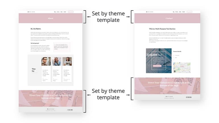
An About page and a Contact page that use the same theme template.
When you see a page or post that uses a template published on a website, what you're seeing is actually coming from two different sources:
- The theme template is responsible for the header, top section, sidebar, bottom section, and footer.
- Individual post and page entries are responsible for the content, or the “meat” of the page.
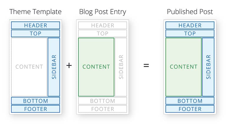
Diagram showing the parts of a published post.
So, it's important to remember that for pages and posts that use a theme template:
- Start by customizing the theme template. When working on a theme template, focus on customizing the header, top section, sidebar, footer, and bottom section. You can access theme templates from the Templates tab inside of Thrive Theme Builder.
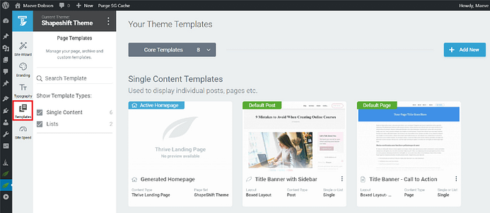
Thrive Theme Builder with the Template tab open.
- The content of the post or page can be customized separately. Fonts and colors are generally inherited from the theme and theme template levels, but customizations made to sections within the content can override the larger container levels. Individual posts and pages are accessible from the Posts and Pages tabs, respectively, inside of WordPress.
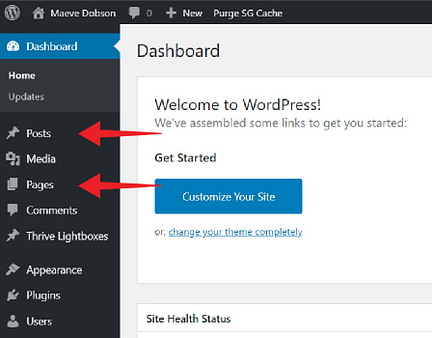
The Posts and Pages tabs in WordPress.
Standalone Pages
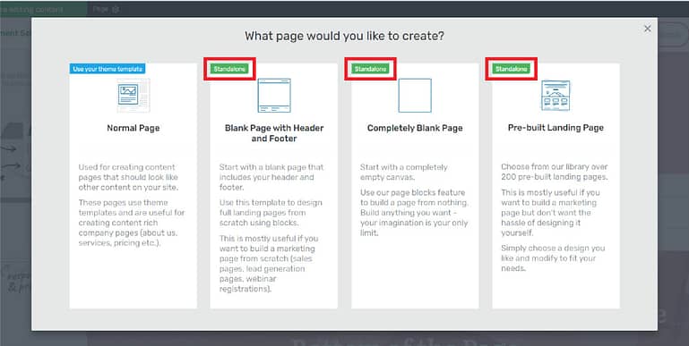
The prompt that appears when creating a new page using Thrive Architect. The Standalone page options are highlighted.
Generally speaking, standalone pages are useful when you want to create a page that is either structurally or stylistically different from the rest of your website.
For example, you might use a standalone page for a sales page, or a lead generation landing page (to help grow your email list). With these types of pages, you might want to omit your normal header, or use a specific set of attention-grabbing colors — so a standalone page is ideal.
For more in-depth information about the difference between standalone pages versus pages and posts that use theme templates, check out our previous article on how to set up fonts using the Outside-In Principle.
The Outside-In Principle
The Outside-In Principle states:
When applying the same styling to multiple elements, apply the styling to the parent container of those elements, starting from the biggest container working your way inwards to the smallest container.
In general, smaller containers override larger containers.
In previous articles regarding fonts and colors, we've explored how containers work in Thrive Theme Builder — in particular how the container structures differ for pages/posts that use a theme template, and standalone pages. To refresh your memory, here is the container structure for pages/posts that use a theme template.
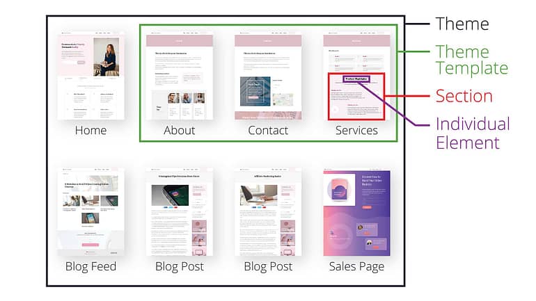
And here is the container structure for standalone pages.
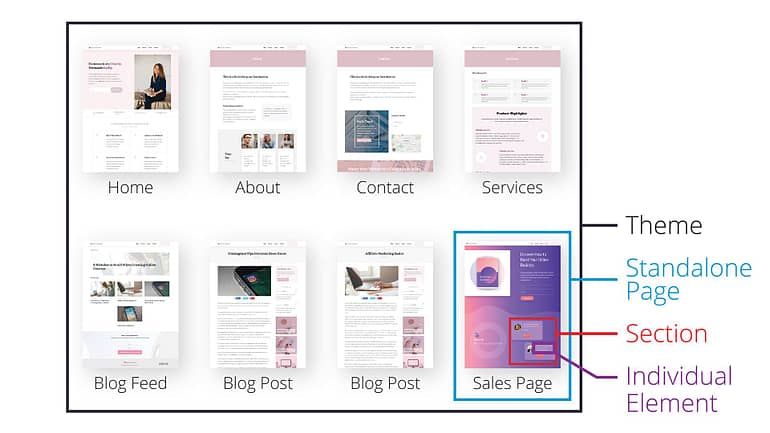
In this article, we'll be talking about how to use the Outside-In Principle with on-page elements. More specifically, we'll be talking about the practical applications of the Outside-In Principle after you've set up your theme fonts and colors, and you’re in the process of doing things like writing blog posts, and building sales pages.
1. How to Style Headings and Paragraphs on Pages or Posts that Use a Theme Template
Before we delve into customizing fonts for smaller containers on a page, it’s important to understand where the default fonts for the page as a whole come from.
Let’s briefly review how to specify fonts for all headings and paragraphs on pages or posts that use a theme template. For a more in-depth explanation, check out The Outside-In Principle: Time Saving Tips for Setting Up Headings and Fonts.
Pages and posts that use a theme template will inherit the typography that was set in the Typography tab in Thrive Theme Builder.
Thrive Theme Builder with the Typography tab open.
As you customize a theme template or post/page content, you can assign headings to text elements using the text element floating bar dropdown menu.
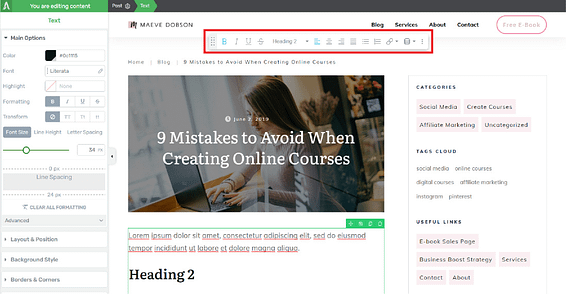
The Thrive visual editor with the text element floating bar highlighted.
If you would like to change one of your theme's default heading styles, you may do so by styling a specific text element to your new specifications, then use the floating bar dropdown menu to update the default heading. Note that this will update all text elements across your site that use this particular heading.

Using the floating bar dropdown to update a default heading.
Custom Styling for Headings and Paragraphs within the Content Section
If you would like to create new headings or paragraph styles just for use within the content section of a page or post, you can create custom styles using the text element floating bar dropdown.
Custom styles are available site-wide, however, you can help describe the use of a particular style for a particular page or post by naming the style accordingly. In the example below, we’ll create a new custom H2 heading.
Start by assigning a text element as the default H2 heading (this sets up the right heading tag), and then style the heading to your liking. Next, navigate to the text element floating bar dropdown, and click the “Custom” tab. Enter a style name, and click “Save”.

Saving a custom style.
You’ll see that a new style has been added to the custom style list. You can then assign this style to other text elements.
When a Standalone Page Becomes Necessary
Now, here's a scenario that you might run into: What if you want to edit the styles of all headings and paragraph text for the entire page or post — but only that one page — including sections that are governed by the theme template?
Remember, theme templates are meant to provide a consistent structure for specific groups of pages. For example, if you want all of your blog posts to display the header and top section in the same way, a theme template will provide that consistency. A change made to the theme template will reflect on all posts or pages that use that specific theme template.
But in this case, because you want to change the styling of elements on just a single page , we recommend using a standalone page instead of modifying any theme page template settings. Alternatively, if you plan on using the new styling on multiple pages or posts, you can simply create a new theme template inside the Thrive Theme Builder dashboard.
2. How to Style All of the Heading and Paragraphs on a Standalone Page
Standalone pages have their own typography styling separate from the rest of your theme templates, posts, and pages on your site. To change the heading and paragraph styles for a particular standalone page, you can either use the Page Settings Typography tab, or the text element floating bar dropdown.
The Page Settings Typography Tab
The Typography tab under the Page Settings for a standalone page is handy because you can edit all your headings at once, and there’s a couple of typography settings that are available here that are not available in the text element floating bar dropdown (such as list items and hyperlinks).
So, if you’re just starting to set up the typography for a standalone page, it’s best to start with the Typography tab. Here’s how to do it:
Use the breadcrumbs to navigate to the Page Settings, open the Typography tab, and select “Edit landing page typography”.
Then, you can use the green container lines to select specific text element groups and edit all elements within the group. For example, you can select the middle container at the top of the page to select and edit all headings.

Editing all headings on a standalone page.
The options in the Typography tab on the left side of the page will change depending on the text elements that are selected.
When you are finished making your edits, click the “Close” button, and all elements on the page will automatically update.
The Text Element Floating Bar
As you customize your standalone page, you can use the text element floating bar dropdown menu to assign styles to your text elements. The headings and paragraph styles listed in the Landing Page tab apply only to the specific standalone page. The styles listed in the Custom tab of the text element floating bar dropdown are global, and can be accessed from any theme template, post, or page on your site.
In addition, you can update your headings and other text styles from the text element floating bar. Start by selecting an element that uses the heading you would like to update. Next, style the heading as needed. Then, navigate to the heading style name in the floating bar dropdown menu, and select “Update to match”. All of the headings on the page that use the particular heading will update as well.

Updating a heading on a standalone page.
3. How to Style All Text Elements within a Container
Sometimes, you'll find that you need to change all of the elements within a container to use a different font or color from the rest of the page. Instead of selecting each element one by one, you can simply select the container and apply the customization at the container level. All of the elements within the container will take on that customization (as long as individual elements have not been styled already).
For example, let's say you’ve set all of your typography for a standalone page to be dark grey. But then, you change one particular section of the page to a dark grey background. That means now you'll have to change the font color for this particular section in order for the text to be readable.
Instead of selecting and changing the color of each text element one by one, you can save time by making a single, section level edit.
Using the breadcrumbs at the top of the page, select the entire Background Section element, navigate to the typography tab, and change the typography color to white for the entire section.

How to change the color of all text in a background section.
Then, if there are particular elements within the section that you want to stand out, such as the heading, you can edit them individually.
4. How to Align All Elements within a Container
Columns like this one are pretty common, especially on sales pages and landing pages.

An example of a column setup.
But, what's the easiest way to edit the alignment of a set of columns such as this? Should you click each text element and edit it individually? Is there a better way?
Although you could edit each element individually, a much faster way would be to use the Outside-In Principle to apply the alignment specification to the container. Then, all of the elements inside the container will take on the specification.
Start by using the breadcrumbs to select the Columns element. Then, open the typography tab on the left and select the appropriate alignment setting.

Aligning all text within a Columns element.
What’s especially handy about this technique is that any additional elements that are added to the container will automatically inherit the alignment specification.
5. The Ninja Tool: Using a Content Box to Style a Group of Elements
In practice, not all of the sections on your pages will be as simple to customize as the ones we've shown so far. How can you use the Outside-In Principle if there are multiple elements or sections within a single section that you want to display a unique styling?
For example, here are several text elements inside of a background section. Let’s say you want:
- The text inside the columns aligned center.
- The text below the columns aligned left.
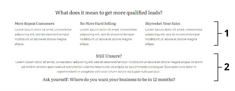
The container structure of this background section looks like this:
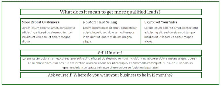
For the text elements inside of the Columns element, we can apply the alignment specification to the Columns container.

Easy enough, right?
But the Text elements beneath the columns aren't in a container by themselves. They share the Background Section container with the columns. Although you could apply the alignment specification to each Text element individually, you may want to use this "ninja" tool instead: Content Boxes.
Simply place the Text elements inside of a Content Box...

...and apply the alignment specification to the Content Box.

Content Boxes are a great way to add structure to your layout when there isn't a convenient container surrounding elements that you want to customize. And we’re calling it a ninja tool because ninjas operate stealthily. Content boxes can be virtually invisible as well, lending a helping hand when needed, but otherwise blending into the background.
Then, if you change your mind and want this section center aligned, you can easily make that change for all of the elements within the Content Box in just a few clicks.
6. Styling for Mobile Devices
You may have noticed there are three buttons at the bottom of the Thrive visual editor that enable you to switch between desktop, tablet, and mobile editing modes.
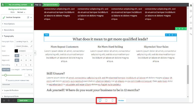
The Thrive visual editor with the desktop, tablet, and mobile editing mode buttons highlighted.
Let’s go over two very important guidelines when making style specifications for mobile devices.
Styles Cascade Down to Smaller Screen Sizes (But Not Up!)
When you click through the various mobile device buttons, you’ll notice that the screen view changes, as well as some of the settings in the tabs on the left sidebar of the Thrive visual editor.
So, which view should you set up first?
Much like the Outside-In Principle, we recommend starting with the largest screen size — the desktop mode — then moving on to successively smaller screen sizes. This is because styles applied to larger screen sizes apply to the smaller ones as well, but styles applied to smaller screens do not affect the larger ones.
Styles applied to the desktop mode will also apply to the tablet and mobile mode.
Styles applied to the tablet mode will also apply to the mobile mode.
Styles applied to the mobile mode will only affect the mobile mode.
In-Line Alignment Specifications Apply to All Modes
The second important rule for mobile optimization is that — if you would like particular elements to display different alignments on different sized devices, then you’ll need to apply the alignment specification to a container instead of the individual element. This is because in-line (i.e. styles that have been applied to individual elements) alignment specifications will always apply to all views.
Let’s look at an example. Here we have a 2-column element inside a Background Section. On desktop, this layout looks nice with the text aligned to the left.

But let’s say you’d like to have the text aligned to the center on mobile. How can you accomplish this?
Because in-line alignment specifications always apply to all views, we can’t specify different alignment settings for desktop and mobile. If we tried to click on the mobile view and apply the center alignment setting directly to the text element, the element would be center aligned in the desktop and tablet views as well.
Instead, you should apply the alignment specification to the Column container. This will allow you specify left alignment on desktop and center alignment on mobile.

Applying left alignment on desktop and center alignment on mobile.
Here’s the resulting page on desktop and mobile:

To learn more about mobile editing, check out 8 Tips for Making Your Content Fully Mobile Friendly and Mobile Responsiveness in Thrive Architect.
Main Takeaways
You did it! Together with our previous articles about fonts and colors, you’ve learned all there is to know about the Outside-In Principle.
Let’s quickly reiterate some practical Outside-In tips for styling your pages and posts with ease:
- Before applying a style to an individual element, consider whether applying the style to the container surrounding the element might save you a few clicks down the road.
- If you find yourself applying the exact same font specifications to multiple elements throughout a page, consider creating a new custom style instead.
- Don’t be afraid to use Content Boxes! They're super handy when the other container options aren't quite what you need.
- When editing for mobile, start your customizations at the largest screen size, then work your way down to the smallest screen size.
- When applying different alignments for different screen sizes, apply alignment to the container surrounding the element.
Let's Get Styling!
Hopefully this was helpful in providing you with practical examples of how to use the Outside-In Principle. Once you get used to it, you’ll find it’s a huge time-saver!
And, if you’ve ever found yourself wondering, “Wait a second… where did this customization come from?” — having a consistent customization framework will help you avoid guessing and head straight to the source. You’ll know exactly where you made that customization.
Of course, you can’t customize your website without the right tools, so I highly recommend getting Thrive Suite. You’ll get all of our tools (including Thrive Theme Builder, Thrive Architect, and Thrive Leads) for one low price.
As always, if you have any questions or comments about anything we've covered here, be sure to leave us a comment below.


Great explanation! Very thorough and succinct.
Thanks Andy!
Thanks Christine. You are excellent at breaking down and explaining design features, so that they are easy to understand and implement.
Thanks Franc! Glad you like it 🙂
Thanks Christine, Very useful presentation, clearly presented, lots of useful tips. I will start implementing your tips, as i have lots of work to do on my sites.
Thanks, let us know if you have any questions!
Wow, Christine you certainly are a gifted tech trainer! So clear and perfect pace. Sean she is a keeper give her a raise!
Thanks Jenn! Your comment made my day 🙂
That last trick with changing alignment on *containers* for the text elements in mobile view will improve my designs substantially and save me lots of time. Thanks Christine, keep doing these videos on the basic functions, super useful.
Here’s a few ideas for future videos:
– tricks with images
– a video about layering elements on top of each other with Z-index, when is it useful, what kinds of effects can be achieved
– styling background sections and using them correctly
– miscellaneous time-saving tricks
– a video series on the most common design mistakes in TAR and Theme Builder, and how to fix them
Thank you!
Hi Lorenzo, glad you like the video. 🙂 Great ideas! I’ve jotted them down.
Great job Christine. Thanks.
Thanks, glad you like it!
Thanks Christine. Can I ask one question though. If I want to use the designed page on another website how can I export the template and use it. It appears to be working only for standalone pages that are saved as a template. When will you make it to work for Pages that Use a Theme Template or for a single Content section saved as a template. That is a standard feature for Elementor and we miss it a lot.
Hi Svet, your request has been noted. Would you want to include all theme content (header, footer, sidebar, top section, bottom section)? Or just the content area of the page?
As the header footer can come from a Theme, as in my case, I need a way to export all the page content. The same is valid for all saved templates and symbols. They should also be exportable.
Thanks, Svetlomir. I’ve forwarded this feedback.
Although there are not too many comments, please keep making these kind of video’s. Even though I consider myself a Thrive Themes power user, I learned a few nice tricks that I didn’t know where possible, like the different alignment on desktop and mobile using the container elements.