TL;DR: Ebook Landing Page Essentials
If you’re building an ebook landing page, the goal isn’t just to look polished — it’s to make signups feel effortless and irresistible. Here’s the short version of what works:
- Lead with a benefit-driven headline (sell the result, not the title).
- Show a professional ebook cover to make the offer feel real.
- Use bullets that highlight outcomes readers will get.
- Keep your opt-in form short — email (and maybe first name) is plenty.
- Add a clear, action-focused CTA button like “Download Your Free Guide Now.”
- Drop in a touch of social proof — even one testimonial builds trust fast.
That’s the backbone of a high-converting page. If you want the full walkthrough — plus pro tips on design, copy, and optimization — keep reading.
How do you convince a stranger to hand over their email for a PDF they haven’t read yet?
I ask myself that every time I build an ebook landing page. I’m not chasing pretty; I’m chasing proof—that quick spark of “this is for me” that turns a scroll into a signup. I’ve seen a lot of brilliant ebooks stall at the front door because the page felt vague, busy, or shy about the value. So I build the page like a promise: clear outcome up top, zero friction in the form, and just enough proof to calm the second thoughts.
In this guide, I’ll show you exactly how I design an ebook landing page that earns the yes. We’ll keep the focus on list growth, write copy that sells the transformation, and set up a clean, credible flow that makes the opt-in feel obvious.
Ready? Before we touch a template, let’s lock in the essentials your page can’t live without.
We’ll walk through the anatomy of an ebook landing page, but if you want a broader framework, check out our Guide to Landing Pages for the big-picture strategy.
Ready to Share Your Book But Unsure Where to Begin?
I know how much energy it takes to get your book finished — the late nights, the edits, the second-guessing, and finally that sense of relief when it’s done. The next step is getting it into the hands of readers, and that’s where so many authors stall. Social posts disappear in a feed, emails only reach the people you already know, and Amazon can feel like a noisy marketplace where your work is just another title on the shelf.
That’s why I always recommend starting with an ebook landing page. It gives your book a home of its own, a dedicated space where you control the spotlight and the message. With the right structure, your landing page will:
- Put you on the map – a single, focused page makes it easy for readers to find you and understand what your book is about.
- Showcase your value – highlight the transformation your book delivers, not just the title on the cover.
- Build credibility – author bio, testimonials, even a single positive review can shift a reader from curious to convinced.
- Grow your list – capture email addresses from interested readers so you’re not just selling once, you’re building an audience.
- Guide the sale – clear, confident calls-to-action move readers from “I’m interested” to “I’m buying.”
Think of your landing page as your book’s stage. It’s where you get to present it in the best possible light, connect with your readers directly, and start turning quiet interest into actual momentum. And keep in mind, our ebook is more than a download — it’s a lead magnet. For bigger-picture tactics, see our Lead Magnet Strategy guide
Key Elements of a High-Converting Ebook Landing Page
Before you dive into building, keep these must-have elements in mind — they’re what turn a simple download page into a lead-generating machine:
- Headline that promises a result – Instead of “Free Marketing Ebook,” say “Double Your Email List in 30 Days.” Clear benefit > vague title.
- Professional ebook cover – A clean 3D mockup signals value; if it looks like a Word doc, people won’t bother downloading.
- Bullets that sell outcomes – Use 3–5 points that answer “What will I gain?” (e.g., “Steal the exact subject lines that got 45% open rates”).
- Friction-free opt-in form – Just ask for an email (maybe a first name). Each extra field = fewer signups.
- CTA with urgency – Buttons like “Download Your Free Guide Now” outperform passive labels like “Submit.”
- Social proof that reassures – One quick testimonial (“Helped me land 10 new clients in a week”) or a row of logos adds instant credibility.
Keep these six essentials front and center, and your ebook landing page will do more than look good — it’ll actually convert.
How to Create an eBook Landing Page That’ll Bring In Sales
1. Download and Install Thrive Architect
I’ve seen a lot authors pour their energy into writing a brilliant ebook, only to get stuck at the landing page stage — either fiddling with generic WordPress blocks, paying too much for a bloated funnel tool, or settling for a page that looks like everyone else’s. That’s the fastest way to bury your work.
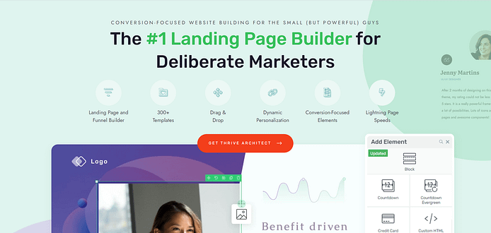
And this is where Thrive Architect changes the game. It’s not just another page builder; it’s built specifically for people who need their landing page to perform. You don’t just get a way to drag and drop elements — you get a tool designed from the ground up to help you grow your list and sell more books.
Here’s why it makes all the difference:
- Design without second-guessing – Drag, drop, and publish with confidence. The editor is intuitive, so you spend time writing and promoting, not Googling “how to fix spacing in WordPress.”
- Pages that are ready to convert – Every template is based on proven layouts that guide readers straight toward your opt-in or buy button, so you’re building on top of what already works.
- Credibility from the first click – Mobile-optimized, fast, and professional out of the box. A polished page makes your ebook feel valuable before anyone reads a single word.
- Persuasion built in – From testimonial blocks to countdown timers, you’ll have the elements that turn curiosity into action — without having to install five extra plugins.
- Value that compounds – One builder, unlimited landing pages. Instead of paying for different tools to handle design, opt-ins, and CTAs, you’ve got it all in one place.
If you want your ebook landing page to do more than exist — if you want it to attract attention, build your email list, and prove your work has real value — then Thrive Architect is the key. Install it now, and you’ll have the foundation to create a page that doesn’t just look good, but actually delivers results.
If you want to see how Thrive Architect measures up against other page builders, check out our in-depth comparisons:
Each guide breaks down the real differences in speed, conversion tools, and overall value — so you can see exactly why Thrive Architect is the smarter choice for your ebook landing page.
2. Create a New Page in WordPress
Creating a new WordPress page for your website is super straightforward.
In the WordPress Dashboard, select “+New” in the top menu and choose “Page.”
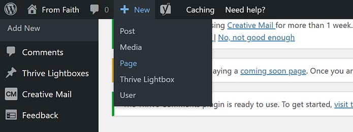
In the WordPress Block Editor, name your page and click the “Launch Thrive Architect” button.

A new screen will pop up with four options:
1. Normal Page
2. Blank Page with Header and Footer
3. Completely Blank Page
4. Pre-built Landing Pages
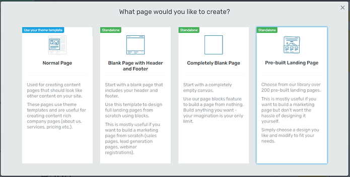
For this tutorial – and to create your eBook landing page template – choose the “Pre-built landing page” option.
3. Choose a Landing Page Template
When you enter the Thrive Architect landing page template library, you'll notice a wide variety of high-quality options to choose from. There are landing pages for different purposes, including lead generation, webinar registration, and sales pages.
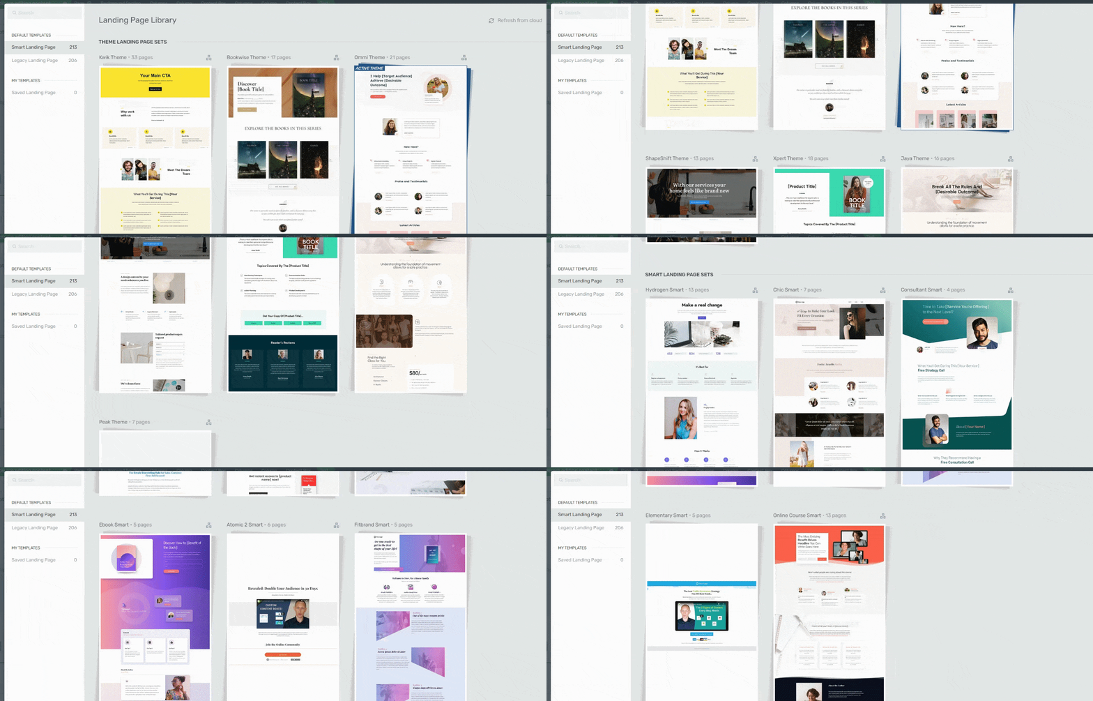
As an author looking to promote your book, we have the perfect template set for you. The "BookWise" landing page template set is designed for independent authors like you, who want their eBook landing pages to stand out.
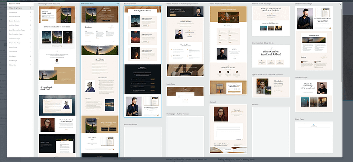
This set goes beyond other eBook landing page examples, helping you achieve a memorable, unique look for your page.
Within this set, you'll find a specific book sales page, which we recommend selecting for this tutorial.
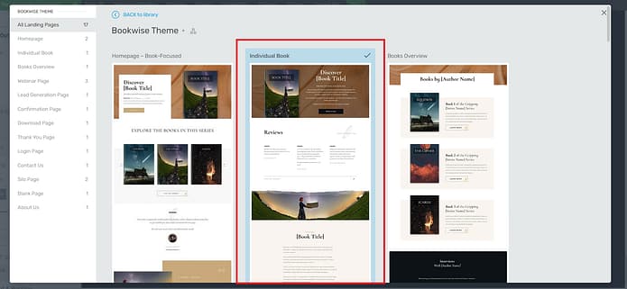
4. Customize Your Landing Page Template
A great thing about our templates is the fact that you can transform them into your ideal version of a landing page.
If there's a border you don't like and want to delete, you can go right ahead and do that.
Want to change the background visual in one of the block sections? You can easily do that too.
When we say our templates are fully customizable, we mean fully customizable.
Throughout this section, you’ll see how easy it is to customize your landing page template so it matches your brand's colors, your book's theme, and everything you imagined your eBook landing page to be.
Let’s get started.
Hero Section
The hero section, at the top of the page, is the first thing your potential readers will see when they land on this page. It needs to stand out, draw attention, and encourage your audience to keep scrolling
BookWise gives you a great template to get started with – and it’s tailored to specifically promote a physical or digital book.
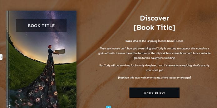
Add Your eBook Cover
The first thing you’ll want to add is your book cover, since this will probably determine your page’s color scheme and design.
You can upload a cover that doesn’t have your book’s title and use the “Book Title” content box to add it there.
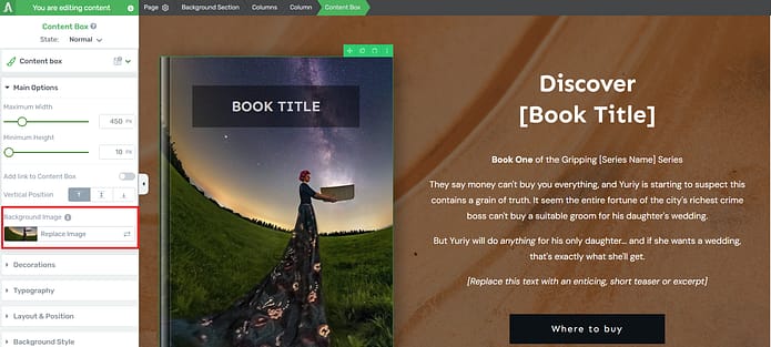
Or you can upload your book cover as is. Just click on the book template and select the replace image option in the left sidebar:
Once you upload your image, it’ll automatically appear in the book template, like this:

Change the Background Image
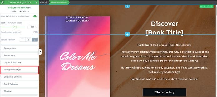
Now, if you aren’t feeling the background image and want something different, simply click on the block and take a look at your options in the left sidebar.
Here, you can customize any part of your hero section, including the background.
Look for the “Background Style” tab.
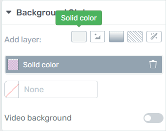
Here, you’ll find several options. You can delete the existing image and choose a new color, image, or gradient for your new background. You’ll find all your options next to the “Add layer” text.
Customize the Headline and Description Section

Once you’ve chosen your color, work on the text in your hero section. Turn the placeholder text into an attention-grabbing headline and add teaser text underneath to spark curiosity about your book.
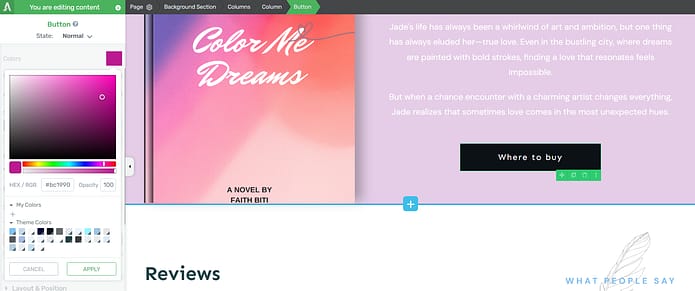
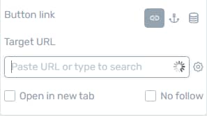
Don’t forget to customize your call-to-action (CTA button) and add a link to where your book can be purchased.
To do this, click on the CTA button in the Thrive Architect editor and enter your URL in the “Target URL” tab in the left sidebar.
Social Proof
Next on our template is a social proof section. Adding testimonials after your hero section is a clever conversion hack, and a great way to build trust with your target audience.
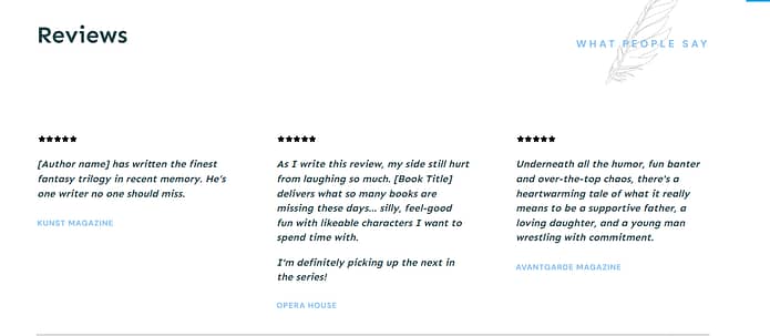
Simply copy and paste a few reviews from critics, previous customers, or beta readers.
Thrive Tip: Looking for ways to collect testimonials without feeling awkward? This quick guide can help you out.
Book Description
This section lets you add a detailed description about your book, to give your audience a sneak peek into what they can expect from your book:
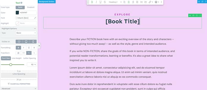
In this section you can also introduce the main characters of your book as well as provide a brief description of the plot. If you’ve written a non-fiction book, use this section to spotlight your most interesting chapters and give a few intriguing details.
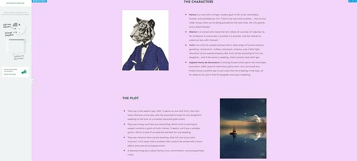
Thrive Tip: Need help improving your copywriting skills so you can create copy that inspires your audience to convert? Check out this guide to learn several simple hacks.
CTA Section
After your audience has read about what to expect from your book, the best thing to present them with is a clear call to action section.

You have a higher chance of getting potential readers to take action because they are already engaged and interested in your book's content.
Here are some tips for creating an effective call to action section:
Be clear and concise: Use simple, direct language that clearly communicates what you want your readers to do.
Create a sense of urgency: Encourage your readers to act now by using phrases like "limited time offer" or "don't miss out." Alternatively, you can add a countdown timer to your sales page to drive more conversions.
Highlight the benefits: Remind your readers what they stand to gain by purchasing your book
Make it visually appealing: Use bold fonts, contrasting colors, or eye-catching buttons to draw attention to your CTA.
Keep it brief: Your CTA should be short and to the point, typically no more than a couple of sentences.
And make sure you add links to all the platforms that are selling your eBook – Amazon, Scribd, etc.
If you want to sell your book directly from your website you can use an eCommerce plugin like WooCommerce or Easy Digital Downloads to sell a PDF or epub file of your book.
Opt-in Form
Sometimes potential readers might not be ready to purchase your book but want to know more about you as an author

You can use this small opt-in form to capture their emails and engage with them further through your email marketing strategies.
Collecting emails from your ebook landing page is the start of your list-building journey. If you want to dive deeper, here’s our complete guide to generating leads through your website.
To entice them further, offer a free eBook chapter as an exciting lead magnet in exchange for their contact details.
For non-fiction writers, you could offer a content piece that’s related to your book — like a case study, for example.
Pro tip
Connect your email service through API. You will only need to do this once for the first opt-in form you set up.
You can find tutorials for all major email providers (Drip, HubSpot, ActiveCampaign, etc.) here.
Go to your landing page and click on the WordPress form. In the sidebar, click on "Connect form with service" follow the setup wizard.
Social Proof
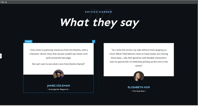
You have one more section to add more reviews or testimonials. Use this space to solidify your brand’s reputation (and boost your conversion rate) by displaying glowing feedback from previous readers or critics.
Bonus Section: Customize Your Page Even Further
If you really want to take your eBook landing page design to the next level, you've got to check out Thrive Architect's Block Template Library.
Even though the pre-made templates in Thrive Architect are already great, the Block Template Library lets you add your own personal touch to make your page truly unique. It's a collection of customizable sections and elements that you can add to your page and adjust to match your style.

To explore this library, just follow these easy steps:
- Open your eBook landing page in Thrive Architect.
- Click the "+" button your page to open the Block Templates library
- Get ready to be amazed!
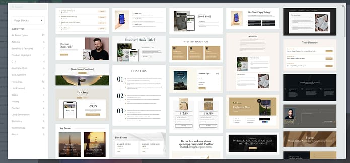
You'll find a variety of useful blocks, including:
Attention-grabbing hero sections
Compelling call-to-action sections to encourage eBook downloads
Impressive testimonials and reviews templates
A dedicated space for your author bio and book details
Detailed benefits and feature sections (with cool bullet points, too)
Pricing and purchase templates that encourage readers to buy
…and so much more.
Adding a block to your page is simple – just drag and drop it where you want it. Then, let your creativity shine as you customize the content, colors, fonts, and layout to perfectly match your eBook's branding.
Frequently Asked Questions About Ebook Landing Pages
I’ve noticed that when people start building their first ebook landing page, the same questions always pop up — from “what even counts as a landing page?” to “how do I get more people to actually sign up?” So I pulled together clear answers to the most common ones, so you don’t have to go digging through a dozen different sources.
An ebook landing page is a single, distraction-free page designed with one purpose: to get visitors to download your ebook in exchange for their email address. Unlike a regular web page, it strips out menus and extra links so the reader’s only path is toward your call-to-action.
A strong lead magnet solves a specific problem quickly. The best ebooks feel valuable, look professional, and deliver a “quick win” the reader can apply right away. Think focused guides, checklists, or templates — not broad, generic “ultimate guides” that overwhelm without solving.
Every great ebook page shares six must-haves: a benefit-driven headline, a strong hero image (like a 3D book mockup), scannable bullet points that show what readers will gain, social proof (reviews, testimonials, or logos), a friction-free opt-in form, and a bold, action-oriented CTA button.
Focus on outcomes, not features. Instead of describing chapters, explain how the ebook will make life easier, faster, or more profitable. Use clear, direct language (“you’ll learn how to double your leads”) and weave in social proof to calm doubts. Keep it short, scannable, and written to your reader, not to impress yourself.
Start by clarifying your goal (grow your list) and audience (who the ebook is for). Then choose a builder like Thrive Architect, pick a conversion-focused template, customize it with your copy and visuals, connect it to your email service, set up your opt-in form, and publish. Finally, drive traffic with email, social, SEO, or paid ads.
The fastest option is to use the template library inside a builder like Thrive Architect, which comes with conversion-tested ebook layouts. You can also explore marketplaces (like Etsy or ThemeForest) for niche-specific designs. Free templates exist, but premium ones usually convert better thanks to smarter layouts and polish.
Run a “friction audit” first: shorten your form to the minimum, speed up page load time, and make sure your CTA is obvious on mobile. Then layer in trust signals (like a testimonial or download count). If traffic is low, test big changes (short vs. long pages, image vs. video hero). If traffic is high, run smaller A/B tests to fine-tune.
Next Steps: Work on the Rest of Your eBook Funnel
To really make the most of your success, it's time to focus on building out the rest of your eBook funnel.
People will hear about your book through email, social media, and other digital marketing channels. But your funnel is where they go from being interested to becoming true fans.
By taking care of your audience and giving them value at every step, you'll build trust, show off your expertise, and sell more books in the end.
Here are four free tutorials to help you get started:
Ready to Build Your Stunning eBook Landing Page?
You've got this! Creating an eBook landing page that converts is all about combining compelling copy, attractive design, and strategically placing key elements.
By following the tutorial we've covered in this blog post, you'll be well on your way to whipping up a landing page that looks better than other examples of eBook landing pages out there.
So, are you ready to start building your own high-converting eBook landing page?
Thrive Architect is the perfect sidekick for the job. With its user-friendly drag-and-drop editor, battle-tested templates, and conversion-boosting elements, Thrive Architect makes it a breeze to create a stunning landing page and a memorable user experience.
What are you waiting for?
Dive into Thrive Architect today and watch your eBook sales take off!


