


TL;DR:
Wondering how to create a clean website from scratch — without hiring a web designer? This beginner-friendly guide shows you how to build a clean, professional WordPress site that’s fast, mobile-optimized, and built to convert.
You’ll learn how to:
Define your website’s goal and audience
Choose a domain name and set up hosting
Pick the right website builder (we recommend WordPress + Thrive Themes)
Use Thrive Theme Builder and Thrive Architect to design your site — no coding needed
Create essential pages, optimize for SEO, and track performance
By the end, you’ll have launched a fully functional, conversion-focused WordPress website from scratch — even if it’s your first time.
I still remember staring at a blank screen the first time I tried to build a website.
I had this big vision — something clean, mobile-optimized, and professional. A site that would make people trust my brand from the first click and actually take action.
But instead of building, I got stuck.
I went down endless rabbit holes on “white space,” “typography rules,” and the so-called right way to structure a homepage. I wasted hours researching what makes a clean website layout — and even more hours wrestling with tools that weren’t built for beginners.
It was frustrating. And honestly, I wasn’t sure I’d ever pull off a professional website design without hiring someone to do it for me.
If that sounds familiar, you’re not alone.
Maybe you're a small business owner, freelancer, or coach who just needs a site that works — something simple, clear, and built to grow with your business.
Here’s the good news: you can build a clean, conversion-focused website from scratch — even if this is your first time.
You don’t need to learn to code. You don’t need a web design degree. You just need the right WordPress website builder, a solid structure, and some user-friendly tools that take the guesswork out of it.
In this guide, I’ll walk you through the exact steps I wish I had when I started — from picking your domain name and setting up hosting, to designing your pages with Thrive Theme Builder and Thrive Architect.
By the end, you’ll have a stunning, mobile-optimized WordPress website that looks like it was built by a pro — but it’ll be all you.
Let’s dive in.
Here’s Why You Should Consider Building Your Website On Your Own
WordPress is “open-source” software. Which means you have the freedom to build a custom website that suits your needs — with any selection of tools.
But, a lot of potential small business owners fail to start their dream ventures because they think they need a high budget and a pro web developer or designer to build the best WordPress site for their business.
That doesn’t have to be the case.
Building your own WordPress website can be a remarkably empowering step for your small business, and here's why it's a decision you should consider.

First, you get to save costs. Hiring a web developer can significantly dent your budget, but WordPress, with its intuitive design and extensive library of free and premium themes and plugins, makes it possible to create a professional-looking site on your own.
You also get to learn a ton in the process. Navigating through WordPress is like a crash course in digital marketing. You'll pick up on SEO, how to manage content, and even get the basics of web design under your belt. This DIY route makes you more self-reliant and savvy about your online business presence.
This immediate control over your website ensures that it can evolve as quickly as your business does, keeping you agile and responsive to your customers' needs.
What Do You Need to Build Your Own Website From Scratch?
Before you start designing your homepage or choosing fonts, you need to lay a solid foundation for your website. Whether you're setting up a personal blog, portfolio, or an online store, these are the essential first steps.
➡️ Step 1: Define Your Website Goal and Audience
Start with clarity. Ask yourself:
- What is the main purpose of my website?
- Who am I trying to reach?
- What action do I want them to take?
Are you building a personal brand, promoting a service-based business, launching a digital product, or creating an eCommerce store?
Your answers here will shape everything — from your layout and navigation to your copywriting and calls-to-action.
Defining your website’s goal and audience ensures that every design choice supports your message, attracts the right people, and helps convert visitors into customers or subscribers.
➡️Step 2: Choose a Domain Name
Think of your domain name as your digital street address — it’s how people find you online.
A good domain should be:
- Short and easy to remember
- On-brand and relevant to your niche
- Free of hyphens, numbers, or confusing spellings
You can register your domain name through tools like Namecheap or Google Domains. Some web hosts also include a free domain for your first year — more on that next.
➡️ Step 3: Select a Hosting Provider
WordPress is a self-hosted platform, which means you’ll need to sign up with a web hosting provider to store your website files and keep your site accessible online.
Look for hosts that offer:
- 99.9% uptime reliability
- Free SSL certificates (for security)
- Daily backups and performance support
- Easy WordPress installation (many offer one-click setup)
Top hosting providers that work well with Thrive tools include SiteGround and WPX Hosting.
Once you’ve locked in your website’s purpose, picked your domain, and selected hosting — you’re ready to start building. And this is where the fun begins.
Let’s dive into how to build your WordPress website using Thrive Theme Builder and Thrive Architect.
How to Make a WordPress Website (Step by Step)
After you’ve chosen a web hosting provider (e.g. Bluehost ) and selected a hosting plan, and added a website name, follow the instructions you’re given for the WordPress installation process.
Most reliable hosting services offer a one-click solution to install WordPress, so you won’t have to worry about trying to set it up on your own.
You’ll be required to add a site title, tagline and a few other details to your site before you can start building.
NOTE:
If you’re brand new to WordPress, read this tutorial to learn how to install WordPress correctly.
This tutorial covers the rest of the steps:
Step 1: Download and Install Thrive Theme Builder and Thrive Architect
When you use the right tools, build your website will feel like a fun, fulfilling adventure and not a tiresome chore.
That’s why we recommend using Thrive Theme Builder and Thrive Architect, the ultimate website-builder duo.

You can dramatically elevate the flexibility and uniqueness of your website if you use a WordPress theme builder and page builder.
And these particular tools complement each other, helping you create any type of website to stand out.
Think of this combo as “web development made easy”. No need to know how to create a site with HTML or CSS.
Thrive Theme Builder helps you build and customize every aspect of your website design without typing a single line of code.

Thrive Theme Builder in Action
Once you’ve created your website’s structure, you’ll hop in and customize your web pages with Thrive Architect.

Thrive Architect in Action
Creating custom webpages is 100 times easier in the Thrive Architect editor thanks to its drag-and-drop
functionality and library of professionally-designed, customizable landing page templates.
With its suite of conversion-focused tools, creating compelling calls-to-action (CTAs), conducting insightful A/B tests, and generating conversions will become seamless.
As a result, you get to build an impressive online presence your target audience will love.
These tools prioritize mobile responsiveness and SEO, helping you create a website people and search engines will love.
Step 2: Select a Theme in Thrive Theme Builder

Professionally designed companion themes available in Thrive Theme Builder
Next, you need to choose a theme.
All of our themes come with a set of fully-customizable, professionally-designed templates that are perfect for your brand – no matter what niche you’re in.
This is a major advantage for you because you don’t need to worry about purchasing a WordPress theme from another platform and wonder if it will work the way the developers say it will – or if it’s compatible with the rest of your plugins.
Lots of white space for easy reading and navigation
Harmonious color schemes that you can customize with one click
Clean typefaces
Optimized for desktop and mobile devices
...and so much more.
And it gets better with our Thrive Theme Builder Setup Wizard...
Step 3: Complete the Thrive Theme Builder Setup Wizard
The Thrive Theme Builder Setup Wizard helps you select all your web page templates, a color palette, and all the fonts you need for your clean web design – and it only takes a few minutes to get this done.

Thrive Theme Builder Setup Wizard
By the time you’ve completed the Wizard, you’ll have set up the following:
- A sitewide logo for dark and light modes
- A clear, cohesive color scheme
- A conversion-focused header
- A focused footer
- The perfect homepage template
- A Single Blog Post template (with or without a sidebar)
- A Blog Post List template
- A default WordPress Page template
- Your navigation menu settings
By the end of the Setup Wizard, you'll have created a clean website layout that you can now go in and customize using Thrive Architect.
Step 4: Configure Your Site Typography
In this step, you’ll establish your site-wide typography settings.

The Typograph settings area of the Thrive Theme Builder dashboard. To edit your Typography settings, you'll click the pencil icon to open the Basic Typography editor.
These font settings include choosing font types, font colors, font sizes, font spacing, etc. to populate the following types of text:
- H1
- H2
- H3
- H4
- H5
- H6
- Paragraph text
- List text
- Hyperlink text
- Plain text
- Blockquote text
- Preformatted text
")
The Basic Typography editor preview window inside Thrive Theme Builder.
Remember that once you get these settings saved in Thrive Theme Builder, they will apply automatically across your theme templates and designs. Saving you tons of time.
Step 5: Set Up Your Core Post & Page Templates
Core Page Templates are page designs that you can save as single templates and then apply on other pages of your website.
That way, you won't need to design each page from scratch. For example, let's say you build a standard blog page template.
Whenever you create a new blog post, this pre-designed template will automatically load and add your new post to this page’s list.
No need to design each page from scratch -- Thrive Theme Builder takes care of that for you.
The initial Core Web Page Templates you’ll design in Thrive Theme Builder are your:
- 404 Error Page
- Standard Blog Post
- Default Page
- Blog List Page
- Blog Archive Page
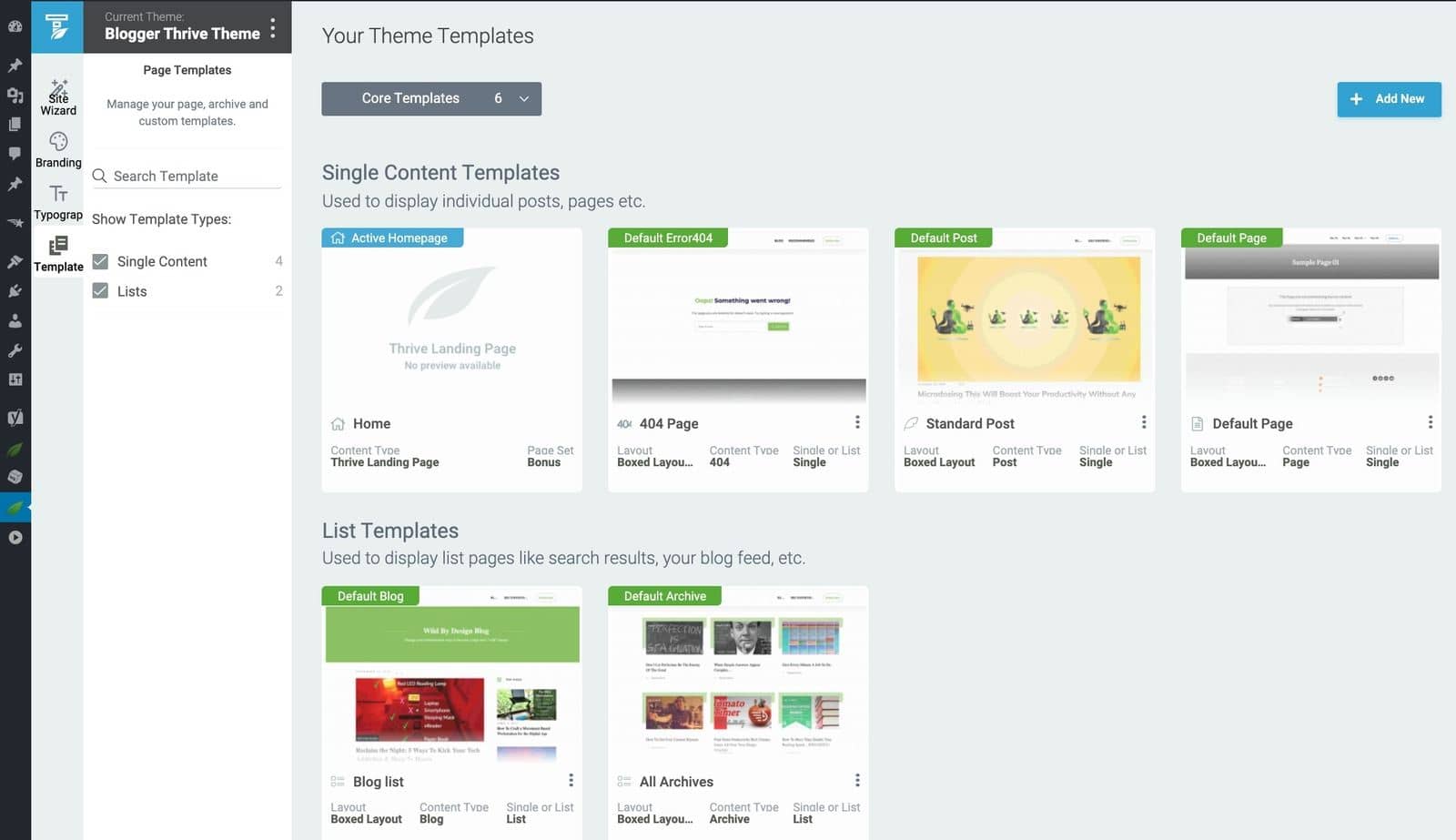
The Core Page Template area of the Thrive Theme Builder dashboard.
You can also create and manage as many extra page templates as you need from the "Templates" area of Thrive Theme Builder.
Explore Thrive Theme Builder's Site Speed Optimization Tool
Thrive Theme Builder also includes a Site Speed Optimization tool that makes establishing your site's performance settings in one click simple!
Simply put, this tool focuses on putting out clean, lean code.
Leaner code = less to load = faster website response times.
This feature is automatically activated on your website, so you don't need to do anything here.
Next, the Site Speed Optimization feature helps you configure your caching settings with either WP Fastest Cache or W3 Total Cache in just a few clicks.
Our site performance optimization tools are simple to understand and straightforward to use, so you can complete this setup in less than a few minutes.
Step 6: Finalize Your Homepage
When you were working through the Thrive Theme Builder Setup Wizard, you got started creating your Homepage template...
A homepage is automatically generated for you, and you'll find it in the "Pages" section in the WordPress Dashboard.
Search for the page titled "Generated Homepage".

Generated homepage from Thrive Theme Builder
Launch the page in Thrive Architect to finalize the design and add compelling copy, high-quality images, social media links, simple animations, etc.
Step 7: Create & Customize Your WordPress Site Pages
If you followed step 1 and purchased Thrive Architect, you’ll use this tool to customize your site pages.
The following pages are must-haves for any type of business website — in addition to your homepage —
An about page to provide more detail on who you are, your expertise, and your values.
An engaging blog to share business updates and valuable insights
A products/services page to provide more detail on what you offer
A testimonials/reviews page to showcase the glowing testimonials you've received from your clients and customers
A contact page to make it super easy for interested potential clients or customers to request additional information.
An FAQ page with answers to the most common questions customers ask about your business.
A WooCommerce Store/Shop page if you have an ecommerce business, this should take your visitors to where you sell all your products
Creating a new page for your WordPress website is super straightforward.
In the WordPress Dashboard, select the "+ New" button at the top of the page and select "Page".

Creating a new page
When taken to the next screen, name your page and select the bright green "Launch Thrive Architect" button.

Give your page a title
Thrive Architect, our powerful visual, drag-and-drop page editor, will provide you with four options:
1. Normal Page
2. Blank Page with Header and Footer
3. Completely Blank Page
4. Pre-built Landing Pages

Select the type of page you want to create in Thrive Architect
To create clean, conversion-focused pages that are aligned with the website layout you built in Thrive Theme Builder, we recommend the "Pre-built Landing Page" option.

Landing Page Library in Thrive Architect
In the Landing Page Library, you can select a Smart Landing Page from any of our companion themes.
Our Smart Landing Page sets are designed to help you create stunning, conversion focused pages in minutes.
It's as simple as perusing the Landing Page Library, finding a landing page template you like, selecting it, and customizing its design to fit your branding.
Watch this video to learn how to use smart landing page sets like a design pro:
Step 8: Install an Analytics Tool
If you’re serious about building an audience and a remarkable online business, you need a reliable Google analytics plugin.
An analytics tool helps you understand how your site visitors interact with your website, so you can make data-driven marketing decisions to grow your business.
We recommend using MonsterInsights to track your site’s analytics.

MonsterInsights
Step 9: Install an SEO Plugin
You’ll also need a reliable SEO tool to help you optimize your on-page SEO settings, and also handle the technical part for you.
If you’re building a website on WordPress, we recommend All in One SEO (AIOSEO) or Yoast SEO.
Both plugins offer a wide set of features to help you optimize your new website for search engines and human readers. These plugins work with most page builders and themes — including Thrive Themes, Elementor, etc.
FAQ: Building a Clean Website from Scratch
What’s the first step to building a clean website from scratch?
The first step is defining your website’s goal and audience. Whether you’re creating a blog, small business website, or online store, getting clear on your purpose will guide your design, structure, and content decisions.
Do I need to know how to code to build a WordPress website?
Nope! With user-friendly tools like Thrive Theme Builder and Thrive Architect, you can design a clean, professional WordPress site without writing a single line of code. These tools use drag-and-drop functionality to simplify the entire process.
How do I choose the best domain name for my website?
Pick a domain that’s short, easy to remember, and aligned with your brand. Avoid using hyphens or numbers. You can register your domain through platforms like Namecheap or Google Domains.
What’s the difference between a website builder and WordPress?
A website builder (like Wix or Squarespace) is an all-in-one platform, while WordPress is an open-source content management system that gives you more flexibility. WordPress works best with a hosting provider and plugins like Thrive to customize your site exactly how you want it.
Next Steps: Grow Your Online Business
Now you’ve seen how easy it is to go from zero to a clean, conversion-focused website using Thrive Architect and Thrive Theme Builder.
And if you need more guidance on how to create a stunning website for your business, take a look at these resources:
30+ Must Have Website Features for an Amazing User Experience
How to Create SEO-Friendly Blog Posts Users and Bots Will Love (14 Tips)
As you get more comfortable with our user-friendly tools, you'll start refining every detail to turn your simple design into an impressive website that offers your visitors an amazing experience — and also gets them to convert.
But most of all, make sure to have fun and we can’t wait to see what you build!
Are You Using the Right Tools for Your Online Business?
Thrive Suite is your all-in-one solution to building a thriving online business on WordPress – all by yourself.
With Thrive Suite, you’ll be miles ahead of your competition.

