You're all set to start building your mailing list, knowing that it's one of the most important assets for your business.
There's just one little issue...
...what the heck should you create as an opt-in bribe?
If you're serious about building your list "subscribe to my newsletter" isn't going to cut it, but neither is some generic, boring free report.
So what exactly does an excellent opt-in form and page look like? Read on to find out...
More...
Three Rules for Excellent Opt-In Offers
An opt-in incentive, an offer, a bribe, a lead magnet – all mean the same thing: something to persuade your visitor to punch your opt-in form. An effective opt-in offer can take many shapes or forms, but always includes these 3 characteristics:

1. It Must Provide a Solution to ONE Problem!
Regardless of how people find their way to your website, they're looking for a way to alleviate a frustration or fulfill a particular desire.
Your opt-in offer is a quick taste of the sort of information the visitor will find on your website currently and in the future. To be effective, it must target a problem specific to your audience.
Your opt-in forms should provide one solution to one incredibly annoying problem each.
Note:
A common error is to be too broad and all-encompassing. Your opt-in offer is not about solving ALL the problems.

2. It Must Be QUICK & SIMPLE!
A one page-cheatsheet is enough. A ten minute audio file is enough. A five minute video is enough. When it comes to your opt-in offer, bigger is not better.
You're aiming for something that your visitor could instantly apply. A good way to keep your opt-in offer lightweight and bite-sized is to give yourself a time constraint.
Take no more than two hours to create your opt-in offer!
Remember that 90% of your audience are complete novices. Create it for them! Using your opt-in offer should require as little skill as possible.
When your opt-in offer needs explaining, you've lost it.
Note:
People think that a good opt-in offer is a 400-page ebook or a 5-hour video series. While those occasionally work, the function of an opt-in is not to educate at a massive scale. Your audience is looking for a piece of chocolate, not a gourmet meal with added benefits.

3. It Must Be Consistent With Your Overall Message!
The most often overlooked aspect of opt-in pages and forms is consistency.
To keep a good perspective on consistency, try to remember how your visitor got to your page in the first place.
If the page your visitor lands on matches their expectations, it's much easier to hold their attention (in our Next Generation List Building training, this is the principle of relevancy).
Think of it from a visitor's perspective:
Imagine a visitor fascinated by your article on, for example, cake decorating. This visitor is so enthralled by cake decorating that they click your targeted sign-up link to learn more.
Whatever they see next must continue from the same thought, almost like an uninterrupted conversation.
If your sign-up offer is focused on not cake decoration, but say, baking in general, it's an immediate disconnect. Your visitor probably won't stick around.
However, what if we offer this visitor a quick guide on homemade cake decorations? They'd be likely to download your guide because content of the page matched their expectations.
11 Opt-In Page Examples
Keeping the three key concepts from above in mind, let's look at some of the best examples of brilliant opt-in pages from around the web.
Example 1 - The Quiz Opt-In
Site: | |
Author: | Erin Cerries |
Opt-In Offer: | Quiz-style personality test |
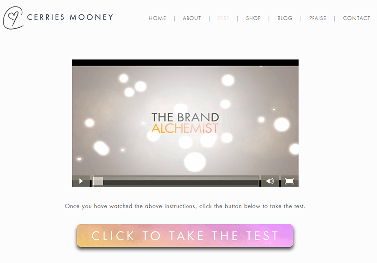
Cerries Mooney, the Brand Alchemist, has clearly grasped the concept of engaging her audience in a fresh manner. Her ebooks paint portraits of different personality archetypes. To find out yours, all you need to do is answer a quick quiz!
Who could resist a quick little game to find out something about themselves? You find yourself almost throwing your contact information at the screen for a chance to find out. This is what makes a quiz so at getting opt-ins and emails.
The beautiful visuals Cerries uses throughout also make for a rewarding experience and are a testament to her attention to detail:

Building curiosity like this is a surefire way to not only get more opt-ins, but also build a list of highly engaged email subscribers.
Key Takeaway
Cerries' offer is perfectly aligned with her blog's overall tone and message. In addition, it's easy to understand at a glance, the value you get is obvious and there's an aspect of fun in taking the quiz.
You can use Thrive Quiz Builder to create your very own quiz and build a segmented email list.
Example 2 - The Free Report, Done Right
Site: | smartblogger.com (ex boostblogtraffic.com) |
Author: | Jon Morrow |
Opt-In Offer: | Free PDF with 52 headline templates |
As a copywriting veteran and self-proclaimed Royal Awesomeness of blogging, Jon Morrow knows how to engage his audience.
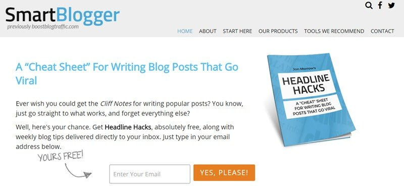
The Headline Hacks cheat sheet is a classic example of less is more. It’s a streamlined opt-in form, grabbing attention with a single line of copy - “A cheat sheet for writing blog posts that go viral” - and offering them a simple template book for writing killer headlines.
Simple. Effective. Anyone could write viral articles with this book. A value proposition like that is irresistible for any serious writer.
This opt-in has had a consistent conversion rate of around 50% to email ever since it was published. And that includes cold traffic, from people who have never heard of Boost Blog Traffic or Jon before!
Here's what Jon told us about this opt-in bribe:

Jon Morrow
Smartblogger
"On an opt-in page, you want the copy to be as short as possible. One litmus test is if what you are offering requires more than a headline to explain, it’s too abstract. It’s not familiar enough, it’s not obvious enough!
Now, just to be clear, this is a 55 page document; you don't want to do that. If I was a beginner and I was starting over again, I would give people the one headline template that works all the time to create viral posts – the one, not fifty two."
As you can see, we once again have a case of "bigger is not better". Like Jon says, what makes this offer work isn't the volume of what's on offer, but the way it aligns with something his visitors want.
Key Takeaway
Jon's offer, although grand in volume, is a simple concept and offers a huge, almost instantly applicable benefit. It's perfectly aligned with the blog's overall tone, touching something the audience shares - the desire to be a successful writer.
The Free Report & Opt in Page, Done Wrong
Sometimes, a negative example is as useful to learn from as a positive one. With that in mind, let's take a look at a not-so-brilliant offer before moving on.

Site: | |
Author: | Various authors |
Opt-In Offer: | Free PDF with social experiments |
This book is a good example of what not to do with your opt-in offer. While the book itself is well presented and offers some entertaining social experiments, it’s near useless as an opt-in offer.
The major offender here is the presentation of the book. The name of the book says nothing about the content, and there is no copy to speak of, on the pages advertising the book. With no obvious tangible benefit available, a random visitor will more likely click the back-button than the download-button.
This opt-in example creates a curious situation: only the people already familiar with “Fuck Up Nights” will be interested in this book. There's nothing here for people who are new to the site. Incidentally, this is the exact opposite of what an opt-in offer is supposed to do.
Key Takeaway
It doesn't matter how good the content of your free offer is - if it isn't presented in a way that is both clear and enticing to new visitors to your site, no one will be interested and you won't be getting any opt-ins.
Example 3 - The Challenge Opt-In Page

Site: | |
Author: | Nathalie Lussier |
Opt-In Offer: | 30 day mailing list-building challenge |
A great way to engage your audience is by challenging them in an entertaining or useful way. Nathalie Lussier has built a 30 day email list building challenge for this purpose, which appeals to anyone interested in building their email list.
The part that really shines about this opt-in offer, apart from the engagement and near entertaining education, is the brilliantly devious way of inserting a paywall into the process.
Anyone can partake in this adventure for free, receiving a new email each day for 30 days. But for the impatient ones, it's possible to get access to the course immediately for a small fee.
Nathalie's opt-in offer educates, entertains, challenges and engages her audience and is a source of income for her, all at the same time!

Nathalie Lussier
nathalielussier.com
"As for how we came up with these things, it's really been a co-creation process with our tribe. People wanted a way to unlock all the videos and they told us they'd be happy to pay for it, so we tried it and it worked.
It might seem silly because we really just do what our people ask for, and that's been the biggest key to our success."
This challenge opt-in offer has a conversion rate of about 45%, and the paywall option gets a conversion rate of 3-4%.
Key Takeaways
Your goal isn't just to get opt-in emails from anyone, it's to build an engaged audience. A challenge is a great way to attract the kind of people who are willing to engage with you over a longer period of time.
The second takeaway is that it pays to pay attention: Nathalie found a simple way to monetize her challenge, simply by listening to what her subscribers were telling her.
Example 4 - The Ongoing Product Opt-In Page
Site: | |
Author: | David Sherry & Allie Lehman |
Opt-In Offer: | Free photos every month |
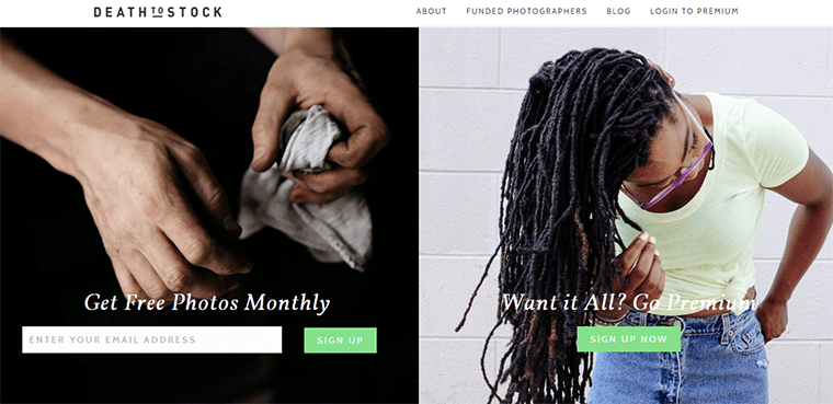
You don’t need to be a blogger or internet marketer to have an effective opt-in. The rogue photography duo at Death to the Stock Photo uses their own products as an incentive to sign up on their homepage which doubles as the opt-in page.
The offer is consistent with the audience’s desires. People come to the site looking for free photos, and Death to Stock will send you free photos monthly. It’s also a good way to get visitors interested in a premium option, which is also available.
Note how this follows rule #2 of an offer being quick and simple. Click a button - receive stylish photos.

Death to Stock have implemented the "freemium" business model that is common for software startups, but they've done it in the simplest, low-tech way possible.
If you have a personal strength or your business has a native product, think about ways you can "freemiumize" it and use it to build your email marketing list (and your business).
Key Takeaway
An opt-in offer doesn't always have to be one downloadable thing in return for an email address. If you can offer something on an ongoing basis, it gives your subscribers a reason to stay subscribed and keep watching their inbox for your emails - two fantastic traits most marketers can only wish for.
Example 5 - The Zero Effort Opt-in Page
Site: | |
Author: | Shane Melaugh |
Opt-In Offer: | Blog content, re-purposed as a free report |
Been blogging for a while? Maybe there’s a brilliant article hiding somewhere in the dustier parts of your content feed, that never really got the exposure it deserved?
Why not repurpose it into a hot opt-in offer?
When you have an article that isn't doing so well, or an older post that has lost traction, what do you do? You can put more effort into promoting it, tweak it, or forget it and move on. Most people tend to forget it and move on, forgetting that not all content is equally suited for all purposes.
In other words: something might be much more suitable for a video than for a podcast episode or something might be more suitable as a free report than a blog post.
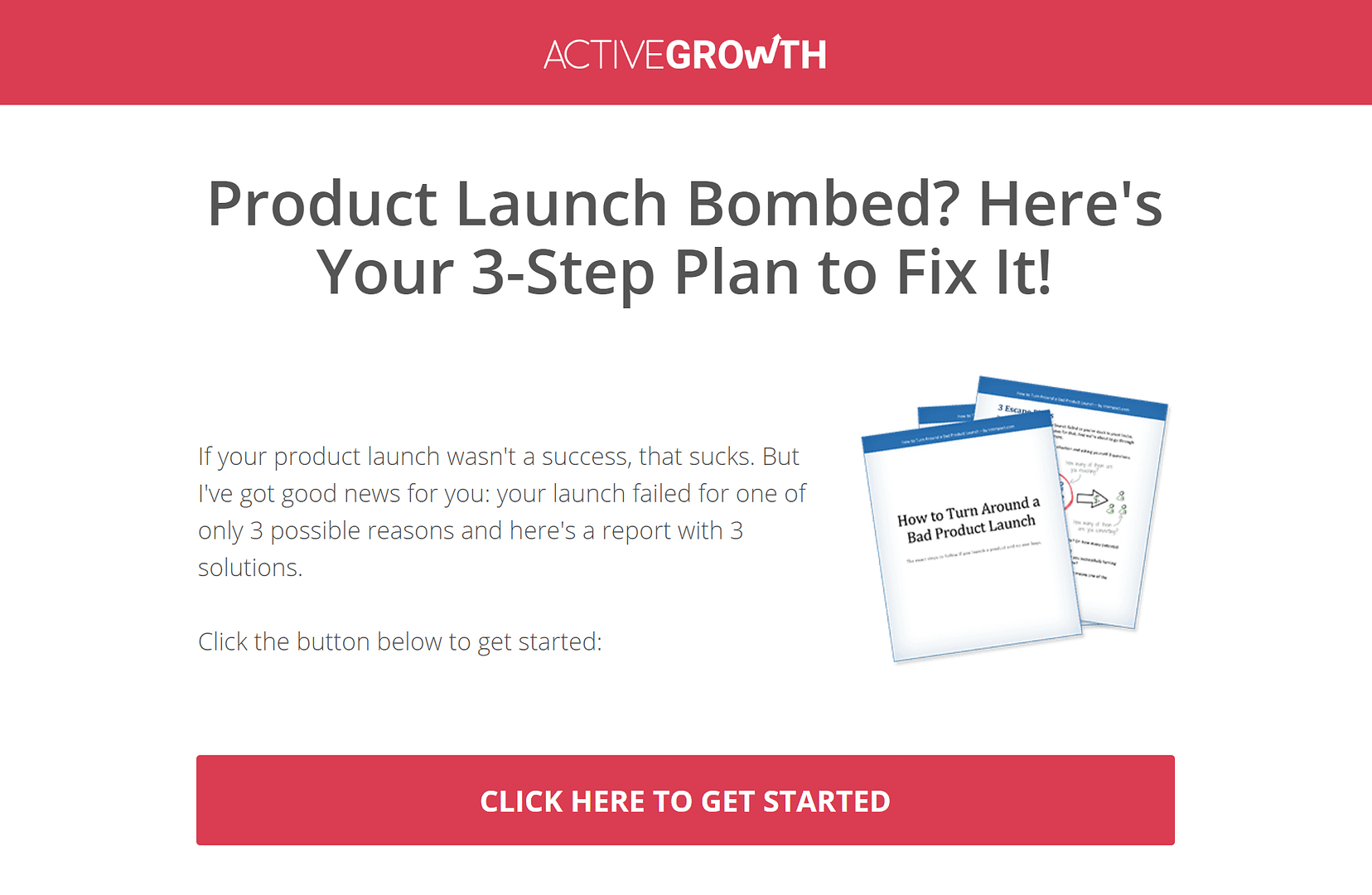
Our very own Shane Melaugh had a well written article lingering around that hadn’t quite found its audience. Being the clever sort of marketer, he wasn’t going to just dump the article and move on, though.
After a few little tweaks, the article turned into a perfect content upgrade for a podcast episode. The offer is advertised in a very simple way in the blog post:
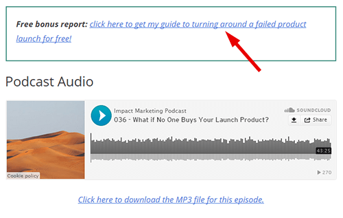
Conversion rates for this podcast episode went from 3% with a generic offer to 7% with this new, more suitable offer. These opt-ins still aren’t huge numbers, but more than doubling conversion rates by reusing a bit of content you've already created?
Seems like a good deal.
Key Takeaway
Creating an opt-in offer seems like a big, scary task to many bloggers, but it really doesn't have to be. Look through content you've already created and you might find a shortcut to a great opt-in offer.
Example 6 - The High Value, High Investment Opt-In Offer
Site: | |
Author: | Brendon Burchard |
Opt-In Offer: | Free book (except for shipping) |
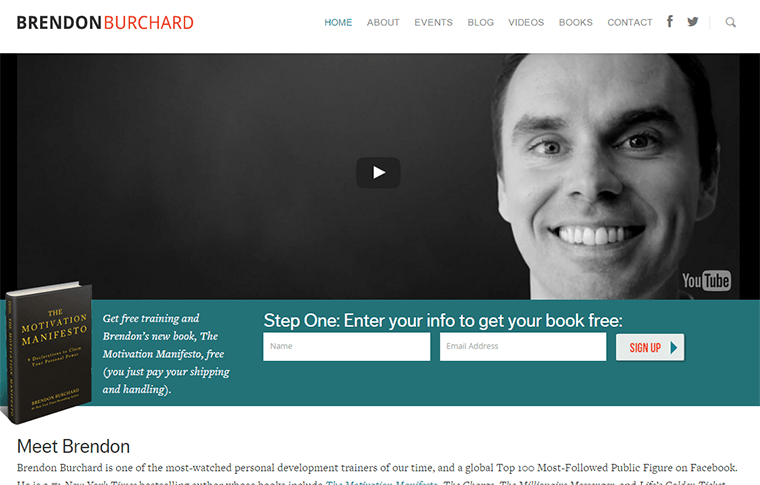
Brendon Burchard is a big player with huge influence in the self-development field. He can afford to hurl some heavy hits.
He offers his book, The Motivation Manifesto, as an opt-in offer on his homepage. Now you might be thinking “A whole book? That’s insane!”, but there’s a clear method at work here.
A physical book has a higher perceived value than an e-book and here, you get all that value for free... or almost for free, anyway.
While the book is free, you have to pay shipping to get it. Still a fair deal, right? But now you’re involved in a value exchange.
By taking the "free" offer, you're making a small investment and you've started spending money on Brendan Burchard products.
This approach can be highly polarizing and it can also be costly (printing books isn't free, after all), but if you have a good marketing machine ready to process the leads, this be a killer marketing strategy.
Key Takeaways
Look for opportunities to go against the flow. Everyone's giving away e-books? How can you step up the game and stand out from the generic opt-in forms and email marketing? A physical book is one way to go.
The second takeaway is that if you get new leads to commit to a transaction early on, you're building a list of buyers right away.
Example 7 - The Automatic Webinar Opt-In Page
Site: | |
Author: | Amy Porterfield |
Opt-In Offer: | Automated Webinar |
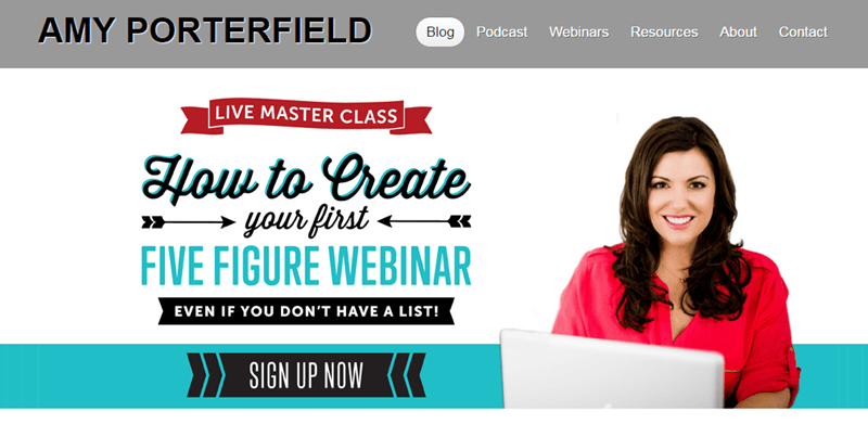
Amy is a social media strategist and co-author of Facebook Marketing All-In-One for Dummies. She earned her stripes by travelling the world and working with no other than Tony Robbins.
After learning what she could from the world's top marketers, she decided to stop consulting other businesses and start her own. Amy quickly found her home in front of the camera and behind the mic, creating a popular podcast and many successful webinars.
It's no surprise then, that Amy's opt-in offer is a chance to partake in a webinar.

Amy Porterfield
amyporterfield.com
"Admittedly, the first time I did a live webinar, it was a mess. I was promoting my first product and forgot to add a link to the product in the slideshow—a classic rookie mistake!
But I stuck with it, and now I do tons of webinars every year—they’re my primary way to reach new audiences. In fact, nothing else has been so successful for growing and scaling my business.”
An automated webinar is a curious opt-in offer. Even though technically it's simply a recording of a previous presentation, you still get most of the advantages of watching a live webinar:
- You hear the questions people asked during the live webinar. Chances are you're going to have the same questions anyway, so it doesn't really matter who asks them.
- You get closer to the community. The webinar might offer entry to a closed membership area or some other special offer you might otherwise miss.
- You get the intimate feeling of being part of a presentation rather than watching a static Youtube video.
While the webinar requires more commitment from a visitor than just a bog standard PDF-guide, the perceived value is also much higher.
You can also try to warm up your visitors with smaller opt-in offers before presenting them with a webinar.
Key Takeaways
Set up an automated webinar once and offer massive value continuously.
Example 8 - The Amazing Audio File Opt-In
Site: | |
Author: | Marie Forleo |
Opt-In Offer: | Audio Training |
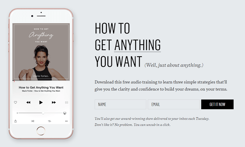
How to get anything you want? Hey, sign me up!
You might know Marie Forleo from her appearance on Oprah, her own show MarieTV, or her multinationally published book. She helps people dream big and back it up to create results.
When someone with these credentials offers you a short audio clip showing you "How to get anything you want," you might want to listen up, because they're probably capable of delivering.
The real genius of this opt-in offer is the audio format.
You can listen to this while you're driving, at the gym, walking about or just taking a break from staring at the screen.
It also gives an added layer of depth and personal value when you can listen to a real person's voice telling you this stuff.
Key Takeaways
An alternative format might help your opt-in offer reach people not on their computers constantly.
Example 9 - The Website Analyzer Opt-In Page
Site: | |
Author: | Hubspot Inc. |
Opt-In Offer: | Website analyzer |
Even being a huge and powerful marketing organization doesn't relieve you from the burden of creating an effective opt-in offer.
HubSpot strives to provide an all-in-one approach to marketing with a complete set of tools and data. They have everything marketing-related under one roof.
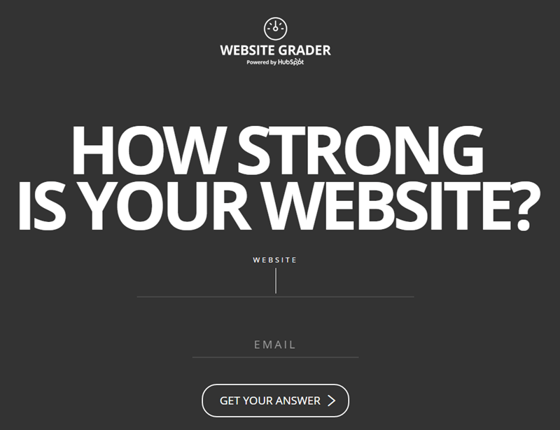
Hubspot's Website Grader is a simple but powerful tool to quickly assess the usability of your website. All you have to do is enter your URL and email address and the software does the rest.
It can be gratifying and even relaxing to know that everything works correctly, and your visitors aren't leaving because of a website malfunction.
Obviously, your contact information is stored the moment you sign up for a try.
Key Takeaways
A useful tool or software trial will have the engagement of a fun quiz, but also provide a useful benefit for your visitor.
Example 10 - The Quiz-turned Checklist Opt-In
Site: | |
Author: | Susan Jones |
Opt-In Offer: | Quiz for new entrepreneurs |
Susan Jones helps entrepreneurs get their business off the ground. As a Lecturer at at Swinburne University in Australia, she is well versed in the troubles of startup business creators and their pitfalls.

Susan Jones
Ready Set Startup
Business isn’t rocket science, but there are certain things you need to think about and get right if you want to be successful.
I concentrate on these. In my experience this important information isn’t so easy to find. Until recently, it’s only been taught in business schools.
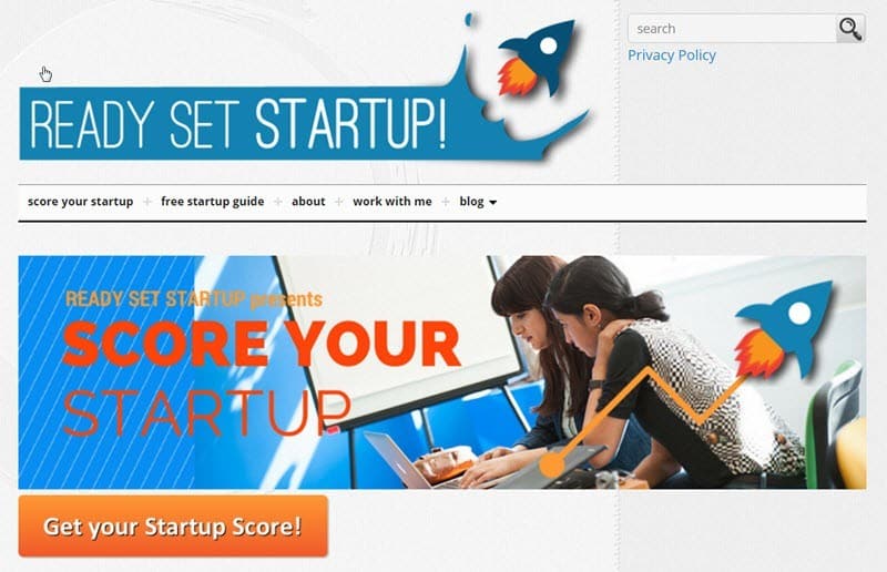
Susan's opt-in offer is a quiz that helps aspiring business builders pinpoint their weak spots.
The difference between this quiz and Cerries Mooney's quiz is that this one started out as a simple checklist.
By adding the possibility to interact and become part of the process, Susan turned a rather basic opt-in offer into something enticing and memorable.
If your opt-in feels a bit dull, this can be a great way to add some spark!
Key Takeaways
You can add spark and intrigue into a standard checklist-offer by turning it into a quiz.
Example 11 - The Free Coaching Opt-In
Site: | |
Author: | John Benzick |
Opt-In Offer: | 20 minute consultation call |
John Benzick has an impressive resume. Owner of three startups in different industries, consultation experience for companies like Procter & Gamble and Best Buy, keynote speaker for AIGA Design Camp - the guy gets around.

John Benzick
Venture Superfly
Over the years, I've realized that most startup attempts suffer due to a lack of "fit" between the entrepreneur and his or her business idea.
This realization led me to create Venture Superfly, a simple-to-use, 3-step application that helps entrepreneurs align their personal traits with a viable business idea, to help ensure startup success.
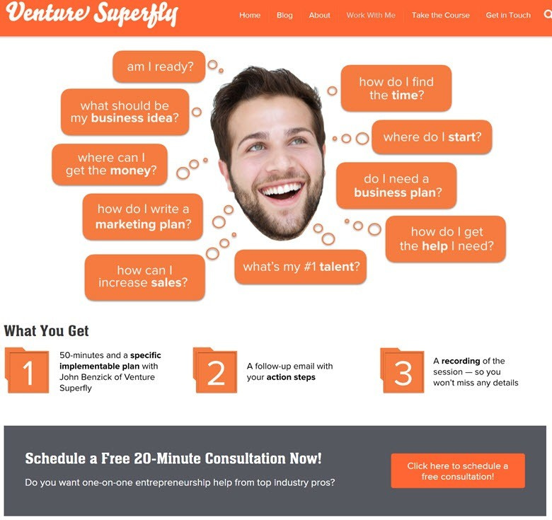
His website Venture Superfly has a handful of ways to collect leads and engage visitors. You can join a free trial of their entrepreneur course, you can download a bunch of videos by famous entrepreneurs, or...
... you can get a free 20 minutes coaching session.
With this amount of expertise, that's insane value. 20 minutes is also a short enough timeframe to ease commitment, in case the coaching wouldn't be useful.
This sort of opt-in offer might take up a lot of your time, but think of it this way. If someone finds value in your coaching, they will remember you and likely be committed to your products for life.
Key Takeaways
Literally give away some of your personal time and extensive knowledge to get committed and engaged subscribers.

Your Turn to Create a Killer Opt-in Page
We've now looked at 11 distinctly different opt-in incentives, all part of effective list-building strategies.
There's hundreds more out there in various forms and formats. But the ones with any success always follow the three rules of opt-in examples.
And so should you.
When you build your opt-in offer, take a step back and look at the journey your audience takes from the first moment they hear about you to the moment they end up at your opt-in form.
Make sure the process is streamlined, and the opt-in offer answers a single burning question in your visitor's mind.
And then you're done.
Now, stop worrying about creating the perfect opt-in incentive. Instead, create a simple offer, inspired by what you discovered in this post and start growing that list!
If you have any questions or feedback, please leave a comment below!


Hi Jay,
What a great post, and very timely indeed. I have been struggling coming up with a giveaway but I think you have given me a couple of ideas.
Thanks again.
Hey Greg!
Thanks! That’s great to hear. Put those ideas into action!
-Jay
I want to do something like Jon Morrow. I was thinking something like a big list of around 50-100. But since I’m targeting the beginner/intermediate, I don’t think that’d be a good idea, huh?
I should probably go for something smaller. Much smaller.
Right?
Hi Julian
What is the biggest fear or desire your basic visitor has on their mind? What can you offer as a bite size incentive for this group of people?
Forget the intermediates. Target the absolute beginners. Forget the big list. Make it a list of 1-5. If it’s longer than one, maybe two pages, you’re spending too much time on it.
Have fun. =)
-Jay
What is the best way to do a quiz type opt in within thrive themes?
Good question Eddie, I’m interested to know this as well.
I also would like to know how can we create online assessments where our prospects can answer some questions and then get an automatic report.
Thanks for the great post:)
Hey Mouhamad!
Thanks! Glad to help. Please see the reply above, I believe there might be an answer for you as well.
-Jay
Thrive Leads has a multi-step-optin possibility, to further segment your mailing list.
https://thrivethemes.com/multi-step-optin/
Currently there is no built-in quiz feature, but I’d recommend checking out the Viral Quiz Builder at
https://viralquizbuilder.com/
It does everything related to targeted quizzes, lead building and more.
If you’re looking for something a bit different, there’s also a plethora of WordPress plugins for this purpose. Simply set up a survey or quiz and end it with a Thrive Leads opt-in.
Quiz plugins:
https://premium.wpmudev.org/blog/wordpress-quiz-plugins/
Survey plugins:
https://www.wpstand.com/wordpress/plugins/8-fantastic-wordpress-survey-plugins.html
Hope that helps!
-Jay
Just a typo point.
The key takeaway box for both Erin Cerries and Jon Morrow is the same:
ie ” Cerries offer….”
Hey Paul
It is! Thanks for pointing that out. I’ll fix it immediately.
Jay, great article. My question is about #3 – challenges. It seems to break a couple of rules: 1) it definitely takes more than 1-2 hours to create and 2) it cannot be consumed quickly by the subscriber (another important optin offer requirement, in my opinion).
If you do want to go with a challenge-style opt-in, do you have any data that supports what length of challenge is ideal? (1 min challenge vs. 3 day challenge vs 30 day challenge, etc.). Thanks!
Hi Srdjan!
Thanks for the comment! That’s a great question. Let’s have a look.
You’re absolutely right. It takes more than 2 hours to create. Nathalie’s one definitely took tens of hours to create. But she has the resources to do that. She has the time to do that.
As a complete beginner, you should not be using your time for this.
But let’s look at the rules again:
1) Does it provide a solution to ONE problem?
It’s a list building challenge. What does it do? Builds lists. What do I need it for? To build a list.
One problem – one solution. Check!
2) Is it quick and simple?
It takes 30 days for sure. But I can have a bite size answer NOW, if I want to. And the clever thing is, that I can have an additional bite size answer EVERY DAY for the next 30 days. Think of it as thirty opt-in offers instead of one.
Quick and simple? Check.
3) Is it consistent with your overall message?
Nathalie is a digital marketer and definitely this is in line with her overall message. Check.
As for how you should approach a challenge opt-in offer. My first suggestion is: Think about what you would teach in this 30 day-challenge, and then release the first day’s lesson as an opt-in.
My second suggestion is – Don’t do a 30 day challenge yet. Start with something simpler, and once you have some exposure, THEN build something bigger.
Does that help?
-Jay
Great post. Love the part that if you have to explain your opt-in offer, it’s not the right offer!
Hey Angela!
Thanks! That truly encapsulates the core of the opt-in offer.
-Jay
Very helpful post! The overview of the opt-in offers is a great resource. Now I’m off to craft a new one 🙂 Thanks for the useful links and resources.
Hey Ashley!
Thanks! Great to hear it helped.
-Jay
Creating the right bribe can be a real challenge. Thank you for a your tips and examples.
Hey Ilka
You’re very welcome. True enough, they can be challenging. Once you start thinking small enough, it starts making sense! Good luck.
Jay
Impressive & to the point. Brilliant.
Hi Christopher
Thank you very much! Hope it’s useful.
-Jay
Certainly is.
These examples are really great, and so is this article. It’s one thing to talk about theory. It’s another to see a sample or two. But to see a bunch of superior opt in pages strung together like this, with notes on how and why they work, is beyond great.
I’m working on a new set of opt in pages right now, and these have proven to be very educational and inspirational. Thanks so much! 🙂
Hi Karl!
I’m so glad to hear that. =) That’s exactly why I wanted to make this post.
Good luck on your opt-in pages!
Jay
Hi Jay, thanks for a fantastic post! The 7 examples are truly brilliant. The only one I was familiar with before, is Jon Morrow’s. I’ve looked into brilliant landing pages myself. Time consuming. Unless you’re a research junkie, your beautifully illustrated post saves days of research.
Hi Jay
This is very informative. I am still struggling with what to offer but your post will surely make it much easier once I start creating something. Thank you for sharing your knowledge!
Hi Amanda!
Thanks.
Who is your audience? What is their number one frustration at this moment?
Can you address that concern? Can you provide an answer to a tiny part of it? There’s your offer.
Jay
Great article! Simple and actionable advice that we will definitely utilize. Thanks for the wonderful example websites as well. Always great to see ‘real-world’ examples in articles written to help others complete a difficult task.
Great range of helpful examples. I was way overthinking my bribe. This will help me get back on track. Thanks 🙂
Hi Nicki!
You’re very welcome. I’m an avid overthinker myself, and I constantly tell myself to TRY SOMETHING FIRST, then look at what could be improved.
Good luck!
-Jay
I absolutely love the idea that this isn’t about a gourmet meal but a piece of chocolate. What a superb post this is Jay.
Hey Elle!
Thanks. =) Glad you like it!
Jay
Great post! I have a couple of opt-ins already that work well, but recently I have been looking to build my email list with a challenge. It just so happens that I have done Nathalie’s so thanks for reminding me!
Wow Jay, love love the article. I’m slowly and surely getting out of the mindset of the billion page gift that takes 10 years to create. When I started on this online journey thing in 2008, that’s all that was acceptable. And I froze in place.
Last week I created a video of a poem that has brought me much joy (it was actually created to help a friend out of a slump). When that friend poo-pooed (ouch!) another said it was so wonderful he planned to watch it each day and why wasn’t I using it for lead gen.
It addresses one of the Beasties I tame (mindset), so I put it up there this week. I used several features from ThriveLeads (which rocks socks) and am starting to promote it this week. Don’t know how it will do and all who have seen the video and the PDF version have said go for it.
Deep breath. Going for it!
Thanks again for sharing real life examples. Don’t know that I’m there, yet, and having them makes it easier to tweak and continue growing.
Hugs & Blessings
MamaRed
Hey Mama!
You’re so right. I struggled with this mindset myself for so many years (and still do to some extent). It’s a “Beastie” for sure!
And it leads to FREEZING IN PLACE, like you said. The worst state imaginable for entrepreneurs or anyone really.
I’d sure like to hear that poem (video sounds exciting) if you’re up for sharing! Using something like that for an opt-in offer sounds perfect. I hope you got it up and running.
Whatever you do though – remember to publish first. Then adjust according to feedback. Then publish again. Publish utter crap if you must!
Good fortune to your lead generation
Jay
Hi Jay,
Great article,
I was wondering if you happen to know the Opt-In form plugin that BrendonBurchard has used for his high value offering? I have seen this form used before in other locations, such as Melabraham’s site and am curious as to what plugin it is.
Regards,
Paris
Hey Paris!
Thanks. I’m not sure which plugin he uses, but you can do that and a whole lot more with the Thrive Leads templates.
If you don’t have it yet, get it now. =)
-Jay
Thanks for the quick response Jay,
So with Thrive Leads I would have no problem inserting an opt-in box directly underneath my header like that?
Regards,
Paris
Thanks Jay,
So with Thrive Leads I would have no problem inserting my own custom designed Opt-in box Directly underneath my header like on Brendons Site
Regards,
Paris
That’s correct!
This article is really helpful. Thank you. I see a clear path ahead.
Hi Donna! That’s great to hear! Glad that it helped. =)
I never stop learning thanks mate!
Great ideas do not have to be so complicated-thank you!
Hey Jay,
Thanks for sharing these info; such a great help especially for beginners.
Liz
You’re very welcome, Liz!
Beginner or not, there’s a lot of inspirational ideas in there. Feel free to come up with your own zany opt-in offer. =)
Great article with some amazing ispirations. Thanks!
“7+5 Examples” – What kind of evil clickbait title trick is this? – lol
Awesome post!
Haha Borja, sorry about the clickbait! It’s actually because the original article (7 Examples) was published a year ago, and this is an update to that article. =) Thanks though, I’m glad you enjoyed.
Hey Jay, awesome article 🙂
I personally had success with “free report” style. One neat trick I use is to give a “free sample / free preview” of the free report. For example one page from that report, where people can see how awesome it is (you gotta make it awesome though).
You can see how it looks like here: https://www.azonhacks.com/profitable-amazon-niches/
Cheers
Hey Drazen!
Thanks, glad you enjoyed it.
That’s a brilliant trick. Definitely helpful in creating some intrigue. I’ll see if I could mention it somewhere. =)
Some great stuff in here, and thanks for posting. If possible, one thing I rarely see, and seems to be very difficult to find, are killer examples done by by smaller service industries.. window cleaners, pest control, builders etc.
Do you guys ever get to see great examples of this form?
Again, awesome stuff 🙂
Hey John,
Glad you enjoyed the article, and thanks!
I haven’t seen any opt-in offers from these industries, no. Not because would be impossible, but because these industries (to my knowledge) are mainly B2B, and don’t focus on mailing list marketing. I can’t really come up with any offer-examples either without knowing a more specific case.
Thank you for sharing. What would be a good lead magnet to opt in for a rappers video and album pre launch or better yet would you give me an example of a good copy to use? Thanks a bunch
Hi Jenjer,
You’re welcome.
An opt-in offer for a rap video? Now that’s an interesting question. I would maybe give away a photograph of your lyrics notebook. You know, the scribblings that turn into lyrics later? Or perhaps a small making of-clip of the rap video?
For copy, just follow the guidelines in TLP. Basically always focus on clearly telling about what benefit your product will provide for your audience. Nobody cares what your product is. Everyone cares about what your product can do for them. Hope that helps. =)
Always a pleasure to read your posts and visit the site. There’s never been a time I have come here and didn’t take something of value away with me. Awesome site to visit, Fantastic Products and Shane kicks ass! Love Thrive Themes and IMImpact.
Hi Johnny,
Thanks so much! Happy to hear that you enjoy the content and products. =) Such a joy to create more when people like yourself find it useful.
Excellent post with some helpful examples Jay. I try to tell folks all the time to keep it simple, especially when it comes to an opt-in offer. Give your audience a quick win or solve a common problem and you’ll keep them coming back for more.
Hey Chris,
Thanks. The simplicity thing – it’s SO easy to slip and start thinking too big. Keep reminding people about it. =)
Hi Jay, Our offer is a free 30 sec business video as a teaser to small business showcasing what video can communicate.
Cheers
Alison
Heyo Alison,
Sounds great! That’s exactly what an opt-in offer needs to be.
Good timing. Thanks for the actionable case studies. A math quiz is already in production!
Hey Robert!
You’re very welcome. Quick applause for your upcoming math quiz. =)
Great article as always. If you can think of anything that could create an irresistible offer for metal art products I am all ears 🙂 Have been struggling with that for 2 years. I think physical products are just so much harder to develop lead magnets for. I’ve built a sight using Thrive which is vastly superior to my current Weebly site but have been unable to be very creative with offers 🙂
Hi Mary,
You’re right. Physical products are always difficult. Personally I stay away from physical products because of the logistics involved. =P
For your purpose, consider making a small timelapse-video of how you create one of your metalworks. Or maybe make a list of the tools you use. Orrr….. Maybe a list of 10 places where your metal art would fit perfectly.
Best artikel I read in the last time to this topic! Thanks!
Hi Jan,
Thank you so much, so glad to deliver useful stuff!
This email has come as a very timely reminder. I am trying to increase optin rates from a number of high traffic posts. Even doubling the rates would make a massive difference.
I am going to be using content upgrades and this article has given me some great ideas
Hey Carthage!
So glad to hear it hit the spot. You’re right, opt-in offers can be brilliant content upgrades as well. I hope your conversions shoot through the roof. =)
Hi Jay,
Very direct and useful article, just what I was looking for.
Thrive Themes, you guys rock <3.
Question however:
Do you recommend hooking up all the opt-ins to one main list with groups (Mailchimp) or would you recommend creating separate lists?
Any good sources you would like to recommend for setting up the back-end, as in where to connect the opt-ins to and how to build a good structure.
Thanks!!!
-Luke
Hey Luke,
So cool that you’re finding the article useful!
Personally I recommend keeping it simple at first. Just hook up all opt-in forms to one main list. If possible, tag the different subscribers based on where they come from, or build sub-lists based on that. But essentially yes keep them on one big list.
When you start having bigger subscriber amounts (more than 1000), you should invest in an autoresponder like Activecampaign, which makes segmentation a cakewalk. I don’t think Mailchimp can really compete when it comes to handling bigger mailing lists.
Fantastic post, and the real life examples are what really bring it home for me.
Hey Michael!
Thanks, I’m glad you enjoy it. I had a lot of fun picking these out. =)
Great post, Jay! I’ve been offering something similar to the Death to Stock Photos idea, only with free guitar lesson videos. I have amassed over 60 videos in my free online email list course, but I’ve not seen many conversions from this, so I’m thinking about redesigning the whole process using a new email list provider since I’m not thrilled with the one I’ve had for the past 3 years or so. Do you have any suggestions? I’ll link to the sign-up page when you click on my name in this comment so you can see my marketing strategy.
I haven’t had an opportunity to redesign the page with Thrive Landing Pages yet, but, honestly, I’ve been so bummed out by it that it’s not been high on my list of priorities.
Thanks in advance for any help you can give.
Hey Eric,
Did you message about this earlier this year? I remember something similar.
Anyway, some thoughts:
1. Redoing your page with TLP will take you literally 10 minutes of your time. You can copypaste all your existing copy into a readymade template. All you have to do is connect the readymade form into your autoresponder API and you’re done. And it’s worth it.
Right now your landing page is a bit all over the place. Good content, but your call to action is not clear, and you have what, three different opt-in forms? Just have a rummage through TLP and you’ll have a converting landing page in no time.
2. 60 videos of guitar lessons for free? Dude. Remember the quick taster, not a gourmet meal example?
Imagine doing your shopping when you see that one person handing out tasters of some new cheese. A small quick bite you can taste while walking past? You can’t help but accept.
Now imagine the same cheese-person giving away 60 pounds of cheese to everyone walking past. No less. It’s a truck pallet of cheese and you gotta take it with you.
Do you think many people would be interested? Nah. People would politely refuse.
So here’s my advice: make 1 video. One. Make it less than 5 minutes long. Show people how to play 2-3 chords and a song they can play using those few chords.
Hey Jay,
Great Post! I wonder if I could make a quiz optin form using thrive landing pages.
Thanks
Thanks Javier! Glad you liked it.
Sadly you can’t use TLP for that. The quickest free way to create a quiz is using Google Forms. That’s (currently) my best recommendation.
Thanks so much, Jay! I may have left a comment about this, but I don’t remember. Something as simple as what you described definitely takes the burden off doing hours of work for so little return.
You’ve sparked some great ideas for me to have a clearer call to action and a funnel to get everything started. I guess I shouldn’t see all the tasks I have to accomplish all at once; instead, I need to focus on the next action to take so I’m not so overwhelmed.
Your cheese example applies to me as a business person as well. When I see all the work that goes into re-branding or re-creating such a massive project that’s already established (but that’s not bringing in conversions), I don’t want to take on the whole load (or pallet of cheese) at once. Small bites is a much more realistic way to go!
Thank you for a great article. It was wonderful and very educational. My Opt in as a free intuitive insight. They get to ask a question and get an e-mail response for free. Plus a chance to have their question addressed on my radio show. They also receive a weekly inspiration card once they are on this list as a follow up sequence. About 1 in 20 new visitors sign up for it. But they don’t seem to convert to paying clients. I don’t know if I need to tweak my opt in or follow up sequence. Some of them ask complex or multiple questions when it is meant to be a quick intuitive insight with the chance of a longer response on the radio. That said I also get thank you e-mails and great feedback that people appreciate it. Any advise on what will get me a higher conversion rate from my opt in?
Hi Lesley,
You’re very welcome. I’m glad it was useful.
Wow that’s a great question. Without knowing your business it’s hard to say for sure, but here’s something you might want to try:
1. Instead of asking your visitors to ask a question, try and collect the most common questions into a guide and give that to them. You’re trying to make opting in as easy as possible. Coming up with questions is hard, and will limit signups.
2. Converting visitors to buying clients is a complicated question, but it all comes down to providing value and providing offers that your visitors find valuable.
You’ve heard your visitors ask questions, so you know what they want. All you have to do now is build authority by providing useful answers and solutions. I would recommend looking up guides on building products. Shane’s “The System” on imimpact.com is a great starting point.
https://imimpact.com/the-system/
Hope that helps!
How about email courses?? Like a 5 day or a 7 day free mini course. It also provides good value if done right.
Hey Swathi!
It sure does. Nathalie Lussier has something like that with her 30-day challenge (example 3). The problem with mini-courses is that they’re so easy to overdo.
So if you go the minicourse-route, remember to keep it simple or divide into bits that each take very little time. Nathalie’s challenge takes 30 days to complete, but it’s actually a very small amount of daily work.
Hey Jay – SUPER GREAT article! Thanks for all of these examples and for the three rules! The timing on this is perfect, as I’m just about to create my first opt-in freebie. 🙂 One question, though…the Bonus listed above links back to THIS blog post. I’m a sucker for a bonus. So, I’d love to see this – BONUS: How to create a brilliant opt-in offer in 6 easy steps. The fastest way for you to create a highly effective opt-in offer! – if it exists. Can you help a girl out?
Thanks!
Nancy
Hey Nancy,
Thank you so much! I’m glad it helped.
About the bonus – the links in this article should work. I wonder why you didn’t receive yours… Did you receive an email at all?
If you didn’t, can you email me at [email protected] and I’ll send you the PDF?
Hi Jay
Great article, thanks. Nice to have real-life examples, good and bad, to relate to for a change.
Just one thing I wanted to make you aware of though is that the link to Venture Superfly (ironically the only link I wanted to click on haha) appears to be broken (have checked through broken link tool as well).
Just though you might want to check it out 🙂
Hi Emma!
Thanks, I’m glad it helped. =)
Which link are you talking about though? The link in the article (https://venturesuperfly.com/) works fine. Maybe their site was down momentarily?
Thanks for being vigilant though, had to check it immediately.
Thank you, Jay for this great article and all the inspiring examples!
I was in the midst of creating a 7-day course as my bribe and was going to throw in my Manifesto as an extra gift, but reading this got me thinking.
Instead, I’m going to offer my Self-Love Manifesto for the opt-in, and build my list then offer then the course as a low price offer after a couple of weeks…
Thanks for the Article! Very helpful as I launch my business!
Awesome post! I’m working on creating my first lead magnet, and possibly some content upgrades to add into posts. So, I’ve been trying to gather as much info as possible – and this blog post was extremely helpful.
So, thank you.
Alee King | The Beautified Life
Hi Jay,
this is such a great article. There are Opt-In Forms i never heard of. Awesome Thank you. Best greets from Germany, Tobi:)
This is epic. Thanks Jay. Implementing a bunch of offers to split test for my opt in right now. Chuffed to find this info beforehand.
I keep returning again and again to this article in order to get ideas – and just shared on FB. Thank you for this – clear, great examples, and right to the point!
Thanks Erin
The first first banner you have on the blog post that opens up to an opt in. How did you create that type of banner with the hyper link within the banner?
It is after the 6th paragraph.
Hi Tyler,
I’m not 100% sure what banner you’re referring to, but you can use the event manager to open a lightbox from a text link or you can use the two-step ribbons to have a ribbon with a button to open a lightbox.
Hope that answers the question 🙂
Nicely done.
Thanks Mea
What’s a ‘native product’ in this context:
“If you have a personal strength or your business has a native product”
-from example #4
-sorry, new to the whole marketing UX/UI realm. I tried Googling it.
Hi Josh,
This would just be “your own” product 🙂
Hello. For the blog post, do you recommend using subdomain (https://blog.abc.com) as my main domain SEO has funny backlinks, though the main domain has pretty good traffic ?
Hi Cheefoo,
I would not put the blog on a subdomain. but on the main domain/blog
This will help the SEO of the main domain because you’re publishing fresh content regularly (a ranking factor for Google)
Hanne is absolutely correct!
Subdomains are viewed as separate sites so your fresh content will not benefit the main domain. Plus, it cannot add authority to the main domain through either external or internal links.
Thank you!
Your welcome.
love it!
What could be the best offer for a hair extensions informational website? I also want to add affiliate products in that along with direct product selling. Kindly I need some unique and successful ideas .
Helpful just used one of these.Thanks
Love it, Jay. Sharing with my clients now.
All of these are great but don’t really apply to my type of buisiness. I’m in the service industry and need to drive footfall into my shop (hairsalon) other than me offering money off (which I’m loath to do ) I can’t see another option and once they have recieved that money off they can just as easily opt back out ? Just wondering what type of solution you have to that ?
Well, don’t think none of these opt in offers fit. You may need to sit back and chew on them.
As a hair salon, you could build your list physically by giving your customers forms so they can assess your business and service.
Then you can continue to offer them relevant content using email as it concerns your business.
DIYs are a craze, so you can offer how-tos as an opt in offer. Such as how to make a French braid or some fruity conditioner for the hair. After they opt in, you can then offer a more professional service they can only get when they visit your salon.
You could offer some sort of free gift on their next visit- scented candles, essential oils a nail/ hair/ skin care kit?
What’s the result your customer wants? They want to look great. But that hair style that looks great on Susan might look terrible on Jane, and Jane’s going to make a huge mistake if she insists on “The Susan”. How does Jane pick a hairstyle that suits her and her personality? “How to Choose the Hairstyle Right for You – Do NOT Get Your Next Style Until After You Read This”
Maybe offer ways for customers to keep their ‘look’ up between salon visits that they can do at home? Like, if you do a lot of highlights, is there something simple yet effective you could teach your potential ‘clients’ to do at home to keep their highlights ‘highlightly?’ (note: I have no idea about highlights, just using it as an example)
Hello jay
This is a great work that one can use as a textbook or reference book, please can you send it to my email i will really appreciate thanks
Hello Jay,
This is amazing article. I never thought we have this much options for opt-in offers. I only use subscribe box in blogs. Now, I think its time to move and use these techniques for the email lists. Thanks for this great idea.
Sunny J
I scored my startup 🙂
This is a very good post. Thank you!