You hit “Start from Scratch”… and freeze.
That blank website template feels exciting – until it becomes a wall between your vision and a site that actually does something.
I’ve been there too. In my early days of building websites, I thought starting with a blank template would give me total freedom – but instead, it gave me decision fatigue, scattered designs, and way too many “I’ll finish this later” drafts.
Eventually, I realized the problem wasn’t a lack of creativity — it was too many open-ended decisions and no clear path forward. What I needed wasn’t more freedom, but a structure that helped me start strong and actually finish.
You don’t need to learn code, buy another rigid theme, or waste hours guessing what goes where.
You just need a smarter strategy and the right tools to support it.
In this guide, I’ll show you how to turn a blank website template into a high-impact, conversion-ready site – without the overwhelm.
Feeling Overwhelmed by a Blank Canvas? You’re Not Alone — But There’s a Smarter Way
Blank templates seem empowering at first – no restrictions, no pre-set styles, no one else’s layout to undo. But once you’re staring at an empty screen, that freedom quickly turns into a frustrating guessing game:
- What goes where?
- Which font should I use?
- How do I make this look good and convert?
It’s not because you’re not creative. And it’s definitely not because you’re “not techy enough.”
It’s because most people are never shown the right way to approach a blank page.
You’re not the problem. The process is.
When no one shows you how to approach a blank template with strategy, it’s easy to get stuck second-guessing every decision. That’s why the key isn’t just starting—it’s starting with the right setup for your skills, your goals, and how hands-on you want to be.
So before we dive into building, let’s figure out if a blank website template is actually the best path for you.
Which Way Is Best for You? 3 Website Building Paths (and How to Choose)
There’s more than one way to start a website from a blank template — but not all paths lead to a site that’s easy to build, customize, or grow with.
Some options give you full control but take forever to finish. Others are quick to launch but difficult to adjust later.
In this next section, we’ll break down the three most common paths — and help you choose the one that fits your goals, your skill level, and how hands-on you want to be.
Once you’ve got that clarity, we’ll show you how to follow the path we recommend for most creators: one that keeps things flexible, focused, and beginner-friendly (without sacrificing results).
1. The Pure Blank Start (For Developers Only)
This is the most technical route. You begin with an entirely empty canvas – no layout, no styling, no guidance.
You’ll need to build everything manually: layout, fonts, spacing, responsiveness… even basic elements like headers and footers.
This usually involves:
Hand-coding with HTML, CSS, and JavaScript
Or using a developer-oriented theme framework built for custom coding
🟢 Best for: Developers or designers who want full technical control and know how to build a website from scratch.
Note: 99% of us aren’t accomplished developers, so we won’t discuss this in more detail.
2. Fully Pre-Built Theme (Not Ideal for Growth)
You buy a theme that looks great in the demo… but customizing it becomes a headache.
You’re boxed into someone else’s layout. You end up deleting demo content, fighting with the theme settings, and adding extra plugins just to get things working the way you want.
You’ll need to use:
WordPress theme from a marketplace (e.g., ThemeForest)
Native WordPress Block Editor for basic edits
🟢 Best for: Beginners who need something live quickly and don’t plan to customize much.
⚠️ Why I don’t recommend it: These themes often sacrifice performance, flexibility, and long-term scalability.
3. The Hybrid Approach with a Visual Theme Builder (Recommended)
This is where we recommend most people start – and it's what the rest of this post is focused on.
With Thrive Suite, you don’t need to choose between freedom and structure. You get the best of both:
✅ A blank starting point that you can fully customize
✅ A visual setup that requires no code
✅ The exact tools you need to grow your website into a conversion engine
Here’s how it works:
- Thrive Theme Builder gives you full control over your site’s global design – headers, footers, templates, branding, blog layouts, and more.
- Thrive Architect lets you build your actual pages – home, landing, about, sales – using a powerful drag-and-drop editor.
🟢 Best for: Business owners, creators, and marketers who want full control, fast implementation, and a custom site that grows with them.
With Thrive Suite, this isn't just another blank template – it’s the foundation for a flexible, focused website you can grow and evolve as your goals change.
You get a full ecosystem of tools for website building, list building, selling, segmenting, and growing your business – all within WordPress.
🔜 And once your site is up, Thrive Suite gives you additional tools to build your list, sell products, create online courses, and more.
Why I Recommend Thrive Suite – Especially for Blank Template Builds
By now, you’ve seen why the hybrid approach – starting with a clean, customizable framework and building with visual tools – is the smartest way to go.
But the real game-changer isn’t just how you build your site – it’s what you build it with.
Thrive Suite is built for people who want to move fast, design with intention, and get results – without getting bogged down in complexity.
Here’s why it works so well:
You don’t need to install five different plugins to add a form, connect your email tool, or create a landing page.
You’re not stuck hacking apart a rigid theme just to make something feel like yours.
You’re working inside one system – so every tool plays nicely together.
More importantly – everything is built with conversions in mind.
In all honesty, I purchased Thrive Suite because of all the features. Even though there is a learning curve, when I compare what is offered with what others are offering, there is no comparison. Thrive is the real deal. Thank goodness for their library of videos, which have helped me navigate some of the "techy" things I am a novice to.
Camille Fenton-Mason
Your lead generation tools, landing page builder, and design controls are all in the same place – so you’re not just building a site that looks good… you're building one that works.
The result?
You build faster. You make smarter decisions. And you stay focused on what actually moves the needle.
Want to dig deeper? Not sure how themes, theme builders, and page builders really differ—or how they work together in WordPress?
👉 Read our guide: How to Choose a WordPress Theme vs Page Builder. It breaks it all down in plain English so you can make the best decision for your site.
✅ Ask Yourself This:
“Do I want to express something unique, or do I just want to get online fast?”
If your answer is both – “I want it to feel like me, but I don’t want to waste time figuring everything out…” – the hybrid approach is your best friend.
It’s the fastest way to build a professional, high-converting website without burning out halfway through.
How to Customize a Blank Template Without Losing Your Mind (or Hours of Your Life)
I’ve been there – staring at a blank screen, knowing what I want the page to do... but having no idea where to start. It’s not that you don’t have the vision – it’s just hard to know what to build first, or how to make it actually work.
This section is here to help you break through that fog. I’ll walk you through the exact steps that helped me (and so many others) go from “Where do I start?” to “That looks clean, clear – and ready to convert.”
1. Start With Messaging, Not Design
Before you touch a layout or block, ask:
What do I want this page to accomplish?
What action should the visitor take?
This section is intentionally short — because this one task matters more than anything else you do in the early stages.
If your messaging isn’t clear, no layout, color scheme, or clever design trick will save the page. Start with clarity – and build around that.
Don’t design around lorem ipsum. Write your value proposition first, then build the layout to support it. Need help working on your page copy? This guide on copywriting tips can help you out.
2. Use Clear Design to Lead People Through the Page
Your website visitors don’t want to work hard to understand what your site is about. If everything looks equally important, nothing gets attention—and that’s a fast way to lose the sale, the lead, or the sign-up.
Visual hierarchy is how you guide a visitor’s eyes – using size, contrast, layout, and flow to naturally draw attention to what matters most.
Start by asking:
What’s the one thing I want them to see first?
What should they do next?
Is anything fighting for attention that doesn’t need to be?
Want to learn more about visual hierarchy and user-focused design? Check out this article from a design expert: 👉 13 Fundamental Web Design Principles for Better, High Converting Websites
3. Design Mobile-First (or At Least Mobile-Now)
Mobile isn’t just an afterthought anymore – it’s often your main traffic source. If your layout feels cluttered or hard to navigate on a phone, you’re losing people before they even read your headline.
Mobile-first design means thinking about how your content flows on small screens before you perfect the desktop version – it’s a key part of what makes a good website. Prioritize clarity, simplicity, and scroll-friendly sections.
Most of your traffic is coming from mobile—so don’t wait to optimize.
In Thrive Architect, mobile optimization is built-in:
Preview your layout for mobile and tablet instantly
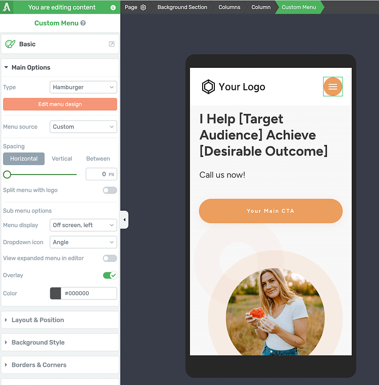
Mobile editing in Thrive Architect
- Adjust margins & padding, image sizing, font scaling, and section order per device
- Hide or show elements depending on the screen for better UX
🟢 Tip: Keep mobile layouts super scannable. One column. One goal. One CTA.
4. Use Colors With Intention, Not Just Aesthetic
Color isn't just about branding – it’s about guiding attention. The right color choices can make your most important message pop, while the wrong ones can overwhelm, confuse, or make your CTA invisible.
Great websites use color to create contrast, highlight actions, and reinforce hierarchy—not just to “look nice.”
Inside Thrive Theme Builder, you can make this happen by:
Using one main accent color for buttons and important actions
Making sure your CTA stands out from the rest of the page
Want to learn how to create your website’s color scheme with Thrive? Here’s everything you need to know.
5. Use Proven Patterns—Don’t Reinvent the Wheel
When you're working from a blank template, it's easy to feel like you have to invent the perfect layout from scratch.But here's the truth: high-converting websites are built on repeatable patterns—layouts that guide visitors toward a specific action without distractions or friction.
Some of the most effective?
The Z-pattern, F-pattern, inverted pyramid, and hero-CTA-testimonials structure.
These patterns work because they match how people naturally scan pages – and you can build them fast with Thrive Architect’s block templates.
Want to explore these layouts in more detail? Check out this guide on high-performing website layout patterns.
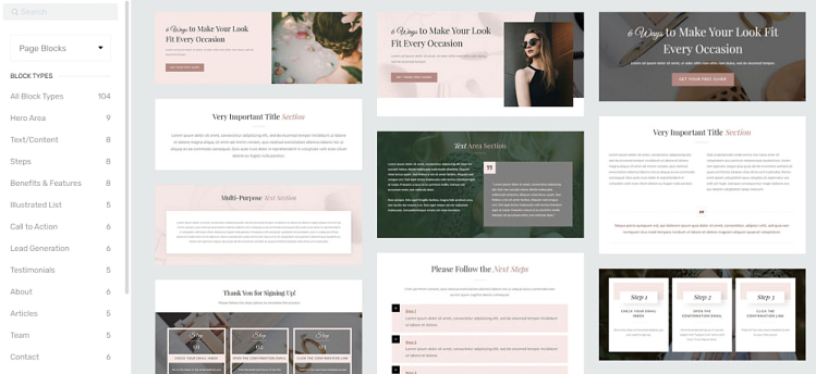
That’s where blocks in Thrive Architect come in.
What Are Blocks (and Why Do They Matter)?
In Thrive Architect, think of blocks as the building units of your page—ready-made content sections you can drag, drop, and customize. Each block is designed with a specific purpose in mind, so you're not starting from nothing, and you're not stuck with a generic, pre-made template.
Every block is:
Fully customizable (spacing, colors, fonts, animations, background, borders—you name it)
Responsive by default, and easy to modify according to device type (smartphone, tablet, etc.)
Reusable—you can save any custom block or section as a template for future pages
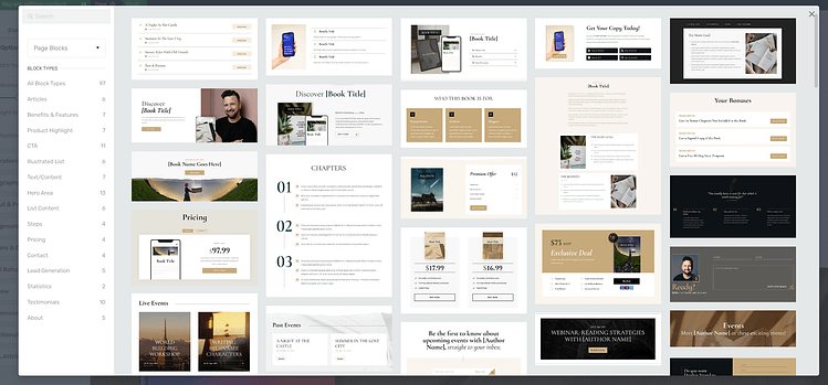
Blocks in Thrive Architect
With blocks, you:
- Build faster (no more guessing what goes where)
- Stay focused on your message and goal
- Avoid design overwhelm and decision fatigue
- Get to “done” faster—with a page that’s structured to convert
You can place a block, adjust the styling, and move on—without worrying if you “did it right.” The heavy lifting has already been done for you.
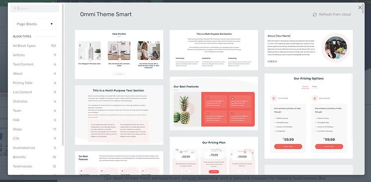
The Types of Blocks You Get in Thrive Architect:
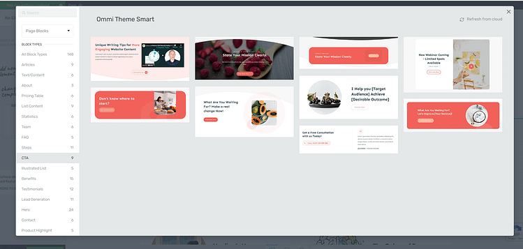
An example of some of the conversion blocks in Thrive Architect
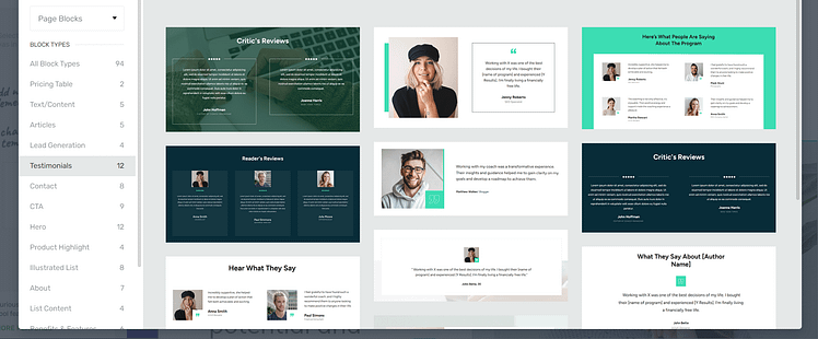
A few testimonial blocks from Thrive Architect
3 Creative (and Effective) Ways to Use a Blank Website Template
There’s something powerful about starting with a truly blank canvas. No clutter. No pre-set layout. Just space to build exactly what you need—on your terms.
But that kind of freedom can be intimidating, especially if you’re used to being boxed into rigid themes or demo content. The key is starting with a clear idea and building only what serves that goal.
Here are 3 cool (and surprisingly simple) ways to give it a shot—whether you’re testing an idea, launching something new, or just want a website that finally feels like yours.
1. One-Page Websites — Launch and Validate Ideas Quickly
Got an idea for a product or service but not ready to commit to a full site build? Use a blank template to create a lean 1-page site that can get the job done.
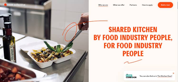
I’m a fan of how Cook Collective designed theirs.
It’s beautifully designed and their navigation is super simple. You understand who they are and what they do in less than a couple of minutes. And if you’re interested in their offer, their CTA button is right there, ready for you to click.
🟢 Tip: Want to learn how to create your own one-page website with Thrive Theme Builder and Thrive Architect? Follow this detailed, step-by-step guide.
2. Micro Funnels — Build Targeted Lead Gen Pages
Blank templates are perfect for building hyper-focused funnels with no distractions.
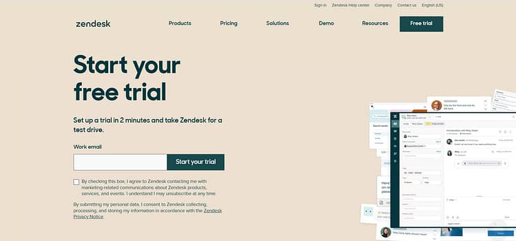
Take a page out of Zendesk’s book and create a focused lead-generation page to promote demos, free trials, or other offers.
3. Personal Digital Resume or Bio Site
Forget the generic LinkedIn link—create a sleek, scrollable digital resume that feels like you.
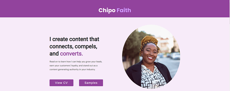
Here’s an example that was built with Thrive Theme Builder and Thrive Architect: my resume site.
I used a blank template and Thrive Architect’s block templates to create this page and it took me less than an hour, too!
And we have a solid tutorial for building resume sites right here for you to follow, too.
Wrap-Up: A Blank Website Template Isn’t Empty – It’s Full of Potential
Starting with a blank template doesn’t mean building blindly. When you pair it with a clear goal and a system designed for performance, you’ll move faster, launch smarter, and build a site that actually supports your business.
So whether you’re launching your first offer, showcasing your work, or building a brand that’s ready to grow—this is where you start.
Not with perfection.
But with clarity, intention, and a blank page that’s ready to convert.
And if you need the tools to make it happen, you know what to do.
Get Thrive Architect and Thrive Theme Builder today. Or take things ten steps further and start building with Thrive Suite.
P.S. Not quite ready to start from scratch? Thrive Suite also comes with a collection of pre-made themes you can use as a head start — they’re flexible, fully customizable, and never lock you in. You can always begin with a theme and make it truly yours.


