Homepage not getting clicks? Sales stuck? People bouncing before they even blink?
Then yeah… it’s probably your hero section.
I say this with love, because I’ve been there. I’ve spent hours fine-tuning a WordPress hero section design, picking the perfect background image, writing a headline I thought was clever, and then… nothing. Zero clicks. Just vibes.
Something I’ve noticed in my years of marketing (give or take 8 or so), is that people approach design like an aesthetic exercise. This applies to learning how to create a hero section in WordPress, landing pages, homepages – all of them. And that’s where the mistakes start. You’re building with “this needs to look good” in mind, but forget about its actual purpose.
Here’s what your hero section actually needs to do:
- Grab attention instantly
- Make it blindingly clear what you offer
- Prompt one focused action (no “choose your own adventure” stuff)
- Load fast and look good on every device
If it’s not doing those things? Visitors are gone in 50 milliseconds. Blink and *poof* — they’re off to someone else’s site.
In this guide, I’ll show you how to create a hero section in WordPress that gets real results — clicks, leads, and maybe even a sale or two while you’re still sipping your coffee. Let’s fix the top of your funnel, one scroll-stopping section at a time.
What Makes a Hero Section Convert — Not Just Look Pretty
Back when I was freelancing, this was one of the first lectures I had to give, usually right after a client sent me a homepage mockup they were in love with.
You know the type: full-screen photography, moody fonts, slick scroll effects — everything looked high-end. But when the site went live? Crickets. That gorgeous custom hero section in WordPress wasn’t getting a single click.
The problem wasn’t the design. It was the WordPress landing page header itself — it wasn’t clear what the business actually did, and there was no obvious next step for visitors to take.

I still give the same talk today to friends and family working on their business sites: Pretty doesn’t convert. Clear does.
Most WordPress hero section designs fall flat because they focus on how it looks, not how it works. But when you treat the hero section like the top of your funnel — not just a banner — everything changes.
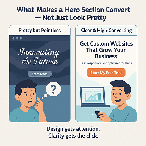
So this is your key takeaway: If your hero section isn’t instantly clear, emotionally relevant, and visually aligned, your visitors will scroll right past it. Or worse, bounce completely.
And you won’t even know it’s happening. Your analytics just quietly report “meh” numbers while your homepage could be converting like crazy.
But don’t worry. Next, I’ll show you exactly how to build a WordPress hero section that actually delivers.
Your WordPress Options — And Why Most Fall Short
You want to create a hero section in WordPress that actually gets results, not just receives compliments from your designer friend who loves whitespace.
And if you’re building a website on WordPress, you have several ways to build a hero section. Some are quick. Some are restrictive. Some will test your patience in ways you didn’t know were possible.
Let’s walk through the options: the good, the bad, and the ones that should come with a warning label.
1. The WordPress Cover Block (a.k.a. the safe but boring option)
If you’re new to WordPress, here’s the quick version: most WordPress themes today work with a “block editor” (called Gutenburg or WordPress Block Editor) — kind of like a drag-and-drop builder built into WordPress itself. One of those blocks is called the Cover block, and it lets you create a full-width section with a background image, headline, and maybe a button.
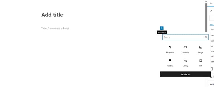
Sounds perfect for a hero section, right?
Well, it is a good starting point if you want something simple and plugin-free. You can add your image, overlay text, adjust colors, and make it stretch across the top of the page.
But, in my opinion, it’s not the best option and here’s why:
❌ It doesn’t always behave the same way depending on your theme
❌ You’re limited in terms of layout, mobile responsiveness, and design control
❌ There’s no built-in way to A/B test or add more advanced marketing elements
Verdict: It works for basic pages, and it’s a solid option if you just want to get something up quickly — but it’s not ideal if you want flexibility or if conversions matter (which, let’s be honest, they probably do).
2. Your Theme’s Built-In Hero Area
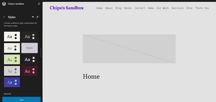
Many WordPress themes offer a default homepage hero image section (or standard section for your other landing pages) you can edit from the Customizer. Convenient, yes. But I wouldn’t recommend this option if you’re looking for deep customization options.
Verdict: If you never want to touch your design again, sure. But if you care about performance? Keep scrolling.
✅ Quick to set up
✅ Matches your theme’s look and feel
❌ Customization is usually limited to headline, text, and maybe one button
❌ Layout, spacing, mobile view? Good luck.
❌ No room for creativity or optimization
3. Hero Banner Plugins
There are plugins made just for building hero sections — with sliders, animations, and special effects galore. Sounds cool... until you try to actually use one.
✅ Niche features like rotating headlines or full-screen carousels
❌ Adds plugin bloat
❌ Often requires extra CSS or fiddling with shortcodes
❌ May not integrate well with the rest of your theme or content
Verdict: Could work for very specific use cases, but usually more complicated than it’s worth.
4. Custom Code (aka: You better love debugging)
Yes, you can hand-code a hero section using HTML and CSS. But unless you live and breathe front-end dev, you probably don’t want to go there.
✅ Maximum flexibility and control
✅ Lightweight if done well
❌ Time-consuming and fragile
❌ Can break with theme or plugin updates
❌ Not beginner- or marketer-friendly
Verdict: For developers only. Everyone else: protect your sanity and avoid this path.
5. A Page Builder Built for Serious Business Owners (This Is the One You Want)
This is where things get good. If you want full creative control and built-in marketing tools, a visual builder is your best friend.
✅ Drag-and-drop everything
✅ Create a custom hero section in WordPress that looks exactly how you want
✅ Add CTA buttons, forms, countdown timers, testimonials — without extra plugins
✅ Instantly tweak mobile spacing, typography, and layout
✅ Designed with performance and conversions in mind
👉 This is the option right here, and I swear by it. You get total design freedom without touching code, and you can actually build a hero section that sells. It’s fast, flexible, and yes — fun to use. Especially when the clicks start rolling in.
Verdict: This is the option I use and recommend — especially if you're building your business online and want your pages to do something beyond just sitting there.
Now I know I know, there is more of an upfront cost compared to using the free stuff. But if we get real about this, is free really worth it?
This option is more likely to reduce your bounce rate, increase your conversions, and save you hours of fighting with clunky layouts? I’d see this more as an investment, and not just a “cost”.
And at the end of the day: One good hero section can pay for itself faster than most people realize.
The Bottom Line: Go With the Tool That’s Built for Conversions
If you’re serious about building a WordPress hero section that gets people to stop, read, and click, then the visual builder route is the clear winner. Here’s why:
You can build faster, without waiting on a developer
You’re in control of layout, copy, mobile optimization, and styling — all in one place
You can actually embed the elements that drive conversions (forms, trust badges, countdowns, testimonials… go wild)
And you’ll never have to hack together five different plugins just to make your site look decent
Now, if you’re wondering which visual builder to use? This is where I stop being polite and start being honest:
👉 Thrive Architect is the tool I recommend — and use — every single time.
And yes, I work with the team behind it now, but I was a paying customer first. I built my business with it, figured out what actually works on the ground, and only then ended up on the inside. So when I say it’s the tool I trust for building high-converting pages — I mean it.
It’s not just easy to use. It’s designed for people who care about conversions. You’re not just dragging boxes around — you’re building landing pages, hero sections, lead magnets, and sales tools that actually work.
If you're tired of guessing, tweaking, and wondering why your homepage bounce rate is still brutal, Thrive Architect changes everything. It’s how I stopped wasting time and started building hero sections that actually deliver.
Up next? I’ll walk you through how to build yours — step-by-step — using this exact strategy.
How to Build a Hero Section in WordPress (Using Thrive Architect, Step-by-Step)
Okay, we’re done with theory. It’s time to build your hero section in WordPress like you actually want it to convert.
And we’re not going to slap something onto your already-messy homepage. We’re starting fresh — because whatever wasn’t working before? We’re not dragging that into this new era.
We're doing this inside Thrive Architect, because it’s fast, flexible, and designed for people who care about conversions (hi, that’s us).
Let’s walk through it — step by step.
Step 1: Open a New Page (Clean Slate Energy)
Inside your WordPress dashboard, head to Pages → Add New. Launch Thrive Architect on that page.
We’re starting from scratch here: no clutter, no awkward leftover sections. If your last WordPress hero section design wasn’t getting results, this is your fresh start.

Step 2: Choose a Page Type
When you launch Thrive Architect on a new page, you’ll be asked what kind of page you want to build — and this choice sets the tone for everything that follows.
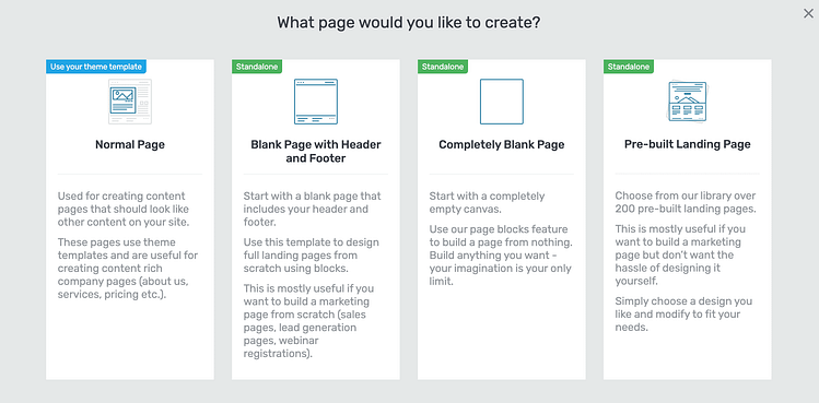
You’ve got four main options:
Normal Page (theme template): Best for content-heavy pages like blog posts or About pages that need to match your site’s existing layout. Not ideal if you want full control over your hero section.
Blank Page with Header and Footer (Standalone): Gives you a clean canvas with your site’s header and footer still intact. Perfect for marketing pages where you want flexibility without losing your site’s overall structure.
Completely Blank Page (Standalone): Wipe the slate clean — no header, no footer, just pure layout freedom. This option is great if you want to design everything from the ground up.
Pre-built Landing Page (Standalone): Choose from Thrive Architect’s massive library of landing page templates. It’s the fastest way to launch something polished — especially if you don’t want to deal with spacing or layout from scratch.
👉 For this tutorial, I’m starting with a blank page — not a fully empty canvas, but clean enough to show you how to build a hero section from “scratch”-ish. This way, you’ll see exactly what to do even if you’re not using a template.
Step 3: Drop in a Hero Block Template
If you chose a blank page, it’s time to add your first building block.
Click the “+” icon in Thrive Architect, scroll to “Block Templates”, and select “Hero”.
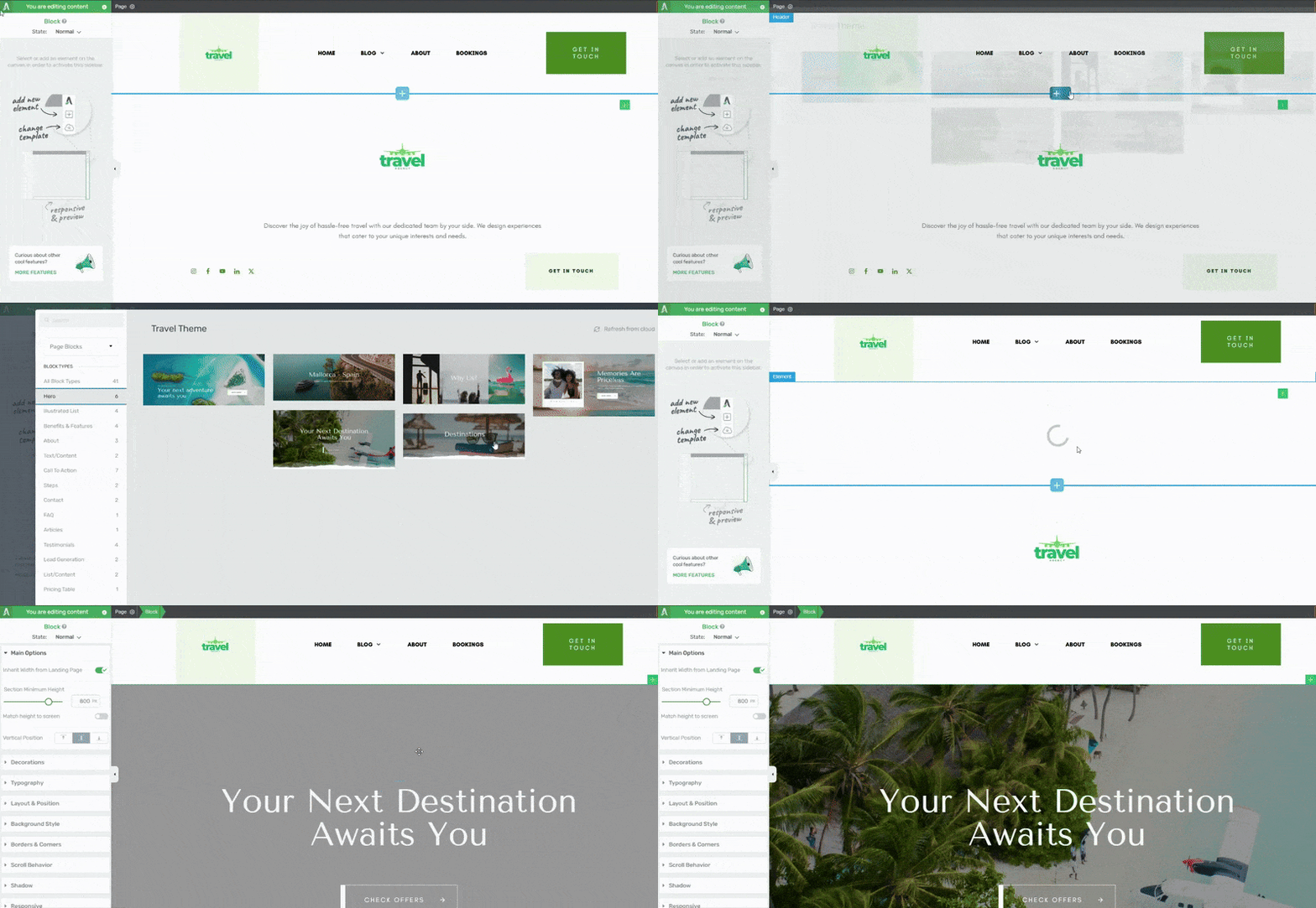
You’ll see a variety of beautifully designed, conversion-focused hero blocks to choose from — each one customizable and built to perform. This isn’t just about looking good. These are layouts that follow proven formulas: strong headline, sharp subheading, and one clear call-to-action.
(And if you're curious about where my block templates are from. This is from our Travel set, the perfect theme for building a travel website)
Step 4: Customize Your Hero Section (Make It Yours)
Here’s where the fun starts.
You can:
Edit the text inline
Swap out images or background videos
Adjust spacing, font size, and alignment for mobile and desktop
Change colors, overlays, and button styles
Add or remove elements — want a countdown timer, testimonial, or form? Drop it right in.
Now pause: what actually makes a hero section in WordPress grab attention and get clicks?
These are your non-negotiables:
✅ A bold, benefit-focused headline
✅ Supporting text that explains the “why”
✅ One strong, obvious CTA (no “Learn More” nonsense)
✅ A visual that reinforces the message — not distracts from it
✅ Mobile-friendly layout with intentional spacing and font sizing
Thrive Architect lets you control all of that — in real time, without guessing, coding, or rage-refreshing.
Step 5: Complete the Rest of Your Landing Page
Once your hero section is locked in, you can scroll down and continue building the rest of the page.
Not sure what should come next after your hero section? We’ve got a full guide on that. 👉 Check out our Landing Page Hacks tutorial — it walks you through the rest of the page, from trust-building elements to conversion-boosting tricks.
You’ll learn how to structure your page, build trust, and drive action — all using Thrive Architect and its magic bag of conversion tools.
Recap (In Case You’re Skimming)
To build a high-converting hero section in WordPress using Thrive Architect, you:
Start fresh on a new page
Pick a blank page or start with a pre-built landing page
Drop in a hero block from the Thrive template library
Customize everything — text, visuals, CTA, layout — in real time
Finish your page (with help, if you want it)
This is how you create a first impression that clicks — literally.
Advanced Hero Section Techniques That Convert Even Better
So now you’ve got your shiny new custom hero section in WordPress — congrats! It’s already better than 80% of the homepage banners out there.
But if you’re the type who wants to go from “Nice site!” to “How is your signup rate THAT high?!” — here are some pro-level upgrades you can implement using Thrive Architect (and a little creativity).
1. Turn Your Hero Section Into a Mini Funnel
Instead of a basic “Start Here” button, why not use a multi-step opt-in form to segment leads right at the top of the page. It’s fast, frictionless, and way more strategic.
With Thrive Leads, you can:
Ask a quick segmentation question
Show targeted offers based on their answer
Guide different traffic types to different landing pages
This turns your WordPress landing page header into something that thinks — not just something that looks good.
👉 Explore Thrive's Lead Generation Tools to see how deep this goes. And yes, they’re all included in Thrive Suite, which gives you access to everything you need to turn casual visitors into qualified leads — without piling on extra plugins.
2. Add a Countdown Timer (Urgency Without the Drama)
Limited-time offer? Webinar starting soon? Promo ending in 3 days?
Drop in a countdown timer using Thrive Architect’s built-in elements or pair it with Thrive Ultimatum. It slides right into your hero layout without looking aggressive. Urgency + design = chef’s kiss.
Bonus: it gives your hero image WordPress tutorial–style section something dynamic that grabs attention and encourages faster action.
3. Use Scroll-Triggered Animations (Tastefully)
You don’t need things bouncing all over the place like a 2004 MySpace profile. But a subtle entrance animation on your headline or CTA button? That’s ✨ tasteful ✨ persuasion.
Animations can be toggled on individual elements — just enough to add movement and guide attention down the page.
4. Showcase Social Proof Right Away
This is one of those tweaks that seems small… but makes a ridiculous difference.
If you want people to trust you before they’ve even scrolled, you’ve got to show proof right in your hero section.
“As seen in…” logos
5-star review snippets
A quick quote from a happy client
People trust people. A sharp testimonial says more than a whole paragraph of clever copy — and yeah, I say that as someone who writes copy for a living.
Here’s why it matters: adding testimonials or reviews to your sales pages can increase conversions by up to 270%.That’s real-world behavior backed by data.
👉 Not sure how to ask for testimonials without feeling weird or salesy? Start here: 💬 How to Ask for Testimonials (Without Making It Awkward) — Includes what to say, when to ask, and a simple message template you can copy-paste.
👉 Already have a few happy clients and wondering what to actually do with those quotes? 🛠️ How to Collect and Display Testimonials on Your WordPress Site — Covers layouts, formatting tips, and how to drop them right into your hero section using Thrive Architect.
Let those testimonials pull their weight — right where they matter most.
5. Test, Tweak, Repeat (aka: Be the Scientist)
Here’s where things get nerdy in the best way. With Thrive Optimize (part of Thrive Suite), you can A/B test your Thrive Architect hero section variations to find out what actually works:
Headline vs. headline
CTA wording
Button placement or color
Image vs. no image
Imagine having real data behind your hero section layout examples instead of relying on vibes and wishful thinking.
Bonus: Turn It Into a Template for Future Pages
Once you build a hero section that works, save it as a reusable block inside Thrive Architect. Next time you launch a page — sales page, course page, even a blog post with a featured offer — boom. Drop in your saved WordPress hero section design, tweak the copy, and you’re good to go.
🚫 Common Hero Section Mistakes (and How to Avoid Them)
Even with the best tools, it’s easy to mess up your WordPress hero section design if you’re not thinking like a visitor. Here’s a rapid-fire list of “don’ts” — and what to do instead:
Too vague: If your headline could be on any website, it’s useless. Be specific.
No clear CTA: Don’t make people guess what to do next. Use one button, one action.
Clutter overload: You’re not building a dashboard. Keep it focused.
Bad mobile layout: If it’s broken on phones, it’s broken.
Stock photo syndrome: Generic visuals = generic response. Use images that support your message.
Fix these, and your hero section in WordPress will go from “meh” to money.
FAQ: How to Create a Hero Section in WordPress (Without Losing Your Mind)
You’ve got options — but only one of them won’t make you want to scream:
Cover block (Gutenberg): Good for the basics. Just don’t expect anything fancy.
Your theme’s built-in hero area: Fine if you never want to touch it again.
Visual builder (like Thrive Architect): Drag. Drop. Done. This is the one I recommend — because you’re not just designing, you’re building a high-converting custom hero section in WordPress without duct-taping five plugins together.
Let’s keep it simple (but strategic):
A bold, benefit-driven headline — no fluff allowed.
A quick subheading or supporting line that answers “so what?”
A strong, clear CTA (and no, “Learn More” doesn’t count).
A relevant hero image or background — pretty and purposeful.
That combo works because it hooks, informs, and drives action — which is literally the job of a WordPress landing page header.
Absolutely. You can build a responsive hero section in WordPress and still showcase your blog content.
If your theme doesn’t support it, just create a custom homepage using Thrive Architect. Drop your hero section up top, and pull in your latest posts below with a Posts List element. It’s clean, flexible, and looks like you hired a pro (spoiler: you didn’t).
Oh, you mean how to stop your beautiful desktop design from turning into a hot mess on phones? Yes. Here’s how:
Preview and adjust for mobile inside Thrive Architect (it has dedicated mobile view toggles).
Keep text short and readable — no tiny fonts or massive line breaks.
Use padding and spacing that doesn’t squish your CTA off the screen.
And always, always preview before you publish.
A good WordPress homepage hero image should look just as sharp on a tiny phone as it does on a 27” monitor.
Final Thoughts: How to Create a Hero Section in WordPress That Actually Works
If you made it this far, one thing’s clear: you’re not here to build a generic homepage banner. You want a hero section in WordPress that does the job — grabs attention, earns trust, and drives real action.
And now? You’ve got everything you need to make that happen.
You know what makes a hero section convert, not just look nice
You’ve seen how easy (and kind of fun?) it is to build one using Thrive Architect
You’ve got pro-level tricks, mobile tips, and common pitfalls to avoid
You’ve even got FAQs to back you up if you second-guess yourself at 11 p.m.
So stop settling for pretty-but-pointless and start creating homepage hero sections that pull their weight. Because when you combine clear messaging with intentional design? Your visitors won’t just scroll — they’ll click.
Now go build it. And if you want to cheat a little? Thrive Architect’s ready when you are. 😉


