


Start treating your mobile landing page as the primary version of your site — because for most of your visitors, it already is.
Today, mobile accounts for over 64% of global web traffic. And since Google fully rolled out mobile-first indexing in 2023, your rankings are now judged on the mobile version of your site. A page that loads slowly, buries its CTA, or forces awkward zooming isn’t just inconvenient — it costs you both visibility and conversions.
Optimizing for mobile isn’t about shrinking your desktop design to fit a smaller screen. It’s about rethinking the fundamentals: where your CTA should live, how to simplify forms, what visuals actually earn their place, and how fast your page loads when someone’s on the go.
In this guide, you’ll find the best practices (with real examples) to build mobile landing pages that not only look sharp — but actually convert on the small screen.
✅ Key Takeaways
- Google now ranks you on your mobile site. With mobile-first indexing in full effect, the mobile version of your site is the version Google uses for indexing and rankings. And with mobile accounting for nearly 59% of global web traffic, optimizing for small screens isn’t optional — it’s the majority experience.
- Speed directly impacts conversions. According to Google, every extra second of mobile page delay can cut conversions by up to 20%. Even more striking: 53% of mobile visits are abandoned if a page takes longer than 3 seconds to load.
- CTAs must be thumb-friendly and above the fold. Research shows 57% of page-viewing time happens above the fold, making it prime real estate for your most important call-to-action. And don’t forget: 60% of smartphone users have contacted a business directly from search results via click-to-call.
- Simplify layouts and forms. Complex, multi-field forms kill conversions. One study found that reducing form fields from 11 to 4 boosted conversions by 120%. Stick with single-column designs, concise copy, and the bare minimum fields to reduce friction.
1. Design for Thumbs, Not Cursors
On mobile, your visitors aren’t navigating with a precise mouse — they’re tapping with their thumbs. That means your landing page design needs to prioritize touch, limited screen space, and quick scanning.
- Touch-friendly CTAs. Calls-to-action should be at least finger-width in size and spaced apart so users don’t accidentally tap the wrong element.
- Whitespace matters. Generous spacing reduces mis-taps, improves readability, and encourages scrolling.
- High-contrast design. Mobile users browse in all kinds of lighting conditions. Strong contrast between text, buttons, and backgrounds ensures everything stays visible.
- Single-column layouts. Side-scrolling is a conversion killer. A vertical flow keeps content intuitive and guides visitors smoothly toward your CTA.
- The Arm’s Length Rule. If your text is hard to read when you hold your phone at arm’s length, your fonts are too small. Aim for a minimum of 16px on body copy.
Good Example: Asana Vanessa

Click and zoom to see the full mobile homepage.
The Asana Vanessa homepage is a good example of a “finger-friendly” mobile homepage. As you scroll down the page, notice how the interactive elements are at least finger-width in size and spaced out from each other.
In the case of interactive elements that are stacked on top of each other without much space (such as the blog grid), those elements are much larger than just finger-width making them easy targets to press.
Single-Column Mobile Design Made Simple
Thrive Architect landing page builder puts the work or crafting single-column layouts for mobile on autopilot for you.
Check out how the wide range of templates available and see how easy it is to create mobile and tablet friendly blog posts or landing pages for your website here.
2. Optimize for the Viewport
On a mobile device, the visible screen — the viewport — is limited and highly valuable. What appears in those first few seconds sets the tone for the entire experience. If your headline, value proposition, or CTA is buried below the fold, many visitors will never see them.
To maximize conversions, treat the viewport as a decision-making zone. Place your most important elements where they can’t be missed, then reinforce them as users scroll. For longer pages, use design patterns that keep actions accessible at all times.
Here are a few viewport best practices:
- Front-load your value. Lead with a clear headline and supporting subhead that instantly communicates what your offer is about.
- Show a visible CTA. At least one call-to-action button should appear above the fold, sized for thumbs and styled with strong contrast.
- Minimize clutter. Avoid long text blocks or competing offers in the opening view — simplicity drives focus.
- Use sticky elements wisely. A sticky header or floating CTA ensures your primary action (sign up, buy, call) is always within reach as the visitor scrolls.
- Design for multiple devices. Test across phones of different sizes. A CTA visible on one screen might slip below the fold on another.
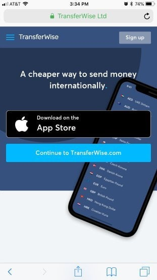
Good Example: Wise

Click and zoom to see the full mobile homepage.
Although Wise uses multiple call-to-action buttons on their mobile homepage (“Sign up”, “Download on the App Store” and “Continue to Wise.com”), each option is strategically placed at the top of the page.
Their mobile homepage not only uses finger-friendly buttons, a benefit driven headline and negative space to focus visitors towards the actions they want, but it’s all done at the very top of the page so no potential customer can miss it.
3. Create Mobile-First Forms
Filling out forms on a mobile device is one of the biggest friction points in the conversion journey. Tiny keyboards, auto-correct mishaps, and too many required fields can quickly push visitors away. To improve completion rates, your forms need to be designed specifically for mobile users.
Here are a few ways to make your forms mobile-first:
- Ask for the essentials only. Every field should earn its place. If you’re not going to use the data, don’t ask for it.
- Use collapsible or progressive fields. Break longer forms into smaller, step-by-step interactions so they feel lighter.
- Enable auto-fill. Let browsers and devices fill in common details like name, email, and address.
- Use smart inputs. Trigger number keypads for phone numbers, email-friendly keyboards for email addresses, and date pickers for scheduling.
- Offer social logins. A “Sign in with Google” or “Sign up with Facebook” option can reduce the time and effort it takes to complete the process.
Good Example: Learn Jazz Standards
 Learn Jazz Standards mobile lead gen page.
The Learn Jazz Standards opt-in form is an example of good mobile opt-in form asking for more than just an email address.
Asking for a first name allows for personalized emails and the “Select Instrument” drop down menu allows the website owner to send customized jazz education content to new subscribers based on their primary instrument abilities.
4. Leverage Mobile-Native CTAs
One of the biggest advantages of mobile landing pages is that they can tap into actions desktop pages can’t. While a desktop CTA usually means filling out a form or clicking a button, mobile opens up new, frictionless ways to connect.
Think beyond the standard button and use mobile-native calls-to-action that align with what your audience needs in the moment:
Click-to-call. Perfect for local businesses or high-ticket offers where personal contact builds trust.
Click-to-text. Let visitors start a conversation over SMS or WhatsApp without switching apps.
Add-to-calendar. Make it one tap to save a webinar, event, or call to their calendar.
Map integrations. A “Get Directions” button that opens Google Maps can drive foot traffic straight to your location.
Good Example: Vivint

Click and zoom to see the full mobile homepage.
The Vivint homepage offers a good click-to-call button example as they use it twice above their mobile fold: first as a phone icon in the header and second as a call-to-action button beneath their headline.
As an online visitor looking to add security measures to my home, it’s hard to miss what I should do next...give Vivint a phone call.
Click-To-Call Elements Made Easy
Thrive Architect makes adding click-to-call buttons on your mobile pages super simple.
You can read all about Thrive Architect's click-to-call feature here.
5. The Need for Mobile Speed
When it comes to mobile, patience is short and connections are often weaker. A landing page that takes too long to load won’t just frustrate your visitors — it will cost you conversions. In fact, 53% of mobile users abandon a site that takes longer than three seconds to load.
Speed optimization should be treated as a core conversion strategy, not a technical afterthought. Every kilobyte matters when someone is on the go.
Here’s how to keep your mobile landing pages lightning-fast:
- Remove unnecessary visuals. Every image or video should directly support your conversion goal. If it doesn’t, cut it.
- Optimize what remains. Use the right file type (JPEG for photos, PNG for graphics), resize images to display size, and compress them with a tool like TinyPNG or Kraken.io.
- Lazy load where possible. Let below-the-fold images load only when a visitor scrolls to them.
- Test on cellular data. Don’t just test on fast office Wi-Fi — simulate the experience of a user on 4G or slower.
- Respect data plans. Heavy, unoptimized media doesn’t just slow pages down — it can literally cost your visitors money, pushing them to leave.
Good Example: Evernote

Click and zoom to see the full mobile homepage.
The Evernote mobile landing page takes data minimalism to the extreme. The above-the-fold area of the page uses a simple white background, headline, subhead and call-to-action (CTA) button.
Below the fold, there’s a limited number of visuals used to educate visitors about the product and focus them towards the conversion goal of signing up for a free account. Effective whitespace usage is on full display here giving the mobile homepage a modern feel.
Speed things up. A fast page shows respect for your visitor’s time — and it directly boosts conversions. If you need help tightening up load times, check out our Website Speed Optimization guide for practical tips.
Bonus: Don’t Guess — Test! The Power of A/B Testing
Best practices will get your mobile landing page moving in the right direction — but the real growth comes from testing. Every audience is different, and the only way to know what truly works is to measure it.
A/B testing (or split testing) lets you compare two versions of a page by changing one element at a time and seeing which drives more conversions. Over time, these small, evidence-based improvements compound into significant gains.
Here’s how to get started:
Test one variable at a time. Start with high-impact elements like headlines, CTA colors, or form length.
Use the right tools. Most landing page builders and analytics platforms make it easy to split traffic and collect data.
Pay attention to the details. Even micro-changes — like switching “Sign Up” to “Get Started Free” — can produce double-digit conversion lifts.
Keep iterating. Optimization isn’t a one-and-done task. Treat your mobile landing page as a living asset, always evolving with what your audience responds to.
👉 Want the simplest way to run A/B tests inside WordPress? Thrive Optimize (included in Thrive Suite) lets you clone a page, make your tweak, and launch a test in just a few clicks. No extra plugins, no complicated setup — just data-backed decisions to grow your conversions.
Frequently Asked Questions About Mobile Landing Page Optimization
Mobile landing page optimization (LPO) is the process of improving every element of a page — copy, design, CTAs, forms, and speed — to increase conversions on mobile devices.
It matters because more than half of all searches now happen on mobile, and Google uses your mobile site for rankings. A poor mobile experience hurts both conversions and SEO.
Responsive design adapts a desktop page to smaller screens, while mobile-first design starts with the mobile experience as the priority and builds up from there.
Mobile-first forces clarity, single-column layouts, and focused CTAs. It also aligns with Google’s mobile-first indexing, ensuring your site is evaluated on its strongest version.
Headlines should be clear, concise, and visible above the fold — ideally under 6–8 words.
Copy should focus on benefits over features and be broken into scannable chunks with bullet points and short paragraphs. This helps users quickly understand “what’s in it for me?” without being overwhelmed by walls of text.
A high-performing mobile CTA is:
Large enough to tap with a thumb (minimum 44px tall).
Placed in easy-to-reach “thumb zones.”
Repeated or sticky so it’s always visible as users scroll.
Designed with strong color contrast.
Labeled with action-oriented copy like “Get My Free Guide” instead of “Submit.”
Speed directly impacts bounce rates, conversions, and SEO.
Google data shows that 53% of users abandon pages that take longer than 3 seconds to load. Techniques like image compression, code minification, CDNs, and lazy loading are essential to keep pages under that threshold.
Keep forms short and simple.
Use only essential fields, enable auto-fill and smart inputs (number keypads for phone, date pickers for scheduling), and consider social login for instant sign-ups. If more information is needed, break the form into multi-step stages so users don’t feel overwhelmed.
Best practices are just the starting point — real gains come from continuous testing.
A/B testing lets you compare variations (like headlines, CTA colors, or form lengths) with real traffic to see what performs better. Even small changes can deliver double-digit conversion lifts, making testing the engine of long-term optimization.
Bringing It All Together: Mobile Landing Page Optimization
Think about how you use your phone. You’re checking it while waiting for coffee, on the train, or winding down at night. That’s exactly how your visitors are meeting your landing pages too. If the experience feels smooth and easy in those moments, you’ve already built trust and nudged them closer to taking action.
The great part? Mobile landing page optimization doesn’t have to be complicated. It’s really about removing little bits of friction and making things simple. Here are the core pieces to focus on:
- Design for thumbs. Make buttons big enough to tap and layouts easy to scroll.
- Keep the important stuff in view. Your headline and CTA should be visible right away.
- Make forms painless. Use autofill, number keypads, or even social logins so they’re quick to complete.
- Use mobile-native CTAs. A one-tap “Call Now” or “Add to Calendar” button makes it easy for people to say yes.
- Speed things up. A fast page shows respect for your visitor’s time.
- Keep testing. Small tweaks, tried over time, add up to big wins.
Do a few of these well, and you’ll already be ahead of most sites. Do all of them, and your mobile landing pages can turn into one of your strongest conversion assets.
👉 And if you want the easiest way to make it happen, Thrive Suite has you covered with mobile-friendly templates, built-in A/B testing, and all the tools you need right inside WordPress. With the right setup, you won’t just keep up in a mobile-first world — you’ll thrive in it.


