When you want to promote a limited time offer or communicate some time sensitive information to your online visitors, what’s the best way to grab their attention and get your message across?
Keep reading to learn how Thrive Leads and Thrive Theme Builder can help you build and deploy a surprisingly simple notification design on your WordPress website — fast.More...
Meet the Notification Bar
It’s a narrow, screen-width banner that appears at the very top of posts and pages that either communicates a brief message or promotes a limited time service, product or offer to online visitors.
In their simplest form, notification bars (also known as alert bars, announcement bars, hello bars, sticky bars or floating bars) are just solid color banners displaying simple text and a call-to-action button or anchor link:

You may have noticed more and more sites using notification bars lately to inform visitors about something critically important — like service impacts due to a global pandemic.
Why?
Because notification bars are super effective at making time-sensitive information stick out.
Notification Bar Use Cases
But announcing the impact of a health crisis to your audience isn’t the only way you can use notification bars to great effect on your website.
Let’s take a quick look at a few other use cases you might want to model when it comes to not only making your online audience more informed, but boosting your conversions too!
1. Promote an Event, Contest or Limited Time Product Launch
If you’ve been following Thrive Themes for a while now, then you know we love deploying notification bars (with countdown timers inside) to promote our product launches:
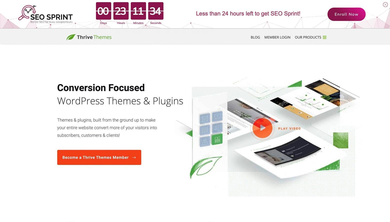
We often use notification bars here at Thrive Themes to promote our limited time product launches.
If you’ve have an upcoming event or are running an online contest, consider using notification bars to get the word out about those time constrained offers as well!
Want to Make Your “Limited Time” Product Launch Evergreen?
Check out the Ultimate Scarcity Marketing Plugin for WordPress — Thrive Ultimatum.
With this tool, you can take your limited time product launches to a whole new level by creating:
- Fixed Date Campaigns
- Automatically Recurring Campaigns
- And even Evergreen Scarcity Campaigns
… using a lockdown feature that keeps your notification bar countdown timers honest — even if a visitor switches devices, uses different browsers or clears their cookies!
And don’t forget that Thrive Ultimatum, Thrive Leads and Thrive Theme Builder are all included together inside Thrive Suite.
2. Promote a Seasonal Sale or Limited Time Offer
Is Black Friday around the corner?
Or maybe you’re thinking about offering some kind of limited time, seasonal sale or live training?
Using a notification bar to promote the occasion can help grab an online visitor’s attention so they don’t miss out.
Udemy uses notification bars all the time to promote their limited time offers or even live trainings:

Udemy uses notification bars all the time to promote limited time offers, trainings and seasonal sales.
3. Showcase a Particular Service or Product You Offer
Do you have a specific product or service you want to bring a little extra attention to?
Don’t be afraid to put it front and center with a notification bar like Decathlon’s UK store uses:

Decathlon's UK store uses a simple notification bar design to promote one of their lesser known services.
4. Maximize Email Signups with Notification Bars
Growing your email list is more important than ever. Notification bars, with their prominent placement and attention-grabbing designs, offer a unique opportunity to boost your email signups significantly. Here’s how to harness the power of notification bars to enhance your email marketing efforts:

Offer Exclusive Incentives
People love feeling special, and exclusive incentives give them a reason to engage with your notification bar and sign up for your email list. Consider offering a discount code for their first purchase or access to members-only content. For example, a notification bar that reads, “Join our VIP list for a 10% discount on your first order!” directly appeals to new visitors’ desire for savings while encouraging them to sign up.
Personalize Your Approach
A generic message won't cut it. Tailor your notification bar’s message to reflect the interests and needs of your target audience. Use data-driven insights to segment your audience and craft personalized messages that resonate. For instance, if you run an online bookstore, your notification bar could promote a downloadable guide, “Top 10 Must-Read Books for Thriller Enthusiasts,” to visitors who frequently browse the thriller genre.
Simplify the Sign-Up Process
The easier it is to sign up, the more likely visitors will do it. Ensure your notification bar leads to a simple sign-up form with minimal fields—ideally just an email address. To maintain a clean design, you could have the notification bar expand into a sign-up form when clicked, keeping the user's experience smooth and unobtrusive.
Use Engaging Visuals and Clear CTAs
A visually appealing notification bar can make a significant difference in attracting sign-ups. Choose colors that stand out but are in harmony with your website’s design. Your call-to-action (CTA) button should be clearly visible and labeled with action-oriented text like “Get My Discount” or “Access Exclusive Guide.” Remember, the goal is to make the action as clear and compelling as possible.
Test and Optimize
Not all notification bars are created equal. Use A/B testing to try out different messages, incentives, designs, and placements to see what works best for your audience. Keep an eye on metrics like click-through rates and the number of sign-ups to measure effectiveness. This data-driven approach will help you refine your strategy and maximize email sign-ups over time.
By implementing these strategies, you can turn your notification bar into a powerful tool for growing your email list. Remember, the key is to offer value, make the sign-up process effortless, and continually optimize based on performance data. With a bit of creativity and strategic thinking, you’ll see your email list—and your business—grow.
5. Highlight Unique Selling Propositions (USPs) and Announcements
Standing out from the crowd is crucial. Your website's notification bar is an excellent tool for spotlighting what makes your brand unique—your Unique Selling Propositions (USPs)—and for sharing important announcements directly with your audience. Here's how to effectively use notification bars to highlight your USPs and make key announcements:
Showcase Your USPs Clearly

Your USPs distinguish your brand from competitors. Use the notification bar to concisely highlight these benefits. Whether it’s free shipping, a no-questions-asked return policy, or environmentally friendly products, make sure it’s something that resonates with your audience's needs and values. For example, a notification bar that states, “Enjoy Free Next-Day Delivery on All Orders!” immediately communicates a significant benefit of shopping with you.
Make Timely Announcements
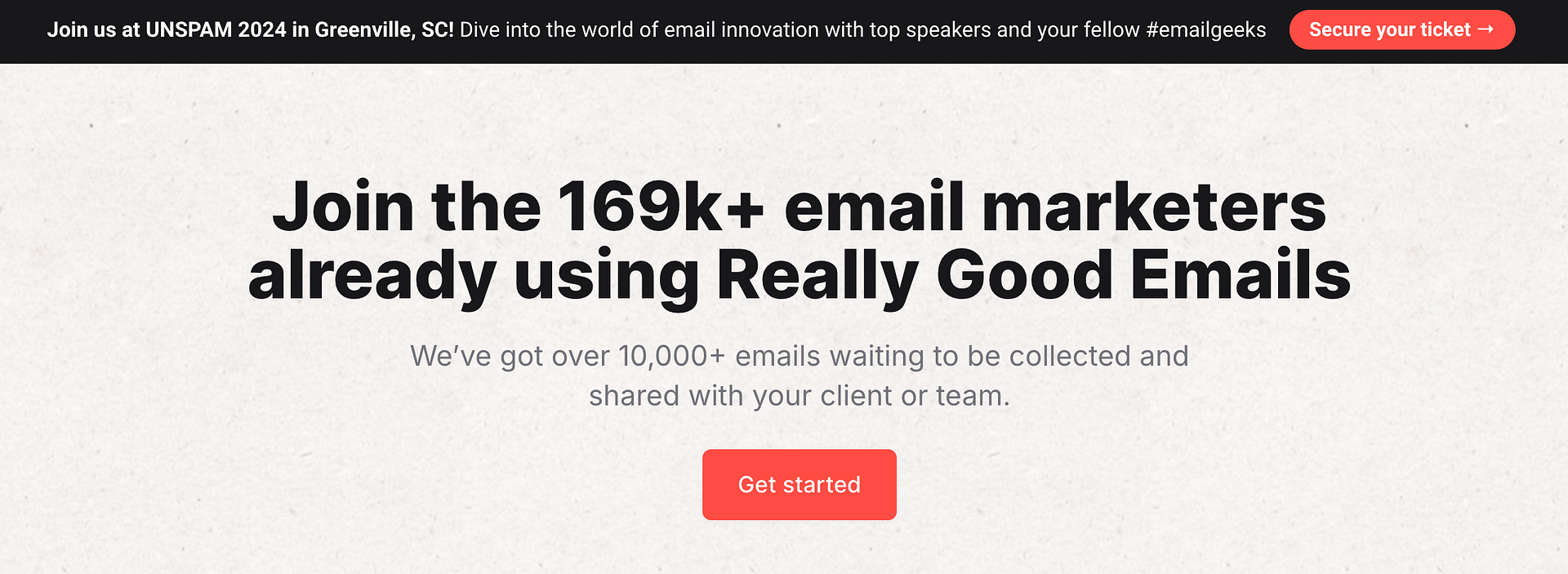
Use notification bars to make real-time announcements about your business. This could be anything from launching a new product line to informing customers about a limited-time sale. Keeping your audience informed not only builds trust but also encourages them to take action. A notification bar that says, “Our Spring Collection Drops Tomorrow – Get Early Access!” creates anticipation and encourages visitors to check back.
Employ Visual Elements to Draw Attention
Visual cues can significantly increase the effectiveness of your notification bar. Use icons, emojis, or even simple animations to draw the eye and convey your message quickly. If your USP is eco-friendliness, consider incorporating a green leaf icon into your notification bar. These small details can make your message more engaging and memorable.
Use Language That Reflects Your Brand
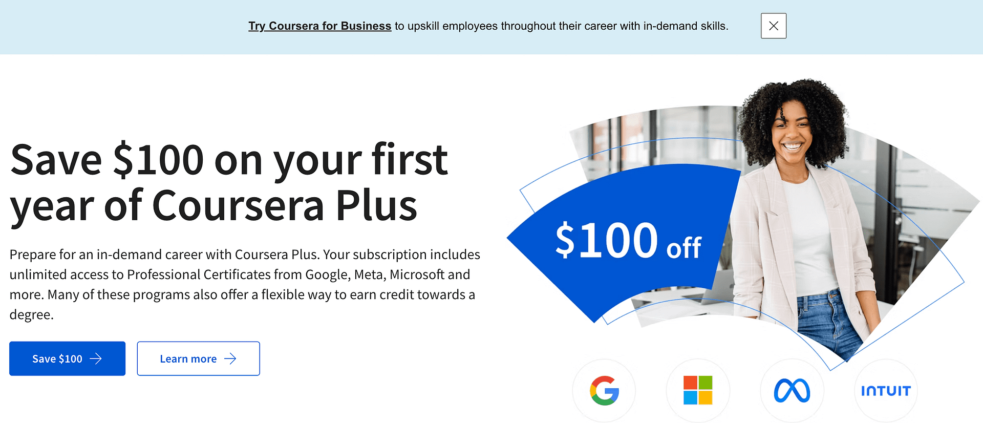
The tone and language of your notification bar should align with your overall brand voice. Whether your brand is formal, playful, or anything in between, consistency is key to reinforcing your brand identity. If one of your USPs is a fun and quirky product range, reflect this in your notification bar with playful language and exclamation points to grab attention.
Refresh Content Regularly
Keep your notification bars fresh by regularly updating them with new USPs and announcements. This not only keeps your website looking active and current but also gives returning visitors a reason to pay attention to the notification bar each time they visit. Regular updates can be tied to seasonal offers, new content releases, or any changes in your service offerings.
Link to More Information
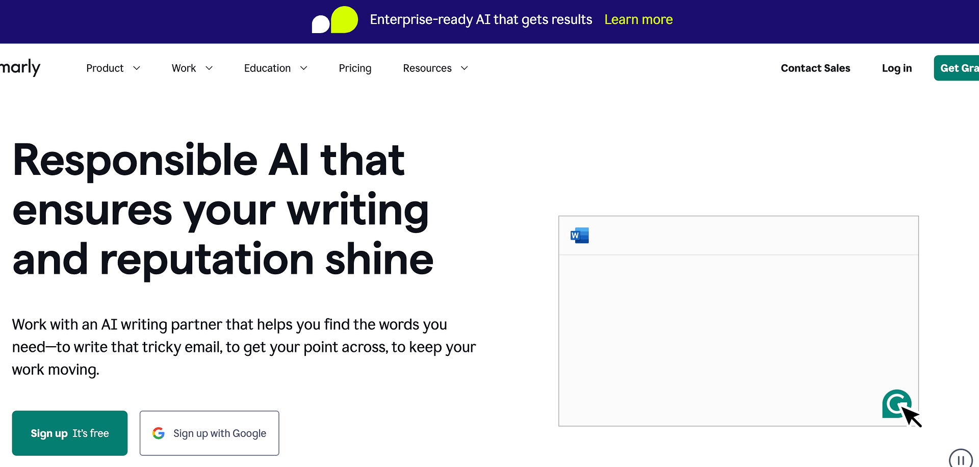
While notification bars are great for concise messages, sometimes you need to provide more details. Include a call-to-action (CTA) link within your notification bar that directs visitors to a page where they can learn more about your announcement or USP. This could be a product page, a blog post, or a dedicated landing page for a special event.
By strategically using notification bars to highlight your USPs and make announcements, you can effectively communicate the value of your brand and keep your audience engaged and informed. Remember, the goal is to add value to the visitor’s experience on your site, so always prioritize clarity, relevance, and engagement in your notification bar strategy.
6. Using Notification Bars for Customer Engagement and Feedback
Engaging with your audience is a critical component of building a strong online presence. Notification bars offer a direct line of communication with your site visitors, making them a fantastic tool for enhancing customer engagement and soliciting feedback. Here’s how you can use notification bars to foster a dialogue with your audience and gather valuable insights.
Invite Feedback Directly
Feedback is gold in the e-commerce world. Use your notification bar to invite customers to share their experiences or opinions. A simple, “Tell us what you think!” with a link to a feedback form or survey can provide you with actionable insights and show your customers that their opinions matter. Make sure the process is quick and straightforward to encourage participation.
Engage Users with Interactive Content Like Podcasts, Polls and Quizzes

Use interactive content to engage people through your notification bars. Polls and quizzes are not just fun; they’re also engaging ways to learn about your audience. Use a notification bar to invite visitors to participate in a poll about what new product line they’d like to see or a quiz related to your industry. This not only keeps your audience engaged but also gives you a peek into their preferences and interests.
Highlight User-Generated Content
Showcasing user-generated content (UGC) can significantly boost engagement. Use your notification bar to encourage customers to share their photos, reviews, or testimonials of your products. For example, “Loved your purchase? Share your photo with #BrandHashtag for a chance to be featured!” This approach not only provides you with valuable content but also builds a community around your brand.
Offer Live Chat Support
Sometimes, customers have immediate questions or need support. A notification bar that offers live chat can be a game-changer in providing real-time assistance. “Have questions? Chat with us now!” shows your commitment to customer service and can increase conversion rates by addressing concerns on the spot.
Create a Sense of Community
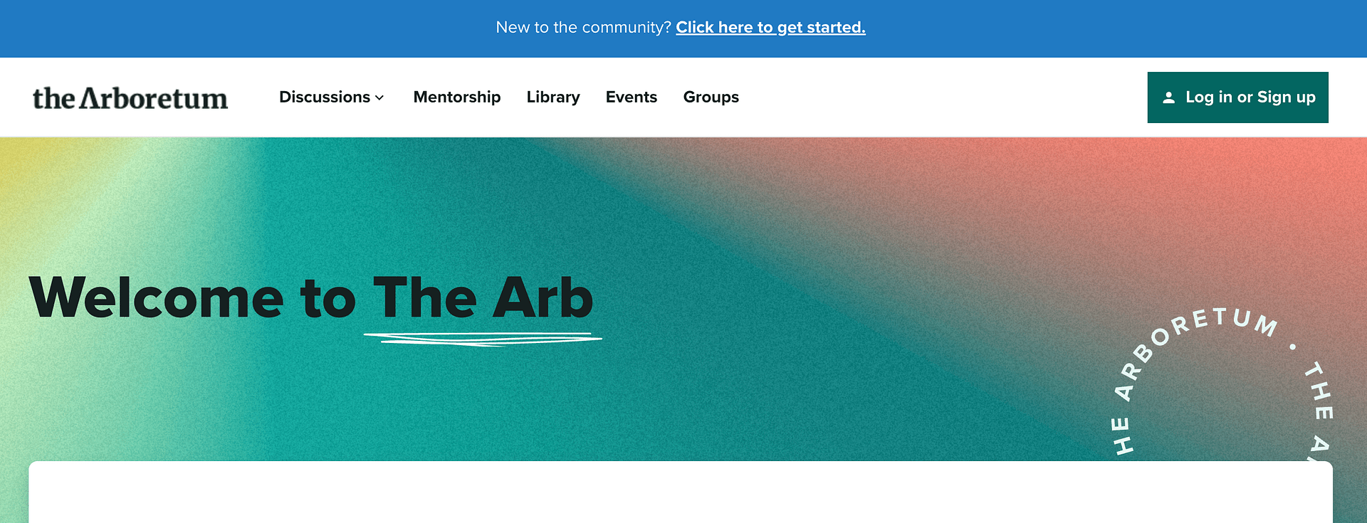
Use notification bars to invite visitors to join your brand’s community, whether that’s a loyalty program, a brand ambassador program, or an online forum. A message like, “Join our community and enjoy exclusive benefits!” can foster a stronger connection between your brand and your audience, encouraging loyalty and repeat business.
Solicit Ideas for New Products or Features
Engage your most enthusiastic customers by asking them what products, features, or improvements they’d like to see. This not only gives you a wealth of ideas but also makes your customers feel like they’re a part of your brand’s journey. A notification bar that says, “What should we create next? Share your ideas!” can stimulate engagement and innovation.
By using notification bars strategically for customer engagement and feedback, you not only enhance the user experience on your site but also build stronger relationships with your audience. Remember, the key is to communicate openly, listen actively, and show that you value your customers’ input and participation.
7. Promote Your Business’s Charity Project or Referral Program
Is your business involved with a charity or has a referral program you want customers to be aware of?
The notification bar is a simple way to let your online visitors know about it like TOMS does on their website:

8. Inform Customers About Operating Hour or Service Offering Changes
Does your business have specific hours of operation?
Did your store hours change recently?
Or maybe you ran out of a popular product and won't have stock again for a while...
If so, then using a notification bar is a great way to communicate such critical info to your customers, just like Midland Liquidators did during the Covid pandemic:

And with the Thrive visual editor's Conditional Display feature, you can even set specific times of day that your notification bar will be visible. This feature is ideal for businesses who can't afford to answer their phone 24/7 and only want to make their contact number visible during business hours.
9. Communicate Service Impacts Due To Natural Disasters or Global Health Threats
Finally, if your business has been impacted by some kind of natural disaster or global health crisis, then consider using the trusty notification bar to let your customers know what’s up.
Even the American Museum of Natural History used a bright colored notification bar to let their patrons know how museum reservations were given during the pandemic:

The American Museum of Natural History uses a stand out notification bar to help patrons navigate their new timed-limited entry ticketing system.
So now that you have good use cases of how notification bars can be deployed on your own website, let’s change gears and discuss how to actually get them built for WordPress using Thrive Suite...
How To Build Notification Bars Using Thrive Suite
You may have noticed that the notification bar examples above used fairly similar designs. However, there’s actually two different visitor experiences notification bars can be categorized under:
- Visitors CAN close the notification bar (because it includes a close button)
- Visitors CAN NOT close the notification bar (because it’s part of the header)
So before building your own notification bar, you must first decide which visitor experience you want to provide because it determines which Thrive Suite tool you should use to get the job done:
- Use Thrive Leads (our lead generation and opt-in form plugin) if you want visitors to be able to close your notification bar. You’ll accomplish this by using the Sticky Ribbon opt-in form type.
- Use Thrive Theme Builder (the most advanced and visually customizable theme for WordPress) if you don’t want visitors to be able to close your notification bar. You’ll accomplish this by adding the notification bar to your header design.
To get started, let’s first see how to build a simple notification bar design visitors CAN close using the Sticky Ribbon form type inside Thrive Leads:

Let's build a simple notification bar design that visitors CAN close with a Thrive Leads sticky ribbon form.
But if you’d rather build a notification bar as part of your header, just click here to skip to those instructions instead.
How To Build a Notification Bar Visitors CAN Close with Thrive Leads
First, make sure you have the Thrive Leads plugin installed and activated so you can open the Thrive Leads dashboard.
Under the Lead Groups area, click the “Add New” button and give it a name. Once the new lead group has been created, click the “Add New Type of Opt-In Form” button and select the Ribbon option:
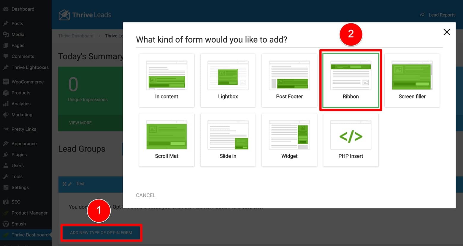
Create a new Lead Group in the Thrive Leads dashboard and add a Ribbon form type to it.
Once a Ribbon has been added to your new Lead Group, click on the “Add” text that appears, press the “Create Form” button (after the new screen loads), and give your new Ribbon form a name (best to make it descriptive).
From there, enter the Thrive Leads visual editor by clicking on the “Edit Design” button (the pencil icon).
Designing a Notification Bar Inside the Thrive Leads Visual Editor
When the visual editor loads, you’ll need to select a template design. For the purposes of creating a simple notification bar (as shown here and in the featured video), select the “Blank Template” option:
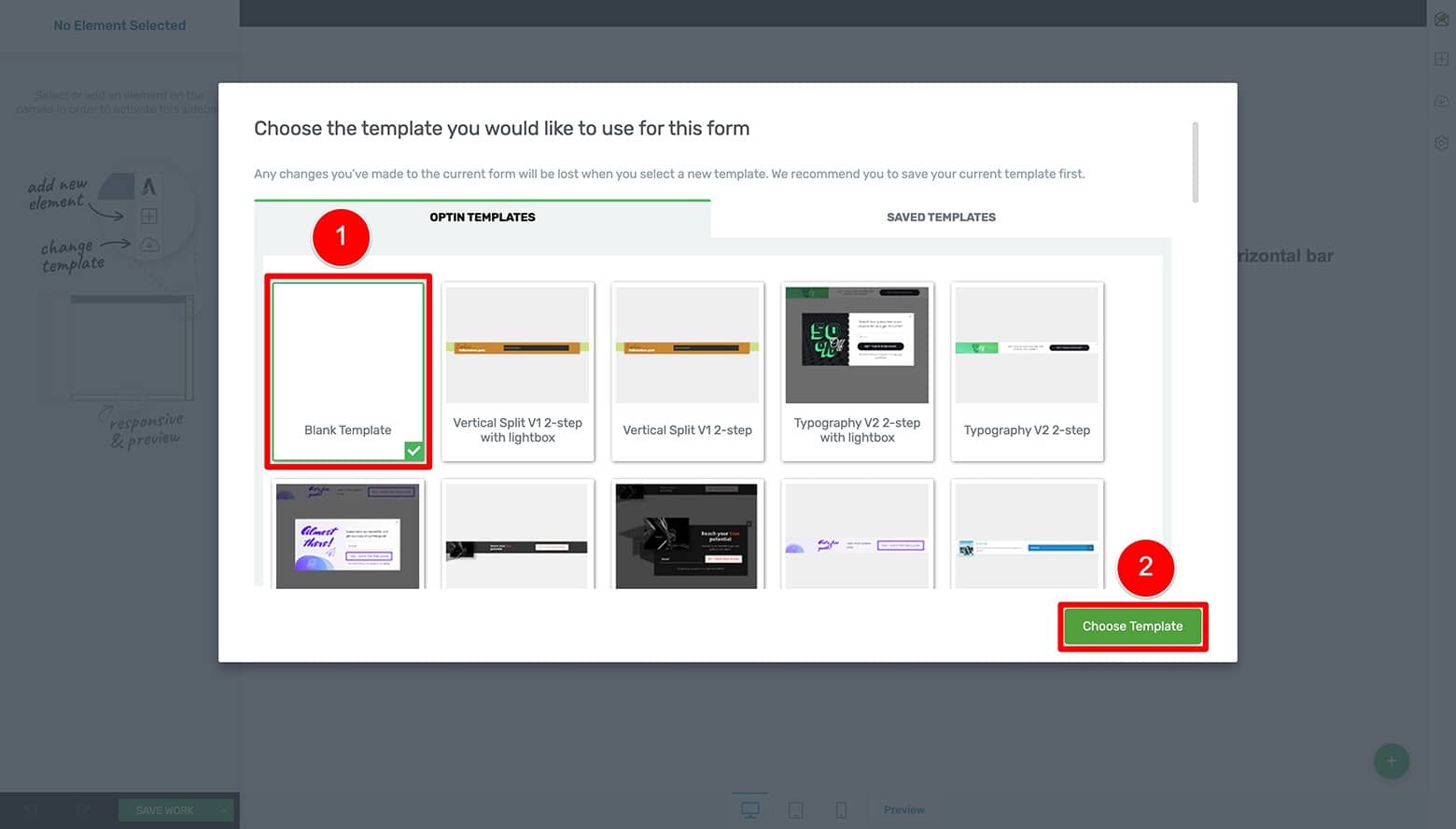
Once you open the Thrive Leads visual editor, select the "Blank Template" design if you want to build a simple noification bar design.
How To Make Your Notification Bars Fancy in Just a Few Clicks
If you want to create a more advanced notification bar design, feel free to select one of the dozens of predesigned Sticky Ribbon templates available inside Thrive Leads instead!
You can quickly modify the text, image(s) or call-to-action button within the template you choose to showcase a more eye-catching design like this one:
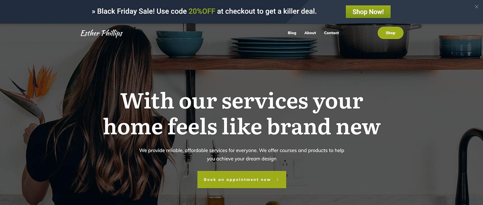
Here's an example of a more advanced notification bar design you can quickly and easily create using one of the dozens of conversion focused sticky ribbon template designs available inside Thrive Leads.
Once the “Blank Template” loads, get started by changing both the Background Section element’s and the Thrive Leads Element breadcrumb’s margins and paddings to 0 pixels:

Change both the Background Section element’s and the Thrive Leads Element breadcrumb’s margins/paddings to 0 pixels
Next, highlight the Background Section element and open the Main Options tab in the left sidebar. From here, set the Background Section element to take up the entire screen width by either:
- Setting the “Content Maximum Width” to 100%, or...
- Toggling ON both the “Stretch to fit screen width” and the “Content covers entire screen width” options.
Continue by setting the “Section Minimum Height” setting to 60 (or so) pixels and centering the “Vertical Position” option:

Modify the Background Section element's alignment settings inside its Main Options tab.
Now open the Background Style tab and set the background color to either your brand color or one that will stand out and "alert" the visitor:
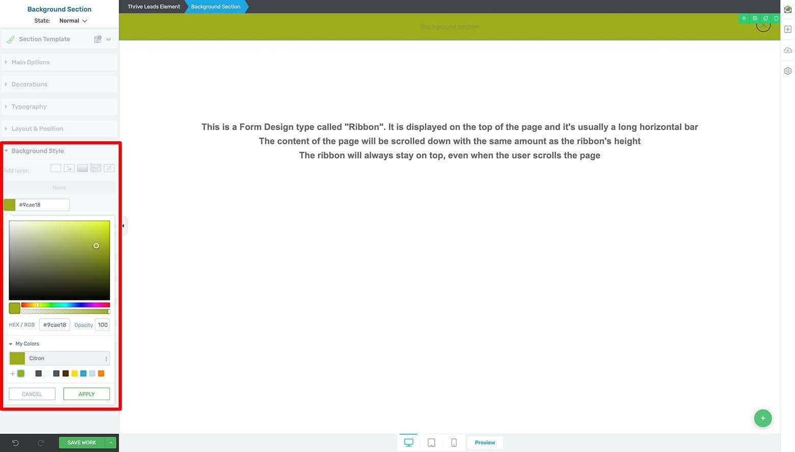
Apply a background color to your notification bar design by highlighting the Background Section element and opening its Background Style tab.
Next, tidy up the look and feel of the “x” Icon element (a.k.a. the close button) so it complements the new background color. Here’s how to do this...
Highlight the Icon element and:
- Open its Main Options tab to both reduce its pixel size and change its color.
- Open the Layout & Position tab, then set all the margin & padding options to 5 pixels.
Then open the “Advanced” subtab, set the “Position” settings to Absolute, and click the upper right corner option. - Open the Borders & Corners tab and change the Icon element’s border color:
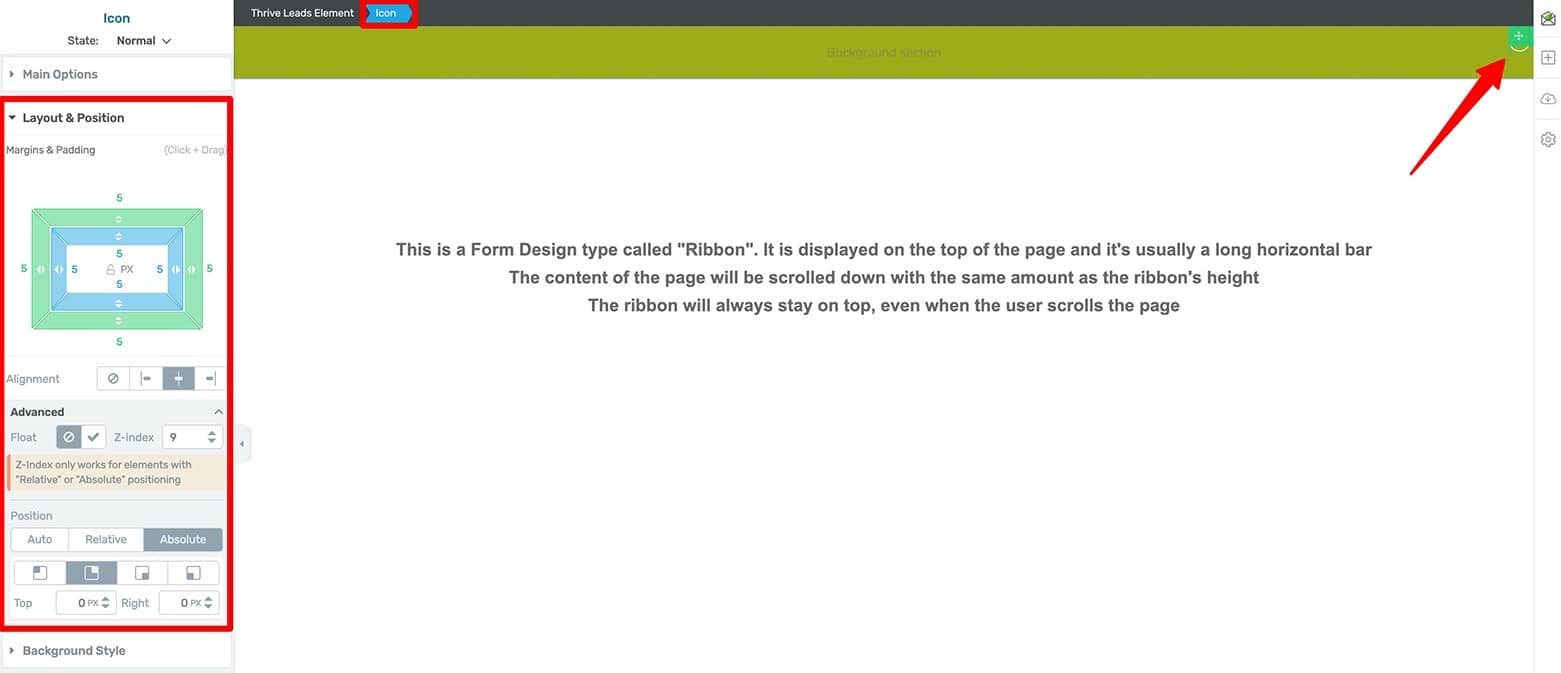
Modify the “x” Icon element's (a.k.a. the close button) display settings to fit your new background color.
Now drag & drop a Text element inside your Background Section and write out your notification copy.
Highlight the newly loaded Text element and complete the following steps to get it styled:
- Center the text via the floating Text Editor bar
- Open its Main Options tab to change the text color
- Change the Font Type, Font Size, Line Height, Line Spacing and Letter Spacing as desired
- Inline edit your text as needed
From here, just set an anchor link within your text that will take visitors to a Target URL when clicked. If setting the anchor link changes the text styling (to the default hyperlink color), just highlight the anchor link once more and set its color back to what you previously chose.
Go ahead and bold and/or underline the anchor link text while you’re at it to make it stand out from the rest of the copy:

Stylize your notification bar's text.
Now that your Sticky Ribbon notification bar design is ready for desktop, it’s time to optimize it for tablet and mobile.
How To Optimize Your Sticky Ribbon Notification Bar for Tablet & Mobile
To do this, just click on the tablet and mobile icons at the bottom center of the visual editor window to make the necessary modifications. Most likely, you’ll need to modify the Text element’s Font Size and add some padding pixels to the Background Section element as needed.
Because changes you make in the Thrive visual editor cascade down from larger screen sizes to smaller screen sizes, make sure to first modify the tablet design followed by the mobile design.
Take care that your close button Icon element does not overlay your text on the mobile version of the notification bar:
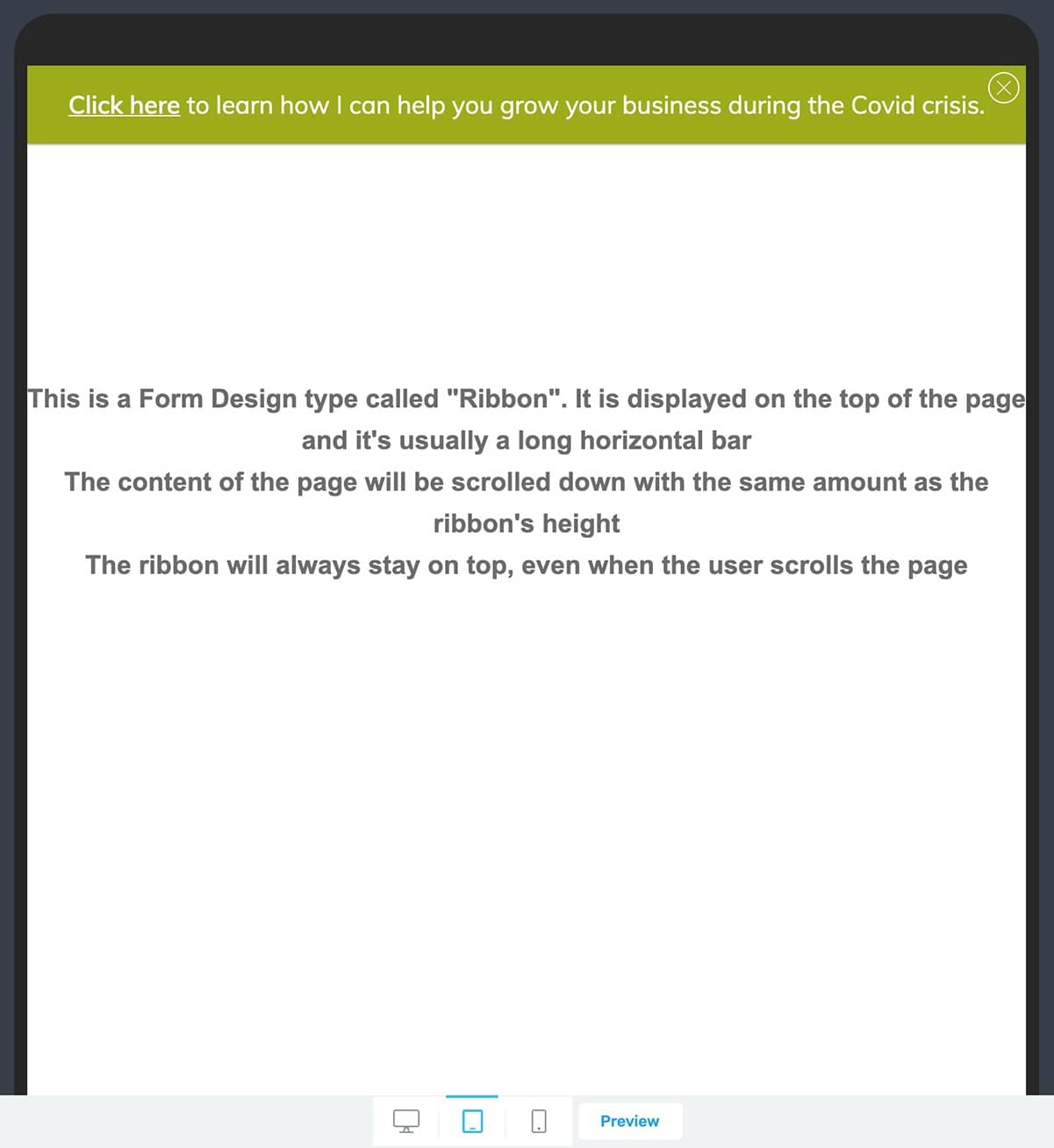
Optimize your ribbon design for tablet.
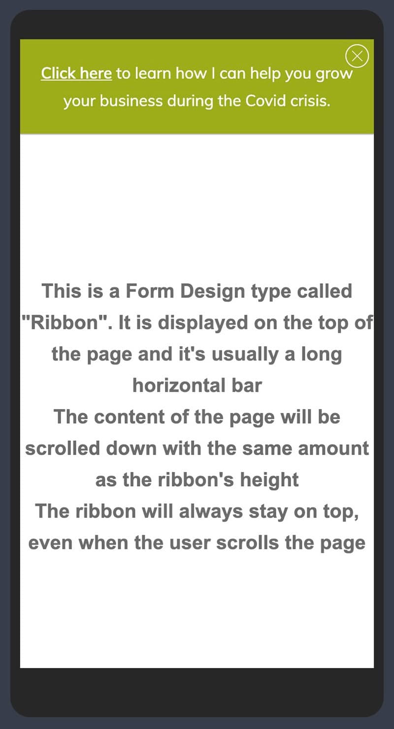
Optimize your ribbon design for mobile.
Once your tablet and mobile screen size modifications are complete, make sure to save your work before returning to the Thrive Leads dashboard.
Setting Your Sticky Ribbon Notification Bar Display and Targeting Settings
When building a notification bar in Thrive Leads, you’ll need to program display & targeting settings. This is done from the Thrive Leads dashboard.
And even though Thrive Leads gives you several Trigger, Display Frequency and Position options for Ribbon forms, use the following recommended settings when you’re building a notification bar:
- Trigger: “Displays immediately on page load"
- Display Frequency: “All the time”
- Position: “Top”

Set your sticky ribbon form Trigger, Display Frequency, and Position settings.
Luckily, these are the default settings for any new Ribbon form you create — so you shouldn’t need to modify them.
From there, move back to the Lead Groups area of your Thrive Leads dashboard so you can set your Ribbon display settings.
Click on the cog icon (on the right side of your new Lead Group) to open the Display Settings lightbox. From there, use Thrive Leads’s powerful display logic options to establish which posts and pages you want your new Sticky Ribbon to appear on:
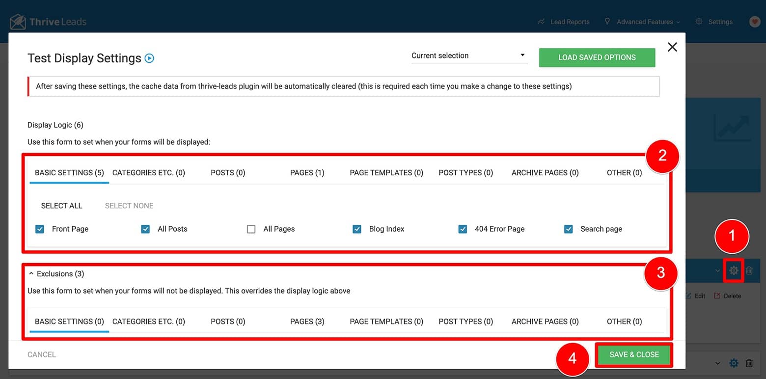
Set your lead group Display Settings.
And finally, after saving your Display Settings, make sure to activate your new Sticky Ribbon notification bar by toggling ON the “Display On Desktop” and “Display On Mobile” options:
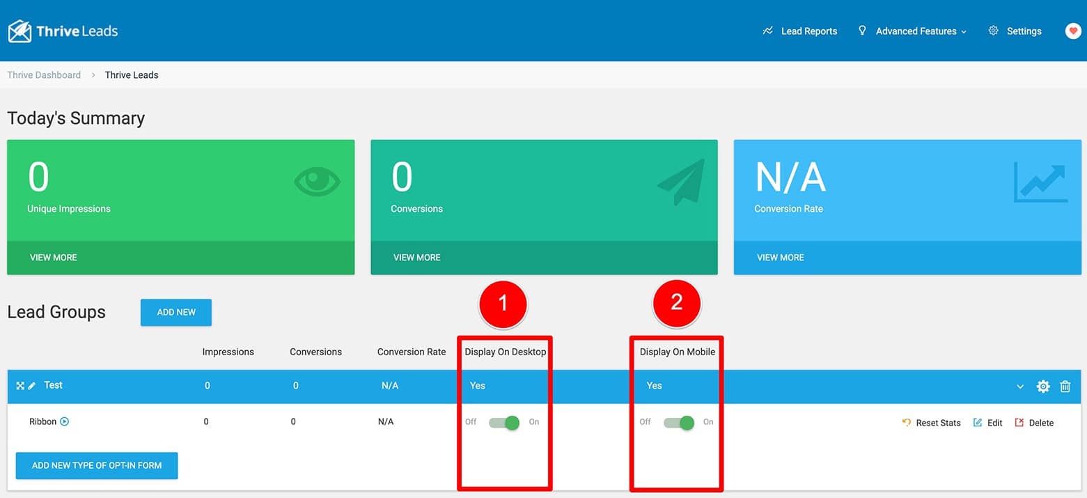
Toggle ON your lead group for Desktop and/or Mobile.
Pretty cool, right?
CAUTION: Know Your Lead Group Display Rules
When using Lead Groups (in Thrive Leads) to display your notification bars, it’s important to understand how Lead Group prioritization rules operate — so you don’t accidentally deactivate your opt-in forms at the same time!
For example, if you have a pre-existing Popup Lightbox opt-in form active via a lead group in Thrive Leads, creating your notification bar (with the Ribbon form option) inside a new or different lead group means that both will never be able to trigger on the same post or page.
To have both appear on the same page, they would need to be part of the same lead group.
Make sure to read and understand the Lead Group rules to ensure the correct forms always appear on the posts and pages you intend them to.
How To Build a Notification Bar Visitors CAN’T Close with Thrive Theme Builder
If you’d rather build a notification bar your visitors CAN’T close, you’ll need to add it to your sitewide header — and the best way to do that is with Thrive Theme Builder.
How To Customize & Manage Your Headers in Thrive Theme Builder
To learn more about how to customize & manage your site headers with Thrive Theme Builder (as well as Thrive Architect), make sure to watch minutes 3:10 to 10:54 in the following video:
From the Blog Post: How To Build Conversion Focused Headers for Modern Landing Page Designs
First, make sure you have Thrive Theme Builder installed and activated as your WordPress theme. Then enter the Thrive Theme Builder dashboard to get started.
Now navigate to the Templates tab of the Thrive Theme Builder dashboard and hover over a Theme page template. Click the “Edit” button that appears on hover to open the Thrive Theme Builder visual editor:
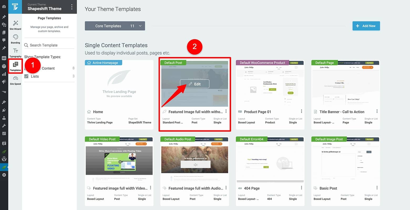
Open your Thrive Theme Builder dashboard's Templates tab to then enter the Thrive Theme Builder visual editor.
Building Your Notification Bar Inside the Thrive Theme Builder Visual Editor
In the visual editor window that loads, highlight the Header element and click the “Edit” option.
This will open the Edit Header mode and any changes you now make to this header design will immediately apply to every other instance of this particular header design where displayed on your website.
Continue by dragging & dropping a Background Section element above the Columns element inside your current header.
Now highlight the new Background Section element and stretch it to fill the entire width of the screen:
- Open the Main Options tab
- Set the “Content Maximum Width” option to 100%
- Toggle the “Stretch to fit screen width” option to ON
While you’re in the Background Section element’s Main Options tab, go ahead and set the “Section Minimum Height” to 60 (or so) pixels. Center the “Vertical Position” option too.
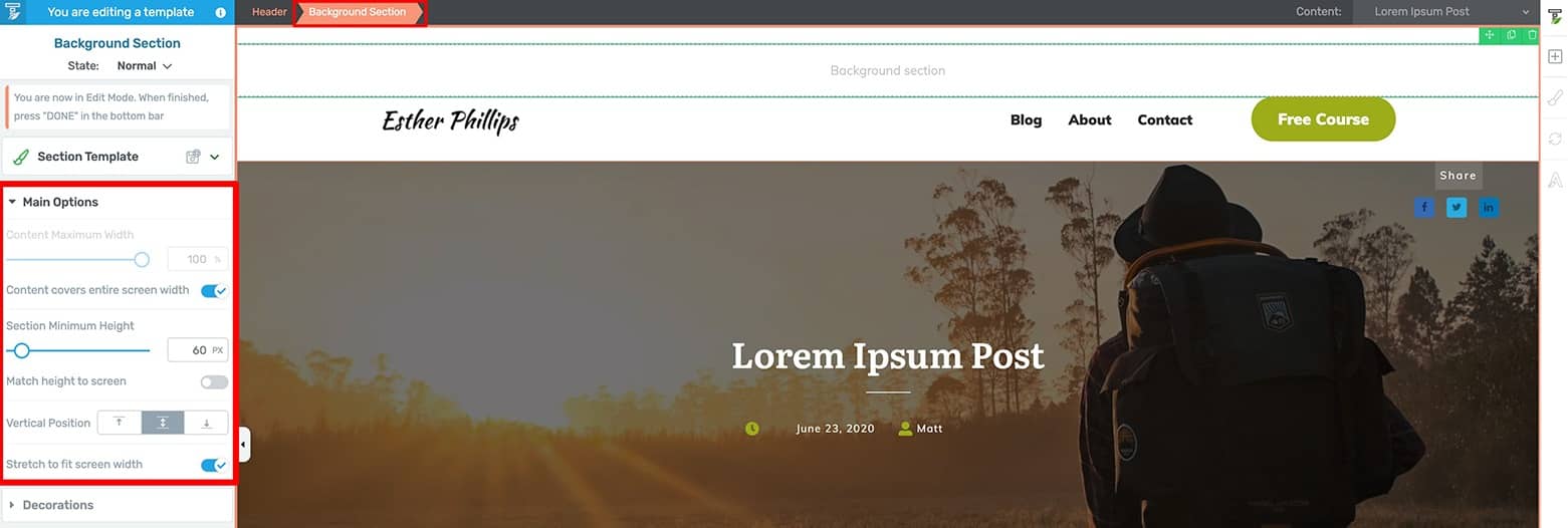
Add a Background Section element to your header and then change the alignment settings in its Main Options tab.
With the Background Section element still highlighted, open the Layout & Position tab so you can set the Padding to 0 pixels on every side. Then set its bottom Margin to match the top Padding pixel value of the Header element (you’ll see why next).
Now highlight the Header element and open its Layout & Position tab. Set its top Padding pixel value to 0. These strange pixel setting steps will keep the main part of your header (the logo and menu items area) vertically centered beneath your new notification bar.
Continue by highlighting the Background Section element once again and open its Background Style tab. From here you can set your notification bar color (either your brand color or one that really sticks out):
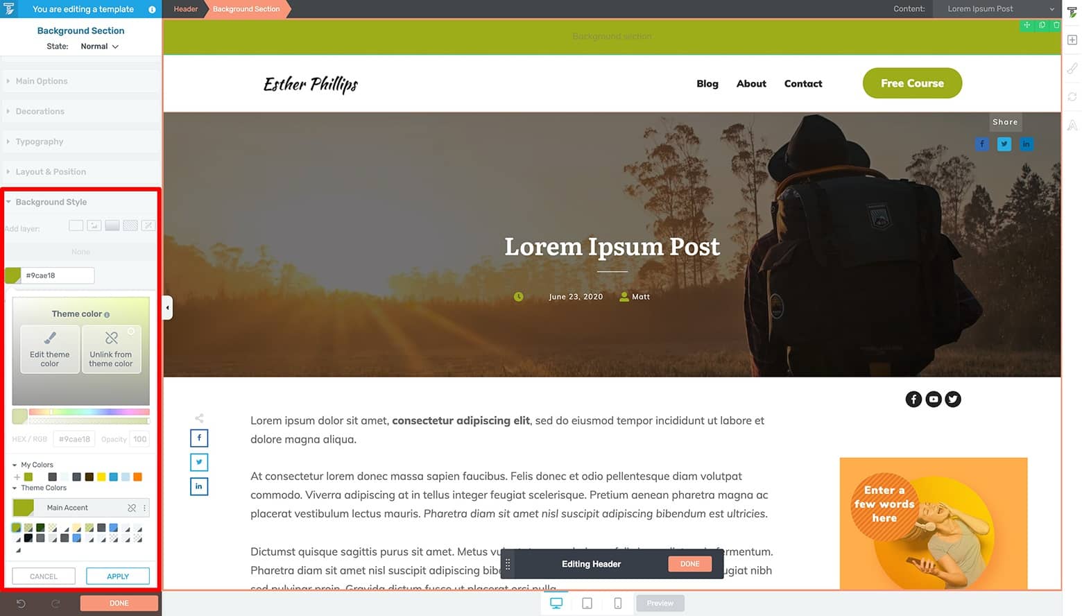
Open the Background Section element's Background Style tab to apply a background color to your notification bar design.
Once applied, drag & drop a Text element into the Background Section element to program your notification copy.
To do this, make sure the newly loaded Text element is highlighted and complete the following steps to get it styled:
- Center the text via the floating text editor bar
- Open its Main Options tab to change the text color
- Change the Font Type, Font Size, Line Height, Line Spacing and Letter Spacing as desired
- Inline edit your text as needed
From here, just set an anchor link within your text that will take visitors to a Target URL when clicked. If setting the anchor link changes the text styling (to the default hyperlink color), just highlight the anchor link once more and set its color back to what you just chose.
Go ahead and bold and/or underline the anchor link text while you’re at it to make it stand out from the surrounding text:
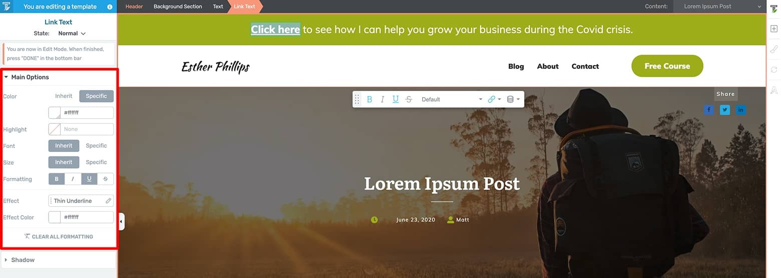
Stylize your notification bar's text.
Now that your Simple Header notification bar design is ready for desktop, it’s time to optimize it for tablet and mobile.
How To Optimize Your Notification Bar Header for Tablet & Mobile
To do this, just click on the tablet and mobile icons at the bottom center of the visual editor window to make the necessary modifications. Most likely, you’ll need to modify the Text element’s Font Size and add some padding pixels to the Background Section element as needed.
Because changes you make in the Thrive visual editor cascade down from larger screen sizes to smaller screen sizes, make sure to first modify the tablet design followed by the mobile design.
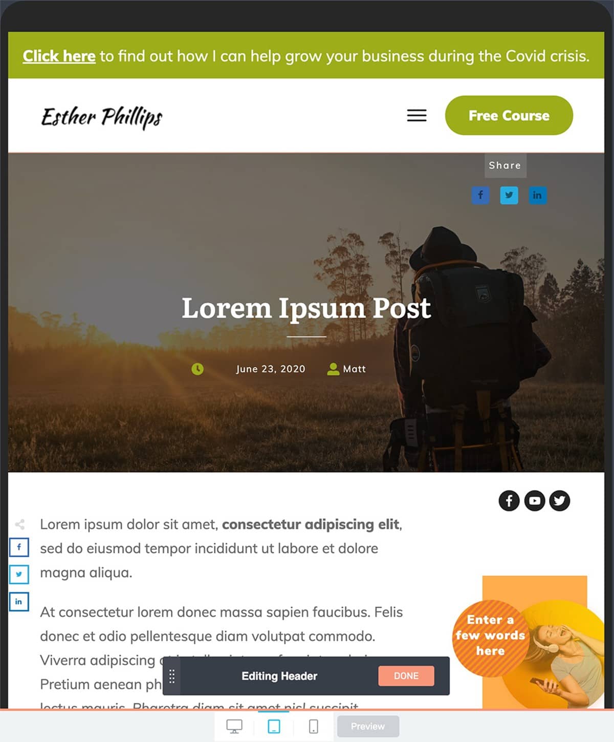
Optimize your header design for tablet.
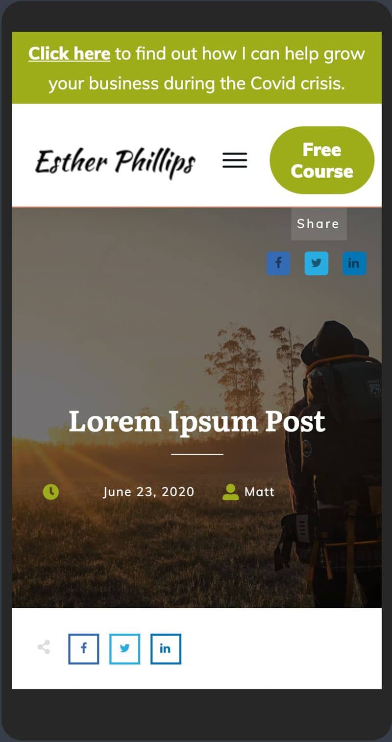
Optimize your header design for mobile.
Once your tablet and mobile screen size modifications are complete, make sure to click the “Done” button on the floating Editing Header bar and save your work.
And that’s it, your notification bar header design is complete! Just watch this video segment to learn how to deploy your new notification bar header across the correct posts and pages of your Thrive Theme Builder controlled website.
Design Placement and Best Practices for Notification Bars
Notification bars are a subtle yet powerful tool for communicating with your website visitors. Their design and placement are crucial in catching the eye without disrupting the user experience. Here's how to strike the right balance with your notification bars, ensuring they're effective and engaging:
Opt for Strategic Placement
The placement of your notification bar can significantly impact its effectiveness. Typically, notification bars are placed at the top or bottom of the screen. Top-placed bars are immediately visible and can grab attention quickly, while bottom-placed bars are less intrusive and can be perfect for longer browsing sessions. Consider your website layout and user flow when deciding placement, and test both positions to see which performs better.
Use Color Contrast Wisely
Color is a powerful tool in drawing attention to your notification bar without being jarring. Choose colors that stand out from your website’s overall color scheme but still complement it. Using contrasting colors for the text and background of the notification bar can make your message pop while maintaining readability. For example, if your website has a light color scheme, opt for a notification bar with a dark background and light text.
Maintain Design Consistency
While the notification bar should stand out, it also needs to feel like a part of your website. Maintain design consistency by using fonts, button styles, and design elements that align with your brand identity (here are some top design principles you can follow). This creates a cohesive user experience and reinforces brand recognition. Consistency in design also includes responsiveness; ensure your notification bar looks great and functions well on devices of all sizes.
Create Urgency Without Being Obtrusive
Notification bars are excellent for creating a sense of urgency, especially for limited-time offers or important announcements. Use clear, concise language and phrases that convey urgency, like "Limited time offer" or "Sale ends soon," to motivate users to take action. However, be cautious not to be too obtrusive; avoid using overly aggressive language or flashing animations that can annoy users and detract from the overall website experience.
Simplify the Message
Keep the message on your notification bar simple and to the point (check out our copywriting guide for top tips). Users should be able to understand the value proposition or action required at a glance. If the message is too long or complicated, it risks being ignored. Use action-oriented verbs and clear directives to encourage interaction, such as "Shop Now," "Sign Up," or "Learn More."
Test and Iterate
As with any element of your website, testing is key to finding what works best. Use A/B testing to experiment with different designs, placements, and messages for your notification bar. Analyze the data to understand what drives more clicks and engagement. Continuously iterating based on performance data allows you to refine your approach and improve the effectiveness of your notification bars over time.
By following these design placement and best practice guidelines, you can ensure your notification bars serve as an effective communication tool that enhances the user experience rather than detracting from it. The goal is to engage users in a way that feels seamless and integrated, encouraging them to take action without feeling pressured or distracted.
Got a Notification to Make?
And that’s all there is to it!
Now you know how to build your own, totally customizable notification bars using either Thrive Leads or Thrive Theme Builder on your WordPress website.
If you’ve got a big product launch approaching or an important announcement online visitors need to hear, then give one of these notification bar design strategies a try.
And if you don’t have either Thrive Leads or Thrive Theme Builder yet, don’t forget that you can join our Thrive Suite to get ALL of our amazing WordPress tools for one — insanely low — annual price.
Finally, if you have any questions about notification bars or how to get them launched on your WordPress website with Thrive Themes, make sure to leave them in the comments section below for us!


Great tutorial!
But I’m unsure why it’s better to build this from Thrive Leads vs, say, just doing it manually with a content box etc.
It’s a legit question, because I see Thrive sort of like a Ferrari, and I pretty much only know how to use the radio, lol…
So, is there a distinct advantage to creating it in Leads? Can/does/could this potentially link to my email platform as well? Thanks!
Hi Jennifer,
The huge advantage of doing it with Thrive Leads is that it will automatically be placed above the header everywhere you choose it to show, you don’t have to manually adjust templates. Let’s say you want this to show on your homepage, the blog list and individual blog posts, if you’d add a content box or background section or… you’d have to do that in 3 different templates. With Thrive Leads it’s one bar and you choose where to show it in the display settings.
And yes off course you can add a lead generation element in there 🙂 (or a button that opens a lightbox on click!) we call those “2-step ribbons” and Thrive Leads has templates ready made for those.
IDK if you allow links, but I LOVE my Thrive top bar on my site (https://sugarsbeach.com/)
I change it our every few days or once a week to highlight if something is on sale, or like right now I’m highlighting my white summer dresses post to get traffic there.
Nice! That’s great use of the announcement bar.
Cool post. Haven’t thought about using notification bars for a while.
Just a few questions.
As you mentioned thrive leads, is the an update coming?
And with adding things to the header. It’s ok to make it look good on desktop. But most changes don’t look good on mobile.
What I mean is I like my mobile headers to just have
Logo
Menu link
Then when you open the menu every thing should be in the sidebar menu that just opened.
The problem I find is you can’t move header elements into the mobile menu dropdown or sidebar.
Can this be done? Have I missed something with TTB?
On my mobile menu
I would like add
The logo
A menu
Sub menu if needed
Login widget
Subscribe box
Cart element.
Social links
Etc
Look forward to your feedback.
Hi Adam,
Automatically, the items from your main menu will become part of the mobile hamburger menu.
I’m unsure what you’re trying to do and what isn’t working but feel free to contact our support team with what you want to accomplish and they will be happy to help you out!
Awesome! I just decided to create a notification bar for Ukraine donations – your guide was perfect for it!
Thanks for the article. As you mentioned it’s great for time sensitive offers. But last week I wanted to use a sticky ribbon for my one time offer on a one-click upsell page. But to keep visitors stick to my video, I wanted to use a 3 minute time delay on the sticky ribbon, so that it appear at the moment of call to action in the video. But I saw that the time delay on sticky ribbons is limited to 100 seconds. Also had a chat about this with Hanne in the FB group.
To bypass this, I wanted to make a section sticky at the bottom, but to accomplish that I had to place the sticky section somewhere on top of the page, including negative margins. This because it’s only sticky from the moment of scrolling. Instead of just adding a “stick to bottom” setting, regardless the position of that section in the editor. In that case I could place it on the bottom of the page in the editor as well. Right now this is really inconvenient in the editor mode, where it overlays the subheadline above because of the negative margin, as you can see at this screenshot of my editor of the specific page: https://dennisjjansen.nl/wp-content/uploads/2022/03/Snap3.jpg
Where the use of time delayed sticky ribbons is pretty common nowadays in online marketing, it’s really inconvenient that Thrive doesn’t make this more easy to accomplish. The best solution to do this would be:
– don’t limit the time delay to 100 seconds on sticky ribbons (why 100 and not let’s say 500? Don’t know where the 100 is based on)
– add the option to make a section sticky at the bottom, not only “stick from scrolling”, to avoid a strange editor UX.
Would be great if this would be implemented.