I get this question all the time: “What’s the optimal landing page structure?” (Seriously, I do.)
And honestly, I get why people keep asking. Landing pages still feel like a mystery to so many smart business owners. You launch one with fingers crossed, sprinkle in some persuasive landing page copy, maybe a testimonial or two, hit publish — and hope something sticks. But guess what? Hope is not a strategy.
Most underperforming pages aren’t failing because they’re “ugly.” They’re failing because the structure is doing zero heavy lifting. There's no clear landing page flow, no strategic call to action placement, no rhythm to the message — just a pretty shell with no engine.
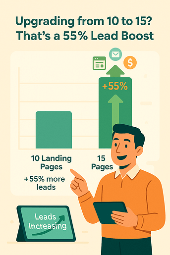
But it’s clear that they do work. Landing pages are more important than ever. I’ve been doing my research and found that businesses that increase their number of landing pages from 10 to 15 see up to 55% more leads. Which means there are people out there acing the formula – and today, you become one of them.
This post is more than just a tired list of landing page layout best practices. Think of it as a mindset shift. To stop trying 1000 different hacks, and zone in on how the right page structure for conversions can turn browsers into buyers.
You’ll learn what every section needs to do, how to stack your landing page elements for max impact, and how to build it all using the tool I use for my landing pages (that do land conversions over and over again). It doesn’t have to be a guessing game. It can be a system.
Ready?
The 7 Core Elements of a High-Converting Landing Page
Before we dive into the details, here’s the quick blueprint every high-performing landing page follows. Think of this as your wireframe checklist — the anatomy that keeps your page focused and conversion-ready:
- Hero Section – a headline + visual that instantly tells visitors they’re in the right place
- The Problem – why they should care (call out the pain point clearly)
- The Solution – your offer framed as the obvious fix, with benefits front and center
- Social Proof – testimonials, reviews, logos, or case studies that build trust fast
- The Offer – a crystal-clear breakdown of what they actually get when they say yes
- Call-to-Action (CTA) – bold, benefit-driven, and repeated throughout the page
- Footer – trust signals + legal essentials (privacy policy, contact info, terms)
💡 Want the full, step-by-step implementation? Check out our Landing Page Checklist — it’s the practical companion piece to this guide.
First, Get Your Head in the Right Place (Not Just Your Elements)
If you’re brand new to this topic, start with our complete guide to landing pages — it gives you the big-picture strategy. This post, though, zooms in on structure: the anatomy that turns that strategy into conversions.
Before we discuss the nitty gritties like hero section design or the best spot for your CTA button, let’s talk mindset — because that is where most landing pages fail.
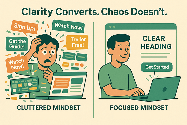
Not from lack of effort. Not from bad design. But from trying to do too much at once.
Too many offers. Too many links. Too many conflicting messages. It’s too much!
Chipo's Clarity Insight
What starts as a simple page quickly turns into a chaotic buffet of distractions… and your visitor? They bounce before they even figure out what you’re offering – and I won’t blame them. I would do the exact same thing.
That’s why the optimal landing page structure starts with one unshakable truth:
🧠 One visitor. One purpose. One page to deliver.
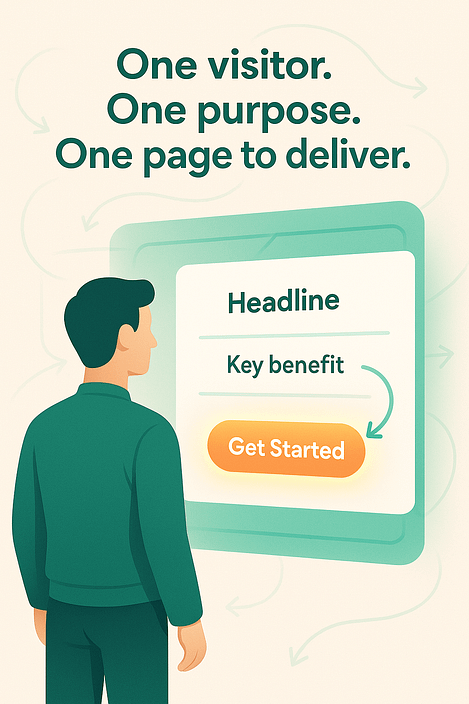
Every element — from the headline to the testimonial — should drive toward that single conversion goal. That’s the backbone of every high-converting landing page. And it’s also the Thrive way: empathy first, clarity always, and everything built to convert.
Throughout this post, I’ll walk you through landing page layout best practices, backed by behavioral psychology and real-world results.
You’ll learn how to guide users through a logical landing page flow, create magnetic messaging, and design with intention – and with the right tools.
Because when you build with strategy, you stop guessing, and start converting.
Speaking of the right tools…
Your Landing Page Structure Is Only as Good as the Tools You Use
You can have the smartest landing page structure in the world — but if your tools won’t let you implement it properly? You, my friend, are stuck.
Way too many “conversion-optimized” templates fall flat where it matters most. Buttons buried below the fold. Clunky builders that won’t even let you customize your hero section design. CTAs that blend into the background. Or worse — templates that lock you into layouts that make no strategic sense.
You shouldn’t have to fight your tools to build something that works. That’s why I use — and recommend — Thrive Architect. It’s a visual builder made for marketers who mean business.
You get:
Everything is built to help you design a page that performs, not just one that looks good and does nothing.
And if you want the full conversion experience, get Thrive Suite. It includes every tool you need to turn your landing pages into a lead-gen and sales machine:
If you're serious about conversions, this isn’t just “nice to have.” It’s the toolkit built for people who want results — and want them without duct-taping 15 plugins together.
👉 Get Thrive Suite and finally build landing pages that work as hard as you do.
The Must-Have Building Blocks of an Optimal Landing Page
So now that your mindset’s in the right place, let’s talk structure. Real function. These are the essential landing page elements that every high-converting landing page needs. Think of them as your conversion toolkit: each one has a job, and when they’re stacked in the right order, they work like a well-oiled funnel.
Let’s break down the building blocks and how to make them work harder for you.
Hero Section That Hits Like a Headline
If your landing page were a movie, the hero section is the opening scene. And if it doesn’t grab attention in the first few seconds, you’ve already lost the plot.
This section needs to answer the visitor’s silent question the moment they land:
🧐 “Am I in the right place?”
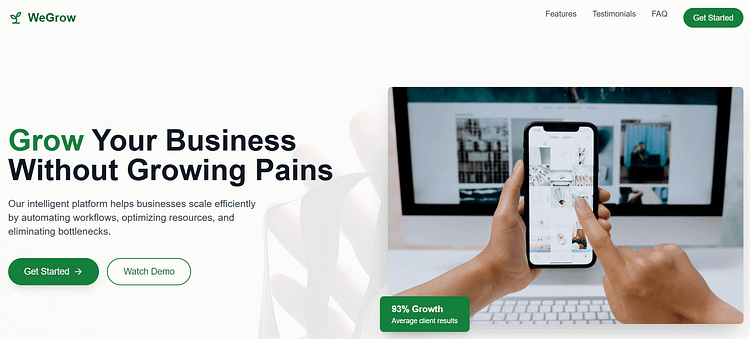
That’s why your hero section design has to be laser-focused. A clear, benefit-driven headline, a sharp subheadline that adds context, one relevant visual (image or video), and (yes) a CTA button, all above the fold. No scrolling required to understand your value.
Your headline does most of the heavy lifting here. Need inspiration? Check out our guide on how to make headlines stand out — it’s packed with swipe-worthy ideas.
Visuals matter: 89% of people say watching a video convinced them to buy a product or service (WyzOwl, 2023). That’s why your hero image or short explainer video isn’t just decoration — it’s persuasion in action.
Take the hero section below, for example. Their landing page relies on a single benefit-driven headline, clean whitespace, and one bold CTA — a masterclass in keeping things simple and effective.
Want to build one fast without sacrificing strategy? Use Thrive Architect landing page blocks or templates. You’ll find pre-designed split layouts, image + text combos, and high-contrast CTA sections that are conversion-ready out of the box.
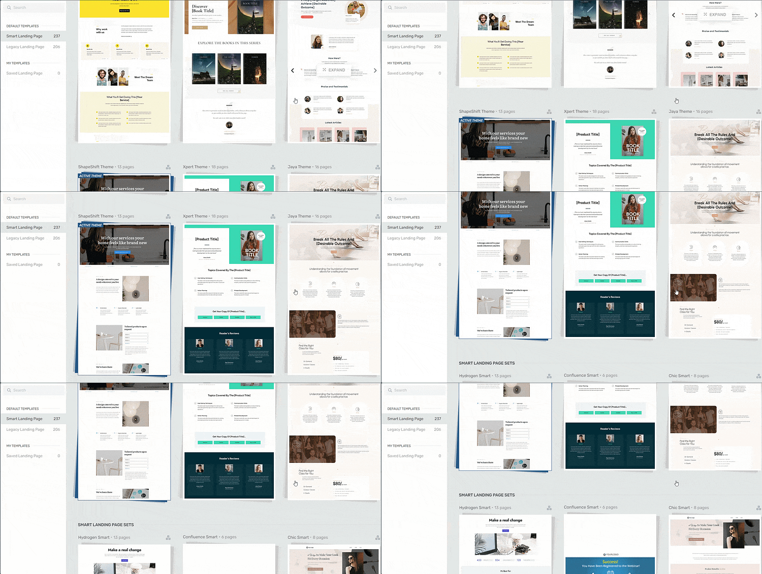
Landing page template sets in Thrive Architect
Chipo's Design Tip
And if you want to go full nerd (and I do), here’s where visual psychology kicks in:
- Use Z-pattern layout to guide the eye across the page naturally.
- Leverage contrast to make your CTA pop.
- Give your copy room to breathe with strategic whitespace.
Because this is about making sure your message lands before the visitor even thinks about bouncing.
Nail the Problem — So They’ll Care About the Solution
Before you pitch anything, you need your visitor to feel one thing: “This page gets me.”
That starts by calling out the problem they’re facing — clearly, confidently, and with just enough empathy to make them lean in. Whether it’s frustration, overwhelm, missed opportunities, or time slipping away, this section isn’t about scaring them. It’s about showing them you understand.
The better you articulate their pain, the more likely they are to trust your solution.
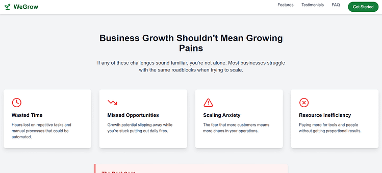
Want to make this even sharper? Use dynamic text replacement to match the message to your traffic source. So if someone clicks from an ad, a quiz, or an email, you can personalize the intro to feel like it was written just for them (you can learn more about creating dynamic landing pages right here).
And visually, this is a great place to lean into contrast. With Thrive Architect, you can build side-by-side blocks that show the “before” (struggles, chaos, confusion) next to the “after” (results, clarity, momentum). That transformation is the emotional hook — and it sets the stage for the offer to land.
Because once someone sees that you get their problem, they’re way more open to hearing about how you solve it.
Present the Solution Like a No-Brainer
Now that your visitor’s nodding along thinking “Yes, that’s exactly my problem,” it’s time to introduce the solution — and make it feel inevitable.
This is where you clearly explain what your product or service does, why it works, and how it leads to the transformation they’re after. Skip the jargon. Focus on the outcome. You're not just selling features — you're promising a better future.
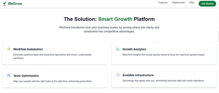
Break it down like this:

This is where clarity meets confidence. When done right, this section feels less like a pitch and more like: “Obviously, this is the next step.”
Because when your solution feels like the most logical, least stressful choice… it becomes the only choice.
Build Trust Fast with Social Proof
I don’t know about you, but before I buy anything online — a tool, a course, even a pair of shoes — I check everything. Reviews, screenshots, testimonials, Reddit threads… I want to know it worked for real people, not just in marketing copy.
Your visitors feel the same way. They’re scanning your page asking: “Has this worked for someone like me?” And that’s exactly what social proof examples are built to answer.
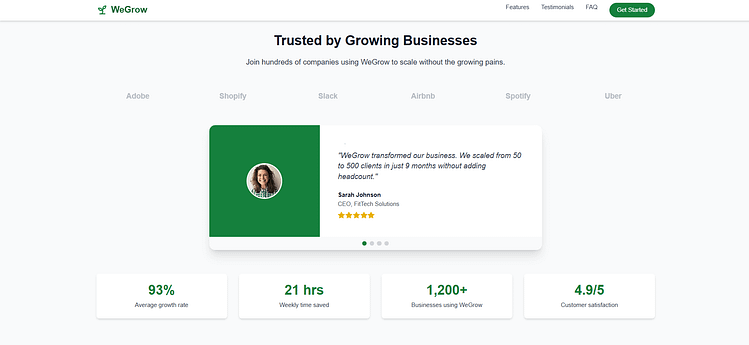
Think testimonials, client logos, review snippets, or even a quick stat that shows your offer delivers results. Bonus points if you can pair them with names, faces, or real-life context — because generic praise won’t cut it.
🔗 Need help collecting strong testimonials — and not just the “great service!” kind?
Read this post on how to collect and display testimonials that actually build trust, convert leads, and fit seamlessly into your landing pages.
If you want to make this section dynamic (and easier to maintain), tools like Thrive Ovation let you pull in testimonials automatically and display them exactly where your visitors need reassurance — like just before a CTA or right after your pricing table. And if you want to go even deeper into strategy…
🔗 Check out our guide to testimonial marketing
It breaks down how to use customer stories across your website, emails, and sales funnels — so your best results aren’t just buried on a testimonials page no one clicks.
This section builds trust faster than any headline ever could. Because when people see others winning with your product, it gives them permission to believe they can, too.
CTAs That Convert (and Don’t Blend In)
You’ve hooked their attention, nailed the pain point, delivered the solution, and earned their trust — now it’s time to ask for the action.
Your primary call to action (CTA) should be loud, clear, and completely unmissable. No clever wordplay. No guessing games. Just direct, benefit-focused language that tells your visitor exactly what to do next.
“Get the Guide” → yes.
“Let’s Go!” → maybe.
“Submit” → please don’t.
Here’s the rule: CTAs don’t beg — they lead.
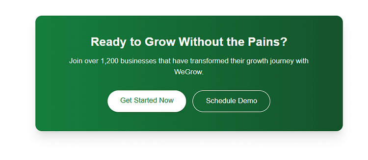
Use Thrive Architect’s pre-designed CTA blocks to make yours pop with bold colors, whitespace, and directional cues. And if you’re capturing leads, Thrive Leads is your go-to for smart integration — think exit-intent popups, sticky ribbons, and timed slide-ins that support the CTA without stealing the spotlight.
🔥 Bonus tactic: Don’t just place one CTA and call it a day.
Repeat it:
The goal is to make saying “yes” easy — no scrolling, no searching, no hesitation. Because a button that blends in is a sale that disappears.
FAQs That Pre-Answer Objections
By now, your visitor’s interested — but interest isn’t the same as certainty. They’re still wondering: “What’s the refund policy?” “Is this really right for me?” “What happens after I buy?”
A great FAQ section tackles these questions head-on, removing hesitation before it turns into a bounce. You’re not repeating what’s already been said — you’re handling the quiet “what ifs” that can stall conversions.
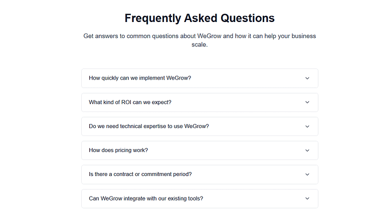
Focus on common friction points:
Think of FAQs as your silent closer. Done right, they convert the cautious without you having to lift a finger.
Footer & Legal: Finish Strong, Build Trust
Yes, even the footer plays a role in conversion. While it’s not the flashiest part of your landing page structure, it’s where people go when they’re looking for credibility. Skipping it (or stuffing it with noise) sends the wrong signal.
Here’s what to include — and nothing more:

Visually, it should blend, not distract. Match your page’s color palette, reduce contrast, and use whitespace so the footer feels like a soft landing — not a dead end.
You don’t need to overthink it. Just cover your bases, keep it consistent, and let it do its quiet job: reassuring the detail-checkers that yes, you’re a real business worth buying from.
Real Optimization Starts Before You Even Design
So far, we’ve focused on what goes on the page. But the real magic starts before you ever touch a template or pick a font. If your landing page doesn’t convert, it’s rarely because of a missing button — it’s because the strategy behind the structure was never clear to begin with.
Real conversion optimization starts before you even design. Let’s talk about the foundational decisions that make or break every high-converting landing page.
Know Your Audience Like You’re Writing to One Person
Before you write a single word of landing page copy, you need to know exactly who you’re talking to — and I don’t mean a vague “target market” on a whiteboard. I mean a real human.
What are they Googling at 2 a.m.?
What frustrates them about every other product they’ve tried?
What language do they use to describe their pain — and what would relief look like to them?
Your job is to echo their inner dialogue. Ditch the “high-impact scalable solutions” talk. Instead, say what they’re already thinking — in their own words.
Chipo's Research Strategy
Want to gather that intel?
- Send a quick survey to your email list.
- Build a short quiz with Thrive Quiz Builder to segment based on pain points.
- Talk to a few real customers (or read your competitor’s reviews).
- Pay attention to patterns: phrases that repeat are phrases you should use.
The more specific and familiar your language feels, the faster your visitor will say, “This is for me.”
✍️ Need help turning those insights into clear, compelling copy?
Check out our guide to landing page copywriting tips — it’ll walk you through how to write copy that connects, converts, and actually sounds like a real person wrote it.
Define Your MWA (Most Wanted Action)
This is the golden question behind every high-converting landing page:
👉 What’s the one thing you want this visitor to do?
Sign up? Book a call? Start a free trial? Download a lead magnet?
Pick one — and then ruthlessly eliminate anything that competes with it.
When your Most Wanted Action (MWA) is crystal clear, it becomes the filter for everything else.
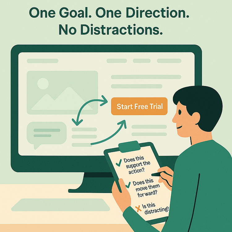
You can still include secondary info, but it should never compete. Your page needs to feel like it’s gently nudging them in one direction — not asking them to choose between five.
Because landing page flow is about clarity, not choice. And clarity converts.
Message First, Then Design
Here’s where a lot of folks trip up: they open their page builder, pick a template, and start filling in the blanks. But great landing pages don’t start with design — they start with the message.
Write the offer first.
What’s the promise? Who is it for? What outcome does it deliver? Once you’ve nailed that, then you can shape the structure around it.
Each section of your landing page should reinforce one idea at a time:
Keep things tight. One section = one message. Don’t overload or stack too much in one spot.
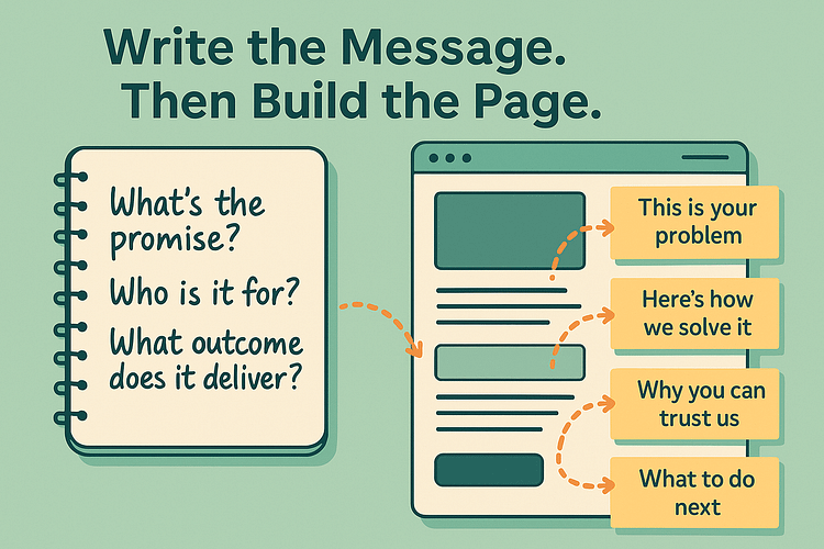
When your message leads and design follows, you don’t just end up with a prettier page — you get a landing page layout that flows logically, reads smoothly, and sells naturally.
Beyond the Basics — Next-Level (and Slightly Out There) Ideas
By now, you’ve got the structure, the strategy, and the psychology. But what if you want to go beyond just good and aim for unforgettable?
This is where we leave the safe zone of “best practices” and play with a few high-impact, slightly unconventional ideas — the kind that get your landing page noticed, remembered, and more importantly, clicked. Let’s explore some next-level ways to turn your landing page structure into a conversion engine your competitors won’t see coming.
Use a Quiz as the Landing Page Itself
Who says your landing page has to be a static scroll from top to bottom? One of the most engaging ways to capture attention and leads is to make your landing page a quiz. Quizzes are frictionless — they don’t feel like forms. They feel like insight. And that’s powerful.
You’re not just collecting emails. You’re segmenting users, warming them up, and delivering a personalized experience before they ever see your offer.
With Thrive Quiz Builder, you can build a quiz that replaces the traditional landing page. Ask smart, strategic questions, then redirect each segment to a personalized result page — complete with a targeted message and opt-in form. Add dynamic CTAs, relevant testimonials, or even a freebie that fits their specific challenge.
🎯 Want to guide your audience with relatable insights?
Learn how to create a personality quiz that builds trust and gets people nodding along while they click — perfect for coaches, creators, and service-based businesses.
🛍️ Selling multiple products or offers? Check out our guide to building a product recommendation quiz that leads your visitors to their perfect match (and your most relevant sales page).
Result? Better leads, stronger conversions, and a landing experience that actually feels fun.
Personalize Content by Source or Visitor Segment
Quick scenario I want you to imagine: two people visit your landing page. One clicked from an Instagram story, the other from a retargeting email. Do they really need to see the same exact headline?
Nope.
Personalization is one of the easiest ways to lift conversions — and you don’t need to be a developer to make it happen.
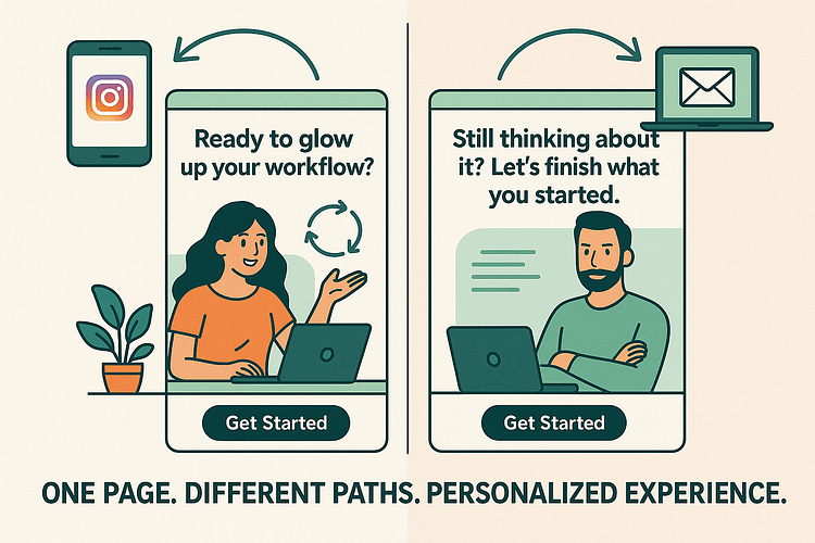
Start with dynamic headlines that change based on the traffic source. You can do this with a bit of URL magic and tools like Uncanny Automator or Zapier — especially when connected to your email platform or CRM. Want to go deeper? Use visitor tags to swap out testimonials, bonuses, or even CTAs.
This isn’t creepy-level personalization. It’s strategic relevance. And in a world full of generic messages, relevance is your secret weapon.
Let Visitors “Build” Their Offer
Here’s a fun twist: instead of giving your audience one rigid offer, let them create their own.
Think:
It feels interactive, it gives your visitors a sense of control, and it increases perceived value without overwhelming them. With Thrive Architect’s pricing table elements, toggle switches, and columns, you can design clean, intuitive layouts that let people “build their plan” or customize what they want.
This works especially well for SaaS, coaching packages, and info products with multiple bonuses or delivery styles.
Bonus: it gives you upsell opportunities without being pushy.
Add Real Scarcity Without Faking It
Let’s be clear — fake urgency is a conversion killer. People can smell manipulation a mile away. But real scarcity? That moves people. Whether it’s a limited-time bonus, a closing date, or only 20 spots available — scarcity motivates action when it’s done with integrity.
With Thrive Ultimatum, you can create time-sensitive offers that run automatically (and truthfully).
And yes — you can trigger these campaigns based on visitor behavior, tags, or page visits. Urgency doesn’t have to feel sleazy. When it’s real and well-structured, it gives your audience a reason to act now instead of saving your offer to the mental “someday” pile.
Don’t Forget the Foundations: A Technical & UX Checklist
Even the smartest landing page structure will flop if the foundations aren’t solid. Before you obsess over copy tweaks or button colors, make sure your page is built on these non-negotiables:
⚡ Fast Page Speed – An “optimal” layout won’t matter if your page takes forever to load. Aim for under 3 seconds. Test with Google PageSpeed Insights and compress every image.
📱 Mobile-First – More than half of your visitors are scrolling on their phones. Design mobile-first, then scale up — not the other way around.
🎨 Visual Hierarchy – Guide the eye intentionally. Use size, contrast, and whitespace so attention naturally flows: headline → benefits → CTA.
🔎 SEO Basics – Don’t let search visibility slip. Add clear meta titles, alt text for images, and a clean heading structure.
🔐 Legal & Compliance – GDPR, privacy policy, terms of service — these aren’t just checkboxes. They’re trust signals your visitors look for.
Get these right, and your landing page won’t just convert — it’ll load fast, work everywhere, and stand up to scrutiny.
Want to learn more conversion killers? Check out this guide.
FAQs: What People Are Actually Asking About Landing Page Structure
You’ve got the structure, the flow, and the strategy — but let’s clear up a few things people always wonder about when building a high-converting landing page.
At minimum, a high-converting landing page needs a strong hero section (headline, subheadline, visual, CTA), a clear articulation of the problem, your solution framed as the fix, social proof, the offer itself, and a trust-building footer.
Each element should drive toward one purpose — your Most Wanted Action.
Think of your page as a narrative:
Hero → Problem → Solution → Social Proof → Offer → CTA → FAQs → Footer.
This sequence works because it guides both quick decision-makers and those who need more detail before converting.
Keep it clean and friction-free: fast load times, mobile-first design, whitespace that lets key elements breathe, high-contrast CTAs, and no distracting navigation.
The goal is to remove anything that makes a user pause or second-guess.
Match the promise of your ad or traffic source, then focus on benefits over features. Be clear, concise, and empathetic — echo your audience’s own language.
Bold action verbs, numbers, or even simple “how-to” phrasing often outperform clever wordplay.
Visitors want reassurance they’re not the first to trust you. Testimonials, client logos, reviews, or case studies remove doubt.
Place them strategically — for example, right after you present your solution — so they neutralize objections exactly when they arise.
Ask only for what’s essential.
A short form almost always converts better. If you need more detail, use multi-step forms to reduce friction.
Always include a visible privacy policy and make forms mobile-friendly (large fields, the right keyboard for each input).
A homepage is built for browsing; a landing page is built for action.
Sending ad traffic to your homepage is a costly mistake — too many links and distractions dilute your conversion goal. A landing page keeps attention ratio 1:1: one page, one offer, one CTA.
Wrap-Up: The Optimal Landing Page Structure = Your Conversion Engine
If there’s one shift I hope this guide inspires, it’s this: stop thinking of your landing page as a design project — and start treating it like a conversion engine. Because the truth is, an optimal landing page structure isn’t just about looking polished. It’s about purpose.
Every section, every word, every CTA is there to guide your visitor toward action — with clarity, confidence, and zero confusion. Here’s the big-picture recap:
You don’t need to overcomplicate it. You just need to build with intention.
And if you want a platform that actually makes this whole process easier (instead of getting in your way), I highly recommend trying Thrive Architect. From high-converting templates to smart integrations with Thrive Leads, Thrive Quiz Builder, and more — it’s built for people who want results, not just pixels.
Your audience is ready. Now your landing page will be too.
Or take things up a notch and get Thrive Suite. Your business will thank you for it.


