Is your WooCommerce sales funnel costing you money?
Let's face it, WooCommerce is an amazingly popular eCommerce plugin, but it's default sales funnel - the journey the customer takes, isn't well optimized. In fact, it's probably costing you a good number of sales.
So, what can you do about it?
Let's take a look at how you can make your WooCommerce sales funnel much more efficient.
You Need to Take Control of Your WooCommerce Sales Funnel
Conversion rates make or break businesses - it's as simple as that.
Just small changes in your conversion rate can make a huge difference to your bottom line. Let's look at a quick example: you sell a product for $50 and you get 1,000 people to your sales page each month.
- 1% conversion rate = $500 monthly revenue
- 1.5% conversion rate = $750 monthly revenue
- 2% conversion rate = $1,000 monthly revenue
- 3% conversion rate = $1,500 monthly revenue
Pretty self explanatory, but what we don't think about is that we're leaving lots of % points on the table when it comes to conversion rates.
Take your WooCommerce sales funnel for example. The default customer journey looks like this:

One of the key principles of conversion rate optimization is eliminating barriers to the sale. The more hoops you make people jump through, the more clicks you force people to make, the more time it gives them to think, "do I actually need this product?"
Most purchases are emotional decisions, so you need to ride that wave of excitement that someone gets when they commit to buying your product.... all the way to the point where they've completed their purchase.
But, as you can see, the WooCommerce sales funnel has lots of steps, and in some cases, they're really not intuitive.
Each of these steps is causing you to bleed prospective customers.
In our earlier example, we had 1,000 people landing on our sales page each month. Let's say we've got an unbelievable product and an amazing sales page. Maybe 5% of those 1,000 people think, yes, I'm going to buy this product - that's 50 prospective customers.
If the funnel is perfectly designed, you make 50 sales for revenue of $2,500.
The problem is, by sending people from the sales page to the product page, you might lose 5 people because they get distracted and have identified a new doubt about the product.
Nevermind, you've still got 45 people on the hook clicking to buy the product. When they click "Buy Now," people aren't brought to the checkout though, so again, 5 people have got distracted - they're kid just got home from school, or they got a notification on their phone, and they think maybe another day.
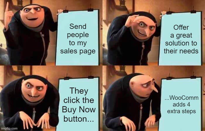
You get the picture - we're now down to 40 potential customers and there are still 3 more steps to go. Follow those through and we'll lose another 15 customers.
We started with 50 sales and revenue of $2,500 and we've finished with 25 sales with revenue of $1,250.
The bottom line is, your sales funnel is incredibly important.
So what do we propose?

We're going to streamline everything and reduce the number of clicks it takes for your customer to go from an interest in your product to a fully paid customer.
Oh, and stick around, because we'll show you how to add in some bonus steps with upsells and cross sells.
How to Transform Your WooCommerce Sales Funnel and Boost Conversions
There's a big financial incentive to streamline your WooCommerce sales funnel, but how do you go about it?
We've put together this step-by-step guide you can use to make an immediate impact on your conversion rates.
Step 1: Download and Install Thrive Architect
Your sales funnels are one of the most essential parts of your digital marketing strategy. If you don't have control over the customer journey, you're going to leak customers at every step and that's going to hurt your business success.
To give you back control over your marketing, the first step is to download and install Thrive Architect.
Architect is the ultimate WordPress page builder, and it's got a secret weapon that will allow you to instantly improve your WooCommerce sales funnel. We'll get to that in a bit, but first, here's a flavor of what you get with Thrive Architect.
- Incredible conversion-focused sales page templates
- Seamless drag-and-drop builder
- Built-in conversion rate optimization tools
- WooCommerce compatible
- And much more...
This is the first step towards taking back control of your marketing strategies, so head over to the pricing page. Once you've completed your purchase, simply download the plugin (follow this simple guide), and upload it to your site from the WordPress plugin page.
Thrive Architect is a paid plugin, which means it's an investment, but, as we know, you're probably losing out on a ton of sales because your sales funnel isn't optimized, so you'll find Architect will quickly pay for itself.
Check out Thrive Architect's pricing!
Step 2: Create Your Sales Page
You've probably noticed that when you're adding your products to WooCommerce, you don't get a lot of say in how you present them. There's a generic layout and you simply add in your details.
There's a lot you can still do with this page with high-quality images and excellent copy (here are some great copywriting tips for beginners), but when it comes to conversions, you want more.
Thrive Architect gives you just that by putting you in complete control of how you present your products. You probably aren't a designer, so Architect gives you hundreds of fully optimized templates to start off with, and then you can use the visual builder to tweak everything in your own image.
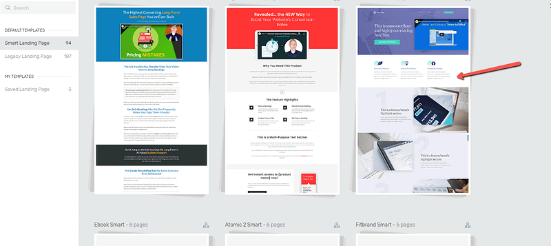
Now you're able to change the layout of your page, introduce new sections, and really tell the full story of your product.
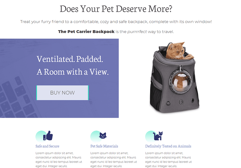
Ideally your sales page should link directly to a payment page. Ideally.
Remember, humans make purchasing decisions based on emotional factors, so you need to be able to do more than just show a few product images. You've got to tell a story that connects with the people behind the screen and make them think "I've got to have this."
This isn't always easy, but it's near impossible if you don't have control over how you present your products.
To create your first sales page, click Pages in your WordPress admin and select All Pages. Now click Add New Page and then the big green Launch Thrive Architect button to get started.
From here, you can choose to build the page completely on your own, or start with one of our tried and tested templates (we recommend this option). In just a few clicks, you can have the outline of an amazing sales page, and all you've got to do is fill in the details.
Step 3: Add a Dynamic WooCommerce Add-to-Cart Link
Now we've reached the point where we're going to supercharge your WooCommerce sales funnel in just a couple of clicks.
Where you've put your "Buy Now" buttons (or whatever CTA you chose), we're going to use a dynamic WooCommerce add-to-cart link so we control the actions that happen next. In this case, what we want to happen is that the customers chosen product is added to their cart and they're sent directly to the checkout page - no unnecessary clicks in the middle!
All you've got to do is:
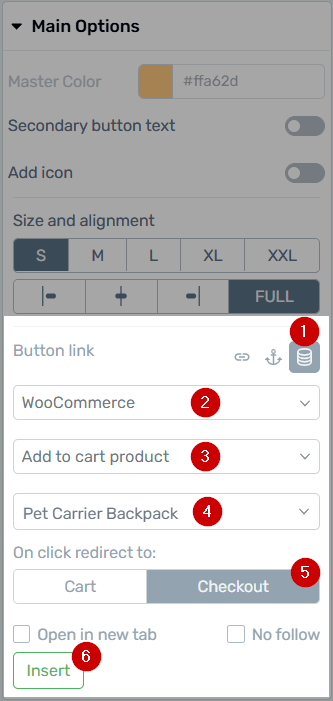
We’ve packed a ton of powerful features into the Dynamic link options.
- Select the Dynamic Link icon.
- Choose ‘WooCommerce’ from the first dropdown.
- Choose ‘Add to cart product’ from the second dropdown.
- A third dropdown will appear where you can search for the product you want to link up.
- Choose where you want to redirect visitors after they click the button or link: in our example, the Checkout (payment) page.
- Don’t forget to click the ‘Insert’ button to lock it all in.
That's it, it's simple.
You've taken control of your sales page and you've cut out a lot of unnecessary clicks at the same time. Of course, in some situations, you might want to have different journeys with more steps in your sales funnel, but now you're the one who gets to decide.
But before you go, we're going to show you one more step you can add to your sales funnel, which is an upsell/cross sell page.
Bonus Step: Adding an Upsell/ Cross Sell Step to Your Funnel
One of the reasons for this article is because we want you to capitalize on that moment when someone decides they want to buy your product.
It's not easy to get people to this point, so you really have to make the most of it.
And it definitely isn't easy. People go through a complex decision-making process when they make a purchase and rightly, they're protective of their hard earned money.
But you can use this fact to your advantage. When someone has finally committed to spending money, suddenly, the question of how much isn't as important.
For instance, if you commit to buying my $100 course, suddenly buying a second course for $20 isn't a big hurdle. But try selling that $20 course on its own, and people go through that whole buying decision in the same way they did with your $100 course.
This is why upsells and cross sells are so valuable - they work.
Now that you're in control of your WooCommerce sales funnel, you can set one up as well.
All you've got to do is:
- Create a new page: Again, we'd recommend you use a Thrive Architect template (we have a host of upsell templates), and simply edit it in your image.
- Create an upsell or cross sell offer: it should make sense based on your product, for instance, if your main product is a hair straightener, your cross sell might be a hair brush.
- Use smart copy to make your case: Don't be overly pushy, but show people why these products go so well together.
- Add the upsell/ cross sell product to WooCommerce: In the above example, create a new product that includes both the hair staighteners and the hair brush.
- Link your original sales page to the upsell page: Make your call to action (e.g. Buy Now) link to the new upsell page.
- Create a dynamic link for the regular product: Some people won't take up your upsell/ cross sell offer, so you want a "I just want the hair straightener" button that adds the product to the customers cart and sends them to the checkout. (The same as in step 3 of the regular funnel)
- Create a dynamic link for the upsell/ cross sell product: If people decide they do want to bundle the two items, then you want to create a dynamic link that adds the upsell/cross sell product to their cart and directs them directly to the checkout.
Again, this is super simple, but you've got a ton of ways you can expand on the funnel and make it fit your business needs (there are even more upsell/ cross sell ideas in this article).
Keep Striving to Improve Your Conversion Rates
People love to talk about traffic in digital marketing.
"If I could just double my traffic, it would change my business."
The thing is, a lot of that is out of your control - it takes time and consistent effort to grow your traffic.
On the other hand, there is something you can do that can improve your fortunes overnight: conversion rate optimization. These are small changes that have a big impact, and now that you've got the right tool set in Thrive Architect or Thrive Suite, you can start benefiting from them.
So, the next step is to evaluate your product pages, checkout process, and sales funnels and find out where you're losing customers.
Need a little bit of help?
Don't worry, we've got the perfect article to guide you through your conversion rate optimization.
Building the Perfect WooCommerce Sales Funnel
There's one key thing you need to build a great WooCommerce sales funnel: control.
Once you've got that, you're the boss and you can run things exactly how you see fit.
Just make sure to keep up to date with the best marketing strategies, and you'll be fine. Oh, and we've got some great articles to help you with that!
- How to Use Content Upgrades to Rev Up Your Conversion Rates
- From Good to Great: Ultimate Website Optimization Checklist
- How to Create a Simple & Effective Video Sales Page
Now there's just one thing left to do!
Get Thrive Architect and optimize your WooCommerce sales funnel!



Can you share more about the Infusionsoft checkout experience? Maybe we have a solution, or I can share it with our team for a feature consideration.
Hello David,
Certainly. Here’s our current sales page:
https://www.bedandbreakfastcoach.com/bb-email-revival/
I would love the Infusionsoft checkout to operate within the same page as that sales page, and for it to integrate with Thrive Apprentice (i.e. grant access to our course, the way that experience currently works for Thrive Cart – which we don’t have). Many thanks for your thoughts on this.
Stunning website, Matthew!
I’ll definitely share this with the team for their thoughts. Thank you for sharing.
Thanks very much, David (on both counts!) – much appreciated.
Hey Matthew, our plan is to invite many 3rd party checkout tools such as InfusionSoft to integrate with the Thrive Apprentice API… once it’s ready to be scaled out. We’re not quite there yet, but we are getting close. Once we do, anyone who integrates with our API will be able to sell and refund courses in Apprentice.
Unfortunately, we wouldn’t be able to give you design control over the InfusionSoft checkout, even if they have an option to embed it on your site. Checkouts are very sensitive, since that’s where credit card numbers and personal information gets entered. So for many checkout tools, there’s a lot of resistance to letting a 3rd party tool like us make changes to their checkout, for fear that it’ll interrupt payment security.
What add-ons are you using to enhance the checkout page, Mark? We’ll need to dig into this use case some more to understand what you’re trying to achieve and what solutions are available.
Hi David – it’s WooCommerce Product Add-ons by WooThemes. It allows you to add checkboxes, lists, text boxes etc – which is perfect for the personalised options I collect. Thanks, Mark
Thanks Mark. We’ll definitely look into it and see how it fits with our roadmap.
You’re absolutely right, a good checkout page can make or break an online sales funnel!
That isn’t the focus of today’s article however, so all things being equal and using the exact same checkout page, a 5-step funnel will convert worse than a 2-step funnel.
If you want to customize your WooCommerce checkout page with Thrive Theme Builder, you can check out this page for more information.
David, following up on Johnnie’s point and the answer you provided, it would be logical to give the ability to choose the Check Out template.
Right now in dynamic link settings you can choose to redirect to either the Cart page or the Check Out page. So it would be great if you took it a step further and also allowed to choose the template for either of those pages.
In this case I may keep the default check out template for the traditional woocommerce flow and make a separate check out template just for the sales page/dynamic “add to cart” buttons.
This would be another step in the right direction and open the doors of possibilities even wider!
We’d love to do this, but it does mean a fair bit more work. At that point, you’re breaking away from the global WooCommerce checkout and having multiple checkouts on your site, each potentially with their funnel-specific URLs. Maybe one day!
Hopefully this will be a better, more reliable solution for you Katharina. Keep us posted on how it goes!
Thanks Homer. I’m glad it’s a good fit for your funnels!
It wouldn’t work for that use case, this basically generates a woocommerce add to cart link. To simplify, the Woo functionality we make use of here doesn’t support personalized text to be passed on to the checkout…that would be a whole different feature 🙂
How many products do you have? Are you currently using landing pages to sell them? Normally when you have personalized products you’d use the built-in WooCommerce product templates which already support add-ons, but I can see why if you only have a few products, maybe you prefer building separate landing pages for them? Anyway, if you can share some details about your ideal solution, we can log it as a feature request 🙂
This uses the global WooCommerce checkout. So as long as your upsell/downsell extensions leverage the global WooCommerce checkout, then your customer will move through those steps just as they would if they used the regular product page.
Basically yes. The Thrive Architect UI lets you select the product and it will apply the product ID as an add-to-cart link, and if you choose ‘checkout’, they’ll go straight there.
Thank you for your answers are very clarifying.
My question is, if it’s like using the link of add-to-cart, if someone doesn’t finish the purchase, and comes again through the same link, the second time maybe it would have the product twice in the cart. it would be like that?
If you’re selling a digital product, there’s an option in WooCommerce to restrict the product to only 1 per-cart. Enable that and no matter how many times your customers move back and forward, there will only be 1 product waiting for them in the checkout.
Hey Russell, that already is what happens! If the product selected at step 3 has variations, then after a second or two (while Architect fetches the product data), a new dropdown appears— just like this: https://share.getcloudapp.com/geugNeQZ
It would add another, unless you’ve specified in the product settings that only one can be bought per transaction. That’s what I’d suggest for digital products. That means no matter how many times the customer goes back and clicks ‘buy’, the checkout step will only have 1 copy of the product in their cart.
Okay cool thank you ????
You’re welcome Oliver. There’s no upsell feature planned yet, but feel free to share your ideas here and we can share it with our planning team.
David, it would be great to have a feature for post-purchase offers so that users can buy in one click without re-entering payment details.
Example: If someone buys product A than I want to offer product B (Upsell) where the user just needs to click a button to make the purchase.
I love this idea. I guess the upsell would come on the payment confirmation page of product A… this might be a WooComm thing rather than a Thrive solution, but I’ll share this with the team so we can put our heads together on it. Thank you, Oliver.
This feature can easily be solved if, CartFlows.com can integrate with Thrive Suite.
Also, another way to solve this problem is to use Thrive Cart if you have it.
A while ago, Bradley Stevens at Thrive Themes wrote an excellent blog post on this topic. Here’ the link to that article:
https://thrivethemes.com/sales-funnel-with-thrive-cart/
Enjoy it.
Please contact our support team so they can investigate and help you out.