Does your sales page need 500 words or 10,000?
The truth is, there’s no universal “right” answer—it depends entirely on your product, your price point, and how much trust your audience needs before they say yes.
That’s why marketers who get the best results don’t ask “long or short?” in isolation. Instead, they ask: Who am I speaking to? How familiar are they with my brand? What’s the size of the commitment I’m asking for?
In this guide, we’ll break down the difference between long-form and short-form sales pages, show you when each one works best, and give you a simple framework to decide which format fits your offer. Along the way, I’ll share examples, industry data, and practical tips you can apply to your own pages right away.
✅ Key Takeaways: Long vs. Short Sales Pages
- There’s no universal winner. The right page length depends on three factors: your audience’s awareness of your brand, how complex your offer is, and the size of the investment you’re asking for.
- Use long-form sales pages when you’re targeting cold traffic, selling high-ticket or complex products, or need space to tell a story, handle objections, and build trust. Serious buyers usually want more details, not fewer.
- Use short-form sales pages when your audience already knows you, the offer is simple or low-commitment, or you’re creating urgency with a time-sensitive discount or bonus. Short pages make it quick to scan and act.
- Always test. Even with clear guidelines, every audience behaves differently. A/B testing helps you validate whether long or short copy actually converts better in your situation.
For a deeper dive on overall structure and positioning, check our comprehensive Sales Page Strategy Guide.
Long Form Sales Page: Pros and Cons
If you're looking to create your fist sales page, then you might be wondering whether to go long-form or short-form. So, let's start by taking a look at the advantages and disadvantages of using a short form sales page as part of your marketing strategy:
Long Form Sales Page Pros
We're going to use our Thrive Architect sales page as an example of some of the pros of a long form sales page.
Plenty of Room to Provide Detailed Information
Long sales pages allow you to provide in-depth information on your offer (e.g. detailed pricing tables, benefits, features, case studies) and address all of your audience's potential pain points, questions, and concerns. This helps to bring all your other digital marketing strategies together, for instance, you can tempt people to your site with your email marketing, and then build on the story with your long-form landing pages.
In fact, longer pages can generate up to 220% more leads than shorter ones when targeting audiences who need persuasion and proof.
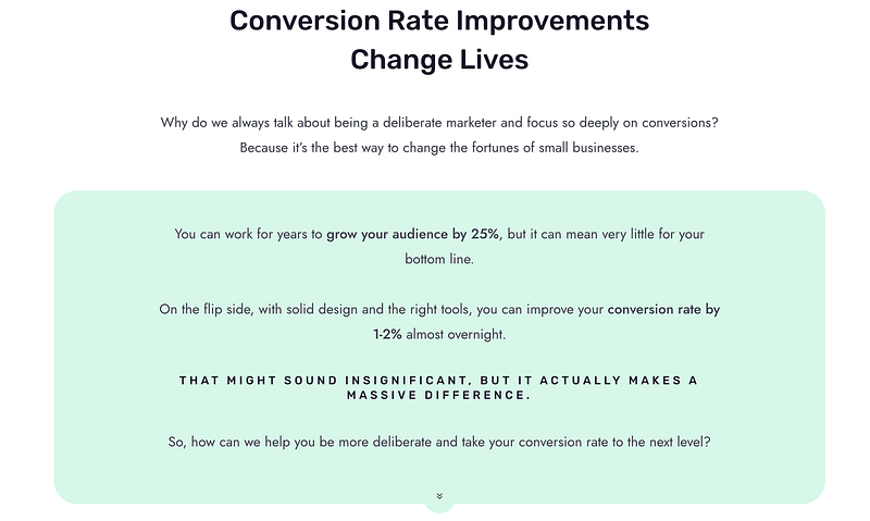
In the example below, the long form sales page has given us an opportunity to dig deeper into one of our unique selling points: conversion rates. There's nothing fancy happening here. We're just using the opportunity to showcase the importance of maximizing conversion rates.
Allows for Comprehensive Storytelling
On a long sales page, you can share your brand story, part of your own personal story, or customer success stories to make your offer more persuasive while building a deeper connection with your audience. This can be particularly necessary if you're bringing in a lot of cold traffic - visitors who have no previous interactions with your brand, such as people who have clicked a social media ad.
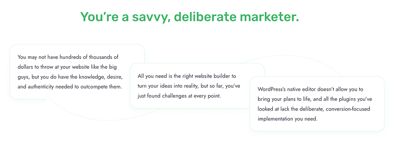
Again, in this example, we haven't done anything fancy. We're just using the space afforded by the long-form format to craft a story. We simply aim to understand the challenges our audience is facing, show them that we understand, and promise to guide them to the best possible answer.
It's an opportunity to build a connection that you might not get with a short form sales page.
For in-depth topics, even SEO experts like Neil Patel report that posts with 2,700 to 3,000 words consistently outperform shorter ones in backlinks and traffic. Long-form sales pages benefit from the same principle: depth builds trust and ranking authority.
Ideal for Including Lots of Social Proof
Long sales pages provide more than enough space to showcase stellar customer reviews, testimonials, and case studies. This is key to winning your audience's trust and proving that your offer is as effective and valuable as you say it is.
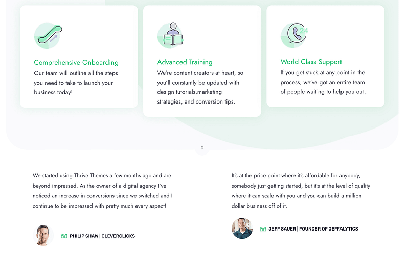
If you're constantly cramming social proof into a short-form sales page, it's going to look a little odd, but with the expanded long-form format, you've got many more opportunities to back up your claims.
More Design Flexibility & Customization
More page space means more room for conversion-focused design elements like call-to-action buttons (CTAs), pricing tables, benefits sections, testimonials, images and videos.
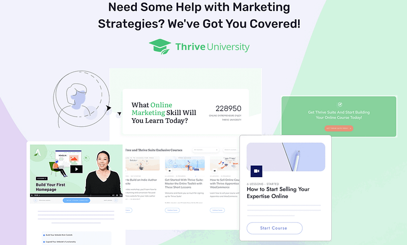
Above, we see a very large design element. If this was on a short-form sales page, it would be the dominant feature of the entire page, but in this format, it becomes a great way to break up the content, and offer a visual experience.
Long Form Sales Page Cons
Short Form Sales Page: Pros and Cons
Let's take a look at the advantages and disadvantages of using a short form landing page to promote your offer:
Short Form Sales Page Pros
Ok, for this one, we're going to take a look at an Airbnb page that's short and sweet, but totally hits the nail on the head.
Simple & Easy to Navigate
Short sales pages have a straightforward layout that makes it easy for your site visitors to navigate and quickly understand your offer without getting overwhelmed.
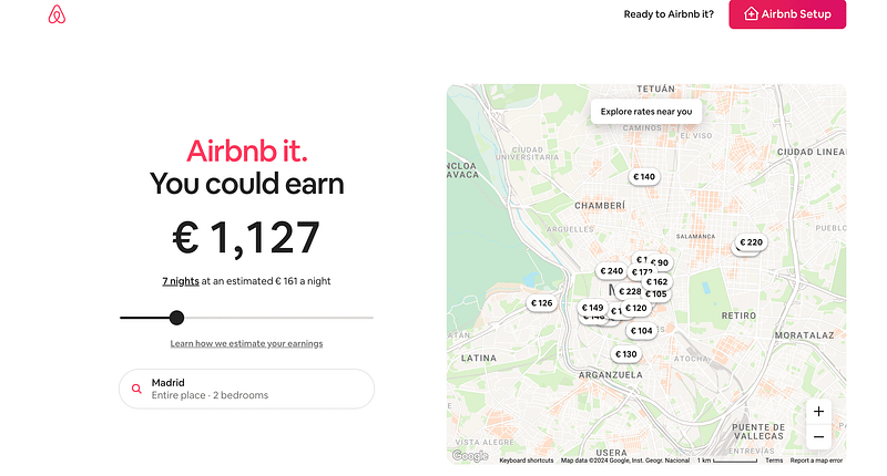
One of the first things you'll notice with our example is that it's an incredibly simple design.
We often think we've got to add all these advanced design elements, but sometimes simple and to-the-point gets the job done. Remember, keeping it simple is one of the most important web design principles!
Sparks Curiosity & Interest
The goal of a short sales page is to entice your audience and encourage them to opt-in (or buy) in order to learn more about your offer.
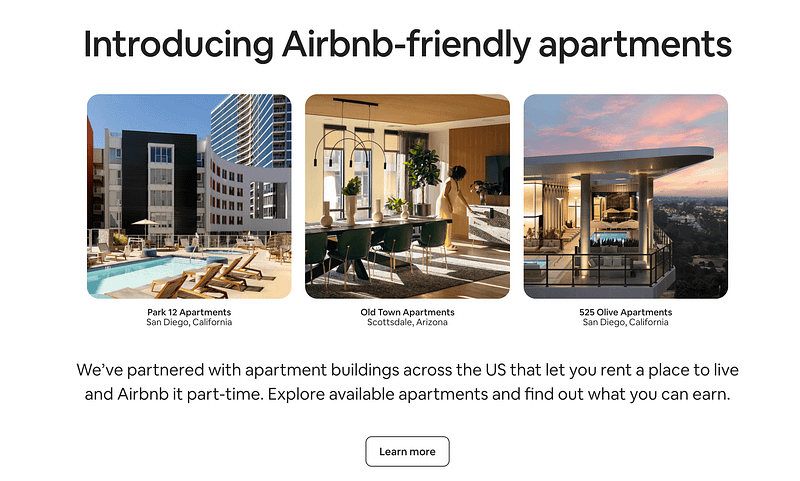
There are only 6 elements on this short-form sales page, but Airbnb has dedicated one to sparking curiosity.
This tactic works really well on people who haven't quite been persuaded to sign up as a host yet. Instead, they're given an "oh that looks interesting" feeling and they're encouraged to learn more. It's a fall back action that keeps people engaged and helps Airbnb to drive them to the ultimate goal of getting them to sign up.
Pro tip: What Action Do You Want People to Take?
Your sales pages will only be successful if they inspire people to take action, but first you've got to have a clear picture of what that action is. Then you can use our Copywriting Tips to earn that action, just like Airbnb has here.
Easier to Create
Since short sales pages require less content and design elements, you can builder them in less time - compared to building a long-form sales page. This is a major plus for small business owners who have limited time and want to put out their simple offer quickly.
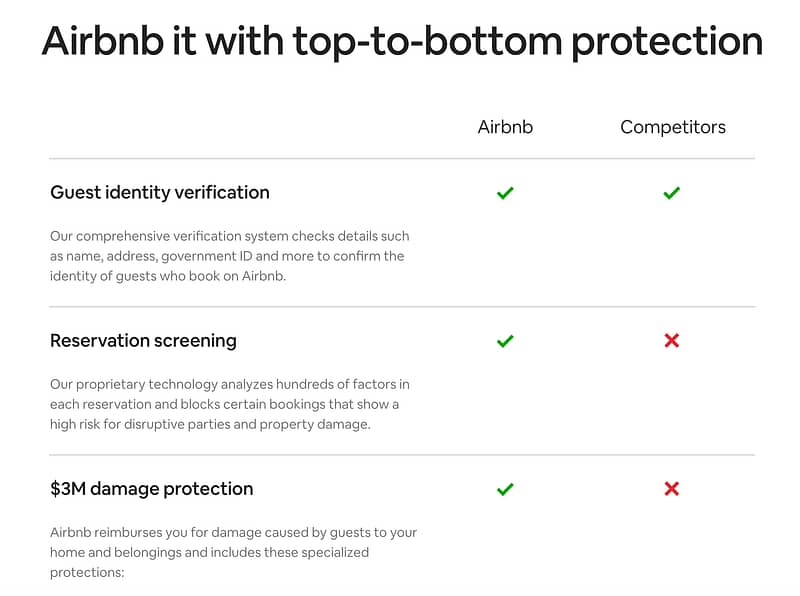
Our example Airbnb page is incredibly easy to make. With a good landing page builder like Thrive Architect you'll find pre-designed templates for all these elements and then you can edit them as you see fit.
Add in some nice images and a few hundred words of copy and you're good to go!
Mobile-Friendly
Short sales pages work well on mobile devices since they require minimal scrolling & get straight to the point on what's being offered.
Just a few flicks of the finger and you can scroll through the entire page. Remember, people's time is precious, so a concise mobile landing page can bring impressive results.
Converting Warm Leads & Nurtured Audiences
Industry consensus is clear: short-form works best when prior trust already exists. If you’re sending people from your email list, retargeting ads, or a loyal social following, you don’t need to reintroduce yourself or explain your entire value proposition. These audiences are “warm” — they’ve seen your brand before, understand what you offer, and simply need a quick reminder and an easy next step.
That’s why many marketers reserve short-form sales pages for:
- Low-cost products or add-ons.
- One-time discounts or flash promotions.
- Returning customers who already know the benefits.
In short: warm traffic + simple offer = short page wins.
Short Form Sales Page Cons
When to Use Short Form Sales Pages
Short-form sales pages often work best for the following scenarios:
- 1Low Cost or Low Commitment Offers: If you're promoting an offer that's super affordable or requires a low commitment from your audience, like a low-priced ebook or guide, you can use a short sales page to outline the key benefits of your offer without overwhelming your audience.
- 2Simple Products: If your product is easy to understand or only has a couple of benefits, you can use a short sales page to communicate the offer and get your audience to take action fast.
- 3Converting Warm Leads & Nurtured Audiences.: Promoting an offer to an engaged mailing list, or subscribers who have followed your brand for more than a few months? A short sales page might be more ideal to sell an offer to them, since they're already interested in your business and products.
- 4Impulse Purchases: If you're running a one-time offer or a limited-time discount, a short sales page is a great way to create a sense of urgency and push your potential customers to purchase quickly.
- 5Mobile Users: A lot of mobile users prefer information that is easy to digest and can be read quickly. A short sales page can work in your favor here, if your target audience mainly uses their phones or tablets when making purchase decisions.
Short sales pages and short-form content are ideal for getting straight to the point and work for offers that require quick action. Avoid using sales pages for complicated offers, or offers that require a high investment. We'll discuss this in more detail in the next section.
When to Use Long Form Sales Pages
Long-form sales pages typically work for the following scenarios:
- 1Targeting Cold Traffic & Building Trust: If your target audience doesn't know about your business, a long sales page is a great way to connect with them, pique their interest and build trust as well.
- 2Complex Offers: If your offer has multiple parts, or requires detailed explanation, a long sales page provides space for you to educate your potential customers and clearly communicate the details of your product. This is ideal for software tools (like Thrive Suite) or subscription services with multiple pricing tiers.
- 3High Commitment Offers: If your offer requires a major time or effort investment, you need to use a long sales page to clearly communicate the benefits they stand to gain and answer any potential concerns they may have.
- 4High Cost Offers: Similar to the previous point, if your offer requires a big cash investment from your target audience, a long sales page is key to securing your potential customers' trust and convincing them that your offer is worth the money. Your sales page must include compelling social proof and detailed benefits & features lists to persuade your target audience.
Long sales pages work best for "high stakes" offers, so you should avoid creating unnecessarily elaborate web pages for simple or low cost offers. Save your time (and resources) to build long sales pages for offers that will significantly change your business' revenue.
Quick Comparison: Long-Form vs. Short-Form Sales Pages
Long-Form vs. Short-Form Sales Pages
Factor | Long-Form Sales Page | Short-Form Sales Page |
|---|---|---|
Audience | Best for cold traffic and new visitors who don’t know your brand yet. They need education, reassurance, and proof before buying. | Best for warm traffic — email subscribers, past customers, or social followers who already trust you. |
Offer | Ideal for complex, high-ticket, or high-commitment offers (software, coaching, courses, premium services). | Works best for simple, low-ticket, or impulse offers (ebooks, tripwires, flash sales, add-ons). |
Goal | Designed to build trust, overcome objections, and explain value in depth before asking for a decision. | Focused on driving quick, low-friction action with a clear offer and strong call-to-action. |
Pros | - Plenty of room for storytelling, benefits, and social proof. - Flexible design with space for visuals, FAQs, and guarantees. | - Fast to build and easy to consume. - Naturally mobile-friendly and great for time-sensitive campaigns. |
Cons | - Time-consuming to create and optimize. - Can overwhelm if poorly structured. - Higher bounce risk on mobile. | - Limited space for detail or persuasion. - Doesn’t address every objection. - Less effective for complex/high-ticket offers. |
Split Test Your Sales Pages to Increase Conversions
To find the best sales page for your offers, you'll need to run A/B tests.
A/B testing is an important part of optimizing your sales pages for conversions and improving their performance. You can test a variety of elements like visuals vs no visuals, testimonials vs no testimonials, and even a long sales page vs a short sales page.
If you want to make data-driven decisions when creating your sales pages, then A/B testing is a must. With continuous testing, you'll receive data that can help you make the right changes to your sales pages so you can see more conversions.
And who doesn't want more conversions?
If you're struggling to find a simple, straightforward A/B testing tool that you can learn to use with ease in minutes...we recommend Thrive Optimize, our A/B testing plugin.

Thrive Optimize is easy to use, enables you to start A/B testing quickly, and provides you with data that is simple enough for you to understand.
And if you're a Google Optimize user who's looking for an alternative plugin to use when your current A/B testing plugin shuts down, we strongly recommend Thrive Optimize.
FAQ: Long-Form vs. Short-Form Sales Pages
There’s no universal winner.
Both formats can drive strong conversions depending on context. Long-form excels when you need to build trust and address objections for complex or high-ticket offers, while short-form performs better when the offer is simple, low-risk, and the audience already trusts you.
The key factor is persuasive completeness—your page should be exactly as long as it needs to be to guide a confident decision.
Short-form pages are most effective for low-cost, low-commitment, or straightforward products. They also work well for warm audiences who already know your brand, such as email subscribers or returning customers. If friction is low and the buying decision is simple, a concise page with a clear call-to-action is often the best fit.
Long-form pages are critical for high-ticket products, complex offers, or cold traffic audiences who don’t know your brand yet. They’re also essential when you need to educate your audience about an unfamiliar problem. The extra length gives you space to build trust, provide proof, and answer objections in detail.
There’s no fixed word count. Short-form is often defined as under 1,200 words, while long-form typically exceeds that—but the real benchmark is persuasive completeness. A page is the right length if it covers everything your audience needs to feel informed and ready to act, without unnecessary filler.
Yes.
Longer pages often rank better because they cover topics in depth, use more relevant keywords, and increase dwell time.
But SEO depends heavily on search intent. Informational queries favor long, detailed content, while transactional queries may be better served by concise, action-focused pages. A strong content ecosystem pairs long-form articles for ranking with sales pages designed purely for conversions.
Industry context is key. In B2B sectors like finance or consulting, trust is built over time through relationships and reputation—so extremely long, direct-response pages can feel out of place. In direct-response niches like supplements, info-products, or coaching, trust is built on the page itself, making long-form copy standard. Your industry’s “trust model” should guide your choice.
Use testing. Start with a hypothesis based on your offer’s price, complexity, and audience. For example: “Because this is a high-ticket course, we expect a long-form page addressing objections to outperform a short page.” Then A/B test variants, measure results, and analyze user behavior with tools like heat maps or scroll tracking. Testing ensures your decision is based on data, not assumptions.
Build Your Sales Pages with the Right Tools
The journey to building high converting sales pages starts with your set of tools. If you aren't using the following tools to successfully promote your offers, you're leaving a lot of money on the table:
1. Thrive Architect for stunning, conversion-focused sales pages. Thrive Architect has a variety of features to help you create sales pages that stand out from the competition including drag-and-drop elements for quick building, a library of block templates to build your pages fast, and mobile responsive design to help you build sales pages fit for all device.
2. AIOSEO to optimize your sales pages for SEO
3. MonsterInsights to receive your pages' analytics in a simple, easy-to-understand format
4. Thrive Optimize to test your sales pages & optimize them for more conversions.
Start Creating Your Short Form and Long Form Sales Pages Today
And that's it. Now you have all the info you need on long sales pages vs short sales pages, and when to use them!
Kickstart your sales page building journey with these resources:


