13 Mobile Landing Page Best Practices (+ Examples Showing Exactly How To Use Them)

Author 
Matt   34

Updated on January 25, 2024

Are you paying enough attention to these landing page best practices?

When’s the last time you double checked what your homepage, blog posts and landing pages look like on mobile?

No worries...I’ll wait here while you go take a look.   😉

If you’re like most people, you haven’t been giving your mobile landing pages the treatment they deserve.

More...

Small screen devices create a much different browsing experience for your visitors than their desktop cousins. You must account for these differences on your mobile landing page designs or risk leaving money on the table in missed conversions.

Now that most people are browsing on mobile, it’s time to optimize your mobile experience for every page or post you publish.

Read on to learn (with examples) the key mobile landing page best practices you need to know if you want your website to impress visitors in the smartphone era.

Optimize mobile landing pages

Optimize Your Mobile Landing Page Designs

Some major differences exist between desktop, and mobile design layouts and you need to be aware of them.

By implementing the following mobile design best practices, you’ll increase your conversions among the ever growing number of global smartphone users.

We're going to look at the best mobile landing page examples and contrast them with ones that haven't quite got the responsive designs right. We'll also show you where you can find expert landing page templates that are designed to appeal to your target audience and maximize mobile conversions. 

1. Make your Mobile Landing Pages Touch Friendly

Make sure that all of your call-to-action buttons are finger-width in size and sufficiently spaced out so your page is always easy to interact with (in other words, they need to be clickable).

If you don’t, visitors will miss important links, call-to-action buttons or be forced to zoom-in on their already small mobile screens to interact with your page.

Always ask yourself: “Are my landing pages finger friendly?". Otherwise, you're never going to get people to take your desired action.

Good Example: Do You Yoga

Yoga-mobile-homepage-good-touch-friendly-example

Click and zoom to see the full mobile homepage.

The Do You Yoga homepage is a good example of a “finger-friendly” mobile homepage. As you scroll down the page, notice how the interactive elements are at least finger-width in size and spaced out from each other.

In the case of interactive elements that are stacked on top of each other without much space (such as the blog grid), those elements are much larger than just finger-width making them easy targets to press.

Bad Example: Yoga With Kassandra

Yoga With Kassandra optimized landing page for mobile bad example

Click and zoom to see the full mobile homepage.

The Yoga with Kassandra homepage is not finger friendly for mobile devices.

The top menu text links are all small and hard to click while the different pink and dark-blue call-to-action buttons sprinkled across the homepage are smaller than finger width in size.

The multi-column layout below the fold and generally small text make the mobile version of this page hard to read.

2. Whitespace on Mobile is Your Friend

Effective use of whitespace on mobile landing pages is crucial to creating functional and more importantly, non-frustrating user experiences for your mobile users.

Not only does additional whitespace help make touchscreen interactions more foolproof (no accidental button or link clicks) for your visitors, it improves readability on smaller mobile devices while encouraging users to keep scrolling down.

Good Example: Bose

bose mobile homepage good example

Click and zoom to see the full mobile homepage.

The Bose Audio homepage is good example of keeping mobile design minimal by prioritizing effective use of whitespace (also called negative space).

This mobile design strategy keeps the headlines, subheads, images and call-to-action buttons separated to minimize distraction—funneling visitors toward the most important info and actions on the page: your conversion goal.

Bad Example: Sparkitive

Sparktive mobile homepage bad example

Click and zoom to see the full mobile homepage.

The Sparkitive mobile homepage is jammed full of text. Not only does that make the page hard to read, but a lack of negative space creates that “wall-of-text” feel which will make your readers want to bounce.

Yes, it uses bullet points to make the information easier to consume (which is a positive), but they're jammed tightly between a ton of other text. This might work for desktop users where the larger screen creates more space, but for your mobile visitors, it's a big negative.

Text only landing pages can be well designed, but you’ll need to leverage whitespace throughout the page to pull it off.

3. Prioritize High Contrast Mobile Designs

What’s one of the big differences between the Mobile and Desktop landing page experience?

Hint: It’s all in the name - Mobile

Mobile landing pages can be accessed anywhere...inside, outside, whenever you might be scrolling social media, or even shopping under the bright lights of a shopping mall.

To combat these different lighting environments, use high contrast landing page designs for your mobile landing pages.

Good Example: Macbook Pro

MacbookPro optimized homepage good example

Click and zoom to see the full mobile homepage.

The Apple landing page for the Macbook Pro showcases a great example of high contrast design. Dark fonts and images on light background make all the important bits of the mobile page pop, no matter what light conditions a visitor is viewing them in.

Apple does a great job making effective use of whitespace too!

Bad Example: Lindsey Racing

LindseyRacing mobile landing page bad example

Click and zoom to see the full mobile homepage.

The Lindsey Racing website fails the high contrast mobile design test. The background is dark, the call-to-action buttons are grey, and the important text ranges from black to dark red.

All these low contrast factors lead to a design that negatively impacts readability for visitors and lowers the e-commerce sales for the business owner.

4. Always Use Single Column Layouts

Side-scrolling on mobile is a conversion killer.

To avoid this problem, make sure your visitors only see single column layouts when browsing on their mobile devices.

The single column layout is intuitive to scroll, keeps your images and text from spilling off the side of the page and ensures that visitors will continue to scroll down towards the end of your landing page.

Just remember... no side-scrolling on your mobile landing pages!

Good Example: ClickMinded

ClickMinded mobile landing page good example

Click and zoom to see the full mobile homepage.

The ClickMinded website does a great job on mobile of converting its 3-column desktop layout into single-columns when viewed on mobile.

This keeps the visitor from side-scrolling at any point on the sales page and swiping down towards the conversion goal instead.

Bad Example: AirBnB

AirBnB mobile landing page bad example

Click and zoom to see the full mobile homepage.

Even though AirBnB is a massive website with an incredible amount of web design resources at their disposal, they use side-scrolling and multi-column layouts on their mobile pages.

Although this may work for their platform, it’s not recommended for solopreneurs like yourself as the text and images get smashed into hard to read sizes with content that streams off the side of the screen.

Do your conversion rates a favor by keeping your mobile pages single column with text and image sizes that pass the Mobile Readability Arm’s Length Rule discussed next.

Single-Column Mobile Design Made Simple

Thrive Architect landing page builder puts the work or crafting single-column layouts for mobile on autopilot for you.


Check out how the wide range of templates available and see how easy it is to create mobile and tablet friendly blog posts or landing pages for your website here.

5. Apply the Arm's Length Rule

How do you test your mobile landing page’s readability before making it live? Very simple...

Apply the Arm’s Length Rule:

  1. Load up your landing page on a mobile device.
  2. Hold the mobile phone at arm’s length.
  3. Read through the entire landing page and modify anything that looks hard to read.
  4. Bonus: Repeat this process with other people (bonus points for finding beta testers with below average eyesight!).

Good Example: Thrive Themes

Thrive themes mobile landing page good example

Click and zoom to see the full mobile homepage.

Not to toot our own horn or anything, but the Thrive Themes website offers a good example of a site that passes the Arm’s Length rule. If you load up our site on your smartphone and hold it at arm’s length, the site remains readable.

As a rule of thumb, keep your font sizes greater than 16 pixels on mobile while keeping your font and background contrast high.

Bad Example: Ido Portal

IdoPortal landing page bad example

Click and zoom to see the full mobile homepage.

Although the one arm handstand is super impressive, the readability of Ido Portal’s Movement Culture mobile homepage is not.

The site navigation text is way too small to read, especially when held at arm’s length. Also, the ill-advised slider-style background often places dark image elements behind the text. That makes that small text even harder to read!

Modify Your Mobile Landing Page Call-To-Actions

Modify Your Mobile Landing Page Call-To-Actions

Calls to action are important on any landing page, no matter the device they’re being viewed on.

In fact, you can learn all about standard call-to-action strategies in a separate Thrive Themes blog post here.

However, if you want to optimize your call-to-action buttons specifically for mobile (I know you do!), pay attention to the following 4 mobile landing page best practices:

6. Place Your Call-To-Action at the Top of Your Mobile Landing Page

Now that mobile internet usage has surpassed desktop and will grow sevenfold between 2016 and 2021, the “above the fold” area has become dynamic digital real estate because what a visitor sees changes depending on the device they’re using.

To combat the smorgasbord of different sized devices your visitors will be using, it’s a good idea to elevate your first call-to-action button to the very top of any mobile landing page so all readers will see it.

Good Example: Transferwise

Transferwise homepage good example

Click and zoom to see the full mobile homepage.

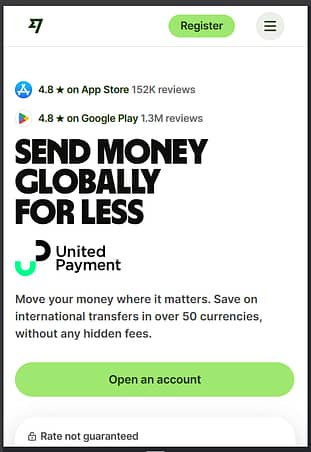
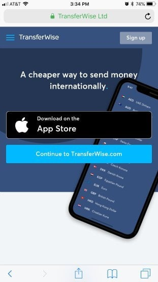
Although Transferwise uses multiple call-to-action buttons on their mobile homepage (“Sign up”, “Download on the App Store” and “Continue to Transferwise.com”), each option is strategically placed at the top of the page.

Transferwise’s mobile homepage not only uses finger-friendly buttons, a benefit driven headline and negative space to focus visitors towards the actions they want, but it’s all done at the very top of the page so no potential customer can miss it.

Bad Example: HubSpot

Hubspot mobile homepage bad example

Click and zoom to see the full mobile homepage.

One of HubSpot’s mobile landing pages really misses the mark when it comes to front loaded calls-to-action as the above example shows.

First, they place an easy to miss click-to-call button at the top of the page asking potential clients to contact their sales department.

Next they use their entire mobile above-the-fold area to show a wall-of-text headline that many visitors are likely to bounce from. If that happens, a potential client will never scroll down to see their contact form offering a “Free Marketing Measurement Assessment” to those who submit it.

By simply transforming the sub-headline into a call-to-action button that takes people to the contact form at the bottom of the page would likely increase the HubSpot sales department’s lead generation rate from this mobile landing page.

7. Test Using Click-To-Call Buttons

Because most mobile devices are smartphones with the capacity to call phone lines, test using click-to-call CTA elements on your mobile landing pages to see if 1-on-1 sales calls are a more profitable conversion channel for your business.

Obviously this feature won’t apply to every online business, but if you run a local brick-and-mortar business or require more personal contact to make sales, the mobile landing page click-to-call button could be a conversion game changer for your business.

For example, Esurance tripled their customer acquisition in a single year just by adding a click-to-call buttons to their mobile ads and web pages.

Good Example: Vivint

Vivint homepage good example

Click and zoom to see the full mobile homepage.

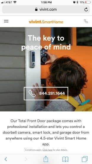
The Vivint homepage offers a good click-to-call button example as they use it twice above their mobile fold: first as a phone icon in the header and second as a call-to-action button beneath their headline.

As an online visitor looking to add security measures to my home, it’s hard to miss what I should do next...give Vivint a phone call.

Bad Example: Space City Float

SpaceCityFloat homepage bad example

Click and zoom to see the full mobile homepage.

At first glance, the Space City Float Center homepage looks like it’s click-to-call game is strong… but here’s why it’s not:

First, the phone number listed in the sticky ribbon at the top of the mobile page isn’t click-to-call, just inert text visitors must either remember or copy/paste if they actually want to call.

Second, the click-to-call icon in the floating ribbon at the bottom of the screen is hard to see and disappears as soon as visitors start scrolling down.

A better strategy would be to place a click-to-call, call-to-action button at the top of the page with a phone icon.

Click-To-Call Elements Made Easy

Thrive Architect makes adding click-to-call buttons on your mobile pages super simple.


You can read all about Thrive Architect's click-to-call feature here.

8. Reduce Your Form Fields to the Bare Minimum

Inputting data on any mobile device is a pain in the butt.

That’s why every input field on your mobile landing page forms must pay its rent in terms of digital space.

Make sure all input fields you include on your forms are absolutely necessary.

For example, only ask for a first name if you actually personalize your emails when broadcasting to your list. Every additional field will harm your conversion rates so make sure each one is actually needed to accomplish your goals.

Good Example: Learn Jazz Standards

Learn Jazz Standards lead generation page good example

Learn Jazz Standards mobile lead gen page.

The Learn Jazz Standards opt-in form is an example of good mobile opt-in form asking for more than just an email address.

Asking for a first name allows for personalized emails and the “Select Instrument” drop down menu allows the website owner to send customized jazz education content to new subscribers based on their primary instrument abilities.

Bad Example: LikeableLocal

LikeableLocal lead generation page bad example

LikeableLocal mobile lead gen page.

Is filling out all the detailed form fields above really necessary for a visitor aiming to download a free eBook?

Buy me a coffee first...jeez!

It may prove better to ask for the email first and then let your eBook free download soft sell services to leads as they’ll be more acquainted with you and your business at that point.

9. Minimize Distractions with 1 Conversion Goal Per Landing Page

Even though ALL landing pages should contain a single conversion goal, it’s even more important when it comes to mobile landing pages.

Small screen sizes and touch-screen interfaces make it easy for visitors to either get distracted or frustrated with the experience. Make their life simple by allowing only a single conversion goal per page!

Good Example: Bar Muscle Up Mastery

Bar Muscle Up Mastery homepage good example

Click and zoom to see the full mobile homepage.

The entire focus of the Bar Muscle Up Mastery mobile sales page is to sell the course...nothing else. There’s no other offers or distractions that would whisk a viewer away from that conversion goal.

When it comes to your mobile landing pages, boost your conversion rates by doing the same – one conversion goal per page.

Bad Example: GymnasticBodies

Gymnastic Bodies sales page bad example

Click and zoom to see the full mobile homepage.

The mobile landing page shown above is a special offer for Tim Ferriss Show podcast listeners by GymnasticBodies.com founder Christopher Sommer.

Coach Sommer was a guest on Tim’s podcast and offered a special discount to Tim’s listeners if they purchased the GB Foundations Course through the landing page.

Although the landing page is optimized for mobile in many ways, it actually fails to maintain a strong focus on selling the Foundations Course as it goes on to offer multiple advanced programs on the same landing page.

Although the advanced courses provide an awesome opportunity to upsell new customers, it would be better to do it after the initial purchase of the Foundations Course deeper in this landing page sales funnel. Instead, the multiple offers likely distract potential customers from making any purchase.

Optimize Your Mobile Landing Page Load Times

As a general rule, mobile phones have slower internet connections and smaller bandwidth limits compared to their desktop counterparts.

That means your mobile landing page needs to be optimized when it comes to data size and paired with fast hosting to support its delivery.

If you’re still using bargain-bin hosting, Step 1 in your mobile load time optimization is to upgrade your hosting. Remember, page speed is incredibly important! If your pages load slowly on mobile, your bounce rate is going to shoot straight up, so this should be a priority.

Step 2 is to minimize the size your landing page in terms of data size. Read the following two image and video best practices to make your mobile pages load as fast as possible to prevent your visitors from bouncing prematurely:

10. Remove Any Unnecessary Videos and Images

Use only conversion critical images or videos on your mobile landing pages. This means that for every image or video you think about posting, ask yourself: “Is this really necessary to achieve this page’s conversion goal?”

Just think how frustrating it can be for a new visitor when they arrive to your mobile site only to wait way too long for images to load, line-by-line-by-line. I mean, how long do you hang around on slow loading pages before bouncing to find a faster loading alternative?

For this reason, you must be extra picky about what images or videos get added to your mobile landing pages. Because of data, network and cost limitations, it’s even more important to ensure your mobile pages load fast by minimizing their total data size.

Good Example: Evernote

Evernote mobile landing page good example

Click and zoom to see the full mobile homepage.

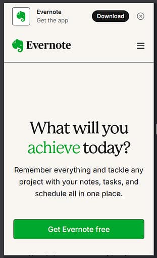
The Evernote mobile landing page takes data minimalism to the extreme. The above-the-fold area of the page uses a simple white background, headline, subhead and call-to-action (CTA) button.

Below the fold, there’s a limited number of visuals used to educate visitors about the product and focus them towards the conversion goal of signing up for a free account. Effective whitespace usage is on full display here giving the mobile homepage a modern feel.

Bad Example: Amrit Yoga

Amrit Yoga Homepage bad example

Click and zoom to see the full mobile homepage.

The Amrit Yoga homepage is nothing but images. That’s not only data intensive for mobile devices, but bad design strategy to help new visitors understand what the different cornerstones of the yoga website are all about.

The images are vague with small text at the bottom of each picture stating what each section is about (i.e. “Meditation in Motion”, “Transformational Sleep”, etc.).

Don’t cram your mobile landing pages with vague visuals. Make sure each image pulls its weight to help get visitors to take your desired call-to-action.

11. Optimize Every Image and Video for Mobile

For the images and videos that you decide are absolutely necessary to include on your mobile landing pages, it’s crucial that each is optimized to maximize their quality while minimizing their data size.

Making your images mobile friendly is pretty simple if you this 3-step checklist:

  1. Save your images in their appropriate file types (png vs. jpeg).
  2. Minimize the pixel dimensions of each image to their required on page display size.
  3. Compress your images through a free online compression tool like kraken.io.

Automatic Image Optimization

Did you know that with Thrive Architect it's super easy to:


  • Hide certain unnecessary elements (such as bulky images) from the mobile version of your page 
Make Your Copy Mobile Friendly

Make Your Copy Mobile Friendly

Copy is always a critical factor when it comes to achieving the results you want online. However, smartphone screen size limitations make the words you choose to use even more important.

Read through the following 3 best practices to see how you can pack a bigger copy punch in smaller mobile screen packages...

12. Clear and Concise is Better Than Clever

Digital real estate is precious on mobile so getting to the point sooner will help boost your conversion rates.

As a rule of thumb, focus more on clear and concise copy rather than clever, curiosity generating storytelling. You can always A/B test your landing page copy to prove me wrong though!

Good Example: Ramit Sethi's I Will Teach You To Be Rich

IWTYTBR-mobile-homepage-clear-copy-good-example

Click and zoom to see the full mobile homepage.

Ramit Sethi eliminates the visual extras and cuts right to benefit driven copy on his I Will Teach You To Be Rich mobile homepage.

Short, punchy headlines, subheads and supporting text tell visitors exactly what they’re getting upfront when deciding whether or not to take Ramit’s earnings potential quiz.

Because mobile size requirements limit the digital space you have to be clever, focus on being clear, concise and benefit focused instead.

JazzStandards mobile homepage - good example

Click and zoom to see the full mobile homepage.

Although the homepage for Learn Jazz Standards has a great headline, the subhead copy looks and reads like a wall-of-text. From the visual perspective alone, it’s tough to get into the above the fold copy so many readers aren’t getting persuaded to sign up.

On top of that, ask yourself “What’s in it for the visitor?”

Will readers actually get anything cool if they click-through and sign up?

This example could be improved instantly with a shorter, benefit driven subheading as well as a better call-to-action button to boost signups.

13. Use Short and Punchy Headlines

Not only should your body copy be more concise on mobile landing pages, but your headlines should be more condensed and punchy too.

Keep your headlines as short as possible so they visually pop while remaining readable on mobile. This will also help your visitors know straight away that they’ve found the website they’re looking for.

Good Example: Double Your Sales

DYS mobile landing page good example

Click and zoom to see the full mobile homepage.

3 big words that offer a benefit every business owner wants to achieve: DOUBLE YOUR SALES!

Now that’s a short and punchy headline that’ll get a new visitor’s attention every time (of course you’ll have to deliver on it though!).

If you can keep your mobile headlines short and powerful, it will not only counter the design constraints of mobile, but also push readers to keep reading downscreen.

Bad Example: Traffic and Funnels

TrafficAndFunnels mobile landing page bad example

Traffic and Funnels mobile landing page.

The headline in the Traffic and Funnels mobile landing page example above may look like a short headline at first glance, but in reality, they broke one extra-long headline up visually.

Check it out:

“Smartest Guys in Marketing Presents: How We Generate High Ticket Clients Using Paid Traffic and a Simple 2-Step Funnel!”

They used the majority of their above the fold mobile real estate for a single headline pushing their call-to-action button down the page and ruining their ability to add supporting copy.

Write Better Copy

One of the many benefits to becoming a Thrive Suite customer is instant access to Thrive Suite customer only courses like the Landing Page Copywriting E-Course.


And even if you're not a Thrive Suite customer yet, you can also sign up for a free Thrive University account to get instant access to one of our many free online courses like Headline Swipefile: The Shortcut to Writing Attention Grabbing Titles.


Note that you must first create a free Thrive University account and login to access the above courses. Then, only Thrive Suite customers will be able to access the Thrive Suite customer only courses.

Which One of These Landing Page Best Practices Is Your Favorite?

Are you ready to start boosting your sales and growing your email list faster just by optimizing your mobile landing pages with the above 13 best practices?

I know you are so it’s time to take action and rapidly implement what you’ve learned here on your own website.

If you have any questions about conversion optimizing your landing pages specifically for mobile, leave them in the comments section below!

by Matt  March 29, 2019

34

Disclosure: Our content is reader-supported. This means if you click on some of our links, then we may earn a commission. We only recommend products that we believe will add value to our readers.

Enjoyed this article ?

You might also like:

Leave a Comment

  • This is great. In the Apple Macbook example, can we create that using Thrive? I can’t seem to find how to make text launch a lightbox. It seems that i’d have to add an icon and then add a click action to launch the video lightbox.

    Also…. do you generally recommend adding a short video on mobile? Does it improve conversions relative to the increase load time & potential distraction?

    Thanks!

    • Hi David, the point of showing the Apple Macbook example was just to showcase their use of high contrast design (striking dark images on a white background for example).

      It looks like Graeme did a good job of answering your “how can text launch a lightbox” question in his replies below.

      As for the video, I think the increased load times of a video on your mobile page may likely harm your conversion rates so I’d only use one if you think it’s super essential.

      But as always, don’t take my word for it…you can use Thrive Optimize to test a video version versus non-video version of your mobile landing page against each other to see if it actually makes an impact. 😉

    • There is actually an even easier way to launch a lightbox from a text link 🙂
      – Select the text
      – Click on the link icon in the top menu
      – Start searching for the name of your Thrive Lightbox
      – The lightbox will show and you’ll be able to select it

      Tadaaa 😉

      You can find a full tutorial here.

      Or if you’re using Thrive Leads, you can create a Thrivebox when searching in the text link, this will also show up.

      Hope this helps!

  • Another great Thrive Themes blog post. It is always time well spent reading your stuff. I get so excited when I get that email announcing a new post.

  • Hey Hanne, We are long time Thrive Theme members and I love the content that you guys put out on both this blog and via Active Growth. I would classify my self as a raving fan!

    I shared this article via a link on a Facebook group I’m in and one of the members there, who I know and respect, happens to have a business optimizing WordPress site load times. She said that the article would not load on her mobile connection. (They full time in an RV)

    Here is her comment:

    Oh, wow. I tried to look at this post and it would not even load on my mobile.

    In case that was a result of our sometimes dodgy RV internet, I ran the page through webpagetest.org. Yikes.

    Not being snarky here & I definitely need help with landing pages, but it seems Thrive broke the two cardinal rules of website efficiency:

    Load more things, wait more time.

    Load big things, wait more time.

    The problem is obviously magnified when dealing with mobile devices and connections ????
    https://www.webpagetest.org/…/180602_6S…/

    I know when we have issues with our business I like people to let me know so I thought I’d pass this on for you to check out and comment.

    Cheers,
    Jason

    • Hi Jason, thanks for your comment and sharing the post with your Facebook group!

      Your point about the long load times is a good one and something we mention a lot here on the Thrive Themes blog.

      It’s true that this blog post is exceptionally data heavy weighing in around 6 megabytes with 52 images!

      However, it’s a blog post trying to educate readers using tons of visual examples (I know because I found, captured, resized and optimized every screenshot before adding them all to the article… it took forever!)

      I just n=1 tested this post’s load time with my own iPhone 6+ using Ting’s LTE mobile connection, and the load time did not feel longer than normal. I think your friend’s slower RV connection may have played a part in the slow load experience she described.

      I also tested the page load time on webpagetest.org using their Dallas server/LTE mobile settings and the mean test value did show a long total load time (9.2 secs!), however the First Byte and Start Render times were much faster -> 1.6 secs and 3.4 secs respectively…arguably the more important metrics.

      If this was a mobile landing page (the focus of this post) and not an educational blog post, there’s no way I would have used that many images because conversions would definitely take a hit.

      However, this post is long form blog content so the visual education element was given some priority.

      • Hi, thank you firstly Jason for pointing this out and secondly Matt for answering – It helped me understand the difference between landing pages and long form educational style blog posts.

        I’m relatively new to web design and I’ve found everything Thrives Themes does to be of great help.

        Currently my website is running a Genesis Framework + Theme. I’ve recently been using Thrive Themes & Architect and it’s quite literally changed my life!

        I’m considering doing a complete redo before I start down path of launching my online course – which is yoga – interestingly for me was the yoga website demonstrations in this blog post!!!

        Thanks again

      • Thanks for your comments Peter and I’m glad to hear you found the article helpful!

        The online yoga world is an interesting one…I use it to identify good and bad website examples all the time because it’s saturated with businesses that usually don’t know the first thing about creating conversion focused websites.

        That’s good news for someone like you who can take what you learn here to instantly start kicking your online competition’s butt! 😉

      • Hey Matt, Thanks for you detailed reply.

        She did manage to access the article later, here are her comments:

        “I was finally able to get the post loaded up and it is indeed full of solid advice.

        Page builders like Thrive and Divi do tend to add bulk to pages, but there are things one can do to mitigate some of that.

        I hope they get it sorted, especially on that post. It’s a good one, full of best practices that are especially important for an audience of people who live on mobile internet”.

        So you content was appreciated and endorsed.

        Perhaps a note somewhere near the start to say that as this is a detailed artical and not a landing page it will perform a lot differently?

        I will share your response within the group. It is a group for RV Entrepreneurs who either full time RV (or are working towards that goal)

        Loved your article

        Cheers,

        Jason.

      • Thanks for the update Jason. And you’re a full-time RV entrepreneur?! That’s awesome!

        And I just might steal your idea to add a note to the mobile version of this blog post because…ya know…that’s one of the cool perks about using Thrive Architect! 😉

  • Aloha Matt,

    Many thanks for this great article — very helpful and instructive.

    A little trivia: I received the Email with the link to this blogpost on Friday 06/01 and read it today Monday 06/04. Just for curiosity I wanted to see Kassandra’s homepage on my mobil. Much to my surprise I didn’t see anything of what the picture you use shows.
    I seems as if Kassandra read your blogpost on Friday and over the weekend changed her landingpage taking into account most if not all of the above points.
    It made me jealous — I wish I could work with the speed of light!

    Question: Can I and would it be advisable to make completly different landing-pages for the different devices? Is it possible to do this with TA?

    Many thanks and best regards,
    JuanPedro

    • Wow! You’re right Juan…the Yoga with Kassandra website has undergone a complete overhaul!

      Unfortunately, when I tested it on my phone just now, several of the call-to-action buttons do not appear or are unclickable on mobile. Also, the load time performance is slower now (likely due to some the new, fancy animation elements).

      This oversight to check the mobile version of the page gives me the feeling that they didn’t read this article and that the website overhaul just happened to coincide with the publish date of this post.

      To answer your question, Thrive Architect allows you to create separate versions of the same landing page for desktops, tablets and mobile.

      The best way to do this is to create your desktop version first, then switch the responsive view to tablet, modify the tablet version, and finish by switching the responsive view one last time to mobile to modify it.

      If you follow this process, your landing page will be responsive to most any device it’s viewed from.

  • Less is more for a conversion-focused landing page. Great advice on mobile-friendly landing page design. I enjoyed reading your articles 🙂

  • Great Article just loved the insights , i have facing some issue with mobile landing page Before but after reading this article my all doubt got cleared. Thanks for it 🙂

  • Wow! Nice information Now I am going to implement on my site.
    I just love this blog because of awesome information.
    I always make sure to write a short and catchy headline.
    Thanks

  • Awesome tips Matt, Really helpful. Especially, your good example and bad example. I also use thrive theme. It’s really cool. Hopefully, we will see more like this.

  • Great post! Your insights are spot-on and provide valuable information. As someone deeply invested in the healthcare niche, I can truly appreciate the expertise you’ve shared here. I’ve also got a website dedicated to healthcare, so I understand the importance of feedback. I’d love for you to visit my site and share your thoughts – any feedback would be immensely valuable. Keep up the excellent work!

  • {"email":"Email address invalid","url":"Website address invalid","required":"Required field missing"}
    >