


Want to take control and learn how to edit the sidebar in WordPress?
Your sidebar is an essential part of your website and we're going to show you how to use it for maximum advantage.
Here's your guide to editing the WordPress sidebar (with awesome examples thrown in).
Does Your Sidebar Really Matter that Much?
Yes! Your sidebar is an important tool that you shouldn't overlook.
Your ultimate goal as a marketer is to get people to take action. Whether that's clicking a link, becoming a lead, buying a product, or something else, you want your audience to take some kind of action, otherwise you wouldn't be creating content.
For your audience to take action though, they need certain things:
- Information about the action you want them to take (how, when, why?)
- Proof that the action you want them to take is worthwhile
- A clear signpost for what the action you want them to take is (CTA)
Naturally, your content (the page, post, course, etc) is going to contain all this information, but what's the problem with this?
Very few people read what you write word for word. We're a world of skimmers trying to pick out the important information in the shortest possible time.
Which is great for you, because your sidebar is one of the most prominent areas of your site, and it's an amazing place to put key information. When you do this, you'll drive more action and this is going to help grow your business.
A Basic Way to Edit Your Sidebar in WordPress
If your goal as a marketer is to inspire action, and your sidebar is one of your best tools to do this, then really, you want absolute control over how you present it.
We'll get to the best way to edit your sidebar in a second, but first, let's show you a very basic way to make changes.
Most WordPress themes don't offer a lot of customization when it comes to the sidebar.
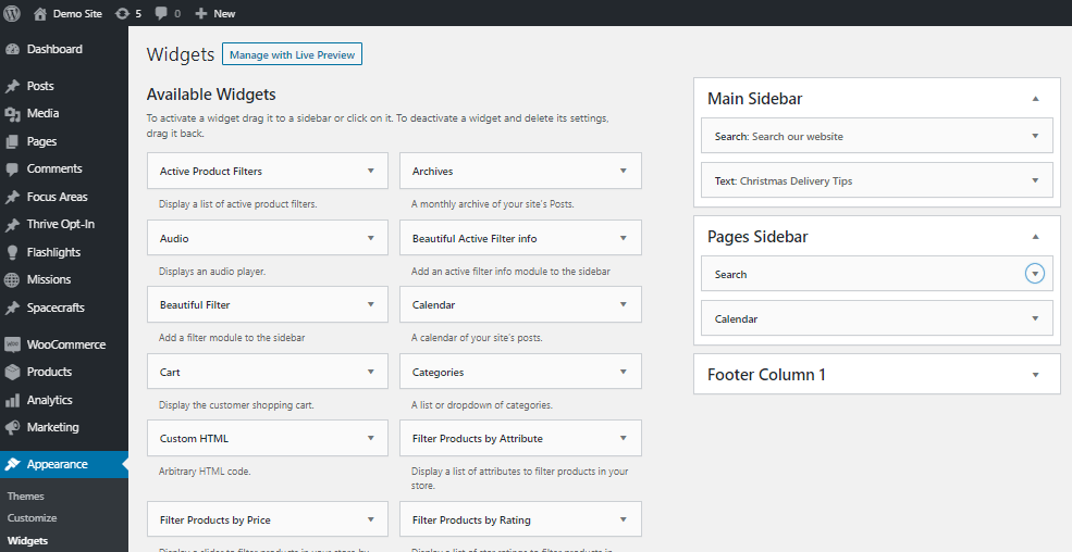
You can make basic adjustments by going to Appearance in your WordPress admin, and then selecting Widgets. On the right, you'll see the different sidebars available to use and on the left, you'll see different widgets you can add to each one.
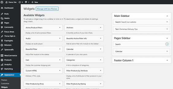
The default sidebar options are so far removed from the final result, that it’s almost impossible to know what you’re building.
Unfortunately, there's no visual element to this, so it's a bit of a guessing game. All this means is that you're not really in control of this crucial element in your marketing weaponry.
So, how can you properly edit your sidebar in WordPress to take control of your marketing strategies?
The Best Way to Edit Your Sidebar in WordPress
Editing the sidebar in WordPress is simple, but it's frustrating and doesn't give you good options.
Thankfully, there's a much better option that's going to allow you to build your sidebar your way!
Step 1: Install Thrive Theme Builder

Thrive Theme Builder is the most powerful and efficient way to build a WordPress website.
It's going to give you much greater control over every element of your marketing, and that includes your sidebar.
- Professionally designed, conversion focused themes
- Seamless drag-and-drop template builder
- Templates for all key elements, including sidebars and footers
- Smart color pallettes
- Global editing (make changes across your entire site with a click)
- And much more...
Simply head to the pricing page and as soon as you've completed your purchase, you'll be ready to upgrade your website.
You can quickly install the plugin from your WordPress admin following this handy guide, and then you're ready to start using your sidebar to drive action on your website.
Step 2: Edit Your Page Templates
Thrive Theme Builder becomes your central hub where you can make global changes to your website. Rather than just have one theme template, it allows you to create different templates for the many types of pages and posts you use on your website.
For example, let's say you have written blog posts and video blog posts. They're slightly different pieces of content, so you will want them to look different. Thrive Theme Builder allows you build individual templates you can reuse each time, rather than having to build the post differently every time.
And of course, this allows you to have different sidebars for different pieces of content!
Just go to your Thrive Theme Builder dashboard and click Templates.

You can then edit the templates and build them out exactly as you see fit. As you can see here, we have a different template for our written and video blogs, which is going to allow us to create very specific sidebars for each one.

Step 3: Build Your Sidebar
Here's where we answer the key question: how do you edit the sidebar in WordPress!
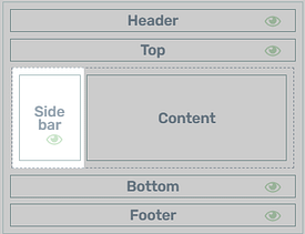
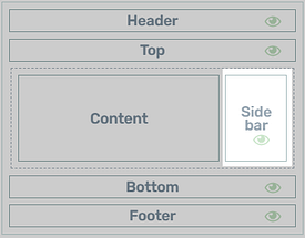
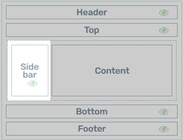
When you're editing a page or post template, you'll see a dropdown menu called Section Options where your page is broken down into its component parts. You should see the Sidebar listed here, but if not, don't panic! Click Layout and Visibility below, and click Sidebar to add it to the design.
Click on Sidebar again and now you're editing!

Open the Choose a Design box, and you'll have access to 19 templates created by our team of professional designers!
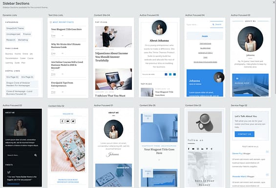
Each template is fully customizable and works great with our Smart Color technology… making it a breeze to fit your website's color branding.

Choose a primary brand color and your sidebar will update to match. Now that’s Smart.
And that's not all!
You can change everything about your sidebar:
- Set a minimum height
- Set a minimum width
- Make your sidebar sticky
- Add background images or colors
- Create sophisticated borders
- Add shadows
- Add any of our countless content blocks
The possibilities really are endless.
What Elements Should You Use in Your Sidebar?
Ok, so we've shown you how you can completely customize your WordPress sidebar.
The question now is, what should you put in there?
Here are a ton of examples you can incorporate into your WordPress sidebar.
Sidebar Ideas for Personal Brands
Personal branding websites focus on a person, story and personality, so the best sidebars should promote all these qualities while still guiding visitors to take action… whether that’s signing up to the email newsletter, buying a product, or simply exploring some of the great content on offer.
Here’s some sidebar additions that lend themselves to a personal brand website:
Mini Personal Bio
Smile and tell everyone about yourself! This mini bio element is perfect for reminding people about your story and message, and providing a relatable human face.
It’s also a good opportunity to include links to your regular social media platforms.

A mini bio box is a great addition to any personal branding blog sidebar.
Email Opt-in Call-to-Action
The goal of many personal branding websites is to grow an email list of subscribers, and continue to deliver valuable content and offers directly to their inbox.

An embedded lead generation form should be simple to make use of the limited space.
While it’s possible to add a lead generation form to your sidebar, there isn’t a lot of room to play with. Instead, one option is to include a beautifully designed, compelling call-to-action box that triggers a popup (also known as a lightbox, overlay or modal). This keeps everything looking neat and professional.

This sleek call-to-action design is included in Thrive Theme Builder’s block library.
Top Content
People love personal brand websites because they enjoy reading what you have to share – your stories, tips, recipes, reviews, interviews, rants… your loyal audience just can’t get enough.
But new visitors can feel overwhelmed scanning through pages of blogroll. They need you to guide them to your very best content.
Don’t rely on an automatic list of posts sorted by date. That’s a needless duplication of your main blog homepage. Instead, you should carefully pick and display your 4 - 8 pieces of top content, or use the built-in Featured Content List.

Books
This sidebar element works great for authors who want to showcase their best selling books. (Be sure to check out Bookwise, our WordPress theme designed specifically for authors.)
Here’s a great example from Tim Ferris’ website. It adds a lovely splash of color and reminds visitors to buy his books.

Source: https://tim.blog/
Sidebar Ideas for Published Content
OK, what exactly is published content?
Blogs, news, magazines, podcasts, videos… these are all online businesses that primarily focus on publishing and monetizing content. But the truth is that most successful websites are content publishers to some degree, even if they only feature a supplemental blog or some buyers guides.
That’s why these sidebar ideas can be applied to anyone who runs a WordPress blog, regardless of their business model.
Top Content Picks
We’ve already covered this in the personal branding section, but it’s a super common and misunderstood sidebar application, so it bears repeating with another inspiring example I cooked up in Thrive Theme Builder.
This is so much more enticing than a list of recently published posts.

Featured Video
Adding your latest (or greatest) video to your sidebar is easy with Thrive Theme Builder.
Just drop a Video element into your sidebar, choose a few simple options, and you’re good to go!

Yes this is a real video. Shane hasn’t finally lost the plot. Check out ‘This is why online marketing isn't working for you.’
How simple is it to set up a video element exactly? Like really simple.
Select a source, paste in your video URL, and make some optional customizations. Thrive Theme Builder will handle the rest to give you a playable video in your WordPress sidebar.

Adding a video to your theme sidebar is easy with Thrive Theme Builder.
Subscribe to the Podcast
So we’ve covered articles and videos, but what about podcasts?
Tim Ferriss is back with an example of how he uses his sidebar to encourage visitors to subscribe to his podcast.

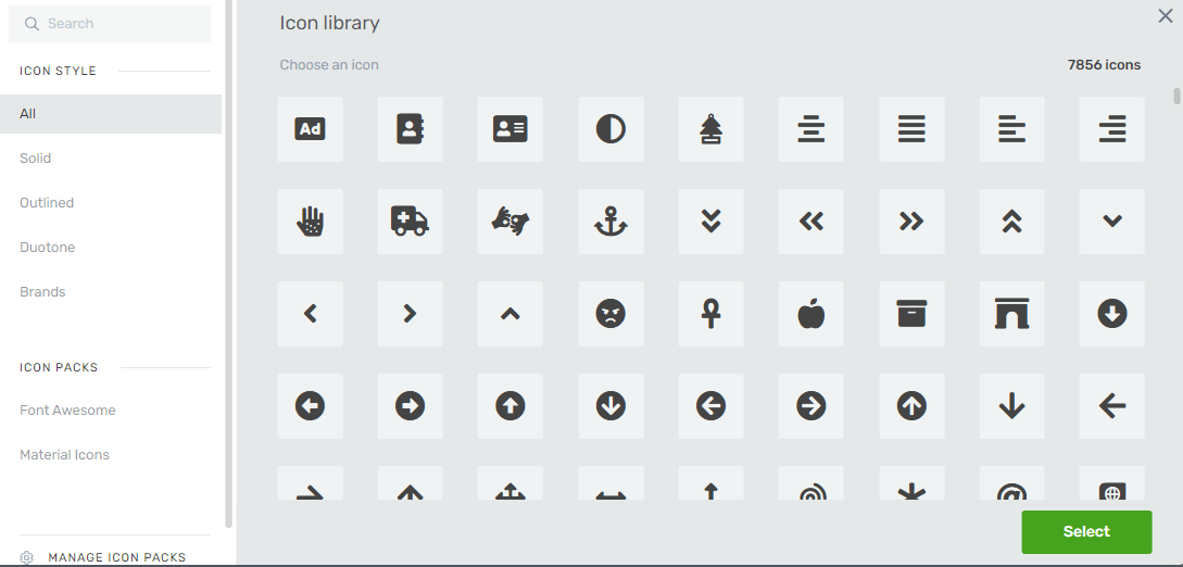
These are simple buttons with icons, linked to the various podcast platforms. You can achieve exactly the same effect with Thrive Theme Builder’s button element, by selecting the Add Icon toggle in the button options.

You can choose any icon from our massive library of designs. With over 7,800 icons to choose from, I recommend using the search feature!
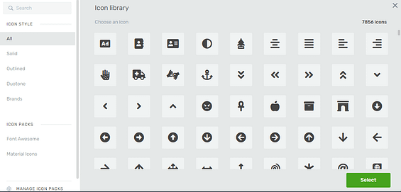
Add icons to your buttons with Thrive Theme Builder.
Categories and Tags
Maybe I was a little harsh on sidebar categories and tags earlier. Sometimes they deserve a place in blog sidebars to give readers an alternative set of navigation options.
But the default WordPress design is boring, and doesn’t offer any control over which categories and tags to display. If only someone could build a better system...
Can you see where this is heading?
Thrive Theme Builder gives you total control over which categories and tags to display, which to hide, how to sort them, and how many to show.
Plus our pre-designed templates will make your sidebar look professional right out of the box.

But wait there’s more!
Even though we’re looking at categories and tags here, you have the option to add any of the following to your sidebar, with exactly the same powerful filter rules:
- Categories
- Tags
- Authors
- Months
- Metas
- Pages
- Recent Comments
- Posts
Sidebar Ideas for Course Content
Structured online course content is a special sidebar case. Unlike typical published content, online courses need a dedicated sidebar.
Here’s why...
While it’s possible to recreate structured course content by stringing together WordPress pages, we really don’t recommend it. It’s messy and there are much quicker solutions.
Thrive Apprentice will help you quickly build and publish your course, and provides a great learner sidebar experience straight out of the box. This includes:
- Course menu
- Teaching information
- Lesson list
- Progress bar
Of course, you can still add other elements if you choose, but this gets you off to a great start!
Get access to Thrive Apprentice
Everything You Need to Build Professional Online Courses — Straight Out Of the Box

Sidebar Ideas for Membership Content
Membership sites usually publish 2 types of content:
- Members-only content
- Public content to encourage people to subscribe
Both types of content need different things in their sidebars.
Here are some great ideas to inspire your membership content.
New Members Content
Suitable for: Members
Recurring membership subscriptions often depend on new content being added. Use your sidebar to remind your members that their membership constantly grows in value.

Encourage members to renew by demonstrating new value to their membership.
Courses and Workshops
Suitable for: Members and Non-members
If your membership business offers community events to increase its perceived value, then your sidebar is a perfect place to keep this front of mind with a compelling call-to-action element. For existing members, it’s a good reminder of the value they receive. For non-members, it shows what they’re missing by sitting on the fence.

Link to more information and encourage non-members to join.
Become a Member!
Suitable for: Non-members
It’s no use offering fantastic membership content if no-one knows about it.
Use your blog post and page sidebars to encourage visitors to become paying members, with a prominent, compelling call-to-action. Be sure to test different messaging and designs to find what converts best.
Here’s a great example from The Membership Guys...

Sidebar Ideas for Local Business Content
If you run a bricks-and-mortar shop, workshop, office or showroom, there’s a few inspiring ideas to add to your WordPress website sidebar.
Opening Hours
Most local businesses hide away opening hours behind a footer link, but they can work great in a sidebar too. This sidebar element is better suited to information pages, rather than your website’s blog posts.

Keep opening hours simple. There’s no need to list similar days individually.
Contact Details
If you welcome telephone or email enquiries, why not make it super easy for visitors to get in touch?
Take it a step further with Thrive Theme Builder’s powerful Click to Call feature. Like the name suggests, this lets anyone with a smartphone, or a desktop VOIP calling service, simply click on the phone number to start dialing.

Click-to-call makes it ridiculously easy for new customers to get in contact with you.
It’s easy to make your phone number interactive. Just add your number as a text element and make it a hyperlink... but instead of linking to a normal URL, add the following:
tel:886444444
Like this...

Obviously use your telephone number here. Did you know you can add a click-to-call number on any element that supports links?
Embed a Google Map
I love this idea, because it instantly makes your local business website look more professional.
It’s very simple to add an interactive map to your sidebar with Thrive Theme Builder and Thrive Architect. Just drop in a ‘Google Map’ element, set your location, and choose your preferred zoom setting.

Et voilà! An instant, responsive map that links to a full-screen version in the Google Maps application.

Sidebar Ideas for Service Providers
Get in Touch
Whatever your main conversion goal – booking a call, scheduling a consultation, requesting a quote – you should make it ridiculously easy to achieve across your whole website.
One option is to top-and-tail your content with blocks or lead generation elements, but another option is to add a compelling call-to-action in your sidebar.
Combined with our sidebar sticky scroll behavior, you can guarantee that your visitors always see a way to get in touch, even if they scroll down a longer page of content.

Sidebars are perfect for converting casual visitors to leads. Link to either a contact page or a contact form popup.
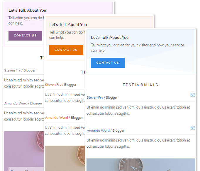
Testimonials
Displaying success stories from happy clients is a great way to build social proof, and ultimately convert leads. Your sidebar is the perfect location to feature testimonial snippets to build trust with potential new clients.
To make them even more effective, try linking them to a dedicated testimonials or case study page, and include a photo of your client to give readers a human face to relate to.

These professionally designed testimonial sidebar templates are available in Thrive Theme Builder.
FAQs: How to Edit the Sidebar in WordPress
Here are some of the questions we commonly see about the WordPress sidebar.
Are Sidebars for Blog Posts, Pages, or Both?
Great question, I’m glad you asked.
Sidebars can work great on both blog posts and static pages, but there are some important things to consider.
First, the choice to include a sidebar or not should be driven by these questions:
- Will a sidebar help users or distract them?
- Are there real business benefits to displaying a sidebar?
- Does a sidebar fit with your design choices?
Second, just because you choose to feature a sidebar on some posts or pages, doesn’t mean you have to include them across your entire website. WordPress lets you assign a template to each post or page, so it’s possible to be selective about where sidebars are displayed.
And third, remember that you can feature entirely different sidebars across pages and posts, meaning you can offer content-related navigation to blog readers, while featuring business-focused calls-to-action on your static pages.
Here’s a few more examples:
Sidebar Elements Ideal for Blog Posts:
Sidebar Elements Ideal for Pages:
Of course, there’s no rule that says you can’t feature your popular articles in the sidebar of your pages, or your operating hours on your blog. The choice is yours to decide what works best for your business and audience!
But it gets even better – there’s also no rule that says all blog posts (or pages) must use the same sidebar.
Thrive Theme Builder gives you the power to design and assign entirely different sidebars to groups of posts or pages.
- Display different sidebars for video posts vs. written articles.
- Display different sidebars for podcast episodes vs. interviews.
- Disable sidebars on long-form content to allow for full-width images.
The bottom line is that you can achieve any sidebar strategy with the combination of WordPress and Thrive Theme Builder. Again, you have full control.
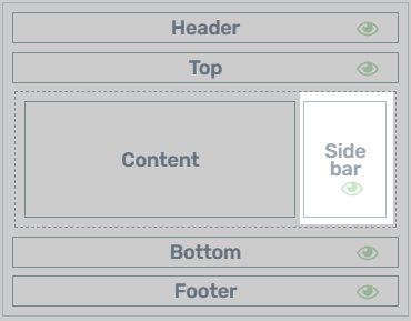
Should Sidebars be on the Left or Right?
Here’s another common question that crops up a lot when discussing WordPress sidebars… Which sidebar alignment performs better, left or right?
Truth be told, it doesn’t seem to matter much in terms of measurable performance. Moving your sidebar probably won’t noticeably impact visitors time on site, page views, or conversions.
Usability best practices suggest a right-aligned sidebar lets readers get to the content faster, but it certainly isn’t a binding rule. It’s just a sensible suggestion based on what we know about how people scan web pages.
In general, you’ll notice the following trends:
- For published articles and pages, sidebars tend to be aligned to the right of the content.
- For structured content such as courses and eCommerce listings, sidebars tend to be left-aligned.
But the most important advice is to be consistent. Don’t change the alignment between pages unless you have a really good reason – find something that works and stick with it.
The good news is that Thrive Theme Builder lets you quickly switch between left and right aligned sidebars to find what works best for your website.
Time to Edit Your WordPress Sidebar
I’ve shared some inspiring ways you can use your WordPress sidebar to guide visitors to important information or actions for your business.
But we’re just scratching the surface… your only limit is your imagination and creativity. I encourage you to try new things with your sidebar. Make it work for your unique audience, website and personality!
Thrive Theme Builder makes it easy to visually customize your sidebar, without touching any code or mixing together some unholy collection of bloated one-trick widget-based plugins. I honestly believe that it offers the simplest, most intuitive sidebar builder for WordPress. Ever.
So give it a try! Use these free resources to get started:
- Thrive Theme Builder Tutorials
- Is Thrive Theme Builder Right for Your WordPress Website?
- Thrive Themes Review: Is It Really Worth It?
Now there's just one thing left to do, buy Thrive Theme Builder today!

Great ideas that have me rethinking my sidebars. Thank you!
What if I want an alphabetical list of categories in a side bar? Last I checked Thrive didn’t do that. Has that changed?
If you want an alphabetical list of categories, then go for it! I’m just being a little playful in the opening section of this article, because that’s what usually comes out of the box on default sidebars.
Just curious about your thoughts on this David…
If we’re using the SILO method as recommended in SEO Sprint, it would seem to compete having categories in the sidebar… I’ve mirrored Shane’s ActiveGrowth “double-menu” (custom menus in TTB are awesome! :-D) and I show my Silos in the 2nd part of the Menu…
Just thinking it would be redundant — and possibly distracting — to have them in both places…
Great ideas in the article, especially loving the sidebar templates now included!
First thing I thought about was having “SILO-specific” lead-gen & content links!
Like Joel H. I’ll have to rethink my sidebar strategy… I’m not using any at all, but TTB makes it so easy to add them, I’m definitely going to reconsider!
Thanks to the team who made this happen! <3
That’s not what I meant. When I tried this a while ago using the Thrive side bar I could get the categories to show up, but it wouldn’t alphabetize them. Tech support said that wasn’t an available sorting option. Has that changed?
You can use the dynamic styled list element, it will allow you to choose to display a list of categories and sort them in ascending order.
https://help.thrivethemes.com/en/articles/4426232-how-to-use-the-dynamic-styled-list-element
The problem is when you select CATEGORIES as your element, the option to ARRANGE RESULTS BY is not available. So you can do it ascending or descending but not by title. (I’m not sure by what actually).
For categories we set it to only be sortable by title, that’s why the “arrange by” option is missing. But I checked, and you are correct that there is currently a glitch with how it’s working and doesn’t sort them properly. A fix for this will be available in our next release, sorry about that 🙂
Hi, I love the possibilities to create nice side bars!
However – I was wondering if it is possible to adjust the size (width) of the total side bar at all?!?
It takes one third of the whole page and I’d love to have it smaller, like only one forth of the page?
Thank you!
Yes, you can customize the sidebar to be any width you want.
Select the dotted area that surrounds the content and sidebar (like in the article above), and simply drag the dividing line to decrease the sidebar width.
So….where are these elements you’re using? That’s unclear. Say, for instance, one wants a mini-bio. Where is that? It says use the “mini bio element.” What am I missing? Do we pick and chose from the templates and save the elements we want as templates? Thanks!
Hi Andy,
You can either find this exact design in the pre-designed sidebar sections (choosing one of these will replace your current sidebar) so if you already have stuff in your sidebar, you might want to build something like this yourself using the “about the author” element or a combination of the “author image” “author name” and “author social link” elements.
Hi, how do you handle the sidbar in mobile view? Hide ?
Yes in general, sidebars just don’t work well for mobiles. It’s definitely better to collapse them.
I notice there’s only 1 sidebar. Why Thrive Themes Builder does not come with 2 sidebars ? Left for Table of contents, right for author bios, etc. It would be perfect !
Hi Cheefoo,
When we were thinking of developing this, it added a lot of complexity that didn’t warrant the possible use cases.
If you want a two sidebar type of layout, you can always use a 2 column layout in the content area and a sidebar to add the table of content next to the content.