Do you find yourself glazing over when reading a long blog post or article?
Or skipping ahead, searching for the actionable content?
Worst of all, have you ever just given up reading, rather than face an intimidating wall of text?
In this article, you’ll learn how to solve these frustrations for your website visitors with a Table of Contents, and encourage them to keep reading what you have to share.
More...
Long content offers some great benefits, but it also creates additional challenges for readers... Visitors can feel overwhelmed by the sheer volume of reading, or lose their bearings halfway through.
This is where a professional, powerful, and customizable Table of Contents element can make a huge difference.
A Table of Contents element like this...
What is a Table of Contents, and why should you care?
A Table of Contents – often called a TOC – lists the major sections in a page of content.
It’s similar to a book’s page listing, but has the added benefit of letting the visitor click to quickly jump down to each section. I’m sure you’re familiar with Wikipedia...

Wikipedia's Table of Contents
A good Table of Contents element can transform a dull wall of text into an interactive, mini-navigation for your awesome content.
Here’s 6 solid benefits that a Table of Contents provides:
- It sets the reader’s expectations by showing the structure beforehand. This shows the skimming reader that your content is worth investing their time.
- It lets the reader skip to a specific section, with the help of jump links. If you can connect your reader to relevant content faster, they’re less likely to get bored and leave.
- It lets the reader dip in and out during multiple visits. Repeat visitors are more likely to become fans of your brand.
- It allows sharing of direct links to individual sections.
- It helps readers orient themselves, when used with sticky scroll behavior.
- It looks professional on long-form content.
When should you – and shouldn’t you – use a Table of Contents Element?
A Table of Contents is a great fit for these types of content:
Long-form articles
If you're pushing over 1,500 words, you might want to consider a Table of Contents. This helps to let visitors know what to expect, so they feel informed before committing to a full read.
If you choose to make your Table of Contents sticky, it can also provide some always-available navigation, so readers understand where they are in the wider topic.
Structured content
Table of Contents rely on structured sections or chapters, along with HTML headings like H2s and H3s. The article you’re reading right now is a perfect example.
This lets your Table of Contents automatically update, and allows visitors to instantly navigate to a particular section of interest.
Structured content doesn’t have to be long; your visitors might find a Table of Contents valuable on Q&A or list-type posts, especially if there are repeated sections that are easy to get lost in.
Tutorials, guides and online course lessons
Educational content often teaches an overarching topic or skill by breaking it down into steps or subtopics.
A great example of this is our Beginners Guide to Starting an Online Business – this type of content becomes immediately more accessible and digestible when supported by a Table of Contents element.
A Table of Contents isn’t suitable for these types of content:
Short-form content
Just like you don’t need a page listing for a leaflet, you’ll discover that content below 800 words rarely needs a Table of Contents.
For shorter, snappier content, it’s best to let your readers jump in and follow the narrative from start to finish.
Non-structured content
If you publish content without HTML headings, your Table of Contents simply won’t work.
In general, we don’t recommend publishing unstructured, stream-of-thought content. It’s never ideal for your readers. If you’re looking for guidance on how you can structure your content, read our post about content patterns.
Utility pages that serve a specific function
Sure, it’s technically possible to add a Table of Contents to your homepage, category archives, 404 page etc, but does it offer any real value to your visitors?
Unless you have a compelling reason, then these utility or navigation pages are not ideal locations to feature a Table of Contents element on.
How to add a Table of Contents?
You can add a Table of Contents element to any WordPress content.
The two most common applications are:
- Static pages – like sales pages, course lessons and other long-form content.
- Blog posts – like, well blog posts.
(Technically there’s nothing stopping you from adding a Table of Contents to your homepage or 404 page, but we can’t think of a compelling reason to do so!)
The next question you need to ask yourself is, do you want a Table of Contents on:
- Every static page or blog post?
- Or on just a few, selected ones?
Don’t worry, we have a solution for each.
Add a Table of Contents to a single page or post
The best tool for this job is Thrive Architect.
Thrive Architect lets you edit the content of a page.
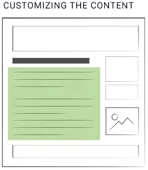
Your content is displayed in an allocated area on your WordPress theme.
The article you’re currently reading is a great example of adding a Table of Contents to a single post or page.
Here’s how...
- Open your page with Thrive Architect and insert a new element
- Select the Table of Contents element
- Drag and drop it onto the page
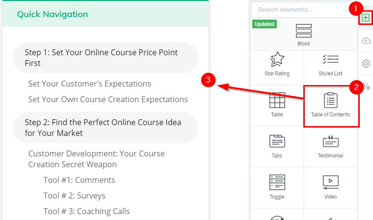
Adding a Table of Contents with Thrive's visual editor. It's as easy as drag and drop.
Your Table of Contents doesn’t have to feature at the very top of your content – you can place it anywhere you want.
Add a Table of Contents to every page or post
The best tool for this job is Thrive Theme Builder.
Thrive Theme Builder lets you edit your WordPress theme – the common elements that surround your content.
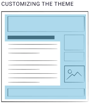
Your theme surrounds your content on every page of your website.
Adding a Table of Contents element to your WordPress theme opens up a whole world of opportunities.
You can automatically show a clickable Table of Contents with every blog post, dynamically populated based on the headings in each, individual post.
You can also choose exactly where it should be displayed. For example, above the content or in the sidebar.
If you publish longer content with structured headings, this may be a gamechanger for improving readability and navigation!
The most important thing to remember when adding a Table of Contents to your WordPress theme is that it will dynamically change depending on the page that a visitor is viewing.
- A page with 20 headings will show a Table of Contents with 20 links
- A page with 2 headings will show one with 2 headings.
- A page with no headings won’t show any Table of Contents.
You get the point.
It’s a powerful feature but, as Spider-Man knows, with great power comes great responsibility… You should think very carefully before adding a theme-wide Table of Contents element – it will show up on every page that contains headings.
Technically, it will show on every page that uses the same page template.
With Thrive Theme Builder, you have full design control over each page template – you can add a Table of Contents to templates like your static pages, blog posts, full-width blog posts, video posts, etc.
You may want to create a page template called "Post with TOC" (or similar) so you can easily choose which content deserves a Table of Contents.
Configuring your Table of Contents
Our Table of Contents element isn’t the first such solution for WordPress. But I’m willing to bet it’s the most powerful and customizable – we set out to give you complete control over how your Table of Contents behaves.
Let’s walk through the configuration options now.
Heading Levels
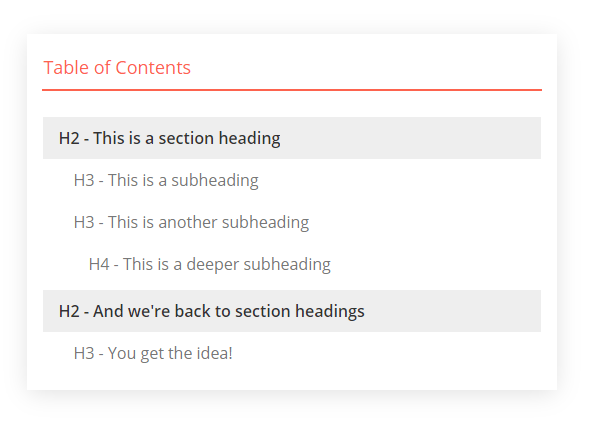
Depending on the needs of your content, you can choose which heading levels to include in your Table of Contents.
By default, it displays your H2, H3 and H4 headings. We’ve found this fits most long-form content – there’s not usually a compelling reason to include your post title, which is usually formatted as a H1 heading.
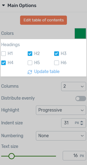
Choosing which headings to include in the Table of Contents.
Of course, you have total control. If you want to include your H1 heading, you’re free to do so.
Likewise, if your content utilizes H5 and H6 headings, you can include those too.
A word of warning, however – when everything is important, nothing is. It’s best to focus your Table of Contents on just the top-level chapter headings, rather than every small sub-heading.
Columns
A Table of Content element is designed to make long-form content more readable, not add unnecessary scrolling. But the longer and more structured your content, the longer your Table of Contents grows.
Here’s a good example of a long, single-column Table of Contents:
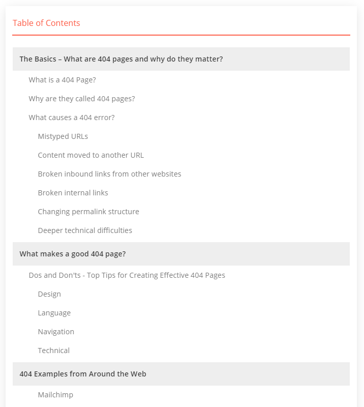
A single-column Table of Contents.
Would it look better to spread the links across 2 columns?
It sure would!
Select up to 3 columns, and watch your Table of Contents become instantly more readable.
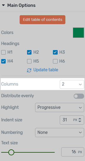
Choose to show headings across 1, 2 or 3 columns in your Table of Contents.
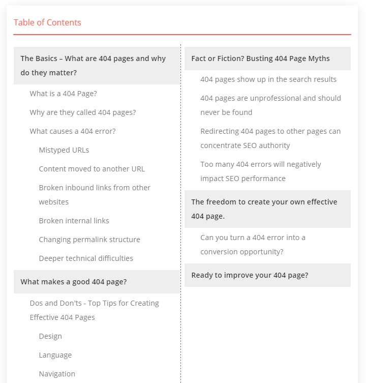
A 2-column Table of Contents.
Column Distribution
Here you have a stylistic choice to make:
- Do you want your Table of Contents split equally across the columns?
- Or do you prefer to keep major sections together?
Personally, I prefer equal columns, but we’d rather give you full control to make your own decision.
It’s easy, just toggle the Distribute Evenly option and choose whichever layout looks best.
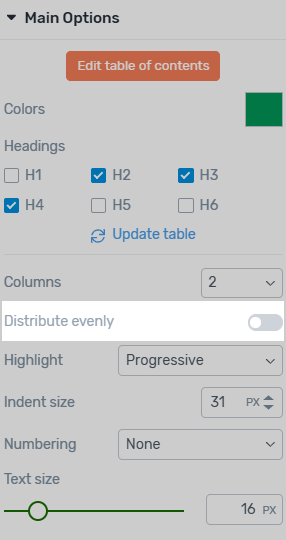
Toggle between keeping sections together, or distributing headings evenly across columns.
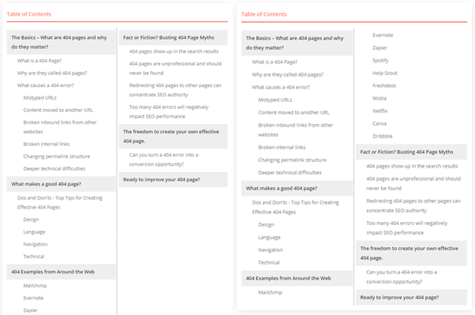
Evenly distributed columns in your Table of Contents.
Highlighting
This option is designed for Table of Contents that follow the visitor as they scroll – known as sticky scroll behavior.
If you only intend to feature your Table of Contents at the top of an article, you can safely ignore this option, as highlighting effects won’t be visible.
Highlighting lets your readers see – in real-time! – exactly where they are in the overall structure of your content.
They know what section they’re currently reading, what comes next, and how it all fits into the bigger picture. In short, it provides immediate context.
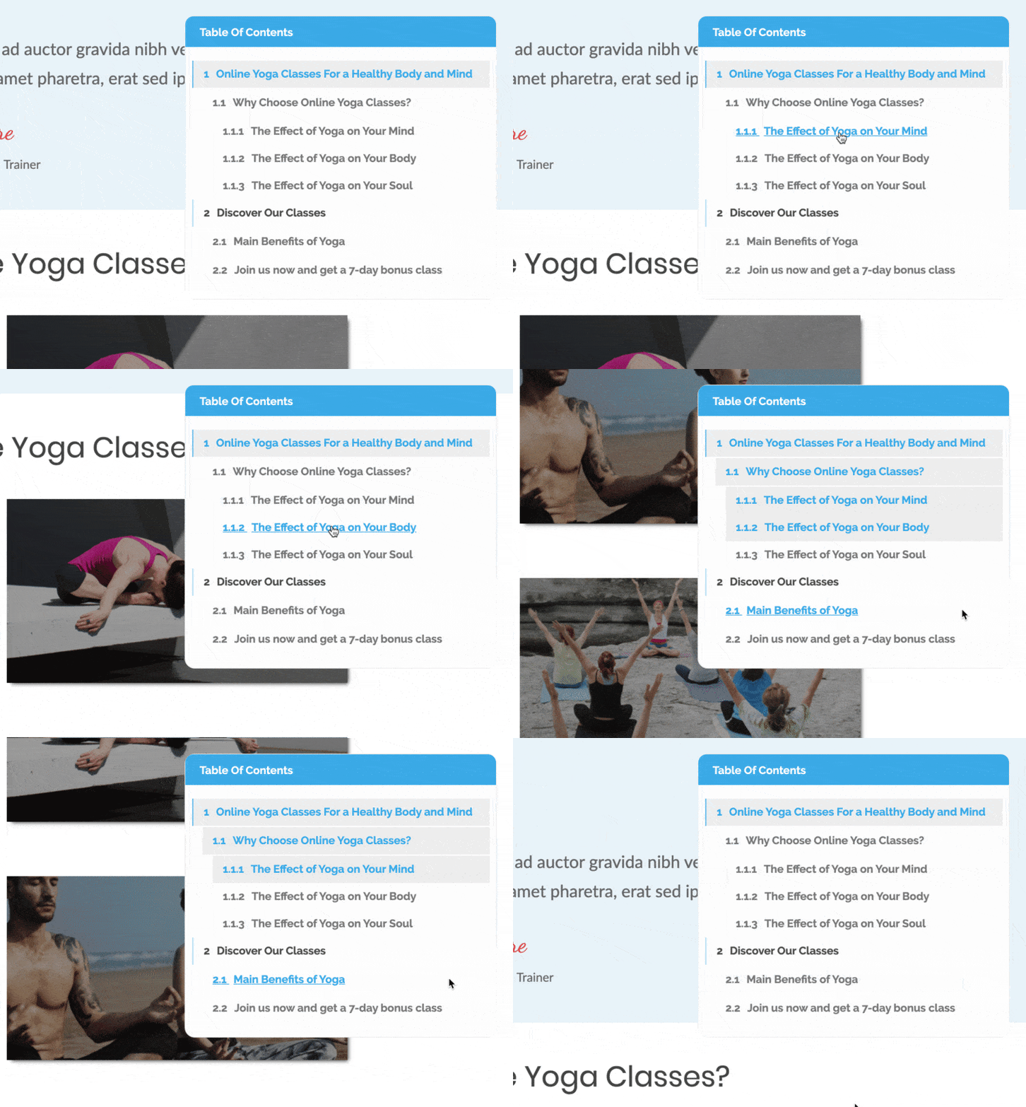
Highlighting effects on a sticky Table of Contents.
You can choose any design styles to represent highlighted sections.
The example above combines a blue link text color with a grey background. You could also choose a more suitable effect, like bold text.
But it gets even better!
You can also choose the behavior of the highlighting.
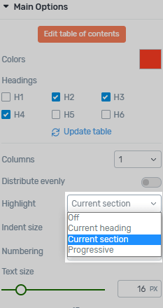
Choose the behavior of the highlighting styles.
- Off
- Current heading - highlights only a single heading.
- Current section - highlights from the parent heading to the current heading.
- Progressive - highlights everything from the start to the current heading.
Numbering
Some tightly-structured – or chaptered – content looks best with a numbered Table of Contents.
You can choose from:
- No numbering.
- Basic numbering - Incrementally number the top-level headings.
- Advanced numbering - Incrementally number every heading.
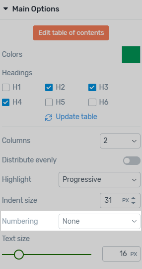
Choose how to number your Table of Contents headings.
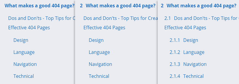
No numbering, basic numbering, and advanced numbering.
Modifying Sections
Renaming Sections
This is a feature we’re really proud of.
It’s a game-changer for anyone wanting to add a useful Table of Contents to their WordPress content.
Traditionally, WordPress TOC solutions are 100% dynamic. They display the same exact text used in each section heading.
That’s both good and bad!
It’s good because it updates automatically to reflect any changes you make. This saves time and eliminates errors.
It’s bad because this means your Table of Contents is a slave to your headings. Long, academic, SEO-driven, or stylistic headings look terrible in a Table of Contents.
Take a look at this…
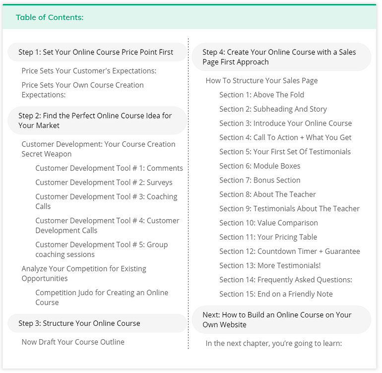
Long section headings will generate a cluttered and busy Table of Contents.
The headings on this long-form page don’t create a readable, intuitive Table of Contents.
What if you could rename individual links in your Table of Contents, and override this rigid 1:1 relation?
In our new Table of Contents element, every single heading is fully editable.
Just select the Table of Contents and expand the Modify Heading toggle in the main options.
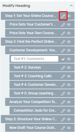
Edit each heading to improve readability.
I spent 2 minutes modifying our example Table of Contents to improve usability.
I’ve removed filler words, extra punctuation, and unnecessary numbering, and I’ve even hidden the final heading entirely.
What do you think?
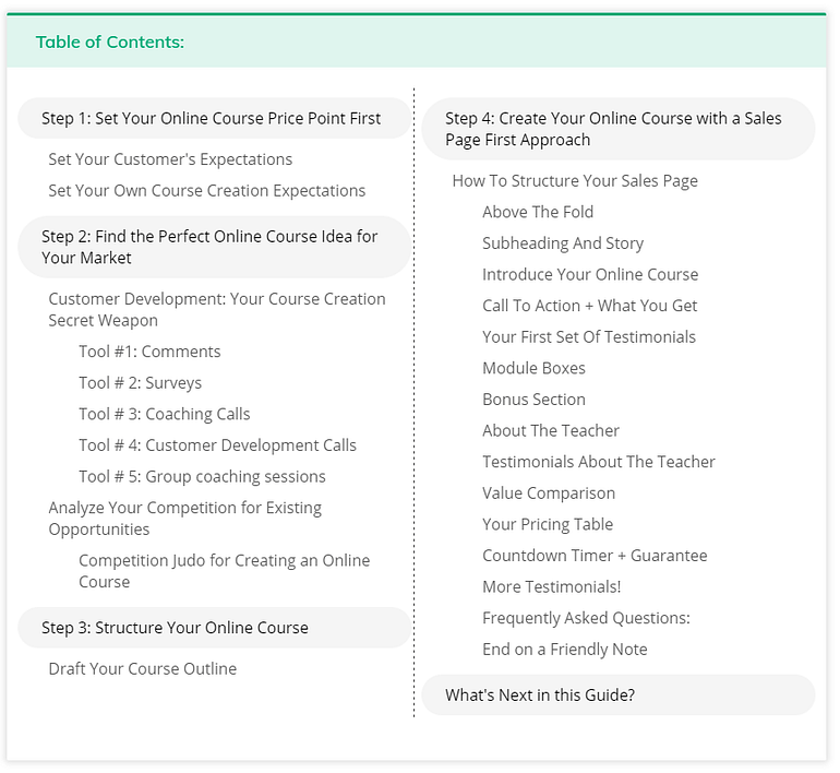
Much better! Shorter, clearer headings create the best Table of Contents.
Hiding Sections
As mentioned above, it’s easy to hide a Table of Contents link with just a click.
And this works recursively to let you hide entire sections – hiding a H2 heading will also hide any child headings.
Unless you choose to include them, of course. Did I mention you have complete control yet?
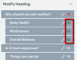
Choose which headings to hide entirely if they're not suitable for your Table of Contents.
Renaming and hiding headings works a bit differently in Thrive Theme Builder.
When you add a Table of Contents to a theme template, it applies to all posts and pages that use that template.
This means it will look very different for each page – a page with 20 headings will include a related Table of Contents, while a page with no headings won’t show anything.
If you use our visual editor to create your content (not the standard WordPress editor), you can choose which headings to show/hide, or rename, by selecting the heading and expanding the Advanced formatting options.
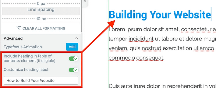
Rename and show/hide any heading, even with dynamically generated Table of Contents.
Styling your Table of Contents
In keeping with our philosophy of giving you options plus total control, our new Table of Contents element can be styled to look exactly like you need.
Start with a professionally designed template – and tweak it to perfectly fit your brand.
Pre-designed templates
The Table of Contents element is available for both Thrive Theme Builder and Thrive Architect users — and of course, Thrive Suite customers! — but there are some small differences.
If you own Thrive Architect, or are a Thrive Suite customer, you can choose from 14 pre-designed templates, created by our professional design team.
If you only own Thrive Theme Builder, you’ll have access to just the starter template. Don’t worry, you can still achieve everything you need by customizing the starter template. If you want to save time however, consider getting Thrive Suite, so you can access our complete library of templates – as well as instant access to all our WordPress products.
Just pick a pre-designed template and watch your Table of Contents transform to match.
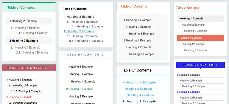
Thrive Architect comes with a library of great Table of Content designs to choose from.
Choose the design that gets you closest to what you need, and get ready to make some customizations!
Custom designing
Each component of your Table of Contents can be individually styled:
- Top-section such as title
- Headings
- Link hover effects
- Current section highlight effects
- Spacing and indentation
- Background colors and styles
- Borders
If you’re familiar with the Thrive visual editor used in both Theme Builder and Architect, you’ll feel right at home. It feels like you’re editing your live website.
The overall Table of Contents element can be customized using the Thrive visual editor. Just select the component, make the changes, and hit Save.
If you want to customize individual components – for example, just the H3 headings – you can use the “Edit” button to unlock even more customization options. This powerful edit mode lets you lock in any changes, so there’s no risk of upsetting your careful design later.
Your WordPress website will instantly update to match.
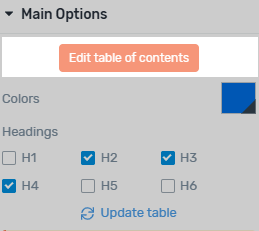
How to edit invididual elements.
Choosing a Main Color Palette
Matching colors across components in our pre-designed Table of Contents couldn’t be easier.
In just a few clicks, you can select a main color that matches your brand.
This affects a range of related color accents, from the border and top section, right through to the hover color on each linked heading.
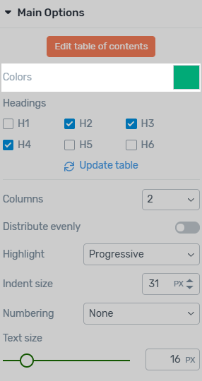
Choose a main color that matches your website branding.
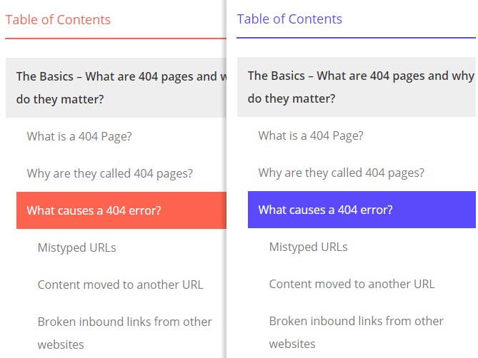
It's easy to change the color palette across your whole Table of Contents.
Just like everything else, you can override any of these at any time. You have total control over how your Table of Content looks and feels!
One last thing… if you don’t like the wording “Table of Contents”, just replace it with something friendlier, like “Quick Links” or “Jump to an Article Section”. It’s up to you.
Sticky Scroll Behavior
Here’s an advanced way to offer a truly integrated Table of Contents experience.
Instead of a traditional Table of Contents at the top of your page, why not make it follow the user as they scroll?
You can achieve this with sticky scroll behavior, a funny way of saying it’s always visible, even when you read further down the page.

A sticky Table of Contents doesn't scroll with the rest of your content.
This would be perfect for tutorial-style content like an online course or step-by-step guide.
Simply select your Table of Contents element and enable the Sticky option under Scroll Behavior.
You may want to add a little extra ‘Distance from the top of the screen’ so your Table of Contents has a little room above when readers scroll down.
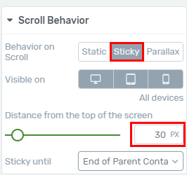
Enabling the sticky scroll behavior.
I know you’re excited!
But before you go adding a sticky Table of Contents to your site, there are a few things to be aware of.
Positioning your sticky Table of Contents
A sticky Table of Contents is best featured next to your content, like the example above.
It’s a purely stylistic choice whether it’s on the left or right side.
The easiest way to achieve this with Thrive Theme Builder, by adding your Table of Contents directly to the theme sidebar.
There are more technical methods for page templates without a sidebar, but that’s beyond the scope of this article.
I recommend creating a new theme page template called “Page with TOC” (or something similarly helpful). Then, whenever you publish a new page, you can easily choose whether to apply the Table of Contents.
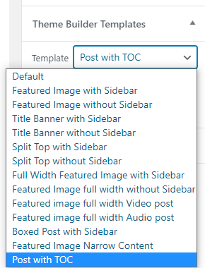
Selectively apply a Table of Contents by choosing an appropriate page template.
Choosing a readable width
Don’t try to pack your Table of Contents into a standard width sidebar. That will crunch everything up into a thin, long mess.
Instead, use Thrive Theme Builder’s easy visual editor to extend the sidebar width.
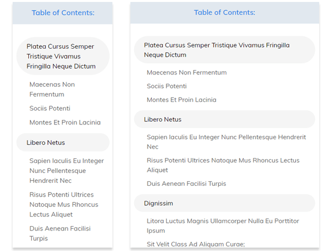
Narrow Table of Contents can feel claustrophobic in your theme sidebar.
When featuring a sidebar Table of Contents, we recommend using a page template that utilizes more of the available screen space – full-width with just enough side margin.
This gives both your content and Table of Contents enough room to do their jobs.
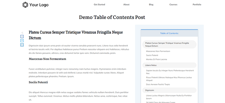
It's easy to create a wide page template with Thrive Theme Buider – Perfect for sidebar Table of Contents!
Choosing when to disable the sticky behavior
Finally, don’t forget to tell your Table of Contents to stop scrolling once the reader hits the end of your awesome content.
If you forget this step, your Table of Contents will obscure your footer!
Just set the Sticky until option to End of Parent Container to achieve this:
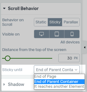
Keep your sticky Table of Contents from obscuring your footer.
What’s Next?
You should now have a good idea which types of content would benefit from a Table of Contents on your website.
You can learn more about setting one up in these tutorials:
How to Set Up the Table of Contents Element
Using the Table of Contents Element in a Theme Template
Let us know your thoughts in the comments below, and please do share any great examples of well-designed Table of Contents from around the web. We’d love to see what inspires you!


me: look, there’s a new mail from Thrive
inner self: MUST.READ.IT.NOW
me: read it
inner self: WTF – this is awesome!
me: what did you expect? It’s from THEM!
What a wonderful functionality. Thank you for going into so much detail.
Such satisfying feedback, thank you Phil!
I’m glad you find the post useful. Let us know if you get around to using the TOC feature on your own website.
David,
very well written, detailed and clear article! Great features! Congratulations to Thrive Themes team. I will certainly use the new TOC.
Kind regards, Pawel
Thanks Pawel. It’s a great feature for sure. Let us know how you get on with the new TOC and share your pages.
Hi. Looks nice. Question: Other TOC plugins use jump points and “#” and things like that. Google will notice some of those and come up with a “skip to” link in search results. Does this TOC allow for that, or would Google not be able to do anything with it? Thanks.
That’s a great point, Tom.
Our TOC uses standard “#” jump links too, so Google should be able to show these additional links in the search results.
I’m using it and Google read it well 😉
Here’s a screenshot of a search result snippet in Google from using the ToC element:- https://thrivethemes.com/wordpress-table-of-contents/#comments/408748
This is a seriously cool feature. I have tried a few. All looked next to bad.
I am so happy to know I can now do it professionally with this tool.
Excellent tutorial.
Glad you like it Johan!
Hi David,
I implemented this already in a website. If it’s a small one, it’s great to have it sticky on top of the page. If it is bigger and you clicked on one of the options, you have to scroll back to the top for the overview of the other options. Maybe it is a valuable add-on to have a sticky button for instance that brings you back to the Table of Content. This article is a great example of what I mean. 🙂
Love the new features! Being able to change the exact text used is really nice 🙂
But there’s still the problem with your TOC: it’s not SEO friendly 🙁
This has prevented me from using it more. It won’t use SEO-friendly hyperlinks (with text and alt) and it will only use the #.
Other TOCs (even built from scratch) will link the sections appropriately and Google will find those links and use them as search results, giving you more chances to position for the keywords used in your sub-headlines.
Have you taken a look at this issue before?
Have a look at these results snippets in Google all from using the Architect table of contents element:-
You can see that the jumplinks are included in the search snippet. Those jumplinks are created by the ToC element.
That said, we have another small improvement due for release next week to try and optimize it further.
Thanks Paul!
It does seem like it works as it should. Is this something relatively new? I’ve worked with a SEO expert and they showed me how it wouldn’t work. Sorry I can’t share any scrrenshots but the problem was with the tags not including the text used in the headers, which would hurt SEO.
So I’m guessing that even if Google does find the post structure thanks to the ToC jumplinks, things could be even better if those links had the keywords in them. Is this correct?
I have no doubt you’re working to make this feature even better, as you do with every product you have 🙂
Great work! I can’t wait to use these on my site. Long-term Thrive user here (from the TCB days). Keep up the good work.
Thanks for your continued support over the years!
I love it! In fact, I’ve hand made a table contents for my post using the jump link features with photos, and feel great about it. I hope you will make it possible with the Table of Content element too.
Here’s my post if you want to know what I meant:
https://ysamphy.com/productivity-resources
I’ve gotta say, that’s a beautiful page you’ve built right there!
All made possible with Thrive Themes!
Absotively gorgeous and usable Samphy! Would you be offended if I modeled this approach for a couple of projects I’m working on? Many blessings! MamaRed
Not at all! In fact, im happy it’s useful! 🙂
Thank you Samphy! I wanted to check before moving forward. Hugs&Blessings. MamaRed.
I’m impressed by the way you created your table of contents, congratulations on your workaround and thank you for gathering all those resources togehter.
Thanks, Jose. I’m glad you like it. ????
The Table of Contents feature is absolutely awesome! I love it and use it every day in our articles. It makes my work so much easier.
The features could not be better!
There is only one thing you could improve: In very long articles, it is better to use two columns. BUT in the mobile view, it would be great to have only one column, because it is easier to read. The two columns are very small on mobile.
Good point Tina – we actually have something in the work to handle this case
Is it possible to disable sticky behavior on mobile but keep it for desktop? There’s just no enough space on mobile and I don’t want to duplicate them
Yes, sure is.
But if I disable mobile then it’s not visible on mobile at all
No that’s not how it works. That means that the “Scroll behavior” won’t be visible on mobile, not the actual element that it’s applied to.
1. I am having trouble with table of contents. It is not showing up on my blog posts. I use WP Rocket – is there a compatibility issue?
2. Is there a way to exclude certain text from all pages? E. g. Social sharing plugins add “Share this:”, “Like this:” Is there a way to exclude these?
3. What about the people who use the Classic Editor for posts? How can they add TOC?
Hello Peter,
1- Are you seeing the table of contents element display inside the editor and just no in the front end of your site? If so this sounds like a caching issue.
2 – Yes, see the section about “Modifying headings” above
3 – You’ll need a separate standalone plugin with nowhere near as many features 🙂
Thanks. What part of caching does it conflict with? Yes, I see it on the backend, on the front end I see a flash of the TOC template without the dynamic content, then it disappears.
> Is there a way to exclude certain text from all pages? E. g. Social sharing plugins add “Share this:”, “Like this:” Is there a way to exclude these?
If a heading is included in the content area of your theme, it will show in the TOC by default.
If you’ve added the elements with Thrive Architect, you can hide them from the TOC using the method shown in the ‘Modifying Sections’ chapter above.
Headings outside of the content area (e.g. in the footer) will not be shown in the TOC.
I found table of content update amazing.
One cool hack I use is, using my sidebar to show the table of content. It’s kinda like reading on Kindle. Your table doesn’t vanish from the eyes and if someone wants to reach quickly to another section they can do it.
You are awesome guys.
I am curious if you have any plans to bring Drip capabilities to Thrive Apprentice. This is the only thing that has stopped me to make Thrive my complete online home.
You’ll be quite pleased in the near future 🙂
Hey, David I like the new updates, but what happens to a sticky table of contents on mobile?
You can turn it off on tablet / mobile if you prefer:-
So I’m using a different theme, NOT a thrive theme. It has its own page designer/editor baked in. Can I still use this?
You can use this inside the content area of any content that’s built with Thrive Architect even with third party themes.
The advantage of also being a Theme Builder user is that you’ll also be able to add this ToC element inside your theme template.
Great article and great feature. It was a nice piece of work, for sure. Thank you!
Thanks Kevin! Glad you found it valuable.
Why doesn’t this post has a table of contents to illustrate the module?
You see the huge bright green thing that says “Quick Navigation” towards the top of the post….? 🙂
Nice updates – but when are we going to get a simple ‘Hide’ option at the top of every table?
This is pretty fundamental behaviour for a ToC, so hoping you will implement this soon.
I know there’s a work around at the moment – but it’s clunky and clearly a workaround!
(Keeping everything crossed for another quick update soon!)
That improvement is currently scheduled for the 12th August.
That’s great news Paul – thanks!
Hi Rob, this is now available!
I love all the new TOC elements and options, but I wish you had kept the old TOC as a style. Now my new articles have a different TOC than my old articles. If there’s a way to keep the old style TOC, yet have all the new options, that would be great!
Which design were you using from the old TOC?
Hi David, As far as I know there was only one option, which you can see at this (older) article on my site: https://therationalkitchen.com/induction-cooktop-reviews-best-portable-induction-cooktop-commercial-grade-1800w/
Thanks for your quick reply!
Our new TOC focuses on more modern designs, but you can certainly re-create your older TOC so it looks exactly the same.
Then, you can save this as a Template or a Symbol, so you can re-use it on future articles.
In the meantime, I’ll ask the team about including the old design sometime in the future.
looks really great, only one thing more would be nice…
if the table could be toggled on and off. for example when visiting page first you read “table of contents” only, and complete table only shows up when you click a “show table” text or icon. (like in that other table of contents plugin (not from thrive))
Paul has confirmed a hide/toggle feature will be added on the 12th August, if all goes to plan.
But I do want to point out that our Table of Contents is not an additional plugin. It’s a free update for anyone already using Thrive Architect or Thrive Theme Builder.
Hi Jo, I can confirm that the Table of Content is now colapsible! See it in action here: https://thrivethemes.com/august-2020/
Can I put this TOC on another page?
For example, I would love to have a designated TOC on the introduction page of a module, that lists all of the jump links to topics on various pages inside the module. Is this possible, or do I need to keep the TOC on the page it is pulling headings from?
If not, is there another way I can do this easily?
Hi Tessa. The TOC looks for headings on the same page.
I can’t think of an existing solution for listing headings across a range of different pages. That’s a very interesting scenario.
Of course, you can automatically show links to sub-pages by using a custom menu, but not to individual headings within each page.
This is great but how can I get it work if I still use the default WordPress editor to publish blog posts? Is there a shortcode option or can there be in the future?
Hi Chris,
If you’re not using Thrive Theme Builder and you’re not creating your blog posts with Thrive Architect, you won’t be able to use the TOC.
When your site runs on the Thrive Theme Builder theme and you add the dynamic ToC to your post template (in which case it will show even on content created with the WP editor)
great!
This is awesome!
Hi David,
i tried and I’m not so convinced – why?
Because there are (as far I could see) only #jumplink with a number and no text – but whereas a text is a good seo optimiser.
Any thought on this?
Thx Alex
Using a number for the jump link identifier does not negatively affect SEO. Only the TOC anchor text and the actual HTML headings that matter.
See these examples of Google successfully showing the TOC snippets in the search results.
Note that there are never any guarantees that TOC links will display the search results, it depends on a lot of factors (and the whims of Google!).
can I request for thrive architect :
please dont remove default header footer under theme like genesis framework. so I mean when I’ve create page using thrive architect, header footer still availabel from theme. like other page builder.
Do you mean the default theme header and footer?
When creating a page in Thrive Architect, you can choose to start with your theme or a blank page.
Let me know if I’ve understood.
Have implemented it on the right sidebar of one of my post: https://penasihathosting.com/panduan-cpanel/ 🙂
Nice implementation!
Looks great, Randika!
Why not make the TOC sticky, so it’s always visible as readers scroll down? That would let people see where they are and jump around if needed.
I have made it sticky. Could you see once again if the TOC already sticky from your end?
Yes it works! Wow, this really enhances your long-form content. Nicely done.
This article says “Your Table of Contents doesn’t have to feature at the very top of your content – you can place it anywhere you want.” Does this mean there’s a way to display it within post content? For example, my clients writes the posts in WordPress directly and then wants to add the TOC a few paragraphs down after the intro. Is this possible?
Yep totally possible as long as they write their blog post in Thrive Architect they can drop the table of content element wherever they want.