How should you design your homepage? That's a question many entrepreneurs struggle with. We know that the homepage represents our business and brand, more than any other page. We want to get it right.
What if you could learn from the best? Not just learn from what the most successful sites do right now, but also learn from how they got here?
That's exactly what this post is about.
We dove into the homepage history of the websites run by 6 leading minds when it comes to content marketing and personal branding: Tim Ferriss, Ramit Sethi, Marie Forleo, James Clear, Celestine Chua and Gary Vaynerchuk.
Read on to discover the keys to success that we unearthed in this in-depth study (and to see the "ideal homepage" template we created based on everything we learned).
Learn more on how to build the perfect Personal Branding Website with Thrive Suite!
We wrote a guide on how to build the perfect personal branding website with Thrive Suite. Make sure to check it out!
More...
Personal Brands With Star Power
The websites we're examining in today's post all have one thing in common: they're a platform that led their respective owners to fame and success. Each site is the center piece of a highly successful personal brand.
What exactly does "personal brand" mean, in this context?
Each site represents one expert/author/teacher in a field. The emphasis is on the person, their expertise and the content they create. You can think of a personal brand as the "serious business" version of a personal blog.
For our analysis we picked out some of the leading sites in this field:
- Personal Excellence by Celestine Chua
- Gary Vaynerchuk
- James Clear
- Marie Forleo
- I Will Teach You to Be Rich by Ramit Sethi
- Tim Ferriss
These are all people who have done an outstanding job of building a passionate audience, building a strong brand and turning themselves into recognized experts.
But here's the thing: none of them started out as online superstars. They started out as just some person with a website. What did they do, to become as successful as they are today?
To answer this question (at least in part), we aren't just looking at the current states of their websites, we're also diving into the history of the sites...
The Historic Deep Dive
For our research, we used the Web Archive to look at past versions of each of the website's homepages. We took note of how often the homepages received a major redesign and how they changed over time. And out of all the data we gathered, we looked for common patterns.
In what ways did these pages change over time? What trends does this uncover?
Since these are all sites of highly successful businesses, run by very smart people, we can assume that the homepages are getting better over time. And thus, we can extract some valuable lessons.
In the following, we'll look at the past and present state of the homepages and then extract conclusions and actionable tips from what we find.
Celestine Chua, Personal Excellence
For the longest time, Celestine's homepage was a bit of a mess. In 2012, she displayed a "Welcome to Personal Excellence" headline with a generic stock image, a wall of text and a ton of stuff in the sidebar:
For many years after that, she displayed a video at the top of her homepage, followed by a list of her blog posts.
Finally around 2017 she added a clear title section with a hero image and a strong headline and call to action, followed by a list of blog posts.
You may know our stance on this, which we've repeated often: your blog's homepage should not be a list of blog posts! In my opinion, going from the messy list of posts to a strong title section is definitely a step in the right direction.
Celestine's Current Homepage
Click to see full preview.
The current homepage is the more landing-pagey than any previous iterations. It lists only her 3 latest posts and is much more focused on introducing a new visitor to her site, her mission and "showing them around".
I also found an interesting evolution in Celestine's homepage headline. The oldest one we found was "Welcome to Personal Excellence" which is a very old-school title. Before people knew what to do with web pages, this "welcome to my site!" type headline was typical.
She ditched that and had no title at all for a long time. Then, two different titles in the latest two versions of her homepage:
- 2017: "Hi, I'm Celes and I'm passionate about helping you achieve your highest potential in life. Let's get started! :)"
- 2018: "Hi, I'm Celestine Chua. Let me work with you to achieve your biggest goals and dreams."
I love this. Do you see how those two headlines say the same thing, but the second one is cleaner, more "you" focused and and less abstract? Definitely a subtle but important improvement.
Gary Vaynerchuk
Like the previous example, Gary's homepage displayed a list of his latest blog posts and not much else, for a long period of his site's existence. For many years, you'd find something like this on his homepage:
He switched up the design of his homepage almost yearly, but in principle, it was still a list or gallery of his latest posts. Here's an example from 2015:
However, around 2016 he changed that and started showing a dedicated landing page instead. He used quotes as his page titles for a while:
Gary also prominently featured videos on his site, pretty much as far back as the archive goes. Much of his blog content is in the form of videos and he also used them on his homepage, like you can see in the title section in the screenshot above.
Gary's Current Homepage
Click to see full preview.
Interestingly, no headline. Just a large title section with a video play button. Gary's homepage uses video and images, heavily. He lists only two recent blog posts and shows a "get on my mailing list" call to action very prominently.
Interesting and unique to Gary is his call to actions for getting in touch with him. This has always been a strong focus of his: communication through every possible channel.
James Clear
James Clear is an interesting candidate because he's always had a strong focus on minimalism. As far back as 2012, James has been displaying a short, minimal landing page as his homepage and he's never diverged from this formula.
For a while, he showed a stronger call to action and/or an image of himself on the page:
But for long periods of time, he didn't even include an image of himself on the homepage. Here's a snapshot from 2016:
James has done two things consistently, for years: the first is that lets words do the talking on his site, instead of relying on fancy visuals. If you've seen my "copy only landing page" you know that I'm quite fond of this approach. This goes beyond just his homepage as well: James' site encourages the visitor to browse and read, letting the content win them over and turn them into fans.
Secondly, James Clear's site has shown a simple, calm landing page as the homepage for many years.
James' Current Homepage
Click to see full preview.
The latest homepage on James Clear's site is a further step toward minimalism. There's almost only text here (and not even that much). And his call to action is the dreaded "get on my newsletter".
I have no doubt that a higher converting homepage would be achievable here, but higher conversions are probably not James' goal. In my opinion, this is the clearest example of a website focused on getting 1,000 true fans (although I'm sure James has more true fans than that already). It's not about opening the top of the funnel wider, it's about letting the right people come to you.
Fair warning: you have to create beyond excellent content to be able to pull this off.
Marie Forleo
Marie has been at this for a long time (in Internet years, anyway). Here's her site from 2002:
In more recent years, her website looked like this for quite a long time (roughly between 2013 and 2016):
One thing that's noticeable throughout Marie's site is that she strongly emphasizes personal branding. Which is to say: she puts her face front and center, everywhere. There's no way you can spend even a few moments on her site and not know what she looks like.
Personally, I think it's a bit much, but there's no doubt it works. from real life, we're used to interacting with people face-to-face. What Marie does ensures this kind of face-to-face feeling on her site, as well.
Marie's Current Homepage
Click to see full preview.
Marie's homepage manages to stand out, even from a group of such eclectic sites as the ones we're comparing here. The page is not at all about showcasing her latest content and there's no opt-in form in the page content itself. Instead, there are two major goals on the page:
- Lots and lots of authority proof and social proof. Marie with celebrities and Marie's customers and fans raving about her take up the majority of the page.
- A "getting to know me" effect: there are many images of Marie and the calls to action that exist mainly invite you to learn more about her and her brand.
As noted above, there's no opt-in form in the page content, but that doesn't mean Marie is bucking the trend in this regard. Lead generation does seem to be a high priority on her site, since you'll meet this screen-filling overlay after a few seconds:
This transforms the homepage into a simple, highly focused landing page, until the visitor either signs up or closes the form.
Tim Ferriss
Tim is a bit of a wildcard, here. His site used to look like this:
You can click pretty much anywhere in the history of his site and be presented with an almost identical looking design. Tim has displayed a list of blog posts on his homepage since forever. Mainly, what changes over time is:
- The large header image at the top usually reflects his latest book or project.
- The sidebar has always contained many links and is often used to promote his books, podcast and other current projects.
Tim's Current Homepage
Unsurprisingly, Tim's current homepage still looks mostly the same as it has for years. That's not to say that the site never changes. Top-banner-Tim managed to take his hat off, for one thing.
Joking aside, Tim's site changes quite frequently, but only in small ways. In the current iteration, one notable thing is that it displays his latest blog posts with infinite scrolling. Meaning: before you reach the bottom of the list, new posts are loaded in and you can keep scrolling down forever. The full content of each post is shown in this blog list. Combined, this means you can consume Tim Ferriss content uninterrupted, without ever needing to click through to a different page.
To me, this indicates that the main goal of the page is to get the visitor to engage with the content. Having to click through to something represents a point of friction, which has been eliminated on this blog.
Ramit Sethi, I Will Teach You to Be Rich
Ramit has probably the most interesting history of all the homepages we analyzed for this post. He's known for testing and tracking a lot and it shows: his homepage changes often, in small and big ways.
Ramit switched from showing a list of latest posts to showing a dedicated homepage around 2012:
At first glance, these layouts look similar, but there's a major difference. The 2010 version shows the full content of the latest blog post on the homepage. The 2012 version replaces that with a long-form opt-in page. All that space is now dedicated to explaining what Ramit's site is about and why you should sign up to his newsletter.
Ever since, there's been a trend towards less, on this homepage. The amount of content and number of choices gradually went down over the years. Around 2014, he removed the sidebar from the homepage and trimmed down the content.
And in 2015, the page shrinks to approximately one screen length:
Another way to look at this is that the homepage became more and more focused over the years. Few entrepreneurs have the guts to apply such focus. Most of us want to show off on our homepages and that leads us to overdo things.
Ramit's Current Homepage
This latest version continues the trend towards minimalism. Despite how short it is, the page doesn't neglect personal branding and it also includes authority proof in the form of various "as seen on" logos.
Interestingly, the call to action on this page is to take a quiz. This shows that Ramit aims to segment his audience right away, so he can deliver more relevant content in his incredibly sophisticated follow-up marketing. You can follow Ramit's example by using the Thrive Quiz Builder plugin.
The Current Homepages in Numbers
Here's what the current homepages look like, broken down into data:
Celestine C | Gary V | James C | Marie F | Tim F | Ramit S | |
---|---|---|---|---|---|---|
Page length | 7 | 7 | 3 | 11 | ∞ | 2 |
Word count | 1800 | 570 | 440 | 700 | ∞ | 280 |
Hero image? | ||||||
Opt-in CTAs | 2 | 2 | 1 | 1 | 2 | 2 |
Opt-in type | 1-step | 1-step | 1-step | screen filler | 1-step | Quiz |
CTA above fold? | ||||||
Authority proof? | ||||||
Audience boast? | ||||||
Testimonials? | ||||||
Blog posts | 3 | 2 | 0 | 0 | ∞ | 0 |
Blog layout | list | list | none | none | list | none |
Video? | ||||||
Main menu links | 5 | 6 | 6 | 5 | 6 | 6 |
2nd level links | 44 | 0 | 0 | 14 | 14 | 0 |
Total links | 72 | 58 | 17 | 27 | 80+ | 8 |
Now, let's extract some insights and actionable advice out of this data.
Anatomy of the Perfect Personal Branding Homepage
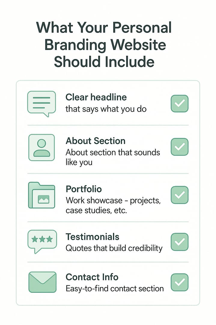
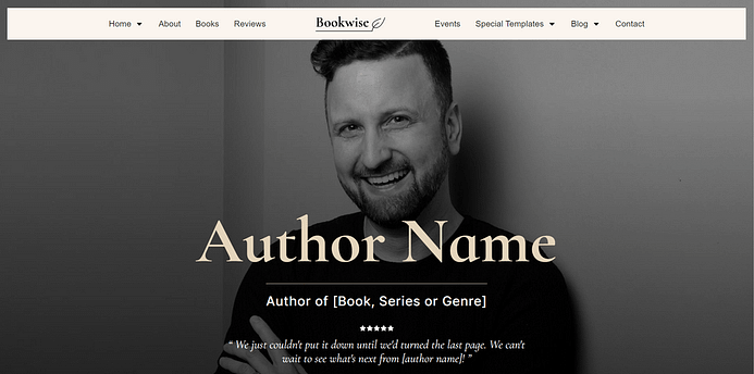
Based on all our findings from the trends and current homepages, we've created the "perfect" homepage for a personal brand. Here are the components:
To make it more practical, here's what to apply on your own website:
1) Use a Hero Image
If you have a personal brand, use a hero image. There's only one exception to this rule, which is James Clear's site. Everyone else uses either a prominent hero image header (here's how you can build one for your site), a video or both.
Why it Matters
The hero image represents a core strategy of personal branding: put your face on things. Even if you don't literally put your face on something, personal branding can only work when you infuse your content with your personality. The brands we examined got to where they are because they eschew the overly careful, politically correct, signed-off-by-legal tone that is the norm of corporate communication.
To step this up a notch, create video content. Marie, Gary, Tim and many others on the list have used video content to build a more direct, personal relationship with their audience.
2) Display Authority Proof and/or Social Proof
One of the most common elements we found both in current and past iterations of these homepages is authority proof. There are 3 ways authority proof is shown on the sites, with the first one being the most popular by far:
- "As seen on" with logos of well known publications and mainstream media outlets.
- Pictures of the author with celebrities.
- Endorsements or testimonials by celebrities or well known figures.
Why are these elements so common? We can't know for sure, but it could be that they increase conversions and engagement on a site. It's worth doing some PR work to get coverage, so you can test it out yourself.
Other forms of proof are testimonials and audience boasts. Most sites either display testimonials from fans or show off the size of their audience (e.g. "join 50,000+ subscribers"). The audience boast is the simplest of these forms of proof, but of course you need the audience first. Testimonials are strong conversion elements and the good thing is that they are easier to come by than authority proof, especially if you use Thrive Ovation.
Why it Matters
As soon as you try to apply this tip, you could encounter a problem: what if you don't have any testimonials, don't have a large audience and have never been featured anywhere noteworthy?
Authority and social proof matter not just because of the effect they have on conversion rates when you add them to a page, but also because of what it takes to get them in the first place. A quest for this kind of proof will see you reaching out to your audience members to interview them, creating noteworthy products and content, reaching out to influencers in your market and pitching stories to major media outlets. Can you see how all of that would also grow your brand?
3) Collect Email Leads
Almost every homepage features one or more opt-in forms. In most cases, one of them is shown as the main call to action, close to the top of the page. It's also typical to see a second opt-in form and call to action at the end of the page.
Email marketing is still the most powerful way to stay in touch with your audience, so it's no surprise we saw so many opt-in forms. What was a bit surprising is that all of them were 1-step forms. There's a lot of hype around the 2-step opt-in, but it seems you can do just fine without it.
Why it Matters
People in your audience are busy. They might read one of your posts, love everything about it... and then promptly forget about it and never return to your site. Creating an opt-in offer means two things for your personal brand: first, you create something of great value, to give to your new subscribers. Second, you get the chance to remind your audience members to return to your site again and again in the future. This gives you the chance to grow a real fan base. And it gives them the chance to really benefit from everything you have to offer.
4) Confirmed: Blog Homepage ≠Blog
A good blog homepages isn't about displaying a list of the latest posts. In fact, most of the homepages we looked at display 3 posts or fewer.
Tellingly, there's a clear trend over time: in earlier iterations, we see just blog posts on the homepage. As time goes on, there's a transition to a dedicated homepage with some blog posts listed and finally we end up at a page with very few posts or no posts at all.
Tim Ferriss is the only exception here and he shows what's closest to a "traditional" blog on his homepage. But even he dedicates the majority of his above-the-fold space to advertise his most important asset: the podcast.
Why it Matters
If you simply display your latest blog posts on your homepage, you're leaving your conversion rate up to chance. A new visitor may or may not be interested in whatever happens to be the top post at the time. This can seriously stunt your brand's growth.
The lesson is: know your unique selling point, know your most important conversion goal and use your homepage to communicate the former and drive people towards the latter.
5) Use 5 Navigation Links, No Drop Downs (in a Slim Header)
Finally, we can see that most of the sites keep a simple, clean main navigation. Most commonly, we see just 5 links and no drop downs. This makes navigation easier and prevents overwhelming visitors with too many choices. The only exception to this rule is Celestine's site.
Also, there's a clear trend regarding the header itself: headers on these top sites in their field are generally simple, slim and minimal. We don't see any secondary menus, we don't see extra links, social icons or large images crammed into the header area and logos are generally small and text-only. This, in particular, might come as a shock to many a beginner entrepreneur who's spent sleepless nights agonizing over the choice of a logo: these titans of personal branding don't have icons in their logos.
Why it Matters
This minimal approach to headers and navigation is more than just a design choice. I believe it's the result of a profoundly important quality that almost all successful brands come to, over time: focus.
It's a beginner's mistake to try to do too many things all at once and try to create a website that appeals to everyone and excludes no one. Personal brands become successful if they manage to streamline. To hone in on a clear message and a clear target audience. And when you have such focus, a multi-level drop-down menu with 200 items in it just won't be necessary anymore.
6) Add Your Own Twist
There are basic principles that we meet again and again on the homepages we examined. But each of the homepages also has its own unique twist, so don't be afraid to divert from the formula.
How do you know what twist you should add? Make it relevant to your brand and your personal style. Here are some examples:
- Is a loud and colorful personality part of your brand? Use bold colors and playful designs on your homepage.
- Do you create a lot of video content? Feature a video on your homepage's title section (or even multiple videos throughout the page).
- Do you host a podcast? Add a section featuring your latest or most popular episode.
- Do you write a lot of in-depth content? Don't be afraid to add extensive text sections to your homepage.
You get the idea: use the first 5 rules to create a framework for your homepage and then infuse it with your brand's style and personality.
Why it Matters
This is the "personal" part of personal branding. Every successful business must stand out from the crowd - must offer unique value in some way. With a personal brand, some of this unique quality comes from the author's personality. And as mentioned before: a brand like this cannot take off unless the author lets that personality shine through - in everything from their content, their tone in communications and design choices on their site.
Bonus Template for Thrive Architect
As usual here at Thrive Themes, we wanted to go the extra mile, so in addition to providing the exact structure and an example to go with this post, we've also made a bonus template available (click here to preview). You can get the exact template shown above and make it instantly available and editable in Thrive Architect, on your own WordPress website.
Here's a quick video with a tour of the page and how to edit it:
Guidelines, Not Rules
In all of this research, we found many "rules" for creating a personal branding homepage, but no rule comes without exceptions. For example: everyone uses a hero image... except James. Everyone uses a dedicated landing page for their homepage... except Tim. And so on.
To me, this shows two things:
- There's a lot we can (and should) learn from the commonalities, trends and patterns we see among these sites.
- Despite that, there's never a single formula or recipe. There isn't one right way to do things.
Sometimes, bucking a trend is in itself a clever tactic. Everyone uses hero images, which makes James' homepage stand out. The minimalism he displays is in line with his brand and everything else he does, so for him, this is a good choice. We use an approach like this in our products as well, see: why sliders make your website suck.
Your Turn
After learning all this, what will you do differently on your homepage? Let me know by leaving a comment!
For my part, I wasn't about to do all this research and then walk away from such a treasure trove of insights. That's why I'm currently running an A/B test (using Thrive Optimize) on the homepage on my blog, based on what I learnt here. When the test is complete, I'll post an update on this blog.
Would you like to see this kind of analysis applied to other types of websites? Let me know which ones!
P.S.: A big thank you to Ryan Osilla, who's "homepages over time" post inspired me to take this deep dive through the web archive and write this post.
Great article. I like the fact that you do some serious research, present it in a clear way and come up with an “ideal” homepage based on the data of these mammoths in personal branding. I’d love to see a similar post on business brands and perhaps even hybrid websites.
Thanks for your comment, Melvin! And thanks for the suggestions. Can you define what you mean by a “hybrid website” for me?
I called it hybrid websites for lack of a better word 🙂 Something between a business brand and a personal brand like magazine style websites with multiple authors or something like ProBlogger. It’s not really a personal brand but Darren features a lot on his website.
I see, yes. Thanks for the clarification! I think we’ll be doing at least a few more “Homepage History” posts in the future, looking at different types of websites and business models.
I would love to see more business sites. Most niches do not work will with using hero images of one person.
Thank you for your feedback, Katerina! More Homepage History articles are in the pipeline. 🙂
Great Post Shane! Happy to discover that I’ve already implemented most of the tips on my site! Thanks, Fran
Thank you, Fran!
One of your best posts. I’ve been implementing these same things on my site. Just need a few more tweaks and then test, test, test…
Thank you for your praise, Michael! 🙂
I agree with Michael. You did a great breakdown — and action steps.
Thank you, Jason!
Thanks, great article! I still have a lot of things to do on my next personal home page, and this helps to think about different options.
And it’s great that you have a ready-made template to support these ideas you show in the article!
Thank you, Lasse! I’m glad to know that this post is useful for you.
I think the hero image is better at the left-hand site than the right-hand side.
Secondly, how can thrivetheme recreate Celestia Chua website?
I’m curious if you are familiar with Thrive Architect? Celestia’s website would actually be *incredibly* easy to create with it. 🙂
I agree, yes. We can definitely replicate a page like that.
That’s fine. Flipping the layout of the hero header around is really easy to do. 🙂
As for re-creating Celestine’s site in Thrive Architect: the answer is “easily”. There’s nothing on that page that would be particularly challenging to replicate in Thrive Architect.
Effin’ brilliant, Shane. One of your best posts EVER. Love how you use the Wayback Machine to show before/after screenshots so you can see how homepages evolved over time. Great homepages don’t happen by accident, and any serious web designer (if they’re honest) has struggled with how to create the perfect homepage. Your analysis and recommendations are fantastic, and should be required reading for all web designers.
Thank you very much, Mark!
I have a question that may not be able to be answered here. I’m sure these personal brands had a professional photographer involved. If I involved a photographer, do you know if most of them now can actually create the image and wording on the home page?
You can’t expect a photographer to do more than take the photograph for your site. Also, I think that there are quite a few (maybe not on this list) personal brands where the person themselves does the photography and videography. This is mainly due to Instagram, where being an online celebrity means you also have to master photography to some degree. So, self-making the images is not out of the question.
As someone who regularly checks out website design and copy in Wayback Machine, I loved this brillant compare and contrast deep-dive of top online entrepreneurs. This post was so interesting and useful! I’m launching my business soon and I’m having a hard time with the name. Is it possible to be a personal brand without using my name as the domain? And, thanks for the beautiful template. I noticed it yesterday and it was love at first site. This is why I’m such a TT fan!
Hello Michelle,
Thank you for your comment! You can definitely have a personal brand without using your name. Although I do recommend a name brand unless you have a name that is difficult to remember and/or pronounce (like “Shane Melaugh”, say…). Even then, the done thing seems to be to use a pen name that’s nice and catchy.
But note, for example, that Ramit Sethi uses “I Will Teach You to Be Rich” as his brand name and Tim Ferriss’ was “4 Hour Work Week Blog” for the longest time.
The decision to use your name as your brand or not, depends on what your exit strategy is. No one should ever start a business without knowing their exit strategy. Tim Ferris and Ramit can sell their businesses to someone else because they have set it up that way. Marie and Celes will have a really hard time with that.
That’s a great point, yes!
Appreciate this perspective – gave me more ideas – I’m not using the hero approach … off to experiment with the tips and tricks you suggested – thank you
Good to know that you’ll be putting this into practice right away. 🙂
Thank you so much Shane (and Team!) for your effort and sharing this valuable tips with us 🙂
Glad you enjoyed this post, Christian!
FAntastic post. Thanks!
Thank you!
Hi, Thank you for this tutorial. This is very helpful.
I looked at my landing page templates and I don’t have the bonus templates section (or templates). My plugins are all updated. How do I upload them?
Thanks. 🙂
Hello Lian,
We had a very brief server maintenance yesterday. It’s possible that you were looking at the template cloud in that brief moment and you wouldn’t have seen the templates. Please try again and if you still can’t see the templates now, please open a support ticket so our team can help you out. Thanks.
Awesome post Shane, I have 2 new clients and this post is exactly what I needed to build them a professional home page. Thanks!!
That’s great to hear, Johanna!
Love this article! And love, love, love Thrive Themes. Where precisely do we members find this landing page? Do you have particular themes you suggest we use with it? I’m starting from scratch so it should be easy. Thanks! 🙂
Thank you very much, Andria!
Watch the video to see how to load this landing page template. Also, this article will help you set it up. I don’t have a particular theme recommendation for it.
Loved this post! Thanks for putting it together. 🙂
You’ve very welcome, Rauno. It was a fun research project.
Another excellent & immensely practical tutorial, Shane! ???? The video tour of the new template was tremendously helpful, as was the image-editing portion!
I’m especially interested in the results of your A/B test with your ActiveGrowth home page, since I’ve thought the latest version of it was quite effective! 🙂
Your transparency and dedication to details continue to set you (& Thrive Themes) apart! ????
Thank you, Karen!
This is fabulous! I’m working on redesigning my website to be more reflective of a personal brand so this is very timely – well researched and thorough… which is what I’ve come to expect from Thrive. Makes design and development SO much more focussed and dare I say, fun! Thanks for all you do. My Thrive membership is one of the best investments I’ve made in my business.
Great stuff! I’m glad to know this came at the right time for you.
What a great Post!
Thank you, Roland!
That was VERY helpful! Both with showing what works, and how to put it together with Thrive Architect! Thanks!
Thank you, Lianda! Glad you liked it.
Thanks for the article. Sheds light on the direction to go.
Glad you found this useful, Amy. 🙂
Thanks so much, great stuff
Thank you, Linda!
Ho hum. They are all the same. Big pretty image. No information. Absolutely nothing to differentiate anything. I mean, really… If you didn’t know anything about these people already, what would you think of them by looking at these home pages (probably Ferriss is the exception)? Here’s my pretty picture. Here’s my over-promised blurb, which I’ve shortened due to short attention spans and mobile devices. Here’s my hand picked stellar testimonials. I am the 5,000th person who will promise you the absolute greatest solution that absolutely will work for you. But I’m the one, just trust me. Two years from now they will all be different, but still all the same. It’s really nothing more than about not being left out of what’s trending. Cause if you’re not trending, your nothing (even if you in fact are everything). I suppose it’s human nature.
I see where you’re coming from, but you’re making one big mistake in your thinking: you are comparing only the cream of the crop websites and they seem similar and “generic” to you. But if you look at these highly successful websites as well as a sampling of the 99% of websites out there that are unknown to most of us, you’ll see that these sites are actually head and shoulders above the average site. They differentiate themselves clearly and strongly from the masses and you haven’t seen real “genereic” until you’ve taken a dive into the lower part of the pyramid, so to speak.
I’d recommend paying attention to what leaders in the space are doing, instead of just dismissing them.
It’s an easy mistake to make, because unless we actively seek out other sites, we’ll generally only come across the top 0.01% or so of most successful sites on the web.
Great Post. You are so brilliant. Will look at this, so important.
Thank you, SB!
Hi, shane this is a very well write piece of content. Thank you Shane. Did you write this blog post for me? I red all this post and i love it, this is what the digital business need. Thank you again. Raffaele from italy
Of course I wrote it for you, Raffaele. 🙂
Hi Shane, I like the examples here. I think yours actually is the best. It’s clean, draws in subscribers, and looks technically, doable. I created a website a few months ago using Thrive Themes and Thrive Architect and based my design off your tutorials. The only thing I need to add is the destination section and testimonials.
Nice work, Matt! Great to see that you arrived at such a focused layout already.
Thanks for the tutorials Shane!
We’ve seen a lot of personal branding homepage demos, but rarely anything that doesn’t have some type of opt-in form as the main CTA.
I’d like to see your thoughts/analysis on websites like the Thrive Themes homepage where you sell a “suite” of complimentary products as well as ideas for sites that have a WooCommerce store/cart system as the main focus (especially because design for that is limited).
Lastly, I’d really like to see more information on websites that use both a shopping cart system (e.g. WooCommerce) but also have other aspects that need to be featured on the homepage. Examples include featuring Thrive Apprentice courses in one of the page sections or a landing page funnel that operates separately from the rest of the site but utilizes the homepage as a way to get visitors into that side funnel.
In essence, I’d like to see how to put all of these funnels together and use the homepage to direct people to these secondary funnels if they haven’t taken advantage of the main CTA.
Thank you for your comment, Bryce!
I’ve got a post here that will help answer your questions, at least in part: How to Create a Homepage for a Website With Multiple Offers
In the group of sites in this post, I think Ramit does the best job of solving the problem you describe: he has many courses and offers, but instead of piling them all onto his site, he has people self-segment using a quiz.
Thanks Shane! That post was very helpful. I’d still love to see more examples of how you’d setup homepages like the one in that post you shared.
Thanks again!
We will definitely be creating more tutorials and builds around how to create a homepage. 🙂
You guys are awesome! Thanks!
Love this, I am in the exploration and discovery stages of analyzing myself and other experts. I’ve looked at Pat Flynn, Gary Varynerchuk, Robert Kiyosaki, and many others in terms of their design language and positioning.
Maybe in a few years someone will read this comment and my site will help and inspire them
Thanks for this post 🙂
Thank you for your comment, Hunter! Good luck with your site build! 🙂
Looks amazing, Shane! Question is: where’s the personal theme to go along with this great looking bad boy?
Thank you, Martin!
We’re working on it. 😉
Thanks – a great article Shane and now I really get the whole concept of creating a personally branded homepage! I don’t know how to cut down on the menu items though. Will have to work that one through. BTW, I really look forward to posts from the staff at Thrive Themes (and yes I do have a life)!
Thank you for your comment, Randall! I know, it can be difficult to cut the fat, so to speak. Keep in mind that not everything has to be in your primary navigation menu. You can also add some secondary links in the footer or in the sidebar on your blog posts, for example. That way, things are still discoverable, but your secondary links don’t clutter up and distract from the primary ones.
Wonderful post! I will change my site currently. I think the most important things on the first site are: 1. personality, 2. which dream I can make come true 3. the latest three blogpost-headlines 4. some testimonials and 5. CTA – that´s it 🙂
That’s a pretty good summary of the structure, yes. I hope you’ll get great results with your redesign. 🙂
This is truly a Great article, Shane! It’s engaging and informative. You have guided me a great deal in my own site with your tidbits in your posts and courses. And I have to say, I am getting very close to this guide line. I am wavering on topics and just how varied I should be. Right now, but I did take away quite a bit today.
I am with Melvin, though. I too would be interested in some research on some business brands. A closer look. I think would be very interesting as well. I will be back to see your test results. Thanks for such a Great post! Kudos : ) I enjoyed the read and had to say so.
Thank you! It’s great to hear that you’ve already been pointed in the right direction by our training and content. 🙂
Awsome.. This is what i want to know…
Can we used the concept for build politics (personal)
Thanks for your comment! I think political pundits are often their own personal brand, so I’d say this is a good fit, yes.
Excellent content. And a template! You’re amazing!!
Thank you, Carrie!
Great post! I love it! Now I have to figure out how to get it in architect and apply it to my website. Thank you, Shane!
Hello Kevin,
Thanks for your comment! This article will help you load the template on your own site.
Magnificent content and training. I think this would perfectly complement with the new upcoming theme and its ability to create blog post templates. This way we can create a template for podcast related blog posts, YouTube channel related blog posts, etc.
I’m dying to put my hands on it and start working.
Thank you for your comment, Luis! Yes, this type of customization is something we’re hard at work on, right now. 🙂
Hi Shane,
when will the new Theme (I think you wrote about it already in Oct. 2017) be available? I’m always hoping it will be out soon.
Siempre sorprendes con tanto contenido de calidad! Gracias.
Shane, this could be the best post I’ve seen from you…ever! Nice work.
What isn’t mentioned is that every blog post on the home page needs to be a natural lead-in to an opt-in (using Thrive Focus Areas, perhaps?). If a visitor doesn’t opt-in on the home page itself, they can read a blog post and opt-in there – if the posts are used correctly. They can’t just be random content. Right?
Thank you for your kind comment, Jeff!
That’s an interesting point, yes. If you want to take your conversion focus to the max, you could show a specific list of your most conversion focused blog posts. However, this is a downside for one group of visitors: return visitors/fans who simply point their browser to your homepage, but they’re actually looking for your latest content.
I think a good practice is to have a clear conversion focused call to action in your blog posts, in general, so that any post someone clicks on will give them a good and clear opportunity to become a lead.
Great review Shane, love your in-depth analysis on the issues that matter. This adds great value to your product and the reason why I use it. Ashley
Thank you very much, Ashley!
Thanks for sharing this!
I noticed that Tim also changed his website from https://fourhourworkweek.com/ to https://tim.blog/
I mean, for a long time his blog was called https://fourhourworkweek.com and now it’s just a list building page. A big photo of him with testimonials and social proof and an opt-in form in the middle. He also uses a screen-filling overlay pop-up.
Now his blog’s URL is https://tim.blog/
Hi Hazel,
That’s a good point, yes. I guess with the blog rebrand, Tim has shifted the focus a bit more towards his personal brand and less on his first book. Makes sense, since he’s known for so much more than just that first book, these days.
Wow, that was one of the best, most complete, a propos, useful, and generous blog posts I have read about site development…ever. It was exactly what I needed to read! Thank you so much for saving me so many hours, now that I no longer need to do all that research myself.
As far as your question at the end about other types of sites to a analyze, I am now building a listing site, and would love to know more about that.
Thank you very much, Jason. I put a lot of work into this and it’s really encouraging to know that it’s useful for you.
Hey Shane, I cannot tell you how much this helped me. I’ve started with a site for my dad who is a doctor in animal science, specifically cattle farming and struggled to sell his latest book. This article is absolutely bloody perfect for me and I’m going to re-do the whole landing page right now. Manus – very happy Thrive customer!
That’s awesome to hear. Thank you, Manus!
Great post! I do remember Ramit Sethi’s blog from the old years, and Tim Ferriss’ too. it’s interesting how this new trend in minimalists personal brand homepages (or landing pages) is being implemented by all the greatest marketers of the online world…
Thank you, Andrea! I remember coming across Ramit’s site in the early days as well. That guy changes his site up a lot…
BRILLIANT
Thank you, Christopher. 🙂
What an outstanding subject and analysis! And timely for me. Was pondering exactly this issue: what should my home page look like? Exceptional value! Thanks
Brij
Thanks, Brij!
Fantastic post, Shane! I am so happy I made the leap last year and became a Thrive Themes member. I have learned tons through your videos and a lot of trial and error. I’m in the process of redesigning and rewriting my website now, so this post is very timely! In fact, I lost sleep last night re-imaging my homepage to include a hero image. 🙂 Thank you for all the hard work you and your team put into the Thrive Themes website. I sincerely appreciate it!
Thank you for your comment, Lisbeth! It’s very encouraging for me to hear that our content and tools have been useful for you.
Incredible blog post Shane, I loved seeing the journey from ‘crappy’ to ‘current’ of leader industries that I respect… it gave me hope for my current half-finished version of ‘crappy’
…and figuring out how to fix the readability of my headline has been bugging me for the longest time! Thanks!
After reading your other linked blog post on focussing your offers & audiences, I think you’ve inspired me to go full out with the Quiz Self-Segmentation option, and get my knuckles deep in ThriveThemes for a week… let’s see if I get overwhelmed or create something comparable to at least one of their ‘Version 2.0s’ ????
Another post of appreciation for all your work
Thank you, Gun!
Yeah, definitely go for the self segmentation! I think that’s a super powerful way to start a relationship with your audience.
I’m a WordPress newbie and this new template kept me as a Thrive customer.
After trying Thrive for 28 days, I was going to cancel my membership and head to Elegant Themes Divi because that builder seems to build pages that look more visually attractive and polished. I want to create a personal branding and blog site and to me, all the Thrive themes and templates look too ugly and visually unpolished for what I want. But this new Bonus template is good looking enough. Well done!
I will continue my Thrive membership.