Are you looking for fantastic call to action examples so you can write your own? We've got you covered.
Whether you're building a sales page, an opt-in page, or just a typical website page, a well-crafted call to action can mean the difference between visitors taking action or simply glossing over your content.
In this article, we'll be deconstructing 21 brilliant call to action examples that you can emulate for your own website.
More...
Why is having a great call to action so important?
To illustrate why you need a brilliant call to action, consider the following scenario:
Sally's about to travel to Italy and arrives on your website where she finds the perfect opt-in offer "A local’s guide to Rome’s gourmet food scene". However, when she's about to download it, the opt-in button states "Submit".
She's confused and slightly worried... Will she get the guide if she submits the form?
She closes your site and goes back to Google to look for another option.
Bummer, right? She was your perfect lead. But that one word triggered a feeling of uncertainty that made her leave.
How can you make sure to avoid this type of anxiety in your visitors' mind?
The answer: Specific call to action (CTA) buttons.
That little bit of text on a button can make all the difference between a confused visitor or a new lead. A happy customer or an abandoned card. A hot prospect or crickets. A full webinar room or a party of one. A... well, you get the picture.
It's the difference between reducing friction and increasing conversions.
In order to understand what makes a call to action successful, let’s take a look at what’s going on in your prospect's brain when deciding whether or not to take action on your call to action...
Talking to the Lizard Brain with Power Words
The lizard brain is the oldest part of our brain. It's been around for 500 million years and still drives our instinctual actions which often overrule the rational brain when it comes to decision making.
This means if you want to get visitors to take action, you'll need to talk to their reptilian brain.
Patrick Renvoise has a fascinating Ted Talk about the topic and he discovered the following about the reptilian brain:
- It's self-centered: it only cares about itself.
- It prefers when things are tangible.
- It likes to see contrast.
- It reacts to emotions.
Certain words have the ability to talk directly to the reptilian brain and trigger action. They're called power words.
Here's what you need to accomplish with power words on your call to action buttons:
- Make it about them, this will please the self-centered lizard brain.
- Make abstract concepts (such as downloading a PDF) more tangible by creating a mental image.
- Show contrast by clearly communicating the benefit and outcome after clicking on the button.
- Trigger an emotional response by using words that will reduce anxiety and/or increase urgency.
Let's look at how to apply all of this to improve your call to action buttons.
Get More Leads: Opt-in Form Call to Action Examples
1. Chris Ducker
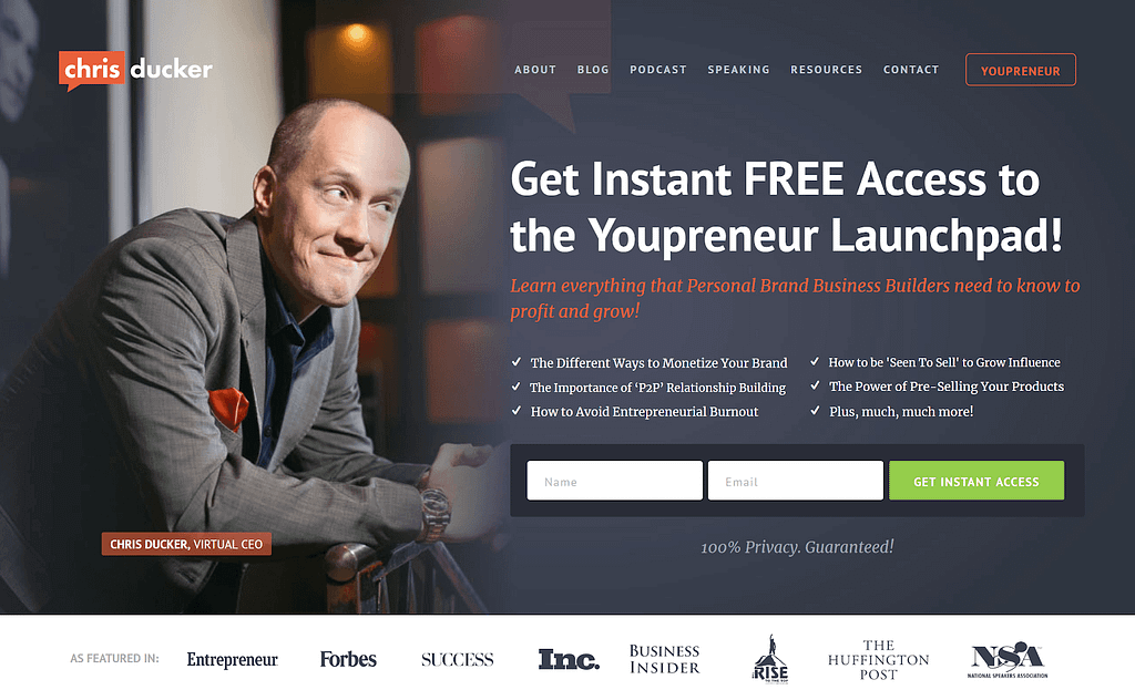
Chris Ducker's call to action on his homepage: Get instant access
Chris Ducker packs his opt-in with a lot of power words to reduce anxiety.
When looking for a solution to problems, people want a good deal (free), that’s fast (instant), and effortless.
The button text: "Get instant access" hits all of these points.
The additional line below the opt-in: "100% Privacy. Guaranteed!" pleases the lizard brain because these words make visitors feel safe about signing up.
By the way, want to create a gorgeous hero section just with a CTA just like Chris's on your website?
Accomplish just that in a matter of minutes using the pre-designed blocks that come with Thrive Architect.
Using Thrive Architect, you can create high converting sales pages, landing pages, blog posts, and more. The plugin comes with page templates, opt-in forms, call-to-action buttons -- everything you need to sell your products, build your email list, and grow your business.
2. She Takes On The World
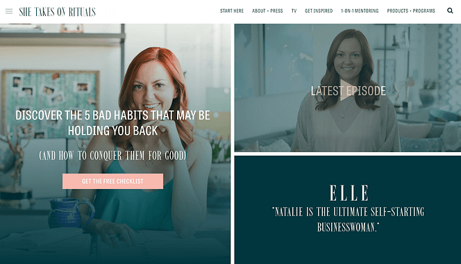
She Takes on the World CTA example: Get the free checklist
Natalie from Shetakesontheworld.com builds her email list by offering a free checklist, which is a great opt-in incentive.
She provides a solution for a common pain-point of ambitious people: a checklist which helps to eliminate 5 bad habits that prevent them from achieving their goals.
She reduces anxiety with a clear message stating that they will get the checklist for free.
3. Amy Porterfield
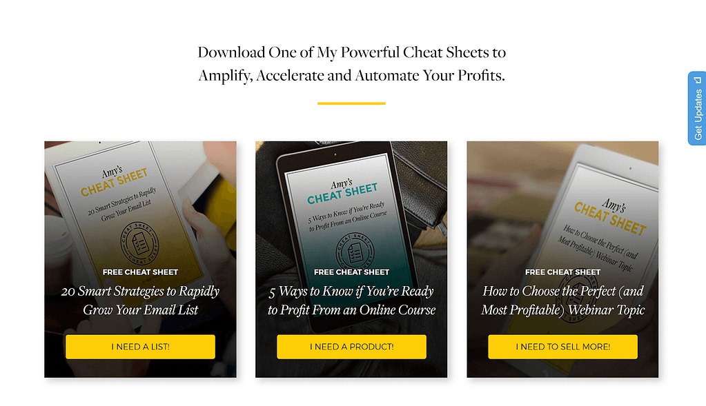
CTA example on Amy Porterfield's homepage: I Need a list!
Amy Porterfield presents 3 offers on her homepage, which is a great way to segment her email list by interests: email list building, online course creation, or selling a product through webinars.
Each button text contains the verb "need", which evokes an emotional response in the reader.
Using the verb in the "I" form makes it about the visitor and to top it all off, each button text is phrased to express a desire.
If you're in Amy's target audience, your reptilian brain will make you click because the answer to the trigger is: "Yes, I need that!"
4. Ahrefs
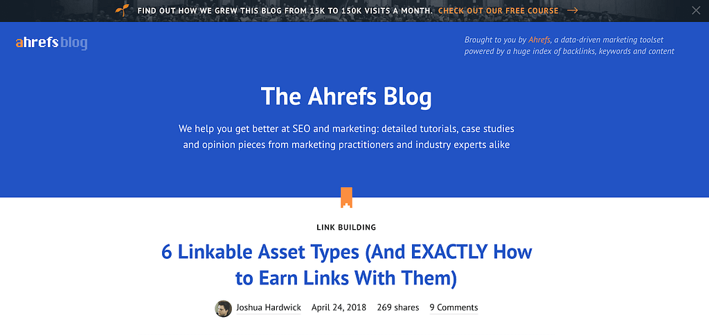
Button on the header of the Ahrefs' blog page: Check out our free course
Ahrefs promotes their free e-course in a banner on the top of their homepage. The call to action text stands out because of the contrasting color and reads "Check Out Our Free Course".
This casual style reduces the feeling of too much commitment, and by using the word free, people are encouraged to click through and see what Ahrefs has to offer.
5. Tim Ferriss
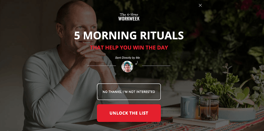
The exit intent popup on Tim Ferriss' website: Unlock the list
This particular opt-in on Tim Ferriss' website is triggered on exit intent and it's a Yes/No screen filler with 2 buttons on it. The vivid red one says "Unlock The List".
By using the word "unlock", Tim creates a mental image and makes his offer more tangible.
It's as if he has the list in a secret box and now you have a chance to unlock it, but only after you join his list.
Did you know?
Setting up a ribbon with a link to a landing page (like Ahrefs uses) or a Yes/No exit-intent screen filler (like Tim Ferriss uses) is a piece of cake with Thrive Leads.
Call to Action Examples on Contact Forms
6. Quicksprout
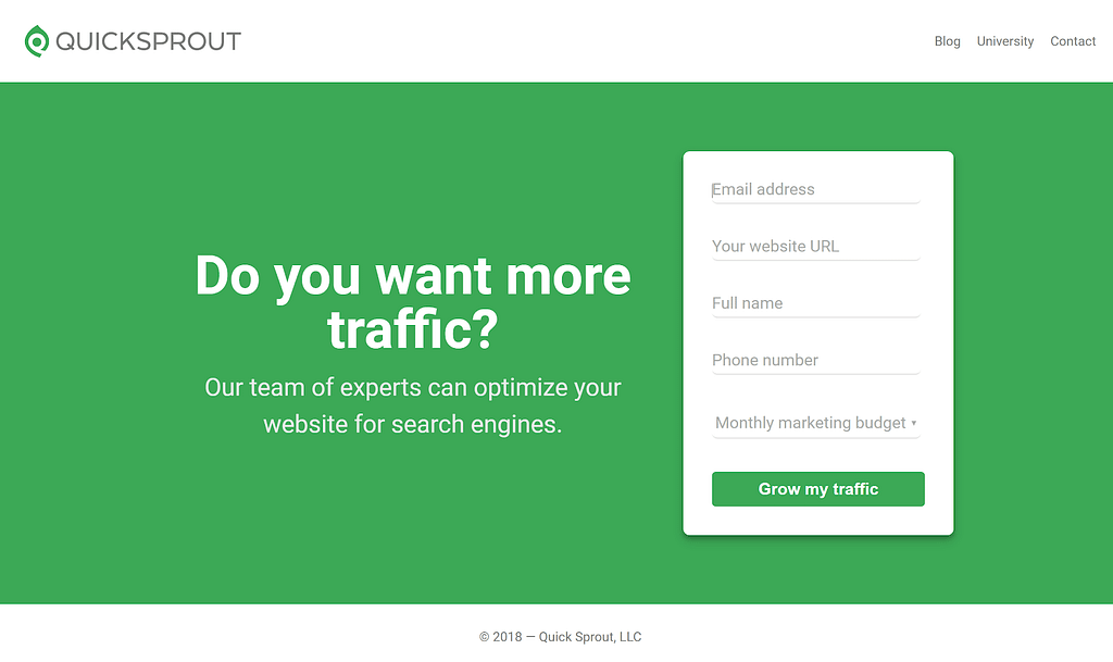
The contact form on QuickSprout's homepage, with the button text: Grow my traffic
Quicksprout offers a search engine optimization service, and they communicate the benefit of their offer clearly in the copy of their contact form.
It shouts out to their potential customers: Do you want more traffic? - Sure, I want to grow my traffic!
The button creates a strong feeling of desired success (emotional response), mirrors a future outcome (contrast) and makes it about the reader using the first person "my". All of these are triggers that make you want to contact them.
7. RisingStack
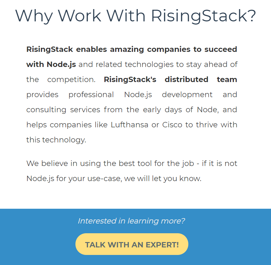
The contact form on RisingStack's website, with the button text: Talk with an expert!
RisingStack offers Node.js related consultation and development services. After a brief introduction, they ask if the reader is interested in learning more about their offer.
Their CTA button suggests the next step of this learning process, which is to talk to one of their experts.
This call to action button eliminates the readers' anxiety of wasting time talking to untrained people.
8. ChoiceScreening
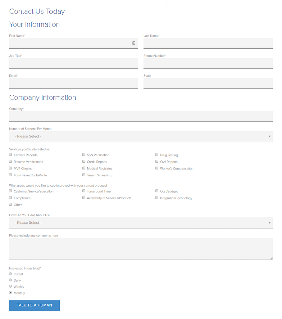
The contact form on ChoiceScreening's website, with the button text: Talk to a human
ChoiceScreening is a background screening company. They have a rather long contact form on their site, which takes a while to fill out. However, at the end, visitors are promised they can talk to a human.
With this call to action text, they eliminate the fear of filling out this form only to get some canned email message as an answer.
Power Words in Webinar Sign-up Forms
9. Authority Hacker
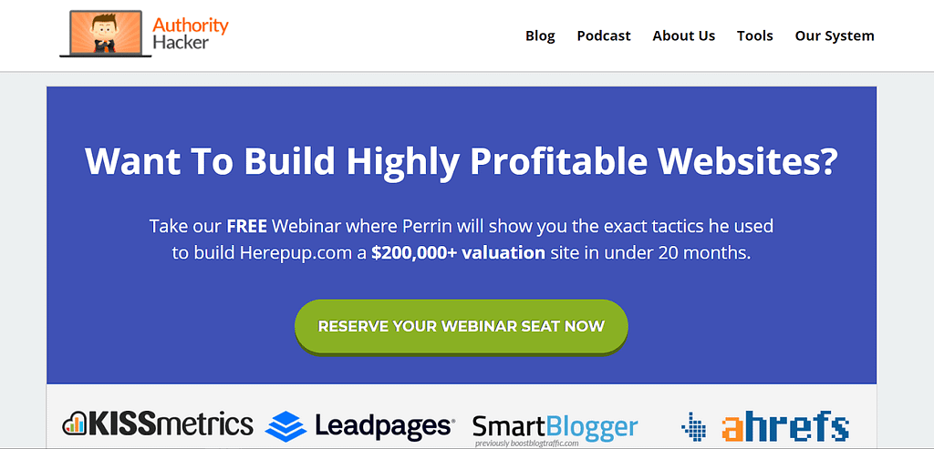
Webinar signup example form on Authority Hacker: Reserve your webinar seat now
Authority Hacker, a website specialized in teaching online marketing, makes smart use of power words in their webinar sign up copy.
Their button says "Reserve Your Webinar Seat Now". Notice how they use "reserve" and not "sign up". This implies the seats are limited, which introduces a sense of urgency to get your spot on time.
They also used the word "your" which makes it about the reader and creates the impression it’s their seat...someone else is going to take it if they don’t act quickly!
10. Close.io
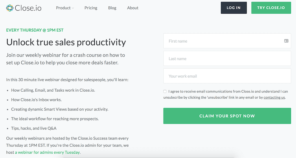
Close.io's webinar landing page: Claim your spot now
Close.io, a website offering a sales CRM, holds a sales productivity webinars.
On their webinar sign-up page, there's a form with the call to action "Claim Your Spot Now".
"Claim" is a strong word expressing that you earned your spot already (and you should take it as soon as possible). It also reinforces the feeling that it's YOUR spot which makes it 100% visitor focused.
11. ReferralCandy
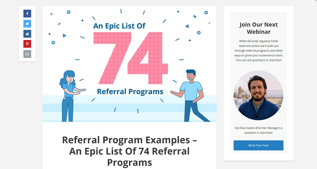
ReferralCandy's webinar signup Form with the button text: Book your seat
This webinar signup form is in the sidebar of Referralcandy.com, a site offering a referral marketing tool.
Underneath the description of the webinar, we find a button with the text "Book Your Seat".
Now let me ask you, what do you usually book? You book a doctors appointment or a hotel room or something else important.
The word "book" suggests there's a need for a reservation, which increases the value and scarcity of the offer. By specifying "Your" seat, ReferralCandy implies the spot is waiting for you.
12. StartupBros
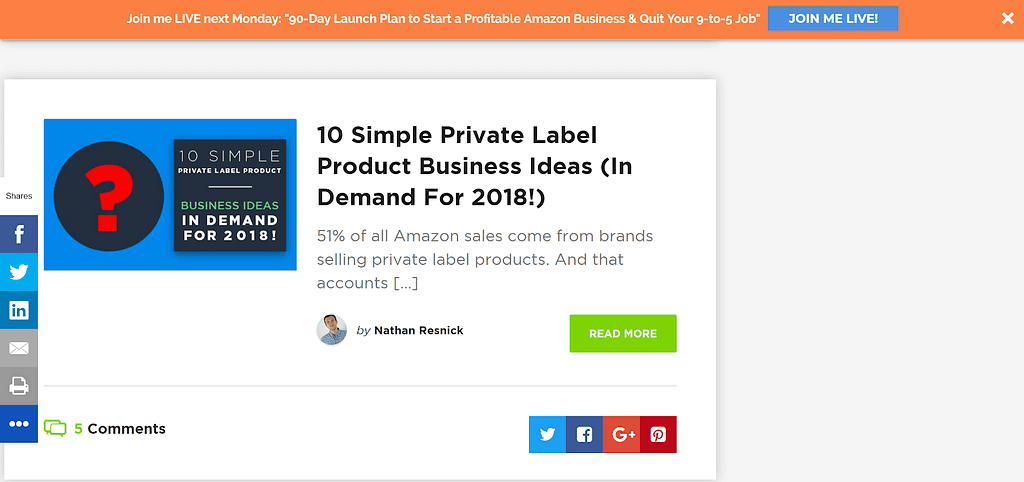
Webinar signup button on the top of the StartupBros page with the text: Join me live!
StartupBros uses a ribbon on the top of the page to advertise their webinar.
The button reads "Join Me Live!"
By using the word "join", they create a feeling of belonging by inviting you into their community.
Adding the word "live" reduces anxiety in their target audience.
Wisely, the StartupBros assume their audience has attended "live webinars" before that turned out to be time wasting, pre-recorded sales pitches.
By making it very clear up front that theirs is a live webinar, StartupBros calms the worried lizard brain to increase their chances of converting readers into subscribers.
13. AdEspresso
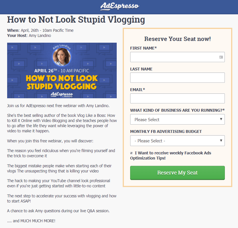
AdEspresso's webinar signup example with the button text: Reserve my seat
AdEspresso is a Facebook ad manager tool, and they recently held a webinar on vlogging.
They chose to use the word "reserve" in their call to action button, creating the impression of limited spots. This time though, we see an example of a different possessive pronoun, "my", which puts the reader at the center of this offer.
E-course Sign-up Buttons
14. Noom
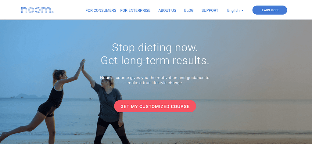
Noom's call to action on the homepage: Get my customized course
Noom came up with headline copy they knew their targeted audience would appreciate: "Stop dieting now. Get long-term results."
While this is a compelling offer, it also immediately raises the question "Will this work for me?"
The call to action text on the button reads: "Get My Customized Course".
"My" and "Customized" make the offer extremely reader focused while also reducing the anxiety that this offer produce results for them.
After clicking this button, you start a quiz about your goals and lifestyle. Based on the answers, visitors get their customized diet and workout plan.
Did you know?
Setting up a quiz and offering a customized result can be done easily with Thrive Quiz Builder.
15. Digitalmarketer

E-course signup banner on Digitalmarketer: Click here to enroll today
Digitalmarketer provides a course to become a funnel optimization specialist.
Even though their call to action text is simple, it's not a generic button. It reads "Click Here To Enroll Today".
Using the word "enroll" makes it very tangible you're becoming a student.
By using the word "today", they assure people an instant start that satisfies the need for an instant solution.
16. Esther Jacobs
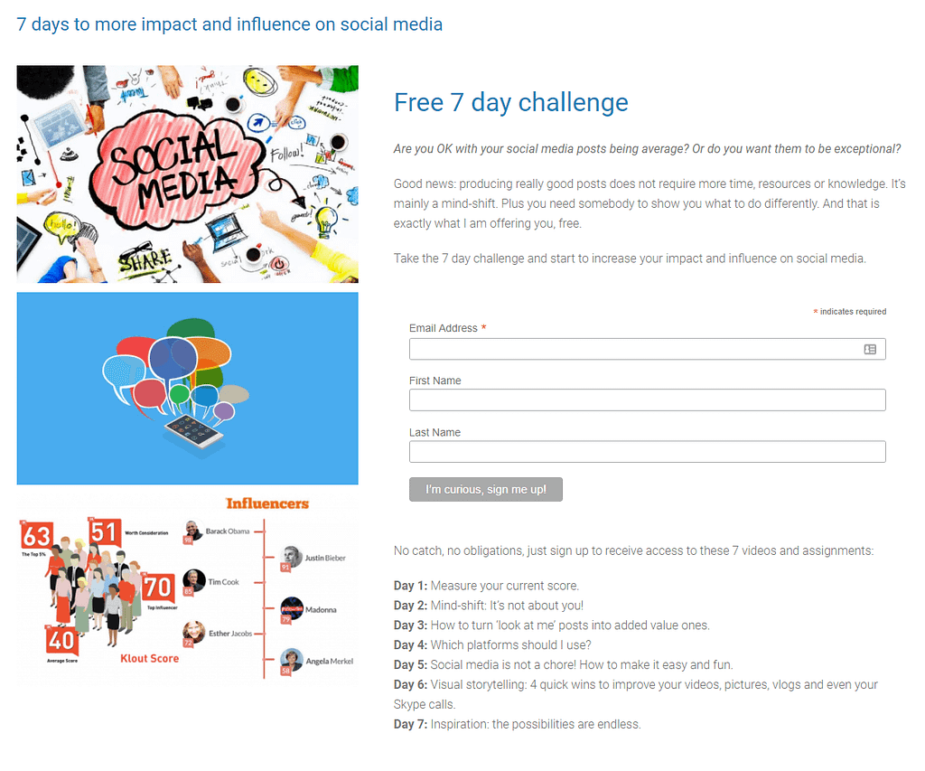
The call to action of Esther Jacobs' 7-day social media challenge: I'm curious, sign me up!
Ester Jacobs invites readers to a 7-day social media challenge. Online challenges are an excellent way to build an email list because they provide extra value to the readers by focusing on the desired outcome.
Ester promises that you don't need more time, resources or knowledge to get more social media engagement (which flies in the face of what most people believe) so her readers are left wondering "How is that possible?"
She knows this and uses the reader’s internal dialogue to persuade them to sign up with the words "I'm curious, sign me up!"
Sales Page Buy Buttons
17. Hustle and Groove
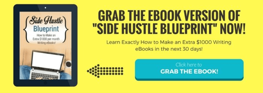
Hustle and Groove's banner leading to their Amazon listing: Click here to grab the ebook!
Lisa Cartwright inserted this banner ad in her blog post about making money by writing e-books.
This post is highly relevant to the topic of the e-book she is selling on Amazon. Her goal is to have people click the banner to go to her Amazon listing and purchase the book there.
By using the word "grab", she creates the mental image of a tangible product waiting for visitors if they click the button.
18. Beachbody
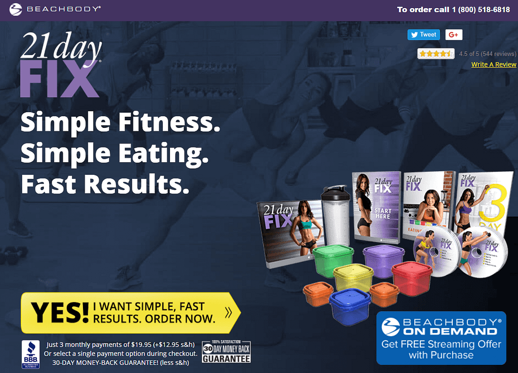
Beachbody's CTA on the homepage: Yes! I want simple, fast results. Order now.
Do you know what it feels like to be on a diet for 7 days, only to step on a scale and see no improvement? Frustrating, right?
When it comes to fitness, losing weight or obtaining that beach body for the summer, people want to see results fast.
By using the words "simple, fast, results" in their button text, Beachbody.com promises exactly what the lizard brain is looking for: instant results.
CTA when Offering a Free Trial
19. Netflix
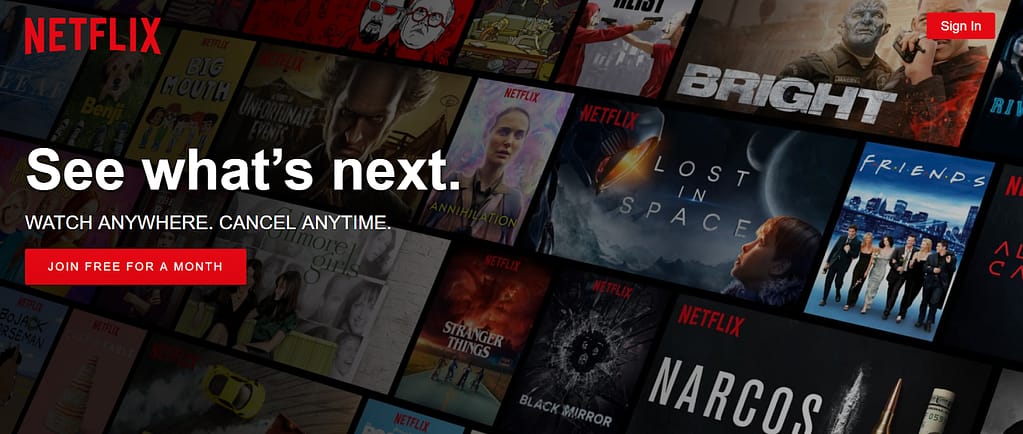
Call to action on Netflix homepage: Join free for a month
On the Netflix homepage, the design and copy aren't the only powerful elements on the homepage. The CTA button is too. Netflix visitors immediately know what they're getting if they convert: a full month of Netflix, for free.
This copy eliminates any commitment, as it’s stated above the button "cancel anytime".
This, together with the word "free" reduces anxiety and gives visitors an unobstructed psychological path towards a free month of Netflix.
20. Pluralsight
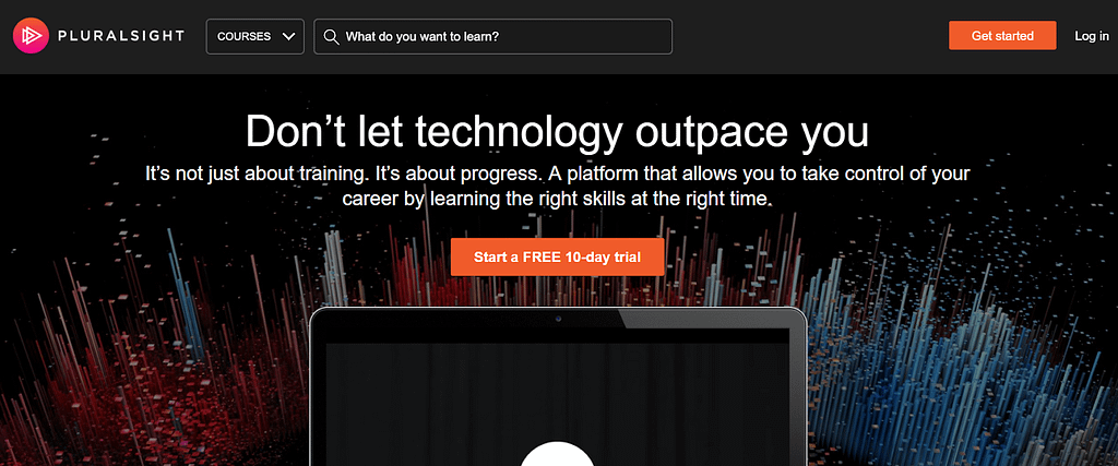
Call to action on the homepage of Pluralsight: Start a FREE 10-day trial
A good call to action button should include a strong action word suggesting the value of clicking it. On the homepage of Pluralsight, customers immediately know the next step: "Start a FREE 10-day trial".
And did you notice how they provoke the fear of getting outpaced by fast technological improvements in their headline? All of this leads the visitor to a clear solution for taking control of their career.
21. The MobilityWOD Program
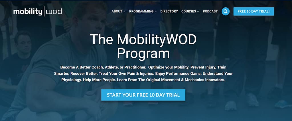
Button on the MobilityWOD Program: Start your free 10-day trial
Much like the Pluralsight example above, we see a similar button text on MobilityWOD.com.
But can you spot the difference?
MobilityWOD exchanges the "a" (very general) in the button copy to "your" (very specific and self-centered).
How to Pick the Winner?
I hope these call to action examples gave you some inspiration on how to trigger the lizard brain and get your visitors to take action.
But you might be wondering: "Which of these should I use on my own call to action buttons?"
The answer is: you should test that!
Though these examples offer you some best practices on how to make your buttons more appealing, you'll need to test what works best for your specific offer and audience.
By launching some rapid fire call to action A/B tests, you'll quickly discover which button text makes your visitors want to go "click".
You can test your opt-in form buttons using Thrive Leads and you can effortlessly create landing page A/B tests with Thrive Optimize.
Which of these Call to Action Examples is Your Favorite?
It’s time to take what you’ve learned and implement it on your own website.
Pick two call to action button text examples from this list above and then use them in an A/B test to see which one resonates better with your audience. Here's some free resources to help you get started:
- 5 Tested and Proven Ways to Increase Opt-In Form Conversions
- Don't Settle for Boring CTA Buttons
- Thrive Leads Walkthrough Tutorial
Now there's just one thing left to do, get Thrive Leads today!



I like “Get all our products” myself…
????
Get all our products is a great value proposition that works well when you bundle products!
What a great “swipe file”, Hanne!
I don’t have a favourite but I think each one is worthy of testing or at least considering.
Thanks Alex. Let us know if you test them!
Delightful content, most appreciated as always, Hanne.
How do you guys are so productive?
What are the systems & tools you use to constantly deliver top of the line relevant content?
What are your techniques for content marketing?
How is it that you never seem to run out of content ideas?
I´m sorry for asking so many questions, but I think it would be very helpful to know, or even better, to have a Thrive Course explaining all of it.
Thank you, Hanne.
Hi Luis,
A content marketing course is definitely something I would like to create!
To quickly answer your questions:
– To find ideas: keep ears and eyes open, ask questions, put yourself in your readers’ shoes and find out what the struggles are.
– To create content: use content patterns to quickly create well-structured content and applyBento Box thinking to your writing.
And finally practice 🙂 Write a lot, ask someone to give constructive feedback, publish it, and write another one.
Hi Hanne – but how does all of this fit with the new GDPR changes?
Hi Melinda,
Don’t worry, you can still use compelling call-to-action buttons!
If you want to learn more about GDPR and how to make your offers compliant check out this article
I really like the idea of an unobtrusive ribbon with a low-commitment CTA that leads to a proper landing page. A good way to start the descent on the slippery slope of YESses. Unfortunately, we can’t test these kinds of forms against each other in Thrive Leads, because the A/B testing is based on leads, not clicks.
That could be a nice addition, enabling us to test the forms based on clicks, it would give us the chance to test CTAs without any optin “directly” attached to them.
Hi Lorenzo,
That’s true and it’s something that we’ve been discussing on and off about internally, but for the moment it’s not on the development timeline.
Too bad.
One little thing you could do though is allow us to publish forms without a lead generation element. As it is, in order to create that kind of CTA form with no lead gen fields, I am forced to include a lead generation element and then twist the form into knots to hide the lead generation, which is very inconvenient.
The quick way to do it if you won’t let us publish a form without lead gen in Thrive Leads is allowing us to hide an element from ALL devices in TA.
Hi Lorenzo,
I would not do that (it will be very clunky).
At the moment, you could simply use a normal button and use a link shortner (like pretty link) to track the clicks on your link.
With Thrive Leads, you can show half of your audience one and the other half the other form and in your pretty link dashboard you would see which button gets most clicks. Based on that, you can set the winner.
That’s a great idea, I didn’t know you could track links with link shorteners.
However, including a lead gen element on the form was not meant to help me track clicks. The fact is you NEED to include a lead gen element on the form or Thrive Leads will not let you publish it. If you try it, and then try to flip the switch “Display on Desktop” to ON, you will get a message that says you need to have at least one form. It’s as if forms are not even registered as such unless they include a lead gen element.
That’s why I said, “allow us to publish a form without a lead gen element”.
I really enjoyed this post. Some great information for sure. I’m trying to find the right opt-in form for my guitar lessons site. Any suggestions?
Hi Sam,
I would start with a lightbox or a screen filler. You can see the pros and cons of the different opt-in form types here. And you can learn more about creating compelling opt-in form copy here.
Thanks Hanne, I have tried both of these. They work equally as well. I guess what I really looking for is the copy for the offer itself.