Looking for easy, straightforward ways to refresh your website and upgrade its performance?
Most business owners make the mistake of thinking that the work is done after a website is built and published — but that’s just the start.
With the way the internet is always changing, you need to make sure you keep your site in line with the times.
Doing so sets you apart from the website owners who struggle to generate conversions through their platforms.
Instead, you get to stay on top of your site’s performance and ensure you’re providing a top tier user experience to your audience — one designed to get them to take action.
The best part? You don’t need to be an expert designer or developer to successfully refresh your website’s design and features.
Keep reading to learn simple hacks to add to your website refresh strategy.
Here’s Why Your Website Design Needs a Regular Touch Up
Things change fast on the internet – design trends, algorithms, user expectations, etc.
That's exactly why you should prioritize regularly refreshing your website. Keeping your WordPress site up-to-date communicates to users and search engines that your content is relevant.

By refreshing your content and structure regularly, you boost your chances of ranking higher in search results, making it easier for people to find you. It's also an opportunity to address any technical issues, like slow loading speeds or mobile incompatibility, which can negatively impact your SEO and user experience.
If your site looks or functions like it's stuck in the past, it can drive up bounce rates and turn potential customers away before they even explore what you have to offer.
Staying current with your website also means you can better meet your target audience's needs.
Whether it’s adding new features, optimizing navigation, or updating your content, these changes can enhance the user experience, keeping your site interesting and useful for both new and returning website traffic.
But First, Conduct a Full Website Audit
You may think you need to overhaul your entire site’s design – but that might not be the case at all.
But you won’t know until you audit your website’s performance and identify the areas that need to be improved. Doing this will help you save time and ensure that you’re taking care of the most important parts of your website.
Kick things off by comparing your site's design and user experience with that of your competitors. It's not just about looking good; it's about how well your site works on desktop and mobile devices, and how easy it is for users to find their way around.
You should also use a site optimization checklist, so you know what to look out for as you conduct your website update.

Google Analytics and similar tools can shed light on how website visitors interact with your site. You'll see which parts they're drawn to and where they tend to get stuck.
Insight from these metrics can help you identify outdated website content, broken links, or slow-loading pages that need attention.
7 Ways to Refresh Your Website and Improve Its Performance
These tips work for any type of website — eCommerce, digital marketing, small business, etc.
They’re tailored for the WordPress content management system, but you can still use these principles for any type of website.
The overall goal here is to help you build and maintain a successful website so you can continually generate profitable results.
1. Revamp Your Current Web Design
After auditing your website, if you find that a total website redesign is in order, focus on a few key elements to make a significant impact.
Update your color scheme to ensure it matches your brand's personality and resonates with your audience.
Consider the readability and appearance of your fonts; they should be clear and fit well with your overall design.
Look at your site's layout too—aim for a straightforward, user-friendly structure that makes navigating your site a breeze.
An efficient way to tackle these updates is by using a theme builder or page builder, or even better, a combination of both.
These tools offer a user-friendly interface that lets you make changes without needing to delve into coding. You can easily adjust color schemes, typography, and layout, as well as update images and graphics with drag-and-drop simplicity.
This approach not only saves time but also allows for greater creativity and flexibility in designing your site.
Thrive Theme Builder and Thrive Architect is the web design duo you need to bring your website refresh to life.

Thrive Theme Builder offers extensive design flexibility and a selection of fully-customizable templates for your site's overall design, enabling you to align every aspect with your brand identity.
Thrive Architect, on the other hand, excels in creating engaging content with its wide array of visual editing features.
Together, they provide a powerful, comprehensive solution for revamping your site.
You benefit from seamless integration, ease of use, and the ability to create a professional-looking website without needing to hire a developer or learning how to code.
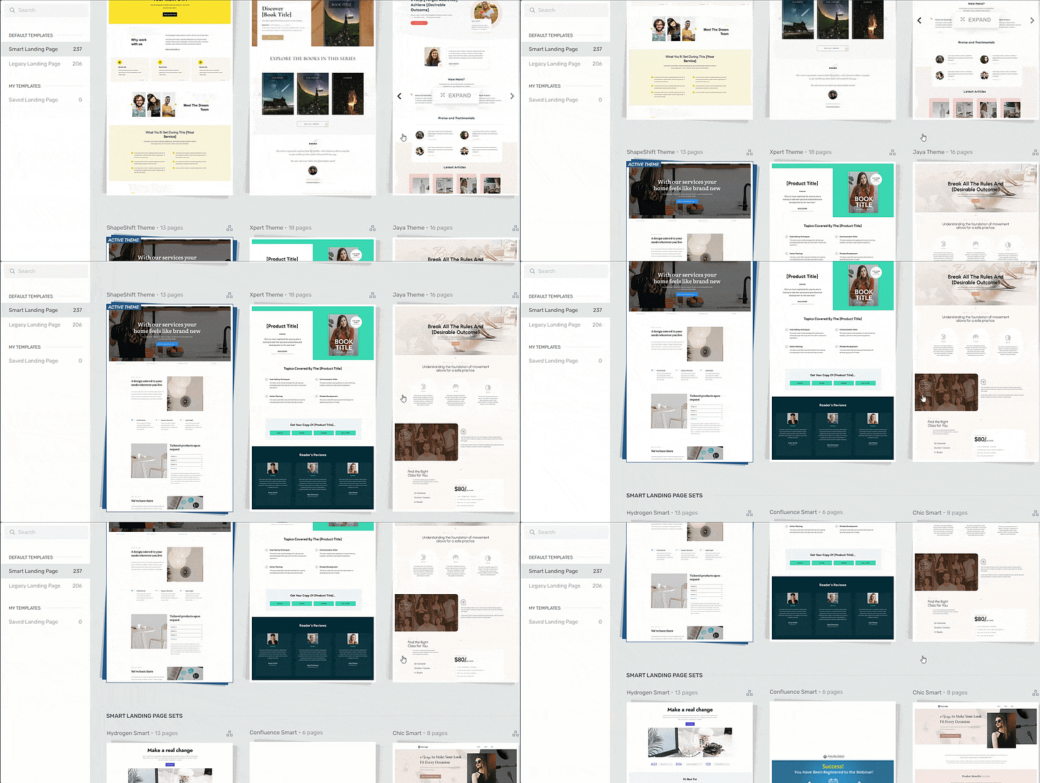
...and hundreds of fully customizable theme and page templates.

Landing page template sets in Thrive Architect
This duo can empower you to effectively update your website, enhancing its appeal and functionality to better meet the needs of your visitors.
2. Make Your Website Mobile-Friendly
A mobile-friendly website is a must.
Most people browse on their phones, so your site must look good and work well on small screens.

Mobile editing in Thrive Architect
Use tools like HubSpot’s Website Grader or Google’s Page Speed Insights to see where you stand.
Aim for a responsive design that adjusts to any device, ensuring texts are readable and links are easily clickable without zooming.
Simple changes, like optimizing images and streamlining navigation, can make a big difference. Making your website mobile-friendly not only keeps mobile users happy but also helps your site perform better overall.
3. Improve Your Site’s Navigation
Clear and intuitive navigation is key to keeping visitors on your site longer.
Start by evaluating your current menu layout—is it easy for users to find what they're looking for?
Simplify your menu structure to include only essential items and group similar pages under relevant categories. Use descriptive labels that clearly indicate the content visitors will find, making it easier for them to navigate.
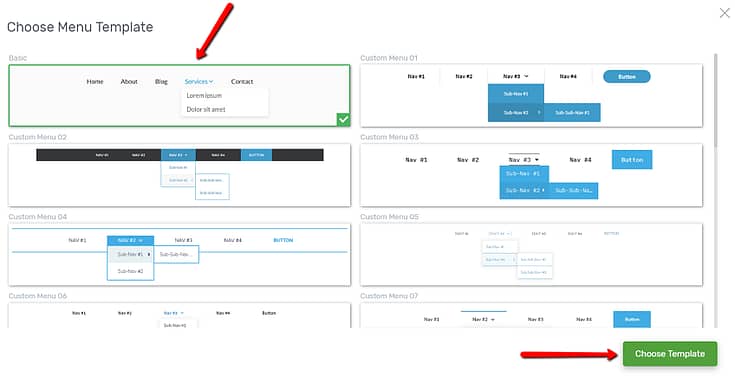
For easier navigation, think of switching to a dropdown menu if you aren’t already using one.

Menu selection in Thrive Architect
We also recommend adding a search bar to your main menu – especially if your site has a lot of content. This allows users to find specific information quickly.
4. Update and Expand Your Content
Refreshing your website isn't just about design and functionality; your content needs attention too.
Start by reviewing your existing content to identify outdated information, broken links, or areas that lack depth. Updating these elements can immediately improve your site's relevance and value to visitors.
Next, consider expanding your content to cover new topics or deepen existing discussions. This could involve adding blog posts, creating helpful guides, or incorporating videos and infographics.
High-quality, engaging content not only attracts visitors but also encourages them to stay longer and explore more of your site.
5. Add Recent Social Proof
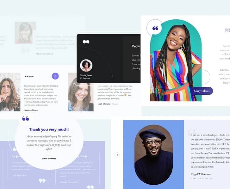
Gather recent testimonials, user reviews, and case studies to display on your most important web pages.
These real-life experiences and positive feedback from satisfied customers can significantly influence new visitors and give them a reason to trust your business.

Also, consider adding badges of any awards or certifications your business has achieved, as they serve as seals of approval from respected third parties.
Place these trust signals on your homepage, sales pages, and relevant lead-generation pages to bump up the chances of landing more leads or sales.
6. Refresh Your Calls to Action
Updating your Calls to Action (CTAs) can help guide your visitors to take the next step, whether that’s signing up, buying, or learning more.
Take a look at your current CTAs—are they clear and to the point? If not, it’s time for a change.
Use straightforward language that tells visitors exactly what they’ll get, like 'Start Your Free Trial' or 'Download the Guide'.

The design matters too. A different color or a more prominent placement can make your CTA stand out. It’s worth A/B testing a few variations to see what works best with your audience. Make sure your CTAs fit naturally with the rest of your content, so they don’t feel out of place.
A little tweak here and there can lead to better engagement and more conversions. It's about guiding them clearly and simply.
7. Add Interactive Elements to Your Site
Adding fun, interactive elements to your website is a great way to keep visitors around longer and guide them to stuff they'll like. Think about what might be cool or useful for your site, like quizzes, polls, or even dynamic page content.

Dynamic content in action
Keep your visitors and your site's goals in mind when you're putting these features in. The idea is to make things better for your users, not more complicated. A quiz, for example, could help someone find the perfect product, and a map could show off where your stores are.
It's all about making these interactive bits feel like they belong on your site. They need to be easy to use and quick to load, so they don't slow down your page.
When done well, these features can make people want to stick around longer and get more involved with what you're offering.
Next Steps: Optimize Your Website for SEO
Once you’ve completed your website refresh, you should turn your focus to getting more website visitors to your site organically.
Updating your website is one way to show search engines that you have relevant, engaging content that should rank high on SERPs — which is key for a successful content marketing strategy.
But you also need to make sure you’re creating your new content in a way that will help your search engine optimization efforts – among other things.
Here are four free tutorials to show you how to improve your written content and generate more organic traffic:
Is It Time to Refresh Your Website?
Now that you have the key steps to refreshing your site, it’s time to get working.
And if you feel like you need a new website altogether, you can use the tools we recommended — Thrive Theme Builder and Thrive Architect — to get the job done.
This website-building duo will help you design a professional website for your business. A site your potential customers will look at and want to engage with.
No need to struggle with code or janky tools.
This combo takes the stress out of web design and leaves you with all the fun — and total design control.
Today could be the day you decide to give your business a new competitive edge and wow your audience with a kickass new site.
And you’re just a couple of clicks away...
Start using Thrive Theme Builder and Thrive Architect today.


