Today’s your lucky day.
You’re about to get a new member on your sales and marketing team.
She’s going to take care of:
- Generating leads for your business
- Nurturing cold traffic into qualified subscribers
- Turning away visitors that aren’t a fit for your business
- Choosing the most aligned product or service for each visitor and then selling it to them
- Following up on the sale
She sounds great, right?
But it gets better, you don’t actually have to pay her!
That's because ‘her’ is actually an ‘it’ - and ‘it’ is a Lead Generation Quiz Funnel.
In this article, we're going to take you through 5 real life examples of quiz funnels, and show you exactly how you can create your own.
That includes in-depth break downs of quiz funnels (complete with visual diagrams!) that will help you decide which funnel structure you should create based on your unique products, audience, and sales process.
All you need is your email marketing service and any quiz building software (Thrive Quiz Builder, for example) to pull this off so if you're ready, let's get started...
More...
Your Basic Lead Generation Quiz Funnel Template
To start off, let’s look at a generic lead generation quiz funnel to get an idea behind how they’re typically structured:
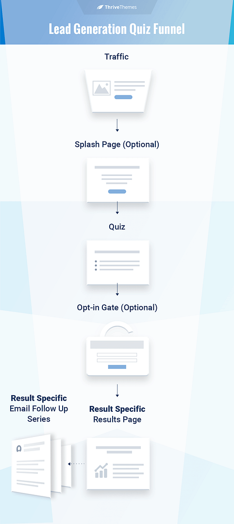
A generic lead generation quiz funnel
Traffic
Traffic is driven to the quiz from other areas of the website through the use of ribbons, lightboxes, etc. and external sources such as Facebook ads.
NOTE:
We’re going to focus on on-site traffic sources for these funnel breakdowns. Note that most of these quizzes probably have external traffic sources directed to them as well.
Splash Page
A Splash Page is a mini landing page shown right before the quiz. It introduces the quiz and promotes the benefits of completing it.
Alternatively you can just get right to it and display the first question of the quiz.
Pros & Cons of Using a Splash Page:
Whether or not you use a Splash Page is something you’ll have to decide on using your quiz analytics.
If a lot of people are landing on your quiz page, but few are actually starting or completing the quiz, a Splash Page may help improve your conversions.
You’ll see a few cases of Splash Page vs. straight to the questions in the examples below.
The Quiz
With most quiz building software, you’ll be able to add your quiz to a landing page on your website. The whole quiz, including the Splash Page and the results will load within that one landing page, though some quiz builders allow you to send the quiz taker to external Results Pages if you prefer.
Building the quiz is the fun part, which is why we have a Thrive University course to show you how. But we'll skip over it here and get to the segmented lead generation steps.
Opt-in Gate
Once the quiz taker completes all the questions, you have the option to ask for their email address before delivering the result. This is called an Opt-in Gate.
You can choose to make the Opt-in Gate mandatory in order for the quiz taker to see the results, or you can make it optional and skip it altogether. The last two options mean you have to get the quiz taker’s email address another way, usually through an Opt-in offer on the results page — such as a free guide.
Pros & Cons of Using a Mandatory Opt-in Gate:
While using an Opt-in Gate might have been viewed as aggressive a few years ago, the majority of quizzes on the web now have one. It’s become standard practice in lead generation quizzes, and your visitor is more likely to expect it.
Results Page
It’s time to reveal the results!
Depending on your quiz builder tool’s capabilities, you have three options for presenting your quiz results. There are specific reasons why you would use each.
1. Use your quiz builder’s inbuilt Results Pages. You’ll be able to customize each page depending on the result. This feature is called Dynamic Content in Thrive Quiz Builder. Pro's include:
2. Redirect your quiz taker to a separate landing page on your site. You’ll have to build your own results page if you choose this option. To do this, just enter the URL you want to send your quiz taker to depending on each result. Pro's for this option include:
3. Send the quiz taker to a generic Thank You Page and tell them to check their inbox for their results. Create an email follow up sequence that send the quiz taker their results.Pro's for this strategy are:
Email Follow Up Series
When the quiz taker enters their email address, you can send a tag to your email service provider with the result they got. With Thrive Quiz Builder, you can also send tags based on their answers to specific questions.
Use the tag to trigger a results specific automated email follow up sequence. You can use this follow up series to sell your prospect into relevant offers, or to nurture your new subscriber in a very personalized way.
By changing the content you send based on the new subscriber’s quiz result, you have an incredible opportunity to send content that really resonates.
And there you have it... a basic funnel for creating your first lead generation quiz.
But how do you choose which elements and variations to use for your quiz?
We’re now going to show you five variations of this basic funnel, go through the differences between each and explain what situations each version is most useful for.
Quiz Funnel 1: Digital Marketer - Marketing Skills Assessment Quiz
Digital Marketer is a big name in digital marketing and agency training. They sell online courses and access to digital marketing communities.
Their lead generation quiz is a Marketing Skills Assessment that visitors can use to gauge their current marketing skill level.
The Funnel
Let’s take a look at a blueprint of Digital Marketer’s Lead Generation Quiz funnel:
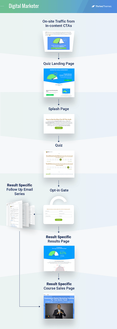
Digital Marketer's quiz funnel
Traffic
Digital marketer uses an eye-catching GIF as an in-post Call to Action (CTA). No one’s going to accidentally scroll past that!

Digital Marketer's in-content CTA
Pro Tip
To make a GIF with a button inside as Digital marketer has done here, you just need to create a button image in the GIF. By making the whole GIF clickable, it gives the illusion that it's a working button, but in truth, the whole image is clickable.
Quiz Landing Page
Click on the banner and you’re taken to an in-depth landing page for the quiz.
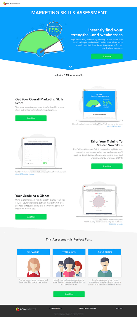
Digital Marketer's quiz landing page
Now you may be thinking that creating such a landing page requires a lot of effort just to promote a free lead generation quiz, but there’s a reason Digital Marketer has done this.
This page is here to prevent drop off during the quiz. It highlights all the valuable information the visitor will get in the results, encouraging quiz takers to get started and stick it out to the end.
But then they use a splash page as well. Why add this many steps between the quiz taker and the conversion?
Because their quiz is boooorrring. I’m talking next level ‘feel like I’m writing a high school English essay’ boring. Without these two introductory pages, the drop off rates would be very high.
Just take a look at this question to see what I mean:
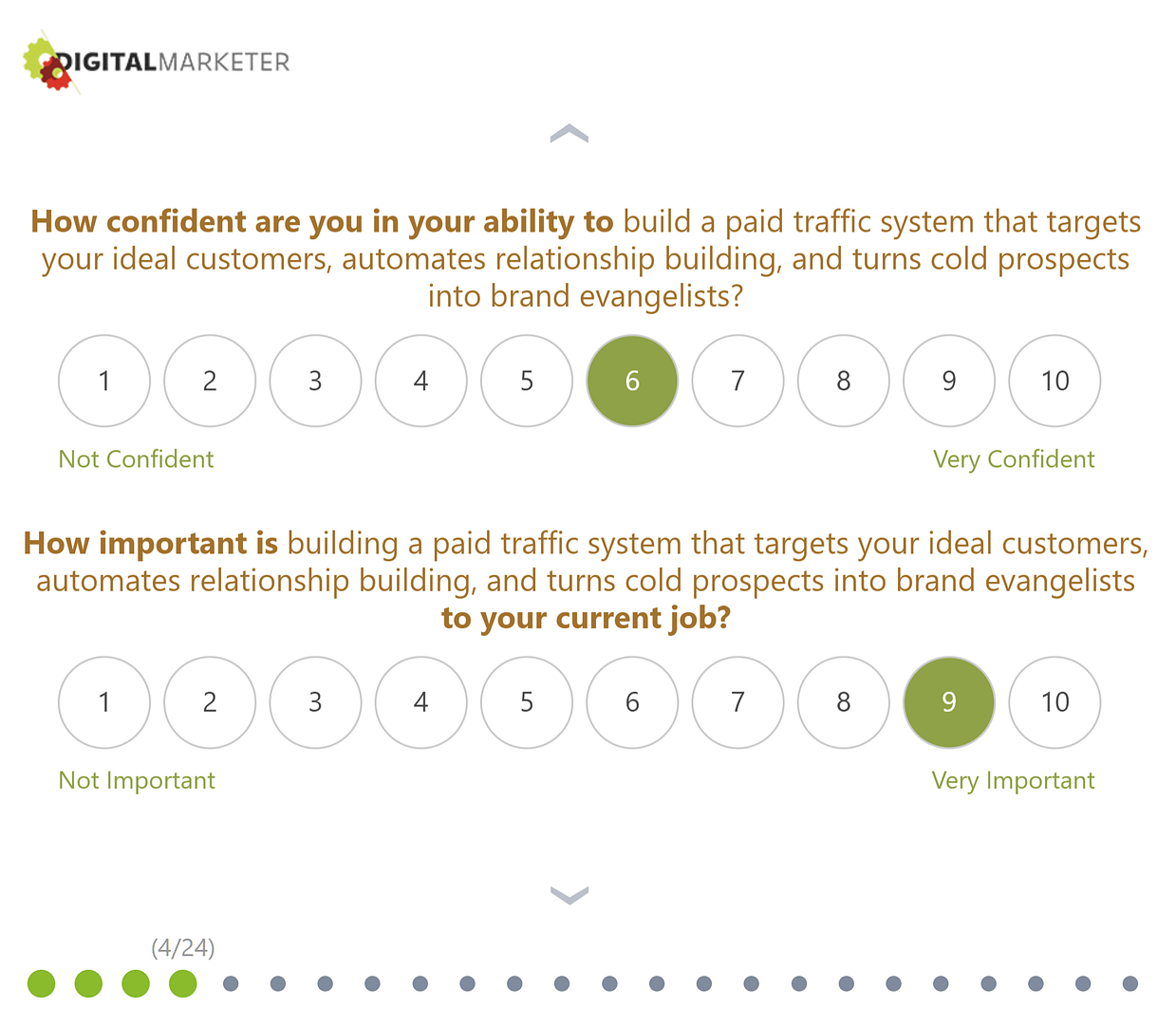
Digital Marketer's quiz
And this is how the whole quiz goes…. 24 questions where the only thing that changes is the type of marketing strategy they ask about.
With these sorts of questions, the double pre-quiz pages are almost required.
Opt-in Gate
The Opt-in Gate at the end of the quiz requires a bit more information than normal (all fields are mandatory), but Digital Marketer gets away with it because any quiz taker that's clawed their way through to the end of this boring quiz probably isn't leaving without their results!
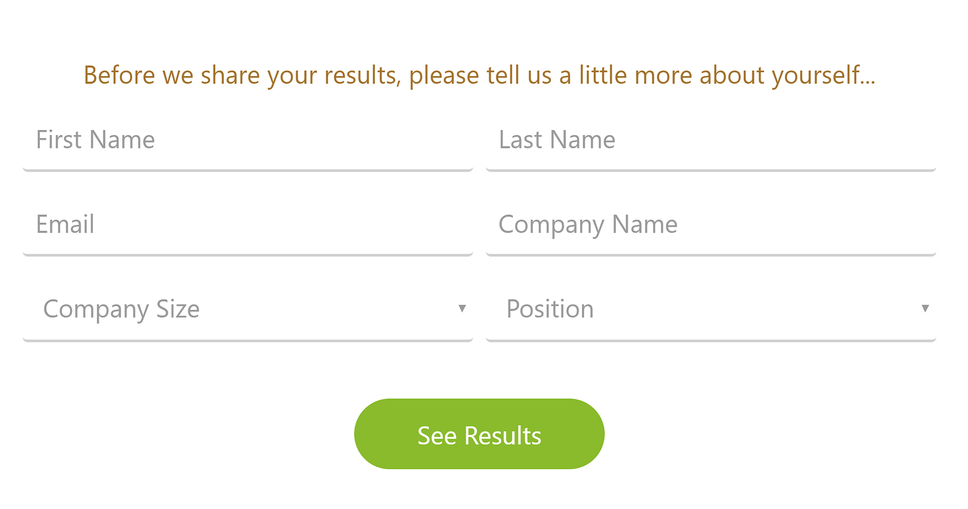
Digital Marketer's Opt-in Gate
On top of that, look at this impressive and important looking results page Digital Marketer rewards their quiz takers with:
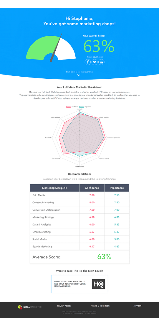
Digital Marketer's result specific Results Page
Disclaimer: Ahrm 63%... Don’t worry, I’m not really that bad at marketing. I just got bored halfway through taking the quiz and started clicking random answers so I could get to the Results Page.
The Results Page doesn’t waste any time. It delivers an in-depth break down of the results, then leads straight into a CTA for a paid course.
And the course offered to quiz takers changes depending on their result. For example, you’ll see that with a 63% result, I received an offer for Digital Marketer’s HQ program - ‘Customized Digital Marketing Training For Your Entire Team’, whereas at 33% I was offered Lab+ - ‘Foundational Digital Marketing Training’.
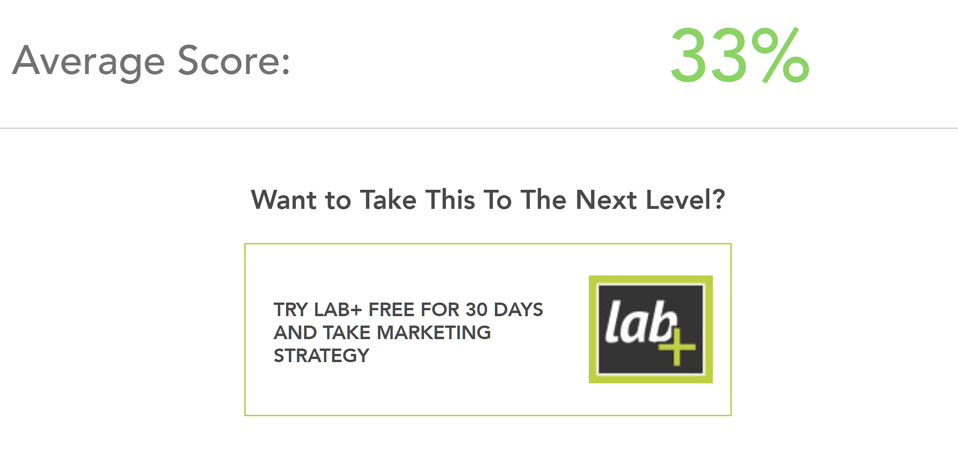
One of the result specific CTAs on Digital Marketer's Results Page
Email Follow Up Series
The quiz taker isn't just redirected to their Results Page, they also receive an email with their results too. The email provides a more in-depth analysis of their quiz results as well as another CTA for the paid course they were offered.
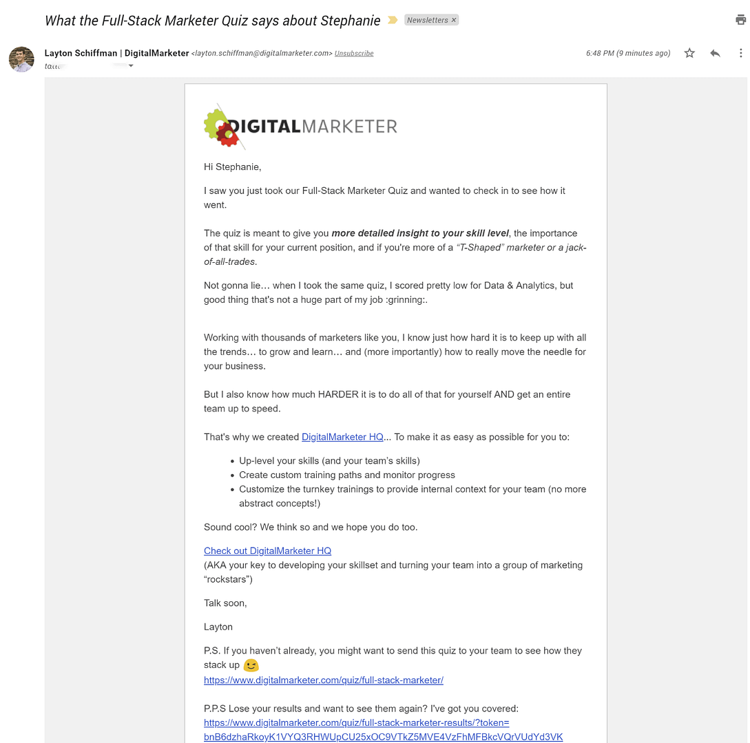
Digital Marketer's result specific follow up email
This allows Digital Marketer to nurture the lead, as well as put their offer in front of the new subscriber a second time.
In this quiz funnel example, Digital Marketer is going immediately for the sale. However, it’s likely that if multiple offers for the course go ignored, new subscribers are simply added to Digital Marketer's regular email list.
Key Lessons From Digital Marketer’s Quiz Funnel
Room for Improvement
- Making the questions fun and conversational
- Avoiding repetitive questions
- Adding images to your answers
What They Did Right
- If after creating your quiz you notice high drop off stats, consider adding a Splash Page or landing page promoting the benefits of quiz completion.
- An in-depth Results Page builds authority and credibility. Use Dynamic Content (if you’re using Thrive Quiz Builder) to make sure each result has a customized Results Page. Add impressive looking visuals like graphs and tables to make your results seem extra-authoritative.
- If you have a paid offer you're trying to lead your quiz taker towards, add a CTA to your Results Page. The visitor is now engaged and open to your content, so this is a good chance to offer them a premium product.
- Give your quiz taker more chances than just the Results Page to take advantage of your offer. They may not be ready directly on your Results Page, so send the offer again in an email. If you’re offering a high priced item, you may want to nurture the lead before presenting your offer again.
Quiz Funnel 2: Dotcom Gains - Make Money Online Quiz
Dotcom Gains is a blog about making money online. They mainly focus on blogs and content marketing.
Let’s take a look at their quiz lead generation funnel:
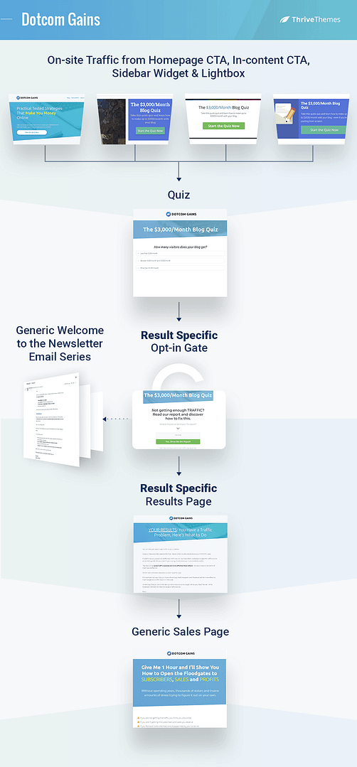
Dotcom Gain's quiz funnel
Traffic
On the above the fold section on their homepage, Dotcom Gains has a CTA for visitors to take their quiz.

Dotcom Gain's homepage CTA
They also use post footers, sidebar CTA’s and a lightbox to drive visitors to the quiz.
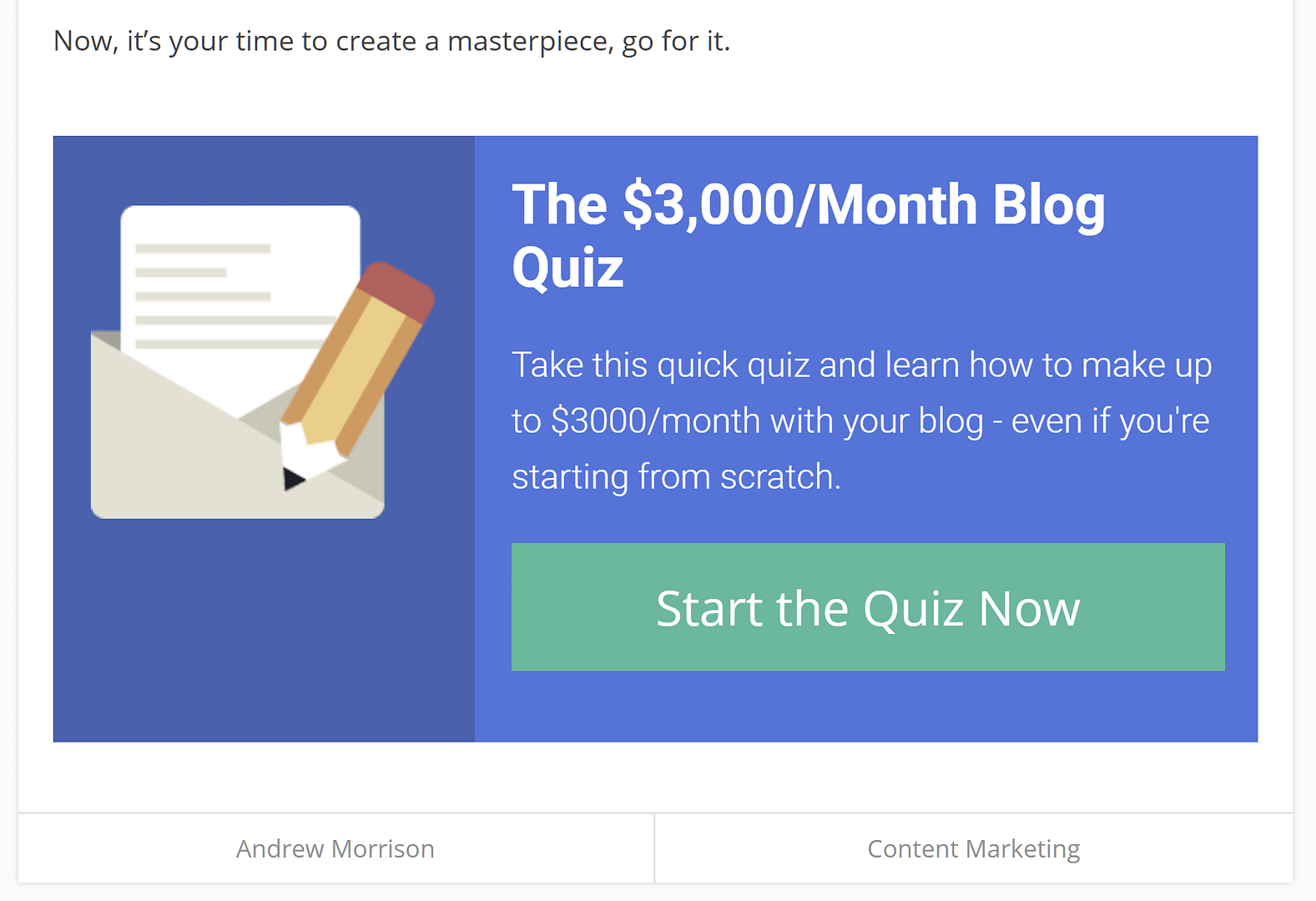
Dotcom Gain's post footer CTA

Dotcom Gain's sidebar CTA
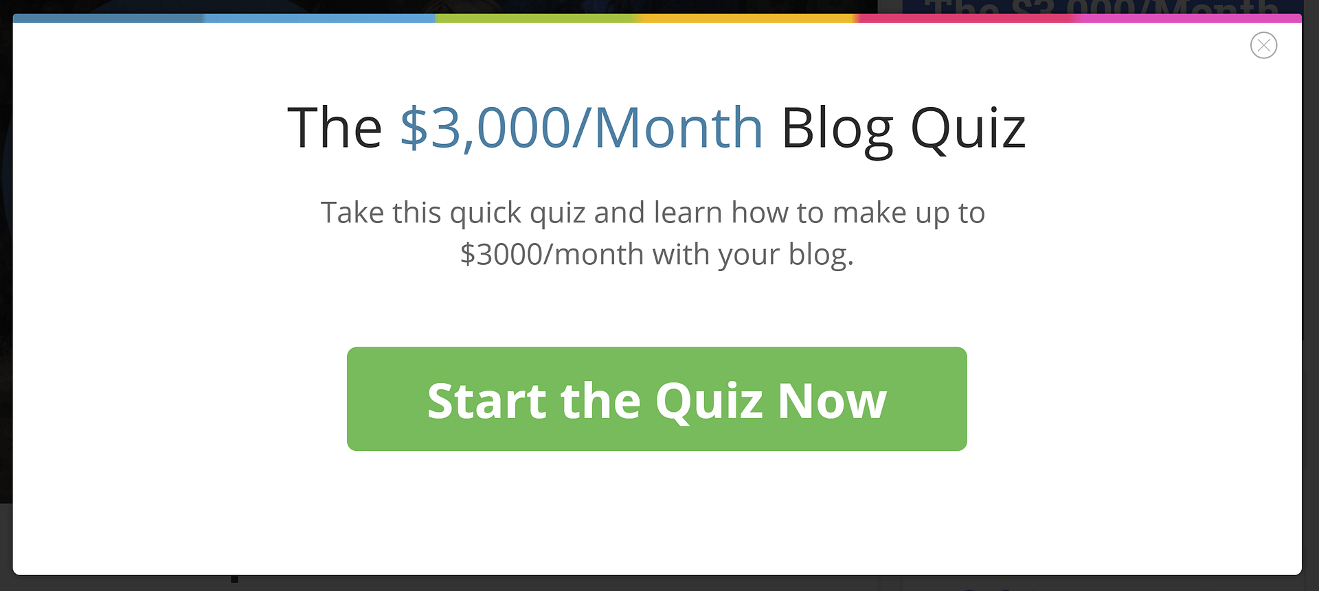
Dotcom Gain's quiz lightbox
This tells us Dotcom Gains is using this quiz as their main lead generation strategy.
(Lack of) Splash Page
Once a visitor clicks on the ‘Start the Quiz Now’ button, they are taken directly to the first question of the quiz.
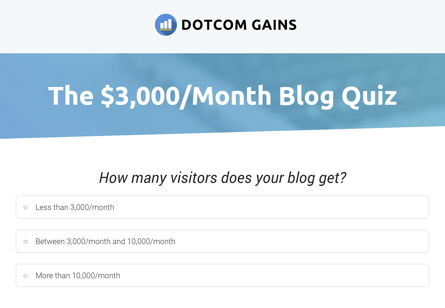
Dotcom Gain's quiz
The lack of a Splash Page here is likely because the quiz creators felt the value of the quiz was conveyed in the on-site CTA’s, and no further explanation was required.
The quiz itself is rather quick and easy to take, which further reduces the need for a Splash Page.
Opt-in Gate
Once the quiz is finished, quiz takers are taken to an Opt-in Gate.
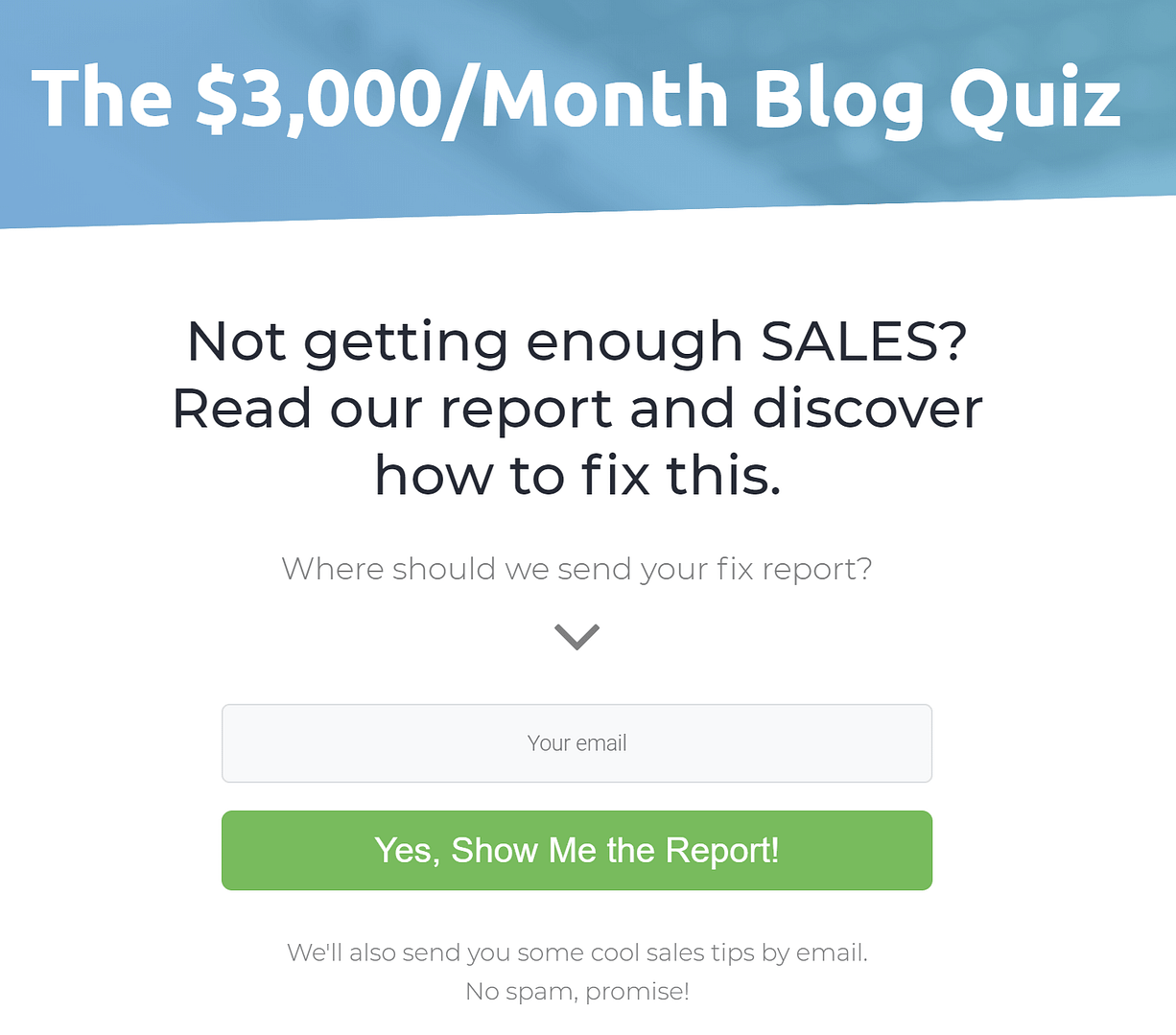
Dotcom Gain's result specific Opt-in Gates
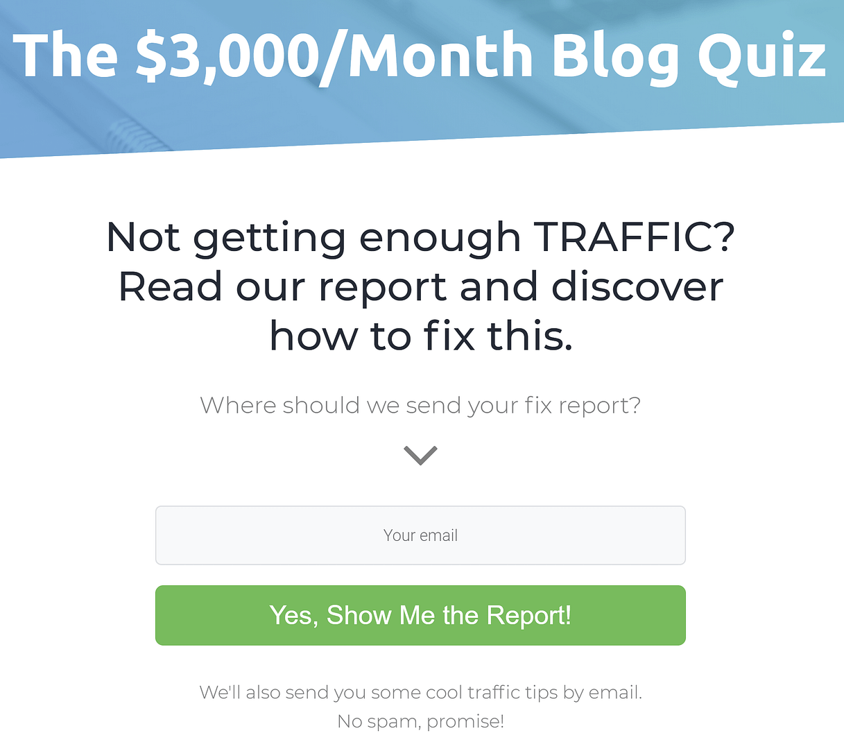
A variation of the result specific headline
What’s interesting here is that Dotcom Gains has used a results specific Opt-in Gate — meaning the headline changes based on the result the visitor gets. This is clever because it ensures the visitor resonates with whatever headline is on the opt-in gate. In other words, it’s more personalized than just saying ‘Your results will be emailed to you’.
Results Page
As well as customizing the Opt-in Gate, the Results Page is customized based on the problem identified in the quiz, ranging from traffic issues to a lack of monetization.
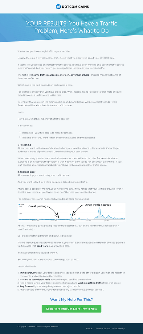
Dotcom Gain's result specific Results Page
The content on the Results Page is education-based and in a blog post style. It goes through all the different solutions to the problem identified in the quiz. And down the bottom, there’s a CTA to get help with that problem.
From here however, Dotcom Gains drops the ball as they miss out on opportunity after opportunity for personalization.
No matter the result, the CTA button at the bottom actually leads to the same sales page. It’s a blanket offer for a one-hour consultation call.
While the page itself is good — it’s a long form sales page —hitting clone and making result specific sales pages could have made their quiz even more effective. Changing the headline and a few other lines of copy to showcase the quiz taker’s results would ensure the sale page resonates with people better.
On top of that, the follow-up email series is just a generic ‘Welcome to the newsletter’ sequence. There is no mention of the offer again, and the content is not personalized to solving the subscriber's specific problem.
Key Lessons From Dotcom Gain’s Quiz Funnel
Room for Improvement
Don’t waste the incredible personalization opportunities a quiz affords you.
You now have unique insight into your new subscriber, which you can use to resonate with them through targeted emails, offers, and content. Take that extra bit of effort and create personalized offers and follow up sequences for your new subscriber based on their quiz results.
What They Did Right
Create an extra incentive for your quiz taker to enter their email by personalizing the copy on your Opt-in Gate. You can do this in Thrive Quiz Builder by using the Dynamic Content element on the Opt-in Gate. This allows you to show different content on the page based on each quiz taker’s result.
Quiz Funnel 3: Smart Passive Income - Slide-in Quiz
Pat Flynn of Smart Passive Income is an internet legend. His blog about passive income is one of the most popular on the web, and he monetizes it through affiliate offers and courses.
Let’s see what lead generation funnels look like — Pat Flynn style:
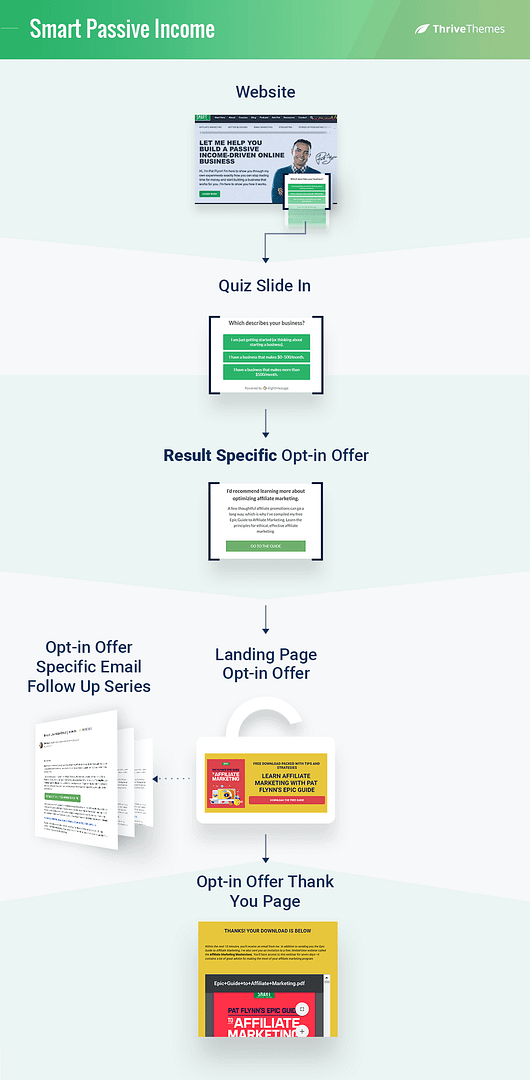
Smart Passive Income's quiz funnel
Displaying the Quiz
Pat Flynn’s quiz on the Smart Passive Income blog is a little different to what we’ve seen so far.
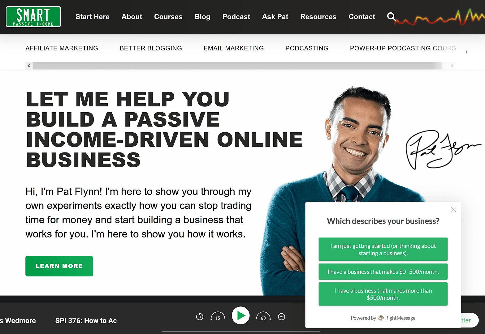
Smart Passive Income's homepage with the quiz slide-in
The quiz pops up in a slide in box on the left. This happens no matter which page you land on.
No Splash Page, no Call to Action to take the quiz - just the first question. As humans, we’re programmed to answer questions. When there’s a little lurker like that over in the corner, we’re almost drawn to clicking on the answer.
Opt-in Offer Instead of an Opt-in Gate
The quiz is only about three questions long, depending on your answers. At the end, it offers a curated opt-in offer.
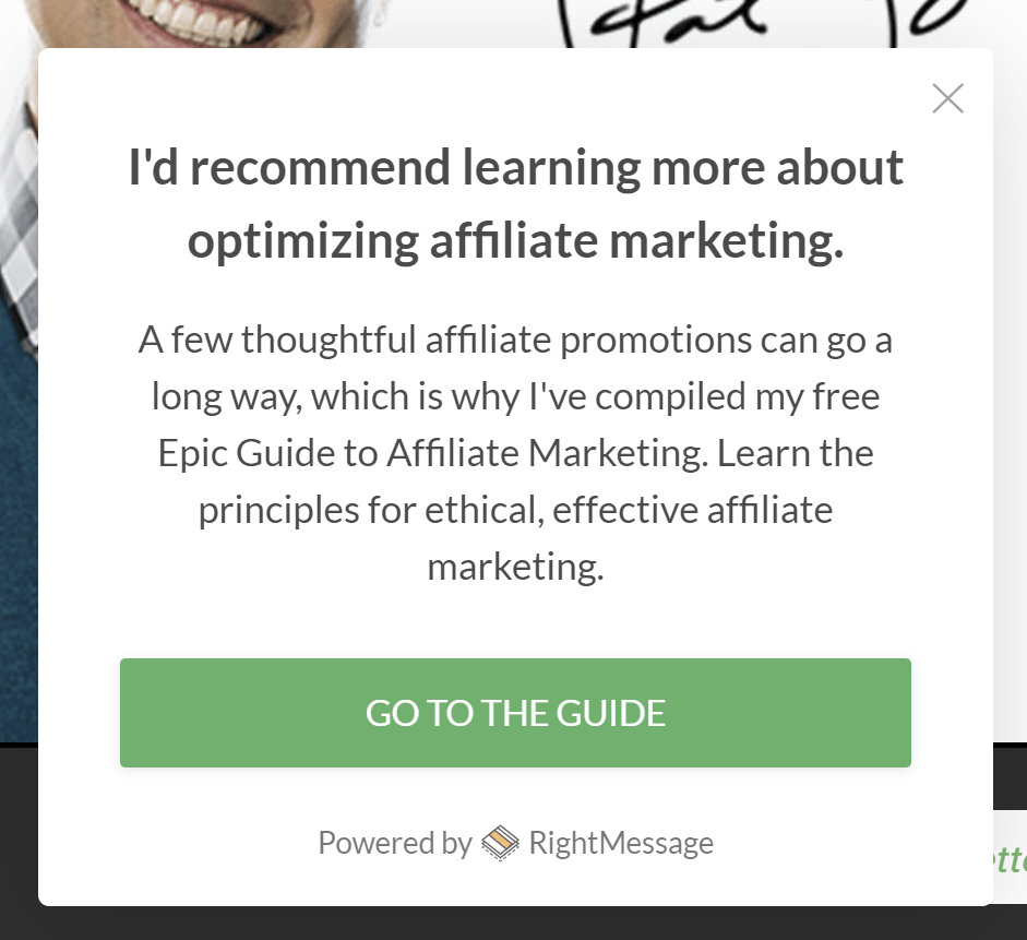
Smart Passive Income's result specific opt-in offer
This method is a lot softer than the other funnels because it doesn’t force the visitor to enter their email address to get the result. The downside of this is the conversion rate will be lower since there is less incentive to sign up.
If you click on the opt-in offer, you’re taken to an offer specific landing page.
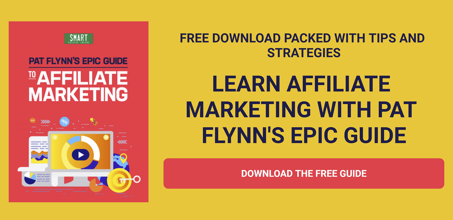
The landing page for one of Smart Passive Income's opt-in offers
I think this is a redundant extra step to make the visitor go through, especially because there isn’t a lead generation form directly on this page. Pat's making visitors click yet another button to finally collect their email address.
I'd rather see Pat Flynn present his lead generation form within the original quiz lightbox so his visitors can enter their email address without any extra steps.
Follow Up Email Series
Once the visitor enters their email address, they receive the corresponding follow up sequence associated with that guide.
This type of strategy — directing users to existing opt-in offers and follow up sequences — is great if you already have high converting follow up sequences. Using the quiz to direct the user to the right opt-in offer for them allows you to take advantage of your existing tried and true funnels.
Key Lessons From Pat Flynn’s Quiz Funnel
Room for Improvement
Make sure there are as few steps as possible between your offer and your customer handing over their email address. Drop off increases at each step — page load or click of a button — you make your visitor take.
What They Did Right
Get right to it! If your quiz is simple, quick and engaging, try sticking it straight into a slide-in lightbox and displaying it all over your site.
Just drag and drop the quiz builder element into a lightbox within your Thrive Leads editor. Monitor your quiz completion stats to decide whether to start on the first question or add a Splash Page.
Note: To avoid the slide-in taking up the entire page, only use this strategy if your quiz answers are short and offers four or less possible answers to each question. This will ensure the quiz box stays small. Don’t use images with this type of quiz either since they tend to take up additional space.
Quiz Funnel 4: Skillcrush - Is a Career in Tech Right for You? Quiz
Skillcrush is an online coding school that sells courses for all forms of software development.
Their quiz helps you determine if getting into development as a career is the right move for you — a question that is likely on the minds of target visitors.
Let's have a look at how Skillcrush turns this well-targeted quiz into leads for their business:
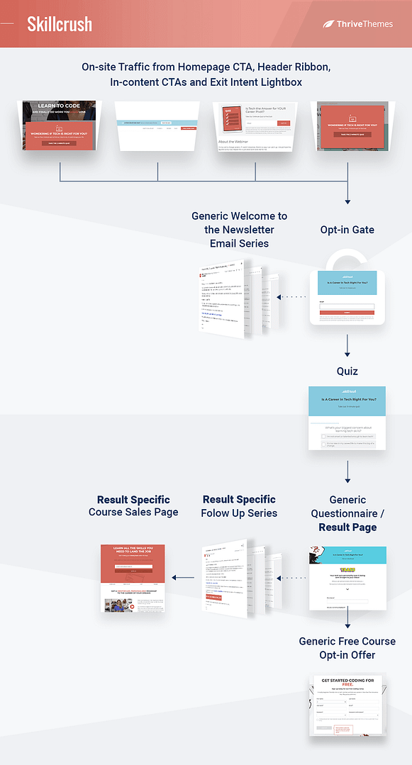
Skillcrush's quiz funnel
Traffic
Skillcruch advertises this quiz all over their site.
Header ribbons, above the fold on their homepage, in-content CTA’s, and an exit intent lightbox... just to be safe.
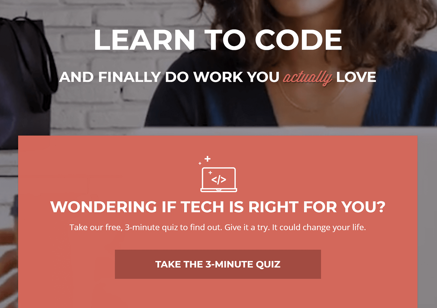
Skillcrush's homepage
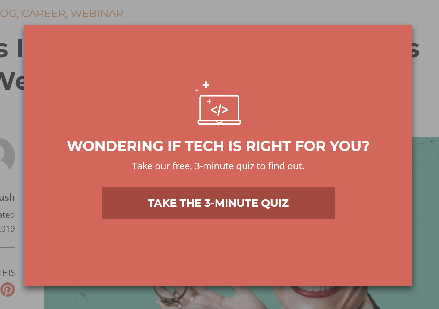
Skillcrush's exit intent lightbox

Skillcrush's header ribbon
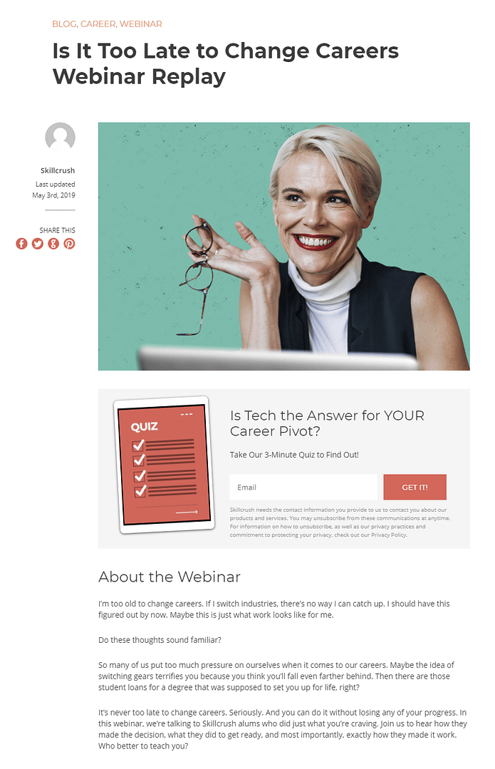
Skillcrush's in-content CTA
Opt-in Gate
Skillcrush must have a baller follow up series.
Why? Because this is the first page of their quiz:
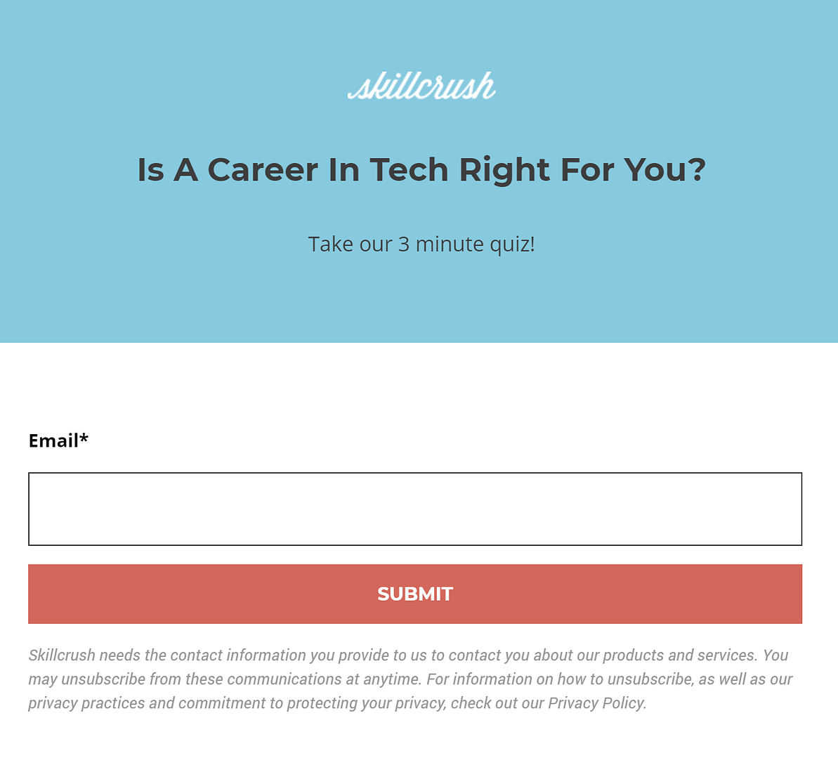
Skillcrush's pre-quiz Opt-in Gate
Skillcrush uses an Opt-in Gate before the quiz.
Having the Opt-in Gate at the start tells us Skillcrush’s highest priority is getting that email address.
I’d bet money they have a very high converting follow up series in place behind this.
So when should you use a pre-quiz Opt-in Gate?
Only if your current quiz drop off rate is high and you have a generic (not result specific) follow up sequence you want to get new subscribers into. In other words, situations where it’s less about their result and more about getting the visitor’s email address.
Note:
Putting the Opt-in Gate at the start comes with another downside. A new subscriber’s email is sent to your email service provider at the time the form is filled out.
Sending the email before the visitor has taken the quiz means you won’t have a result to send along with the email address. This takes away your opportunity for personalization.
You can get around this by offering a results specific opt-in at the end of the quiz, but not all the quiz takers will take you up on this and also requires the visitor to enter their email address twice.
If you do decide to put an Opt-in Gate at the start of your quiz, it’s a good idea to add a Landing page before the quiz to promote the benefits so the visitor has more incentive to continue.
That’s one area where Skillcrush could improve. The CTA’s directing the visitor to the quiz don’t have much information on them, and once visitors click, they see a form asking for their email to continue. There needs to be more value conveyed before asking for an email address.
Post-Quiz Questionnaire
Once the visitor enters their email, the quiz begins:

Skillcrush's quiz
It’s quite engaging, and it's not false advertising — the quiz does only take 3 minutes to complete.
Once you get to the end, there’s another ‘sort of’ Opt-in Gate:
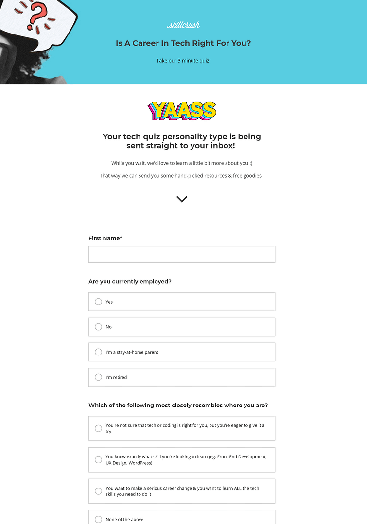
Skillcrush's post-quiz questionnaire
A page filled with a long questionnaire asking about the quiz taker, that also offers a one-on-one call.
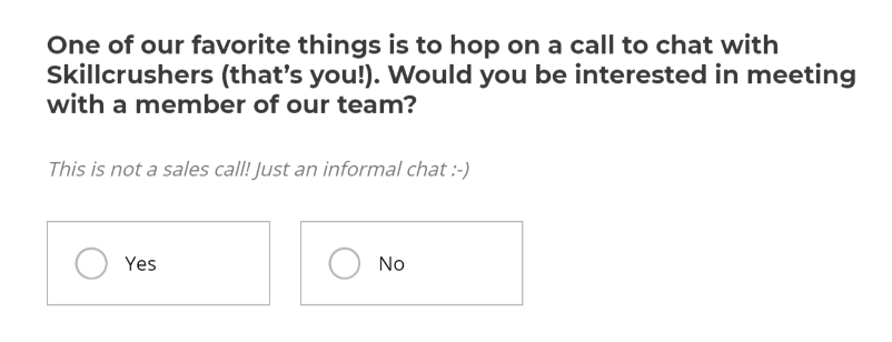
This page is optional, but if you don’t fill out the details, it’s the end of the line. The quiz taker’s only option is to close the window.
If you do fill out the questionnaire, you’re sent to an opt-in for Skillcrush’s free coding course.
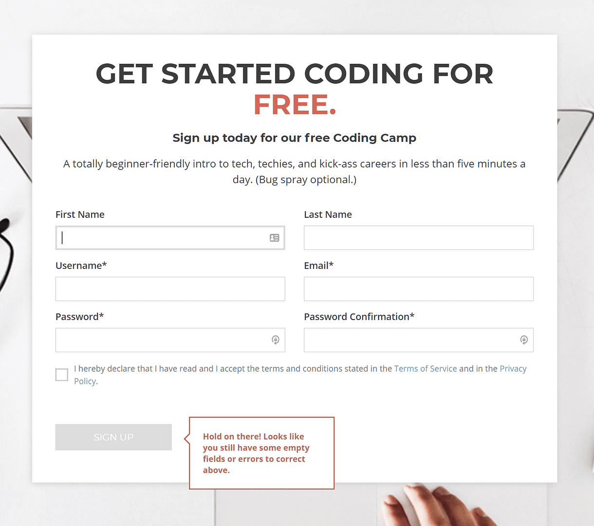
Opt-in for Skillcrush's coding course
At the very same time, visitors receive both a quiz results specific email and a generic ‘Welcome to the newsletter’ email:
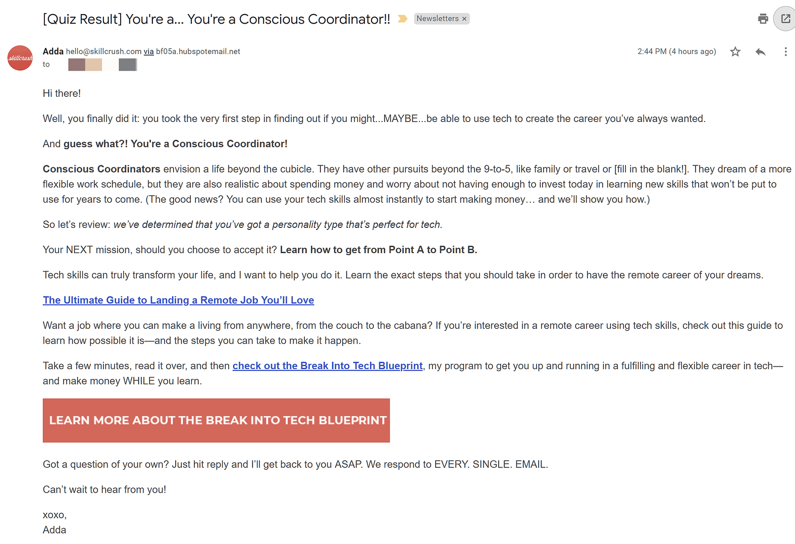
Result specific follow up email
The results specific email series leads into an offer for one of Skillcrush’s relevant paid courses.
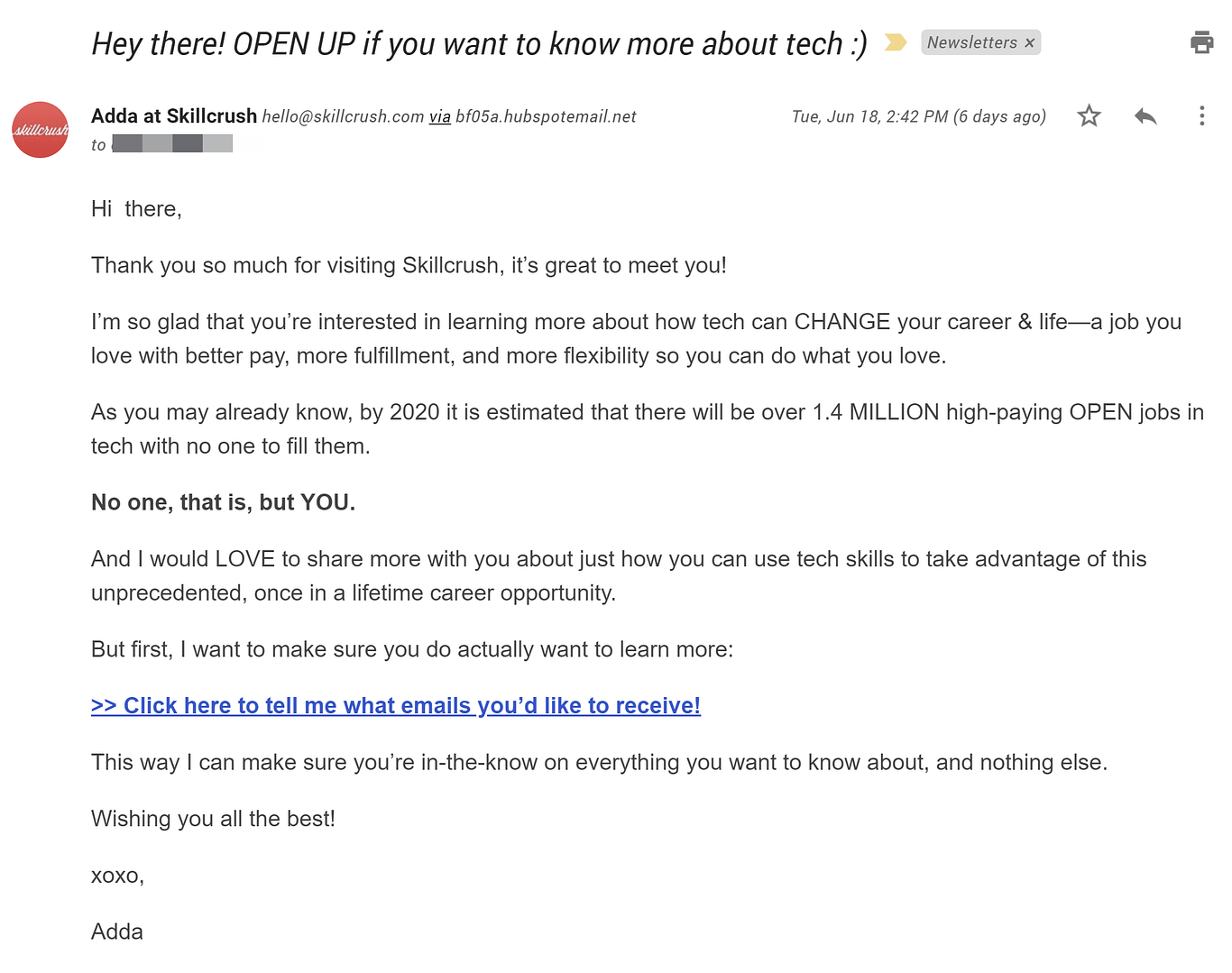
Skillcrush's generic welcome to the newsletter email
The generic email asks what the new subscriber wants to receive from Skillcrush. While this email has the right idea, the subscriber just took an entire quiz and quite possibly filled out a very long questionnaire about themselves.
From that wealth of information they just received from their subscriber, Skillcrush should already be able to tell what type of emails the subscriber wants to receive.
Removing the double email strategy and adding the relevant tags to the new subscriber (from the quiz answers) will tidy up the whole process and cut down the amount of emails and forms the subscriber has to deal with right off the bat.
Overall, this is not the way we would recommend structuring your quiz.
The whole funnel asks too much from the visitor without promising much in return.
What You Can Learn From Skillcrush’s Quiz Funnel
Room for Improvement
Make it as easy and seamless as possible for your new subscribers to jump on board. Don’t ask them the same information twice.
Use tools like answer based tagging to utilize all the information your new subscribers give you in your quizzes.
What They Did Right
Skillcrush did a great job of positioning their quiz to attract their target audience. They are a coding school, so naturally someone visiting the site is wondering if learning to code is the right move for them.
What’s the biggest questions on your visitor’s mind when they arrive on your site? Your quiz should offer to answer this question for your visitor.
Quiz Funnel 5: WilloLovesYou - LightMap Quiz
WilloLovesYou is a coaching service for creative business owners, run by Willo Sana.
Willo has various one-on-one and group coaching programs, and this quiz serves as a perfect lead generation tool for all her different offerings.
Here’s the rundown:
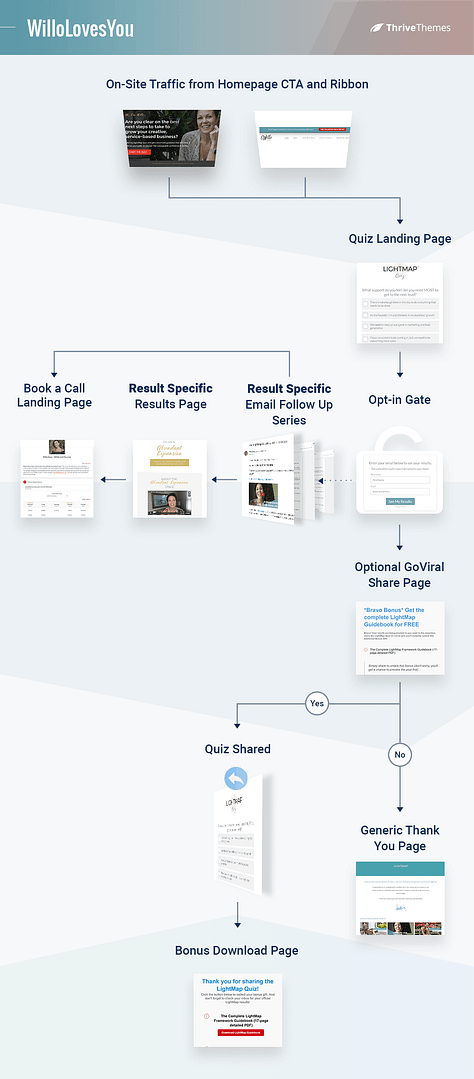
WilloLovesYou's quiz funnel
Looks complicated, no?
But this lead generation funnel has some interesting elements, and is quite streamlined despite how complex it looks.
Traffic
CTAs placed on Willo's homepage and header ribbons (on most pages of her site) direct traffic to the quiz.
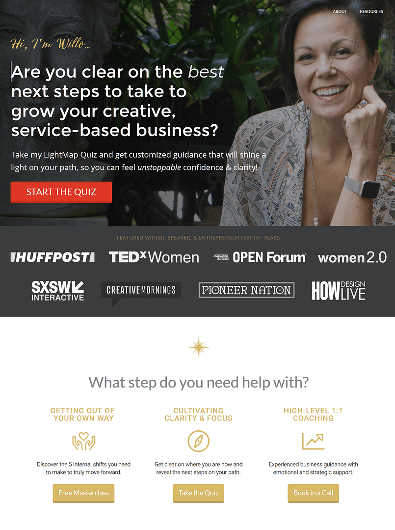
WilloLovesYou's homepage

WilloLovesYou's header ribbon
If you click on the ‘Take me to the Quiz’ button, you are immediately presented with the first question of the quiz.
This is a little abrupt considering the ribbon doesn’t have that much information on it about the benefits of taking the quiz. If that's all the visitor sees before the first question, they're not going to have much motivation to finish the quiz.
A Splash Page here could improve completion rates.
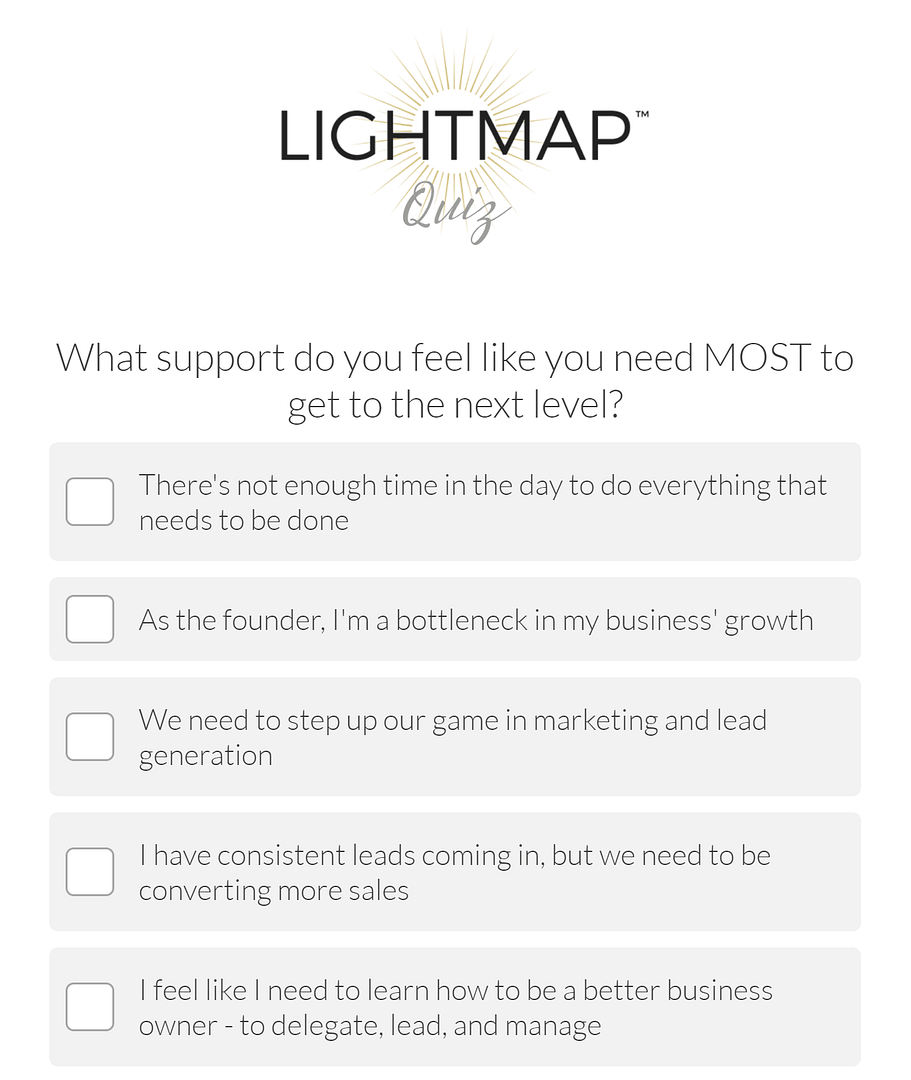
WilloLovesYou's quiz
The quiz only takes a few minutes to complete, which would also be something worth highlighting on the Splash Page.
Giving a time estimate before the quiz begins (or using a progress bar throughout the quiz) increases completion rates because the quiz taker has a better idea how much time investment they’re committing to. Visitors are less likely to abandon the quiz for fear it will go on for longer than they’re willing to spend on it.
Update: Since writing this article WilloLovesYou has added a Splash Page to the quiz.
Opt-in Gate
Once the quiz is completed, an Opt-in Gate appears.
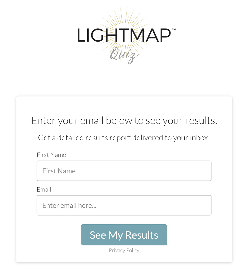
WilloLovesYou's Opt-in Gate
Simple and effective.
But here’s where it gets interesting…
Social Share Page
After the quiz taker enters their details, they’re taken to this offer:
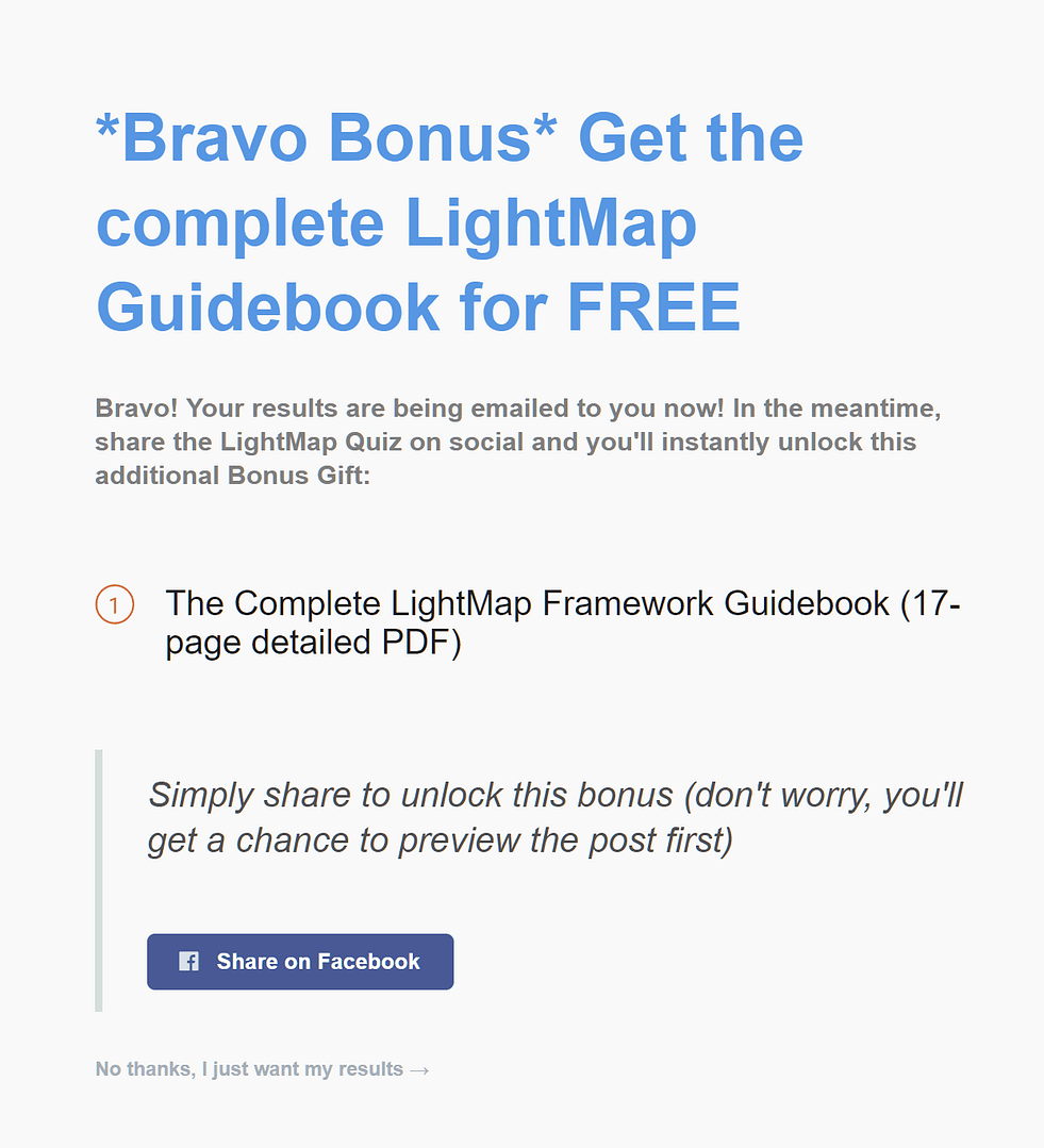
WilloLovesYou's GoViral share page
It’s a GoViral share page, offering a free bonus PDF in exchange for the quiz taker sharing the quiz on Facebook.
This is optional, and if the quiz taker clicks ‘no thanks’, they are sent to a generic thank you page telling them to check their inbox for the results.
If they share, they get access to the PDF download and are told to check their inbox for their quiz results.
The reason this offer is so clever is because Willo doesn’t risk losing anything from her new subscriber at this stage. She already has their email address and quiz result. The follow up email series is on its way.
The worst that can happen now is visitors close the window.
Results Page and Follow Up Series
The results are immediately emailed to the quiz taker, as well as a link to a very detailed, long form Results Page.
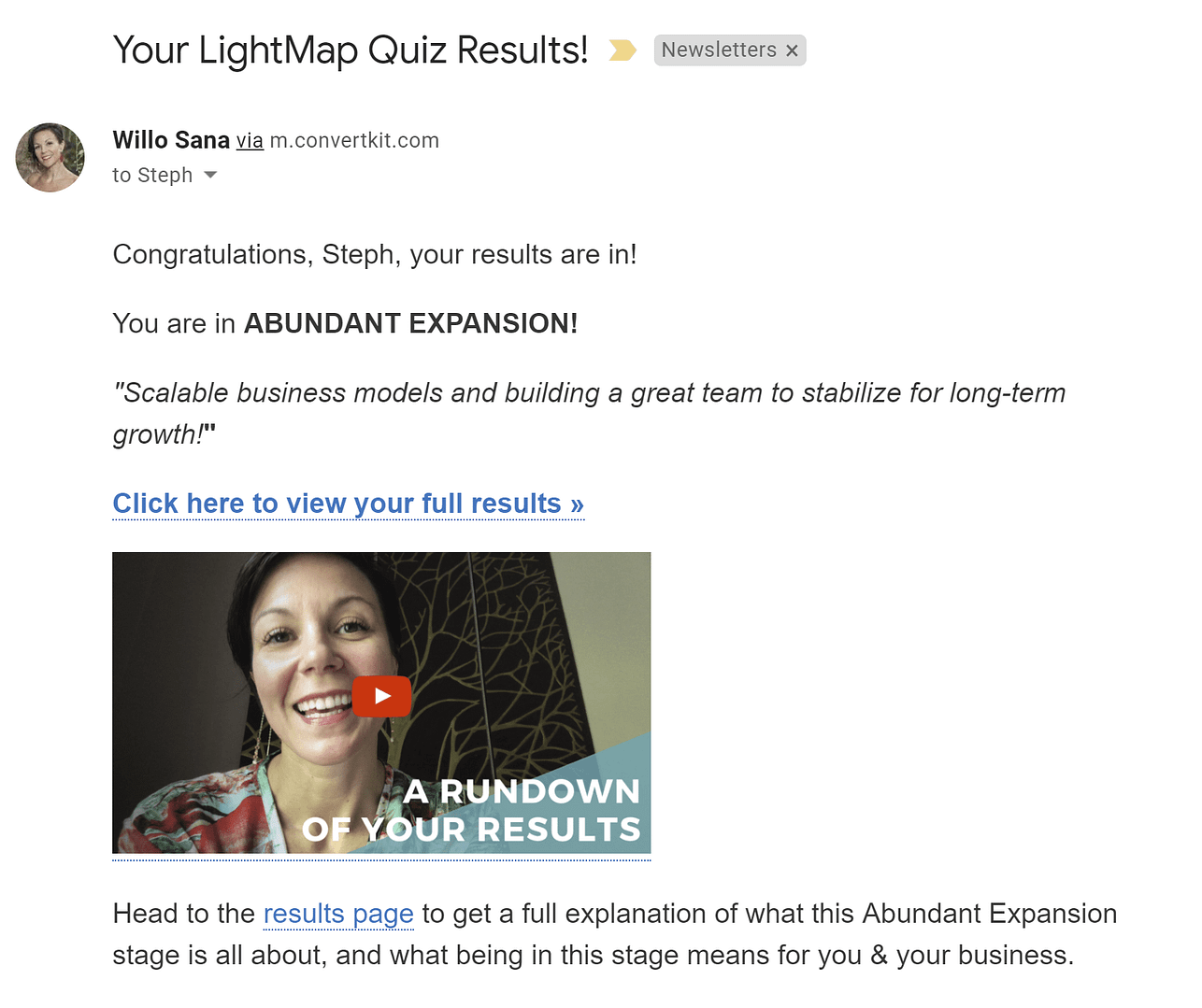
WilloLovesYou's result specific follow up email
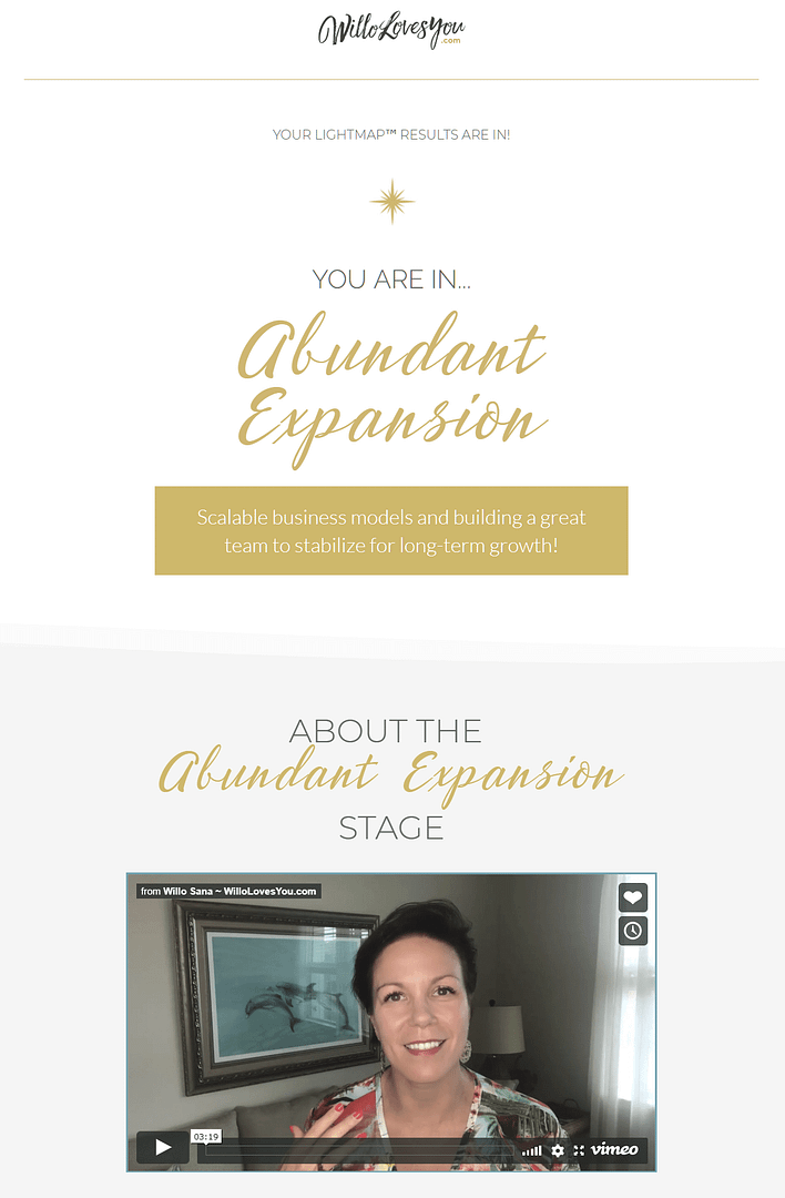
WilloLovesYou's result specific Results Page
The results page explains that they’ll receive a three part video series explaining their result over the next few days.
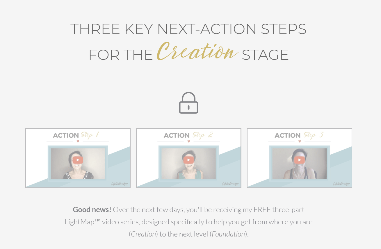
WilloLovesYou's Results Page
Talk about nurturing like a pro! There’s a different video series for every quiz result.
The video series is a great way to warm up new leads, and to let your new subscribers know what’s coming. If this quiz is being used on cold traffic, the whole funnel works well to introduce Willo first and then nurture the lead to a point where they would be ready to purchase from her.
There’s also an offer to book a one-on-one call with Willo on the Results Page, and this is offered again at the end of the video series.

The CTA button on the Results Page
This ensures those who are ready to move forward have a chance to take Willo up on her offer, while those who need a little more convincing get the extra nurturing they need.
What You Can Learn from Willo Sana’s Quiz Funnel
Room for Improvement
Use a progress bar or highlight (in the copy) the time the quiz will take to complete.
Use sentences like ‘Take our 3 minute quiz to find out’ and ‘It only take 3 minutes’ in your copy to promote the quiz on your Splash Page.
What They Did Right
If you’re sending the results via email, make use of your post-Opt-in Gate page by presenting an offer. This can be a share request, a paid course, or a chance to nurture your new lead with a video or free gift.
If you are either sending cold traffic to your quiz or your final offer is a higher priced product, use the insights you gain from your quiz to nurture new subscribers.
You can make an offer on your Results Page for those who are ready to take action immediately, but it’s also a great idea to build in a nurture sequence around each quiz result to build a relationship with your new subscriber.
Quiz Funnels Goals
So there you have it — five examples of lead generation quiz funnels.
I hope this breakdown helped you generate some ideas for your own lead generation quiz.
Done right, these quiz funnels can be a very powerful tool for lead generation and sales.
But before you go running off to build your own lead generation quiz with Thrive Quiz Builder, I have a question for you...
What was the most useful piece of information you took away from this post?
Let me know in the comments below!


Epic content Stephanie – lots of ideas here, thanks!
Thanks Ru!
Awesome Value!
Do you have any Quizz templates like these sample designs?
If not i would love to see them.
Thanks Cathrin
Hi Cathrin, We don’t have templates for the whole funnel no, since it ranges across multiple platforms/software (Thrive Architect, Quiz Builder and your email service provider). Thrive quiz builder does have templates within it for your splash page, results pages and opt-in gate, and Thrive Architect has several landing page templates you could alter to suit your pre-quiz landing page. Hope that helps.
Great share Stephanie. I’ve been testing quizzes and questionnaires on my sites lately and they definitely convert + qualify people. They are very handy for matching people with the right offer.
Some great examples you’ve given as well.
Thanks!
Great to hear it’s working in the wild Warren. I am a huge fan of quizzes (if you couldn’t tell!). There’s is so much potential if they’re done right.
Thank you so much for this valuable content, Stephanie! I have been thinking about including a quiz for lead generation on my website, too.
But my question (and the reason I haven’t done this yet) is: How can I make the optinin GDRR-compliant? Yes, the quiz takers give me their e-mail address but solely for the purpose of getting their quiz results. This doesn’t give me the right to send them an e-mail follow-up.
Do you have any tipps on how to create the optin GDPR-friendly?
Thank you so much again!
Hi Sofia, great question and very relevant. We have a whole knowledge base article on how to make your quiz GDPR compliant here. There are also some useful tips in this blog post.
Great post Stephanie!! Thanks for going deep and giving concrete examples! Lots of great ideas!
Thanks Gary!
Thanks Stephanie!
Great examples and analysis.
It’d be great to have some quiz templates like these.
You guys continue to make things a lot easier for non-tech people like me.
Thanks again!
Bert
Hi Bert, there are a few quiz templates available in Thrive Quiz Builder to help you style the splash, opt-in and results pages. As for the quizzes themselves, they are usually so specific it’s hard to provide useful templates for the questions. But it’s an idea worth exploring so I’ll keep it in mind.
Thanks Stephanie, it looks like you put a lot of effort into this article. Thanks for linking to the Thrive Theme products and posts where you have equivalent solutions for these features (makes it easier for me to check it out!) Lots of good ideas that I will try out soon.
There are so many different types of opt-in forms mentioned in the post I thought I better link to some explanations!
Great article!
Is there a way to use text fields with quiz builder?
And how can I use quizzes with current subscribers?
Thanks
Both great questions. There is not an option to add text fields in Quiz Builder, but you can always add a contact form or similar to the results page. To use a quiz with current subscribers you can use the the same quiz set up. Change the copy on the opt-in gate to ‘confirm your email address to get your results’ and when they enter their email again, your email service provider should automatically update their subscriber information with the new tags and answer based tagging from the quiz. They will still be a subscriber but you will have a lot more information about them, and you can send them a result specific follow up sequence.
To have them enter their email again is not very practical and I am sure it will lower quiz results 🙁
Text fields are actually in the roadmap due for release in about 3 weeks time, Fernando
Thanks Paul, good to know 🙂
Hi Fernando,
Both of these options are now available in Quiz Builder!
You can add open ended questions and you can use the smart complete in the opt-in gate to send a quiz to your current list while getting the data linked to the exisiting profile.
Give it a try!
Thanks for letting me know Hanne.
Really awesome post!! Thank you
Thanks Mike, glad you enjoyed it!
Hi Stephanie,
Really cool blog post. 😀
I have a couple of questions:
1) I want to get leads using FB Ads do you suggest to use one of these tactics on such platform?
2) If so, are quizzes still permited on FB? I read somewhere that effective July 19 quizzes will not be allowed, what do you know abou it?
Thanks,
Carlos
Hi Carlos,
The crackdown you mentioned is on Facebook Apps that use Facebook’s API to run quizzes within the Facebook platform. The sorts of funnels we are talking about are run on your own website, not through the Facebook platform. This means you can still drive traffic to your external quiz using Facebook ads. It’s just like using Facebook ads to drive traffic to a normal link.
And YES! Facebook ads is a great way to drive traffic to your quiz. Facebook is an entertainment medium, people are there for fun and distraction. Quizzes fit that bill perfectly!
Super blog post, highly useful, and very inspiring.
I will share this post, and most importantly, I will implement some of your suggestions.
Merci beaucoup, Steph.
Glad you found it useful Nicholas!
Quiz Builder is fun, but I might be in over my head.
I want to build a quiz that directs golfers looking for a specific type of driver, but there’s a HUGE amount of permutations. Trying to wrangle them together, while making it coherent for the quiz taker and me on the backend.
It’s daunting, to say the least.
Hi Justin,
Having made a lot of quizzes myself I would say open the question editor and give it a try. It often feels daunting but once you start mapping it out, the quiz starts to come together quite easily. The trick is to establish each result first, then figure out what questions you need to ask your quiz taker to determine each result. The Thrive University course on creating quizzes will also help walk you through the process.
Great job Stephanie. And perfect timing because I am doing a high-level quiz writing course at present.
I fired up Thrive Quiz builder and started to build my quiz.
Then I came to a sudden stop.
I couldn’t have a question where quiz takers could enter long form comments (like as is taught in the ASK method).
So I had to go elsewhere to get what I wanted.
Now I know a certain person reads all comments and gets his good ideas for product development from peoples comments and requests. Shane PLEASE get your devs to add in long-form answers….
Keep an eye on your inbox in the upcoming weeks, Ash 😉
Woohoo….we now have long form content boxes.!! Thanks Hanne, Shane and the team. You rock.
Hi Ash,
So you discovered it already 😉
Thanks, Stephanie amazing as usual 🙂
Thanks nono!
Thank you very much. I am sooo excited to here text fields will be available soon!!! Solves a big problem I’ve been having lately.
Another feature I have in my wish list is more customizability of the quiz questions ( for branding). What’s the point of changing the entry and exit portions of the quiz if it doesn’t coordinate with the middle??
As always, thank you for your work and open ears!!
A forever customer!
Thank you for the suggestions Jennifer, we will take note. There are a lot of improvements to Quiz Builder in the next release, so keep an eye out for it!
I did purchased the quizz builder sometimes ago but I cant find out how to do just a simple quizz without points etc I think you should have more templates maybe you sell more aswell
Hi Bjorn,
Can you tell us what quiz you’re trying to make.
You can pick between:
– Number
– Percentage
– Category (probably what you want)
– Right/wrong
The easiest way to get started is to have a look at this quick start video.
just another piece of evergreen epic content, thank you so much @Stephanie.
I encourages quite a few ideas on what to produce. Especially WilloLovesYou, which seems to be close to perfect, is amazing.
Now it’s time to apply this to my own business.
Great post!!! Just what I needed at this point in my production cycle. Great to see real life examples that work!!!!
Most useful information? Good Question. Probably that a Quiz can work.
But like all good questions it leads to the next question. How do I get to highly successful quiz from ground zero?
Perhaps a follow up post?
Hi Mark,
You might want to check out this post on what makes quizzes go viral and this free Thrive University course on how to use quizzes to boost conversions (step by step).
Wow, this post covers it ALL! I have a basic follow up system encouraging clients to leave reviews but nothing a detailed and strategic as a quiz. It looks really achievable and I am planning on setting aside some time at out next team meeting to implement some of the nuggets I found here.
Very grateful Stephanie!
Nunca vi antes um conteúdo tão rico sobre este tema, amei os modelos e exemplos! Gratidão de verdade <3
First of all, Stephanie, Bravo, Bravo…
…that is a really well-done post. You worked your tail off on that one. I’m going to read it again.
I learned that even the “big boyz” have room for improvement. None were perfect. All, I presume, are doing great with their funnels. I noticed that Willow has already added “Take our 3-minute quiz to find out’ to her splash page.
I also see that there are lots of great funnel structures. I person could create a business just around funnels. I guess that has already been done tho..
Again, super-nice job on the post.
This is tons of value…
Do you have any quizz template for Launch course online?
Awesome blog Stephanie. Recently our company got a new client who wants to implement these quizzes for leads. We were confused regarding creating a funnel. But you’re post solves our most of the problem now all we need to do is implement this. Thank you so much.
Great tips. Very good and complete content. Thanks!
Great information Stephanie, Glad to find your article. It was quite beneficial and useful for me to boost my business.
Thanks
Absolutely loved this. Found your article really informative. Thank you.
Hello, Stephanie.
Is it possible to use Thrive Quiz Builder in a similar way to what Pat Flynn does with the “Right Message” tool he uses on his Smart Passive Income Website? You know, the form in the lower right corner of his site.
Thank you.
Hi Luis,
You can do something very similar using Thrive Leads and or combining it with Thrive Quiz Builder.
In Thrive Leads, you can create a slide-in opt-in form. This form is shown in the corner of the site. Then you can either use the buttons and the states in Thrive Leads or if you want more advanced options, you can create a full blown quiz in Thrive quiz builder and put the shortcode in the slide-in form.
The last example has given me confidence I can do this! With the market shifts over the last year or so, network marketing and building an online business has become both more tanginble and more intimidating.
Visualization of the funnel quiz for my site and services becoming clear and organized, I’m now really looking forward to building it and generating leads!
Thanks for a very informative post, and especially for the visual layouts!
Bravo pour cet article formidable qui fait plus que m’éclairer !
Un grand merci pour la qualité de votre travail.