Not gonna lie, back in my early marketing days, whenever someone said “we need a landing page for this”, I’d nod enthusiastically while quietly spiraling. I had no idea what a landing page actually was. I mean… a page is a page, right? Sales page made sense. But landing page?
Where was anyone landing?
Hey, don’t judge me. I was a very green marketing assistant who spent most of her days formatting spreadsheets in Excel and pretending to be thrilled about pivot tables. If that’s where you’re at now, I get it. And if you’ve been casually sending ad traffic to your homepage and hoping for the best, I’ve been there too.
But here’s the truth: treating a landing page like just another web page could be quietly killing your conversion rate. According to Unbounce, the average landing page converts at 6.6% across industries — significantly higher than your average website or click-through page.
Chipo's Note
In digital marketing, that kind of performance boost matters. Especially when your landing page is the first thing someone sees after clicking an ad, an email, or a campaign link — it’s your one shot to turn interest into action.
So this guide isn’t just going to define what is a landing page. It’s here to help you:
Because once you understand what a high-converting landing page really is, you’ll never waste traffic on a generic homepage again.
So, What Is a Landing Page?
The Simple Definition
Alright, let’s get the basics out of the way. Normally I’d skip this part — but if you’ve landed on a post titled “What is a landing page?”, I’m going to assume we’re starting from square one.
So here’s your clear, jargon-free landing page definition:
A landing page is a standalone web page created for a single, focused goal — usually to drive a conversion. That might mean getting someone to sign up for your newsletter, download a lead magnet, register for an event, or buy something.
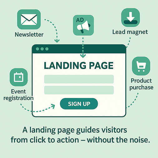
In other words: it’s a page designed to guide someone from click to action — without the noise. Where your homepage says, “Welcome! Have a look around,” A landing page says, “Here’s exactly what to do next.”
Why It’s Not the Same as a Regular Page
If you’ve ever sent traffic from a paid ad or email to your homepage and ended up with disappointing conversion rates, this is why.
A homepage is meant for exploration. A landing page is meant for action.
Here’s what sets it apart:
Think of it like this: Your homepage is the restaurant menu — lots of options, something for everyone. Your landing page is the waiter bringing exactly what you ordered to the table.
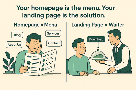
No distractions. Just the next step, served up.
What Are The Key Ingredients of a High-Converting Landing Page?
When I first started building landing pages, I thought each one had to be a masterpiece — custom layout, clever copy, fresh design every time. It was exhausting.
Eventually, I realized the truth: landing pages aren’t art projects — they’re formulas. Sure, creativity helps. But conversions come from nailing the essentials, not reinventing the wheel every time.
Chipo's Insight
Once I stopped chasing “wow” and started focusing on what actually works, building landing pages became way easier — and way more effective.
So if you’re staring at a blank page (or an underperforming one), start here. These are the ingredients that make a landing page do what it’s supposed to do: convert.
1. A Headline That Stops the Scroll
Your headline is the first impression — and sometimes, it’s the only impression. If it doesn’t clearly say what you’re offering and why it matters, your visitor is gone before the page even loads.
Forget vague “clever” wordplay. Say what the thing is, who it’s for, and what they’ll get. Even better? Match your headline to the ad, email, or social post that brought them here. It builds trust and keeps people moving.
And if you need more guidance, here is a clear guide on how to create headlines that stand out.
2. A Crystal-Clear Value Proposition
You need to remember that, when it comes to shopping online, people are skeptical, distracted, and probably multitasking. If they land on your page and can’t instantly tell what they’re getting and why it matters to them, they’re out.
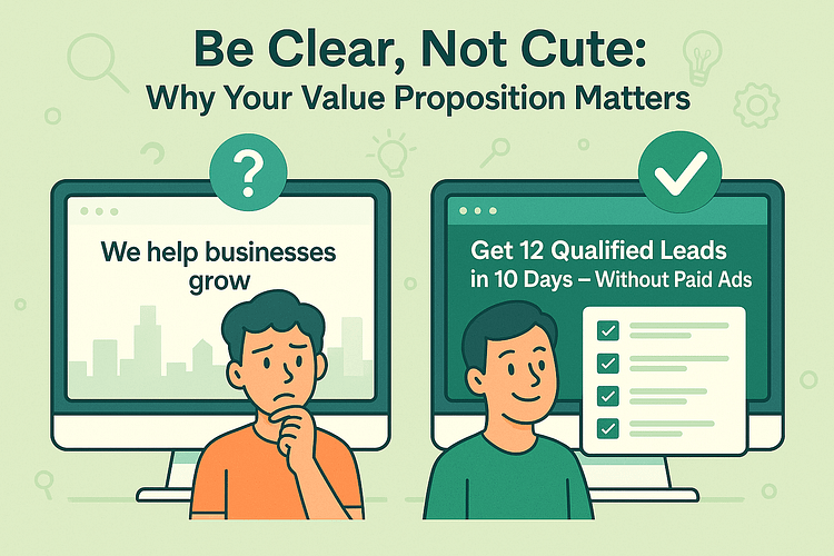
Your value proposition (your main offer) should be so obvious it feels like a no-brainer. Instead of saying, “We help businesses grow,” say, “Get 12 qualified leads in 10 days — without running paid ads.” Be clear, not cute.
3. A CTA That Demands Attention
The call to action (CTA) is the decision point — it’s what tells the visitor exactly what to do next. But it can’t just exist. It needs to stand out.
That means strong, action-first copy (think: “Get the Guide,” “Join the Workshop,” “Start My Free Trial”) — not lifeless buttons that say “Submit” or “Learn More.” Place it high on the page. Repeat it. Make it unmistakable. Style it like it matters.
And check out this guide on CTA click-through hacks to help you convert more visitors.
4. Focused, Scannable Copy
Nobody’s reading your landing page like it’s a novel. They’re skimming. So write like someone scrolling at 11pm on their phone — tired, impatient, and half-committed.

Use short paragraphs, bullet points, bolded benefits, and callouts to guide their eyes. Cut the fluff.
You’re not writing for your old writing professor — you’re writing for someone with 15 tabs open and 3 seconds of attention.
5. Proof That You’re Legit
We all need reassurance. And in marketing, social proof does the heavy lifting. It’s what tells your visitor, “Other people trust this — you can too.”
Use:
This isn't optional — it’s expected. Especially if you’re asking for an email or a credit card.
6. A Form That Doesn’t Make People Flee
If your opt-in form looks like a job application, don’t be surprised when people bounce. Every extra field adds friction — and friction kills conversions.
Ask only what you need (usually name + email). If you do need more info, break it up with a multi-step form or multiple choice form.
It feels lighter, and people are more likely to complete it.
But if you’re still feeling a little unsure and need more tips on creating the perfect opt-in form for conversions, check out these two tutorials:
7. Mobile-First Design (Always)
More than half your traffic is on mobile — maybe more, depending on your audience. If your landing page layout breaks on a small screen or takes too long to load, you’re losing conversions before you even get a shot.
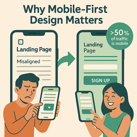
Design for mobile first, not last. Test your forms, CTA placement, and layout on multiple screen sizes. Small tweaks here make a big difference.
✅ Quick Landing Page Checklist
Before you hit publish, ask yourself:
🟢 Does the headline match the ad/email that brought them here?
🟢 Is the value obvious within 3 seconds?
🟢 Is there one clear call to action (CTA) — and is it repeated?
🟢 Is the copy short, focused, and scannable?
🟢 Did you include social proof (reviews, testimonials, logos)?
🟢 Is the form short, friction-free — or multi-step if needed?
🟢 Did you test the design on mobile?
🟢 Does it feel like a page built to convert — not just exist?
🧰 Types of Landing Pages (And When You Should Use Each)
Now that you’ve got the basics down — what a landing page actually is, why it works, and how to build one that converts — it’s time to zoom in. Because not all landing pages are built the same.
Different goals call for different pages. Whether you're focused on lead generation, selling a product, or moving people through your sales funnel, using the right type of page for your marketing campaign makes a real difference.
Let’s walk through the main landing page types and when to use each one to boost your conversion rate — without overloading one page with 12 jobs.
Lead Generation Pages
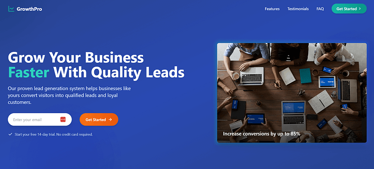
Also called lead gen or squeeze pages, these exist for one reason: to collect contact info. You offer something valuable — like a lead magnet, quiz as a lead magnet, or checklist — and they give you their email.
🟢 Best for
- Top-of-funnel digital marketing campaigns
- Building your list
- Segmenting leads for your sales funnel
Sales Pages
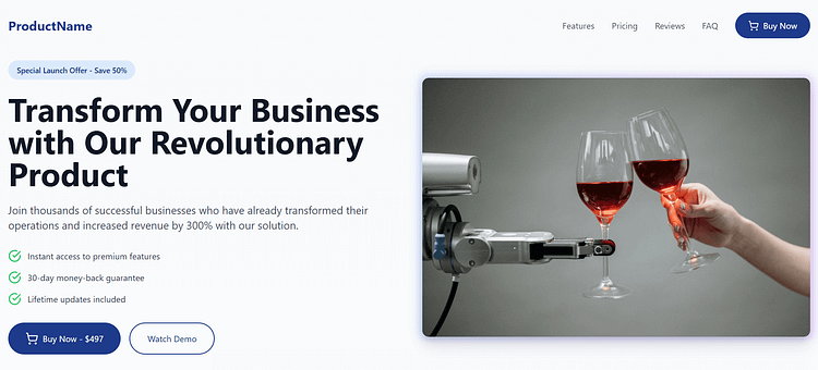
This is your “make the sale” page. It does the heavy lifting: showcasing benefits, handling objections, and delivering a strong call to action (CTA). Long-form or short-form depends on your offer — but either way, it’s built to convert.
🟢 Best for
- Product or service launches
- Course or membership sales
- High-ticket offers where trust matters
Webinar or Event Pages
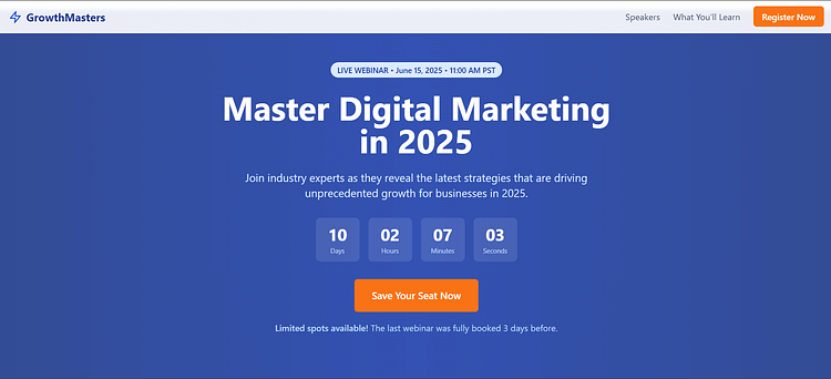
Need registrations for a live session? A webinar registration page is the one.
Your copy should highlight urgency, timing, and the value of showing up live.
🟢 Best for
- Live webinars, product demos, or challenges
- Capturing RSVPs
- Feeding your sales funnel with high-intent leads
Click-Through Pages
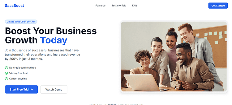
Think of this as a pre-frame. A click-through page gives just enough info to warm up cold traffic — and then sends them to a checkout or sales page to finish the job. No forms here — just clicks.
🟢 Best for
- Free trials
- Affiliate promotions
- Pre-selling offers with minimal friction
- Improving click-through rate
Thank You Pages
This page often gets ignored — but it shouldn’t.
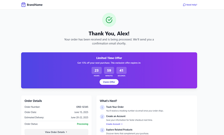
Use your thank you page to confirm the signup or purchase, deliver the promised value, and prompt the next step (like a referral, upsell, or joining your community).
🟢 Best for
- Post-signup momentum
- Low-friction upsells
- Building customer trust after the conversion
👉 So now you know what type of landing page you need — but how do you actually build it without wrestling with WordPress blocks or Frankensteining six different plugins together?
That’s where a landing page builder (like Thrive Architect) makes all the difference. Let’s break down why.
🚀 Why Use a Landing Page Plugin (Like Thrive Architect)?
At some point, I hit a wall. I understood what a landing page is. I knew how it fit into a sales funnel. But every time I tried to build one using my theme or the block editor, I ended up rage-Googling how to remove a header. Or a sidebar. Or that annoying background color that wouldn’t go away.
That’s when I realized: Your average WordPress theme is made to look nice — not to convert.
Why Your Theme Builder or Gutenberg Blocks Just Don’t Cut It
Here’s what you’re up against if you try to build a high-converting landing page using the default tools:
In short: if you’re serious about conversion rate — your tools need to be too.
💡 What You Get With Thrive Architect
Once I switched to Thrive Architect, I stopped fighting with my landing pages — and started optimizing them. And this wasn’t my first tool, by the way. I tried several other builders (won’t name names) before I landed here.
(See what I did there?)
But Thrive Architect was the first one that actually felt built for marketers — not just designers or developers.
Here’s what sold me:
And most importantly? It works — I’ve seen real improvements in signups, click-throughs, and campaign performance.
If you care about results — not just aesthetics — Thrive Architect is my go-to. Every single time.
🎯 Positioning CTA
Want to build a focused, flexible landing page without wrangling code or compromising on conversions?
👉 Try Thrive Architect — and build smarter.
🧪 Go Beyond Basic — Level Up Your Landing Pages
Once your landing page has the fundamentals — headline, offer, strong call to action (CTA) — you could stop there. But we don’t do “good enough” around here.
If you want to boost your conversion rate, keep people engaged, and squeeze more value out of your digital marketing strategy, here’s how to go next-level:
Personalization That Feels Personal
Don’t treat all traffic the same. Use personalized landing page elements based on ad source, quiz answers, or user behavior. Thrive Architect’s conditional display feature lets you swap out blocks, headlines, and CTAs dynamically — no code needed.
Example: Personalization in Action
Visitors from Facebook see a different offer than people from your email list. It’s a small tweak that can make a big difference.
Segmented Thank You Pages
The post-conversion experience matters. Use your thank you pages to deepen engagement by segmenting based on what they signed up for — or how they answered your form or quiz. This keeps your sales funnel feeling like a guided journey, not a dead end.
Gamification (That Doesn’t Feel Gimmicky)
Want higher opt-in rates and more qualified leads? Use a quiz, challenge, or giveaway. Tools like Thrive Quiz Builder make it easy to add interactivity and segment leads from the start.
📈 How to Know What’s Working (and What’s Not)
I remember launching my first real landing page — and obsessively refreshing the page views like that alone would boost conversions. Spoiler: it didn’t.
What I should have been looking at was whether anyone was actually taking action. Clicking the call to action. Signing up. Buying. And if not — why not?
That’s where testing and optimization come in. If you’re not tracking what’s working, you’re not improving — and that’s a waste of good traffic (and time).
What to A/B Test
Don’t test everything at once. Start with the things that actually move your conversion rate:
Even small tweaks can lead to big results — especially if your landing page is part of a high-traffic digital marketing campaign.
Tools That Make Testing Easy
Here’s what I use (and actually recommend):
Hot Tip!
Sometimes it’s not that your offer is bad — it’s just that your CTA button is in the wrong spot, or your form looks overwhelming on mobile.
❓ FAQs About Landing Pages (That People Actually Google)
I used to Google half of these myself — usually mid-campaign, mid-panic, and mid-coffee. So if any of these are rattling around in your head, here’s the clarity you need.
To get your visitor to take one specific action. That might be signing up, downloading something, registering, or buying — but the key is focus. No menus, no side quests — just a clear call to action (CTA).
Yes. Your website is your brand’s home base. But a landing page is your best shot at improving your conversion rate for a specific marketing campaign. Sending traffic to your homepage is like taking someone to a food court and hoping they guess what you’re selling. A landing page says, “This is the offer. Here’s the button.”
As many as you have offers, audiences, and campaigns. A good rule? One landing page per goal, per traffic source. Don’t try to make one page speak to everyone — that’s how conversions tank.
We’re biased — but for good reason. Thrive Architect is designed for marketers who want control, speed, and conversions without needing to code or rely on clunky templates. With pre-built designs, native integrations, and A/B testing, it’s not just the easiest option — it’s the most strategic.
🎯 Conclusion — What Is a Landing Page? It’s the Start of Real Results
If your campaigns haven’t been landing, it’s not because you’re bad at marketing. You might just be missing the one tool that ties it all together.
Chipo's Realization
I used to treat landing pages like just another task — something to quickly design and check off. But the truth is, when I started seeing them as focused, strategic conversion points… everything shifted. It stopped feeling like I was throwing content into the void. Clicks turned into signups. People actually took action. And for the first time, I saw my marketing doing what it was meant to do.
If you’ve been sending traffic to your homepage and wondering why nothing sticks — If you’re tired of beautiful pages that don’t do anything — If you know your offer is solid but the results just aren’t there yet —
You’re not alone. And you’re not doing it wrong. You just need the right foundation.
Your Next Step: Thrive Architect
👉 Thrive Architect gives you the tools to build real, high-converting landing pages — without the stress, confusion, or guesswork.
You’ve got the message. Let’s make sure it lands.



Is the https://thrivethemes.com/ homepage the landing page?
And is the Thrive home page A/B Test according to Goal as Visit Goal Page to Thrive Suite?
Hey there!
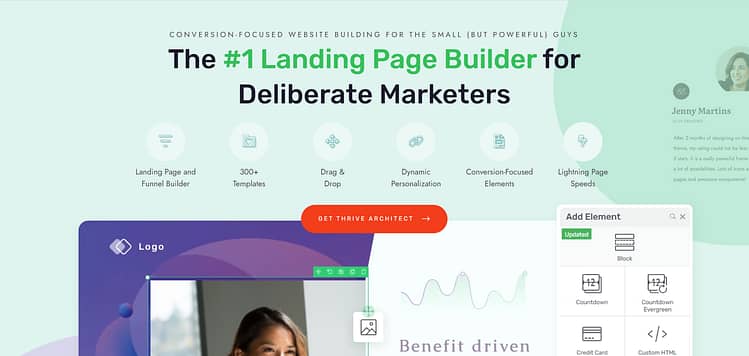
For your first question, no. Our homepage has elements of a landing page (CTA buttons, testimonials, relevant images) but it serves to introduce our visitors to our products — which then leads them to different landing pages (for Thrive Suite, Thrive Architect, Thrive Quiz Builder, etc.). An example of one of our landing pages would be: https://thrivethemes.com/architect/
Regarding your second question, an A/B test would work better for a landing page that is focused on a single goal (e.g. getting visitors to start a free trial, opt in to a form, or buy a product), so you can see which page helps achieve that goal more.
Thank you many