Searching for top-notch tips on how to create a beauty and cosmetics website? You've come to the right place 💄✨
Having a beauty website is fantastic, but if it's not turning browsers into buyers, you're missing out on potential sales.
If web design and digital marketing aren't your areas of expertise, you might be struggling to make your site work its hardest for your brand – but don't stress, we've got you covered.
Dive into this guide to uncover 16 practical, effective tips to create (or upgrade) a beauty and cosmetics website that consistently attracts new customers and helps your business flourish.
Get ready to transform your online presence and make your beauty brand shine.
Is Your Beauty Website Not Performing as Well as You'd Hoped?
You've put a lot of work into creating your beauty brand. Your skincare, make-up, or cosmetics products are great, and you're passionate about what you do.
But when you look at how your website is doing, the numbers aren't what you expected. You're not getting as many online store sales as you thought you would.
This is a common problem in the beauty industry. You know your products are good, but your website isn't connecting with potential customers. You might be worried that you're missing out on sales, or that other brands in the cosmetics industry are doing better than you.
Don't worry - you're not alone. Many beauty business owners face this issue. The good news is that you can make your website much better at attracting customers and making sales with a few key changes.
In this post, we'll show you 16 ways to improve your beauty and cosmetics website. Whether you're not getting enough visitors, not turning visitors into customers, or just feeling stuck, these tips will help you turn things around for your small business.
Ready to stop worrying about sales and start growing your beauty business? Let's get started and make your website work harder for you.
Tips to Create a Beauty and Cosmetics Site That Lands Sales and Signups
This list includes actionable tips you can implement today to attract more customers for your beauty & cosmetics business and take your brand to a higher level.
1. Build Your Website with the Right Tools
When it comes to creating a solid beauty and cosmetics website that stands out, using the right tools from the get-go can make a world of difference — and lead to more clients, customers, and sign-ups.
Think of it like building a house – you want a solid foundation and quality materials, right?
Thrive Theme Builder and Thrive Architect are the best WordPress site-building duo to make that happen.

Thrive Theme Builder, our WordPress theme-building plugin, lets you build your site from scratch, with speed, user-friendliness, and conversion-focus as top priorities.
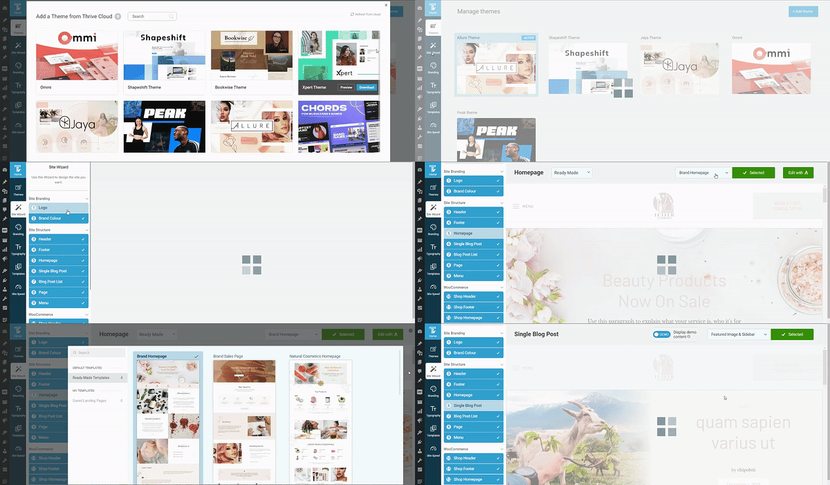
Thrive Theme Builder in Action
You also get access to Allure, our companion theme for online beauty brands, cosmetics stores, skincare brands, and influencers in similar fields.

With this set of templates, you can build a professional-looking website design in less than an hour.
And once you’re done, you’ll hop in to Thrive Architect to customize your page templates and turn them into your unique site.
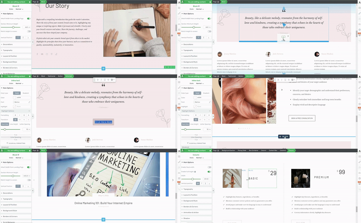
Thrive Architect in action
Equipped with drag-and-drop functionality and a library of high-quality
landing page
templates, you’ll have everything you need to boost your conversion rates and grow your business. In addition to these tools, you also get access to a selection of design elements to customize your pages even further.
From countdown timers to lead-generation forms and pricing tables – you get everything you need to make people convert.
Thrive Theme Builder and Thrive Architect are the tools that’ll take your beauty or cosmetics brand from regular to top tier – and for a steal of a price.
Don’t let this opportunity pass you by.
2. Write Clear and Helpful Product Descriptions
Product descriptions should be easy to understand and informative. A good description includes:
What the product does
Main ingredients and their benefits
How to use it
Who it's best for
What results to expect
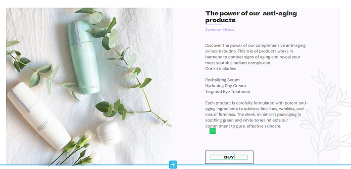
For example: "Our Hydra-Boost Face Cream keeps skin moist for 24 hours. It uses hyaluronic acid to make skin plump. Put it on in the morning and night after washing your face. It's great for dry or older skin. Your skin will feel softer and look brighter in about two weeks."
See?
Simple language helps all customers understand what they're buying. To strengthen the product’s value, add real customer reviews and 'before and after' photos to show how well the product works.
Clear descriptions help shoppers feel sure about what they're buying and can lead to fewer returns.
Thrive Tip: Want to learn how to create product descriptions and website copy that leads to conversions? Check out these copywriting tips.
3. Offer Online Booking for Your Services and Appointments
If you run a business that strongly depends on appointments — e.g. a spa or beauty salon — this step is especially important for you.
Make it easy for visitors to book services or sign up for beauty subscriptions right from your site.
Add a user-friendly booking system that lets people schedule appointments in just a few clicks. For subscriptions, create a simple sign-up form that leads straight to checkout. The smoother the process, the better.
Your booking tool should clearly show available slots for each service. Let customers see your full schedule and pick a time that works for them. For subscriptions, list your options and prices upfront.
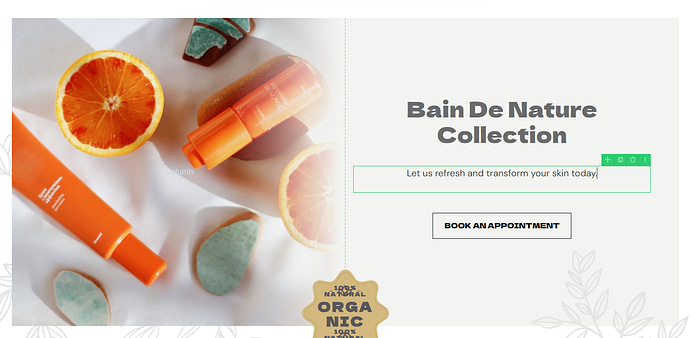
You should also display real-time availability for services like facials, massages, or makeup sessions. For product subscriptions, offer tempting options like monthly skincare boxes or seasonal makeup collections.
Include features for easy rescheduling and subscription customization. This flexibility can be a big draw for busy customers.
There are plenty of great booking and subscription tools for WordPress sites (e.g. WPAmelia, Calendly, etc.). Find one that fits your needs and plays well with your current setup. Your customers will appreciate the convenience, and you might just see your bookings climb.
4. Create a Special Section for VIP Clients or Customers
Why not create a special area on your website just for your loyal customers? This VIP section can make people feel valued and encourage them to keep coming back.
In this exclusive space, offer perks that non-members can't access. You could include things like:
Tutorials from top makeup artists
A private forum for beauty tips and discussions
Early access to new product launches
Discounts on your cosmetics line or partner brands
Personalized skincare advice and tracking
Make joining this VIP area a breeze. Use a clear call-to-action on your main page to highlight the benefits. Once people are in, keep the content fresh. Regular updates give members a reason to visit your site often.
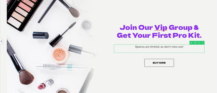
This VIP section is the perfect way to build a beauty community around your brand. When customers feel like they're part of something special, they're more likely to stay loyal to your products.
Set up the sign-up process to be quick and simple. Offer different membership tiers if you want, each with its own set of perks. Remember to make the value clear - show them exactly what they're getting for their loyalty.
For creating a membership platform (and payment system) our top recommendations are Thrive Apprentice and MemberPress.
Pro Tip: Did you know that you can use Thrive Apprentice, one plugin, to create an interactive membership platform for your business? Check out this handy guide to learn more.
5. Use Popups to Entice Hesitant Customers
Popups, when used strategically, can be a powerful tool to engage visitors and boost conversions. They're especially useful for catching the attention of hesitant customers who might be about to leave your site.
Think about using exit-intent popups that appear when a visitor moves their cursor towards the browser's close button. These can offer a special discount, a free sample with purchase, or a reminder about items left in their cart.
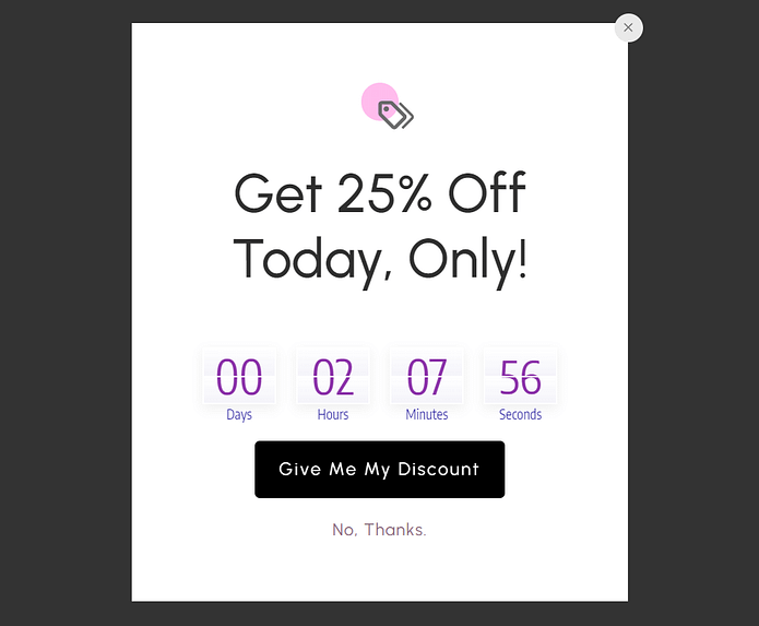
You can also use timed popups to showcase new products or limited-time offers after a visitor has been on your site for a certain period. It’s a great way to create a sense of urgency and encourage purchases.
Remember to keep your popups mobile-friendly, as many customers shop on their phones. Make sure they're easy to close and don't obstruct important content on smaller screens.
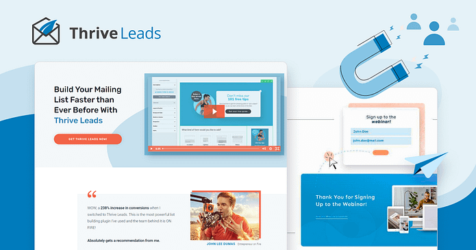
For creating high-quality popups, we recommend Thrive Leads.
This WordPress plugin offers a variety of popup types and templates, advanced targeting options, and A/B testing capabilities. It's user-friendly and integrates well with many email marketing services, making it easy to capture leads and nurture potential customers.
With this tool, you can create popups that match your site's design and offer real value to your visitors, turning casual browsers into loyal customers.
6. Use a Reliable Tool for Your eCommerce Website
This is especially key for beauty, skincare, haircare, and other retailers who will be selling through their website.

Choosing the right eCommerce platform is vital for your store website's success.
A good platform not only makes managing your online store easier but also provides a smooth shopping and user experience for your customers.
Look for a platform that offers:
Secure payment processing
Mobile-friendly design
Easy product management
Integration with your inventory system
Customizable themes to match your brand
Popular options like WooCommerce, WP Simple Pay, or ThriveCart are well-suited for online businesses. They provide solid features and regular updates to keep your store running smoothly.
Take note of your specific needs when choosing. If you're just starting, you might prefer a user-friendly platform with straightforward setup. For larger catalogs or more complex needs, look for platforms with advanced features and scalability.
7. Add a Social Media Feed to Your Homepage
Keep things fresh and add a social media feed to your website to show off your beauty brand's sparkle. Your visitors get a front-row seat to all the glam and glow happening in your community in real-time.
Pick the social platforms where you shine brightest and your audience loves to hang out.
For example, Instagram is a must for businesses in your niche – perfect for flaunting fierce makeup looks, skincare routines that work wonders, or behind-the-scenes peeks at your brand in action. And just about every beauty enthusiast is on TikTok too, so this could be a good place to meet more of your target audience.
And the best way to sprinkle that social media magic on your landing page? A social media feed plugin, of course!
There are plenty of fantastic options out there that'll help you add an eye-catching social media feed to your web pages without breaking a sweat (or your website).
And the best way to embed social media on your landing page is to use a social media feed plugin.
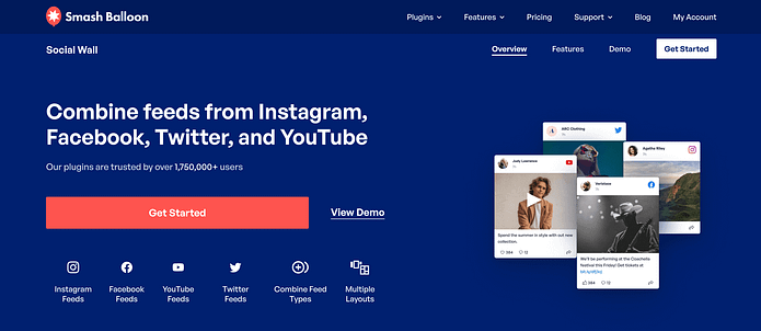
Our number 1 recommendation: Smash Balloon.
This plugin helps you add an eye-catching social media feed to your webpages without needing to code.
In less than 15 or 20 minutes, you can have your Instagram, TikTok, or Twitter feed on your site – with no hassle. Take a look at this guide to learn more.
Thrive Tip: Place these feeds where they'll catch the eye but won't distract from important info like class schedules or sign-up buttons. A sidebar or footer often works well. Make sure the feed updates automatically so your site always feels fresh and current.
8. Post Reviews from Current & Previous Clients
Nothing sells your beauty products better than glowing customers raving about their radiant results — social proof.
Gather reviews from a mix of your customer base - newbies who've just discovered their favorite product, long-time fans who've seen their skin transform, and everyone in between. Ask for the juicy details about their experience. What changes have they noticed? How has your product line helped them achieve their beauty goals?

And don't just tuck these gems away on a hard-to-find testimonials page. Sprinkle them throughout your site where they'll catch the eye. Pop a skin-clearing success story next to your acne-fighting line, or a radiance-boosting review near your vitamin C serum description.
Make these reviews pop off the page. Use before-and-after photos of your clients (with their blessing, of course) to show the real-deal results. If you can, throw in some short video testimonials too - seeing a real person's glow-up can be seriously persuasive.
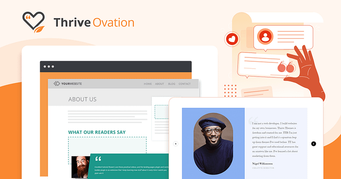
And if you need a testimonial management plugin to help you put your testimonials in the right places – take a look at Thrive Ovation.
This tool lets you collect, manage, and display testimonials right from your WordPress dashboard – saving you a lot of time.
Pro Tip: Asking for testimonials shouldn’t feel awkward. Follow this guide to learn how to collect testimonials like a business pro.
9. Engage Your Potential Clients with a Personality Quiz
People love learning about themselves, and your target audience is no exception. A quiz can be a fun, interactive way to engage visitors and guide them towards products that suit their needs.
A few good ideas could be:
"What's Your Skin Type?"
"Discover Your Perfect Fragrance"
"Find Your Ideal Makeup Style"
These quizzes will entertain your visitors and help them navigate your product range. As you ask about their preferences, concerns, and habits, you can provide personalized product recommendations at the end of the quiz.
Quizzes are also great for collecting valuable data about your audience. You can use the results to tailor your marketing efforts and even inform product development.
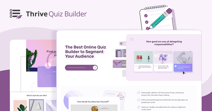
And if you want to create a quiz that’ll drive your engagement all the way up – you need to use , we recommend Thrive Quiz Builder. This WordPress plugin offers a variety of question types, branching logic, and attractive designs. It's user-friendly and allows you to create quizzes that match your brand's aesthetic.
You can also integrate the quiz with your email marketing system to follow up with personalized offers based on quiz results.
Thrive Tip: And if you aren’t sure how to create your first personality quiz, hop into this detailed guide. We’ll walk you through every step.
10. Make Your Website Mobile-Friendly
More and more of your potential customers are browsing on mobile, especially when looking for local beauty stores or products. So, you need to make sure your website looks great and works well on all devices.
Start by using a responsive design for your site. Many popular website builders and themes include this feature, so you might be halfway there already.
If this is the case for you, then that means your pages will automatically adjust to fit different screen sizes, from phones to tablets. Buttons should be easy to tap, and text should be readable without zooming.
Make sure your product images look good on smaller screens, and that your checkout process is smooth on mobile. Test your site on different devices to catch any issues.
Remember, a poor mobile experience might send potential customers to your competitors. Keep it simple, keep it functional, and you'll see more mobile visitors turning into customers.
11. Include a Clear Call-To-Action (CTA) on Each Page
Your visitors can't enjoy your products if you don't show them how to get started.
Put a clear call-to-action (CTA) on every page of your website and tell visitors exactly what step to take next.
Your CTA sections should stand out. Add attention-grabbing headlines, clear visuals, and a button that's easy to spot. Keep the message short and action-oriented. Instead of "Sign Up," try "Start Your Skincare Journey" or "Get Your Free Sample."
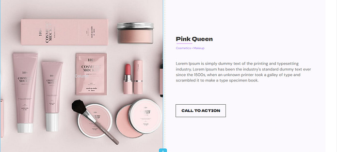
CTA Template from Thrive Architect
Change your CTA based on the page content. On a product page, your CTA might be "Add to Cart." On a makeup tutorial, it could be "Shop This Look."
Don't overwhelm visitors with too many choices. One main CTA per page is usually enough. If you need secondary options, make them less prominent.
Remember, your CTA should solve a problem and appeal to your visitors. Make it enticing, and you'll see more clicks turn into customers.
Pro Tip: Looking for more CTA hacks? Check out this handy guide.
12. Use a Blog to Educate Your Audience on Key Beauty Tips and Practices
One of the best ways to connect with your audience – and establish yourself as a go-to expert – is with an engaging, informative blog.
Write about topics your target audience can't get enough of. This might include:
Skincare routines for different skin types
Makeup tutorials for various occasions
How to address common beauty concerns
Explanations of trending ingredients or techniques
Keep your posts practical and easy to digest. Break up text with subheadings, bullet points, and stunning images. Aim to post regularly - once a week is a good goal if you’re starting out.
Maintaining an active blog is a clever way to boost your search engine optimization (SEO), which can lead to more prospects finding your site.
You can also repurpose these posts and turn them into social media posts, videos, and even podcast episodes (learn more about this content marketing strategy here).
Don't forget to end each post with a call-to-action. This could be inviting readers to try a free sample kit, sign up for your newsletter, or leave a comment with their own tips.
13. Optimize Your Website for Search Engines (SEO)
One of your goals should be to make your website easy for search engines to find and understand so more people can discover your business.
Use tools like LowFruits and WPBeginner Keyword Tool to find the keywords your potential clients might search for. Include these naturally in your page titles, headers, and content.
Think beyond just "beauty products" - try phrases like "cruelty-free skincare for sensitive skin" or "long-lasting lipsticks for all-day wear."

In terms of maintaining an SEO-friendly site structure, create separate pages for different product categories or beauty concerns – giving you more chances to rank for specific searches.
We also recommend optimizing your website for speed (check out this guide here). Search engines tend to favor fast-loading sites – and so will your visitors. So, compress images, minimize code, and consider using a content delivery network (CDN) to improve your site’s speed.
And if you have a physical store, don't forget about local SEO. Claim your Google Business Profile, get listed in local directories, and encourage happy clients to leave Google reviews.
Good SEO takes time. So, focus on creating a genuinely useful site for your visitors, and the search rankings will follow.
14. Offer Free Resources to Attract Visitors and Build Your Email List
Looking to pamper potential customers? Offer them a free sample of your expertise with a beauty-focused lead magnet.
These freebies serve multiple purposes: they attract new visitors, show offyour know-how, and kick off a relationship with potential customers. When you offer something valuable upfront, you build trust and increase the likelihood that people will explore your products later.
Think about what your target audience wants. This could be:
A downloadable skincare routine guide
An ebook on makeup tips for different occasions
A guide to choosing the right products for your skin type
A video series on application techniques
In exchange for these free resources, ask for an email address. Keep the sign-up form simple - just name and email is usually enough.
Once someone signs up, deliver the lead magnet immediately (learn more here). Then, follow up with a series of helpful emails. This nurtures the relationship and gently introduces them to your paid offerings.
15. Make it Easy for Curious Prospects to Contact You
Some visitors may have questions after perusing your site. Make it easy for them to reach you by adding a contact page to your website.
You should put up your contact info where it's easy to find, and include a simple contact form for those who prefer to write.
Display your phone number, email, and physical address in the header or footer of every page. If you have multiple locations, list them all or link to a "Locations" page.
16. Be Proactive with an FAQs Section
A well-crafted FAQs section can be a valuable asset to your beauty website. It serves as a readily available resource for customers, answering common questions and providing important information about your products and services. By anticipating and addressing customer queries, you can enhance the shopping experience and build trust with your audience.
Include information on:
- Product ingredients and potential allergens
- Application tips and best practices
- Shipping and return policies
- Ethical considerations (cruelty-free, vegan options)
- Recommendations for different skin types or concerns
Keep answers clear and concise. Organize questions by topic to help visitors find information quickly.
Next Steps: Create a Lead-Generation Funnel to Grow Your Email List
Now that you've optimized your beauty website, it's time to focus on lead generation to grow your customer base. Creating a lead-generation funnel is a powerful strategy to expand your email list and nurture potential customers. Start by offering a valuable free resource - like a skincare routine guide or makeup tutorial video - in exchange for visitors' email addresses.
Here are four additional tutorials to help you get your lead-gen strategy glowing:
Ready to Elevate Your Beauty Website?
You now have 16 key tips to transform your beauty website into a customer-attracting powerhouse. From SEO optimization to compelling product descriptions, these proven techniques are ready for you to implement and boost your online presence.
When you're ready to take your beauty website to the next level, consider using a website builder tailored for eCommerce and beauty brands.
Our top recommendation is Thrive Architect and Thrive Theme Builder.
This duo offers intuitive drag-and-drop interfaces, beauty-specific templates, and easy integration with booking systems and payment processors, making it simple to create a high-performing website without needing coding skills.
So, why wait? Start applying these tips today and watch your client base grow.
And when you're ready to supercharge your online presence, give this website-building duo a try today.


