Online quizzes are just a bit of fun, right?
Something to pass the time and test your knowledge.
They can’t possibly bring over 100,000 people into your marketing funnel...
… or can they?
Today, we’ll share the secrets of Kaye Putnam’s quiz-focused marketing funnel, and how it powers her highly successful online business, so you can learn how online quizzes can drive leads, grow your email list, boost your social media presence, and sell products by the bucketload.
You’ll discover:
- Kaye’s self-supporting social strategy she uses to get over 100k people to take the quiz
- How to balance giving value with building an email list
- The intelligent way she's using just the right amount of personalization in her email follow-up sequence.
More...
What's So Great About Quizzes, Anyway?
The biggest challenge with online marketing is convincing people why they should care.
Why should people interrupt their daily lives to give you a chance to share your message?
Or, in a word, engagement.
This is where online quizzes really shine– quizzes are fun, and fun is engaging.
But enough talk... let me prove it.
I’ve created a quick 6-question quiz using Thrive Quiz Builder.
Give it a whirl and test your knowledge!
Kind of fun, wasn’t it?
It took me 10 minutes to take this from an idea to a fully published, interactive quiz.
But how can you take a gimmicky tool like this, and transform it into a powerful engine that drives visitors, subscribers, and product sales?
Kaye Putnam has the answers below...
Kaye Putnam’s Quiz-Focused Marketing Funnel
Kaye Putnam’s course, Brandfluency, helps her customers improve their business by embracing and incorporating their brand archetype.
It costs $297 – not a high ticket item, but not an impulse purchase either.
If the term brand archetype has you scratching your head, you’ve realised Kaye’s first challenge:
- How does she sell an enigmatic and vague product?
- How does she communicate the benefits without asking people to read a sales page?
Here’s her secret…
By the time a visitor finds her Brandfluency sales page, not only are they already aware of their brand archetype, but they’re on fire with excitement about it too.
She is selling them their favorite subject: themselves!
Here’s the top-level overview of her genius funnel.
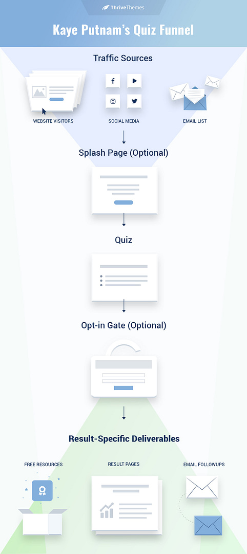
Kaye Putnam's Quiz-Focused Marketing Funnel
Today, we’ll explore Kaye Putnam’s quiz-focused sales funnel so you can apply the same strategies to your own website.
How Kaye Gets People to the Quiz
It’s obvious that Kaye’s free quiz is the main target of her marketing funnel.
She commits to it hard, both onsite and offsite.
Offsite, her social media marketing constantly encourages people to consider their archetype.
Quizzes — especially personality type quizzes, like Kaye's — are great for social media sharing; they appeal to our natural vanity and self-interest, and they’re a fun online distraction with a hint of gamification.
Onsite, her website has what I call a quiz-focused design.
Everything on Kaye’s website is designed to get people to her quiz. It’s the first and last call-to-action on many pages:

This call-to-action is above the fold of Kaye’s homepage. It’s unmissable.
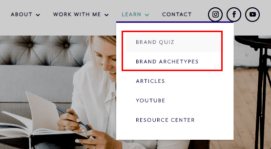
The quiz is a prominent item in the main navigation menu.
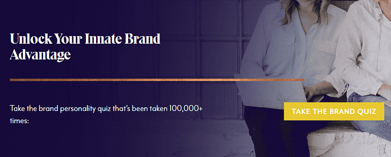
Call-to-action blocks promote the quiz throughout the website.
What does this tell us?
It’s clear that Kaye wants everyone to take her quiz!
… but why?
What are the tangible business benefits to driving people towards an online quiz?
Kaye uses her quiz to:
- Offer a fun and engaging piece of interactive content for visitors.
- Grow her email list.
- Encourage subscribers to self-segment based on their answers, allowing Kaye to market to them in the most effective way.
- Improve conversion rates, by letting Kaye connect visitors to products that are more relevant to them.
- Encourage social media sharing.
Breaking Down the Quiz Page
We can see that Kaye Putnam’s quiz is a critical component of her online sales strategy.
But how does it work? What’s her secret?
Let’s throw ourselves into the start of her marketing funnel, to see how it all fits together!
Starting with her quiz page...
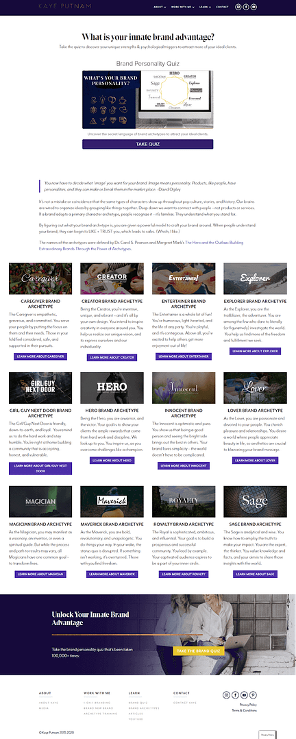
The start of the quiz itself, including the splash page element and benefits-driven headline.
The Hero Call-to-Action
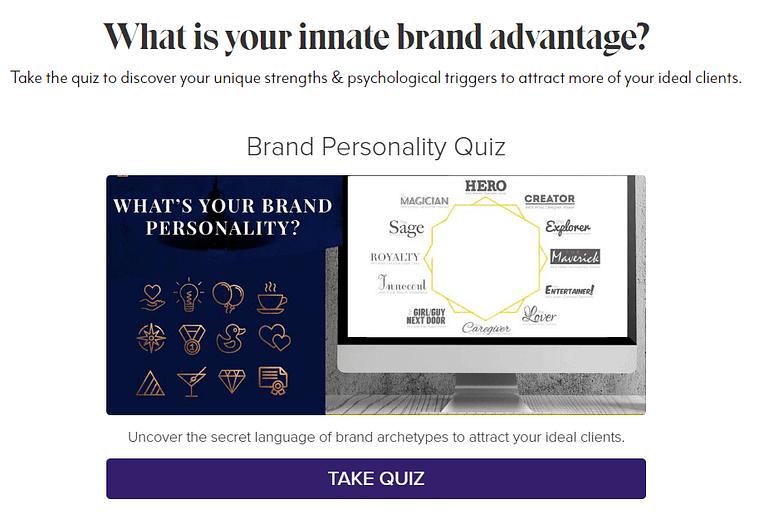
The splash page hero element of Kaye Putnam's quiz.
Kaye’s hero call-to-action on her quiz page is beautifully designed and features clear, compelling language.
We can already see the zodiac-like brand personality results, both in professionally-designed icons and around the wheel with individual font-faces.
Why This Works
The imagery suggests that each brand archetype has its own individual identity and personality.
The similarity to the zodiac feels deliberate; 12 archetypes around a wheel, each with a name and a symbol. It’s a framework that should be familiar to most Western audiences.
Kaye’s use of language is also immediately positive, and appeals to our vanity and sense of individuality...
You have an “innate brand advantage” and a “brand personality” with “unique strengths”... all that remains is for you to take the quiz and discover them.
How YOU can do this too
We call this introductory page a splash page – a term used for similar opening designs in newspaper printing from even before 1927.
Creating a great quiz splash page is easy. You can either:
- Design it yourself, using images, text and button elements from within Thrive Architect.
- Choose from Thrive Quiz Builder’s pre-designed splash page templates.
It’s important that your quiz splash page communicates the benefits and piques the reader's curiosity. That comes down to great copywriting and choosing an enticing image.
Explaining the Benefits and Science
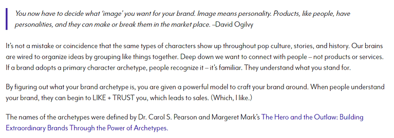
(Kaye realises her claims need backing up with science, so shares the background research here.)
Why This Works
Kaye appeals to authority (David Ogilvy, Dr. Pearson, Margaret Mark) to add legitimacy to her brand archetype quiz.
It lifts a “fun gimmick” into a science-based assessment that you can trust and build upon.
Rather than a trite online personality test, it becomes closer to a credible Myers-Briggs test for your business brand.
How YOU can do this too
Copywriting is a skill that anyone can improve.
Like any skill, it requires lots of practice to hone. However, you need to practice the right habits to see the best results.
Here’s a list of resources to help you improve your copywriting to connect with your audience and sell your products:
- The PAS Formula: A Fool-Proof Copywriting Technique You Can Start Using Today
- Copywriting articles: Learn how to Write Effective Content to Inspire Action
The Archetypes

Kaye offers her results pages before the quiz for anyone curious.
This is where things get really interesting… visitors can access all the brand archetypes immediately, without taking the quiz.
But doesn’t this defeat the purpose of a quiz?
Why does Kaye Putnam offer the results before the quiz?
The value of this quiz is not in hiding the information, but in guiding the reader the right result for them.
Why This Works
Kaye’s quiz is really an interactive tool for guided self-selection.
There’s no right or wrong answer – visitors are encouraged to learn about all the archetypes, and are even given the opportunity to change their result if they feel it doesn’t quite fit them.
Think of it as a way for visitors to self-identify (to themselves) and self-segment (to Kaye). The questions are just a way to lend legitimacy to the process.
How YOU can do this too
Each of Kaye’s archetypes has its own page, linked to from the grid layout above.
You can easily replicate this using Thrive Architect’s Post List element to automatically display your results pages in a professional layout.
Alternatively, you can manually create a grid using columns, buttons, and images.
Taking the Quiz
How is the Quiz Structured?
Kaye Putnam’s online quiz comprises 16 multiple choice questions, followed by a soft opt-in gate, and a results page.
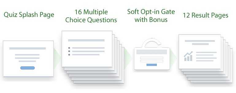
Kaye's quiz is simple, but effectively structured.
The answers are simple, like all effective quiz answers should be, and Kaye uses both text and images to keep the visitor engaged.
We won’t reveal all her questions, out of respect for Kaye’s hard work – you can take her test here – but here are a few examples of how she uses her online quiz to guide and segment potential customers.
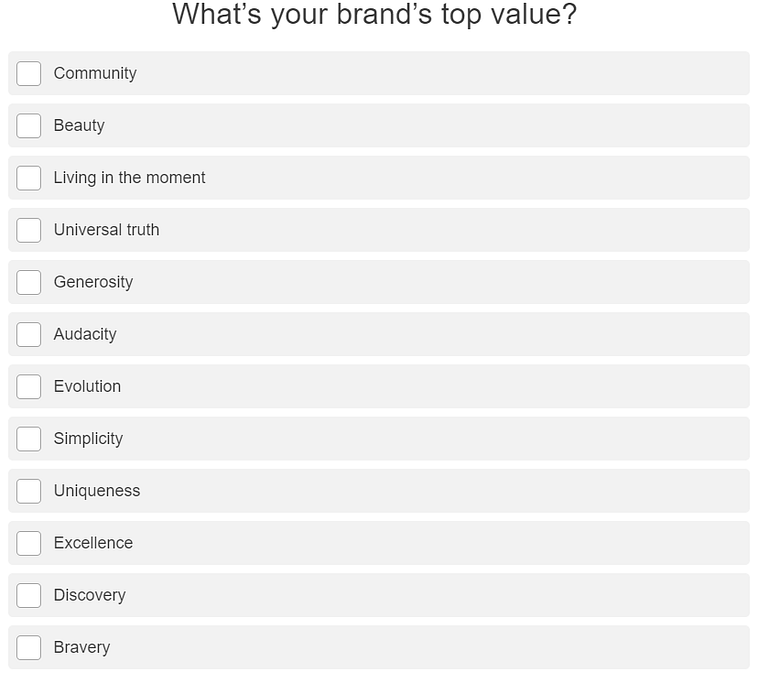
Text-Based Multiple Choice Questions
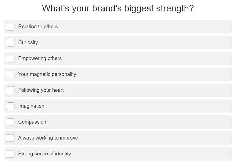
While researching this, I was struck by Kaye’s positive phrasing of her questions.
She seems to invite her visitors to find the best in themselves, making the entire process a fun, friendly experience.
How YOU can do this too
Text-based multiple choice questions are the bread and butter of quizzes.
You can easily create your own in Thrive Quiz Builder with the help of this tutorial.
You can see below how easy it is to create a multiple choice question with Thrive Quiz Builder.
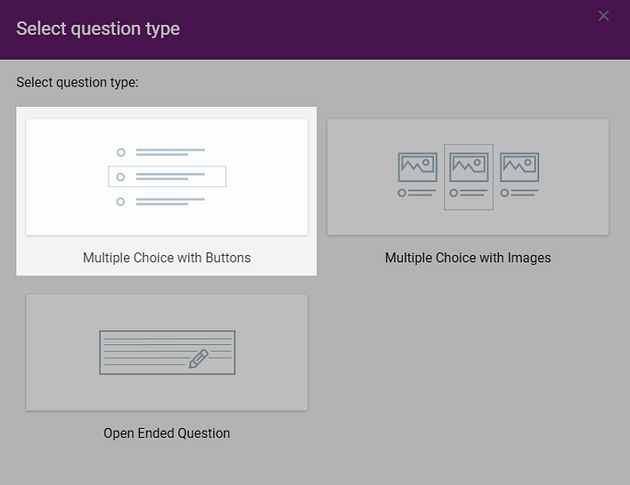
Choosing a question type in Thrive Quiz Builder.
Image-Based Multiple Choice Questions
Answers can often feel more fun and emotionally-driven with images. They’re also a great way to spice up the quiz experience so visitors don’t have to click through pages of boring text.
I love the way Kaye Putnam uses vibrant images of real people to offer additional opportunities for people to recognize themselves.

This image-based question injects some fun into the quiz experience.
Are you Luke Skywalker or Romeo, Jack Sparrow or Prince Eric?
Kaye could have simply asked, “Are you loyal and adventurous, or emotional and spirited?” – but the colorful images are a great way to keep the user engaged.

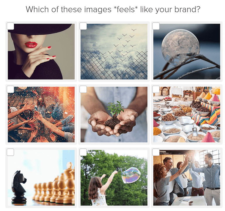
Let’s look at one more image-based question.
This time, it’s purely visual.
Kaye is asking for an emotional response, so she leaves out any text cues that could influence the answer.
From the visitor’s perspective, this forces them to study the images and demands their total engagement.
How YOU can do this too
It should come as no surprise to hear that image-based answers are easy to add with Thrive Quiz Builder.
The text is entirely optional, allowing you to create image-only answers just like Kaye Putnam.
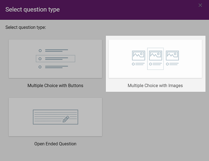
Adding images to multiple choice questions is easy in Thrive Quiz Builder.
Self-Segmentation and Answer-Based Tagging
Huge caveat for this section!
As outside observers, we have no way of knowing exactly what is happening behind the scenes with Kaye’s quiz funnel.
The questions could simply be used to generate the results page, or they could allow visitors to tag themself in Kaye’s email list. We just don’t know.
So in true journalistic fashion, we’ll hedge our bets... this section shows how self-segmentation is possible in quizzes like Kaye Putnam’s.
Quizzes are an exchange of value:
- Users get their promised brand archetype results
- Kaye gains new email subscribers, along with valuable insights into these potential customers
These insights can come from a powerful feature of quizzes – answer-based tagging and segmentation.
Check out this whopper of a question...
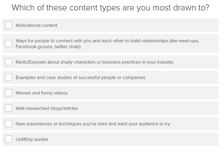
Not only could these answers be used to help define the brand archetype, but they could also encourage the visitor to tag themself in Kaye Putnam’s email marketing list.
Again, we’re talking possibilities, so here is how Kaye could use these answers:
- To focus her content marketing on the most selected content type
- To segment her mailing list by subscribers who prefer serious or relaxed content
- To retarget segments of her mailing list with different campaigns
Here are some more questions with the potential to encourage self-segmentation:

Discovering the fears that drive your audience can be an incredibly powerful insight too...
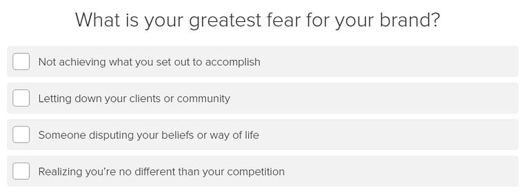
How YOU can do this too
Thrive Quiz Builder integrates with a host of leading email platforms to pass along tags based on the answers your visitors choose.
This means you can apply Kaye Putnam’s strategy to your own business!
The key is to craft questions that provide actionable insights that allow you segment your mailing list based on any tag you feel is relevant:
- Interest groups
- Demographics
- Content preferences
We have a step-by-step tutorial if you want to learn more – How to Build Tagged Answers in Thrive Quiz Builder
The Opt-In Gate
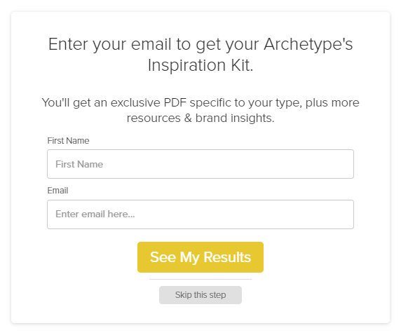
The opt-in gate element, also known as the lead generation element.
After answering the 16 questions in Kaye’s quiz, visitors see this soft opt-in gate.
A quiz opt-in gate is a barrier that prevents visitors from accessing their results, until they share their email address. They can feel deceptive if they block the results unexpectedly, but a soft opt-in gate offers the option of skipping ahead without sharing an email address.
Kaye’s form feels like an opt-in gate to access the quiz results, but look carefully and you’ll notice the headline now offers something completely different and new: an archetype-specific PDF inspiration kit.
Kaye is being a little tricky here – the results are available without subscribing.
So why would anyone give their email if they already know their archetype?
There are 2 reasons:
- Momentum carries them through the process
- Kaye offers a super valuable freebie that helps them understand their archetype even more.
Either way, I’ll bet it converts like hotcakes!
Why This Works
As mentioned, quizzes should be a fair exchange of value.
A quiz is free and valuable to the user; it’s only fair if the website receives something of value – in this case, a new email subscriber.
Kaye understands that her quiz results only provide 2 of the 3 components her customers need: their personal archetype, and information about what this means. They don’t know what to do with this information.
That’s where her email marketing and sales funnel take over.
How YOU can do this too
Thrive Quiz Builder offers a library of professional-designed opt-in gate templates, ready to customize with our visual editor.
Just click on an element, change the style, layout or content, and click Save.
It’s easy to add a "Skip this step" link, just like Kaye Putnam.

Notice the "Skip this step" link above? This gives visitors the option to see the results.
The Results Page
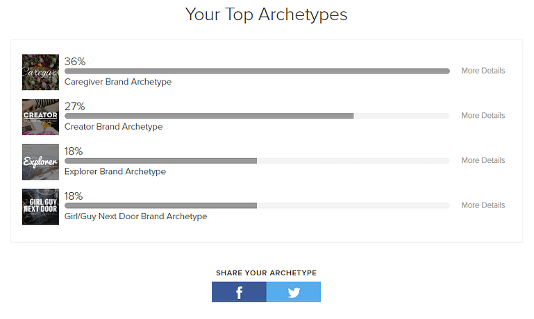
Kaye's initial results page shows the 4 closest matches based on percentages.
I have to admit, I was expecting more Wow-factor from Kaye Putnam’s quiz results page.
After answering 16 soul-searching questions, the visitor is given a choice of 4 archetypes that most match their answers. Each results page is linked to a separate archetype page.
But which one to choose?
Wasn’t that the point of the quiz?
It feels a bit indecisive and noncommittal.
But perhaps Kaye knows her quiz isn’t intended to focus on the results page – it’s really about growing and segmenting her mailing list.
Selecting an archetype from the list reveals what should probably have been a better initial results page:
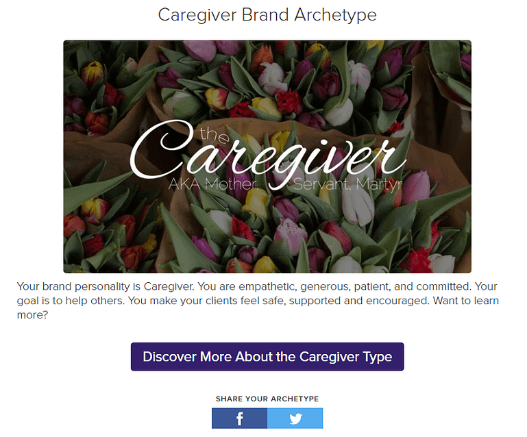
Choosing a result category page offers a teaser, with a link to learn more.
That’s more like it!
A confident declaration of my archetype, with a short description and a link to find out more.
Now to be fair, I selected answers at random. I’m not a caregiver, and I’m certainly not a mother, servant or martyr, but we have to assume these terms are carefully chosen to resonate with true caregiver archetypes.
Why This Works
People appreciate choice, but at some point, they also appreciate a conclusive result based on their answers. Kaye’s second results page delivers that result with a well-designed banner, a short teaser of the archetype, and one of 2 clear choices:
- Learn more about the archetype
- Share the results on Facebook or Twitter
It’s simple, attractive, and focused on guiding the visitor to the next action.
How YOU can do this too
Kaye uses a category quiz type – the visitor is awarded a final category based on his/her answers. With Thrive Quiz Builder, you can build this same type of quiz:
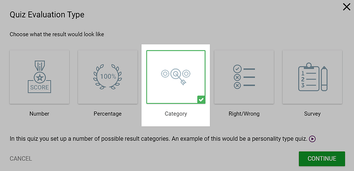
Category results can be selected in Thrive Quiz Builder.
Simply create your questions and answers, and link them to your category results (archetypes in Kaye’s case).
Note: Kaye’s results show multiple categories with different percentages. Thrive Quiz Builder works a little differently – the result must be a single category.
You can then dynamically generate a professional results page, along with any additional elements for each category!
Like this...
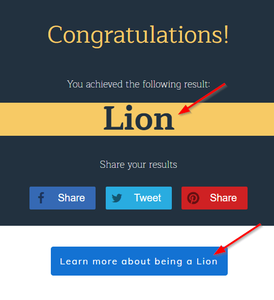
The results page can be tailored to each category result.
Thrive Quiz Builder comes with a choice of professionally designed results page templates, and everything is fully customizable, so you’re sure to find one that fits your brand.
And when I say customizable, I mean it…
Each category page can show different text and elements, with dynamic results.
But wait, there’s more...
You can even redirect each category result to a specific URL, like a landing page on your website. This lets you promote entirely different content and products to different quiz takers!
Tapping into the Power of Social Sharing
Did you notice the social sharing buttons on Kaye Putnam’s quiz results page?
Kaye encourages people to share their results on Facebook and Twitter, and she makes it easy by including a pre-written message widget...

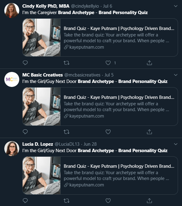
Twitter shows hundreds of similar social share posts by Kaye's quiz takers.
Why This Works
People love to share positive quiz results. It’s really that simple.
They’ll share anything… IQ score, personality traits, their Pokémon spirit animal!
Kaye’s quiz archetypes appeal to the perfect combination of accomplishment and vanity, giving her constant, free social media visibility and a self-promoting marketing funnel.
How YOU can do this too
How can you encourage people to share their quiz results on social media?
It sounds obvious, but they’re more likely to share positive results that show them in a good light. They need to feel proud of their result.
You can achieve this by making sure your result categories (archetypes in Kaye’s example) are all positive.
This helps you not only build a share-worthy quiz, but also a respectable looking social share badge with Thrive Quiz Builder.
Breaking Down the Archetype Page
The final quiz results lead to 1 of 12 seriously impressive brand archetype pages.
This feel-good page is designed to attach positive associations with the visitor’s archetype, by pointing out positive traits… considerate, thoughtful, kind, generous.
You’re not just a generic caregiver archetype, you’re in the same club as Princess Di, Angelina Jolie, and Johnson’s Baby!

One of twelve category-specific pages for each of Kaye Putnam's twelve possible archetypes.
Throughout this comforting archetype page, Kaye has deftly woven 5 call-to-actions that will appeal to different people depending on their personal journey and needs.
The Low Barrier ‘Learn More’ Call-to-Action

The first call-to-action is a professionally produced video for each archetype.
I won’t embed it here out of respect for Kaye’s hard work, but you can watch it yourself on her archetype page.
It’s a feel-good video that adds trust and reassurance (and Kaye’s voice!) to the marketing funnel.
At the end, she pitches her paid course…
If you want a shortcut to [apply the knowledge to build a better brand], I invite you to check out Brand Fluency.
I have 12 different courses, 1 for each archetype that tells you exactly how you can incorporate your archetype into your strategy.
How YOU can do this too
Low barrier calls-to-action require no commitment from the visitor, except their time of course – watching a video, reading related articles etc.
They offer an easy way to consume more content without introducing uncertainty.
So how can you offer a similar, low-barrier call-to-action?
- Shoot a quick video and embed it into your results page.
- Offer links to other content that closely aligns to the result.
- Provide a way to share the result on social media. You can do this with either social share buttons, or Thrive Quiz Builder’s powerful social sharing badge, a feature that lets visitors share an image of their results for all to see.
The Medium Barrier Free Call-to-Action

A free workshop or mini-course is a great alternative call-to-action to keep people in your funnel.
For people not ready to commit to a paid product, Kaye offers a free masterclass.
This is a mini-funnel itself – she’s extending her chance to convert on-the-fence visitors into paid customers later.
How YOU can do this too
Medium barrier calls-to-action are a great way to continue providing value when a visitor isn’t quite ready to buy a high-priced premium product.
They usually involve some degree of active participation, whether that’s through a daily email course, or a live online workshop.
Are you wondering what you can offer to your audience?
Here are some great resources to get you started:
- How to Run Great Online Events - A 6-part mini course on running workshops, webinars, classes and more.
- How to Create a Free Ecourse to Build Your List (Thrive Suite Exclusive Course)
The High Barrier Paid Call-to-Action
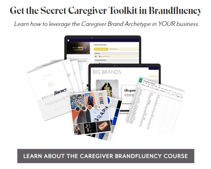
Kaye's premium product call-to-action is personalized with the archetype name.
The paid course itself!
It costs $297 for the first archetype, and $247 for additional ones.
Offering this high-ticket product now achieves 2 things:
- It introduces the product early, so it doesn’t suddenly appear out of nowhere later in the funnel.
- There will be some people who are ready to buy at this early stage.
How YOU can do this too
At this point, we’re talking about your main, paid products… courses, memberships, video series, premium downloads.
If you don’t yet have a paid product, you’ll find some great ideas and guidance in these free resources:
- How to Create an Online Course – that Makes Money (free mega guide!)
- This great post showcases the premium products offered by the pros. You’ll find lots of inspiration here!
If you do currently sell a premium product, then it’s time to up your call-to-action game!
- 21 Brilliant Call to action Examples to Boost Conversions - Tons of great visual examples to copy and modify.
- Adding a professionally designed call-to-action from our template library - There’s no need to reinvent the wheel. Thrive Architect comes with fully-customizable CTA templates to get you started.
The Value Exchange Opt-In Call-to-Action
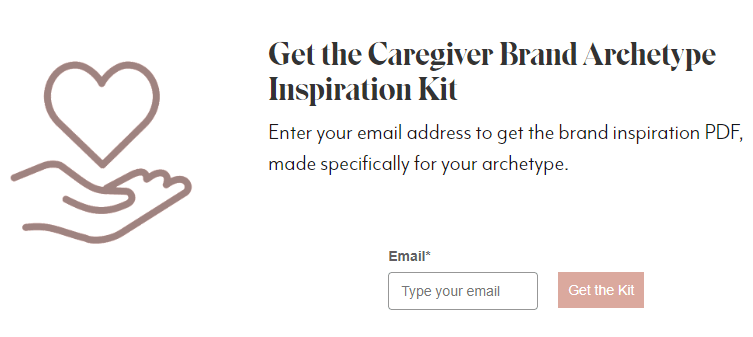
This may be your last chance to guide people to subscribe to your mailing list.
Not everyone who reaches this archetype page are email subscribers.
Maybe they browsed the archetypes without taking the quiz, or they skipped the opt-in gate step.
Whatever the reason, this is Kaye’s chance to add them to her email list.
Again, we see the value exchange – a free brand inspiration PDF for each archetype. The same one that was available when subscribing after the quiz.
This is a smart move by Kaye.
She’s plugging the holes in her marketing funnel by encouraging them to join the mailing list – she knows this may be the only time this particular individual visits her website.
How YOU can do this too
Offering a free resource in exchange for a visitor’s email address can be achieved with a number of different tools. Pick the method that best fits your current workflow and website setup:
- Thrive Leads offers a way to display beautiful opt-in forms on any pages you choose. That could be a single page, a group of pages, or even across your whole website. It offers automatic asset delivery, which means it can share your free resource as part of the opt-in process.
- Thrive Architect offers professional lead generation elements that you can display anywhere on your page. It allows you to automatically redirect a subscriber to a URL, where they can download the promised resource.
- Thrive Theme Builder and Thrive Architect offers professionally designed page blocks featuring effective opt-in form templates. Just drop them into your page, link up the opt-in form to your email service, and choose how you want to deliver the free resource.
The Last-Ditch Hail Mary Call-to-Action
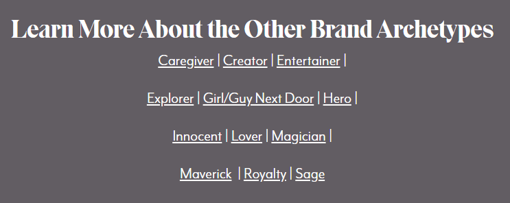
Kaye offers her visitors a final chance to find something that interests them.
If a reader has made it this far down the page without taking another action, it’s a fair assumption that they’re not sold on their archetype.
I certainly wasn’t expecting to be labelled a caregiver, along with the related terms mother, servant and martyr.
This section gives the reader a last chance to explore other archetypes – and maybe find one that more closely aligns with their internal image of their brand.
Kaye’s strategy never leaves a visitor at a navigational dead end; there’s always something more to read.
How YOU can do this too
Ask yourself, what can you offer your visitors if they’re not interested in everything else so far?
Try to be creative here – if your overt calls-to-action didn’t work, there’s no reason to think that similar ones will.
Here’s some suggestions:
- Offer links to your very best feature content.
- Show different results pages (like Kaye’s example) so visitors can change their mind.
- Showcase your offsite content, such as YouTube or Facebook.
- Speaking of Facebook, if you have an active community or group there, now’s a great time to show it. Maybe these visitors just need a little more active social proof before they engage with your brand.
Breaking Down Kaye Putnam’s Email Sequence
It’s hard to appreciate the effectiveness of Kaye’s full marketing funnel without subscribing to her mailing list.
So we did!
After completing the brand archetype quiz, subscribers receive a 3-day automated email sequence:

That’s not unusual in itself but Kaye, being Kaye, works some magic.
Let’s find out how…
Personalization Where It Counts
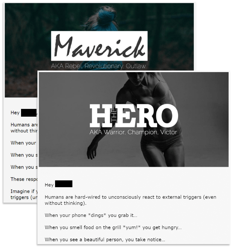
On our first quiz run-through, I identified as a Maverick archetype.
Here’s her first email:

But what happens if we identify as a different archetype, let’s say a Hero?

The email is personalized using quiz results data, but the content is exactly the same.
This is an incredibly smart move by Kaye.
There’s no compelling need to rewrite the emails for each of the 12 archetypes. The content is equally valuable to each archetype, and the personalization helps subscribers to better connect with the message.
Each variation comes with a different archetype PDF, so there is plenty of value beyond a generic message.
Emails 2 and 3 follow the same pattern...
Given the goal of Kaye Putnam’s archetype emails is to introduce and sell her paid course, Brandfluency, the genius part of this strategy is there’s no need to explain the purpose or benefits of archetypes during the sales process.
All that groundwork has been done in the quiz, results and emails.
At this point, all that remains is for subscribers to make a decision: to buy or not.
Why This Works
Personalization only needs to make sense to the individual. There’s no point creating unnecessary work if you’re confident the core message is universally valuable.
At one extreme end of the scale, you could hand-write a unique email to every subscriber.
At the other extreme, send a generic, cookie-cutter email.
Kaye has found the best balance for her business, by personalizing only what matters to her audience.
How YOU can do this too
Most professional email marketing platforms provide tools to send a pre-written sequence of emails over a predetermined period. It’s usually known as an autoresponder, automation, series or sequence.
They also offer ways to personalize your emails with subscriber information – in this case, archetype, using a tag that can be passed from the quiz results to the email service.
If your email provider doesn’t offer these features, ditch ‘em quick. They’re holding back your online success.
What Happens After The Quiz Funnel?
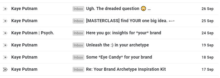
After going through the 3-day archetype series, subscribers start receiving Kaye Putnam’s regular broadcast emails.
This allows Kaye to keep in touch with news about content, events, sales offers and more.
How YOU can do this too
We’ve published a ton of valuable articles and tutorials on building your email list and crafting an effective email strategy.
Check them out and ask any questions you have in the comments below!
Key Takeaways from Kaye Putnam’s Quiz Funnel
There’s so much value to unpack from Kaye’s quiz funnel, it’ll take a while for it to all sink it!
In the meantime, here’s some important takeaways that will help you to get your quiz launched ASAP.
Consider how to design your funnel end-to-end.
How will you get people into your quiz?
How will you lead them through the quiz?
How will you segment and communicate with them afterwards?
Use our illustration of Kaye Putnam's funnel for inspiration.
Build a compelling splash page.
Really dial in and communicate the benefits of taking your quiz, whether that’s just the fun factor, or if your visitor can expect some deep insight from the results.
Complement your splash page with an enticing image, to provide your visitors with more than just text elements.
Link to this splash page from anywhere you want to promote your quiz, both onsite and offsite.
Take advantage of different question types.
Remember how Kaye uses both text-based and image-based multiple choice questions?
That’s a great way to keep the quiz moving and inject a splash of color into the experience.
Image-only answers can encourage an emotional response from visitors, making the quiz feel more engaging and personal.
Consider how you can encourage people to self-segment.
Of course, you should be tagging quiz takers based on their final quiz result category, but did you know you can also assign tags based on individual answers?
This can be a valuable way to let visitors tell you more about themselves for future segmenting and communication.
Capture your quiz takers’ email addresses
Use a quiz opt-in gate to either lock the results behind a subscription wall, or encourage them to subscribe with a compelling benefits-driven offer.
If subscription is required to access the final quiz results, make sure you’ve set expectations early to avoid user frustration.
If subscription isn’t required, think of ways you can sweeten the deal with an additional, valuable offer.
Offer dedicated landing pages for each result category.
To really get the most out of a quiz-focused marketing funnel, you’ll need to give people something more substantial than just a quick results snippet.
Kaye offers a landing page for each of her result archetypes so she can share the right message for each person.
Don’t forget to include a range of calls-to-action that appeal to people in all stages of their journey.
Personalize your follow-up communications based on your visitor's answers and results.
Build on the identity established in the results category. Whether they’ve been awarded the label of Maverick, INTJ Personality, or Squirtle Pokémon, be sure to tie this into your emails so they see continuity and personalization.
Encourage them to identify further with their result, so they feel receptive to any offers you send.
Encourage sharing of the result on social media.
Effective social sharing can encourage even more people to take your quiz, who in turn share their results. It’s a circle of automatic promotion for your marketing funnel.
To achieve this, you’ll need to make people proud of their results, and give them a super easy way to post to Facebook and Twitter.
Don’t forget to include a link back to the quiz in your pre-written social sharing snippets!
Here’s What I Need From YOU
Exploring other people’s marketing funnels can be inspiring, but you need to take action if you hope to improve your own online business.
You can find lots of other great articles that uncover the secrets of the pros.
But just reading isn’t enough.
Ask yourself, what action can you take – right now – to move forward?
Two suggestions:
First, think of a quiz you can incorporate into your website, and share it in the comments below. Even the driest of industry topics can be brought to life with a little fun and interactivity.
Second, take a look at Thrive Quiz Builder, our funnel boosting quiz solution. Watch the video, read the FAQs, and share your new online quiz idea with me in the comments below!


Fantastic information, David. I’ve been trying to decide how to implement quizzes in my funnels and you have provided an abundance of strategy. Thank you!
I’m glad you found some inspiration for your own strategy, Michele!
Thanks for the excellent content, resources and inspiration. Well done!
Thanks Jon.
Great just what I needed, thank you!
Glad to hear it, Anja.
Omg, what a detailed post about a quiz loop funnel as really hit the nail. I’ll be diggin even more into the Quizz builder funnel and segmentation possibilities .. Are there any advance tagging/category (result scripting/calculations way) ?
Hi Jonas,
What are you trying to accomplish?
At the moment, you can assign people to one category based on their answers or you can give them points and calculate a result that way (in number or percentage) and finally in the category quiz you can also add weight to make it even more granular (https://help.thrivethemes.com/en/articles/4497953-the-category-quiz-type-what-happens-when-the-scores-are-tied)
Very elaborate! Great example and well done breaking it down in pieces for us! Thank you!
Although the funnel is relatively simple, there was so much to say about it 🙂 I’m happy it was valuable for you.
Brilliant case study! I’ve just recommended it into Thrive Themes Official User Group 🙂
Thanks Vahn. I can’t wait to hear what the group think.
Thanks for the great article! We have a similar funnel set up. Question: when people don’t opt-in through the soft opt-in gate, but they do opt-in through an opt-in form on the results page, will the quiz answer tags still be sent to the autoresponder?
2nd question: in a category quiz, why not give us the ability to show the scores or rank of the other categories as well (with a shortcode…)? TQB clearly has that data and it can be very useful to see how small or close the gap is between different categories (f.e. on personality tests, some people fall somewhat in-between personality types).
3rd question: would you suggest removing the header and footer on pages with a quiz? We have noticed that in some quizzes (especially on questions with many answer options) the screen bounces up and down from one question to the next, providing not such a great user experience, and without the header and footer it just looks cleaner (+ people are not as likely to click away during the quiz). Just curious what your thoughts are.
Hi there,
1. Yes! The answer based tags will also be send to your email provider when they skip first the opt-in gate as long as the other form is part of the results page (not a URL redirect) To learn everything about answer based tagging you can go here: https://help.thrivethemes.com/en/articles/4426071-how-to-build-tagged-answers-in-thrive-quiz-builder
2. Thank you for the suggestion. It is something we would like to add in the future.
3. The less clutter to more focused people will be on the quiz. I think having the quiz embedded on a clean blank landing page is a good idea, although I would probably keep a logo or something to reassure your visitors they are still on the right site.
David,
Why does the share link after taking Kaye’s quiz on Facebook reference ‘TryInteract.com’ if she is using a Thrive Quiz template?
Hi David,
Kaye isn’t using a Thrive Quiz, Thrive David is just breaking down her quiz funnel and then showing you how you can do the same using Thrive Quiz Builder instead.
Спасибо!
Пожалуйста!
My reason for coming back to Thrive Themes … from the integrated nightmare. It will take some relearning to appreciate word press … but all I have to lose is continue to look like the others. Great job.
That is a brilliant break down of a funnel @David Lindop, thanks for all the work you put into this article. I’ve been wanting to not only segment but deliver a lead magnet for each part of my lead gen service , so that’s a great example I can model from . Cheers
Thanks Paul. Good luck with building your funnel!
A fantastic article – thank you so much! 🙂
If there’s one aspect that seems to be missing in every article that I’ve rad about quizzes, it’s this the content itself. I mean building the quiz, choosing the questions and connecting them to the results.
Even though I’m an expert in a certain subject doesn’t mean that I have the ability to design a quiz that delivers great results.
Say I want to build a quiz about what kind of friend you are (just an example).
First of all, how to choose the results categories – there could be so many different categories (a supporting friend, an outgoing friend, a reliable friend…), so I feel that it’s very tough to know how to pick the final ones so that they are truly helpful rather than just products of my imagination. Also, how can I avoid overlaps in categories?
Eg. if I choose five different categories, should I always have five questions on each page and only one pointing to one results category. What if there are overlaps where an answer might fit into several results categories? Should I then weight the responses differently? With what percentages? Or are there other ways to solve an overlap?
I don’t know if this is something that’s a 100% clear for everyone else, but I know that the difficulty of planning the content, questions, their connections with the results and the results categories themselves is what has kept me from building a quiz.
So, if anyone can point me to an article that covers these aspects, I’d be very thankful! 🙂
Thanks for the in-depth comment, Petra.
It sounds like you’re overwhelmed, and you’re not taking action because you’re trying to create a great quiz from the start.
My advice is to just get started, and fix any issues later!
Many of Kaye’s categories overlap, but like I said in the article, people take a quiz to be told their results, not to have to choose from 4 closely matching results with percentages. I LOVE Kaye’s quiz funnel, but I don’t personally agree with weighted categories.
Thrive Quiz Builder doesn’t currently offer multiple result categories, so this simplifies things.
Perhaps you can work backwards: start with the category results you feel work for your funnel, and choose a few answers that typify each result. Then write the questions.
Thanks for your comment David! Much appreciated!
Thank you David! This is a very timely post.
I took the quiz but it was a little confusing as a customer.
https://gph.is/g/4A1DwrO
Why was there 2 loading animations in the process?
From UX/UI perspective, it’s confusing and distraction for customers that may increase bounce rate.
I thought 1st loading animation was for loading answers… and then second loading animation started which confused me even more.
Besides, just using loading animation, I think it’d be more clear for customers if put little text to indicate something like ‘Analyzing your results…’ above loading animation while showing loading animation.
Just my two cents
Great feedback, Reona. Thank you.
I’ve passed this along to our developers for discussion.