


How do you design the perfect sales page for your online course?
Your sales page has many jobs: Keep your visitor’s attention, communicate value, outline features and benefits, answer questions and ultimately convince them that it’s worth their investment. It becomes your online salesperson.
No matter how many ads, webinars, emails, or funnels you create… your sales page is the final step.
Screw it up, and your potential customers are lost. You’ve got to get it right.
In this post we dive deep into the specific structures of sales pages for online courses by some of the greatest marketers and entrepreneurs around. You’ll learn from the best, with sales pages from:
- Brian Dean at Backlinko
- Joanna Wiebe from Copyhackers
- Derek Halpern from Social Triggers
- Marie Forleo's B-School
- Ramit Sethi from I Will Teach You to Be Rich, and
- Neville Medhora's Kopywriting Kourse.
We’re going to pull their pages apart and reverse-engineer the perfect online course sales page blueprint that will get you customers.
Read on!
More...
Online Course Sales Page Examples You Need to Follow
The sales pages that we are looking at today are not for entry-level products. The cheapest course here is sold for $499 and the most expensive sells for nearly $4000. Yes, you read that correctly.
These products are the backbone of their businesses. If these Sales Pages were to stop converting overnight, their companies could quickly go under.
They can’t afford to screw these pages up.
So, these examples have to be absolutely perfect, eking out maximum conversion rates and driving people through the sales funnel.
Now, one of the things to keep in mind here is that great marketers are always adapting. These pages will go through multiple updates, and they might look quite different depending on when you look at them. However, what doesn't change is the fundamental principles that make an amazing course landing page.
To help you better understand the key elements that make a course sales page convert, we're going to look at how some of the absolute digital marketing pros do it:
- CopySchool by Joanna Wiebe, from Copyhackers ($997 - $1997)
- B-School, by Marie Forleo. ($1999)
- SEO That Works, by Brian Dean from Backlinko ($997 - $3997)
- Blog That Converts 2.0 - Derek Halpern from Social Triggers ($499)
- Zero To Launch, by Ramit Sethi from I Will Teach You To Be Rich ($1997 - $2997)
- Kopywriting Kourse, by Neville Medhora ($750)
If that list of names means nothing to you, then let me assure you of this: They are some of the best marketers and copywriters around. Their sales pages are no doubt the result of months and months of analysis, research and marketing experimentation.
We're going to break down each page and look at how they appeal to potential students, the crucial elements that are used, and the value proposition they create.
Your online course may not be priced like these, but that doesn’t mean you can’t learn valuable lessons from their high converting sales pages.
“But, I don’t even know how to make a sales page yet…”
Our visual editor Thrive Architect was made for making high-converting sales pages that load fast, are eye-catching, and can be made without even touching a line of code.
No matter where or how you create your online course, you can use Thrive Architect to build sales pages as beautiful and profitable as the examples you’ll find in this post. Even if you’re hosting on an external course platform like Teachable, you can link your Thrive Architect sales button to the checkout. Or if your course lives on your own site, that makes it even easier!
All you need is WordPress to structure your site and Thrive Architect to build your landing and sales pages. You can build from scratch or load from our growing library of conversion optimized templates.
Now let’s start pulling apart some sales page examples.
Joanna Wiebe - Copy School

Copyhackers is a brilliant website for learning about copywriting. Every blog post they publish is packed with value and there is no mistaking that Joanna Wiebe knows her stuff.
Copyhackers also have multiple online courses, three of which are bundled together in what they call ‘CopySchool’. Each course is worth roughly $997 on their own. Interestingly, on the CopySchool sales page, they offer just the Email Copywriting course for $997, or the bundle of all 3 for $1997.
Here’s a birds-eye view of their sales page:

CopySchool's Sales Page
What Makes This Page Work:
When looking at the CopySchool sales page structure, it’s important to remember that conversions are the result of context.
Since CopySchool only opens at certain times of the year, the CopyHackers team works around the clock to acquire leads, nurture them and send them to this sales page when it’s open.
The team has to do all this work because Online Course sales pages don’t really convert cold traffic. Think about it: would you decide to throw a few hundred dollars at an online course if you knew nothing about the company?
The nature of this type of product means that it is much more likely to convert warm traffic, visitors who are already familiar with the brand, and people who might've known about the course already. That doesn’t mean online course sales pages can’t convert cold traffic, but rather that it’s less likely.
So keeping that in mind, let’s zoom in to specific elements on this CopyHackers sales page and see how it’s designed to create and leverage brand reputation.
Above-The-Fold Call To Action:
CopySchool’s above-the-fold includes something we see quite often on these sales pages: a product video.
Right underneath the video is the first Call-To-Action button. It may seem odd to include a CTA above-the-fold since, at this point, the visitor doesn’t know anything about the product yet. Would they really be ready to buy before they’ve even scrolled down?

The first thing you see on the CopySchool sales page.
A CTA at the top usually serves 3 purposes:
1) Visitors may be returning to the page after thinking about buying, and when they do, there's no need for them to scroll down and get distracted.
2) Traffic to the page may already be warm, meaning the visitors know about CopyHackers and their products. They might have received emails regarding CopySchool and trust Joanna’s teaching before they’ve even arrived at the page. For those visitors, make it easy for them to take action: keep a CTA above the fold.
3) The product video may be all a visitor needs to see before they are ready to buy. If a visitor has just watched the video in its entirety and is now sold, don’t force them to scroll down just to pay you.
Benefit-Driven Module Boxes
A well-made online course should have its content broken up into modules focused on smaller goals that all fit together. A Module Box is the visual representation of those separate topics on your sales page.
Students want to see a breakdown of the course content, and the marketer also wants to show off what’s in the course. Listing each major module that makes up the course and detailing what customers will learn in that specific module is one of the easier ways to communicate value.
But Module Boxes don’t need to be fancy! Most of us would assume you need custom designs and images throughout your sales page, which means time and money. But look at how simple CopyHackers does it: just a green gradient box with the module text overlay.

A module box can be just a visual box with text beside it
What I really like about this sales page is that it's got a checklist of course benefits (note the simplicity of the bullet point list) before showing you a step-by-step walkthrough of what’s in the modules. This makes the modules mean something more once visitors become acquainted with the benefits.
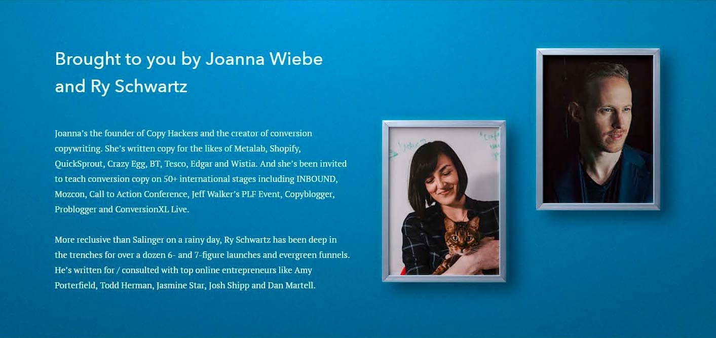
About The Instructor
Including an ‘About The Instructor’ section is very common too. This is when the sales page shifts into a 3rd person perspective and talks about the teacher of the course, boosting the credibility of the program.
This section in the CopySchool example refers directly to Joanna Wiebe and Ry Schwartz as ‘she’ and ‘he’. Have a look:

The 'About The Instructors' section on CopySchool's sales page
The ‘About the Instructor’ section is there to show that the course is made by people who are reliable, knowledgeable, professional and have good credits to their name. It’s the chance to boast, and CopySchool name drops a number of different clients right in this section.
There’s a natural flow to the structure of a well made page like this one. The ‘about the instructor’ section has been placed at the exact moment when a visitor would naturally start to question the authority of the brand, usually just after the course material has been listed.
Pricing Tables
Curiously, this sales page includes its pricing table section near the top of the page.

CopySchool's pricing table is placed both near the top and bottom of their sales page.
It’s common to see sales pages with absolutely no mention of price until the end of the page. The theory is that to get to the price, visitors must scroll past content that influences their perception of value first.
But as with all marketing theories, once you know the rules, you get to have some fun by breaking them to see what happens.
Every market is different, so the only rule that ought to be set in stone is: always split test and track your results. You can’t even know what advice is right until you see the concrete numbers to back it up.
Key Takeaways From CopySchool
> Write For Your Traffic Source: Will the majority of your visitors be coming from your mailing list or are they new visitors to your website? Will you be driving paid traffic straight to your sales page? Make sure you’ve considered the context with which visitors are seeing your sales page and write to match that scenario.
> Include Module Boxes: Showing your visitors the benefits of each individual module will go a long way towards communicating the value of your course.
> Tell Them About The Teacher: Take a moment somewhere on your sales page to communicate who is teaching the course and why they are worth learning from.
Marie Forleo - B-School

Marie Forleo opens B-School only once a year, and charges $1997 for it. To convert at that price, her sales page must win by creating a great perception of value. Marie Forleo runs a personal branding business, where her personality and knowledge is front and center. Case in point: her picture is all over the page.
What I love about whatever Marie Forleo creates is that her content always looks beautiful. Great design, great images, great color, great fonts. Have a look for yourself:

B-School's bright and colorful sales page.
What Makes This Page Work:
People don’t want online courses… they want positive change in their life. A series of videos means nothing to a customer unless it helps them gain something else that has substantial value to them.
So it’s not the features of a course that sell it… it’s the benefits. And Marie Forleo knows this. Her sales page is emotionally charged, with regular talk of ‘starting your dream business’ and the feeling of being satisfied in your work and life.
Let’s look at how this plays out on her sales page.
Above The Fold + Countdown Timer
B-School and Joanna Wiebe’s CopySchool have a nearly identical structure for their above-the-fold content: Headline followed by a video, with a tagline underneath and a Call-To-Action to Enroll in the course.

B-School's above the fold
Both courses also have a countdown timer directly underneath their above-the-fold content too.
Many marketers have split tested the results of including scarcity countdown timers on sales pages and repeatedly seen that it makes a difference.
But where do you put your timer? By including it in the above-the-fold content, any visitor that lands on that page immediately sees that this offer is limited so they should read on instead of procrastinating and returning later.
The ‘Here’s What You’ll Get’ Section
In order to sell a visitor on the features of a course, the benefits ought to be introduced first. Before Marie even talks about the modules of her course or what you’ll learn, she has a section saying ‘Here’s what you’ll get’.

Note the benefits outlined on B-School's sales page
Each of the items listed - Clarity, Guidance, Community and Training - are all intangible, but highly valuable things. In many ways, this entire sales page aims to elicit an emotional response. Intangible benefits fit that mold.
It’s also important to realize that people don’t buy an online course because they want a series of instructional videos: they buy an online course because they want something in their life to change. Focus on that first.
Increasing Perceived-Value with Live Teaching
I’ve written about 6 Ways you can increase the perceived value of your online course, and one strategy is to introduce any form of live teaching. Good marketers know that it’s worthwhile to dispel the perception that an online course is just a series of videos. And Marie has found a great way to do this:

Marie introduces her live office hours with a calendar
B-School manages to introduce the benefits of both a live course and a recorded online course, with ‘Live Office Hours’. Since it is an 8 week course that runs at a specific time of the year, Marie makes herself available during the program.
But she shows off this feature with a calendar listed right there on her salespage.
Price Anchoring
Price Anchoring is a copywriting trick. By giving your visitors a number to gauge price against, they will be able to better understand the value of your offer.
The theory is that you should include a dollar amount that is higher than your product price anywhere above the actual price on your page. Readers who skim will be drawn to those dollar signs and then that number becomes the anchor against which they judge your actual price.

B-School helps visitors calculate the value of the course
One of my pet-peeves is when I see price anchoring done wrong. I’m sure you’ve seen people declare that the value of their course is worth thousands… but they fail to adequately justify it.
Merely stating “This course should sell for $20,000+ but I’m giving it to you for $97” reeks of lazy marketing.
Marie does Price Anchoring better than most. She has pulled apart her own course and given a price to individual sections, tallying up $20,683 in value.
Some of these make perfect sense. For example, the course includes Done-For-You swipe files, saying:
“If you’ve ever hired a copywriter or business consultant to create done-for-you materials, or spent hours looking for the right resources, then you know how valuable this is - $399 value”.
And it’s true: hiring an expert copywriter can easily cost more than $399 to make such resources for you.
But Marie also lists that her core training is worth $10,000 and the best reason why is because it’s taken her many years and lots of money to create. No doubt it’s valuable, but there is some logic missing as to why exactly it is worth that much. Would this course sell better if we saw exactly how $10,000 was calculated?
If you’re looking to use this technique, be realistic and provide ample reasons to explain the value. Don’t expect customers to believe any value number they read.
The Inspirational Ending:
It’s believed that all customers are emotional buyers. Our decision to buy anything is based on emotion, but we justify it with logic. Psychologist Jonathan Haidt talked about the Elephant and the Rider, describing our emotional impulses as a powerful elephant and our rational mind as the rider trying to steer it.
A great sales page is going to provide all the reasons why someone should buy, and then push them to do it with emotion.
That’s exactly what Marie has done here. Her whole sales page justifies the purchase, but the last section at the bottom of the page before the ‘Enroll Now’ button is emotional. Have a look:

The hard-hitting end of B-School's sales page
The very last line that Marie's page ends on is: “You have nothing to lose and everything to gain. Don’t miss your chance to finally start living the life you’ve been dreaming of”.
Key Takeaways From B-School:
> Always Focus On Benefits First: To win over your visitors, be sure to focus on the benefits your course can make to their life rather than strictly the course content. This doesn’t mean you can’t talk about the content, but set visitors up to understand the value of that content first.
> Price Anchoring: Help your customers grasp the financial value of your course. Rather than assuming that they’ll believe the price is correctly set, include some logic to help them understand why it’s a worthwhile investment. Best to do this before the pricing section.
> Emotional Send-Off: Once you’ve communicated all of the important points on your sales page, how do you end it? Try an emotional send-off, something that speaks more directly to your visitors's desires in life.
Ramit Sethi - Zero To Launch

I’ve written about Ramit Sethi’s Zero To Launch course before showing how he uses Evergreen Scarcity marketing to sell on autopilot. He uses a 2-week email sequence that primes and nurtures new subscribers so that when they click through to his sales page, they already know a lot about him and his brand.
The reason I bring this up is because, well… the Zero To Launch sales page... is long.

The epically long Zero To Launch sales page.
Why This Page Works:
Often marketers are looking for hard rules about how to market to their audience. But every seasoned marketer will always answer: it depends. Yes, there are widely applicable marketing strategies, but it always depends on your audience and niche as to what ends up working.
Ramit works tirelessly to produce volumes of content. From daily emails, to filling a blog with hundreds upon hundreds of posts, Ramit’s goal is to saturate his market.
So knowing that all markets are different, let’s look at what he’s doing for the financial niche and why it seems to work.
Sales Page Length:
The Zero to Launch sales page word count comes in at a whopping 17,000 words... and that doesn’t include images, graphics or videos! For reference, a medium length blog post is about 1,500 words and even short novels start at 40,000 words.
When the average person reads 200 words per minute, it would take them 85 minutes to read everything on this page. Add the videos and this is literally hours of content.
But does it work? Well, in this interview, one of the copywriters that worked on the Zero To Launch sales page recounts the story of customers quoting text from the sales page in their post-purchase survey. Customers were at least reading it enough to quote excerpts!
This just goes to show that there is no such thing as copy that's too long… it can only be too boring. And a well written long form sales page will include lots of bolded sections and subheadings to help skimmers get through it quickly.
The point is to communicate value. And length is only one way of communicating value. By the time a visitor sees that this course costs $2000, they’ve already scrolled past about 15,000 words, so that price shouldn’t come as a shock.
Storytelling Sales Page:
How could you possibly write 17,000 words about an Online Course? Well, what’s fascinating about this online course landing page is that it still follows a similar structure to most other pages that we’ve studied, even if it’s 10x the length.
Ramit doesn’t introduce his course until he’s already explored the topic of online business in a way that targets the pains and problems of his visitors (pain points). A common structure for this section is the PAS structure, standing for: Pain, Agitation, Solution.
The idea is to accurately depict the Pain that your visitors have and the problems that your course can help with. Once you’ve shown that you understand that pain, you then focus on what makes that pain so painful. Why does it hurt? What makes it awful? This is the Agitation.
And finally after exploring all the pain, you introduce the Solution: your Online Course.
Although sales pages often use a short PAS story structure before introducing the course, Ramit’s story section is huge. It reads like an entire blog post, starting here:

This reads like a blog post that lives inside the Zero to Launch sales page
By detailing ‘6 Invisible Scripts’, Ramit is showing that he understands the common pains people have and explores why they are or are not valid. Of course, he repeatedly hints at why his online course is the solution to those problems.
And look! The web design doesn't have to be anything complicated - he's just letting the copy lead the show and do the convincing for him.
Social Proof
ZTL is proof that you don’t need to open with a video. Although most other online course offerings will have a video above the fold, Ramit’s doesn’t.

Those are some intriguing charts above the fold
So what does he have instead? Well, Ramit is all about proof. In the financial niche, that’s what it takes to earn respect.
There are screenshots of payment notifications, comments and testimonials, case studies, graphs, charts, and more. This sales page is all about excess. Deliberately so.
But also above-the-fold, you’ll find qualification statements.
‘Qualifying’ is when you help your visitor understand whether or not your product is for them. Often it’s phrased as “If you are this...”, or “If you answer yes to any of these questions...”.
On Ramit’s page, we see this quote above-the-fold:
“Finally, the ‘all-in-one’ course that just works:
- Even if… you don’t have a business idea
- Even if… you’re not a world-famous expert
- Even if… you’re overwhelmed with no idea where to start”
As soon as you arrive on the page, he starts working overtime to prove that he is successful and that his solutions will work for you.
But how does he backup those claims? Well, Ramit introduces his ‘about the author’ section roughly 5-10% down the page and immediately claims authority by showing himself in a magazine right next to Warren Buffet and referring to himself as a “New York Times Bestseller”:

Ramit and Warren Buffet, side by side.
It’s watertight social proof. Within a few page scrolls, you’re shown that this will work for you and that you’re hearing from a reputable and proven source. You’re not even given a chance to doubt him on this page.
Endless Testimonials
If you’ve ever wondered if there’s such a thing as too many testimonials, this page will give you your answer.
Before he’s even told you what the product is, Ramit has testimonials from graduates praising the program. Start with praise, end with reason.

The first 3 testimonials you'll see on Ramit's page
And once the product does get introduced, then a tidal wave of testimonials get unleashed on the reader. In fact, I counted no less than 55 testimonials used on the one sales page! 55! Just at that point where you think you’ve seen enough, you’re not even half-way through the testimonials.
And then… then Ramit throws in a string of 8 video testimonials one after the other. Even if you don’t ever play those videos, they serve their purpose by simply being there.

You don't need to watch the testimonials to know this course must be good
Key Takeaways From Zero To Launch:
> Identify Your Customer’s Pain: Rather than just using your sales page to tell your visitors what your course is, take some time to really describe and agitate the pain that you and your online course will help them solve.
> Testimonials: Collecting and displaying testimonials is important on your sales page. Visitors want to know what others think about your product. If you don’t have testimonials yet, then check out this article on the 5 best ways to collect Testimonials for your online course.
> Qualify Your Visitors: Find a way early on in your sales page to include “...Even If”, statements. Show them that you are able to help, despite their reservations.
Brian Dean - SEO That Works

Brian Dean’s course is the highest priced example that we analyzed for this article. There are 3 pricing tiers, starting with the lowest at $997 and going all the way up to $3997. That is a very expensive course.
For any course charging that much, it needs to be justified. Here is his sales page:

The bird's-eye view of SEO That Works
Why This Sales Page Works:
The SEO That Works sales page is also very long at 10,000 words and follows a very similar structure as the Zero to Launch sales page does: a long story, an introduction to the teacher early on the page, modules, bonuses, testimonials and a nearly identical design for the pricing boxes.
It’s also an excellent example of how to do pricing tiers well. Not only does the sales page work to sell the product, but it works doubly-hard to sell the highest priced tier. Let’s have a look at how:
Hinting At The Product
The first third of this long sales page doesn’t directly mention the SEO That Works online course, but it indirectly references it in images or video captions. This is like a teaser.
By dropping hints that there is a yet-unknown solution to the problem unfolding, readers get curious (a.k.a. a curiosity hook). Yes, the sales page is long, but very early on, the reader discovers that there is something coming up that they don’t yet know about. And they want to.

The letters 'STW' aren't explained until well after they are first shown
Pricing Tier Bonuses
Brian offers 3 different pricing tiers for his online course. But before he even mentions pricing, he introduces all his bonus features for each tier.

Each bonus works to alleviate any customer concerns
Once you’re hooked and really want those bonus features… it’s only then that he introduces the 3 pricing options and you realize that those bonuses are only available at the higher priced tier. It’s almost like giving you something and then taking it away - a sales trick for getting you to take action.
Rather than have a side-by-side pricing table, Brian lays it all out vertically. But look at how he accentuates what you’re missing out on for the lower pricing tiers:

The lowest tier includes a "here's what you won't get" section
The ‘what you get’ for the lowest priced tier has the absent features greyed out. Not only is it clear what you will get, but you can't click a lower tier buy button without also knowing what you are missing out on.
Step 1: convince them to buy, Step 2: Convince them to buy the higher priced version.
Different Box Shots
This was a cool feature on the SEO That Works page...
Each of the 3 pricing tiers have different box shots to visually represent the bonuses. The ‘Standard’ is on a grey background, with a few images. Then the ‘Advanced’ is on a blue background with headshots of the teachers for the bonus lessons. And finally the ‘Complete’ includes an extra stack of files, and a few other images representing the bonuses.


Every bonus is visually represented on the 'Complete' version box shot.
After seeing the image for the Complete version, the Standard seems so… empty. If you’re looking to introduce different pricing tiers, this can be a great technique, though it’s more relevant for a course priced at $2000 - $4000.
Key Takeaways From SEO That Works:
> Bonuses: It’s difficult to mention everything that’s in your course. Your module boxes do most of the heavy lifting there, but anything that isn’t mentioned could easily be included in a ‘bonuses’ section. What more does your course offer? Include it here.
> Box Shots: Use a service like ‘Place It’ to create box-shots for your course, a visual representation of the product.
> Pricing Tiers: Once again, our Pricing Table element in Thrive Architect makes this easy, but if you aren’t sure of what to offer for high prices, take some ideas from this post on How to instantly raise the perceived value of our online course.
Derek Halpern - Blog That Converts

Derek Halpern is the man behind Social Triggers, an online marketing education site. Internet marketing (and social media in particular) is a crowded market so cutting through the noise is difficult. Here’s the Sales Page for his online course called Blog That Converts 2.0

The sales page for Blog That Converts 2.0
Why This Page Works:
The benefit for Derek’s online course is in the name: conversions. There are many different facets of content marketing, but his course aims to fill one very specific need: how to use your blog to improv conversion rates, in simple terms, convert visitors to customers.
By being super-specific, Derek can still get a foothold in an otherwise competitive niche. If you run a blog, what appeals to you more: a generic course on conversion optimization, or one that is specifically made for bloggers?
On top of that, Derek works hard to show that his course is good for your average Jane & Joe non-marketers. Let’s zoom in to see how he does it:
Cut To The Product
The Blog That Converts sales page does something different to all others: it starts immediately on the product. No story to introduce it, no fancy benefit-driven headline, it cuts straight to the name of the course and a Box Shot. It even includes the price at the top:

Unlike the other sales pages, this one has the discounted price above the fold
According to this sales page, the course is marked down from $1997 to $499. As to whether or not the course was ever sold for that higher price, I’m not sure. But advertising 75% off can be a tactic to keep people on the page. Rather than hiding the price, Derek keeps the discount right at the top.
Qualifying Leads
A common concern for visitors landing on your sales page might be: “Is this course for me?”. Even if your course looks amazing, visitors won’t stick around if it’s not right for them.
After the first Box-Shot on the page, Derek’s next graphic works to qualify visitors and show that his course is for them. Have a look:

List of industries his students are from
This graphic lists different markets that his customers have come from, including lifestyle, spiritual, health, etc. Of all the sales pages showcased in this article, this example offers the most creative way to quickly show the relevance of a course to multiple industries.
Improving and Updating a Course:
Note the Title: Blog that Converts… 2.0. This wasn’t the first time Derek released this course. He made the first version some years ago, and has since improved it for a re-release. This is the second version, and that fact is shown on the sales page by describing what is new:

New content becomes a bonus feature on this sales page
Keep that in mind with your own course. You can start small and improve it once you get feedback, update it, and perhaps even re-release it at a higher price.
This aligns with our belief in Rapid Implementation too: Don’t wait until something is perfect for release. Do the best you can now and make improvements to it when you can.
Bonuses That Target Concerns
This is an excellent marketing secret. In a well-written sales page, you should predict a visitor’s next concern and answer it exactly when it begins to form in their mind. Have a look at this:

Bonuses that target customer concerns help with purchase anxiety
I have quoted the copy below to make it easier to read for you:
“You might be wondering, 'Okay this looks great. But what if I have questions about any of the training material?’ I’ve got good news… the Blog that Converts team has GOT YOUR BACK. When you enroll today, you’ll also get:"
The sales page then lists 3 bonuses that are all about personal help. They are called Mini Insight Sessions, Private “Community Mastermind”, and Coaches.
Derek knows that an online course can seem disconnected, hence why he includes 3 bonuses that show that you can get direct feedback and help from people in a live setting.
Offering a 30-Day Guarantee
Offering a guarantee is commonplace in online selling. Why? Because it increases conversions. Customers are usually afraid that your course is not going to be right for them, and might waste their money. But if you can show them that they can try it out risk-free, then you alleviate that resistance.

A guarantee can become a bragging point too
Derek Halpern introduces the Guarantee immediately after the pricing table. In fact, we saw this was the most common spot to have a guarantee on almost all the sales pages we analyzed.
And it makes sense: once customers have seen the price, that’s when the purchase anxiety kicks in.
But even despite these facts, I’ve seen course creators panic over whether or not rogue customers will steal their content and then request a refund. Some even go so far as to provide hidden clauses to their refund policy to make it harder for customers to do this.
But at what cost? Offering a simple refund policy in plain English makes you look confident and shows that you can stand by your product. It is an absolute must and almost every sales page we analyzed for this blog post includes one.
Key Takeaways From Blog That Converts:
> Qualify Your Leads: Show how people just like your visitor have taken the course and achieved their desired result from it.
> 30-Day Guarantee: Right after you’ve shown your main pricing table, you should attempt to alleviate purchase anxiety. The easiest way to do that is with a Satisfaction Guarantee.
> Rules Can Be Broken: Most courses we examined waited until later in the sales page to introduce pricing. But that’s never a steadfast rule. If your sales page has a great discount or is competitive due to pricing, you might want to test showing the price near the top.
Neville Medhora - Kopywriting Kourse

I love Neville Medhora’s sales page for his Kopywriting Kourse. Why?
Because it prioritizes content and speed of implementation over design. It’s got a Web 1.0 feel to it, but not in a way that feels like it's lacking value. Instead, it feels like the sales page is just getting to the point without wasting time trying to impress visitors with good design.
Check out his sales page:

Note: Neville just updated his sales page, so this is different to what you'll now find on his site.
Why This Page Works:
Teaching copywriting is yet another competitive market. There are many different courses that teach this topic, so effective marketing here means finding a unique angle.
Not everyone who wants to learn copywriting will be lured in by beautiful images and polished design. What about people that feel intimidated by suit & tie professionalism, and would prefer to learn from someone as whacky as they are?
Well, that’s Neville.
This sales page has pictures of cats, hamburgers, mismatched fonts, and absolutely no consistency in color or design.
And yet, you get the impression from this page that Neville is down to earth and just another guy like you or me. He’s one guy running a website to help people learn copywriting.
And his target audience is people who are brand new to copywriting, perhaps even people who’ve never heard the term before. Now let’s get in a little closer and you’ll see what I mean.
Poor Design, Great Copy.
Look at this graphic on Neville’s sales page. If you’re a designer, I’m sure you would die a little bit inside when you look at this:

That's an unusual approach to sales page design.
Why are the envelopes designed differently? Why are the colors inconsistent? And why on earth is the background a grass field when you’re talking about email marketing?!
Yet, I love it. Oddly, it’s a breath of fresh air. The theme of this entire page is ‘quick & dirty’, prioritizing speed of implementation and persuasive copywriting over anything else. And this is a page that makes sales.
Great Value Pitch
Neville makes up for basic design of his sales page with great copywriting. In fact, it even proves the point behind his teaching: that great copywriting is one of the most valuable skills you can invest in and should be prioritized over design.
I absolutely loved this pitch. He makes it crystal clear that by signing up for his course, he’s teaching you from loads of experience and saving you countless mistakes.

It's so easy to read and understand the value of this course
The pitch here is that he’s sent hundreds of thousands of emails, sold thousands of products and worked in multiple industries. He’s saying that if you want to fast-track your learning, his course will share all the best discoveries he’s made over the years. And that saves you time.
Your Job Is To Ship
If you’ve followed our blog for a while, you know that we believe perfection is the enemy of progress. Your job is to ship - meaning that you need to make your products & content available for others to consume as soon as possible, rather than keeping it unpublished until it’s "perfect".
And Neville really seems to embody this mindset. Every sales page we analyzed included a Module breakdown — some much fancier than others — but look at how straight forward Neville’s is:

What matters is what's in the modules, more than the design.
Let this be a reminder that you don’t need extraordinary design skills to show off your course content. If you’re using Thrive Architect and one of our landing page templates — even without any design skills — you can put together a sales page that is capable of selling your online course well.
Key Takeaways From Kopywriting Kourse:
> Great Design Is Not Necessary For Sales: You can run a profitable business and sell your course without superb design skills or hiring expert designers. However, your copywriting still needs to be on point!
> Your Job Is To Ship: Don’t let design become a barrier to actually launching your products or online course. Use templates: Thrive Architect comes with hundreds of pre-built and editable landing pages. You don’t need to rely on your own potentially-lacking design skills.
> Focus On a Strong Value Pitch: If you had to divide the time you spend building your sales page, the most important part is your value pitch. You want your product to become a no-brainer purchase. That's definitely dependent on the sales page text and the structure, not necessarily the design.
6 Sales Pages Side By Side
Copy School | B-School | Zero To Launch | SEO That Works | Blog That Converts | Kopywriting Kourse | |
|---|---|---|---|---|---|---|
Video Above The Fold | ||||||
Buy Button Above Fold | ||||||
Course Closing Scarcity | ||||||
Box Shot | Screenshot | Screenshot | ||||
Module Boxes | ||||||
Testimonial count | 7 | 19 | 55 | 28 | 17 | 19 |
Multiple Price Tiers | Split Payment option | |||||
Money Back Guarantee |
The Perfect Sales Page Structure For Your Online Course
After looking at these 6 sales pages, you can start to see patterns emerge. Despite different audiences, different niches and even different positioning & messaging, you might notice they share a common structure.
We’ve distilled this structure down into a blueprint for you to build and launch your first online course Sales Page.
For this blueprint, we are making the assumption that you don’t need an epically long sales page just yet and instead plan to keep it short and punchy.

Want it as an editable template? Check out the bonus section below!
The Only Rule You Should Follow with Your Course Sales Page
I know you wish there was a proven sales-page design that you could always rely on.
But the reality is that such a sales page template doesn’t exist.
Every rule I’ve introduced above can be broken if you please. Go ahead, include the price at the top, put your ‘about author’ section just under the video or move your FAQ section around. Do whatever you want!
That said, there is one rule you should never break: Always test your results.
It’s important to always test your changes to a sales page. There's no single page on your site that affects revenue more directly than your sales page! That means you should always prioritize split testing your sales pages first before your homepage, about page, or lead generation pages.
Sales pages are the pages that make you money, and they're part of a sales funnel, which means there are multiple moving parts. Never assume your changes will result in more revenue without tracking it.
Fortunately, Thrive Optimize makes it possible to set up A/B Split Tests on any Thrive Architect page less than a minute:
Simply create the variation you want to test, set your conversion goal and then Thrive Optimize will send 50% of your traffic to one page and 50% to the other until a winner is determined.
Now It's Your Turn: Build Your High-Converting Course Sales Page
You have all the tips and key takeaways you need to build your own high-converting sales page.
And now it's time to turn these tips into action.
Thrive Architect is the perfect page building tool to help you create impressive, conversion-focused sales pages to promote your products.
And if you want to see the full potential of Thrive Architect, we recommend buying Thrive Suite.
Thrive Suite is an all-in-one toolkit that contains plugins, landing page templates, opt-in form templates, quiz templates and more; designed to help you build high-converting sales pages and grow your online business.
And if you need more information or tutorials on how to create a successful course or sales page, check out these free resources:
- How to Teach Online: A Complete Guide for Beginners
- How to Create the Perfect Long Form Sales Page (+ Templates)
- How to Create an Online Coaching Website (Simple Guide)
- The Perfect Low Priced Online Course Sales Page
So, what are you waiting for?
Wouldn’t it be great if you guys gave us a Thrive Architect template of your sales page blueprint?
Yep, TA template would be fantastic!
@Bradley: Epic post man, thanks!
You’re welcome, Oliver. As for a template? We might be cooking something up already. Stay tuned!
You guys are awesome! Cheers!
I’m just wondering whether you’ve come up with a template for this yet? Thanks.
We have, but it requires a feature we haven’t released yet. If all goes correctly with testing, then that feature will be in the next release and the template will follow soon after.
Thanks Brad, but without any dates shown in these comments it’s hard to determine a timeline guesstimate. Please add comment dates and/or version numbers so we can get an idea of when the template will be available to members.
Good point, Andre. We did run into some issues, but have found a new way around them. This means the template should be out in June.
I fully agree with Jonathan. This sounds like a perfect candidate for a T.A. shell.
We thought the same, so keep your eyes on the blog in the near future!
Great minds think alike.
All I can say is… stay tuned 🙂
TA already rolled out converting Sales Page Template few months ago!
But as far as I know at least for cold traffic VSL works better. Have you data that backs this up?
BTW: Great Post Brad thanks for your effort
We haven’t got any data on that one, but it would be a great A/B test to run with Thrive Optimize. As we say: test the big changes first, not the small ones
Excellent !
Thanks Sarawaut!
Am I the only one who thinks a template of the sales page blueprint listed above would be a good idea?
I was hoping for the exact same thing! Would love a template for this
It seems to be a hot request, so it’s not going unnoticed. More on that later!
Very helpful! I’m looking forward to using it for my latest product release.
And we’d love to see your sales page when you do, Heather!
Awesome if that blueprint would be a template 🙂 hint hint
We agree!
Brad, Many thanks for putting this together! This year (2019) I am finally launching an online course and building my sales page. I have spent the last two years learning and looking at how the guru’s do this (my favorites are not on your list, but very similar – Michal Hyatt and Amy Porterfield). Your reverse engineering and analysis is EPIC. Not only am I going to study it, I will be visiting your blog for more!
Good stuff, Jeff, and thanks for your comment! I hope this helps you get a great sales page to kick off with. I’ll need to check out Michael Hyatt and Amy Porterfield’s pages too, thanks for the reminder
This is very thorough. Thanks. I am looking to build a course, and the simpler the sales page the better. Some of those are just silly long.
I tend to agree, but it does come down to niche. I think starting simple is the way to go, since you can always add more later. Thanks for the comment, Sean
I wold love to see this as a Thrive Sales Page Template Please!
We might already be working on it… 🙂
Sorry for the caps lock, but I have to state this: THIS IS THE BEST SALES PAGE TEARDOWN ARTICLE I HAVE EVER READ. Unreal. Just like other people asked, any chance you guys have an online course sales page template? Or should we piece it together using the “Content Playgrounds” from your existing templates?
Thanks so much for the enthusiasm, Cyrus! Love a good use of caps lock! It takes me a long time to put together a big piece like this so it’s great to hear that you’ve gotten something out of it. Everything in our blueprint can be made with our content pieces, for sure. Toggles for FAQ, pricing table element, etc. But I’m working with our designers on getting a whole template made
Wonderful Article! To be honest, I’ve been waiting for a release of up-to-date templates for online course sales/landing pages for quite a while now. I have a feeling this would be a huge help to many of your subscribers.
We thought the same. Keep an eye out in the near future!
I loved this post thanks Bradley!
You’re welcome, Peti
A very good in-depth article – thanks!
In the past I purchased Derek Halperns ‘Salespage that Coverts’ course, which was good, but I don’t recall him laying out a template like you have.
Analysing the different approaches, as you have done above, is also really helpful. For one, it shows that there is no right or wrong.
That was a huge takeaway for me too, that there is no right or wrong. The perfectionist in me wrestles with that idea. Thanks for your comment, Martin
Thank you for the awesome post!
I am planning to update the sales page for my online course and I will use this guidelines.
Is there a template available for Thrive Architect?
Regards,
Sofia
You’re welcome, Sofia. We’d love to see your finished update when it’s done.
No template for this guideline in Thrive Architect yet, but we’re cooking something up…
This online course sale page teardown example that you have on this post by the bottom, does that exact template structure sale page template exist in the thrive architect download area? Can we download that template in thrive architect? If so, which one is it and what is the template name?
No, we don’t have a template of it… yet.
Ok, when do you think you will have that template?
It would be nice to have that template from you guys. OMG, seriously that would solve so much for us.
Early March, since this template would require an update to be released first.
Ok, I will check in in March with you. Thanks.
Hi, I don’t know if my first email went through so I’m writing this again.
Hey, Bradley, this is Luis Garcia. To continue our chat from last month. If you remember I had asked if sale page teardown example that you have on this post by the bottom of the post, I had asked before “does that exact template structure sale page template exist in the thrive architect download area?”
You replied back saying “No, we don’t have a template of it… yet.” But then you had said “Early March since this template would require an update to be released first.
So, we are in early March and I’m checking in to see if that sale page template now exist exists in the thrive architect download area?”
Can we download it in the backend?
If the answer is yes, GREAT!
If the answer is no, then my next question is, when do you think you guys will have that template for us?
I haven’t looked in the backend as of yet, but I wanted to get a straight answer from you, thank you.
Hey Luis, sadly there have been some delays with this template. We are working on it, but I cannot promise a date that it will be ready. I was warned by the team not to mention potential dates, since that usually means delays are guaranteed. But I ignored that advice and I’ve learned my lesson!
What I can tell you, though, is that we will be sending out an email and a blog post when the template goes live. I’m also hoping to make a video that demonstrates how to use the template. So if you’re on our mailing list, you’ll be notified as soon as it’s available.
Hey Bradley, thanks for getting back to me and no worries about mentioning dates on your behalf. I understand Thrive don’t want false promises as it may look bad for a company, but, as I speak for myself, I’m ok with it all. Ok, I’m on your list and I will be notified when it is out and I look forward on your video blog about editing the template, cool.
Thanks for your patience. The template will be worth it!
Hey, Bradley how you are well. To continue our chat about the sale page template, I see that Shane is doing a live webinar talking about sale pages. So, I thought to reach out again to ask about when is this sale page template is coming out for us in the back end of thrive architect. I know you mentioned that you can’t give a date, but at least mention that we are all so waiting for it, of course with excitement. lol.
Very soon, Luis. If all goes according to plan (and I must stress that in software there is always an ‘if’), then the next main update will be the one we need to release the template.
Great post… 17 000 words? I’d be here until next Christmas writing that! some of the things you mention, like the CTA button above the fold, seem so obvious when they’re pointed out! 😉 I agree with the others below… a template would be great?
Yeah, Ramit gets a few copywriters working together to make a page like that. It’s both impressive and terrifying at the same time! Thanks for your comment!
What can I say, Brad. You´ve done it again…
Over-delivered.
Thanks for everything, especially for the sales page blue print.
Really useful, right? I learnt so much myself from pulling those pages apart. Glad I get to share it with everyone else too
Thx for the examples- Always nice to see what’s working.
You’re welcome!
Bradley! What a great and detailed outline of the top tear DO’s! Exactly what I just need. Thanks for that great piece of content.
You’re welcome, Walter. Glad you got something out of it!
I’m using Teachable to sell my course, but I don’t love their sales page builder. Is there anyway to build a sales page with Thrive Architect and integrate it with Teachable?
Yes, you can. I haven’t used teachable myself, but I believe that you can link to the teachable checkout straight from a ‘buy now’ button on your Thrive Architect sales page
Yes, I thought about it — only issue I can’t find my way around is I have a lot of affiliates whose affiliate links go directly to the Teachable sales page.
Hmm, good point. It might depend on how their affiliate cookies work. I’m sure someone else at Teachable has faced this problem and might have a solution, but if you find it, please let us know
Great article, but can you now do one with entrepreneurs that are just starting out and making sales?
It’s one thing to compare people that have been in the business for years and have the testimonials and names to drop… how do the people that don’t have that stuff do it?
I see your point, but I think the theory is still robust. Sure, you mightn’t have loads of testimonials or accolades, but you still have to figure out a structure for your sales page. My hope was that by looking at these big companies, we can help the starting entrepreneur create a strong first sales page that they can then improve over time. Don’t have testimonials? Remove that section until you do.
when you’re first starting sometimes you have to borrow credibility from other partners, mentors or associates. You have to use “we” more often than “I” until you have your own horn to toot.
This is a great resource post, especially the template, but you know what I kept thinking while I was reading?
“This is all well and good for a 500$+ course, but what about entry level or middle range products?”
These people are millionaires and have the authority to ask these very high prices on their courses, but I would assume most Thrive users are not at that level yet, and need to sell courses in the low-middle price range. That’s certainly true for me.
Obviously, the principles hold true, but where’s the point where you start getting diminishing returns, and when does it just stop paying off? Specifically, I’m wondering: does a 3000+ words sales page with a video, lots of graphics, mockups, etc. really help sell a 147$ product better than a minimalist 1000 wrd page, no video? How much better?
How about 67$?
Could a long form sales page even *hurt* your sales on such a product?
You would think that the contrast between greater perceived value and lower price would work to your advantage, but could it be too much and look scammy? Maybe people would feel that a long page for such a low-priced product betrays a lack of confidence…”why do you need to push like that for a measly 67$?”
On the other hand, a course is a course: you will still need to detail the benefits, the content, use testimonials, personal branding etc.
This is something I intend to test as soon as I get the sales going, and Thrive Optimize would be perfect for that…but I was wondering if any of you guys had had a chance to test it already or had seen any relevant data.
Perhaps we should ask this question the opposite way: how much can we do without (rapid implementation) without losing sales when the product is in the low/middle price range?
We haven’t tested this specific scenario, no. But I think you said it right when you said, “A course is a course: you still need to detail the benefits”. People won’t even bother getting out their credit card for a measly $10 purchase unless you communicate those benefits well, let alone for a $4000 course.
I also don’t think feeling ‘scammy’ is affected by length, since short or long pages can feel like that. Based of a hunch and the ridiculous amount of research I’ve gone into, I’d say priorities for a low/mid range product are:
1) Get a quick sales page up that follows this structure. Don’t overwrite it or make it too long.
2) Test Headlines First.
3) Try lengthening the story section that identifies customers pains. Test results.
4) Add testimonials as they come in. Test results.
5) Maybe add a video. Test results.
Hopefully by that stage, you’ve got your own data that has come from your niche and you’re getting a better sense of what’s working. Hope that helps! And thanks for your comment, Lorenzo
Thank you, Bradley, that makes a lot of sense.
Still, I would be very curious to see how the long time experts handle that scenario. Don’t these same people sell any products below 200$? Below 100$, even? Maybe they don’t. Maybe they only did that at the start?
But I think a post similar to this one on that exact scenario, based on elite-level low price range pages would be a very welcome addition to this awesome library you guys are creating.
I too, eagerly await the Architect page based on this template 🙂
All my companies (regardless of the price) use long form with success.
This is so vast…. but at last I read it…
Thank you sharing such good info regarding online courses… it will help in future. Thank you
You’re welcome.
Wow that is epic. Great work guys!
Thanks Tom!
This is brilliant. All of them are masters when it comes to selling courses.
I’m saving this!
They are, and we can learn a lot!
Crazy amount of value in this post, Bravo Brad!
Thank you!
Love it. Thanks for putting this together, Brad.
You’re welcome, Eric
great article
Thanks Linda!
I thought we would get a template to download…
Not yet… but soon.
Hey team, what are your thoughts on embeddding other peoples Youtube videos into a paid course if they add value to the topic covered?
Ah, this is an interesting one! I took some time a year or two ago to look into this, and some other stuff on copyright law. But let’s make one thing clear first: I’m no lawyer.
My understanding is that you shouldn’t embed any YouTube videos you didn’t make inside your paid course. But you can link out to YouTube from inside your course. Look at it this way: if you created a free 5 part video series on YouTube and you found that someone else was selling a course that included your 5 part video series, how would you feel? Someone else is profiting from your content. But if you link from inside your course platform out to YouTube itself, then the original content creator can’t exactly criticize you since you are driving traffic onto the publicly-available YouTube platform to see a video that anyone could find.
It gets more complicated than that, but that’s the general idea.
Yes I agree. It will really work out well If we can have a TA template for Sales Page.
We’re working on it 🙂
Yes, I agree tracking is really very important or else it will hit you like hell. I personally run a Ecommerce business and I know how important the sales page is.
Yep, split test all changes!
Hi! Very informative post. I read your posts regularly to enhance my skills on sales
We’d love to see your finished template when it’s done.
Soon.
I am planning to start my online course and this will be my guide. I am also waiting for Thrive Apprentice individual license to come out and then want to use the same for my WordPress blog.
These are really great example and inspiring.
Thanks,
Glad I could inspire you, Ravi!
Hi! Bradley Stevens , Thanks for sharing this informative post
You’re welcome!
All the points mentioned above seems to be very efficient, already have started using some of them for my projects.
That’s great to know, James! Thanks for coming back to comment
Is there an existing Thrive template that could be relatively easily modified to match the blueprint, rather than starting from a blank page?
There are a few, but they’ll all need some work to make them follow the blueprint. What I’d recommend is loading the landing page gallery on your website, and then filtering by ‘sales page’. That will show you all the templates that already have some of the content this blueprint is suggesting.
We are working on a template based on the blueprint, though 🙂
Yes, that’s what I’ve started doing. I’ve found that the Bright Video Sales Page template is the easiest to use, just with some tweaking and moving sections about.
Nice and effective tips and tricks are explained in this post, these really helpful particularly for a beginner like me
Happy to help, Jeswanth
Wow! That sales page blueprint infographic is INCREDIBLE! I will definitely be referencing this page when I launch my next product. I would also add that it’s important to establish your authority much earlier in the page. Following your layout, that could be done in the story section, I suppose
Glad you like it, Kyle! Authority would be a great thing to test. Like in the SEO that works and Zero To Launch examples, they’re getting straight into their authority early on the page. The story section would be a good place for it too, since you could serve two purposes in the one section. I like your thinking!
Any update about the template? Thanks!
We’ve had some delays, but we’re still working on it. We’ll send out an email + blog post when the template is available, so if you’re on our mailing list, you’ll be the first to know 🙂
Is the template still in the making and coming or not? I am just wondering since this blog post is almost 3 months old. Please let us know. Thanks!
Hey Oliver, first- thanks for your patience! We ran into a few issues that caused delay, but we’ve found a way around them. Template should be out in June
Cool! Thanks for the info, Bradley!
Ok, I’m not sure if I need Architect or Ultimatum. Since I want some features of Ultimatum (but also MailChimp integration, which I’m not sure if it provides), would I be able to do with Ultimatum the things you mentioned in the article that we can do with Architect? Thanks!
In a nutshell, Architect is our visual editor and it has lead generation elements that integrate easily with mailchimp. You would use Architect to create sales pages, drag and drop images, text, colors, backgrounds, and loads of different elements. Check it out here: Thrive Architect
Ultimatum is our scarcity tool. It allows you create countdown timers and banners that can work across your entire website and on specific pages to promote your products to any visitors. It can also be used to open/ close a sales page once the countdown timer reaches zero. Check it out here: Thrive Ultimatum. Hope that helps!
Thanks for a great live chat on YouTube!
And thanks for tuning in, Matt
Created my 1st Sales Page with Thrive Architect landing page template. Impressed in the structure, so helpful. Thanks.
You’re welcome!
Love, love this teardown.
Any chance you can share full versions of the sales page images – most of the pages are offline at this point.
Would love to read and see how they implement a persuasion ladder
Wouldn’t it be nice to deconstruct a couple of e-commerce websites as well?
Apart from your ThriveCart YouTube video, and that one too was heavily skewed towards ebook selling.
So far you guys are lagging way behind physical products site-building. Wondering why that is?
I don’t understand why you guys allowed ClickFunnels, ThriveCart, and the latest kid in the block, CartFlows to dominate the e-commerce space so much, while you’re still stuck in the old PayPal designs found in your sample Themes.
You’ve updated and tutored every aspect of web designs and conversations except a natively integrated checkout system that should naturally accompany a robust suite of sales and marketing software that you guys have.
I give you A+ on everything, an F on the checkout process.
Too bad I had to do for a company and staff that I love.
Anyway, that was a great post, Brad.
Nicholas, there is always a reason behind what we do, even if we choose not to share it publicly. Glad you enjoyed the post.
Excellent, and I’m forever addicted to Thrive. You guys and gals are AWESOME!