Which article would you rather read? Left or right?
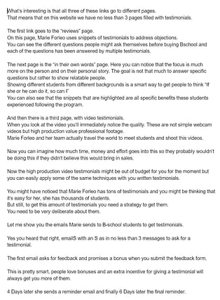
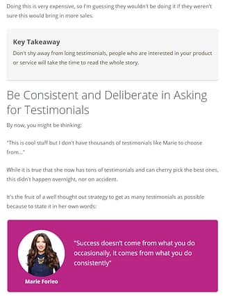
I'm guessing you didn't hesitate one second. And yet, both snippets are from the same article...
More...
The only difference lies in the formatting.
The left image is the final draft and the right image is the fully formatted, published article.
Because attention span online is short, deciphering a wall of text is too much of an effort for most of your readers.
As a content creator it's your job to use formatting to make your material easy and enjoyable to read.
It's the last step in the process of publishing an engaging article.
Once you've structured your ideas and you've written the text, formatting is the icing on the cake. But it's the icing that can make all the difference.
The difference between:
- Visitors reading your content from top to bottom or simply closing the tab.
- Tons of social shares and comments or crickets.
- An engaged email list that opens and clicks on the newsletter links because they know your content will be worth their time or bleak open rates that'll discourage you from sending another email ever again.
The good news? Beautiful formatting doesn't have to be time consuming or difficult.
Let me show you how to create engaging content quickly with Thrive Architect.
Content Templates to the Rescue
The key to rapidly formatting your blog articles is to use the same elements over and over again.
Any type of layout or element can be saved as a Content Template in Thrive Architect to win you precious seconds the next time around.
You only have to create these templates once, then you can save them to use whenever needed. Simply drag & drop your newly created Content Template and the fully formatted element will appear!
This will not only be faster, it will also help create a consistent look and feel throughout your content.
Here are the content templates we regularly use, and recommend you start using too.
1. Key Takeaways
This is, without a doubt, the most important Content Template you can implement immediately in your blog posts to improve readability.
It's a very simple but super efficient template.
Instead of having people search for the most important information, make it stand out by putting it in a key takeaway box.
On Thrive Themes we use a grey content box like this one:
Key Takeaway
It's simple, will work with any blog design or colors, and separates the important information from the less important stuff.
To create a similar key takeaway box, drag a Content Box on the page, change the colors to your liking and add a title.
Ours has:
- Background color: #f6f6f6
- 20 px padding all around
- 4 px rounded corners
- A drop shadow of 2px with 0px blur and spread, 270° and color #c2c2c2
2. Quotes

Zig Ziglar
"The right quote can inspire people to change their ways."
Quoting industry experts is a great way to make your articles more interesting and credible.
The quote box allows you to use a quote like you would an image to break up a wall of text.
Our quote box is created with a Content Box, a 30/70% two-column layout, an image with a circle style and two text elements.
3. Pros and Cons
The possibility to save an element as a content template is not limited to content boxes!
Any column layout can be saved as a Content Template in Thrive Architect.
An example of this kind of content is a pros and cons comparison list.
Pros
- Bullet Point 1
- Bullet Point 2
Cons
- Bullet Point 1
- Bullet Point 2
Or a feature table
Feature 1 | Feature 2 | Feature 3 | |
|---|---|---|---|
Product A |
These will come in handy if you're writing a lot of affiliate review posts.
The pros and cons comparison list is a simple two-column layout, in each column a styled list.
The feature table is made with the Table element and tick or cross images in each cell.
4. The Post-it Note
The note box allows you to add additional advice and make it stand out.
Think about it like a post-it note on a document you're handing off to a colleague. Written on it is the one thing you need him to know in order to understand the document.
Our note boxes are yellow, exactly like a post-it.
This is an example of a note box about API connections:
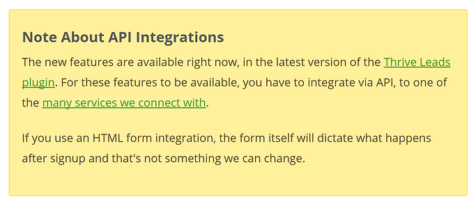
Our note box is created with a Content Box with background color #fff09c, 2 px border color #ffe372 and 4 px rounded corners.
5. The Updates
If you're writing timely content such as product reviews or tutorials, you'll have to update them regularly to keep them relevant to your readers.
Use update boxes to make new information stand out.
This will allow readers, who have already taken the time to read the original article, to quickly scan through and only read the new updates, while new visitors can read the whole post and see you're keeping it up to date.
This is an example of an update box from the Authority Hacker website:

For this one too, use a Content Box as starting point and change colors and other details.
How To Create a Content Template?
Saving a content template is a piece of cake.
Once you've formatted the element and it looks exactly the way you want it, select the container that envelopes all the elements you want to save and click on the littel "save" icon next to the name of the element in the upper left corner.
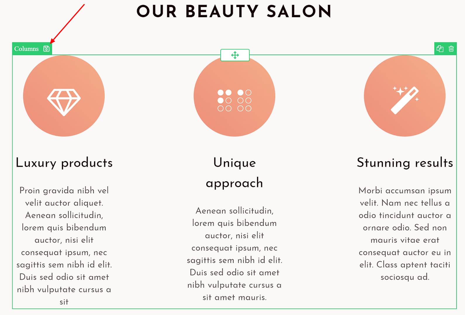
To save an element as a template, select the element and click on the "save" icon.
Decide whether you want this template to be a normal template or a symbol (= a template that is synchronized and automatically updates all instances of the template. Learn more about symbols in this post) and give your template a name.
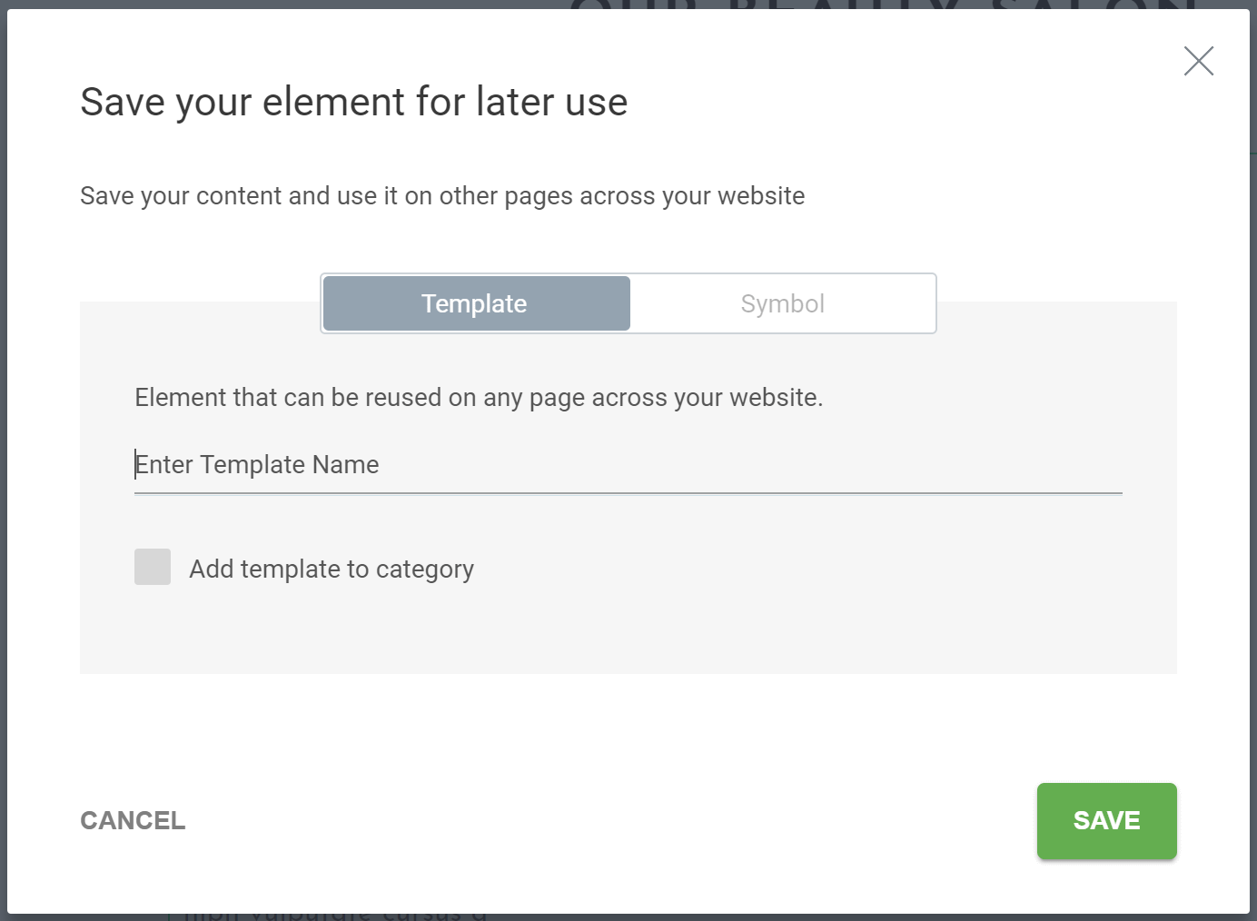
Choose whether you want to save the element as a normal template or a symbol
As soon as you reload Thrive Architect, your new template will be available as a Template and Symbols element. This means that for any new content you create, this template will be available as an out-of-the-box, ready-to-use element.
Drag the Templates and Symbols element on the page, this will open the Templates and Symbols library. From here you can choose previously saved elements.
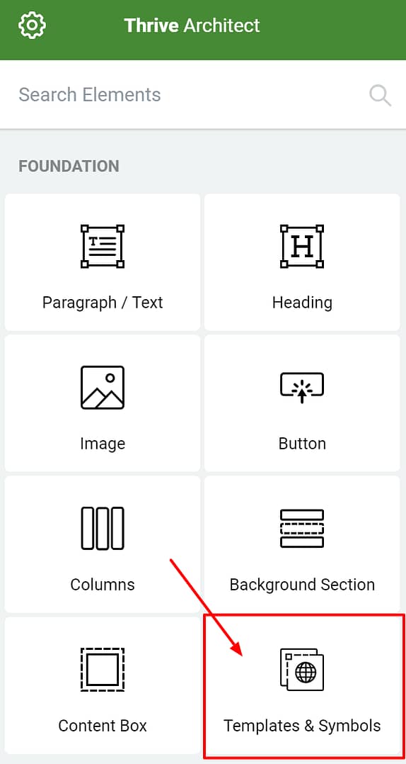
Templates & Symbols element
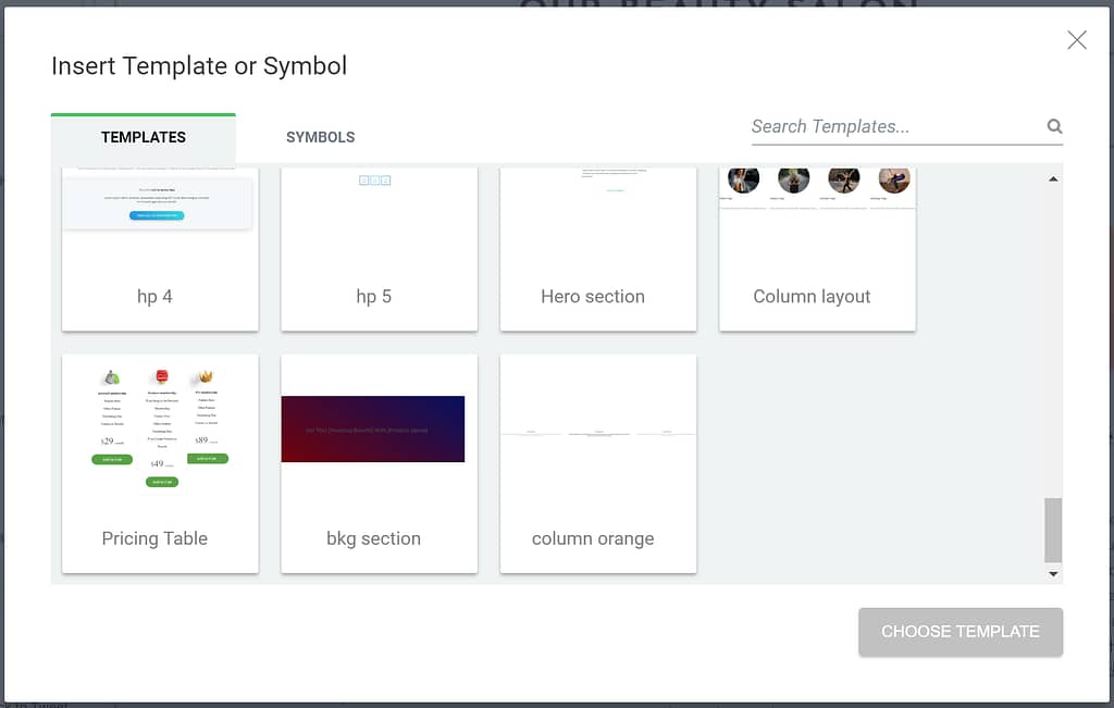
Opens the Templates & Symbols library
Pro Tip
Do you want to save multiple elements as 1 Content Template? Such as a title, a column layout, a subtitle and a box all together?
Use a transparent content box to group the different elements and save the outer content box as Template.
In a hurry? We've got you covered!
Creating your own unique templates is fun and will save you a ton of time in the future, but maybe you're out of inspiration or you need something ready-to-use?
In that case, have a look at the "styled box"-element in Thrive Architect. You'll find a ton of nicely styled content boxes ready to use in your blog posts!
Have You Heard About the New Content Block Feature?
We added new a new feature to the Thrive editor to help you build better looking content faster with far fewer editing steps: the Content Blocks.
These Content Blocks are pre-designed text blocks, ready to be inserted into your posts with one click!
You'll find ready-to go Content Blocks in the gallery, such as:
- Pros & Cons Block
- Quote Block
- Call-to-action Block
- Steps Block
- etc...
Learn more about this new feature in this post!
Use This Feature to Create Blog Post Templates
Besides being able to save and reuse certain smaller elements in your blog posts, with the new Content Block Feature, now you can insert entire blog post templates into the editor. In these templates the structure and design are already set, so all you need to do is to fill out the template with any text you like. This is super useful and saves you a lot of time, especially if you're just starting out with blogging, and you don't have a ton of experience in structurizing content.
Now It's Your Turn To Use the Content Templates
What Content Template are you going to create? Which ones are you already using? Let us know in the comments below!


Great, super useful post Hanne 🙂 A real time-saver, highlighting the value of the Thrive environment 🙂
Thanks Grant
Thanks Hanne! I’m already for 3 days in a row now trying and searching for this answer! So, perfect timing for me! I have seen a lot of instruction video’s on how to create landing pages, but never saw one about formatting a blog post. If such a video exist, can you point me in the right direction please? Thanks!
Hi Harry,
Good point about the video for formatting blog posts 🙂 Added it to our to-do list!
By the way Hanne: how do you make the header of this blogpost? You start with a picture which is like 1180px width? And then the blogpost title is half laid over this picture. How do you do that? Thnx!
I’m pretty sure that’s a customization in our WordPress theme. The title overlay happens automatically to the featured image which is a simple square image.
Looks like that section has a top margin of -120px
I guess it would be something you could tweak in your custom CSS section.
Congrats Hanne, this is great advice, once again! You add much value to the Thrive Framework.
Thanks Christoph 🙂
Super practical article, Hanne. It’s great to get tips like these on how to use the Thrive environment on our websites–tips that are effective and quick and easy to implement. Makes the Thrive tools all the more powerful!
Good to hear Hans, we’ll keep them coming then!
Another great tip from you Hanne. 🙂 I use content boxes on my websites but not enough. Thanks for reminding us for using this great feature.
Hi Irena, good to hear you’re using them already and even better that you’re going to use them more often 🙂
Good article and definitely the process I have been following.
I have always thought that there needs to be a “Thrive Marketplace” where people and Thrive Themes can offer (free and paid) Content Templates to others. Of course, you will need a feature inside of TCB to import these blocks of code – but I think it would be a great way to extend TCB.
We 100% agree on that 🙂
Love these ideas. But I’ve never used Thrive Content Builder for formatting blog posts because I thought TCB wasn’t really built for huge blocks of text. It seems like when I try to copy & paste a bunch of text, it gets all weird & I end up having to format a million things to get the text right. Am I missing something? Is there an easy way to add all the text at once and then break it up?
Hi Linda,
All our posts are made with TCB (and as you might have noticed they are not small posts 😉 )
The best tip I can give you is to use the CTRL+SHIFT+V when copying. This will give you a block of text without any formatting (and will avoid weird mess ups that happen when you copy from a text editor like word into TCB).
The only thing you’ll have to do is add enter when you want to create a new paragraph. Literally takes a few seconds.
Or you could write in TCB directly (which I’m doing for less heavy text articles that don’t need too much editing).
Give it a try! I’m sure you’ll never go back to the “normal” WP editor!
Hanna, this is another great training post! I just learned about your Control+Shift+V tip on your Thrive Themes members only Content Builder hacks. I can’t begin to tell you how grateful I am. I understand Linda K’s frustrations. I write and format first in Microsoft Word then cut and paste into Content Builder. It used to be very frustrating how long it would take to reformat and create bullet lists. Early yesterday morning, I finally did my latest post about upsells, downfalls, and cross sells. I used Control+Shift+V for the first time. I am t thrilled at how much easier it was to make that post look how I wanted. Thank you and Thrive’s developers.
Hi Hanne,
Loved your tips. I use a couple of them. I also use a review box content template that i created for my review posts.
My only wish is what if we could use our saved templates directly using the thrive shortcodes inside WP editor.
-Mahesh
Hi Mahesh,
Glad to know you’re using them! Having them available as a shortcode would add another layer of complexity though… You would create them in TCB and then have to go back to the WP editor to use… and what about the rest of the content? Seems much easier to create the whole thing in TCB to me 🙂
Hanne,
I agree with Mahesh. Reason being, sometimes I like to use Thrive themes content outside of the builder. Without a shortcode, this is impossible. I am very disappointed that items are not being added to the WP editor shortcodes.
Thank you very much. This is exactly what I am looking for from thrive theme. Have been searching for this quite a while.
I have question. How do I create a checkbox? It is like a checklist where user can tick and untick.
Hi Wan,
Do you mean more like a poll? Where users can choose an answer?
In that case you’ll soon be able to use Thrive Quiz Builder.
The example of the feature box here is purely to inform the reader so it’s not dynamic or interactive.
No. Pure checklist. Like a to-do-list. Currently I am using a plugin to do this (https://www.wanyusof.com/senarai-semak-seo-2017/). It will be great if thrive can do this as well.
I see. That’s not an option in TCB and it’s not really something we’re planning on doing.
Can’t help but noticing that your opt-in form (the overlay) has a transparent background… This makes the content on it very hard to read and I’m guessing it’s hurting your conversions 🙂 Might want to fix that 😉
Thanks for your input. I just changed the overlay opt-in. Didn’t realize. Thanks again.
Previously Joanna Wiebe from Copyhackers produced the Headline Scorecard. It looked like a checklist but a nice variation of it. (https://copyhackers.com/2013/09/writing-powerful-headlines/)
When someone clicked on the number, it produced certain score that would be adding up at the end. I think this is great to increase engagement on a particular page.
I am yet to experiment the quiz builder. I have tested the feature but still figuring out the best method of using it.
Thanks again. Love Thrive =)
That is totally doable with Thrive Quiz Builder! Thank you for sharing this gave me soooo meny new ideas 😀
I also always use PROS / CONS option when able, comparison table and reviews summary section.
Also images and graphs make text more appealing and you provide more useful info to your readers.
True 🙂 Good to hear you’re already doing this Kasa
You would think that this post would be useless to someone who has been using Thrive Themes for over a year. Not the case. Very useful article. Great for creating the templates needed to keep branding consistent.
Thank you David! I’m very very happy to read that because sometimes, when you work with the plugin day in day out, things can seem obvious to us and we forget many people don’t know about them (yet).
Hi Hanne! Thanks a lot for this post, its extremely useful to be guided through these elements including how to create them from the TCB templates!
I do have a bit of a roadblock tho, and I hope you can help me find a way around it…
I edit my posts in the html tab (mostly because I’m a bit of a control freak and I rather write the tags and codes directly). I also find it way easier to edit the text like that.
So, I don’t use TBC for posts. Only for landing pages (that I’d either create from scratch or from a Thrive Landing Page template).
And so I haven’t found a way to integrate TBC elements into my posts because TBC can’t go inside the WordPress post structure.
The other reason why I don’t like using TCB for posts is that the content then doesn’t get stored in the WP post table (in the database) and it actually scares me a bit to lose my content (or basically that nothing will show up on the front end) if for any reason the plugin stops working or is deactivated or whatever.
Lastly, I find it rather difficult to write or copy paragraphs while on TCB. It’s much easier to copy/paste this kind of text anywhere, whilst on TCB I can only do it one paragraph at a time (if I paste several paragraphs at the same time, then TCB will add an extra div containing all the p elements – and the control freak in me hates that because it’s not “clean” (code wise)).
So… I love the idea to use the TBC elements in posts, but can this be done from inside the WP editor? Or how do you recommend to use the TBC (in a practical sense) to contour these roadblocks?
BTW I use a Thrive Theme, but the level of customization of the available elements isn’t as powerful as in TCB, is it?
Hi Maricarmen,
Thanks for your questions, I’ll try to clarify as much as possible!
It is true that you can not integrate TCB elements through the WordPress editor. Both are different beasts, and you can not use elements from a front-end visual editor into the WP editor.
That being said, your content IS stored in the database! So if you deactivate your plugin or decide to stop using it, your content is not lost! You can find the full explanation about this here.
About the copy/pasting of text, like I suggested in a previous comment, when pasting more than one paragraph you can use the CRTL+SHIFT+V this takes out all the formatting other programs such as Word would have added to your text, which creates the extra divs etc. This is not just a TCB issue though, if you copy paste text from a text editor into the wp text editor (not the html part) you’ll have the same problem.
So here is the exact process we use for all of our content:
– We write and edit in Google docs (unless the post is short in that case we write it immediately in TCB)
– We copy paste the text with the CTRL+SHIFT+V into TCB, which takes out any editing.
– We add linebreaks, titles, subtitles, lists,… basically everything it takes to make a well formatted post! This typically takes only a few minutes (including adding content boxes, nice looking quotes, etc.).
I don’t know about you, but as a self-proclaimed control freak, I was getting crazy with the WP html editor, having to add p tags and br tags to add line breaks that would disappear the next time I edited my content… It’s just not made for nice looking articles 🙂
Hi Hanne,
Thanks a lot for such a etailed answer, I will give this method a try with my next post 🙂
BTW, what I meant by the post content not being on the database is that if I deactivate the plugin and then someone vistis the post page, it will appear empty (instead of the unformatted text version). That’s what I want to avoid. But maybe just copying the final draft in the HTML editor would do? I’ll try that 🙂
Oh, and I don’t put p and br tags on the HTML editor, I just write there and wordpress will automatically put those tabs in the rendered page. I then keep my posts’ text pretty much tidy – as long as I NEVER switch to the visual tab!
Anyway, your TCB method sounds (and looks!) much better 🙂 Thanks again!
Hi Maricarmen,
This problem has been solved with Thrive Architect. You can see here what would happen if you deactivate the plugin.
Hi Hanne,
Practical & useful post (as usual). Thank you 🙂
I’ve added about 20 content templates to my list.
I’ve found it very useful especially for my online documentation when I want to have the same look and feel across the documentation for certain elements (like complex tables).
As my list of content templates grows, one thing that would be helpful to manage them is to display the content templates list in a dialog (perhaps with a preview). Is that a possibility?
That would be super handy.
Keep up the great work guys,
Marcus
A power user 😀 Love it!
I see what you mean Marcus, we have the same problem here (when different people create different templates) that’s why naming properly is so important!
I agree that a preview would be nice but I have no idea how feasible that is 🙂
Thanks Hanne, great post and I’ve just started doing this now. This will also be awesome for getting a VA to add blog posts by just saying in the text copy [Key Takeaway] or [quote box] ! 🙂
I second Marcus S’s idea of a preview because I can see that it could easily become unwieldy…
Great idea Una!
Thanks Hanne. This is excellent!
Thanks Jim 🙂
Informative post and instantly useable – cheers.
I especially like how you’ve given your readers the actual boxes used in this post – that was a stroke of G right there :o)
Thanks Tony!
Some blog post templates all laid out would be a great addition to the template library .
I agree on that Jimmy, but for the moment it is not possible to import content into a post (only on pages such as landing pages).
Hanne, No need to import anything. Formatted blog posts with Lorem Ipsum placeholders will work just fine for most. “Insert headline here” “Add CTA here” “Add article intro here”
I need it dumbed down for me. The first template could be called the ‘Thrive Money Post’
Ok Jimmy, not sure how we can do this, but I’ll keep it in mind.
Hanne, Thanks for the great post. Step by step makes it so much easier to remember and complete. My question: You added photos to your quotes. I think that’s great but what is the copyright or usage issue of those? Can you use someone’s picture without permission? Can you point me to an article on that?
Hi Vikki,
I have no clue and I’m by no means a lawyer so I suggest you ask legal advice to figure that out 🙂
I have an idea Hanne,
I was compelled to like one of the comments. But, there is no like function. I think it would increase engagement on comments and discussion in general if there was a like function.
Hi Alvin,
Let me give you a teaser… We totally agree and you’ll hear more details in a near future :p
I sooooooo needed this. Using the Thrive CB to create blog post has been a huge pain but necessary to get the look I desired.
Now I see the light. I was simply doing it inefficiently.
Thanks for this article guys! It was greatly needed.
You made my day Christopher! I’m so delighted to hear that 🙂
As always great stuff, thank you Hanne.
Thanks Dina
Nice article, but I didn’t engage more for a technical reason.
I wanted to share this via HootSuite and LinkedIn, but something about the page setup gets them confused. They think the title of the article is “Conversion Focused WordPress Themes (& Plugins)” With a description of “Home of the Thrive Content Builder, the fastest and most intuitive visual editor for WordPress. Also home of the themes for online businesses and Thrive Landing Pages.”
A confused mind will always say no.
(But I loved the tips in the article itself!)
Thanks for pointing that out Kevin. That’s 100% my fault 🙁 I forgot to set proper social media settings so it was taking the default ones…
Should be fixed now 🙂
So useful. Great insights Hanne.
I was wondering how this applies to emails. I always click on your emails and am dying to read the post, but there’s pretty much no formatting or design at all in your emails. You’re site, posts, and everything else has absolutely beautiful designs, but not the emails. Is there a specific reason why there’s no formatting/design in your emails?
As always, thanks a million for all the value you guys provide!
Hi Bryce,
Part of the answer is in your comment… To get people to open and to click on emails you have to provide value 🙂
Now, the reason why we do not use fancy stuff in our emails is because we tested this (having an image and a logo vs plain text). The plain text was always winning so we switched all our emails over to text only.
My suggestion would be to do the same for your list, test 2 different versions of the email and see which one gets the best click through rate because the results might be different depending on your niche!
Thanks for the advice! I’ll give it a try!
Ever since I’ve started using TCB, formatting my blog posts well has become easy and fun. I don’t mind the extra work, I enjoy it 🙂
Glad to hear that Pullkit, me too I enjoy making my blog posts look pretty 🙂
I’ve been using a template bio box and quote boxes. This article has given me some great ideas for using blog templates. Thanks, Hanne.
Nice to hear you’re already taking advantage of the content templates Joan!
Hi Hanne: Here’s another fire to light under the Thrive development team: Rather than creating one huge Thrive-Themes-based WordPress install that is multifunctional, I prefer to make create a ‘family of subdomain WordPress installs’ that look identical in design but serve different functions (eg. one for sales/marketing, another for demos of the products/services I’m selling, another for training materials for purchasers of those products/services, etc). I use Content Templates all the time for each WP install, but really require the ability to export a Content Template from one install and import it into another. Do you agree that this would be a real timesaver? In the same vein, when I incorporate Thrive Landing page Templates into sites built with a Thrive Theme and TCB, I’d like to be able to use the landing page Template’s Hero Title element image in my “non-landing page Template” pages. At present, adding a landing page Template to a site does not place its images into the media library, so my only options are (i) to take a screenshot of the Template’s Hero Title element image and upload that (low res) jpg file to the media library, or (ii) beg the support team to give me a download link for the original high res. image used in the Template. It would be really nice to have a simple way to be able to use these images throughout a site, for esthetic standardization of design. Do you have a workaround?
Hi Stan thanks for sharing this!
For the TCB content, I agree it would be a huge time saver. I’m pretty sure the reason we do not offer this is some WP related thing with posts vs pages (because like you know exporting and importing a landing page is possible) so for the moment, my only workaround would be: put all templates on a page and export the page as a landing page, import the landing page and save the templates in the other TCB. I know it’s far form ideal but it’s the best I can suggest for now.
For the images in landing pages, I know what you mean. Unfortunately I do not have a workaround for this nor do I know if this is something we will be able to offer in the future.
Love this Hanna….had lots of fun creating my new blog, awesome!
Great Grace 😀
Hi… nice!! could I import- export content templetes within different websites?
Hi Juan,
No content templates can not be imported or exported, sorry.
Hanne, you did a video a few weeks ago creating a yoga landing page from scratch. I can’t find that anywhere. Would it be possible to get the link to that video? It would be much appreciated.
Hi Grant,
That would be this one 🙂
Hi
Thanks for all this great advice. Marie Forleo uses ‘tweetables’. Is there a content element that would work to encouraging tweeting like this?
Hi Michele,
Yes there is 🙂 It’s the Quote Share –> Twitter Share element under the Multi -Style Elements menu. You can see a demo here.
Thank you so much Hanne,
Michele (in Oz in mid-summer 🙂 )
Very good Hanne. A good content structure is very important indeed.
Thanks Sara
Loved it! Great article!
Thanks Eric
Great post Hannh… just one question… how do I use the “Insert read more” tag into blog posts created using TCB instead of the regular editor?
Hi Robin,
Next to the link field an before the “paragraph” field in the text element you see 3 dots. That’s the read more tag 🙂
Well this is what I would call a productivity booster blog post. Already started creating content templates. Couldn’t wait…Big Thank You !
Yeay 🙂 Glad to hear that!
Hi Hanne can this be a thrive university offering how to create content templates
Hi Bryn,
We might do a “how to format your blog content” university course in the furture 🙂
Thanks for this very useful and practical tutorial post Hanne.
Just as an aside, when reading in portrait on my iPad, I get very wide left and right margins so that the content only occupies about 60% page width and this makes for a Very Long Page. Is there anything that can be done to correct this to around 95% width?
Hi Sandra,
Not sure if you’re talking about your or our content. If you want to improve mobile view for your content, I suggest you check out this article about the best ways to use TCB for mobile.
Great AGAIN!!
One question- How do I add a background image in the content box?
Hi Betty,
For the moment you can only add colors to the content box background, no images.
Awways great info
Thanks Juan 🙂
Really great tips.
No doubt thrive content builder is the best ever wordpress content editor plugin.
I’m already using some of these above mention techniques to create appealing content.
Thanks for sharing this tips.
Hi Hamim,
Good to hear you’re already using this!
Thanks Hanne!
This came just in time for me, I didn’t understand how you were creating these gorgeous posts, I thought TCB was way too complex to do that, but I see this is what you’re using.
I’ll give it a shot, thank you!
Great to hear Maayan!
How do you choose the right color for the post it note?
I tried a few variations but it doesn’t look anywhere close to what you’ve shared here.
This yellow is #FFF09C 🙂
The time I’ll be saving with these hacks is phenomenal! What a Godsend Thrive themes are, this is the first time since working in Dreamweaver that I feel I can control the WP Beast!
Thank you so much Hanne, you rock!
Hi Maggie,
Thanks for you nice comment, welcome to the Thrive Themes Family 🙂
Hi Hanne
A while back I saw a post or email where you recommended graphic sources for website pages and blog posts. Flat graphic image/icon packs. For example the header graphics on this blog post. Do you have a link for these sources?
Hi George, that’s the post How To Create Compelling Product Images For Your Opt-in Forms And Landing Pages (Even If You’re Not a Designer) 🙂
Thanks for post! Great info as always. Ok, is there some reason why my template will not save? I have tried several times to save a content template and it does not seem to do so. After clicking save, the button stays a faded colour and not action occurs after letting it sit for a while. I thought maybe because there was a lot of content in the template I tried to save, but then it did it for a much smaller element as well?
Not sure what I am doing wrong?
Thanks
Seems like a bug.
Try a hard refresh (Crtl+F5) and if it persists, please contact our support forum
So for this style blog post, do you use a dedicated blog page and insert these elements or use a “template” on a “page”(instead of post) ? If so , how do you get blog elements (sidebar) to show up in a page?
Hi Ryan,
You would start from a post, create your elements the way you want them and then save them as a content template. This way you can use them over and over again.
So with content templates, if I use the same content template for my main header of my website. I can create it once and then insert it easily into 100 other pages if I desire. HOWEVER, is there a way to easily edit the main global version? This way I don’t have to go back through 100 pages to change a tweak across the entire website. I build my entire site with Thrive Architect so having the ability to save Global styles and reuse then is a huge time saver. Let me know
Hi Kenny,
Currently it is not (yet) we’re working on that very feature as we speak.
Great stuff – only problem is there is now no longer a save icon that I can see so what do I do now that I’ve spent time following the instructions to build it exactly as I want it?
Hi Lee,
The save button is in the upper left corner of the outer element (the save icon).
Hi! I saved a few templates and want to remove some to reduce clutter. How can I do that?
Insane article. It just blew my head. I love it too much, I’m going to implement these tips right now in all my wordpress projects.
Happy to hear Bruno
Hello, where can I find an overview of the templates you offer? Thanks for the link. I can not find him anywhere.
I’m smart and I know you’ve got another one.
Thank you Vladi
Hi Vladi,
You can find all the templates here
Hi. Two basic questions: 1: How to center the titles of the post and 2. How to eliminate the outstanding image of the post. Thank you.
Those are two things that are theme dependent.
Thanks for your answer Hanne. By the way, how do I delete templates that I have made and do not use? This happens to me with the pages of my post. I have been adjusting the template, but I do not know how to erase the previous ones. Thank you.
is there any chance you just have some ready made blog templates…I know that sounds so lazy, but I reallyREALLY STRUGGLE with the most basic of web design…
Keep an eye out 😉
What theme do you use on your blog roll? I’m having trouble getting your nice columned look on my blog. Thanks.
Hanne your content ideas are mind blowing!!! The “Style Box” option in Thrive Architect makes life easy.