When people search for website features, they’re usually not looking for a long technical manual. They want clarity. They want the features of a website that keep things fast, trustworthy, and easy to navigate — and a few cool or unique website features that make their brand feel like it finally has a personality.
After years of helping business owners fix “it’s fine for now” websites, I’ve noticed the same pattern: most people don’t need more tools… they need a clear website features list they can actually follow. One that includes the essentials, plus a few good ideas they can add when they’re ready to level up.
Here’s what people usually want when they start exploring their options:
A simple breakdown of the essentials so their site feels organized
A few good features that instantly build trust
One or two unique touches that make their brand memorable
Modern, cool elements that add personality without slowing anything down
Practical ideas — the kind of cool things to add to a website that don’t create chaos
That’s the spirit of this guide. Straightforward, helpful, and built on what actually works.
Good, Cool & Unique Website Features (Quick Breakdown)
Before we go any deeper, here’s a simple way to think about the different types of website features — without drowning in jargon or adding 10 new tools to your life.
These are the “your site cannot function without this” basics. No sparkle here — just structure, clarity, and stability.
Examples:
A clean menu that makes sense on desktop and mobile
Fast load times (your homepage shouldn’t take a nap before it appears)
Clear contact info
A responsive layout that doesn’t break the moment someone rotates their phone
👉 Think of this like IKEA instructions: not exciting, but ignore them and everything collapses.
These make your site feel professional, trustworthy, and comfortable to use — the “wow, they’ve got their act together” energy.
Examples:
Testimonials placed near key CTAs
An About page that actually builds credibility
Blog categories that are organized like a grown-up’s digital filing cabinet
Consistent fonts and color choices (instead of the “I got excited on Canva at 2 a.m.” look)
👉 These are the quiet improvements that make people stick around longer.
This is where personality starts showing up — modern touches that make your site feel polished without overwhelming your visitor.
Examples:
Smooth scroll effects or fade-ins
Elegant hero videos
Interactive toggles or tabs that reveal more info
Clean iconography that guides the eye
👉 Cool features are fun… as long as they’re intentional and not auditioning for a Vegas light show.
These are the signature details — the storytelling moments that turn a generic site into your site.
Examples:
A custom-designed homepage section that only makes sense for your brand
A standout visual style or illustration set
A clever micro-interaction (like a button that reacts when someone hovers over it)
A personalized “start here” quiz or guided journey
👉 A unique feature should make a visitor think: I haven’t seen this done like this before.
⭐ Why this matters
A great website isn't built by piling on 50 “cool” widgets. It's about choosing the right mix of foundational, good, cool, and unique features — so your site feels intentional, memorable, and actually aligned with your brand.
30+ Must Have Website Features That Actually Make a Difference (a Breakdown)
I used to think building a website was just a mix of picking a template, slapping on a logo, and adding a “Contact” page.
Then I actually tried doing it.
What followed was a full week of YouTube rabbit holes, 18 open tabs, and enough conflicting advice to make me abandon the whole thing… twice. It reminded me of the time I packed five pairs of shoes for a weekend trip — and wore one. Sometimes, more isn’t better — it’s just overwhelming.
That’s why I put this guide together.
I’ve broken down the must have website features into sections that actually make sense — your header, homepage, inner pages, footer, and backend. No fluff, no feature bloat. Just the stuff that makes your site easy to use, credible, and worth coming back to.
And if you’re wondering whether these features really matter? Here's one stat that always sticks with me:
94% of first impressions are design-related — which means if your site isn’t clean, fast, and easy to navigate, your visitors are gone before they even read a word.
So let’s build something that sticks — starting with the features that actually move the needle.
Website Header Features That Set the Tone

A few header templates from Thrive Theme Builder
Your website's header is the first thing your website visitors see when they land on your website.
Some of the most important elements your header should have include:
Domain Name
is your website’s address — the name people type in (or tap) to find you online. It’s also one of the first impressions someone gets of your brand.
So it needs to be:
Short and easy to spell
Memorable enough to stick
Relevant to your business name or niche
Think of it like choosing a storefront sign. If it’s long, confusing, or full of dashes and numbers, people are going to walk right past it — or worse, end up somewhere else entirely.
Here’s what we did with our own:
www.thrivethemes.com
It’s clean, simple, and matches our business name — so there’s zero confusion when someone lands on our site.
👉 Quick tip: Try to grab a .com domain if it’s available. It’s still the most trusted and widely recognized extension.
Logo
Your logo doesn’t have to be fancy, but it does need to be there — and it needs to be visible.
Most visitors expect to see your logo in the top-left corner of your website header. It’s one of those small trust signals that says, “Yes, you’re in the right place.”
If you’re using a light background, make sure your logo isn’t too pale or washed out. The same goes for dark backgrounds — contrast matters. We recommend having two versions of your logo: one for light backgrounds and one for dark, so it always looks sharp no matter where it appears.
For example, on the Thrive Themes website, we use:
A bright version of our logo in the header
A dark version in the footer

Thrive Themes logo in header

Thrive Themes logo in footer
👉 Pro tip: Link your logo back to your homepage. It’s one of the most clicked elements on any site — and a quick escape route for visitors who get lost.
Menu
Your menu is your website’s main navigation system — and a good one should feel almost invisible.
When a visitor lands on your site, they shouldn’t have to think about where to click next. Your menu should guide them to the most important pages quickly and clearly.
Here are the core links most websites need in their main menu:
Home – Takes users back to your homepage (your logo can do this too, but people still expect a clear link)
About – A page that tells your story and builds credibility
Products/Services – What you offer, and why it’s worth paying for
Blog – If you publish content, make it easy to access
Contact – How to reach you
FAQs – For businesses, this can reduce support requests and improve conversions
Testimonials – Show social proof, especially for high-trust purchases
If you're running an eCommerce store or service business, you might also need:
Shop or Portfolio – A direct link to your work or products
👉 Navigation tip: Keep your menu short. Aim for 5–7 links max, or group related pages under a dropdown. You don’t want visitors to feel like they’re reading a sitemap at the top of your page.
Search Bar

If your site has more than a few pages or a growing blog, a search bar isn’t just nice to have — it’s necessary.
Think of it like Google for your website. It helps visitors skip the menu and go straight to what they need. Especially if you’re building a content-rich site (like a blog, knowledge base, or online store), search functionality improves user experience and keeps people on your site longer.
Here’s where it works best:
- In the top-right corner of your header (where users naturally expect it)
- In your blog sidebar (for content-heavy sites)
- In your footer, as a backup
👉 Need help adding one? Follow this step-by-step tutorial on how to add a search bar to your WordPress site — it’s easier than you think, especially with Thrive Architect or Theme Builder.
Visitors won’t always click through your categories — but they will search if they think you’ve got what they’re looking for. Make it easy for them.
Call to Action (CTA)
Your website header isn’t just for branding — it’s prime real estate for action.
A well-placed call to action (CTA) gives visitors something to do the moment they land. Whether it’s booking a call, grabbing a lead magnet, or heading to your shop — your CTA should be clear, clickable, and hard to miss.
Common examples include:
“Book a Free Call”
“Download the Free Guide”
“Start Your Free Trial”
“Shop Now”
“Contact Us”
If your goal is to get direct inquiries, adding a click-to-call button in WordPress is a smart move — especially for mobile visitors who want to reach you fast.
Not sure how to design a CTA that actually gets clicks? This step-by-step guide to creating calls to action will show you how to build high-converting CTAs with Thrive Architect, no code required.
👉 Design tip: Use a button with a bold color that stands out from the rest of your menu — and keep it sticky if possible. The easier it is to find, the more likely it’ll get clicked.
Other great calls to action are “Shop Now”, “Get Free eBook”, “Contact Us”, “Book Now”, etc.
Website Homepage Features That Drive Engagement

Home page from Jaya, a theme for yoga instructors
Your homepage is usually your site’s first impression — and online, you don’t get a second one.
Think of it as the front door to your brand. If it’s cluttered, unclear, or too slow to load, most visitors won’t stick around to figure it out. In fact, research shows that users form an opinion about your website in less than 1 second — and over 50% of them do it on their phones.
So, your homepage needs to load quickly, look great on every screen, and guide visitors exactly where they need to go.
Let’s look at the homepage features that help make that happen.
Hero Section
The hero section is the first thing most people see when they land on your homepage — and honestly? It’s my favorite part to design.
There’s something powerful about that one section setting the tone for your entire site. When it’s done well, it grabs attention, builds trust, and makes people want to stick around.
Your hero section should quickly answer three things:
What you do
Who it’s for
What they should do next
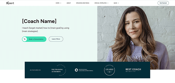
Hero Section from Xpert, our companion theme for online coaches
Here’s what to include:
- A clear attention-grabbing headline that speaks to your audience’s goal or pain point
- A short subheadline to add helpful context
- A relevant, high-quality image or video that supports your message
- A bold, clear CTA button (or two)
👉 If you’re using Thrive Theme Builder or Thrive Architect, you can start with one of the homepage templates that already includes a professionally designed hero section — then just tweak the text and visuals to make it yours.
Relevant Images & Videos
Your homepage (and the rest of your website) should include high quality images to make it easier for your audience to view your content and understand your business.
These visuals can be:
- Real photos of your physical business, or you and your team at work
- Illustrated graphics (e.g. infographics) specially designed for your website
- Relevant stock images
- Slideshows or image carousels
- Videos
Images are a great way to break up the blocks of text on your website, making your written content appear less overwhelming and much easier to read.
Testimonials (Social Proof)
This might be one of the most underrated website features — but it shouldn’t be.
I used to hold off on asking for testimonials. It felt awkward, or like I needed to have more experience first. If you’ve ever felt the same, here’s a quick guide on how to ask for testimonials without feeling awkward — it’ll save you a lot of second-guessing.
Because here’s the truth: if someone’s had a good experience with your business, they’re usually happy to share it. And that social proof? It works.
Testimonials help potential customers see themselves in the success of your existing clients. They build trust faster than any product description ever could.
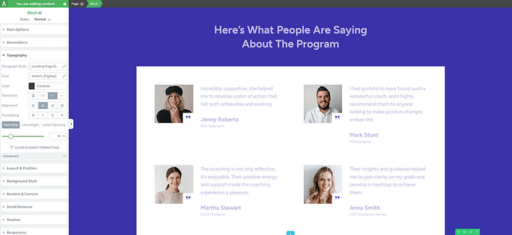
Testimonial block in the Thrive Architect visual builder
👉 Strategic tip: Place your testimonials in high-traffic areas like:
Right after your hero section
Beneath your features or benefits
Just above a CTA
Near your About or Pricing sections
Using Thrive Architect? Just drag in a testimonial block or even embed video feedback — no fancy design skills required.
Not sure where to start? This guide walks you through 5 effortless ways to add testimonials to your WordPress website and sales pages.
Features & Benefits Section
When your potential customers land on your website, the one thing on their minds is, “What’s in it for me?”
Why should they learn more about your business? Why should they consider your products and services?
A lot of entrepreneurs make the mistake of thinking that listing the features of a product will win their target audience over…but it’s not true. Your audience doesn’t want a long list of what your business has. They want to know how you are going to solve their problem or improve their life.
If you list your features or products like this:
- Self-paced courses
- 100+ videos from experts
- Interactive quizzes available
That’s not going to help you land any sales. If anything, your audience will read through the list and ask, again, “So what? What’s in it for me?”
You need to focus on building an image in your audience’s mind that shows them how you can make their lives better.
Content Overview Section
Your homepage is a great place to showcase your best-performing blog posts, videos, and/or podcast content.
The best way to show your audience that you’re a thought leader they can trust is by showing them your work.
Calls to Action
Remember, the goal is to get your audience to take action (buy, sign up, download an offer, etc.).
Call-to-action sections push your site visitors to take action before leaving the page. Be sure to include 2 to 3 clear calls to action on your page: one near the top, one in the middle of your page, and one towards the end.
About Us Section
Adding an “About Us” to the homepage helps your audience get to know you a little better. This is the place to mention who you are.
Include any details on your certifications, work experience, academic achievements, awards, or any other credentials that solidify your credibility as a business owner or professional in your niche.
Don’t forget to add a high-quality photo of yourself to further build trust.
Opt-In Form
Some of your visitors might need more time before they’re ready to buy from your business, but they may be willing to opt into your mailing list.
Offer them a compelling lead magnet that's relevant to a goal they want to achieve, in exchange for their contact information.
Tip: Read this blog post to learn how to use gated content to grow your mailing list.
Footer
Whatever you do, don’t stick to a plain, auto-generated footer. Customize your website footer to include important company information, and conversion-focused elements to encourage visitors to take action when they reach the very end of your website.
Here are a few key elements your footer should have:
Social Media Icons
Adding social media icons to your footer encourages your visitors to click on them and follow you on different platforms. That way, you can keep your business at the front of their minds by regularly posting updates on social media.
Links to Important Pages
Your website footer is also the best place to add internal links to important site pages that might not fit well in the main menu. The best pages to link to, from your footer, are your Privacy Policy page, Terms of Service, FAQs, and even your Site Map.
Company Information
Include important business information like your business name, address, copyright information, and business hours.
Contact Information
You should also add your contact information to your footer. Include key details like your phone number, email address, a map, and a link to a contact form.
Newsletter Opt-In Form
Add a small sign-up form to encourage your site visitors to subscribe to your email newsletter.
Other useful elements to add to your website footer are a search bar, your company’s logo, and even a call to action.
Important Inner Pages for Your Website
There are other key webpages your website should have, to support your homepage and further engage with your visitors. These include a/an:
About Us Page
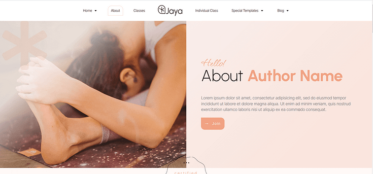
As mentioned earlier, you need a dedicated “About Us” page that details who you are, your company’s history, and your mission & values.
If you have a team, this is also the best page to provide more information on each person’s role in your company. This helps site visitors get to know your business better, building trust.
Products/Services Page
Use this page to dive deep into what your business offers, how your products and services can help your visitors, and how much they cost.
If you have multiple products or product ranges, you’ll want to use this page as a central hub that leads to individual product/service pages.
Product Page -> Product Category -> Individual Product Page
Contact Page

This page informs your visitors on how to contact you. This page should include a phone number, email address, and/or a contact form.
We strongly recommend adding a contact form to your website, as it’s one of the easiest ways for your customers to contact you, regardless of what time it is.
That way, you won’t have to worry about missing calls, for example, outside of work hours.
Blog
A blog is a great way to provide business updates and educate your customers on relevant topics in your industry. People love buying from businesses they can learn from – and the best way to teach your customers is through written, video, and audio content.
Let your blog be a space dedicated to sharing valuable content on your industry, your products, and developments in your business.
Key elements to include in your blog are:
- Structured post list: to show your most recent posts and top-performing content, making it easier for visitors to find their way through your content
- Search bar: so readers can easily search your blog post using specific keywords or topics
- Categories and tags: to organize your posts and help readers to find more content on topics they’re interested in
- Author bios: to provide brief information on the people who create content on your blog, also building credibility
- Comments section: to encourage engagement among your readers. Each blog post should have a dedicated comments section.
- Social sharing options: to allow your readers to share your posts on their social media profiles, encouraging people in their network to check out your work
- Lead-generation form: to encourage your audience to opt-in and join your mailing list in exchange for a high-value lead magnet
FAQ Page
Your potential customers are going to have questions about your business, products, and services that they’ll want to be answered before they decide to commit to a purchase.
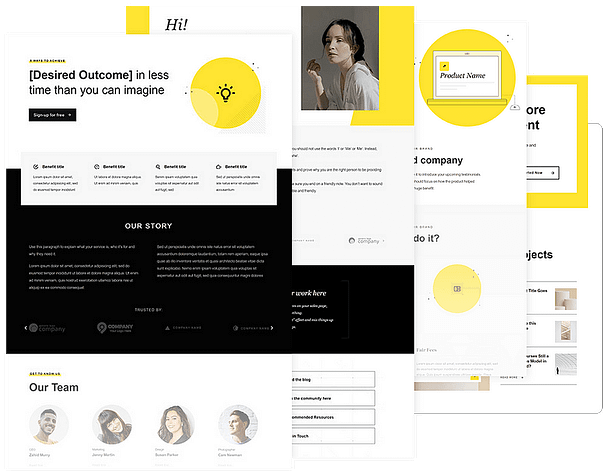
Get ahead of this by adding an FAQ page to your website that includes frequently asked questions & answers on your business (business hours, location, etc.), pricing, and any other details that might not be clear to your potential customers.
Other important pages you should add to your website are:
- Testimonials/Reviews – to showcase your customers’ feedback & share in-depth customer success case studies
- Portfolio/Work Samples – to show off your skills & further prove why your potential clients should pay for your services
- Shop – so your potential customers can view your products and buy
- Terms and Conditions – to outline the T’s and C’s that come with purchasing and using your products
Additional Key Website Features
There are “smaller” parts of your website that’ll play a big part in convincing your visitors to stay on a page and keep reading through your content. These include:
Clear, Readable Fonts
Your fonts shouldn’t make people squint, zoom in, or wonder if your website was built in 2004.
The typefaces you use play a big role in how professional your site feels — and how easy it is to read your content. Fancy script fonts or overly stylized type may look cool in your logo, but for body text? They’re usually a distraction.
Here’s what to aim for:
Use no more than 2–3 fonts across your site (e.g., one for headings, one for body text)
Choose fonts that are easy to read at any size
Make sure there’s good contrast between your text and background
Stick to web-safe fonts that render consistently across all devices
If you’re building your site with Thrive Architect or Thrive Theme Builder, you’ll love the Thrive Font Library — it gives you full access to Google Fonts and lets you customize typography globally or per element, all without touching a single line of code.
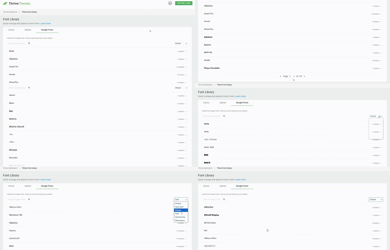
👉 Want to go a step further? Here’s how to create custom fonts in WordPress and apply them in a way that still keeps your site readable and on-brand.
The right fonts won’t just make your site prettier — they’ll make it more trustworthy, accessible, and user-friendly.
Responsive Design
If your website doesn’t work on mobile, it doesn’t work — full stop.
More than half of all web traffic comes from mobile devices, and that number keeps growing. If your layout breaks, your text overlaps, or your menu disappears on smaller screens, visitors won’t stick around — and Google won’t rank you.
That’s why responsive design is no longer optional. Your website needs to adapt automatically to any screen size — desktop, tablet, or smartphone — without sacrificing clarity or functionality.
Here’s what that means in practice:
Text scales appropriately for every screen
Images and videos resize without breaking layouts
Menus collapse into mobile-friendly navigation
Buttons stay tappable and easy to interact with
If you're using Thrive Theme Builder, responsive design is built in from the start — no need to manually create mobile versions of your pages. You can even preview and edit your content on tablet and mobile views to make sure everything looks just right.
👉 Not sure where to start? Check out this guide with practical tips for creating a mobile-friendly website — it’ll help you spot quick wins and avoid common mistakes.
Consistent Color Scheme
Your color scheme doesn’t just make your site look nice — it shapes how people feel about your brand.
Color consistency across your website helps build trust, improve readability, and create a smooth user experience. When your pages all follow the same visual language, visitors are more likely to feel like they’re in the right place.
Here’s how to keep it clean and cohesive:
Stick to 1–2 primary colors and 1–2 accent colors (typically pulled from your logo)
Use colors with enough contrast to make text and buttons easy to see
Apply your brand colors consistently across headlines, buttons, backgrounds, and icons
Avoid random color changes between pages — it confuses users and weakens your brand
If you're using Thrive Theme Builder, you can set your global color palette once and apply it throughout your entire site — no need to manually update every element.

Fast Loading
Your visitors won’t wait — and neither will Google.
A slow-loading website doesn’t just frustrate users, it actively drives them away. In fact, studies show that 53% of mobile users will abandon a site that takes more than 3 seconds to load. And from an SEO standpoint? Page speed is a known ranking factor.
So if your site drags, everything else — your offers, content, CTAs — won’t matter.
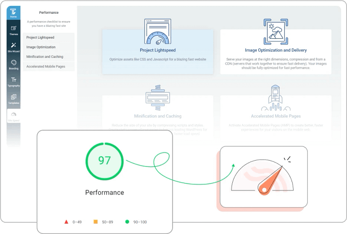
Here’s how to speed things up:
Compress large images without sacrificing quality
Choose a fast, performance-optimized WordPress theme
Use caching plugins and a reliable hosting provider
Minimize heavy scripts or unnecessary plugins
👉 Need practical steps? Read this article on how to improve your WordPress site speed — it covers exactly what to tweak and why it matters.
Spam Protection (reCAPTCHA or Similar)
Spam might seem like a small issue — until your inbox is flooded with junk messages or bots start hitting your forms.
Beyond the annoyance, spam can make your site feel less trustworthy and distract you from real leads. That’s why basic spam protection is a must-have website feature, especially for your contact forms, blog comments, and opt-ins.
Popular options like Google reCAPTCHA are great for blocking bots without hurting the user experience. You can also use a web application firewall like Cloudflare for added security and traffic filtering.
If you're using Thrive Architect or Thrive Leads, you'll already have access to built-in spam protection options — so you don’t have to juggle multiple tools.
👉 Want step-by-step help? Here’s our guide to setting up spam protection on your WordPress site using both Thrive tools and third-party options.
Contact Information
If a visitor wants to reach you, make it easy.
Burying your contact details or hiding them behind multiple clicks is a quick way to lose trust. Whether you’re running a personal brand, service-based business, or online store, clear contact information is one of the most important — and often overlooked — website features.
Here’s what to include:
Business email address (use a custom domain if possible — it looks more professional)
Phone number, if you offer direct support or sales
Contact form for easy inquiries at any time of day
Business address, if location matters for your business (especially for local SEO)
Map embed, if you want to make finding your location easier
Pro tip: Add your contact details to both your Contact page and your footer so users can find them from anywhere on your site.
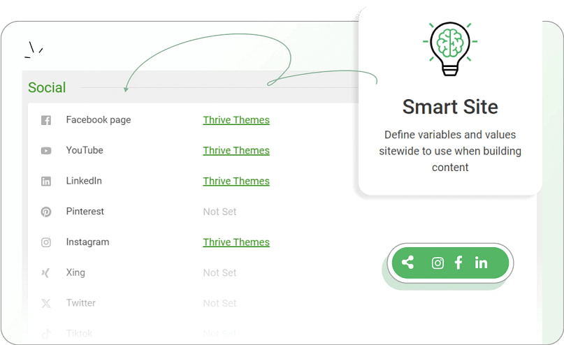
👉 If you're using Thrive Theme Builder, you can set these details once using Smart Site Settings — then reuse them anywhere on your site without updating them manually. It’s a simple way to stay consistent and save time.
Backend Must Have Website Features

These features might not feature on the front end of your website, but they all play a crucial role in keeping your site up, running, and secure.
These include a(n):
Content Management System (CMS)
A content management system (CMS) helps you add, edit, and manage all of your website’s content.
While there are a variety of CMS options to choose from, we strongly recommend WordPress.

WordPress powers 43% of all the websites on the Internet — making it the most popular and widely supported content management system (CMS) and website building platform.
You can use this powerful CMS to build:
- Business websites
- Blogs
- Online magazines
- eCommerce stores
- WordPress membership sites
- Forums
- …and so much more.
Whether you’re a beginner who wants to build a simple website to launch your online presence, or an experienced marketer, consultant, or small business looking to build a kickass website to elevate your brand… WordPress can help you achieve your goals.
The best part? You don’t need to be a coder or advanced web designer to make it happen.
Even though there is a popular misconception that you need to know how to code to build a WordPress website – it isn’t true.
There are a variety of reliable, no-code WordPress website building tools you can use to build a conversion focused website that generates leads, subscribers, and customers.
Website Hosting
If you want to build a website, especially with WordPress, you’ll need a hosting service. WordPress recommends a couple of hosting options but there are a variety of providers to choose from (e.g. WPX, SiteGround, Kinsta).
Site Analytics Tool
An analytics tool helps you understand how your site visitors interact with your website. With the right site analytics tool, you can review key insights like the posts and pages your visitors view the most, how long they spend on your website, the source that led them to your site and more.
If you’re building your website with WordPress, we recommend using MonsterInsights to track your analytics.
MonsterInsights makes it easy for you to understand your Google Analytics reports, so you can see what's working and what needs to be improved in your marketing strategies.
This plugin also has a user-friendly dashboard that helps you track your site data (e.g. pageviews, conversions, sessions) with ease.
Search Engine Optimization (SEO) Tool
On-Page SEO is critical for optimizing your website's content to help search engine crawlers (and algorithms) and actual searchers.
Your content marketing strategy can only be effective when you get it in front of the right traffic. SEO helps make that happen.
A few tips for improving your SEO strategy are:
Use SEO tools like WPBeginner Keyword Generator, Google Keyword Planner, or Ahrefs to start your keyword research & find relevant terms for your content.
Make sure every piece of content has a unique title tag that includes the main keyword. Keep it under 60 characters.
Write an attention-grabbing meta description (130 to 150 characters), for every post and page, that includes the main keyword.
Use headings (H1, H2, H3, etc.) to structure your content. Include your main keyword in your H1 header to highlight your page’s main topic.
Use short paragraphs and bullet points to make your content easy to read and scan. Avoid using long-winding sentences, as well.
If you’re building a website on WordPress, we recommend All in One SEO (AIOSEO) – one of the best SEO plugins for WordPress — to help improve your chances of ranking high on search engine results pages.
Reliable Backup Tool
You can’t afford to overlook backing up your website. Anything can happen at any given moment, and it’s important that you’re prepared.
For WordPress users, we recommend using Duplicator to backup your website.
With this tool, you can easily back up your WordPress website and make sure you're ready for any setback at all times.
Theme + Page Builder
If you’re building a website on WordPress (which we strongly recommend), you’ll need to find a reliable WordPress theme to create the front-end of your website.
A great user experience boils down to this: a website your site visitors can find easily, navigate without any problems, and immediately understand what you’re offering. Your theme is mainly responsible for making this happen.
You also need to make sure that your WordPress theme is secure. Any vulnerabilities in your theme can lead to dire consequences for you and your customers – and you don’t want that.
We also recommend purchasing a solid WordPress page builder to help you design and customize your site’s pages.
So, you’ll need the right tools to create a clean WordPress website that loads correctly, has clear site navigation, and highlights your written content in a way that’s easy for anyone to scroll through and read.
With Thrive Theme Builder & Thrive Architect you can create a clean WordPress website that clearly communicates your brand, and publish impressive blog posts that look great and offer amazing value.
Thrive Theme Builder comes with several professionally designed companion themes, complete with conversion-focused pages and block templates for every part of your website (including your blog).
And Thrive Architect, our drag-and-drop page builder, is what you’ll use to customize your site pages – and blog posts.
We built our tools with conversions & engagement in mind, so you’ll find all the necessary tools you need to create blog posts that are easy to read and simple enough for search engines to crawl through.
You can purchase Thrive Theme Builder & Thrive Architect together as a bundle, or get them and several conversion-focused plugins when you purchase Thrive Suite, our all-in-one WordPress plugin toolkit designed to help you build a thriving online business.
Website Features Examples (Quick Inspiration)
Real sites you know — and what you can learn from them.
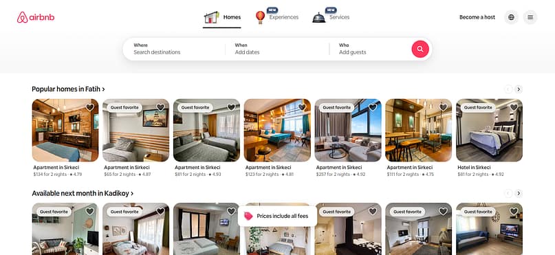
1. Airbnb – Smart Search + Predictive Filters
Airbnb’s homepage centers around a simple search bar with built-in filters that adjust automatically.
Why it works: It reduces cognitive load and gets users to their goal in seconds.
How to use it: Add a clear search feature to your homepage or blog, especially if you have multiple products, services, or content categories.
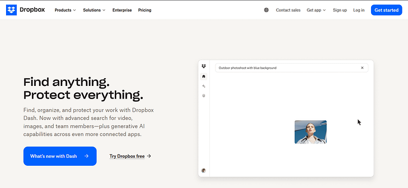
Dropbox uses a minimal layout with one primary message and one primary CTA.
Why it works: Visitors don’t have to guess what to do next — the page guides them.
How to use it: Remove competing CTAs on your homepage. Decide on your main goal and design the page around it.
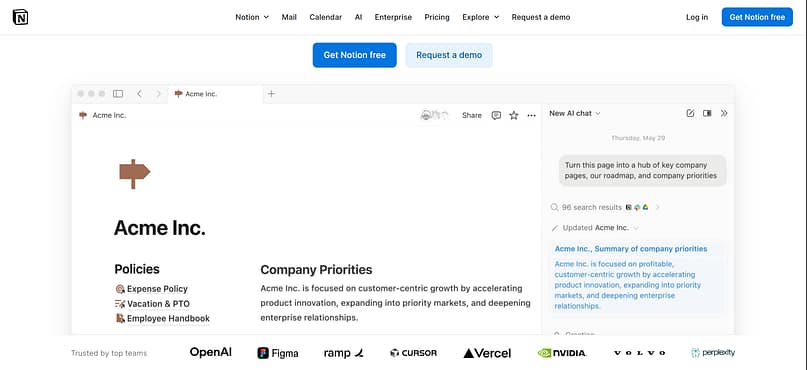
Notion showcases live demos directly on the homepage, letting users “test” the product instantly.
Why it works: Interaction builds understanding faster than text.
How to use it: Add interactive elements like toggles, before-and-after blocks, or short demo clips to help visitors visualize your offer.
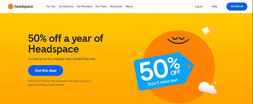
Headspace uses calming colors, simple shapes, and balanced spacing to reinforce its brand.
Why it works: The design itself creates the emotional experience the product promises.
How to use it: Choose a color palette and imagery style that supports the feeling you want your visitors to have.
Next Steps: Build Your WordPress Website
As you read through all the must have features your website should have, you may have felt a bit overwhelmed. If you’re new to building websites and don’t have a lot of experience, you might be worried about finding a way to include most of these features without needing to learn complex code.
But you don’t need to fret - at all.
There are a variety of high-quality no code tools designed to help you build a website without needing to take a crash course in HTML & CSS.
Here are a few resources to help you understand how to build an impressive WordPress website, without needing to code:
Website Features FAQ (Straightforward Answers You Can Use)
The essentials are always the same: fast load times, mobile responsiveness, intuitive navigation, clear messaging, and easy access to contact information.
These foundational features determine whether visitors stay long enough to see anything else.
Small businesses benefit from credibility boosters: testimonials, a clear About page, service descriptions, simple pricing summaries, an FAQ page, and a clean contact form.
These features build trust quickly — especially for visitors discovering you for the first time.
You can create a noticeable upgrade with things like: smooth scroll effects, subtle animations, interactive tabs or toggles, a polished hero video, or updated icons.
These don’t require redesigning your entire site, but they instantly improve the overall experience.
Unique features usually tie back to brand personality: custom illustrations, a distinctive layout, a personalized quiz or guided “start here” journey, or thoughtful micro-interactions.
These features feel more intentional because they’re built around how your brand communicates.
User-friendly sites keep things simple: readable fonts, consistent styling, clear headings, logical page structure, strong contrast, tappable buttons, and pages that don’t overwhelm the visitor. If someone can scan your site and understand it quickly, you’re on the right track.
Conversion-driven features include strategically placed CTAs, testimonials near decision points, limited-choice navigation, lead-generation forms, comparison sections, benefit-driven headlines, and product or service pages designed for clarity — not clutter.
Must Have Website Features: Wrapping Up
If there’s one thing I’ve learned after building and fixing more websites than I can count — it’s this:
A beautiful design means nothing if your site doesn’t work for your visitors.
You don’t need every flashy add-on or “cool website feature” you see online. But you do need a strong foundation: fast loading, easy navigation, mobile-friendly design, and clear messaging. These are the kinds of website features that directly improve your user experience, boost conversions, and help your business grow.
So if you’re feeling stuck or overwhelmed — I get it. But you don’t have to piece it all together from scratch.
That’s why I use Thrive Suite — it’s an all-in-one toolkit with everything you need to build a high-converting WordPress website that looks good and gets results. From intuitive navigation tools to lead generation forms and testimonials, it covers every core website functionality — without the tech headache.
Ready to stop guessing and start building a site that actually works?


