If you ask 10 people “What makes a good website?” — you’ll receive 10 different answers.
Some people focus on what makes a “good” website from the perspective of a web designer, a business owner, or a content publisher, while others equate a good website with the needs of the visitors.
Let’s see if we can pin this down once and for all, so you can build a successful website that helps your overall digital marketing strategy.
More...
Why Do You Need a Great Website?
Well, the answer is simple: Your website is often the first place potential customers learn about your business. A well-structured site makes it easier for visitors to understand what you offer and why they should choose you.
A strong website helps you:
A well-designed website does more than display information. It makes every visit effortless, keeps people engaged, and gives them a reason to come back.
So What Does Make a Good Website?
William Shakespeare once said, “There is nothing either good or bad, but thinking makes it so.”
And, while I respect Will, he never tried building a successful website. He’d probably use Flash and GeoCities.
There are definitely ‘good’ and ‘bad’ websites... and some very clear guidelines to making sure your website lands on the right side...
Good
Visitors can find information and content quickly.
Search engines can understand which keywords relate to your content, and can show your website in the search results.
Content is easy to add and maintain.
Your website looks amazing on all devices with different screens... computers, tablets, and mobiles.
Your visitors find your content interesting, valuable, relevant and timely for the challenges they’re currently facing.
Bad
Visitors struggle to navigate your website, leading to high bounce rates and lower conversions.
Search engines get frustrated with slow loading, buggy pages, and choose to show competitor websites instead.
Adding content is a convoluted mess of frustrating CMS options and unintuitive code.
Visitors have to pinch-zoom (the horror!) or scroll horizontally on their mobile, and your navigation menu doesn’t work with fat fingers.
Your content is dry, self-indulgent, spammy or disrespects your readers’ time.
The 7 Pillars of What Makes a Good Website (Breakdown)
A great website is about function, clarity, and the experience it creates for visitors. Every element should work together to keep people engaged, build trust, and guide them toward action.
Here’s a breakdown of the key pillars that make a website effective:
1. User-Friendly Design
A well-designed, user-friendly website makes it easy for visitors to enjoy and navigate, encouraging them to stay longer and engage more.
As a result, you’ll achieve user satisfaction, lower bounce rates, and a stronger brand reputation. Search engines are also known to favor websites that provide a good user experience, which can lead to better SEO rankings, more organic traffic, and more customers.
The key components of a user-friendly website are a clean, logical layout, easy navigation, and mobile responsiveness.
Easy Navigation
As your website grows in terms of pages, you’ll need to think carefully about how you organize your content.
A simple website can start with a handful of pages, but add in new products, landing pages, marketing campaigns, and blog posts, and your website visitors will quickly become lost if you don’t guide them with a logical way to navigate.
Good site navigation looks like:
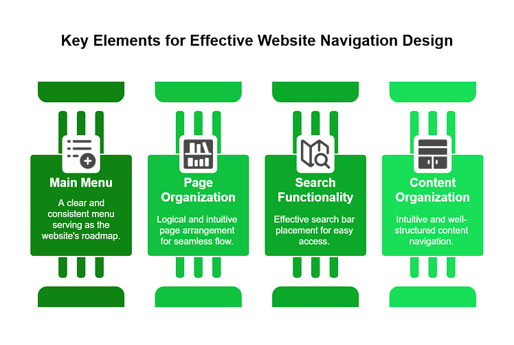
A clear, consistent main menu (usually a dropdown menu) that serves as the roadmap for your website
Logical, well-thought-out page organization that creates a natural, intuitive flow (learn more about website layouts here)
Search bar functionality (in the header, footer, and/or sidebar of the website)
Well-organized content that can be navigated intuitively
Clean, Logical Layout
Your website’s layout and design are foundational to a good user experience.
A visually pleasing design, combined with a clear, straightforward layout, makes your website engaging and easy to use.
Your site layout and design should feature:
Now, if you’re not well-versed in web design, you’ll struggle to build a website like this from scratch.
But with the right tools, you won’t even have to.
Thrive Theme Builder + Thrive Architect are the no-code, website building duo you need to build a clean, conversion-focused website your audience will love.
Thrive Theme Builder helps you create a great-looking site layout, along with the necessary core page templates you’ll need (homepage, blog page layout, default blog post design, 404 page, etc.)
Once you’ve set up your theme, you’ll use Thrive Architect’s user-friendly drag-and-drop visual editor to customize your page templates to your exact liking.
Choose from hundreds of landing page templates to add to your site and use our library of design elements to make them unique to your business.
Mobile-Friendliness

In a world where our phones and tablets have almost become an extension of ourselves, having a mobile-friendly website is non-negotiable.
When a visitor accesses your site through their mobile device, your site’s content and layout should adjust automatically, allowing for easy navigation and an enjoyable experience.
If you’re using Thrive Architect, you can optimize your pages and create a mobile version of your website in seconds.
Thrive Architect features a built-in “Responsive Design” feature that lets you manage the display of certain elements on the Desktop, Tablet, or Smartphone interfaces.
And if you want to learn more key tips to build a responsive website, watch this tutorial from Tony:
2. Conversion-Focus
“Conversion-focus” is all about optimizing your website to make it more likely for your visitors to take action - be it buying a product, signing up for a newsletter, or filling out a contact form.
To achieve this, your landing pages must have:
The best way to find what’s helping (or hurting) your site’s conversion rates is through A/B testing.
A/B testing gives you hard data on what's working and what's not, allowing you to continuously refine and enhance the user experience and conversion potential.
If you’ve purchased Thrive Architect, you also get access to Thrive Optimize, a user-friendly A/B testing plugin you can get started within minutes.
Want to take your landing pages to the next level? Check out our guide on landing page hacks for more conversions and learn practical strategies to turn more visitors into customers. Read it here.
3. High-Quality Content
Keeping your audience’s attention is all about providing valuable, relevant information that resonates on a personal level, making them eager to dive deeper into your site.
As you write, focus on including suitable keywords throughout your content —titles, subheadings, and body text. But, only where they make sense – to avoid keyword stuffing.
You should also refresh your content regularly to keep your audience coming back for more, proving your updates are as fresh and enticing.
Liven up that text with some eye-catching multimedia—images, videos, and infographics. They’re not just pretty to look at; they make your content more engaging, easier to share, and break down complex topics into bite-sized, digestible pieces.
Struggling to keep your audience engaged? Learn how to write compelling content that holds attention and drives action with these expert copywriting tips. Read it here.
You can create the images yourself (and this guide on making your own visuals for your website can help) or you can make use of the in-built stock image library in Thrive Architect:
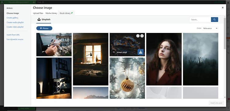
Access thousands of visuals in the built-in stock image library in Thrive Architect
Thrive Architect users now have access to over 6 million high-quality stock images directly into your editor. Just hit search and you'll find a variety of pictures to choose from.
Fed up with slow load times and clunky CMSs that turn publishing a simple post into a tiresome journey?
If you find yourself wrestling with HTML or bemoaning the gap between what your Block editor shows and the published outcome, it’s time for a change.
Switch to a web page builder like Thrive Architect, which gives you a what-you-see-is-what-you-get (WYSIWYG) functionality, ensuring the editing stage mirrors the final page.

Thrive Architect Editor
4. Fast Loading Speed
Did you know that 1 in 4 visitors abandon websites that take more than 4 seconds to load?
Or that each 1 second page load delay leads to a 16% reduction in customer satisfaction?
Websites that load quickly give users the fast and easy experience they're looking for.

Slow-loading pages can lead to frustration and high bounce rates, as users are likely to leave a site that doesn’t load promptly.
To avoid a slow-loading website, you should:
Optimize your images and videos
Ensure none of your plugins are outdated
Use a theme that is built with clean code and is updated regularly
Use a reliable web hosting provider
Install a site speed plugin (or tools found in Google Search Console) for additional assistance
Thrive Theme Builder also includes a Website Speed Optimization tool to ensure your website loads fast.
This feature is automatically activated on your website, so you don't need to do anything here.
Our site performance optimization tools are simple to understand and straightforward to use, so you can complete this setup in less than a few minutes.
5. Search Engine Optimization (SEO)

For on-page SEO, start with keyword research use tools like the WPBeginner Keyword Generator to start your keyword research & find relevant terms for your content.
Your page and post content should have:
- A unique title tags (per content piece) that’s under 60 characters
- Attention-grabbing meta descriptions that include your main keyword,
- Structured headings to organize your content
- Use short paragraphs, bullet points for easier reading, alt text for images, and internal linking with descriptive anchor texts.
- URLs should be simple and include your target keyword when possible.

In terms of an off-page SEO strategy, focus on building quality backlinks (link building) through guest posting, collaborating with other creators in your industry, and identifying broken links on other websites – offering your content as a replacement, instead.

And concerning, technical SEO, you must make sure search engines can easily crawl, understand, and index your site.
This is done through optimizing loading speeds, securing your website with an SSL certificate, creating a sitemap, adding schema markup for Google rich snippets, and conducting regular audits to identify and fix issues.
Other important tasks include using robots.txt files wisely, optimizing your site’s core web vitals , checking for crawl errors, using heatmaps, and conducting regular technical SEO audits.
If you’re handling your site’s SEO on your own, this could become very time-consuming in no time. Especially if you aren’t knowledgeable on the ins and outs of SEO.
To make your job 100 times easier, we recommend using a WordPress SEO plugin like All in One SEO, to optimize your website for search engines.
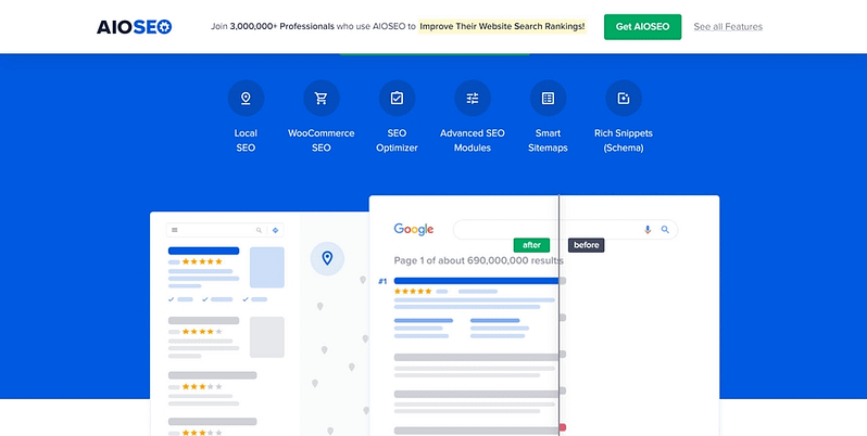
AIOSEO handles all the technical aspects of optimizing your website and provides key tips on how to make your content SEO-friendly.
This plugin is easy to install, even easier to use, and will help you get your content higher up on search engine results pages (SERPs) and attract more of your target audience.
6. Security
Your site’s security focuses on defending sensitive data from malicious attacks and maintaining the integrity of your online presence.

When site visitors feel confident about their safety on your site, trust grows, which is fundamental for customer loyalty and retention.
In addition to using a security plugin to scan for malware and vulnerabilities, your site will also require the following:
Installing an SSL certificate to protect the data exchanged between your website and its visitors
Updating your theme, plugins, and content management system (CMS) regularly
Using strong passwords and 2 factor authentication to protect your site’s user accounts
Backing up your website on a regular basis
7. Analytics and Feedback
Web analytics are your compass when it comes to navigating your site’s performance. With the right tool, you can get a clear picture of how users interact with your site.

From which pages they visit to how long they stay and where they drop off, these insights allow you to tailor your website to better meet user needs and achieve your business objectives.
As a starting point, we recommend setting up Google Analytics on your website. It's a powerful, free tool that provides a wealth of data about your website's traffic, user behavior, and much more
The best way to set up analytics on your website is to use a WordPress analytics plugin.
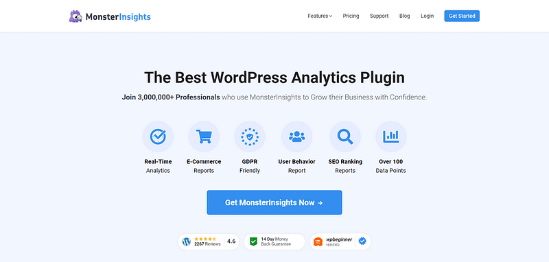
We recommend using MonsterInsights.
MonsterInsights
Known for its outstanding ease of use and powerful feature set, this plugin makes it super simple for WordPress site owners to integrate Google Analytics with their sites – without needing to deal with any code.
Once installed, the MonsterInsights plugin offers a comprehensive, user-friendly dashboard directly within your WordPress dashboard, allowing you to view complex analytics data in a clear, easily understandable way.
This powerful tool also offers a wide range of in-depth tracking features – putting it far ahead of its competitors.
You can use this plugin to observe real-time stats, e-commerce tracking, form submissions, and custom dimensions tracking.
Whether you’re a WordPress beginner or an advanced user, MonsterInsights will help you make the right kind of data-driven decisions without struggling with Google Analytics' native interface.
Next Steps: Audit Your Current Website Design
Now you know how to optimize your website, it’s time to review your web pages and identify the areas that need to be improved.
Here are four additional tutorials to help optimize your site’s design, SEO, and marketing:
What Makes a Good Website: Final Words
And there you have it!
Now you know everything you need to great the best website for your visitors -- and to grow your business.
With the right tools, website building can be a fun, fulfilling experience, instead of a tedious chore.
If your current tech stack is letting you down, this is a good time to switch up and try something new.
Thrive Theme Builder and Thrive Architect are the best duo you need to revamp your current site and turn it into the lean, mean business machine it was meant to be.
But don't just take our word for it.


