Trying to figure out how to create a homepage your site visitors will love?
You’ve come to the right guide.
Your homepage serves as the front page of your website and sets the tone for your new visitors’ user experience and interaction with your brand.
If your homepage display fails to engage your audience and communicate your business’ value — you’ll lose conversions.
...and you don’t want that.
Keep reading to learn how to create an impressive homepage design that’ll turn your site visitors into leads and customers for your small business.
What Are the Key Elements of an Impressive Homepage?
Your homepage is one of the most important pages of your new website.
In most cases, it’s the first page your new visitors will see.
To keep your audience’s attention and get them to convert, your homepage should have the following elements:
Clear value proposition: Let your visitors know what your business is about. Grab their attention with clear headlines that stand out.
User-friendly navigation: Make sure your navigation menu is straightforward and easy to use.
Clear calls to action: Direct your audience to take a primary action (sign up, shop now, etc.)
Responsive design: Make sure your homepage works well (and looks great) on all devices – mobile devices and desktops.
Fast load times: Your website needs to load quickly — this is important for search engine optimization and user experience. Optimize all visuals on your pages and avoid using heavy or outdated themes and plugins.
Engaging visuals & compelling copy: Use your page copy to connect with your audience and support this text with relevant, high-quality visuals
How to Create a Homepage for Your Own Website (Step-by-Step Guide)
1. Install Thrive Theme Builder and Thrive Architect
After you’ve purchased or set up a free domain name, chosen a WordPress web hosting provider, and completed the WordPress installation process -- it’s time to start working on your custom homepage.
The great thing about using WordPress as your Content Management System is the fact that you can create your website in any way you like — from choosing your own hosting company, to designing your site without writing a single line code.
This section shows you how to create a homepage without needing to know HTML, CSS, or any other coding language.
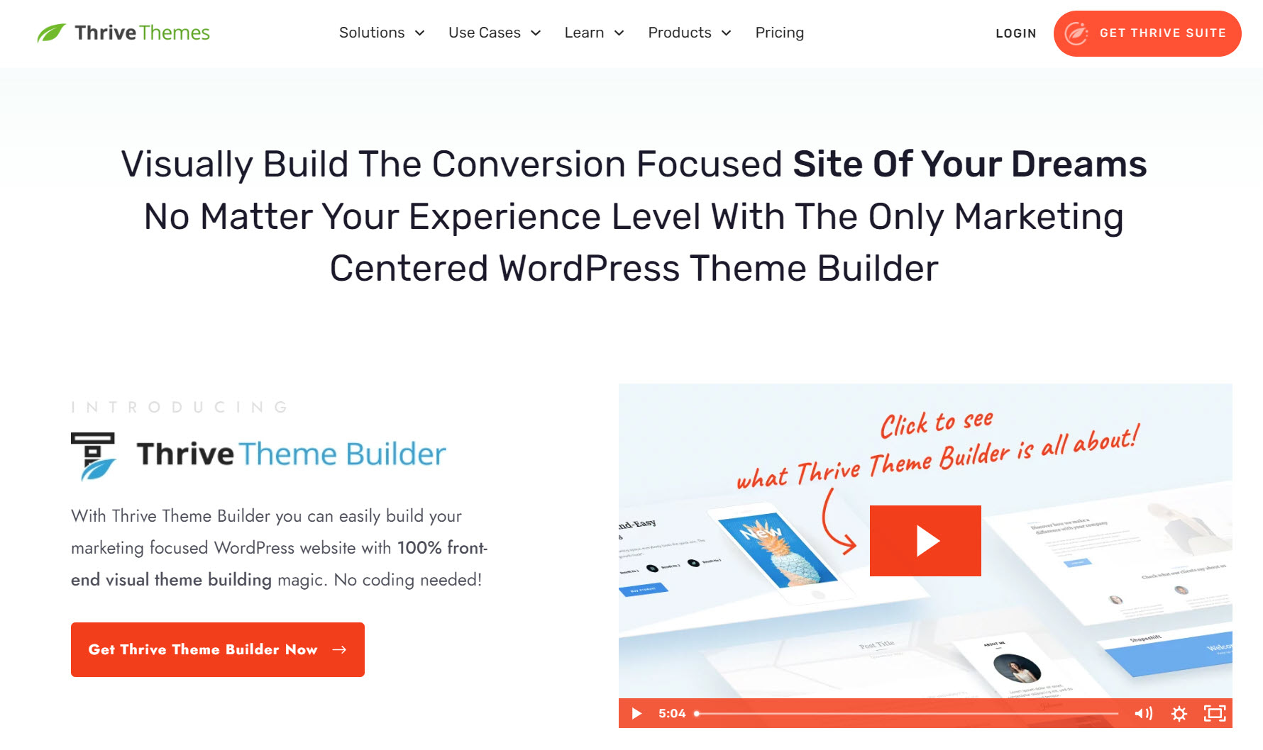
If you want a custom WordPress theme to make your homepage (and website) stand out from the rest – you need Thrive Theme Builder.
This is the best theme customizer and website builder available on WordPress.org and WordPress.com.
Thrive Theme Builder helps you build and customize every aspect of your business website without typing a single line of code.
You get access to pre-built templates to build a clean, SEO-optimized website that search engines will love — without wasting time creating complicated designs from scratch.
The best part? You can have all of this set up in minutes. We’ll show you how.
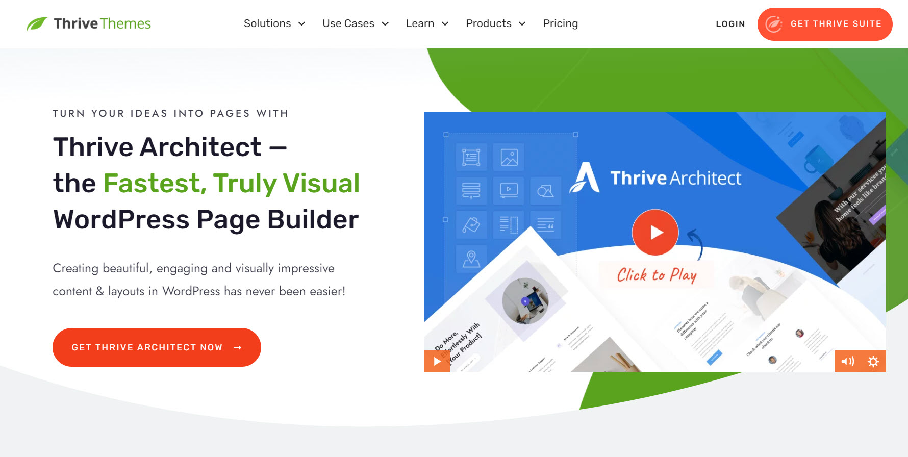
And once you’ve created your website’s structure, you’ll hop in and customize your webpages with Thrive Architect, our page-building plugin.
Thrive Architect will help you design an attention-grabbing homepage your visitors will love.
You can also use this plugin to design your other WordPress pages — about page, contact page, blog post page, and more.
One of the best Elementor alternatives, this page builder features drag-and-drop functionality for easy building; and a large of selection templates you can use to create unique web pages.
No need to code. No need to purchase expensive add-ons. You get everything you need to build a stunning static homepage.
You can purchase Thrive Theme Builder and Thrive Architect , the best WordPress website building duo, as a bundle or as part of Thrive Suite, where you get access to eight additional premium plugins.
2. Choose Your Theme with Thrive Theme Builder
Thrive Theme Builder comes with a selection of professionally designed premium themes, complete with conversion-focused pages and block templates for every part of your website.
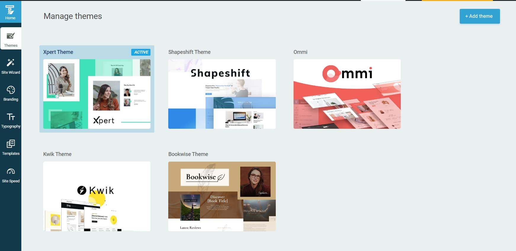
Some of our themes were built with specific niches in mind – like yoga and online coaching – but they still work super well with any other type of website.
Every theme is fully customizable, allowing you to create a unique website design to impress your site visitors and stand out from the competition.
And it gets better with our Thrive Theme Builder Setup Wizard...
3. Create Your Custom Web Design in the Thrive Theme Builder Setup Wizard
The Thrive Theme Builder Setup Wizard is the key to creating your website’s structure.
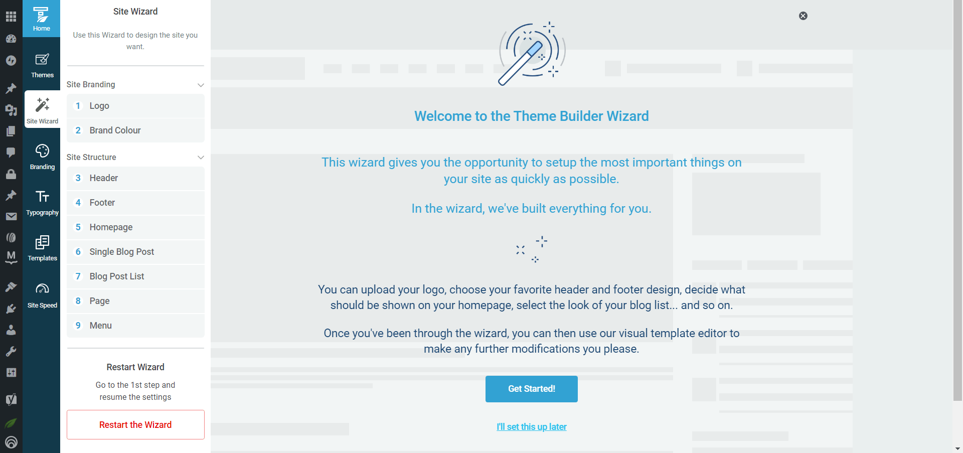
Setup the wizard in Thrive Theme Builder.
This is also where you’ll set up most of the important elements of your homepage including:
- Choosing a color scheme for your entire website
- Configure your site’s fonts
- Adding a dark and light version of your logo
- Selecting a header and footer template
- Configuring your menu
- Selecting a default homepage template

Example of Homepage Templates from Ommi, a Thrive Theme Builder theme
Every Thrive Theme Builder theme includes ready-made templates to help you build and customize your website with ease.

More homepage templates from Thrive Theme Builder
The Setup Wizard will also help you select templates for your blog page (e.g a posts page with a sidebar) and a default, static page on WordPress.
4. Customize Your Homepage with Thrive Architect
Now it’s time to customize the homepage template you selected in Thrive Theme Builder. For this section, you’re going to use Thrive Architect, our drag-and-drop
landing page builder plugin.
When you were working through the Thrive Theme Builder Setup Wizard, you got started creating your Homepage template…
A homepage is automatically generated for you, so you don’t need to create a new page or configure any other homepage settings.
You’ll find it in the "Pages" section in the WordPress Admin Dashboard.
Search for the page titled "Generated Homepage".

Click on the link and you’ll be taken to the Block Editor space, from the WordPress Dashboard.
In the Editor, click “Launch Thrive Architect”.

As you work on your page design, you’ll realize that you may need to add new sections (e.g. a drop-down menu, widgets area, or FAQ section) or remove a few. Thrive Architect makes this super easy to do, and you’ll see how.
To create an eye-catching homepage that communicates your business's value, it must have the following sections:
Hero Section to Create a Great First Impression

A hero section is one of the most important elements of your homepage.
It’s one of the first things your visitors see when they land on your site, ultimately setting the tone for the rest of their experience.
A good hero section must have:
A clear, high-quality image of yourself, or something relevant to your business and products
An attention-grabbing headline that addresses your audience’s needs, or introduces who you are and what you do
A supporting sub-headline or tagline to briefly elaborate on your headline and provide more information to your audience
A clear, compelling call to action button to prompt your visitors to take action – "Shop Now," "Sign Up," or "Contact Us”.
Social Proof to Build Trust
Social proof is key to strengthening your potential customers’ trust in your business.

Testimonial block in the Thrive Architect visual builder
Most of our homepage templates include a testimonial section, but if you want to add more we recommend placing them in the following places:
Above the fold, right after your hero section
After the “Features/Benefits” section
Underneath the “About Us” section
Close to a call-to-action button
Tip: If you’re struggling to find the courage to ask for testimonials, read this guide to learn 5 effortless ways to add testimonials to your WordPress website and sales pages.
Features & Benefits Section to Showcase the Value of Your Products
When your potential customers land on your website, the one thing on their minds is, “What’s in it for me?”
Why should they learn more about your business? Why should they consider your products and services?
Your audience doesn’t want a long list of what your business has. They want to know how you are going to solve their problem or improve their life.
If you list your features or products like this:
“Premium website hosting service”
“Multiple hosting plans to choose from”
"Best Bluehost alternative”
That’s not going to help you land any sales. If anything, your audience will read through the list and ask, again, “So what? What’s in it for me?”
You need to focus on building an image in your audience’s mind that shows them how you can make their lives better.
Thrive Architect provides a selection of features & benefits sections you can use to clearly communicate how your products will change your visitors’ lives, or help them achieve a goal.

Content Highlight Section
Your WordPress homepage is the perfect place to showcase your latest posts, videos, and/or podcast content.

Post list templates in Thrive Architect
The best way to show your audience that you’re a thought leader they can trust is by showing them your work.
For example, you can use this section to showcase recent blog posts and direct your audience to your blog posts page.
Use the Post List element in Thrive Architect to select the content on your website that you’d like to share on this page.
About Section to Share Who You Are
Adding an “About Us” to your homepage helps your audience get to know you better.
This is the place to mention who you are.

About Section featured in a homepage template from Jaya, our theme for yoga studios & instructors
Include details that add to your credibility – certifications, work experience, academic achievements, awards.
These show your audience that you’re well-versed in your field, helping them trust you more.
And if you have a team, this is the perfect place to share more information on the people running the business with you.
Don’t forget to add a high-quality photo of yourself (and your team members) to further build trust.
CTA Sections
The goal of your homepage is to introduce your business to your visitors and get them to take action.
You can use these sections to encourage your audience to:
Sign up for a free PDF guide or eBook
Register for a webinar
Try out a free trial of your online course
Purchase a discounted product from your eCommerce store
Fill a form to get their results from an online quiz
Contact your business via a “Call Now” button
Submit their contact information in a designated contact form
…the list goes on
We recommend including two or three CTA sections – depending on the length of your page.

Make sure your CTA sections have a:
Clear compelling headline (e.g. a question or benefit-driven statement)
Supporting image to draw attention to the section
Bright CTA button that has a compelling prompt and clearly communicates what your visitor should do next (e.g. “Buy Now”)
Lastly, don't forget to configure your navigation menu and add the correct social media links to your header or footer.
To make navigation easier for your visitors, we also recommend adding a search bar to your homepage.
If you have an online store, don’t forget to add a product carousel or product highlights section on your page as well.
Once you’re happy with your homepage design, save changes, and hit that publish button.
Next Steps: Create an Opt-In Form for Your Homepage
The goal of your homepage is to introduce your business to new visitors and encourage them to convert.
One of the easiest ways to do this is with an opt-in form. Some visitors might not be ready to buy, but they could be willing to submit their contact info in exchange for a valuable lead magnet.
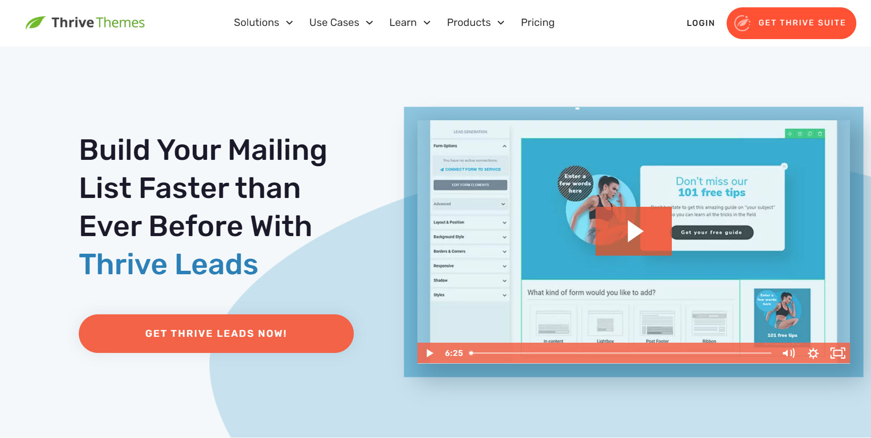
We recommend using Thrive Leads, our lead generation plugin, to build eye-catching opt-in forms to turn your audience into leads.
When you buy Thrive Leads, you get access to 450+ professionally designed opt-form templates to build stunning signup forms fast.
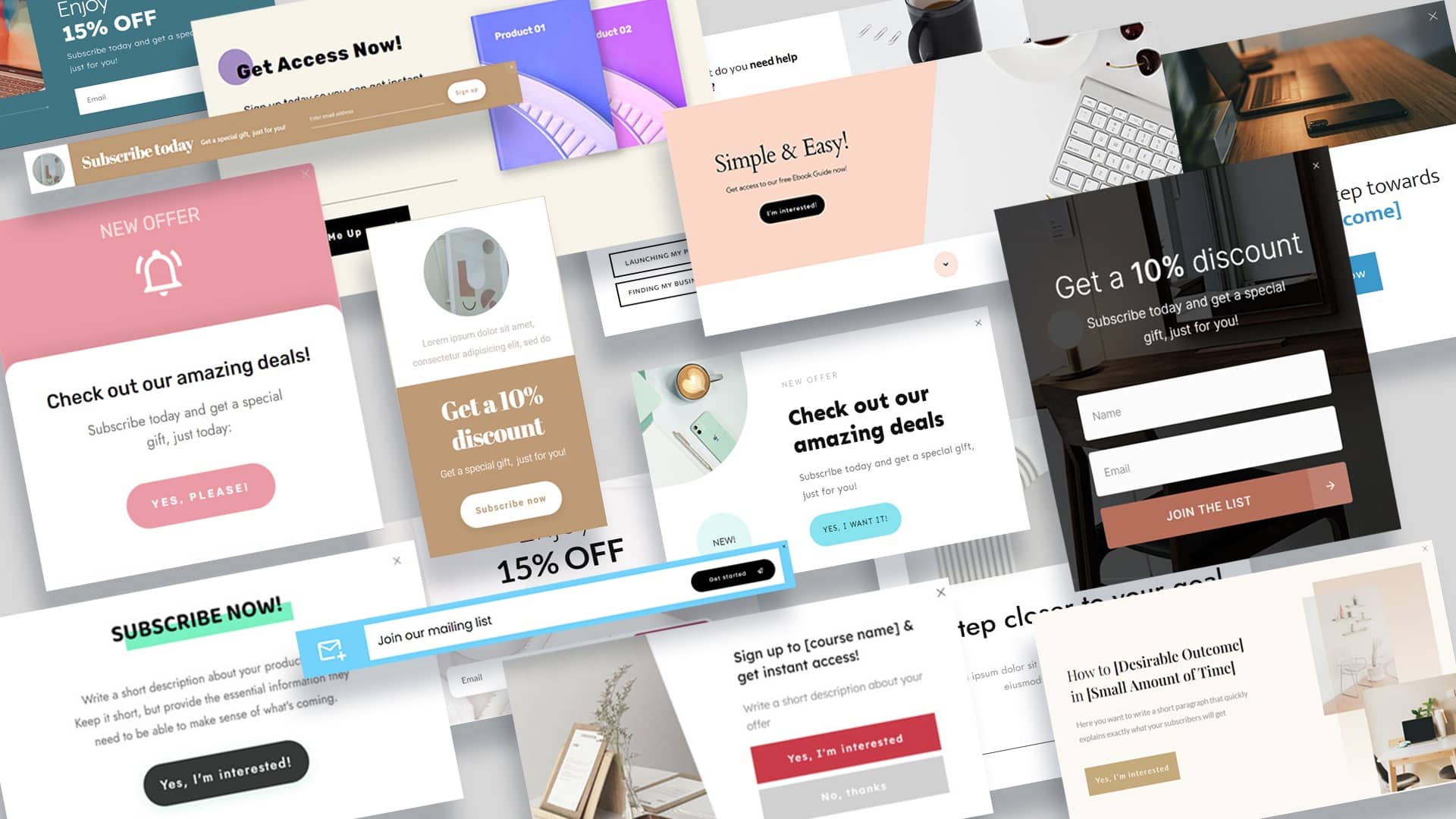
This plugin seamlessly integrates with most popular email marketing tools, so you can send your new leads to your CRM with ease.
You can purchase a paid subscription of Thrive Leads as a standalone product, or get it with Thrive Apprentice and several other power-packed site-building tools when you buy Thrive Suite.
Start Driving Website Traffic to Your New Homepage
Now that you’ve got an impressive homepage, it’s time to get it in front of the right eyes.
Here are 4 free website & marketing tutorials to help you grow your audience & get your business noticed:
7 Keyword Research Tips for the Busy Entrepreneur (Improve Search Page Rankings)
How to Create SEO-Friendly Blog Posts Users and Bots Will Love (14 Tips)
As you’ve seen, building a homepage for your WordPress site isn’t hard when you’re using the right tools.
If you want the full Thrive experience, though, you should get Thrive Suite, the best WordPress plugin bundle available.
These tools are ideal for users with any level of technical experience — from beginners, to intermediate web developers, and even advanced WordPress users.
When you purchase Thrive Suite, you get access to 10 powerful plugins to help you add conversion-generating features like popups, countdown timers, online quizzes, and so much more.
Don’t just take it from us.
Give Thrive Suite a try and see it for yourself.

