Are you looking for simple, practical ways to increase conversion rates and generate more revenue for your business?
You've come to the right blog post.
Boosting your conversion rates isn't just a stroke of luck. It requires consistent tweaking and testing — and it doesn’t have to be complicated.
In this post, we'll explore 21 easy hacks to rev up your conversion rates. These aren't just theoretical ideas; they are practical, tried-and-tested methods that can transform how your audience interacts with your website.
Keep reading to learn how to optimize your website and increase the number of people converting through your lead-gen and sales pages.
Here's Why You Need a Conversion Rate Optimization (CRO) Strategy
Think about this: You're working hard to bring visitors to your site - running ads, creating content, and building your social media presence. But what happens when they arrive? Are they taking the actions you want them to take, or are they leaving without a trace?
This is where Conversion Rate Optimization (CRO) becomes your secret weapon. Instead of just focusing on getting more traffic, CRO helps you make the most of the visitors you already have. It's like upgrading your fishing net rather than just casting it more times.
Here's what makes CRO a game-changer:
But it's not just about the numbers. CRO helps you understand exactly how people interact with your site, showing you where they get stuck and what makes them leave. By removing these friction points, you're not just improving conversion rates – you're building better experiences that naturally lead to more sales.
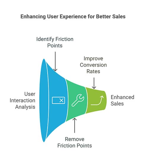
Think of CRO as your website's personal trainer - it helps you turn what you already have into something much more powerful. And the best part? These insights often lead to improvements across your entire marketing strategy.
Ready to get started? Let's dive into how to build your CRO strategy...
21 Easy Hacks to Boost Your Website’s Conversion Rate
This list includes actionable tips you can implement today to achieve a good conversion rate — whether you run a blog, eCommerce website, or service-oriented business site.
1. Have a Clean, Conversion-Focused Website
Let's be honest - your website isn't just there to look good. It's there to turn visitors into customers. A well-designed website acts like a skilled salesperson, guiding visitors naturally toward taking action, whether that's making a purchase, signing up, or reaching out to your team.
The secret lies in what we call "conversion-focused design": fast-loading pages that give visitors what they need, clear calls-to-action that stand out, and navigation so intuitive that your grandmother could use it.
But here's where many business owners get stuck:
- "How do I choose colors that actually drive action?"
- "Where should I place my content for maximum impact?"
- "Do I really need to spend weeks building this from scratch?"
If you're nodding your head right now, you're not alone. Creating a website that both looks professional and converts visitors isn't easy - especially if you're not a designer by trade. But here's the good news: you don't need to be a design expert to create a website that works. With the right tools and methods, you can build something that both looks great and gets results.

And that’s why we recommend using a theme builder and page builder to design your website in an easier, streamlined way.
These tools simplify the design process, allowing you to easily create a professional-looking website and get higher conversion rates.
Thrive Theme Builder and Thrive Architect are our recommended website-building duo for business owners who want to create an impressive website that stands out and generates conversions.
2. Simplify Your Forms
Simple, straightforward forms are more effective than long, complicated ones. When your visitors want to sign up for an offer, they want to do it as fast as possible.
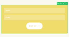
So, only include the most important fields in your opt-in forms and avoid having multiple stages in the sign-up process.
Usually, “Name” and “Email” are enough. If SMS marketing is a part of your marketing strategy, then “Phone Number” is another important field to add to your forms, too.
Pro tip
The perfect opt-in form is everything — from its appearance to how it functions. To learn how to create conversion-optimized forms, check out this step-by-step tutorial.
3. Optimize Your Website for Mobile
Your visitors are probably reading this on their phones right now. Mobile traffic dominates the web, which means your site needs to look and work perfectly on smaller screens.
We've all been there - squinting at tiny text, struggling to click microscopic buttons, or fighting with forms that refuse to work on mobile. These frustrations send visitors running (and they rarely come back).
Here's what makes a website truly mobile-friendly:
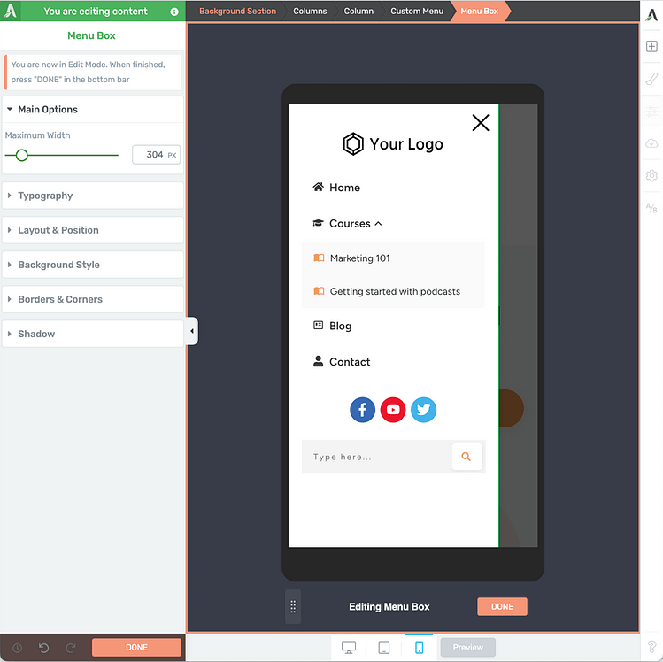
The good news? You don't have to be a mobile design expert to get this right. Page builders like Thrive Architect handle the heavy lifting for you, automatically optimizing your content for mobile devices. This means you can focus on creating great content while knowing it'll look perfect on any device.
4. Use High-Quality Images and Videos
Walls of text are the fastest way to lose your readers' attention. When you break up your content with engaging visuals, you transform dense information into an experience that keeps visitors scrolling and absorbing your message.
Quality visuals do more than just make your site look pretty - they help visitors understand your content faster and remember it longer. Whether it's showing your product in action, explaining a concept with an infographic, or adding personality to your blog posts, the right images and videos make your message stick.
If you're using Thrive Architect to build your pages, you can easily access millions high quality images right from the WordPress Media Library.
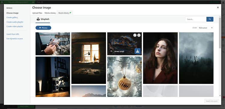
Access millions of high quality stock images right from your WP media library!
When you add the image element to your post or page, and open the WP Media Library, you can access these images in the “Stock Library” section.
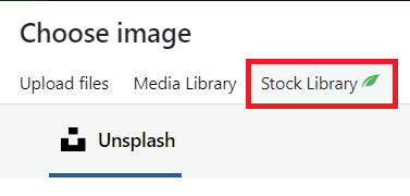
Adding quality images to your posts and pages just became so much easier!
Pro tip
You don’t need to hire a professional photographer or pay an arm & a leg for a Shutterstock subscription to get good visuals for your site. Check out this guide to learn how to create images for your website – for free.
5. Have a Clear Value Proposition
Your value proposition is the backbone of your website's success. Think of it as your site's "first impression" — you have mere seconds to tell visitors exactly what you offer and why they should care.
But here's a common mistake many websites make: trying to be everything to everyone. Each page should focus on one clear offer or solution. Want to promote multiple products? Give each one its own dedicated funnel. You can always introduce related products later through strategic upsells or cross-sells, but your main message needs to stay laser-focused.
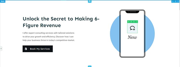
Keep your value proposition front and center on your landing page
This single-minded focus does two crucial things: it keeps your visitors from feeling overwhelmed with choices, and it makes your messaging crystal clear. Remember, a confused mind doesn't buy — but a mind that sees exactly what it needs, does.
The best part? Once you nail your value proposition, it becomes your north star for all marketing efforts, ensuring your message stays consistent whether someone finds you through social media, email, or your website.
6. Include Compelling Calls-to-Action (CTAs)
Your call-to-action (CTA) is where all your marketing efforts come together - the moment of truth where visitors decide to take the next step. A weak CTA can waste all the hard work you've put into getting visitors to that point.
The most effective CTAs don't just ask for a click — they drive action by creating a perfect mix of visual appeal and psychological triggers. Your button should leap off the page with bold, contrasting colors that catch the eye. Pair this with action-driven text that speaks to your visitor's desires, not just generic "Submit" or "Click Here" messages.

Every part of your CTA section should be designed to drive action
Want to amplify your CTA's impact? Add proof of value nearby - whether it's a compelling product image, a customer testimonial, or a countdown timer that creates genuine urgency. These elements work together to transform casual browsers into active participants.
Pro tip
Looking for more tips to get more conversions from your call-to-action sections? Check out this handy guide.
7. Make Your Headlines Stand Out
You only have a couple of seconds (at most) to hook your new visitors’ attention and reel them into reading the rest of your content.
The best way to grab attention and fire curiosity is by designing bold, eye-catching headlines.
From a copy perspective, you should lead with strong, compelling words in your headlines, addressing your audience directly with the right pronouns (You/Your), and focusing on selling the solution to a problem.
In terms of design, use larger fonts for your headings, play around with color, and make use of text highlights.
Nothing says “look here” like animated text highlights. And if you have Thrive Architect, the best WordPress page builder, you can add these to your headlines in seconds.
See for yourself in this quick tutorial from Tony:
8. Speed Up Your Website (Because Slow Pages Kill Sales)
Slow-loading websites are a big conversion killer – and we don’t want that for you.
Nobody waits for slow websites anymore. If your pages take more than a few seconds to load, you're losing visitors - and sales - before they even see what you offer.
The easiest ways to speed up your page load times are by:
The good news? You don't need to be a technical expert to create a lightning-fast website. When you use Thrive Theme Builder as your WordPress theme, you get built-in speed optimization tools that handle the heavy lifting for you.
And if you need more guidance on speeding up your website, check out our ultimate guide.
9. Simplify the Checkout Process to Boost Your eCommerce Conversion Rate
For eCommerce sites, if your checkout process involves lengthy forms or too many steps, you’ll lose customers.
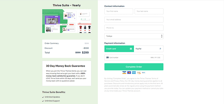
Make your checkout page as clear as possible
Purchasing a product through your site should be straightforward and user-friendly.
The best way to avoid checkout problems and enhance the customer experience is to use a reliable tool like WooCommerce, WP Simple Pay, or WPForms.
These tools provide the infrastructure to create a seamless checkout experience, including pre-designed templates to help you build payment pages and forms that look great and function well.
Alternatively, if you don’t need a checkout page, a simple plugin like PayPal Button for WordPress works just as well.
10. Offer Multiple Payment Options
Ever abandoned a purchase because a site didn't accept your preferred payment method? Your customers feel the same way. Nowadays, people expect to pay however they want — whether that's credit card, PayPal, Apple Pay, or something else.
Setting up multiple payment options is easier than you might think. WordPress payment gateway plugin like WP Simple Pay, Easy Digital Downloads, and WooPayments handle all the technical details for you, letting you accept payments in whatever way your customers prefer.
Think of it this way: every payment option you add is another door through which money can enter your business. Why leave any of those doors closed?
11. Prove Your Worth with Social Proof
Nothing sells better than happy customers telling their success stories. When potential buyers see others benefiting from your product or service, their hesitation melts away. That's the power of social proof.
Fresh, authentic testimonials are pure gold for your sales pages. They transform your marketing claims from "trust what we say" to "see what others like you have achieved." Place these success stories strategically throughout your sales funnel - from your main pages to checkout and even thank-you pages.
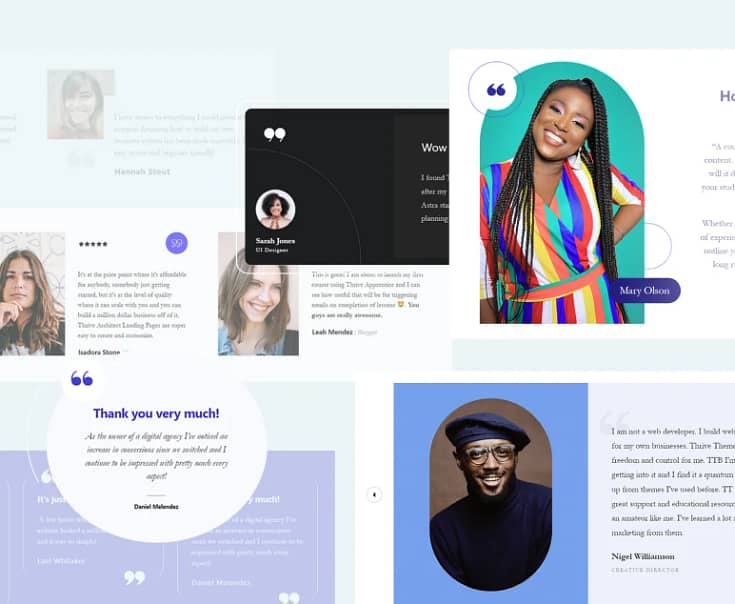
But here's a common challenge: getting those testimonials. Most business owners know they should collect customer feedback, but they either forget to ask or feel awkward doing it.
The solution? Automation. Set up a simple email sequence that reaches out to customers a few weeks after their purchase, when they're experiencing the benefits of your product.
Pro tip
Not sure where to start? We've got you covered. Check out our guide on 5 effortless ways to add testimonials to your WordPress website — including templates for asking customers for their feedback without feeling pushy.
Remember: Your satisfied customers are your best salespeople. Let their voices do the selling for you.
12. A/B Test Regularly
The best way to know what’s helping (or hurting) your page and form conversion rates is through running regular A/B tests.
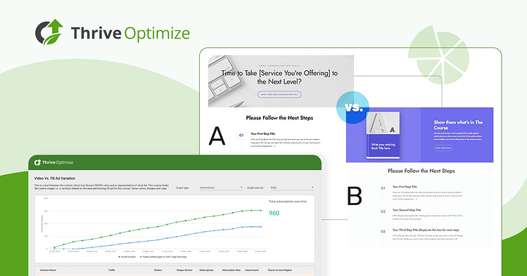
You can get this set up easily when building your pages with Thrive Architect.
When you purchase Thrive Architect, you get the option to also purchase Thrive Optimize, an easy A/B testing plugin that will help boost your page conversion rates.
For your opt-in forms, Thrive Leads is your secret weapon. Implementing it is a breeze, and it comes with a powerful built-in split testing engine. This means you can optimize your forms in minutes, without the hassle of additional plugins.
13. Create a Sense of Urgency to Drive More Sales
When users feel that they might miss out on something valuable if they don't act quickly, they are more inclined to take immediate action.
Phrases like “Limited Time Offer”, “Hurry, Sales End Soon” and “Only X Spots Left for this App Demo” are effective CTAs that appeal to your potential customers’ FOMO (Fear of Missing Out) and pushes them to click.
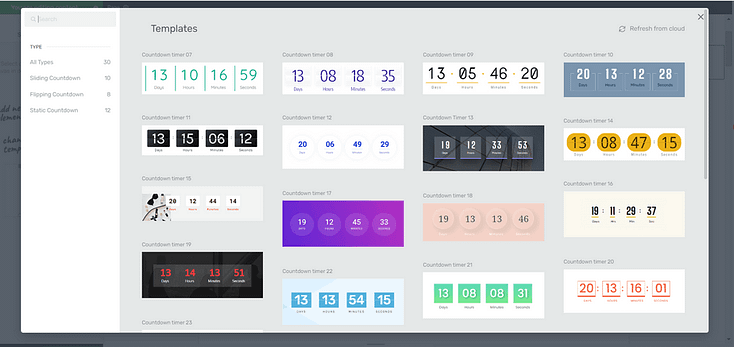
Countdown Timers in Thrive Architect
Using design elements like countdown timers and dwindling supply indicators can also help boost your CTA click-through rates.
However, use this strategy sparingly to avoid eroding trust with your audience in the long run.
14. Use Exit-Intent Popups
Just because a visitor is heading for the exit doesn't mean you've lost them forever. Exit-intent popups act like a skilled salesperson making one final, relevant offer before a customer leaves the store.
These popups detect when someone's about to close your site and jump in with something that might interest them. But timing isn't everything - the way you present this last-chance offer matters just as much. Make your message compelling and clear, and always give visitors an easy way to decline.
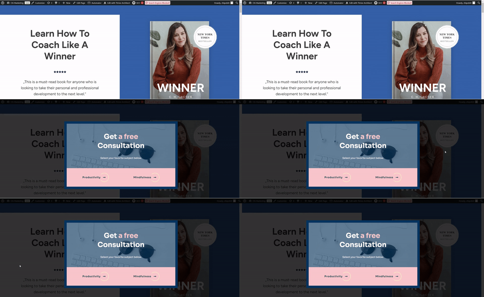
Think carefully about what might make someone pause and reconsider. It could be a special discount, a valuable piece of content, or a simple way to stay in touch. Whatever you offer, make it genuinely worthwhile.
Pro tip
When you make it easy for visitors to dismiss your popup, you show that you value their choice. This builds trust, even if they don't convert right away. And if you need a guide on how to set up these nifty popups, check out this guide.
15. Remove Risk with a Money-Back Guarantee
Nobody likes throwing money at something they're unsure about. A solid money-back guarantee strips away that fear, making it easier for potential customers to say "yes" to your offer.
Think of it as letting customers test-drive your product without the worry. When you stand behind your offer with a guarantee, you're sending a clear message: "We're so confident you'll love this, we'll take all the risk." This confidence is contagious - it shows you believe in what you're selling.
Your guarantee doesn't just remove barriers to purchase - it actually builds trust. It tells potential customers that you care more about their satisfaction than making a quick sale. And here's the best part: when your product delivers on its promises, refund requests usually stay surprisingly low.
16. Use a Quiz to Drive Engagement & Generate More Leads
People love quizzes - they're engaging, personal, and tap into our natural curiosity. But they're more than just fun - they're powerful tools for understanding your audience and generating quality leads (which you can learn more about here).
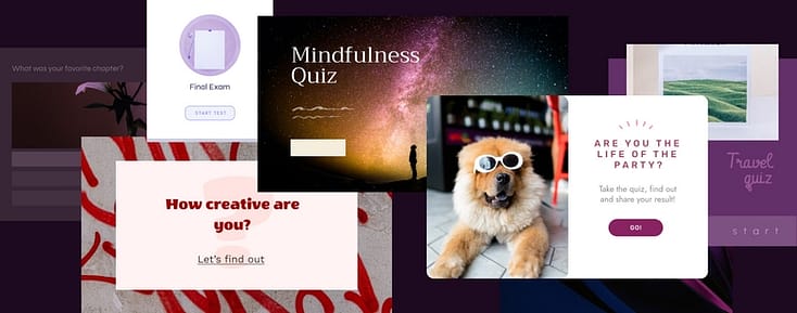
A well-crafted quiz does three things at once:
- Engages visitors with interactive content
- Collects valuable data about their needs and preferences
- Guides them naturally toward your offers
The best part? Your quiz results can help you deliver exactly what each person needs, making your marketing more personal and effective. Instead of guessing what your audience wants, you'll know based on their answers.
Creating these quizzes is easier than you might think. With Thrive Quiz Builder, you can build engaging quizzes without touching a line of code. The plugin connects directly with email services like ConvertKit, letting you automatically segment leads based on their responses and send them perfectly targeted follow-up content.
17. Target Abandoned Cart Customers
Targeting abandoned cart customers is a smart strategy for boosting your average conversion rates.
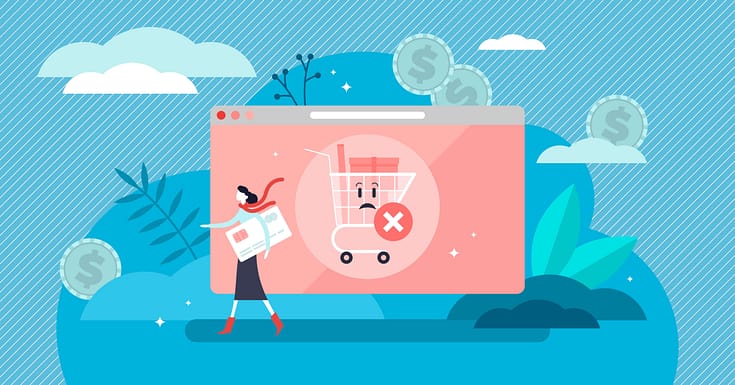
When potential customers add items to their cart but leave without completing the purchase, it indicates a level of interest that hasn’t yet translated into a sale.
By focusing on these customers, you can engage them with targeted communication like email reminders, targeted ads, or push notifications, drawing their attention back to the items they left behind.
18. Use Dynamic Content
Using dynamic content on your website is like creating a personalized experience for each visitor.
The content changes based on who’s viewing it - adapting to their location, device, or past interactions with your site. This personalized approach helps grab and keep your audience’s attention.

For example, if a returning visitor lands on your site, they see offers and products that align with their previous interests.
This relevance in what you present makes the user journey smoother and more engaging. When visitors find what they’re looking for easily and feel that the content speaks to them personally, they're more likely to convert.
If you’re using a page builder plugin like Thrive Architect, you can create dynamic landing pages that look and act like they were designed by a pro.
19. Include an About Us Section to Build Trust
You wouldn’t buy from a faceless company that has no reviews on its products or services, would you?
Neither will your potential customers.
Having an "About Us" section on your website helps build trust and credibility with your, the customer. It's where you get to know the story, mission, and values of the brand, giving a human touch to the business.
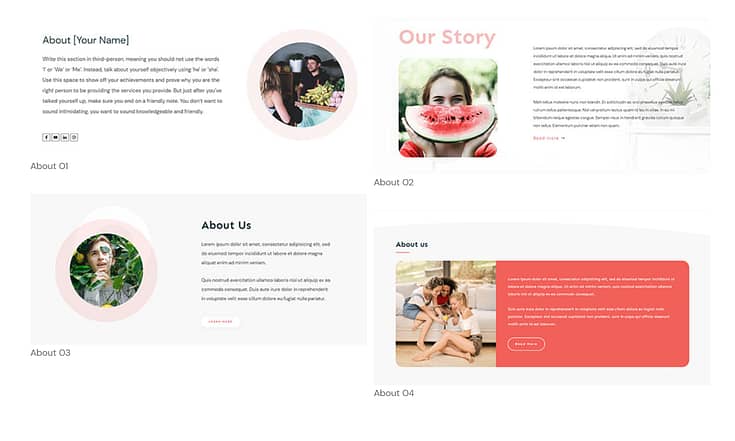
A few "About Us" templates in Thrive Architect
This transparency creates a sense of familiarity and trust, making you more comfortable and confident in making a purchase.
We recommend adding this section to your homepage and offer pages, so your audience can easily get to know you.
20. Embed a Live Chatbot
A live chatbot is a versatile tool that can enhance customer support, provide round-the-clock engagement, guide customers through their purchasing journey, and reduce cart abandonment.
You can use this live chat feature to provide immediate assistance to your customers. Quick responses to frequently asked questions (FAQs) or issues can significantly improve the user experience, making visitors more likely to convert.
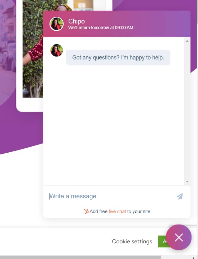
Unlike human support, chatbots are available around the clock. This constant availability ensures that you capture and engage customers at any time, potentially increasing conversions outside of regular business hours.
If you're new to chatbots and want to test them out, we recommend using a free plugin like HubSpot. But if you want more advanced features, you'll need to pay for a premium AI chatbot plugin.
21. Install an Analytics Tool to Monitor Key Metrics
Running a growth marketing strategy without a reliable analytics tool is like going on a big adventure without a compass – or Google Maps.
How will you know what’s working?
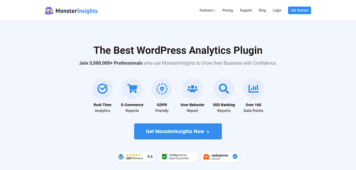
If you need a beginner-friendly WordPress plugin that takes the stress out of Google Analytics, we recommend MonsterInsights.
MonsterInsights helps you set up Google Analytics in minutes.
You also get access to a user-friendly dashboard to track your real-time site data like webpage views, source of traffic (e.g. social media), product page conversions, bounce rate etc.
Use this plugin to track your website’s performance metrics so you can identify the growth strategies that are bringing in the most traffic.
Next Steps: Create Your Next Landing Page
Now you have 21 solid tips for optimizing your site for more conversions. Now it's time to put them to work.
Starting with your next landing page.
Landing pages are key for putting your offer in the best light to entice your audience and get them to take action.
So, here are 4 free tutorials to help you get started:
- Beginner’s Guide: How to Create a Great Landing Page
- How to Set Up a Complete Lead Generation Funnel
- How to Create the Perfect Long Form Sales Page (+ Templates)
- How to Create Affiliate Marketing Landing Pages that Stand Out
Increase Conversion Rates with the Right Tools
After reading this list of conversion-boosting hacks, you might be feeling a bit overwhelmed. There's a lot to take in, but the journey to higher conversion rates doesn't have to be daunting.
But the good news is, you don't have to tackle all of this alone.
You might have noticed a recurring theme in our list of tips — various Thrive products popping up as recommendations. This isn’t a coincidence.
Our products are intentionally designed with a conversion focus in mind, ensuring that every tool you use directly contributes to enhancing your website's performance.
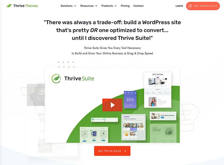
And you can get instant access to all these tools when you purchase Thrive Suite, the ultimate WordPress plugin bundle for your business.
Imagine having a toolkit at your disposal that directly aligns with each of these hacks.
From creating compelling landing pages with Thrive Architect to engaging your audience through quizzes with Thrive Quiz Builder, each product in the suite is a cog in the machine that drives conversions.
The beauty of Thrive Suite lies in its cohesive approach – it's designed to work seamlessly to amplify your digital marketing efforts. And the best part?
You can get all these powerful tools in one bundle at a price that’s a real steal.
So, if you’re serious about boosting your conversion rates and want a suite of tools that can help you achieve just that, Thrive Suite is your go-to solution.
It’s more than an investment in tools; it's an investment in the future success of your online business.




“These hacks are absolute game-changers! Thanks for sharing such valuable insights. Implementing these strategies on my website has already started to show promising results.